Landing page build in Webflow – Germany based SEO Studio
Website design and development in webflow for an SEO consultant studio from Germany
By Milan Gohil

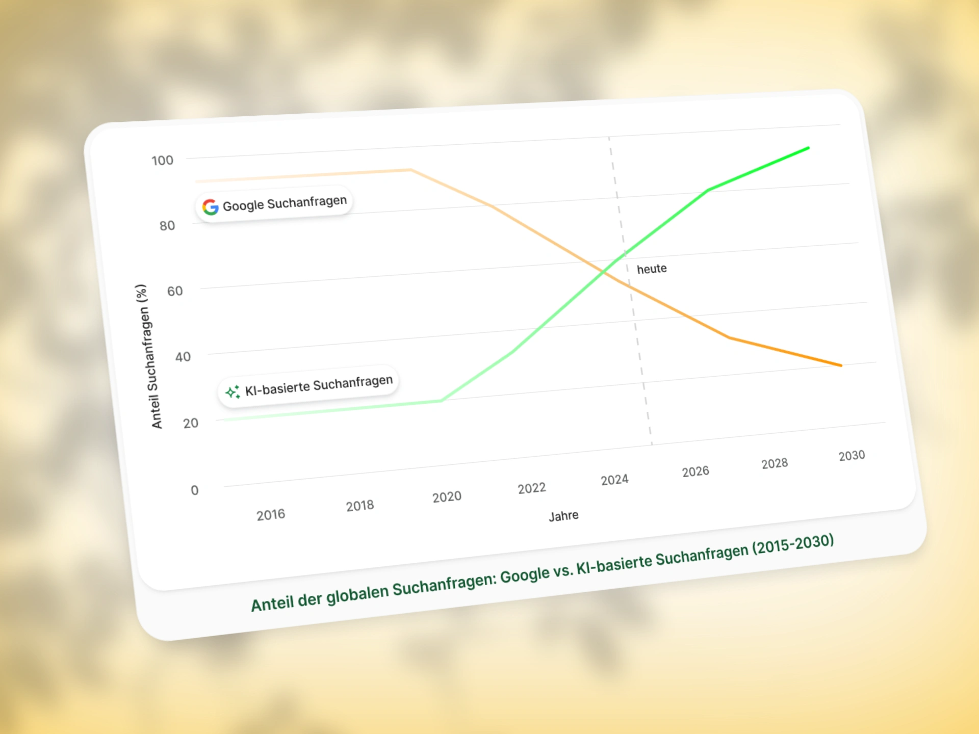
Google vs AI search graph (custom graphics)
Getting Started
Everything began on 25 June 2025
The first steps were simple:
A working contract was created and shared through Contra
A project document was set up to keep everything in one place
A few discussions followed. Questions came in. Some had quick answers. Some took more thought
First Few Days I spend on Understanding & Direction
From 26 to 30 June, most of the time went into:
Reviewing Adrian’s questions
Studying similar websites and find what worked and what didn’t
Beginning the moodboard
Sharing links for review and keeping conversations going on WhatsApp
The design hadn’t started yet. The focus was on direction
Slowing Down to Rethink
1 July was the turning point. I tried a couple of layout themes, but none felt convincing.
Instead of forcing progress, I took a step back.
I spent time looking at how similar websites are experienced, not just visually, but emotionally.
Read through real user reviews from different markets. Tried to understand what actually builds connection.
From that, a clearer approach started to take shape.
Progress in Layers (2–10 July)
Designed the first full layout in Figma with auto layout.
Built only one Custom graphic initially for the search graph.
Shared a Loom walkthrough with thoughts and direction.
Collected a list of things needed to move forward:
Logo
People photos
Section-wise content
Clarification on which sections needed graphics vs simple copy
Over the next few days:
Created custom graphics (benefits, services, process)
Set up basic page structure in Webflow
Added animations that support the layout without distracting
Ensured everything worked on desktop, tablet, and mobile
Optimized for loading speed and usability
Added real content where available to start shaping flowFigma was updated with final content notes
Notes on the Process
This wasn’t a rushed build. And it wasn’t one-directional.
There were pauses, rethink moments, and slow confirmations.
That helped shape something clearer, with less noise.
The structure stayed simple.
No overload. No decoration for the sake of it.
Everything was added because it felt needed or left out if it was not.
Tools & Flow
Docs and tasks tracked on Notion & Google Docs
Design built in Figma
Development done in Webflow
Reviews happened over WhatsApp and Loom
Final files optimized and structured for clarity
Closing Thought
This was one of those builds where direction did not come from a moodboard, it came from sitting with the problem long enough. Listening, not assuming. Testing, then discarding.
And eventually, landing on something that feels like it belongs.
That’s all.
Here is live link of website:
Wireframe without custom Graphics

Wireframe of landing page
Like this project
What the client had to say
Was a great experience and we will continue to work together for more projects
Adrian Mühleisen
Sep 2, 2025, Client
Posted Aug 5, 2025
Built a clean, responsive Webflow landing page for a Germany-based SEO studio, focused on clarity, structure, and quiet, thoughtful execution
Likes
1
Views
27
Timeline
Jun 27, 2025 - Jul 29, 2025


