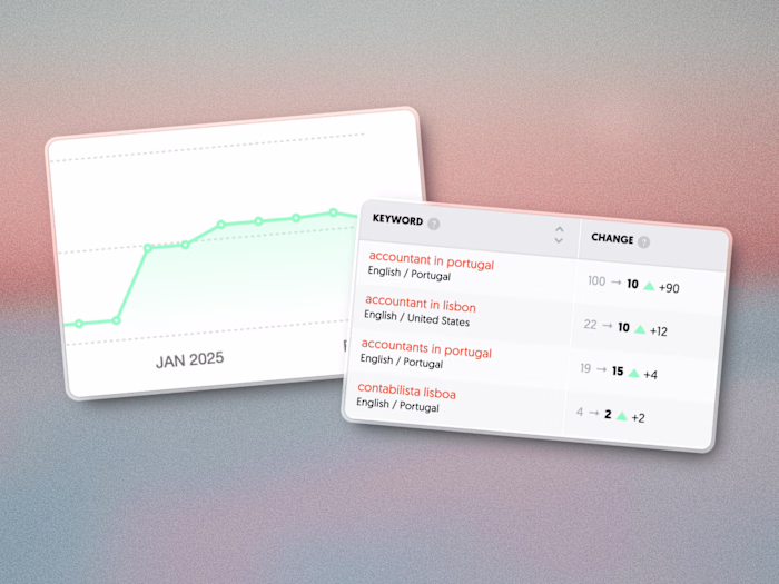
4.3X more visitors turned It into login users
Milan Gohil
Verified
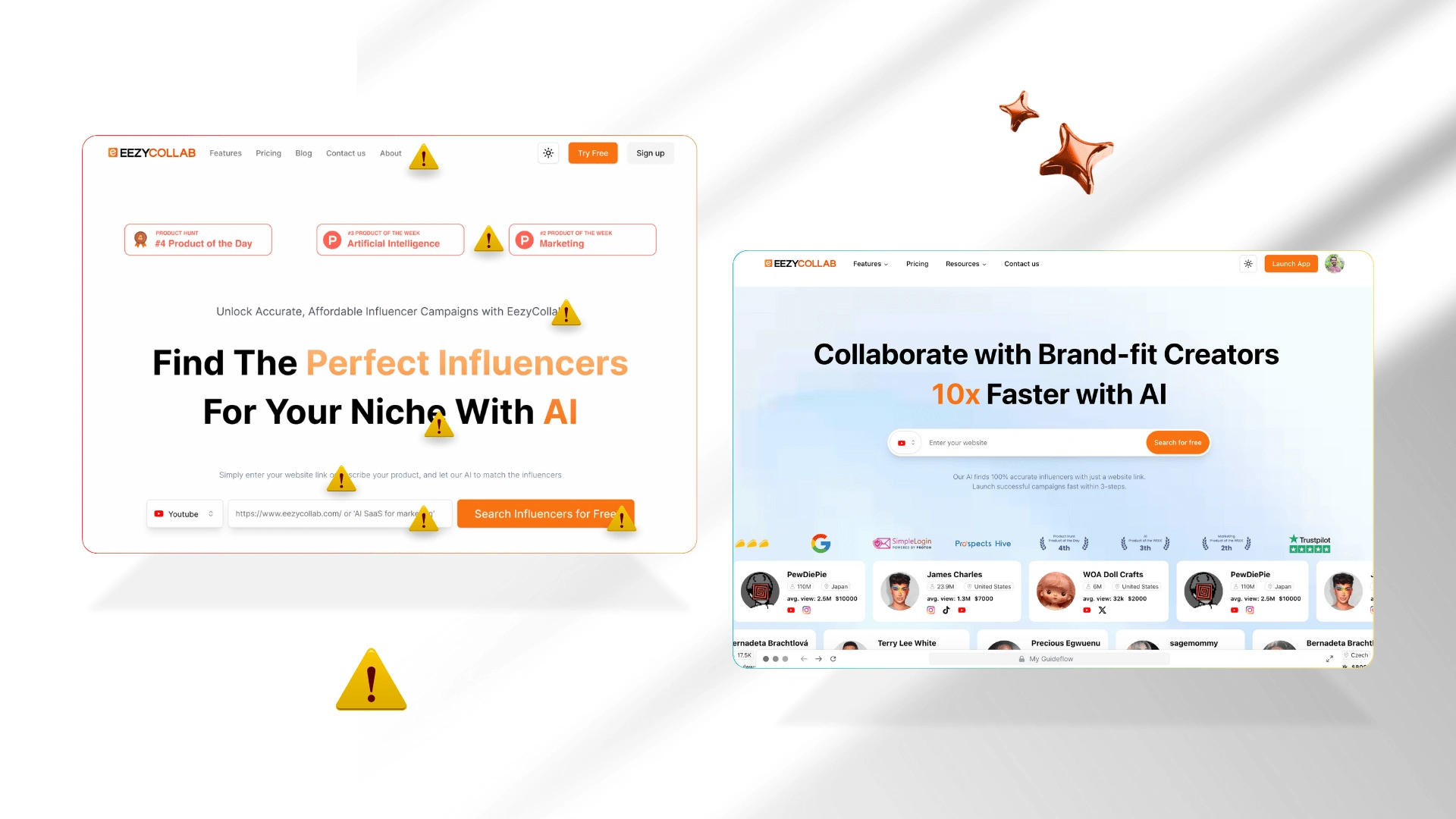
Before vs After redesign complete easycollab.com
Scrolling home page
The Reality Check
I landed on the page, expecting to see a functional, user-friendly experience. Instead, I found a mess. It wasn’t just bad—it was hurting conversions
The biggest issues?
Pages leading no-where: random redirections that made no sense for first-time visitors (in the header section)
Fake trust signals: ratings from external platforms that added zero credibility (without logo or link to a 3rd party website)
Empty noise, no real message: the tagline didn’t connect. The text was excessive. The visuals looked nice but said nothing
Typography: inconsistent fonts, bad spacing, and cluttered design
CTAs that confused instead of converted: the words didn’t match how the tool actually worked
No social proof where it mattered: reviews were missing, and influencer credibility was nowhere in sight
So, What Did I Do?
I rebuilt the Complete Design, this time with the user in mind, which you can experience in live ↴
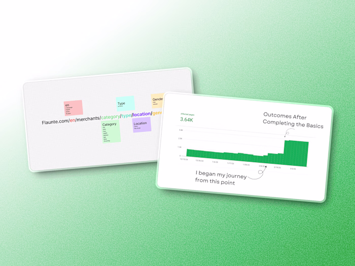
Instead of static, text-heavy graphics, each graphic was re-envisioned to tell a part of the story. One of the motion graphics now not only demonstrates dynamic design but also embodies the energy and fluidity of the platform
Meanwhile, performance snapshots (like the Google speed test) act as proof points, reassuring users of the site’s newfound efficiency
Custom-made graphcis
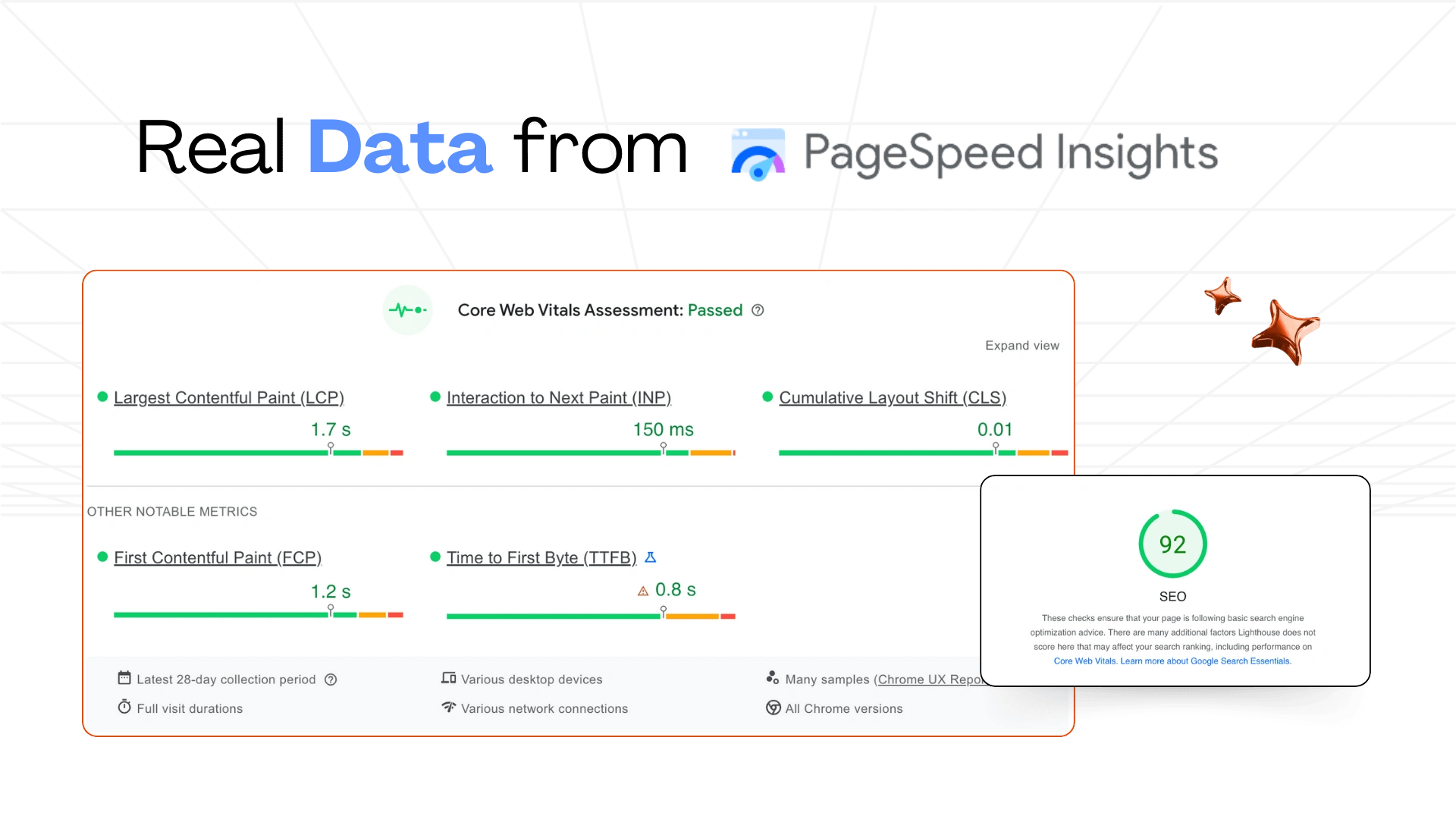
PageSpeed google tool result
By the time the final chapter of this redesign was complete, visitors were not only staying longer—they were actively engaging. The site’s newfound clarity transformed initial confusion into trust: a 35% drop in bounce rates and a 70% surge in meaningful clicks told the story of a digital experience reborn
What we need to understand?
Every website isn’t a decoration. It’s the first handshake with your users
Website preview as long image 🪴
easycollab website redesign outcome
Like this project
Posted Jan 24, 2025
EezyCollab's website saw a 35% decrease in bounce rate and a 70% increase in CTA clicks after a complete design rethink focused on clarity and user experience
Likes
4
Views
86
Timeline
Apr 18, 2025 - Jun 22, 2025
Clients
Blue Hope