Otto UI/UX: Designing a Dense, Calm PM Workspace

Shoaib Vohra


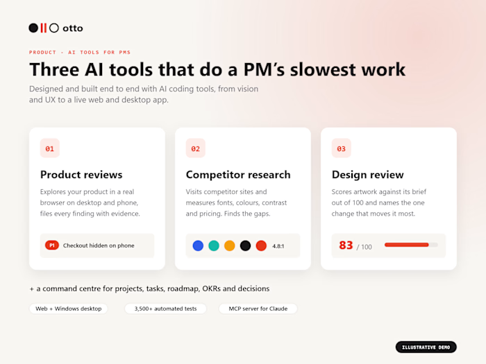
TL;DR. Otto is an AI command centre for product managers, on the web and as a Windows desktop app. I designed all 21 screens and built it with AI. This is the design side: how to fit a PM's whole week on one screen without it feeling noisy.
Role: Product designer & PM · Platforms: web and desktop · Timeline: Jun–Oct 2026
The design problem
PMs scan dozens of projects, tasks and decisions a day. Most tools either hide detail behind clicks or drown you in it. Otto had to be dense and still calm.
Key design decisions
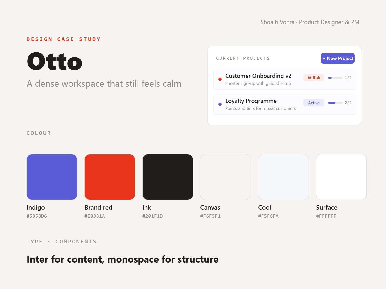
Density with rhythm. Each project is one compact row: status dot, name, one-line goal, status pill, a tiny progress bar and "1/4 · 3 pending". Everything you need to triage, nothing you have to open.
Monospace for structure, sans-serif for content. Section labels (CURRENT PROJECTS, COMPLETED, BLOCKED / WAITING) are small uppercase monospace, so the eye separates the frame from the content without heavy dividers.
Two colours, two jobs. Indigo (#5B5BD6) is only for actions: New Project, New Task, Copy to clipboard. Brand red (#E8331A) belongs to the brand. Status pills always carry a word (Planning, Active, At Risk), never colour alone.
Filters as chips, not menus. All / Work / Personal and All regions / KSA / Pakistan are one-tap chips, because a PM working across markets switches context all day.
A sidebar that follows the week. Daily work (Dashboard, Projects, Tasks, Product Reviews, Creative Review, Competitor Research) sits above Planning & team (Work Journal, Performance, Summaries), with keyboard search at the top.
Output-first summaries. Summaries open with three numbers (Completed, In progress / open, Blocked / waiting), then a copy-ready update grouped by market and project. The main button is Copy to clipboard, because the update really lives in email or Slack.
Design review built in. Otto's own design review scores a UI on 25 checks across 5 pillars: Craft, Communication, Brand & context, Practicality and Outcome. I use the same checklist on client work.
The screens
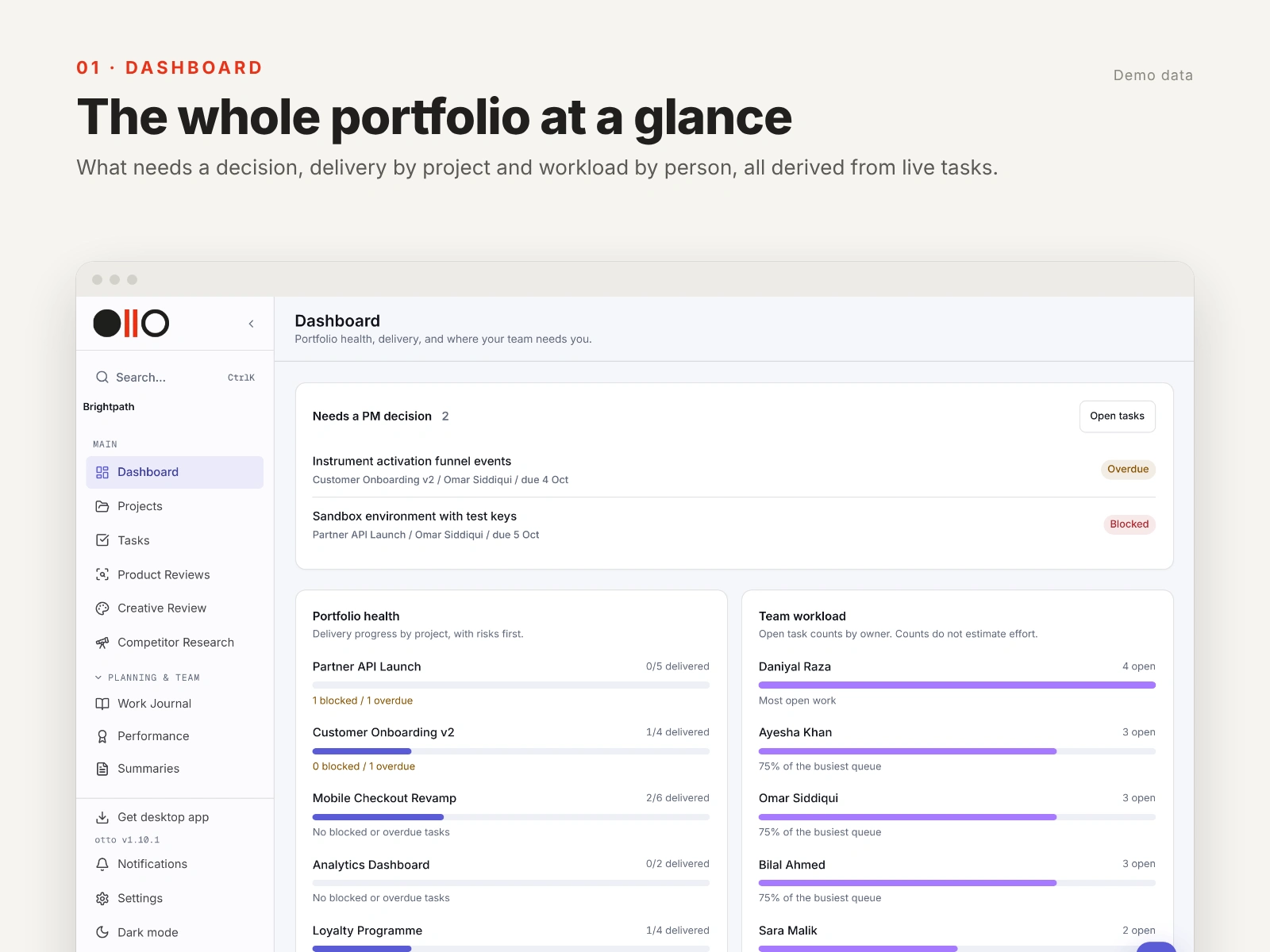
Command centre: portfolio health and team workload on one screen.
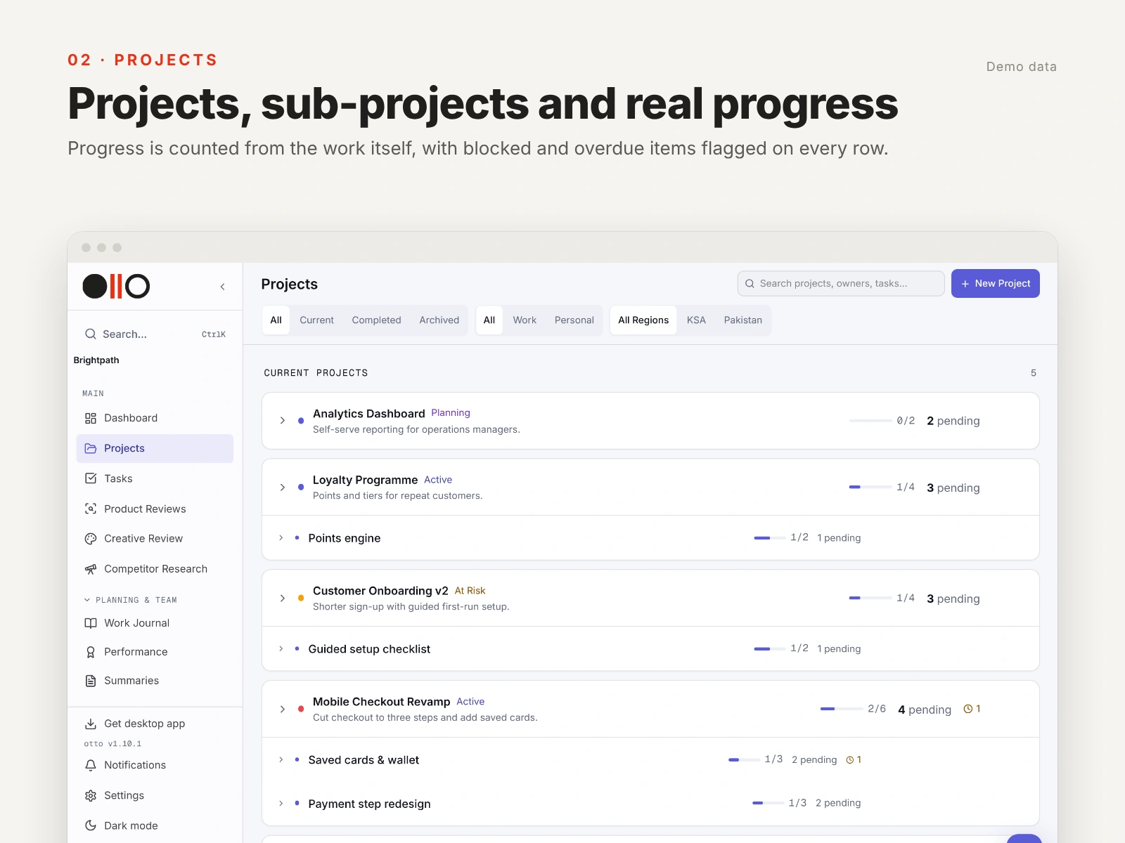
Projects: one compact row per project with status, progress and what is pending.
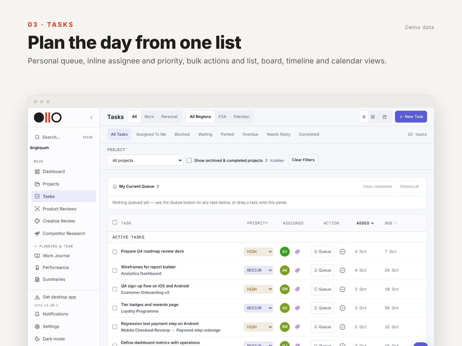
Tasks: queue, filters and priorities, built for fast triage.
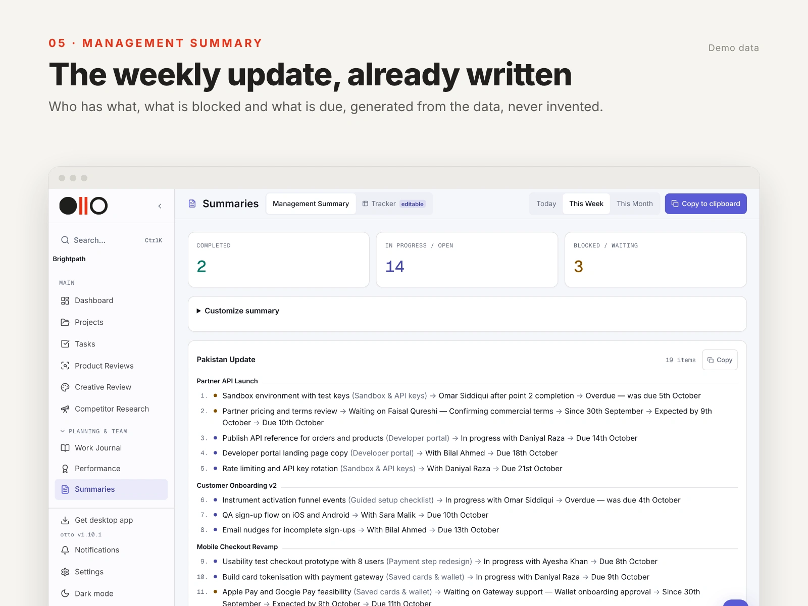
Summaries: three numbers first, then a copy-ready weekly update.
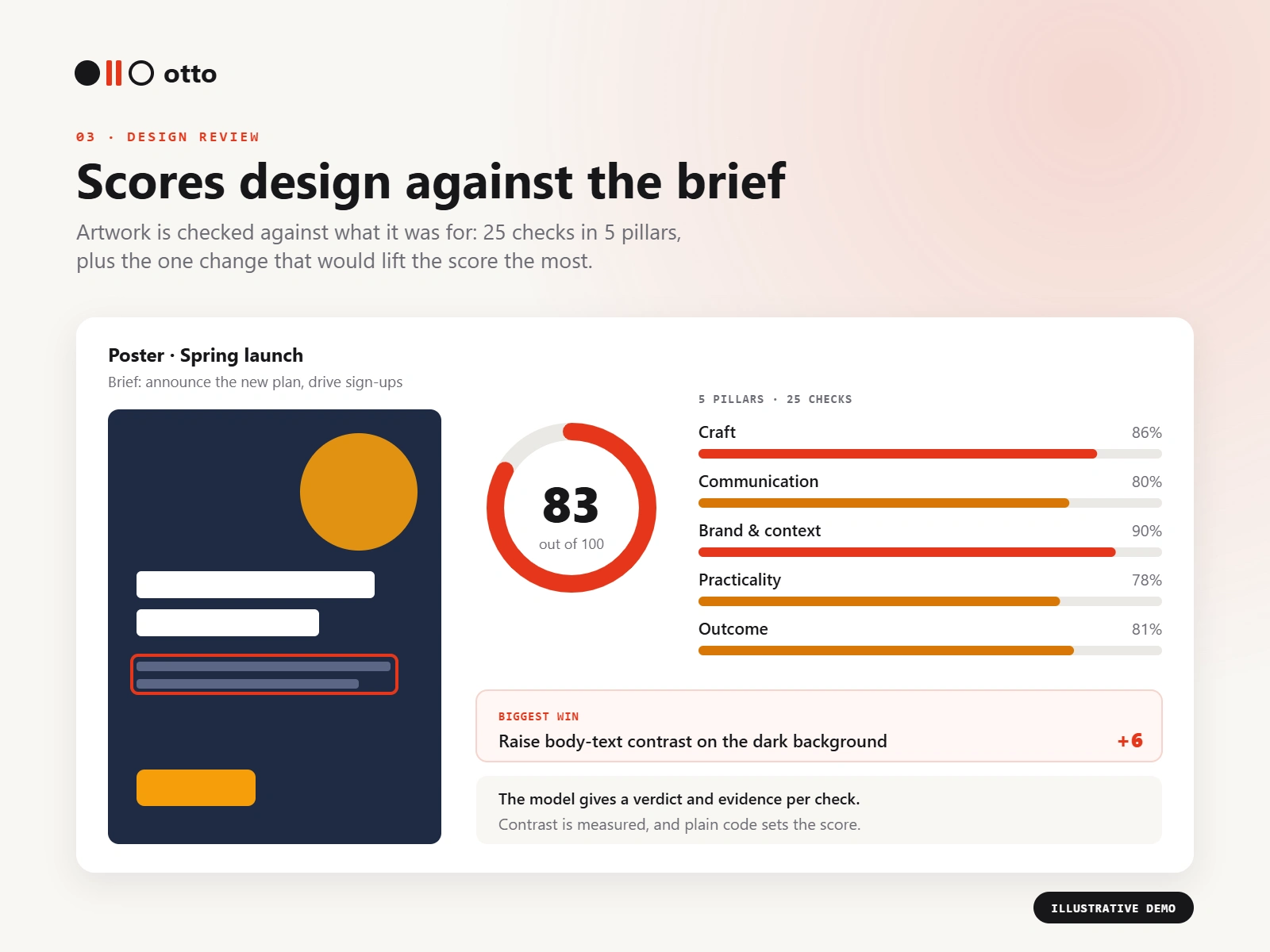
Design review: 25 checks in 5 pillars, the same checklist I use on client work. Example data.
Design review: what I'd improve next
Small screens. Otto is desktop-first. The dense rows need a proper mobile layout, not a squeezed one.
Contrast. Some secondary text is very light grey on near-white. It needs a WCAG AA pass.
Testing. I haven't run usability sessions yet. That's the next step.
What this shows
I can design data-heavy tools that stay calm: dashboards, admin panels and internal tools. If your product has a lot to show, send me a message.
Like this project
Posted Oct 29, 2026
Design case study: hierarchy, colour and type for a data-heavy AI workspace for product managers. 21 screens across web and desktop.
Likes
0
Views
0
Timeline
Jun 1, 2026 - Oct 31, 2026