Designing an Efficient Internal Enterprise Tool-Web App
Victoria Bona-Egun

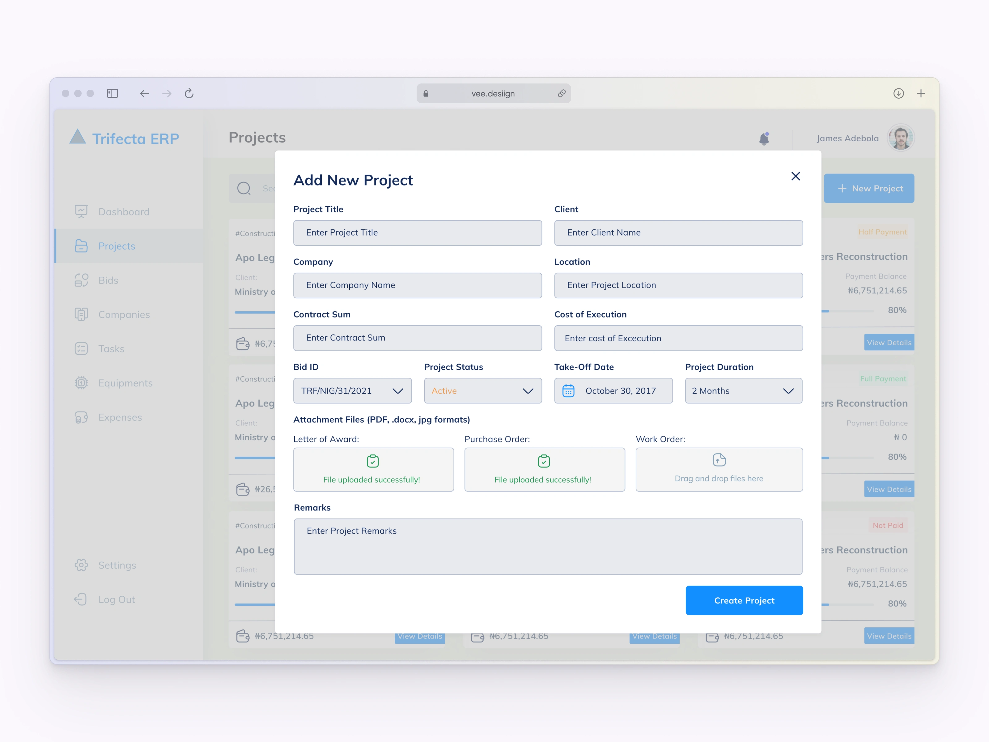
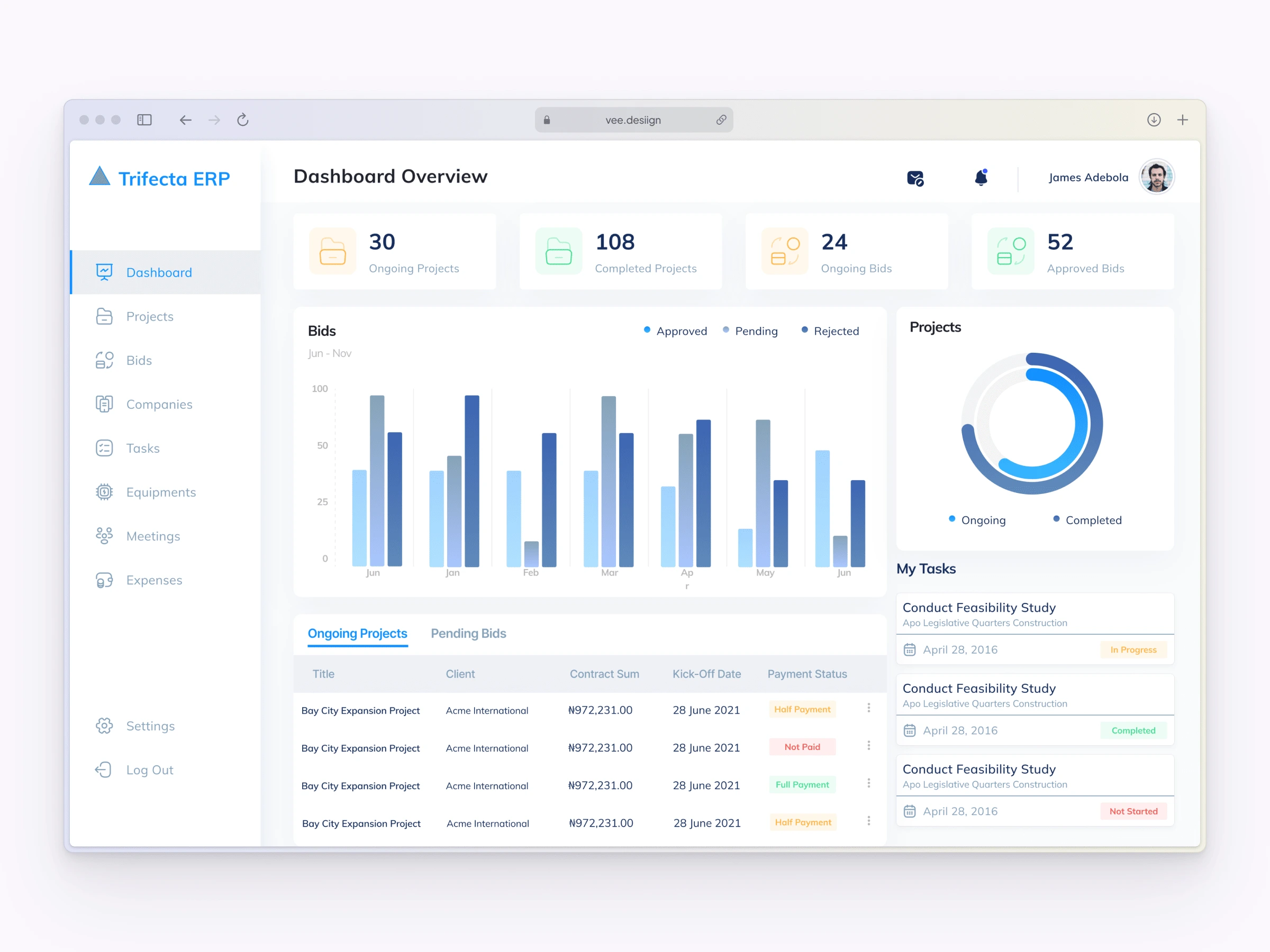
Image of TERP Web App.
Overview
I designed an Enterprise Resource Platform (ERP) for Trifecta, a construction consulting firm to manage and streamline their workflows, improving productivity by 30%. I achieved this by providing a solution for real-time data access to data, progress on task stages and project tracking.
My Role
As the sole designer on this project, I collaborated with the project manager, stakeholders and developers over a 3-month timeline. My responsibilities involved conducting research, ideating the design concepts, prototyping the interface, creating data visualizations for the dashboard, designing information architecture, and facilitating design handoff to the development team.
Process
Having conducted thorough research and engaged in extensive discussions with stakeholders, I acquired a comprehensive understanding of the project requirements. We meticulously documented our findings and organized the tool's modules accordingly. With a strong foundation established through ideation and prioritization, my primary focus shifted to designing the initial screen. To effectively visualize the data, I integrated various visual elements such as graphs, tables, and pie charts. Throughout the design process, the overarching goal remained consistent: to create a user-friendly interface characterized by a clear hierarchy, intuitive functionality, and easy navigation.
Solution
The successful implementation of this internal enterprise tool has brought tangible benefits, including improved workflow, streamlined processes, and enhanced decision-making among employees in the company. The user-friendly interface and intuitive functionality have received positive feedback from users, further validating the design approach.
Like this project
Posted Jun 12, 2023
End-to-end design of the company's ERP software, including UX for data visualizations. The structured approach increased workplace efficiency by 40%