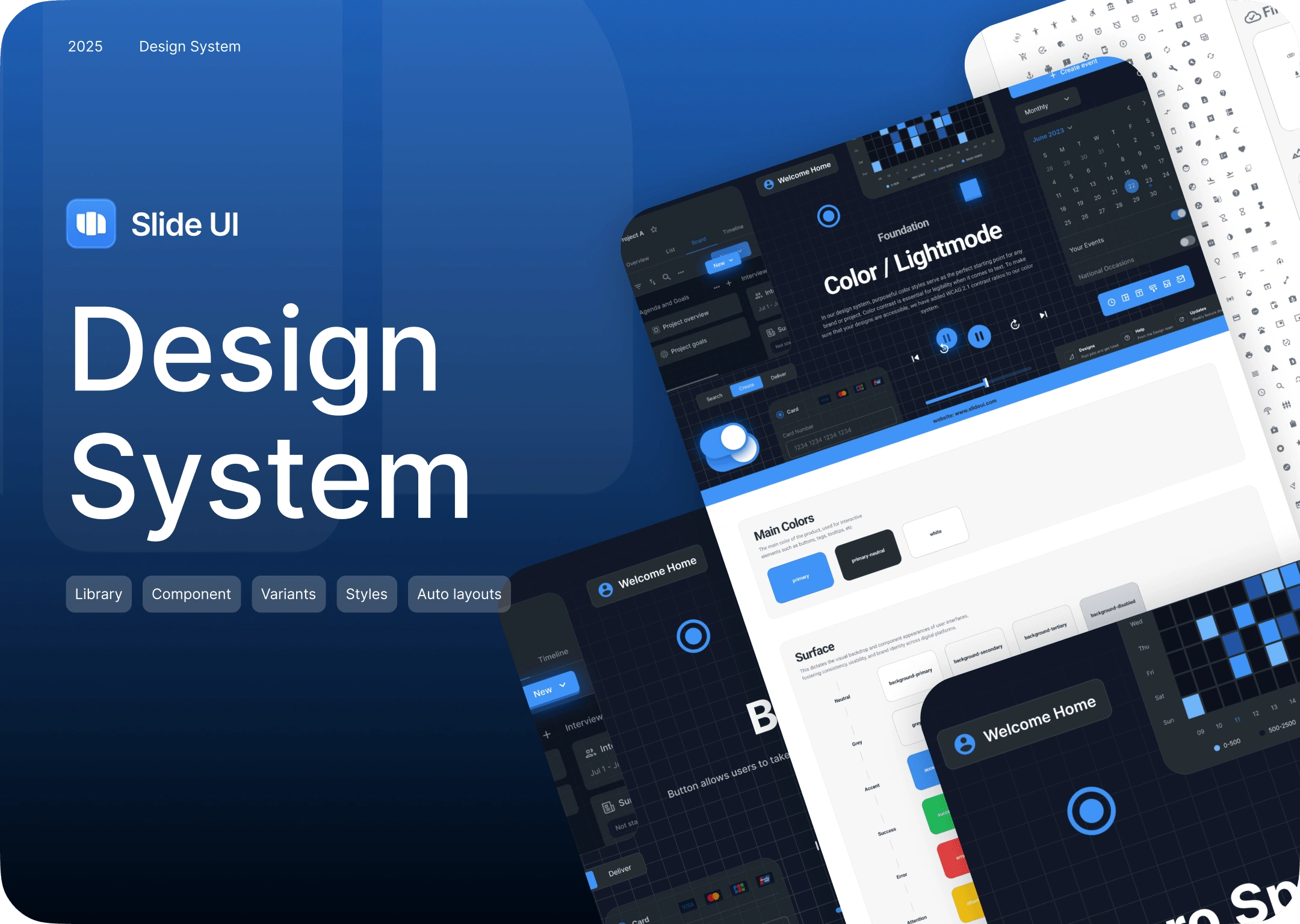
Dose design system
Capi Product
Verified
🎯 Project: Dose Design System
Client: Dose
Agency: Capi Product
Type: Design System / UI Framework
Role: Lead UI/UX Designer
Tools: Figma, Auto Layout 5.0, Variables, Tokens
1. Background & Objectives
Dose is a digital product brand that needed a cohesive design system to unify its interface across multiple products.
Before partnering with Capi Product, their team faced growing inconsistency between web and app experiences, which slowed down iteration and developer handoff.
Our goal:
Build a scalable design system that reflects Dose’s brand identity.
Standardize UI components and visual styles for efficiency.
Improve collaboration between design and development teams.
2. Problems Before the System
Visual inconsistency: Colors, typography, and layouts varied across screens.
Limited scalability: Components were recreated manually in each project.
Inefficient developer handoff: No clear rules for states or behavior.
Manual updates: Lack of design tokens or variable-based system.
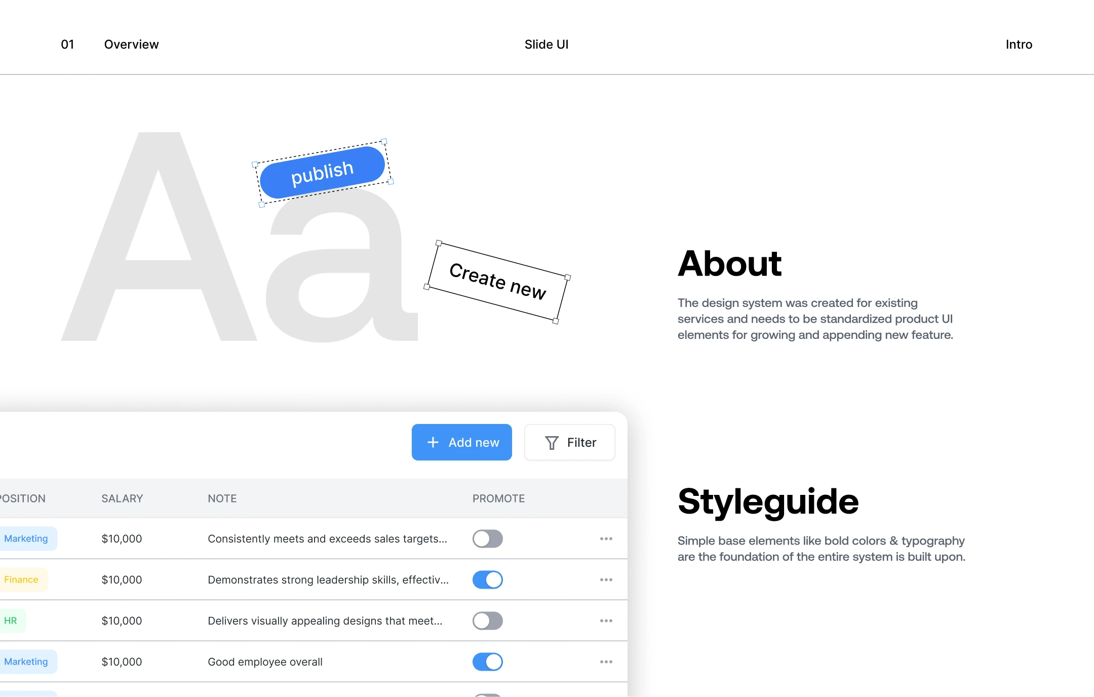
3. Solution: The Dose Design System
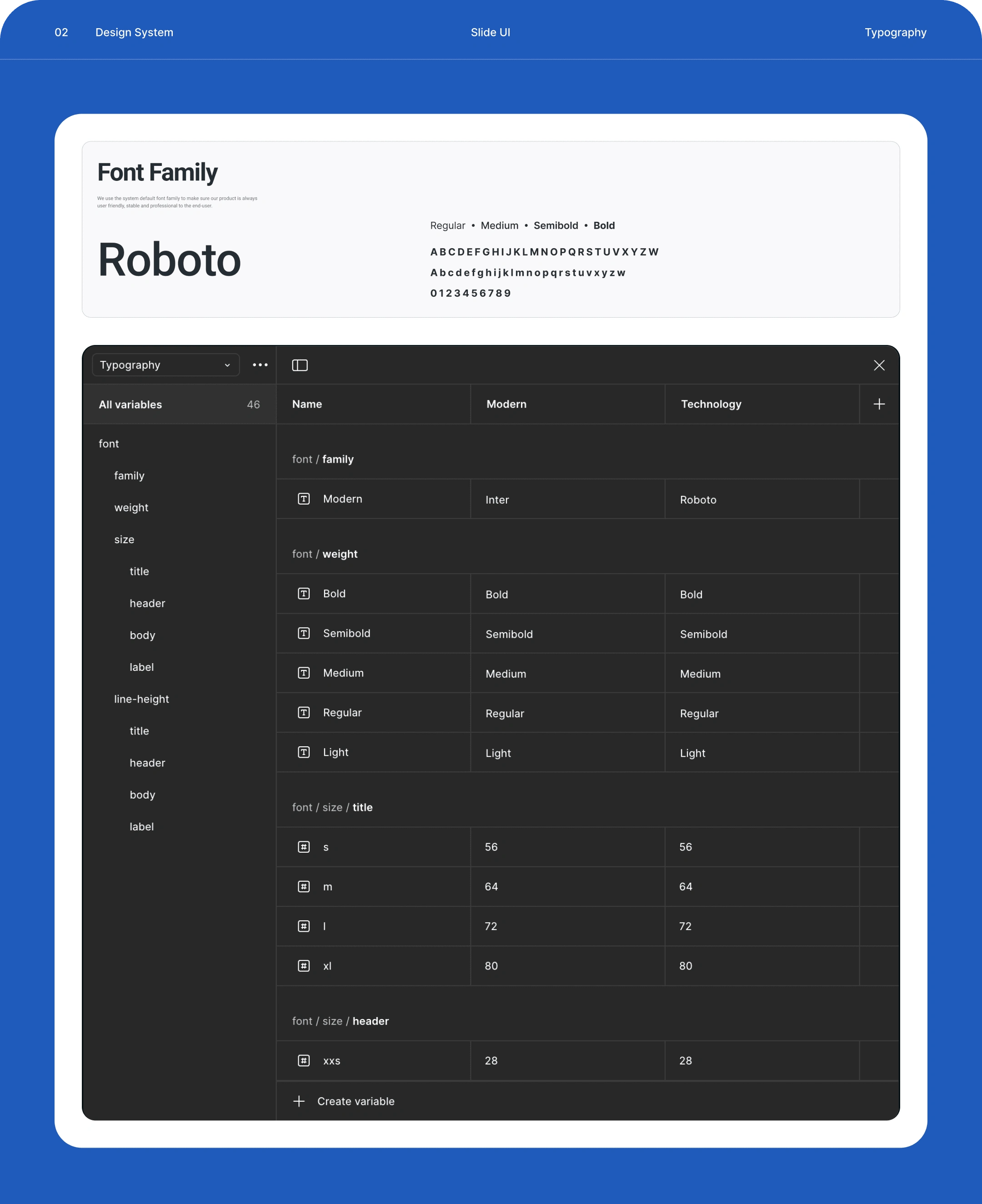
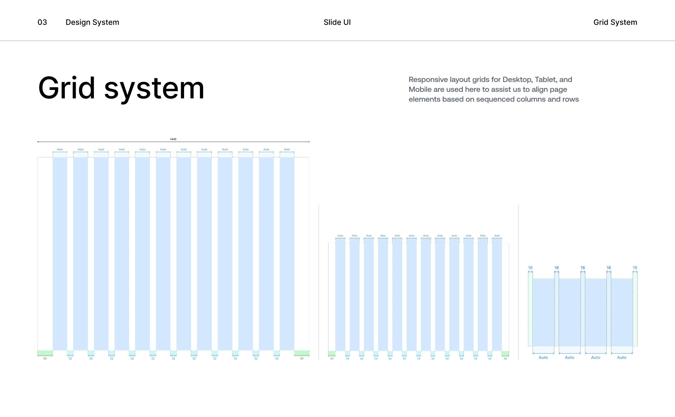
(a) Foundation Setup
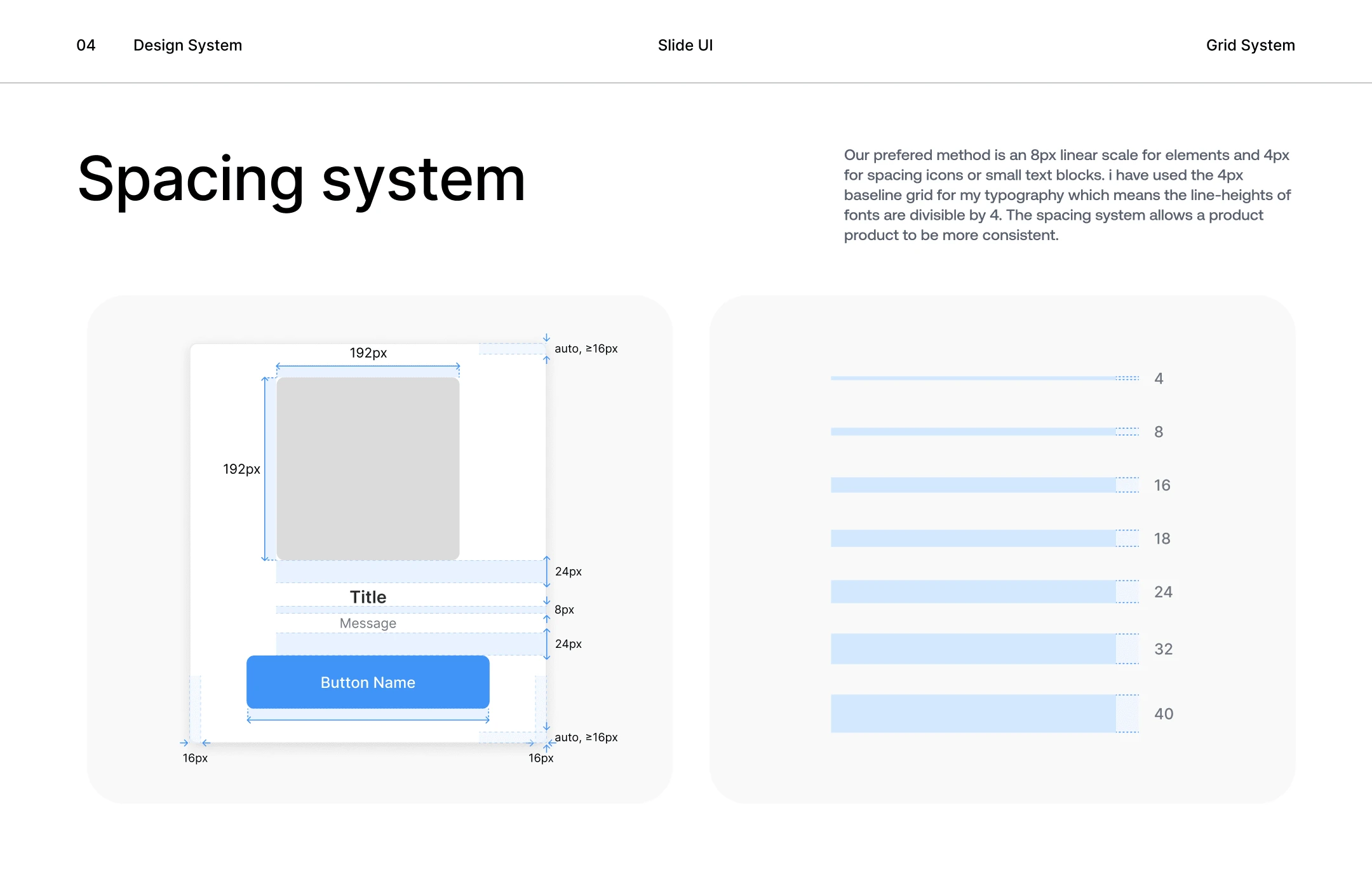
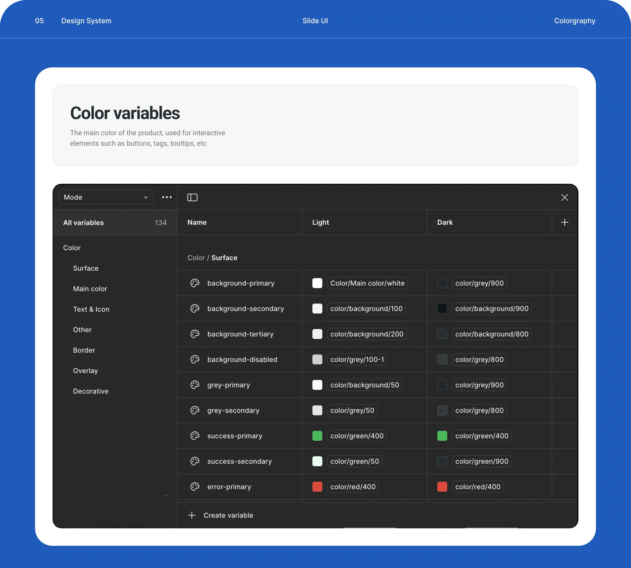
Defined Design Tokens for color, typography, spacing, and grid.
Applied semantic naming conventions for easier maintenance.
Used Figma Variables to control light/dark modes and states dynamically.
(b) Component Architecture
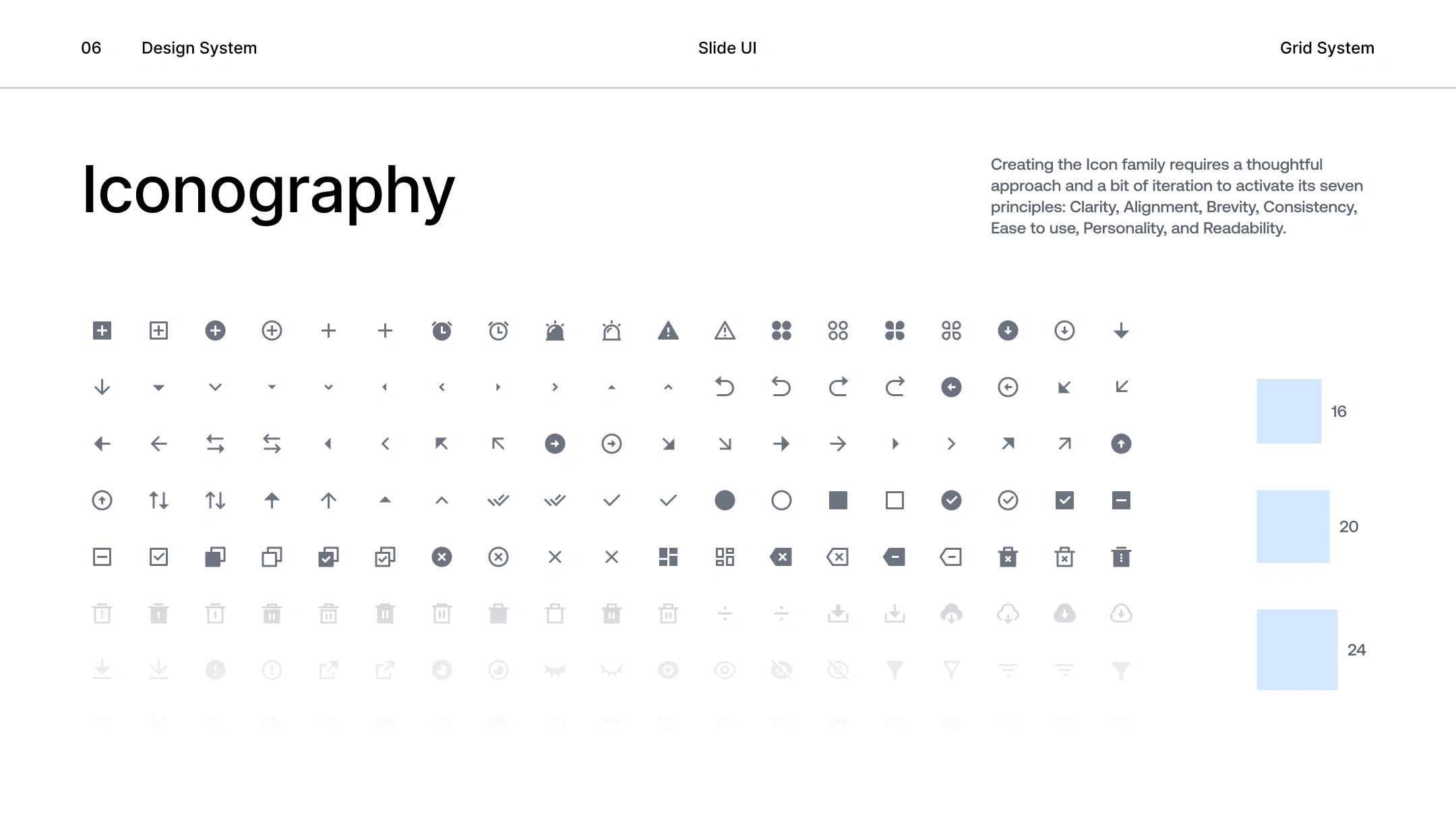
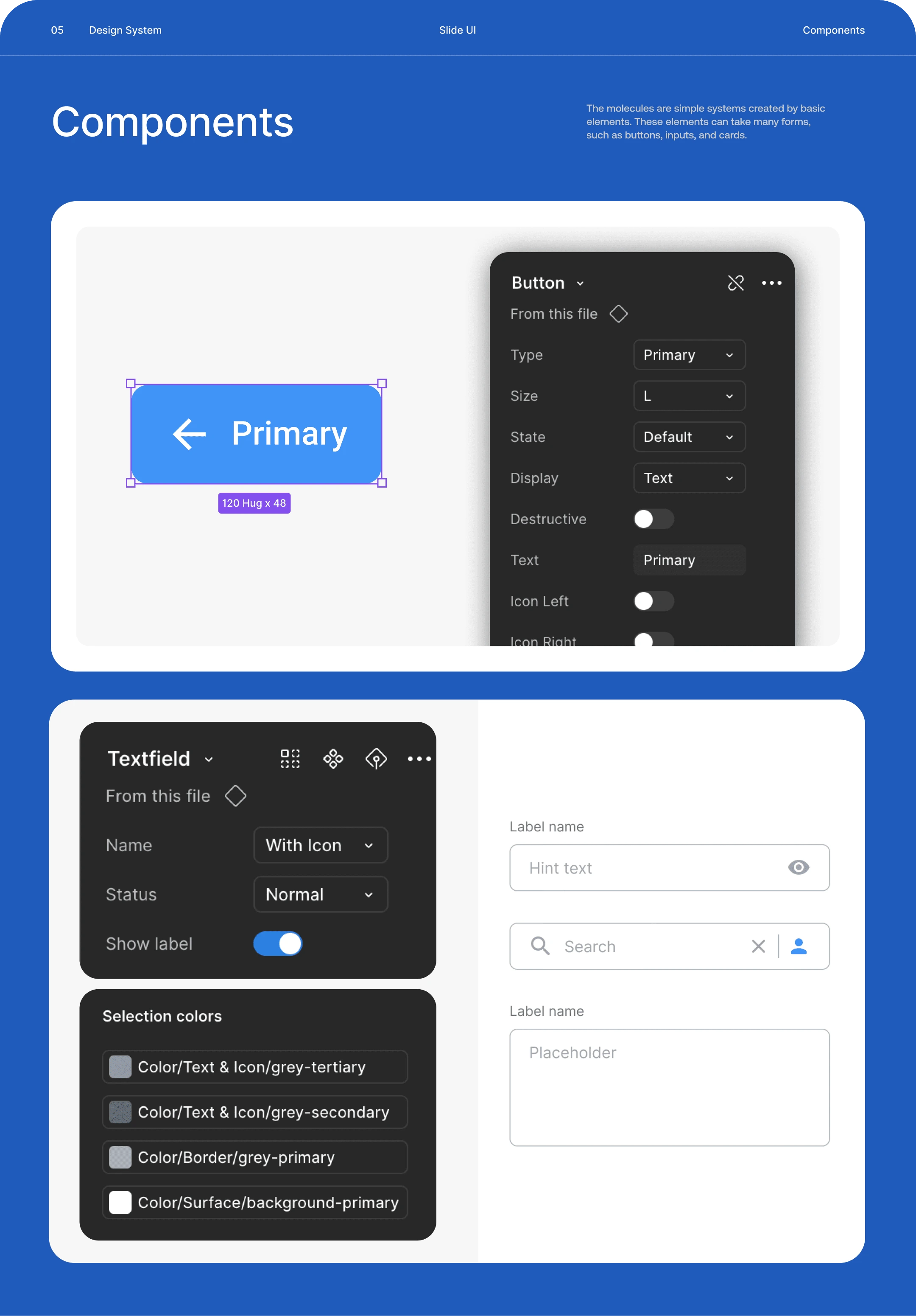
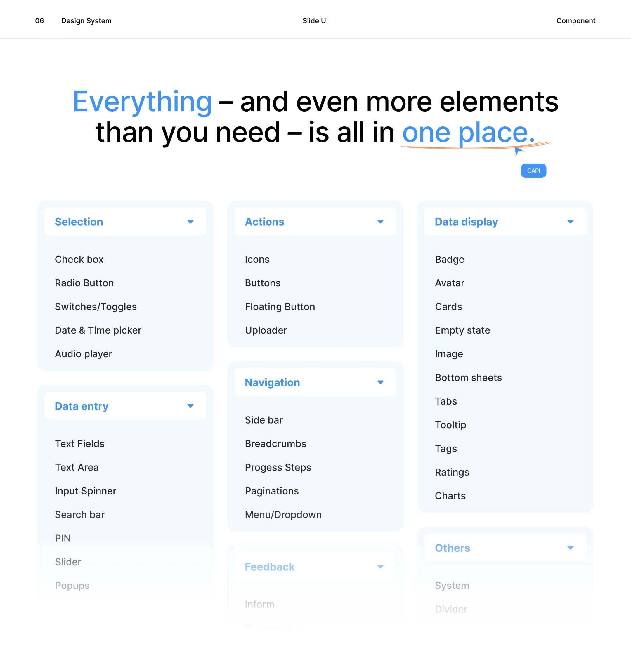
Built over 150+ responsive components using Auto Layout 5.0 and Variants.
Structured components with reusable states: default, hover, focus, disabled, loading.
Optimized for flexibility across desktop and mobile.
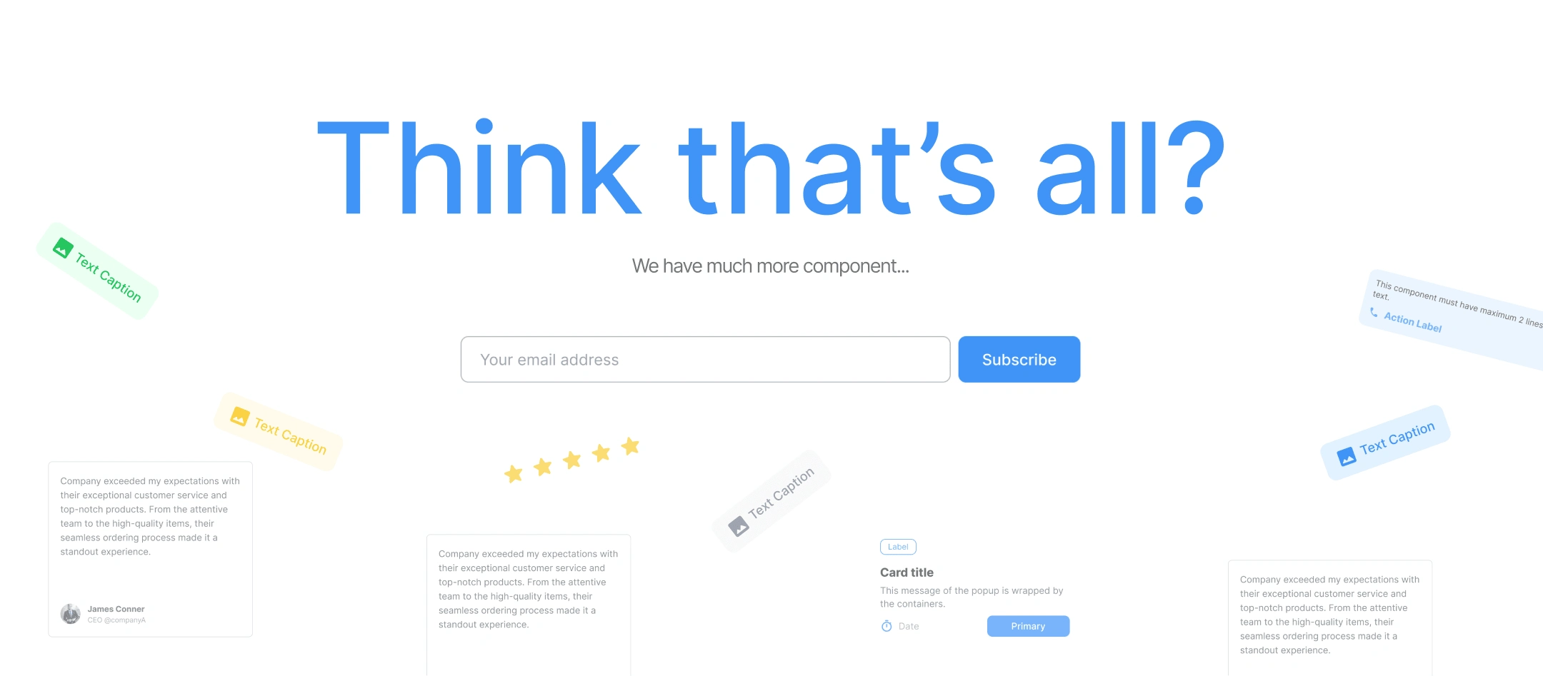
(c) Documentation & Guidelines
Created detailed usage documentation in Figma and Notion.
Added visual examples and Do/Don’t patterns for better onboarding.
Ensured accessibility and visual harmony throughout the interface.
(d) Design–Development Handoff
Integrated token-based workflow for developers.
Allowed one-click updates through Figma Variables API, syncing color and spacing tokens automatically.
4. Outcomes
✅ A unified visual system applied across Dose’s digital platforms.
✅ Reduced design–dev handoff time by 40%.
✅ Improved brand consistency and usability across all interfaces.
✅ Built a scalable foundation for future products and features.
5. Impact & Reflections
The Dose Design System has become the core of Dose’s design language — empowering both designers and developers to move faster while maintaining brand quality.
“This project allowed us to translate Dose’s bold digital identity into a structured, flexible, and scalable design system — turning design consistency into a real business advantage.”
6. Deliverables
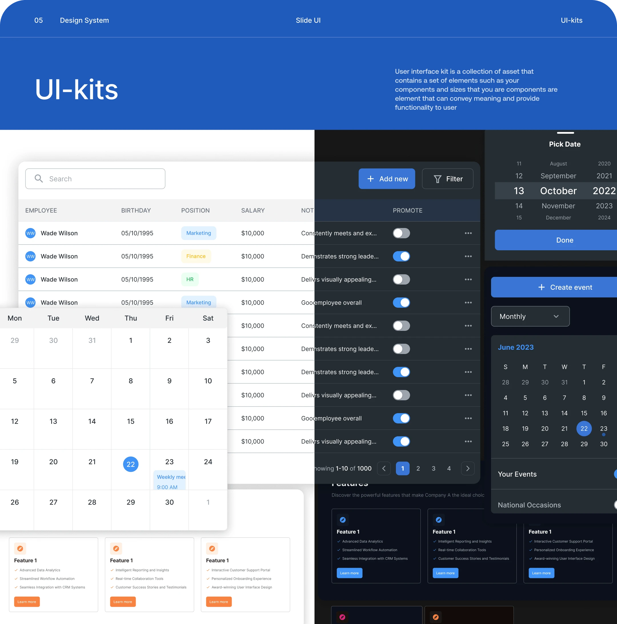
Figma Library (Dose Design System v1.0)
Documentation (Figma + Notion)
System preview on Contra
Like this project
Posted Apr 24, 2025
A unified and scalable design system built for Dose — improving visual consistency, speeding up handoff, and aligning designers through a shared UI language
Likes
7
Views
67
Timeline
Mar 15, 2024 - May 9, 2024