BOHO; Branding an Artistic Thai Dining Experience

Nafiul Badhan Nafi


BOHO is a conceptual Thai restaurant created for the heart of Dhaka, a city constantly moving.
Rather than competing through traditional Thai aesthetics, BOHO was designed around a different idea:
Creating a place people look forward to spending time in, not just eating at.
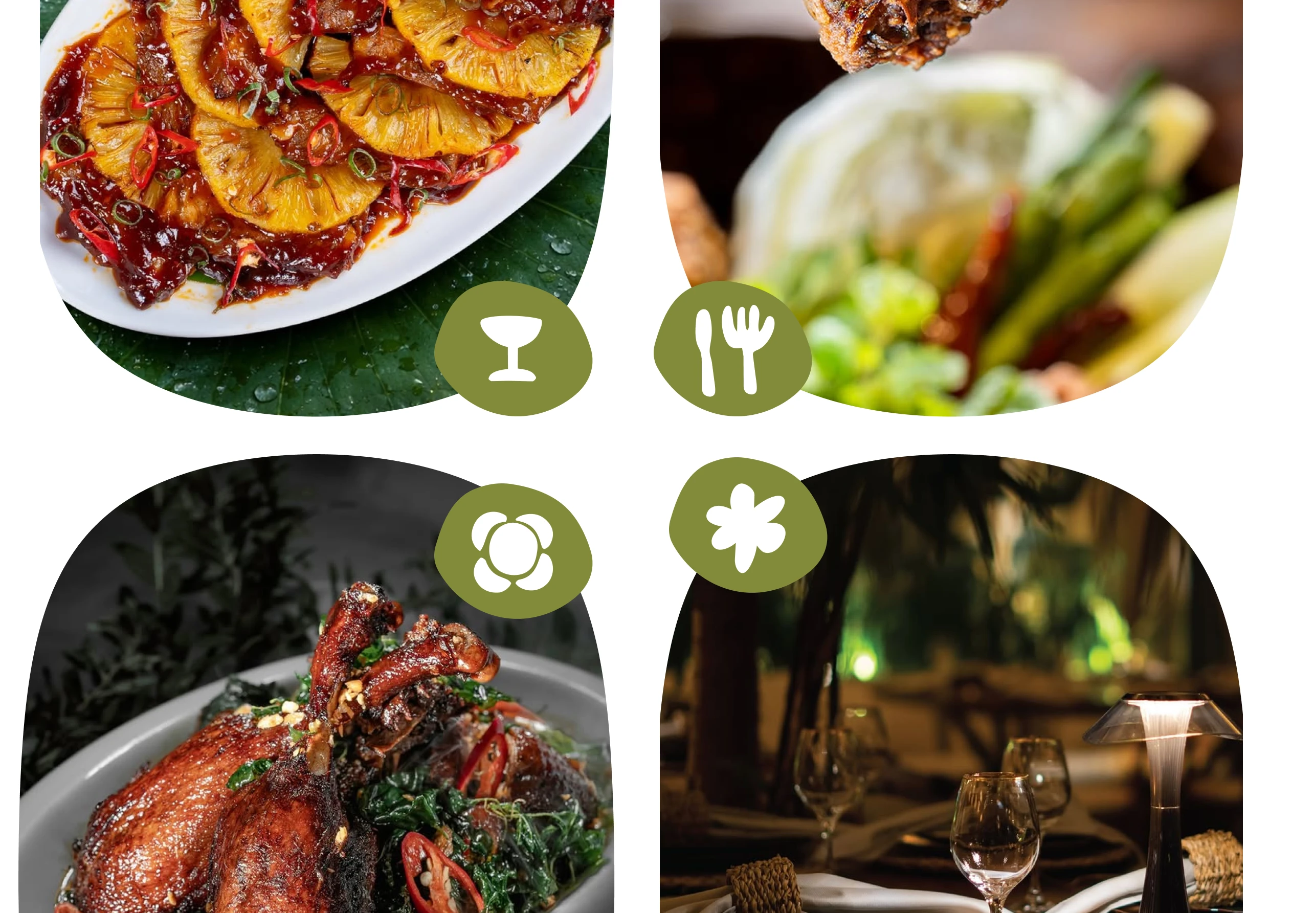
The project combines authentic Thai cuisine with artistic interiors, organic forms, and a warm visual language to transform an ordinary meal into a memorable escape.
The Challenge
Restaurant branding often follows familiar visual formulas.
Thai restaurants, in particular, tend to rely on decorative cultural symbols, ornate typography, and expected color palettes to communicate authenticity.
While recognizable, these approaches rarely create a unique brand experience.
The challenge was to develop an identity that respected Thai cuisine while feeling contemporary, artistic, and emotionally memorable.
Brand Positioning
BOHO is more than a Thai restaurant.
It's an artistic dining destination designed for people who want to slow down, reconnect, and enjoy authentic Thai cuisine in an atmosphere that feels refreshing, creative, and welcoming.

Logo Concept
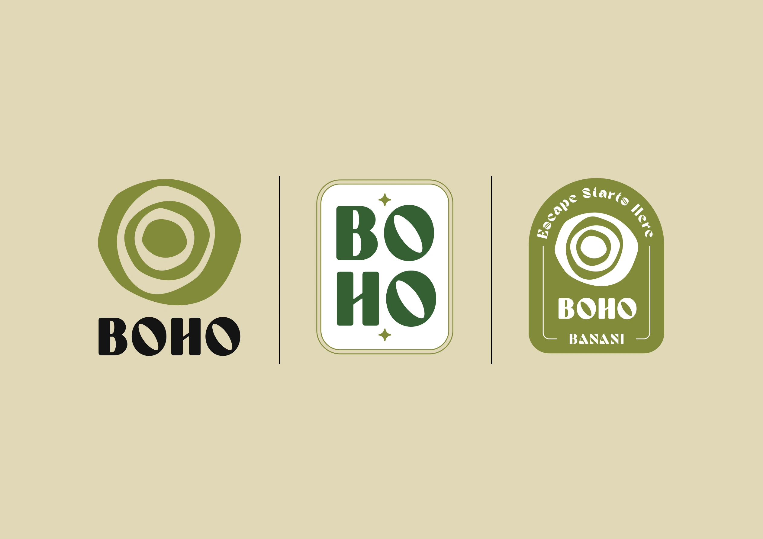
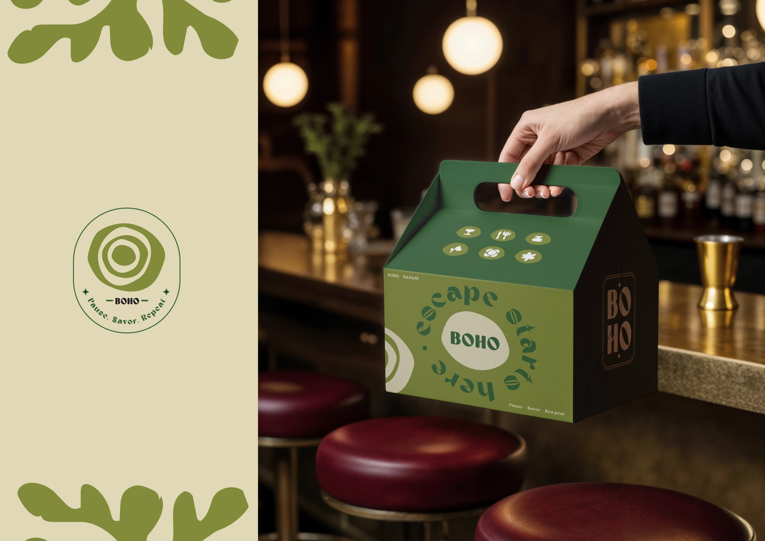
The logo symbol is built from imperfect concentric forms.
Rather than functioning as a literal icon, it represents ideas that repeatedly appear throughout the BOHO experience:
handcrafted ceramic plates
ripples created by still water
balance
presence
slow moments
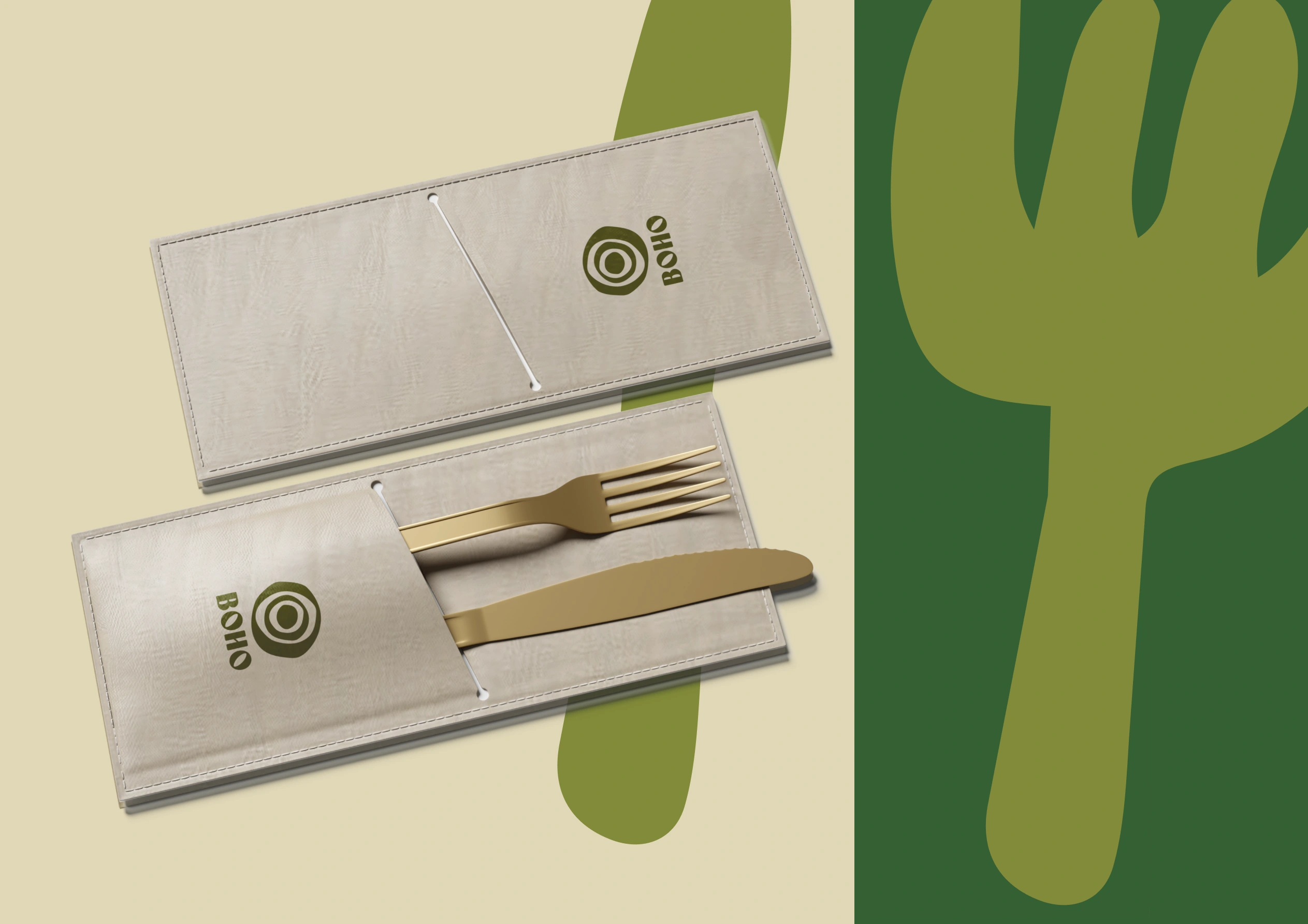
The intentionally irregular geometry reflects the imperfect beauty found in handmade objects, reinforcing BOHO's artistic personality.
Color Strategy
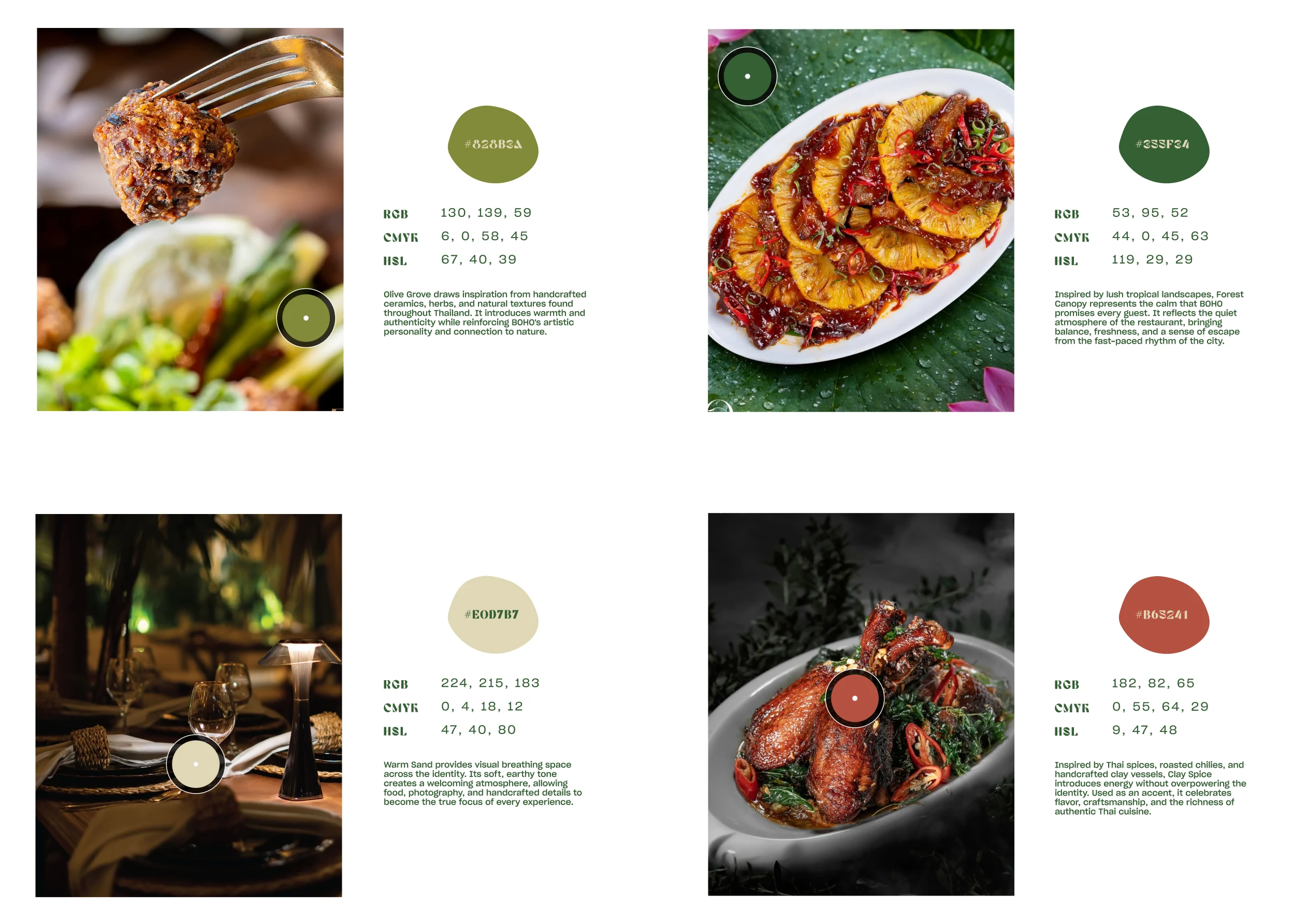
The palette was inspired by the restaurant itself rather than visual clichés.
Forest Green
Reflects lush greenery and the calm atmosphere guests experience inside BOHO.
Olive Green
Inspired by herbs, leaves, and handcrafted materials commonly found throughout the dining experience.
Warm Sand
Balances the identity with warmth while allowing food photography to remain the visual focus.
Clay Spice
A rich earthy accent inspired by Thai spices, grilled dishes, and handcrafted ceramics.
Together, these colors create a palette that feels natural, modern, and timeless.


Outcome
BOHO demonstrates how strategic thinking can create differentiation without relying on familiar cultural symbols.
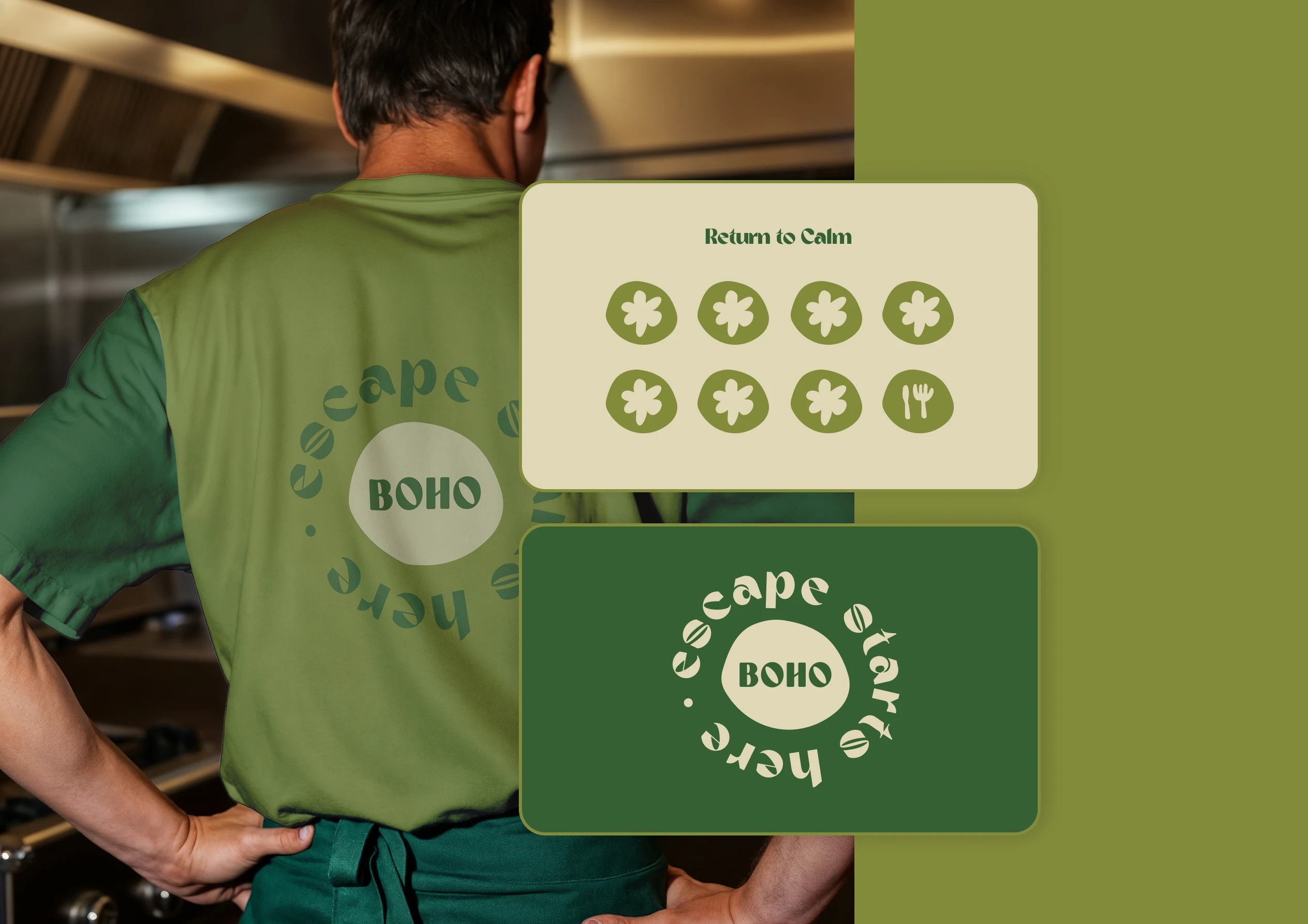
Instead of communicating "Thai" through visual clichés, the identity communicates it through atmosphere, craftsmanship, and experience.
The result is a restaurant brand that feels contemporary, memorable, and emotionally engaging one that invites guests not only to enjoy authentic Thai cuisine, but also to slow down and stay a little longer.
Like this project
Posted Jul 25, 2026
A complete brand identity that combines authentic Thai cuisine, organic design, and artistic storytelling to create a memorable dining experience.
Likes
0
Views
13
Clients
BOHO