Retro Rabit Brand Identity Design

Nafiul Badhan Nafi


The Brief & Challenge
Retro Rabit is an avant-garde hardware manufacturer engineering next-generation virtual reality systems and spatial computing devices. Their product lineup spans from the enterprise-grade behemoth Vision X to the ultra-portable, everyday lifestyle headset Flow.
The Core Problem
The existing spatial computing and VR market is heavily crowded with two extremes: hyper-futuristic, aggressive "gaming" aesthetics, or cold, clinical tech corporate styles. Retro Rabit needed a distinct market positioning; high-end branding built on soft power, premium minimalism, and deep visual storytelling.
Brainstorming & Conceptualization
The design process began with unpacking the dualism inherent in the name itself: Retro (timelessness, tactile legacy, grounded geometry) and Rabit (agility, curiosity, the portal to a deeper digital "rabbit hole").
Design Metaphors
During the ideation phase, the focus turned toward the physical interaction between human vision and hardware optics. The identity was anchored on specific core design metaphors:
The Continuous Loop: Representing the continuous loop of data and spatial environment interaction.
The Monogram "R": Serving as a structural typographical anchor for the brand name.
Rabbit's Ear: Incorporating the client's preference to keep the rabbit ear imagery symbolically represented within the logo geometry.
Hardware Form Factors: Reflecting the literal form factor of VR lenses and ergonomic headbands.
Symmetrical Harmony: Leveraging symmetrical geometric harmony to reflect balanced weight distribution and comfort.
Visual Identity & System Breakdown
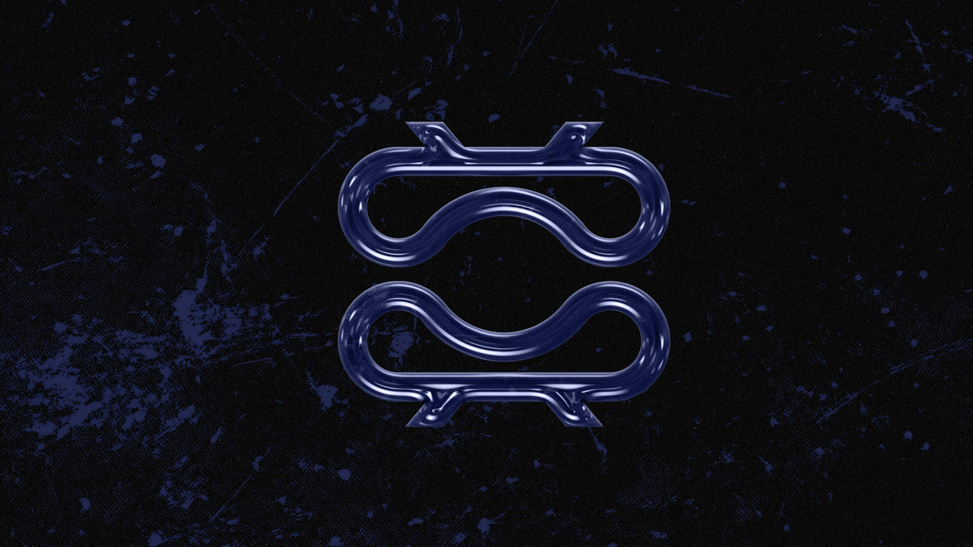
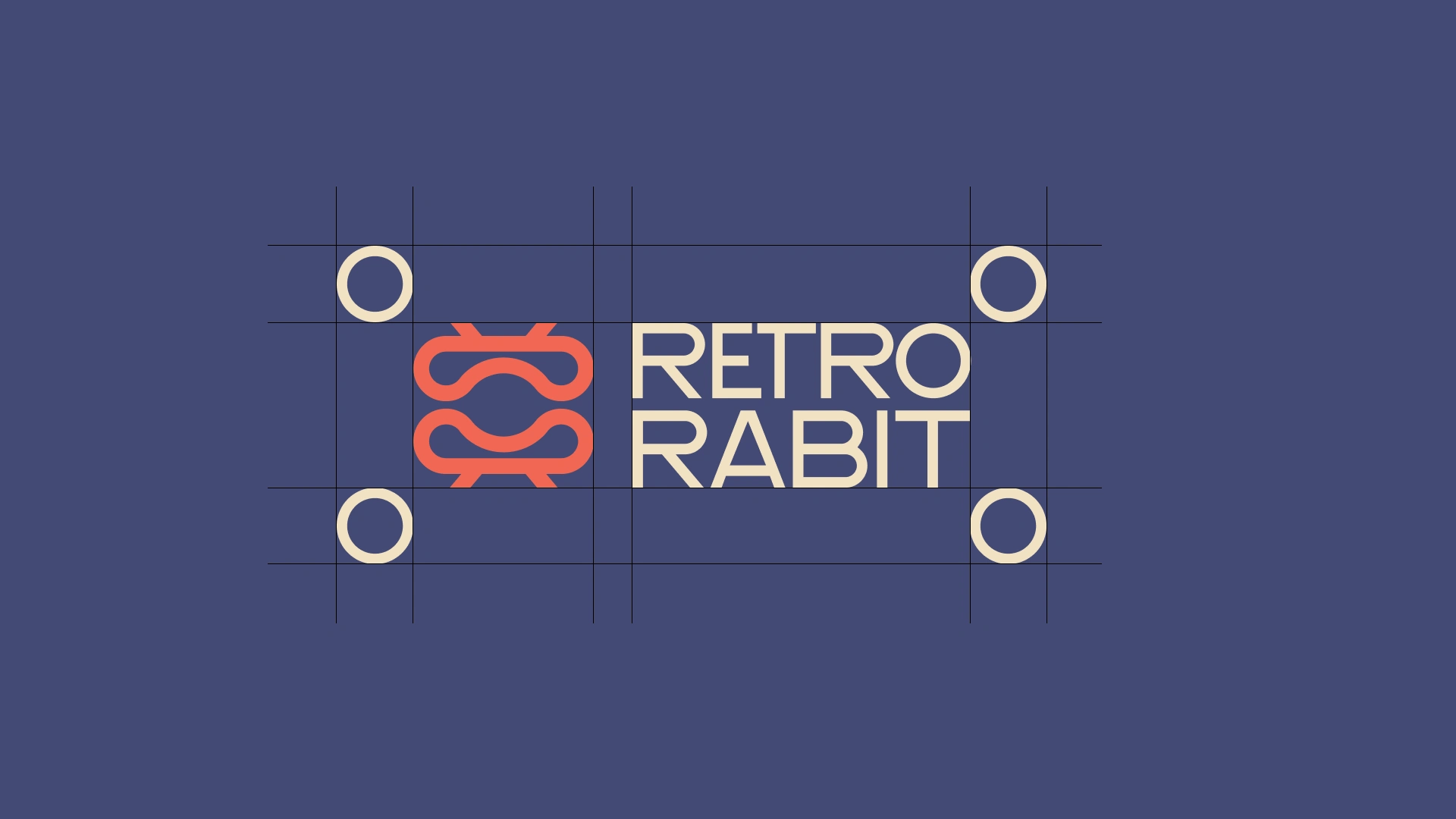
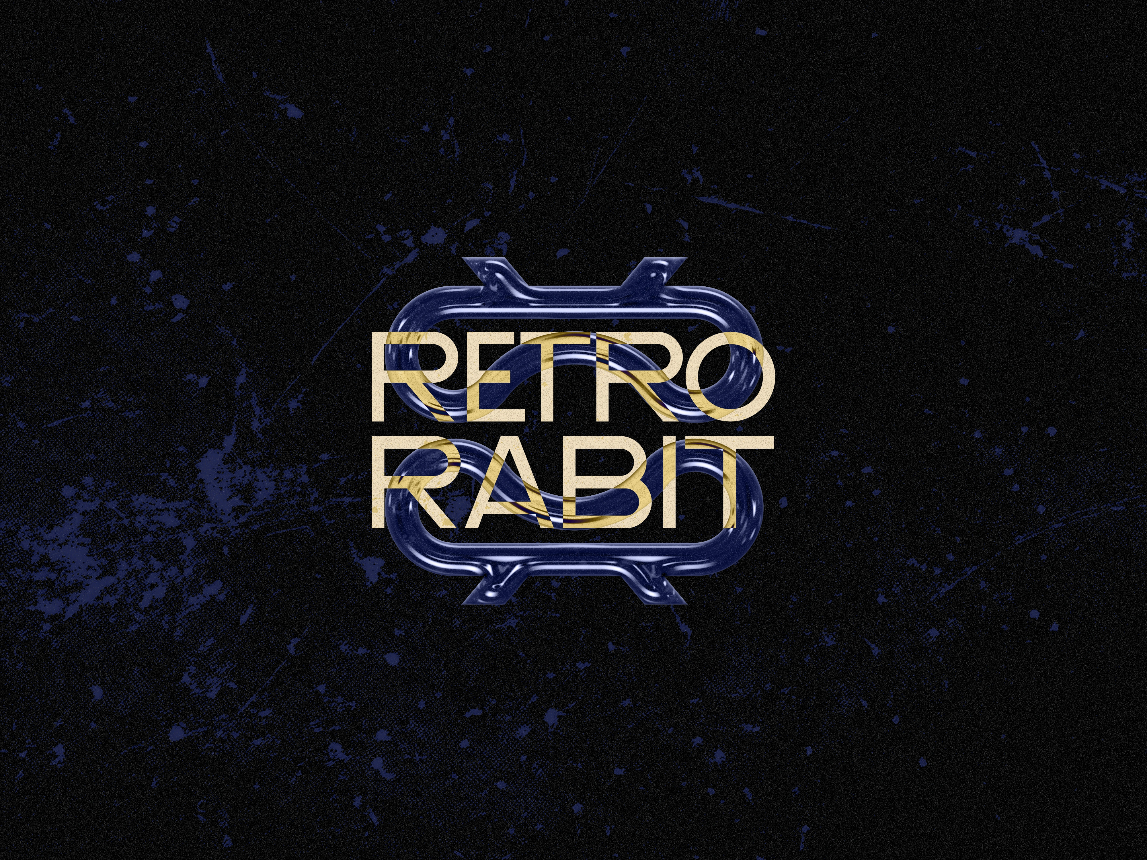
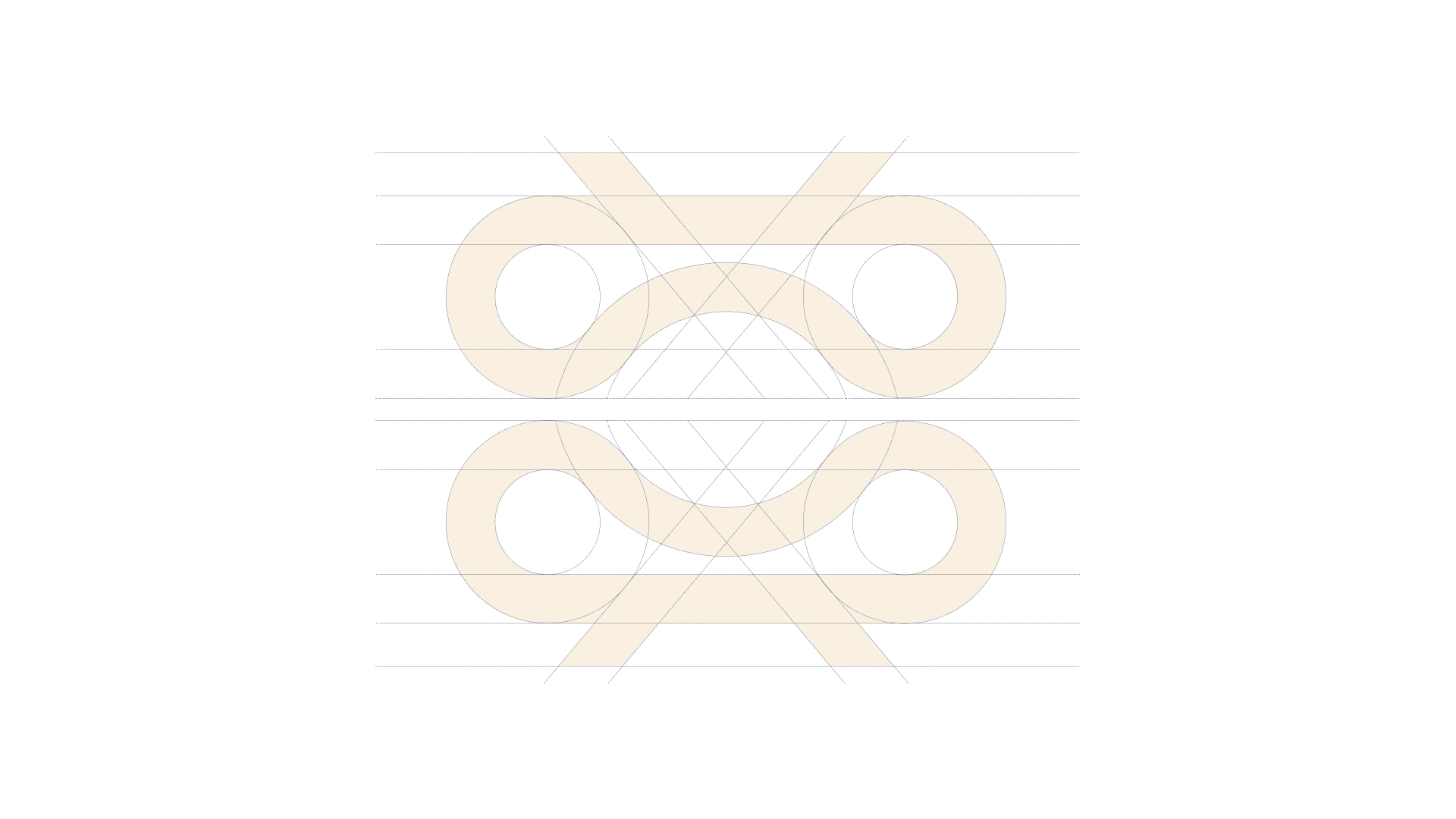
The final logomark is a masterclass in geometric simplicity. It is an abstract, symmetrical icon crafted from continuous parallel lines that simultaneously represents:
A stylized, ultra-sleek interpretation of a rabbit's silhouette and ears.
The literal contour of a premium VR headset/goggles and lenses.
An infinity loop, signaling boundless digital exploration.
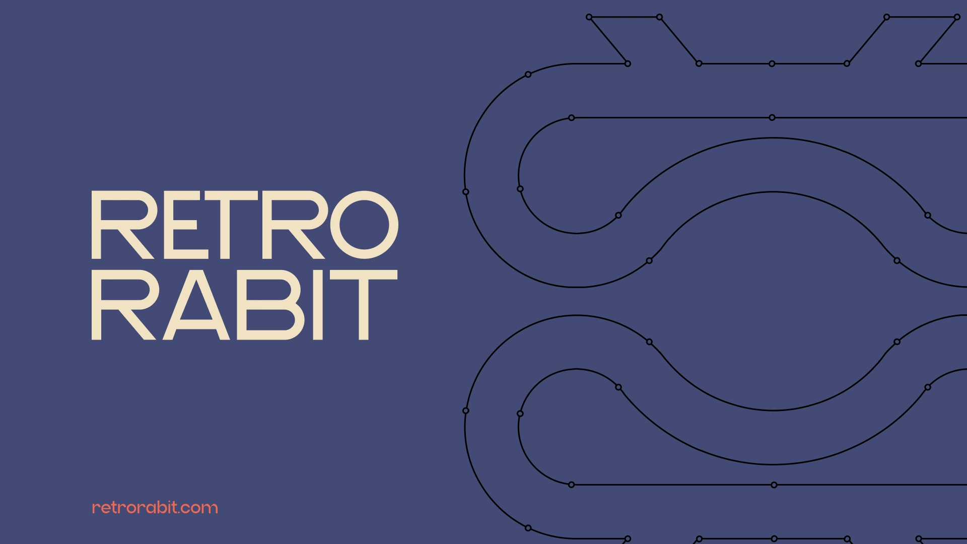
The construction utilizes perfectly balanced curves and straight lines to mirror industrial engineering blueprints. The accompanying logotype uses a customized, clean sans-serif font with subtle tracking adjustments to command premium spatial gravity.

The Color System (Tactile vs. Digital)
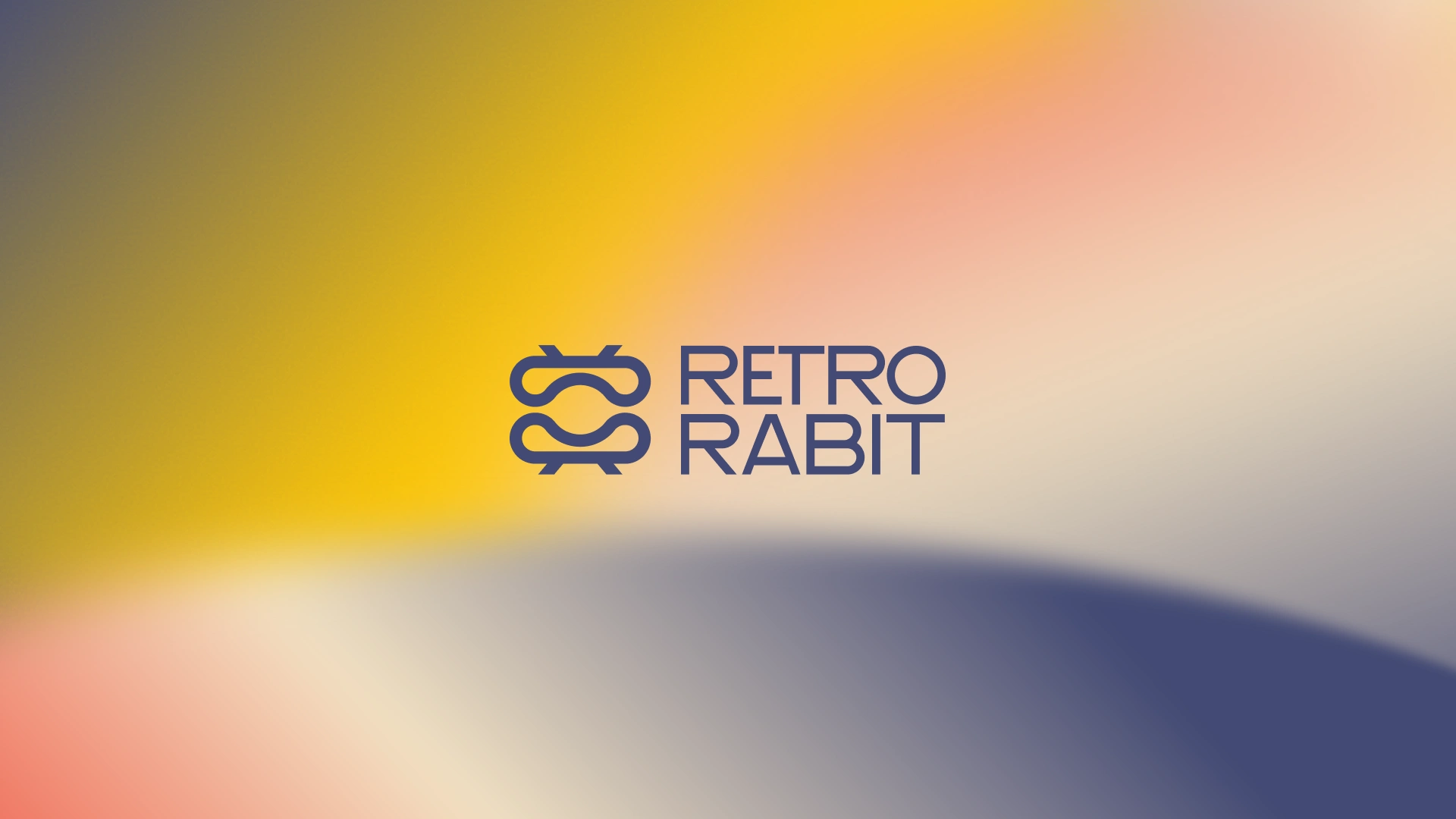
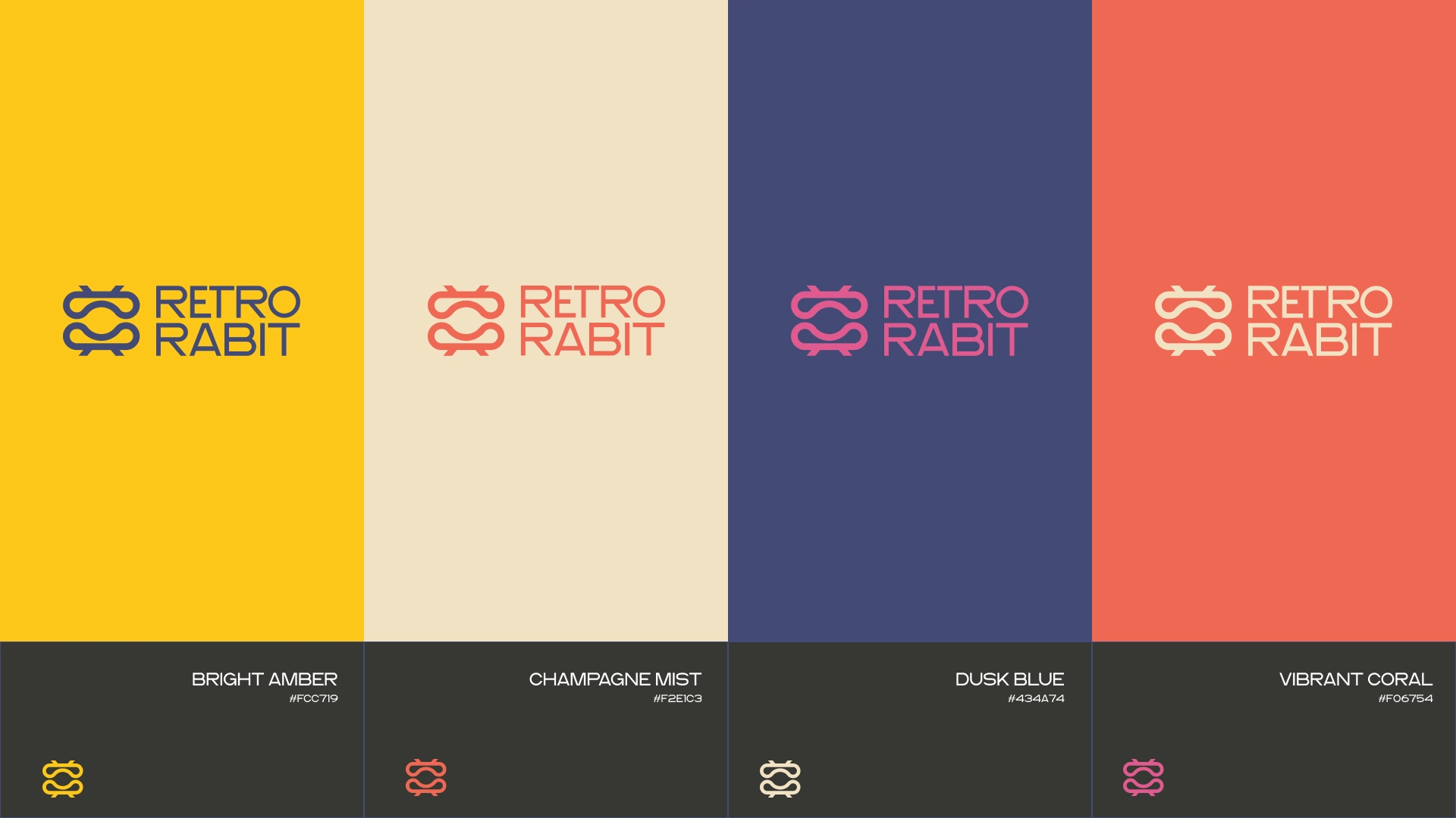
To separate Retro Rabit from typical monochrome tech brands, a high-contrast palette was developed to evoke tactile lifestyle premiumism:
Bright Amber (#FCC719): Energizing, high-visibility accent reminiscent of golden-hour light reflections.
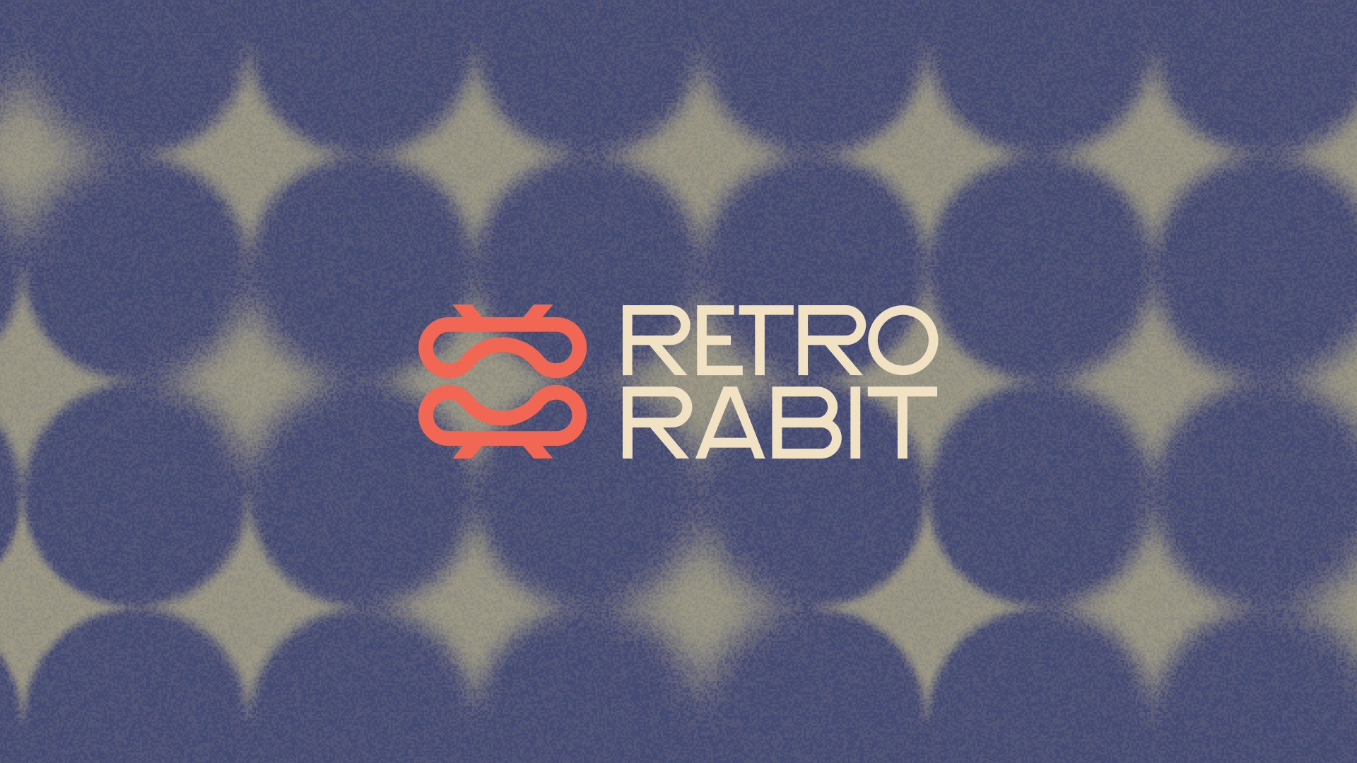
Champagne Mist (#F2E1C3): The primary off-white backdrop, establishing a warm, high-end editorial feel.
Dusk Blue (#434A74): The deep anchoring tone, replacing harsh blacks with a sophisticated, velvety dark space.
Vibrant Coral (#F06754): The humanistic bridge, utilized for secondary highlights and dynamic digital components.

Conclusion
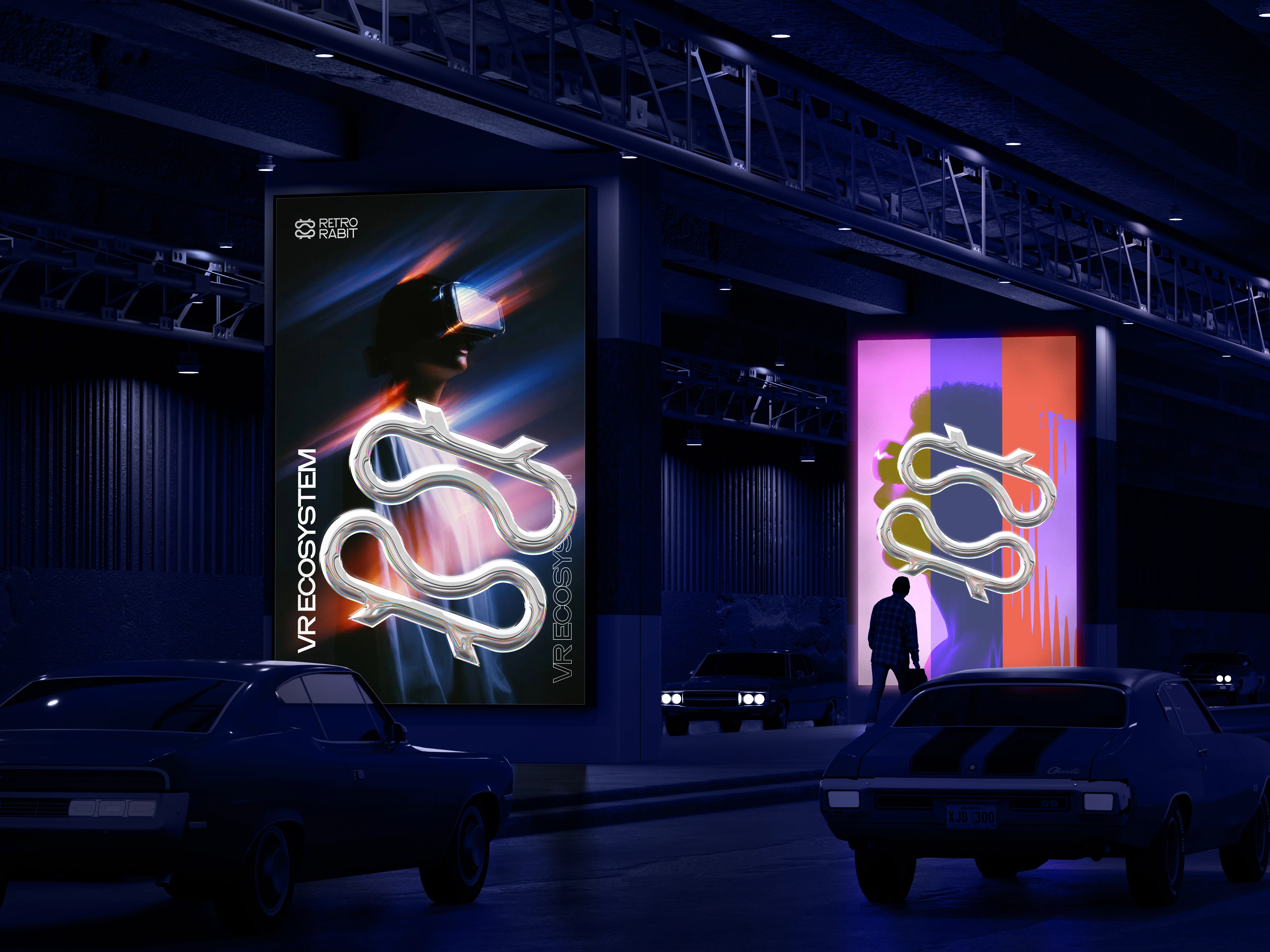
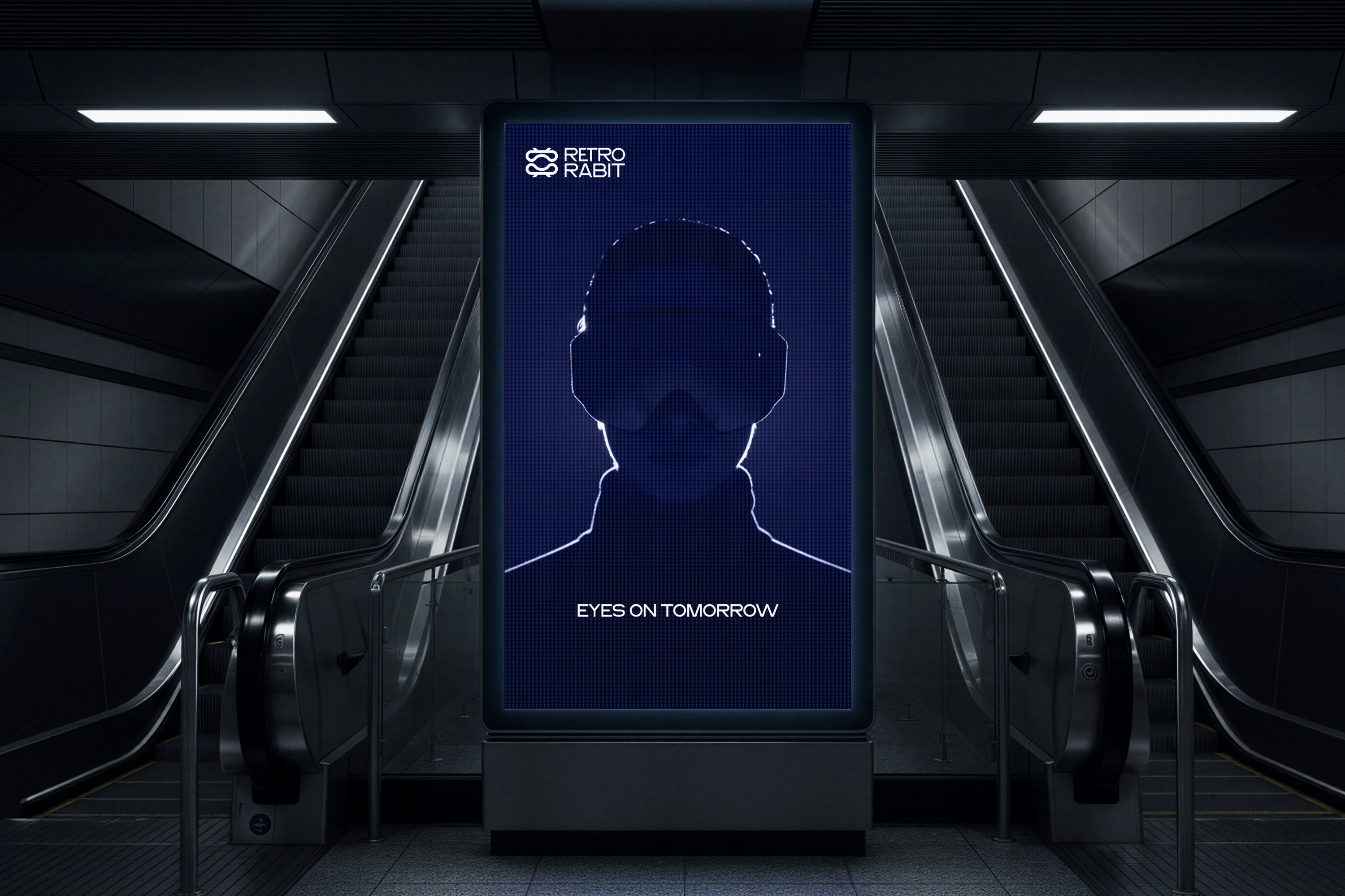
The final design successfully elevates Retro Rabit from a hardware company to a definitive premium lifestyle ecosystem. By rejecting clichéd tech tropes in favor of geometric harmony, sophisticated color pairings, and high-fidelity 3D storytelling, the new brand identity commands an authoritative, future-proof space in the next generation of digital interaction.
Like this project
Posted Jul 11, 2026
Delivered a cohesive, premium brand system that successfully redefined Retro Rabit’s VR market positioning and scales effortlessly.