Branding || Venturemate : Making Corporate Advisory Timeless

Nafiul Badhan Nafi



Summary
Venturemate Australia is a premier corporate advisory and business facilitation firm dedicated to simplifying complex corporate transactions, mergers, acquisitions, and strategic partnerships. Operating in a highly competitive market, the brand needed a visual identity that radiates trust, modern efficiency, and clear corporate communication while maintaining a premium market positioning.

As a senior brand designer, my objective was to strip away the traditional, rigid corporate coldness and replace it with a modern, sophisticated aesthetic that anchors their core philosophy:
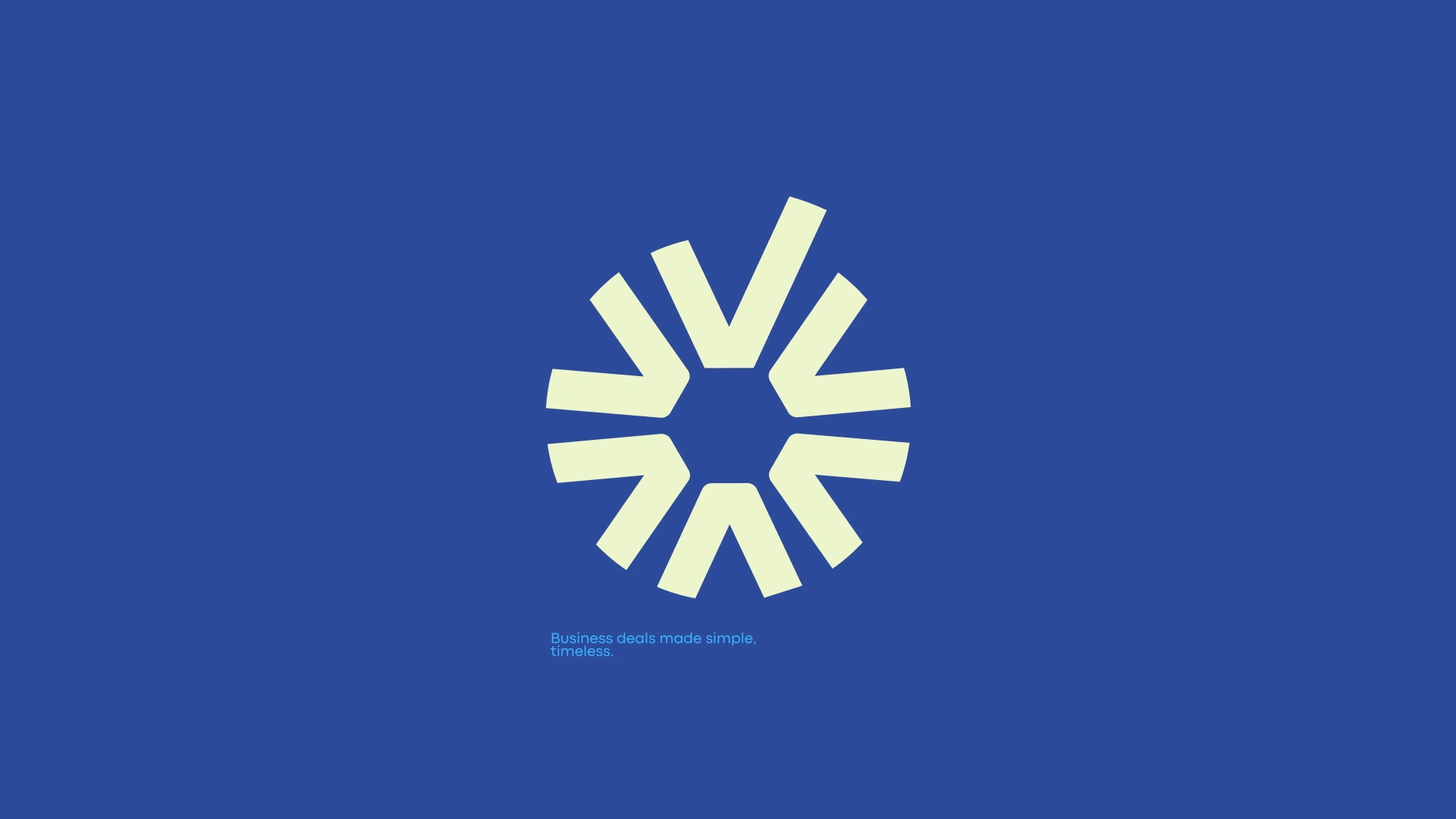
"Business deals made simple, timeless."
Brand Positioning & Strategy
The core challenge was to position Venturemate not just as another corporate intermediary, but as a trusted partner that brings clarity to high-stakes environments. The target audience: entrepreneurs, investors, and corporate executives; demands both absolute precision and forward-thinking adaptability.
The strategy shifted the narrative from process-heavy complexity to seamless execution. Every element of the new visual system was designed to communicate high-end reliability, high-value deal-making, and structural integrity.
The Logomark: Multi-Layered Visual Semiotics
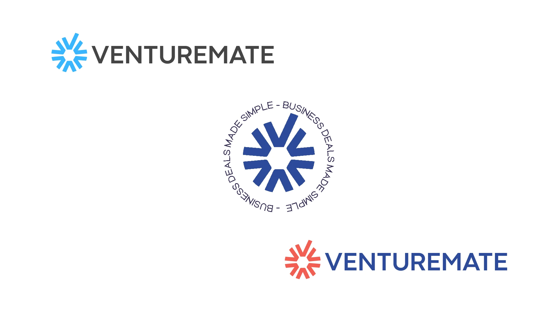
The heart of the rebrand lies in a highly conceptual, geometric logomark. Rather than relying on a single literal metaphor, the mark is a synthesis of critical brand values engineered into a unified icon:
The Letters 'V' and 'M': The cyclical, radiating structure subtly integrates the brand's initials (Venturemate) into a continuous, cohesive loop.
The 'Tick' Mark: Integrated seamlessly within the upper segment of the mark, the definitive check/tick mark visualizes the core brand promise—business deals successfully made simple.
The Pentagonal Core: The negative space at the center forms a clean pentagonal shape, structurally representing clear corporate communication and balanced governance across five pillars: trust, clarity, strategy, execution, and partnership.
The Radiating Wheel: The geometric arrangement evokes a sense of collaborative momentum, legal frameworks operating smoothly, and an expansive network of opportunities.
Color Palette: The Energy of Sophistication
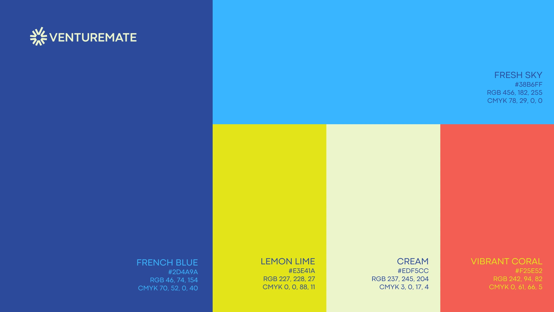
The color system moves away from typical washed-out corporate blues into a rich, energetic, and premium landscape:
French Blue (
#2D4A9A): The foundational anchor representing corporate stability, deep industry expertise, and unwavering trust.Fresh Sky (
#38B6FF): Injects a breath of modern digital efficiency and clarity into the system.Lemon Lime (
#E3E41A): The differentiator. This vibrant, high-contrast hue brings creative energy, forward-looking vision, and disruption to an otherwise conservative industry.Cream (
#EDF5CC) & Vibrant Coral (#F25E52): Used as sophisticated secondary accents for editorial layouts, messaging hierarchy, and digital application states.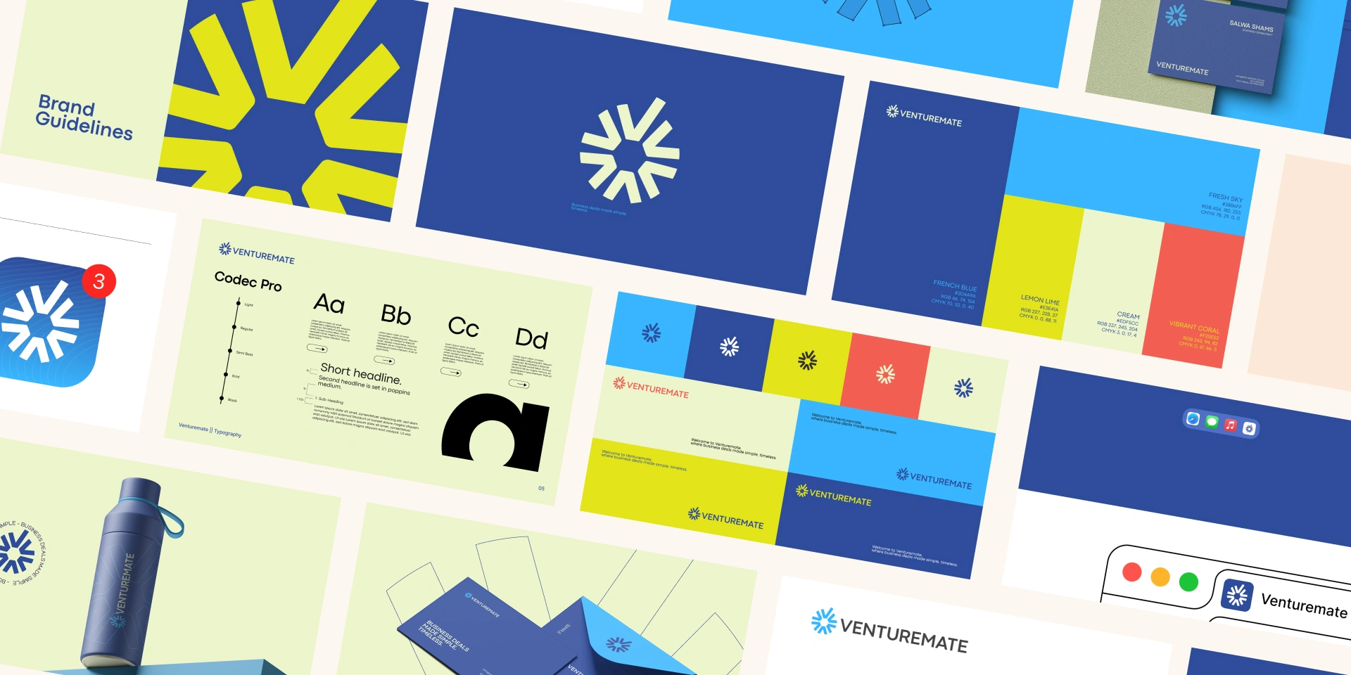

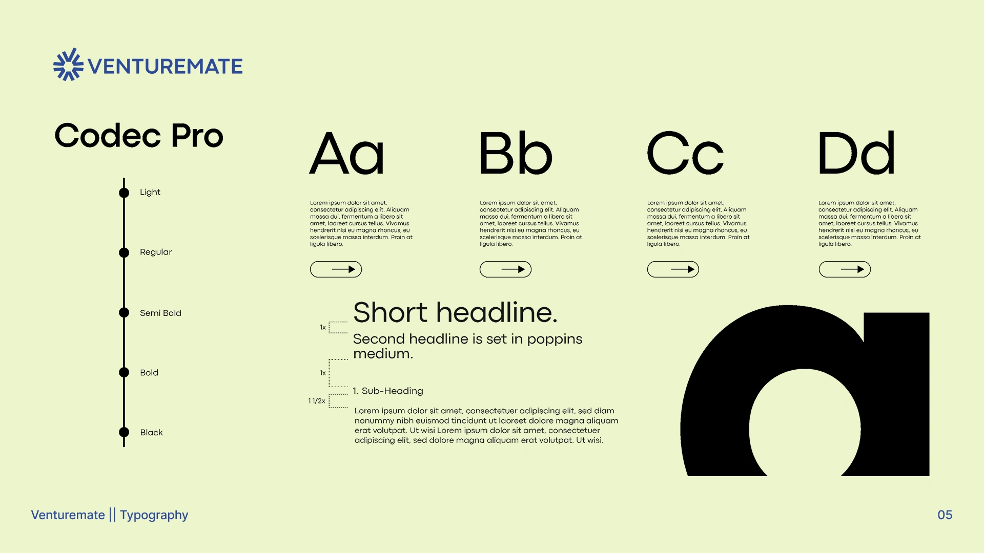
Typography: Structural Clarity
Selected Codec Pro as the primary typeface. Its clean, geometric sans-serif architecture mirrors the precision of the logomark. The sharp cuts balanced with open counters offer exceptional readability across digital interfaces and high-end print collaterals, grounding the brand's authoritative voice.
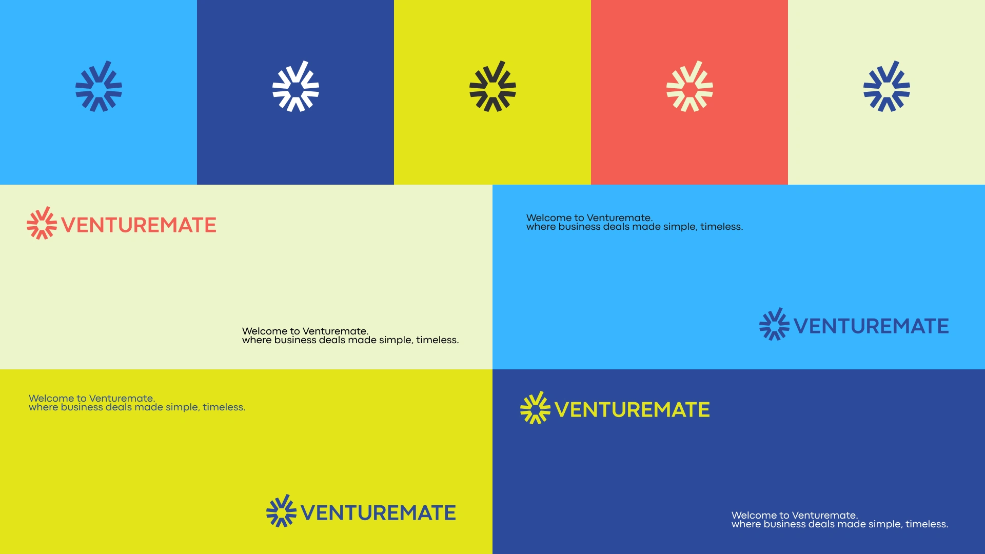
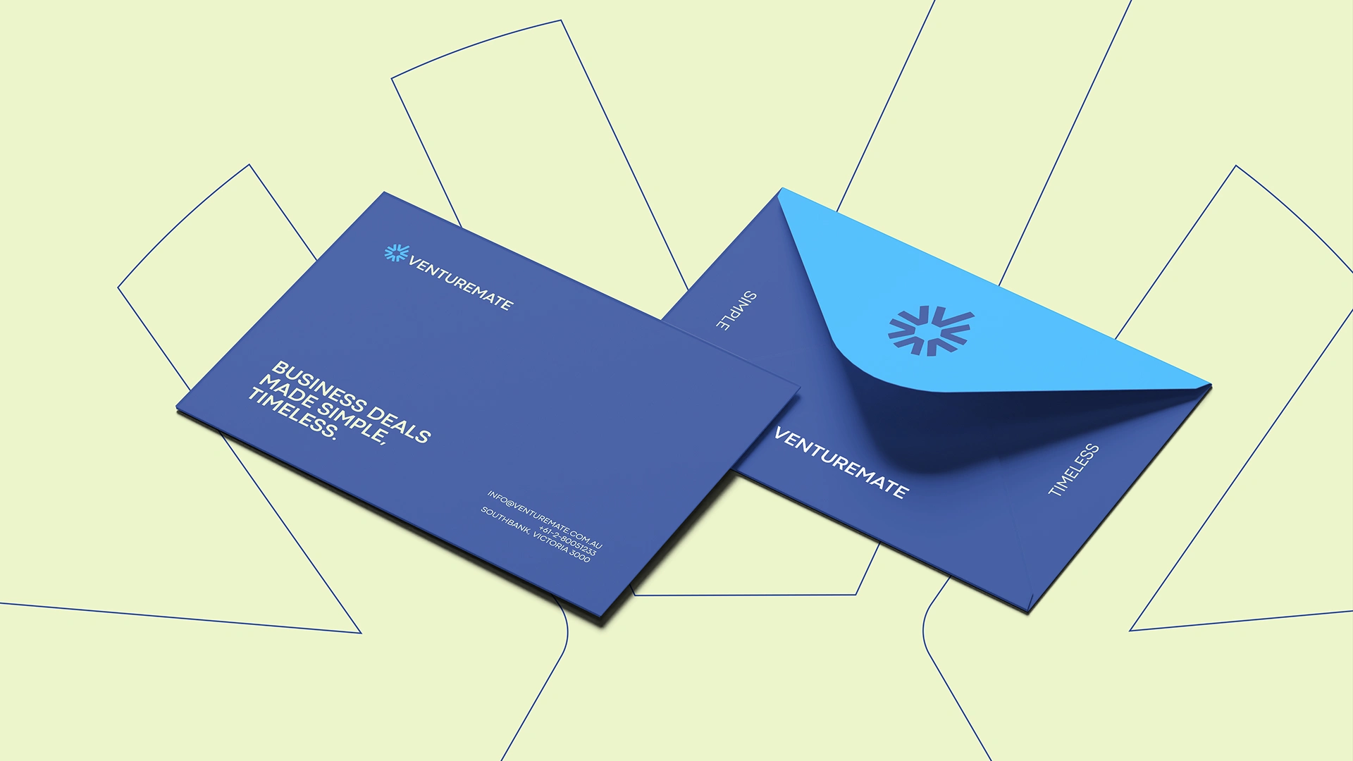
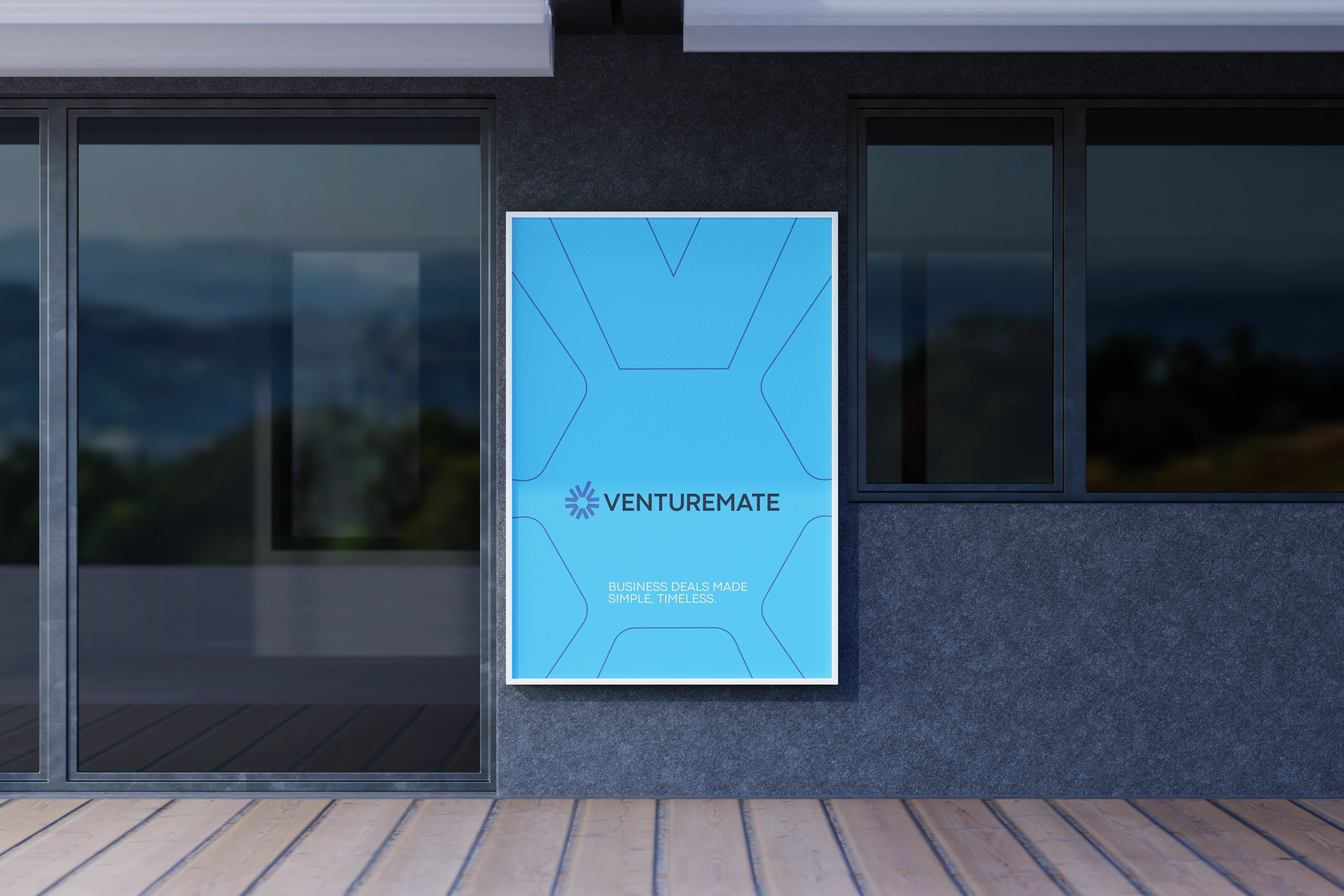

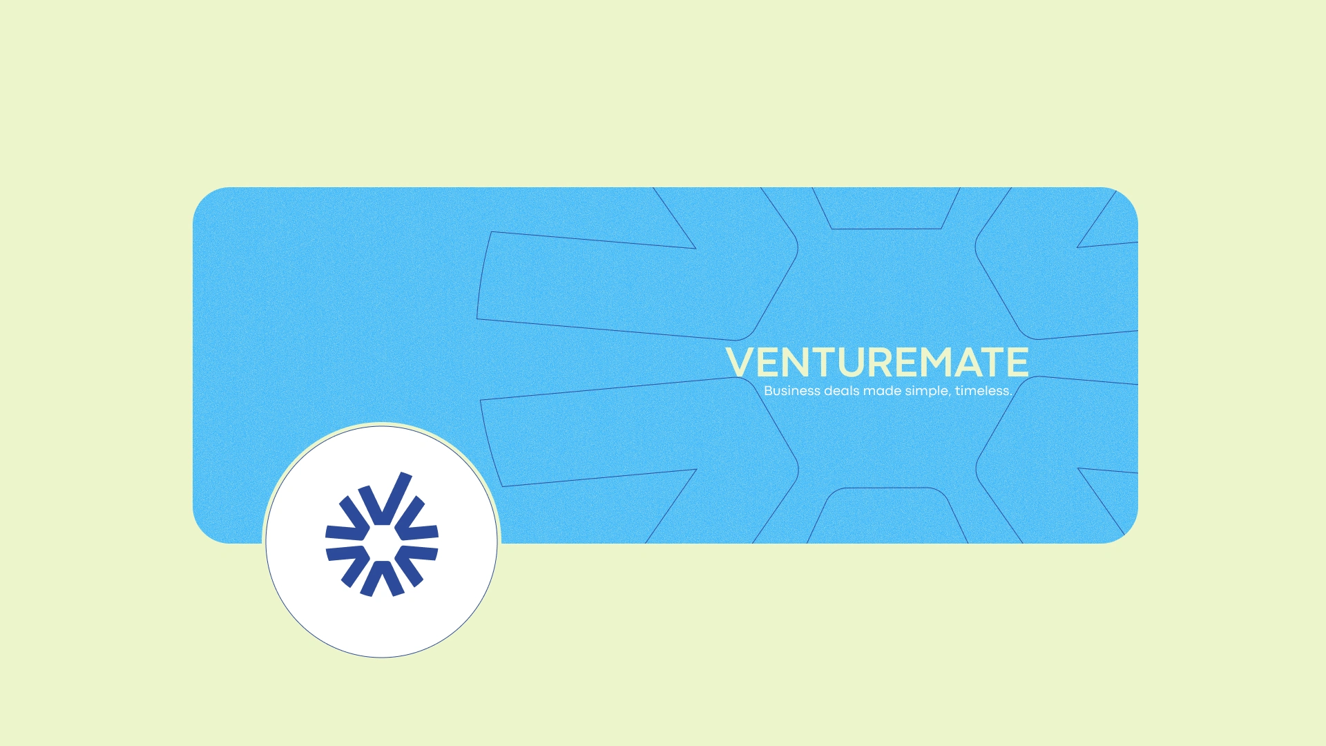
The Impact
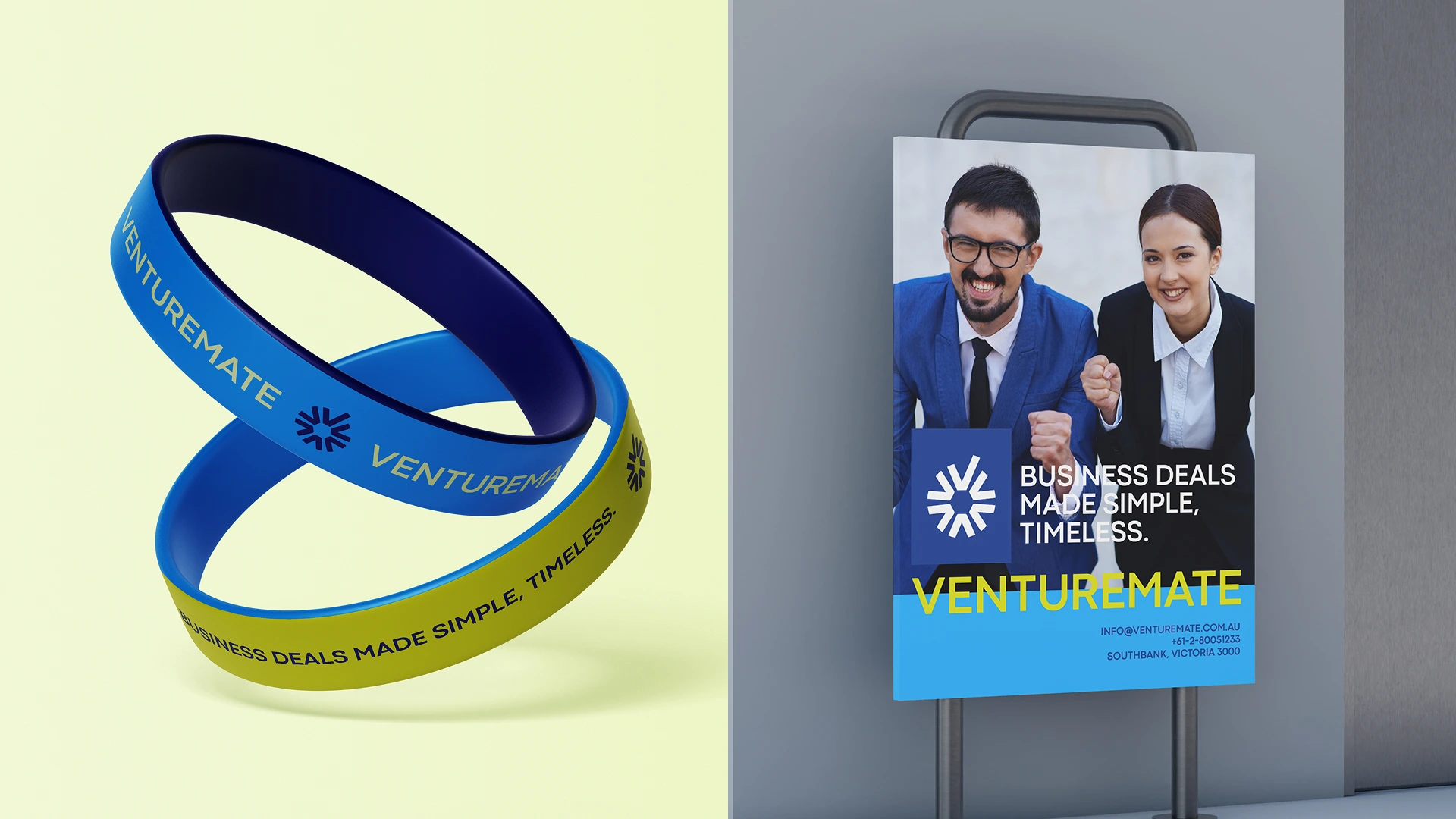
The result is a transformative visual identity that elevates Venturemate Australia into a league of its own. By translating complex advisory workflows into clean, intentional design language, the brand is fully equipped to dominate the contemporary corporate landscape, proving that high-stakes business deals truly can be made simple and timeless.
Like this project
Posted Jul 12, 2026
Rebranded Venturemate Australia. Designed a geometric identity symbolizing clear corporate communication and making complex business deals simple and timeless.