Learnplus Brand Identity Design

Nafiul Badhan Nafi


Overview
Learnplus is an innovative EdTech platform dedicated to bridging the gap between child curiosity and cognitive mastery. As the ultimate catalyst for personal growth, the brand operates at the intersection of human potential and modern technological tools.
This comprehensive brand identity was engineered to reflect that core promise; creating a visual language that is dynamic, approachable, and forward-moving. By combining professional reliability with a vibrant, human touch, this design system establishes a unified voice across all digital and physical touchpoints. Ultimately, these guidelines serve as a strategic toolkit to build lasting trust, maintain ecosystem integrity, and ensure the brand’s message of continuous improvement resonates clearly with every student and parent it serves.
The Challenge
The EdTech landscape is often saturated with either overly clinical, rigid corporate styles or excessively childish, chaotic layouts. For a platform focused on core Child Development, STEM, and Brain Power, the challenge was to design a visual identity that achieves two goals simultaneously:
Instill Trust in Parents: Establish professional reliability, modern authority, and a sense of structured cognitive growth.
Engage the Young Minds: Inject a playful, vibrant, and optimistic energy that sparks curiosity without visual fatigue.


Logo Concept & Design System
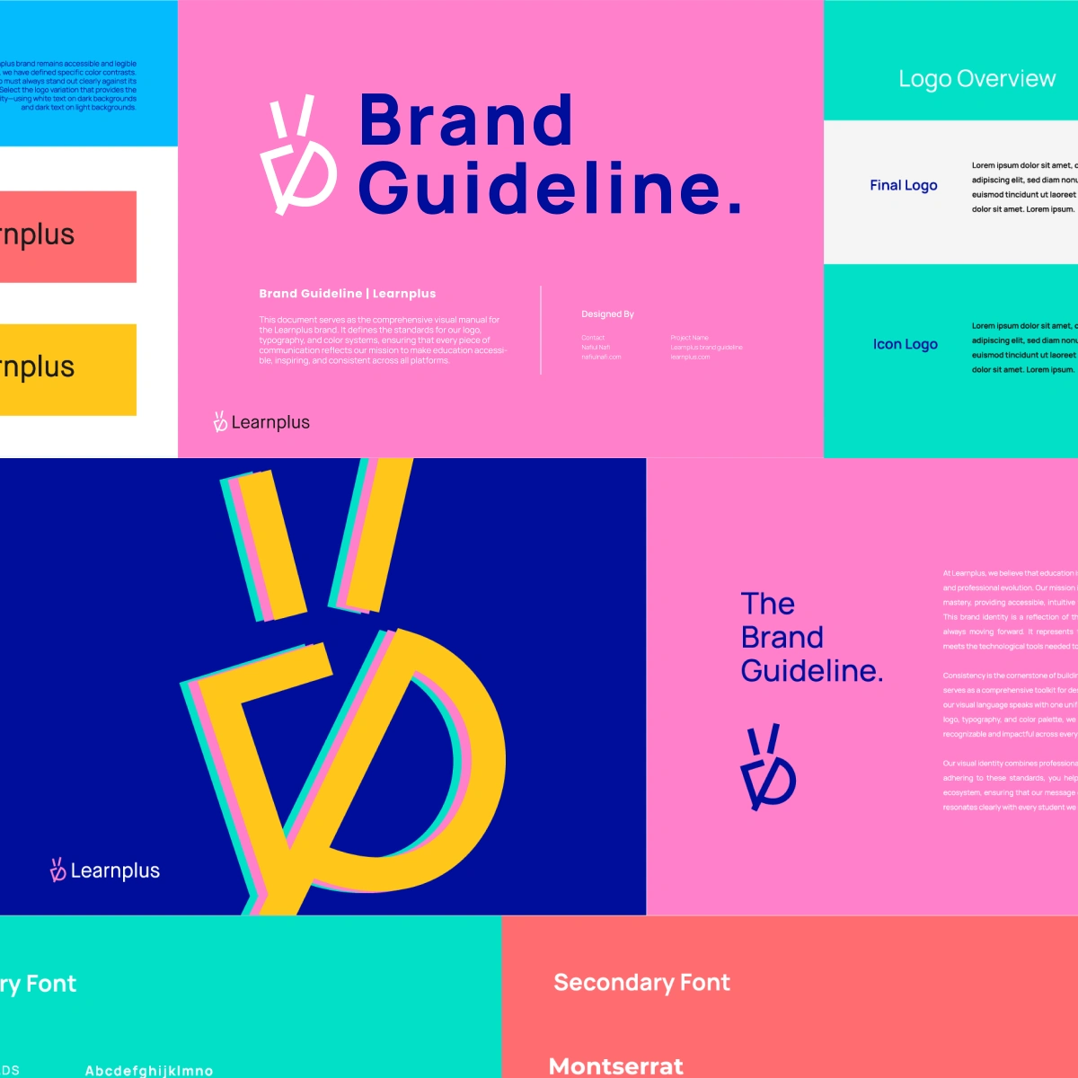
The visual architecture of the Learnplus identity is anchored on clean geometry, high contrast, and deep symbolic value.
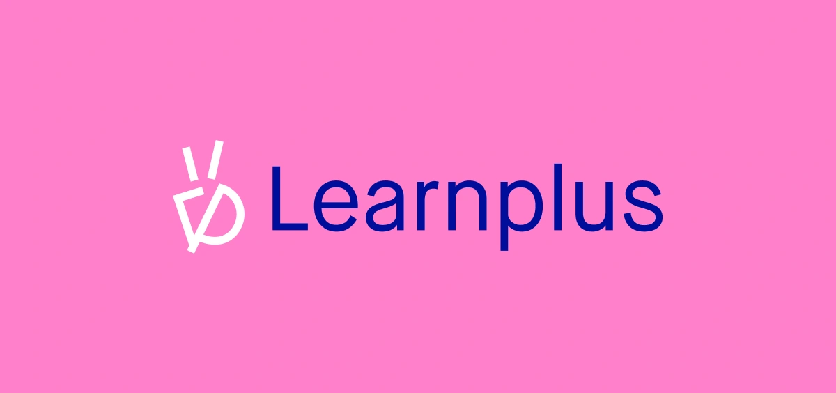
The Logomark: A custom-crafted geometric monogram that seamlessly merges the letters 'L' and 'P' with a minimalist representation of a sprout/glowing lightbulb at the top. This signifies a kid's brain illuminating with ideas and potential.
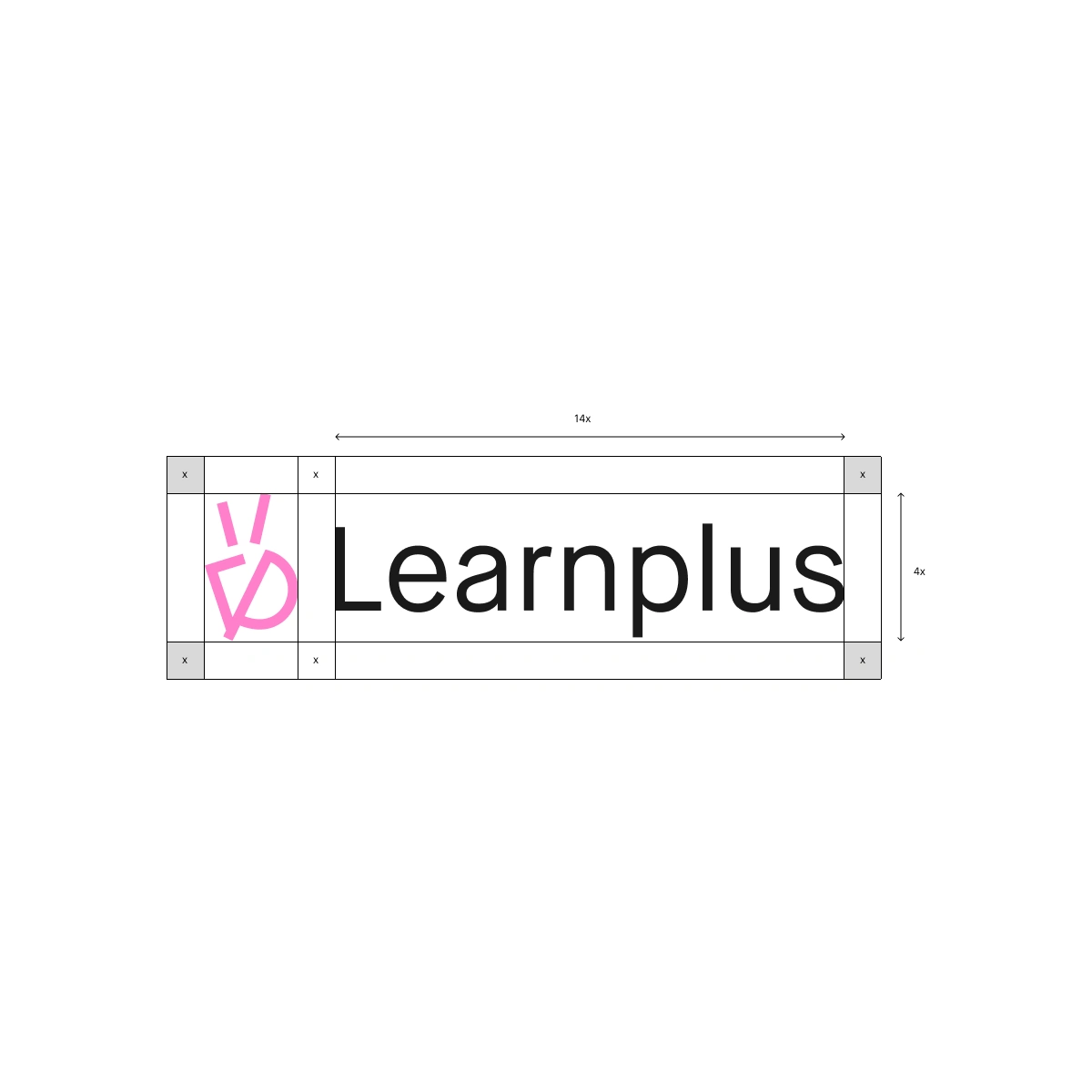
Grid System & Clear Space: Built with strict mathematical proportions ($14x \times 4x$ grid structure) to guarantee flawless legibility, pixel perfection, and breathing room across micro-digital screens and macro-print environments.
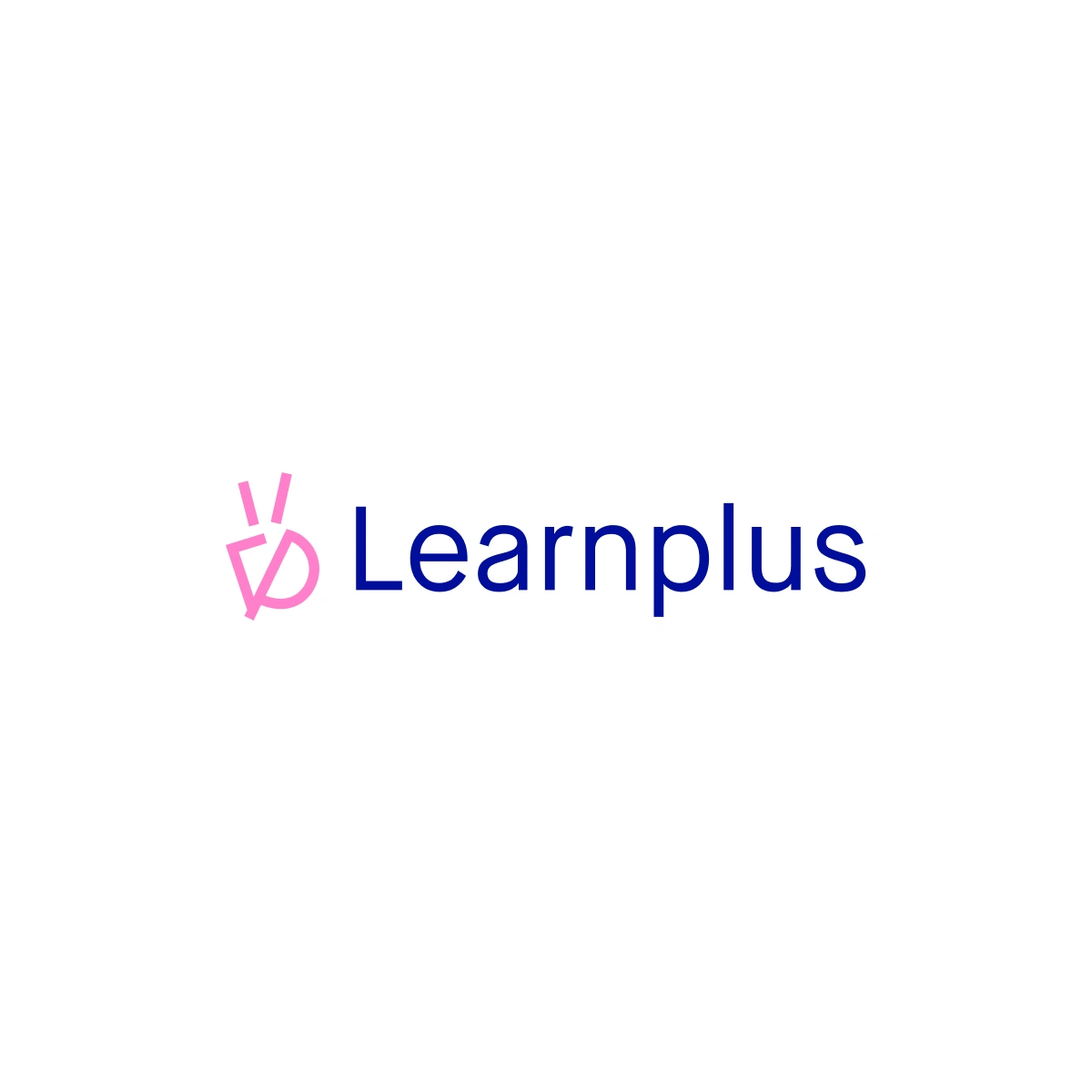
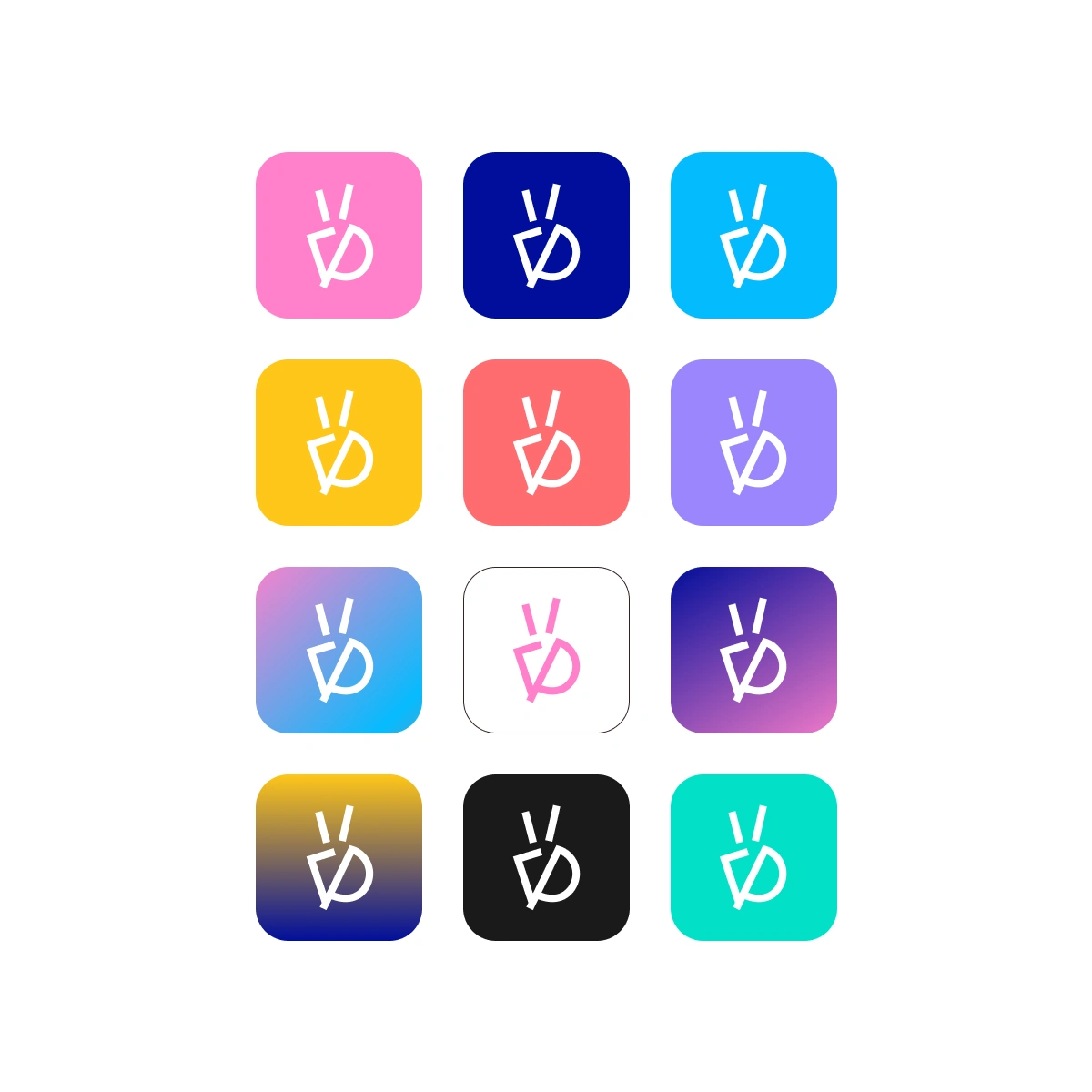
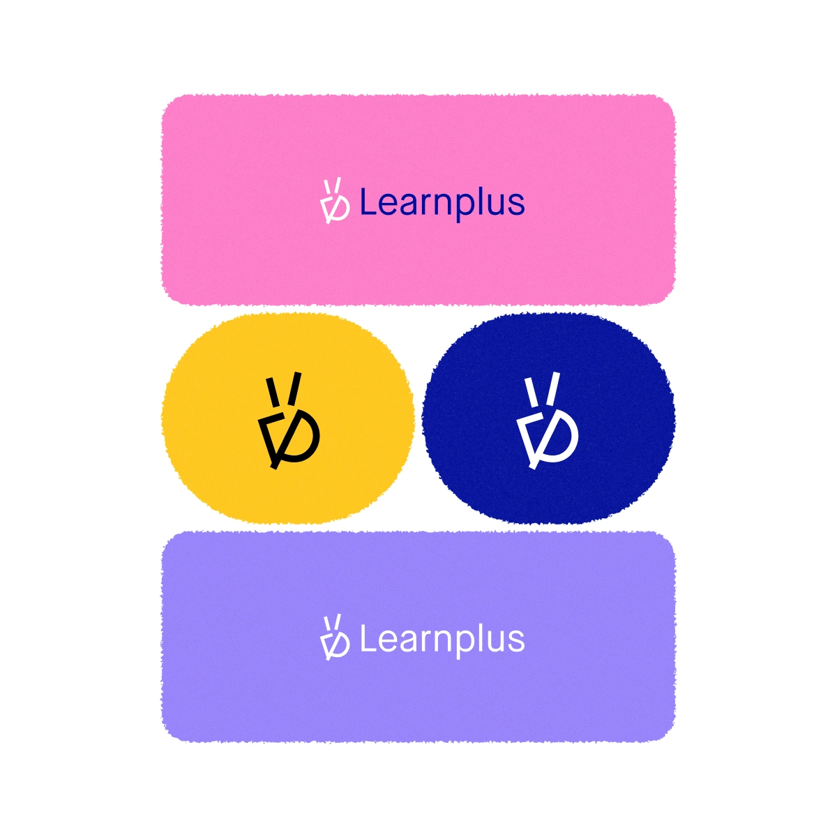
Responsive Variations: The logo is optimized in multiple colorways (Monochrome, Vibrant Inversions, and Gradient Grids) to maintain absolute brand equity across diverse brand touchpoints.
Visual Language & Assets
Color Strategy
The color system moves away from typical dull educational blues into a high-contrast, premium palette:
Deep Corporate Navy: Projects authority, academic trust, and security.
Vibrant Pink & Teal Accents: Sparks imagination, innovation, and playful modernity.
Warm Electric Yellow: Represents cognitive clarity and curiosity.
Typography
Primary Font (Brand Guideline): Clean, geometric sans-serif for headlines to give a cutting-edge tech vibe.
Secondary Font (Montserrat): Used for micro-copy and body text to ensure absolute readability across digital platforms.
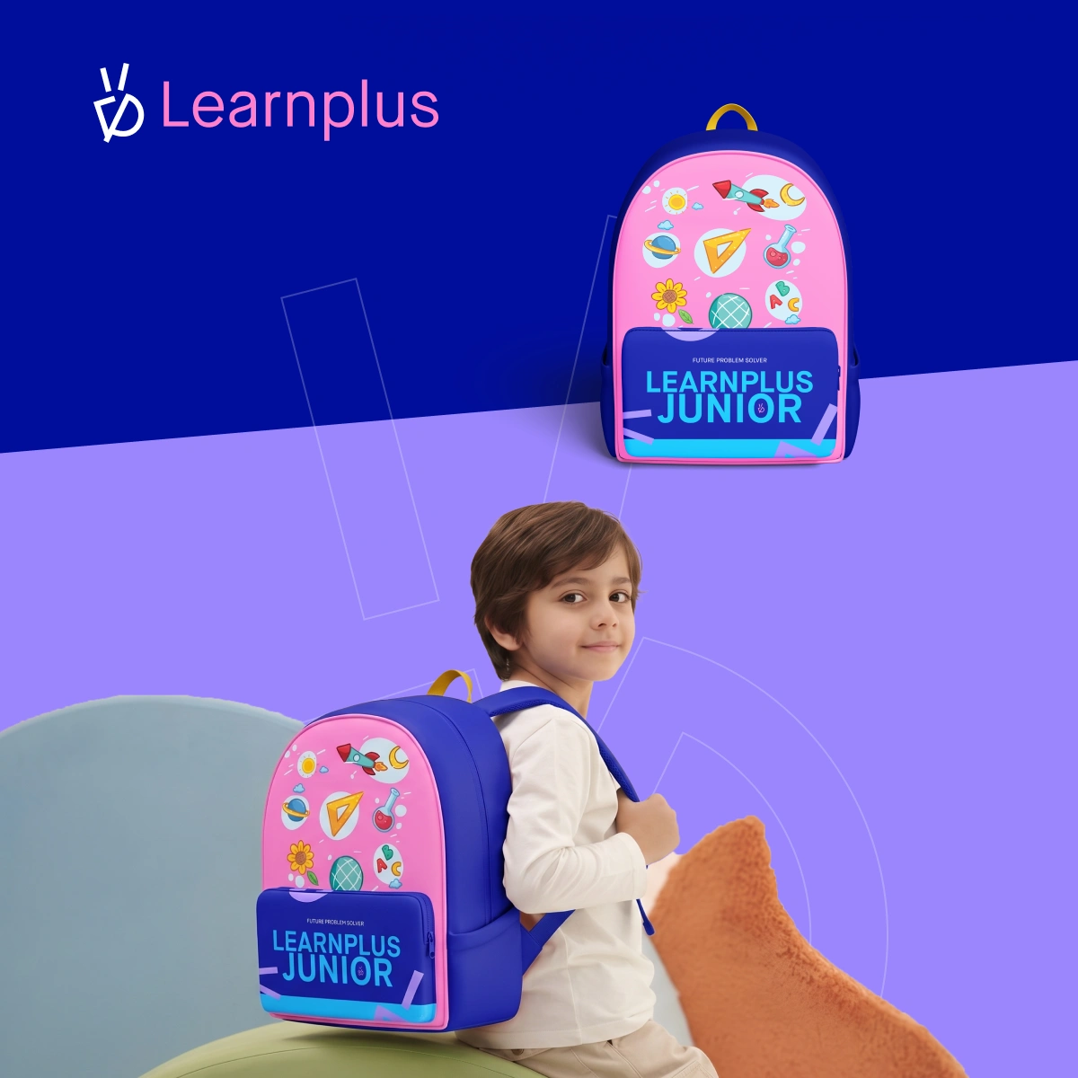
Physical Touchpoints & Merchandise (Learnplus Junior)
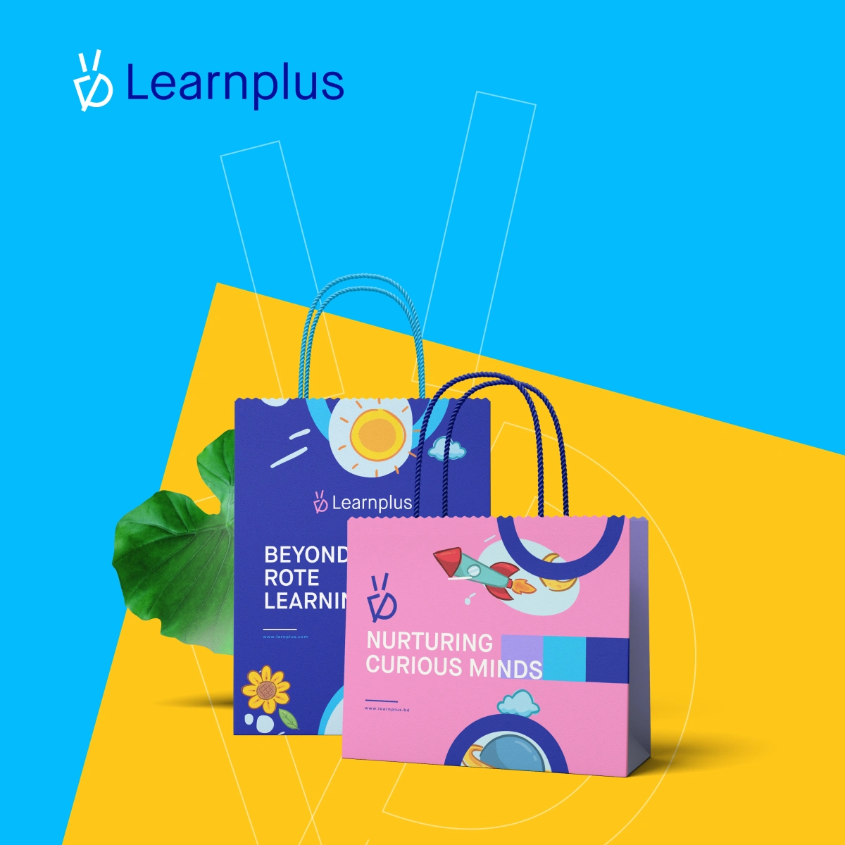
The brand guidelines translate organically into tangible assets for children:
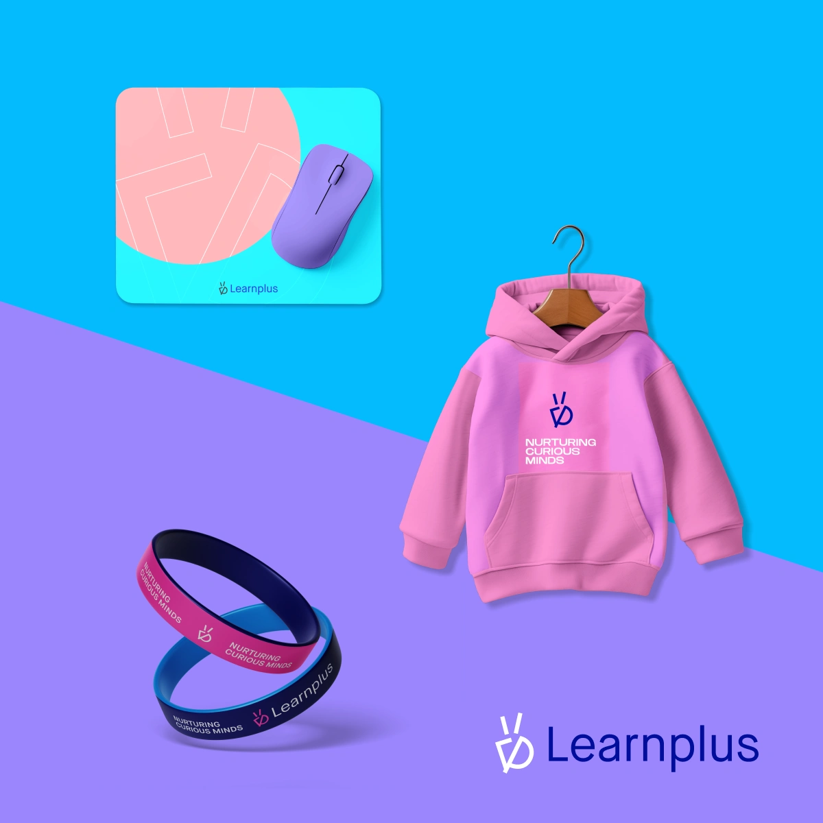
School Bag & Apparel Design: Utilizing the child-centric sub-slogans like "Nurturing Curious Minds" and "Beyond Rote Learning," the product design leverages rich storytelling elements (rockets, atoms, planets) overlaid on clean blocks of primary colors.
Corporate Swag: Silicon wristbands, premium hoodies, and mousepads engineered to transform a simple educational service into a lifestyle ecosystem.
Like this project
Posted Jul 14, 2026
Delivered a scalable, premium identity that balances educational authority with vibrant curiosity, maximizing brand equity across digital and physical channels.
Likes
0
Views
10