Redesign App
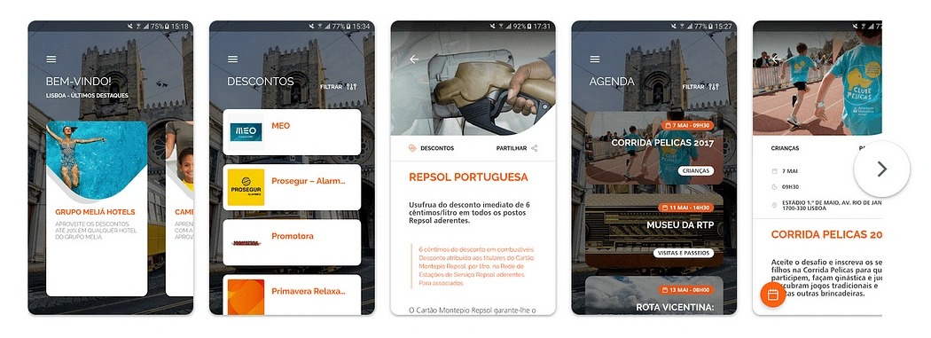
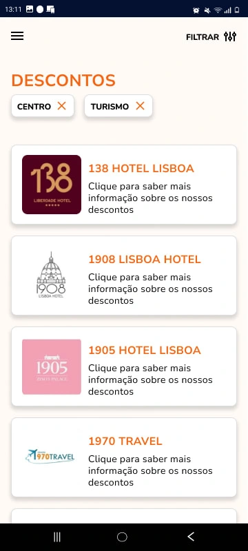
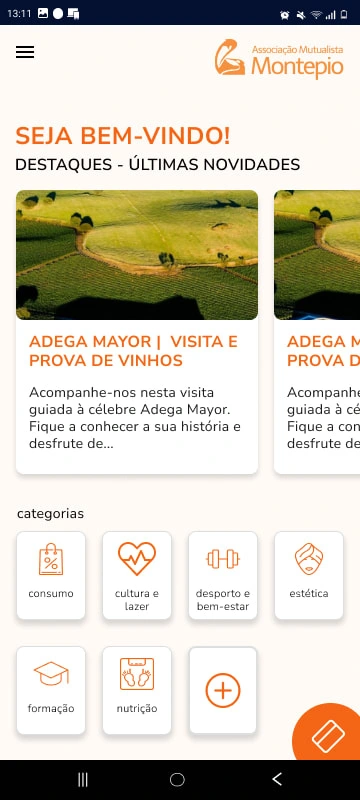
This was a project for a Portuguese app - Associação Mutualista Montepio. This is a picture of the older version of the app. My solution is below.
The solution
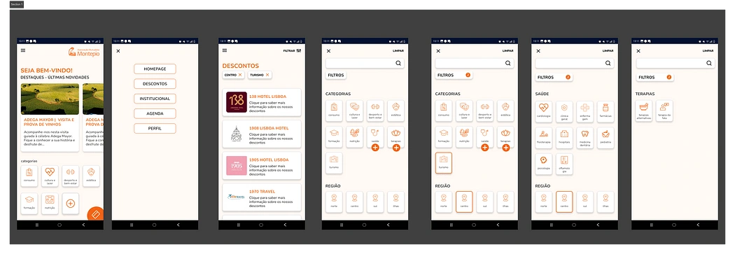
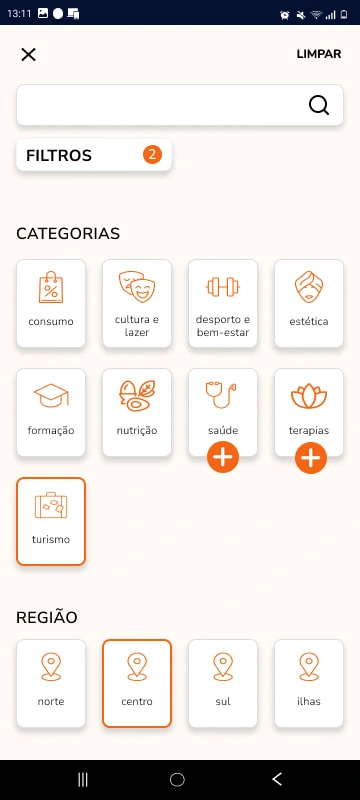
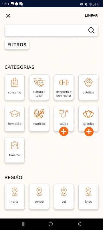
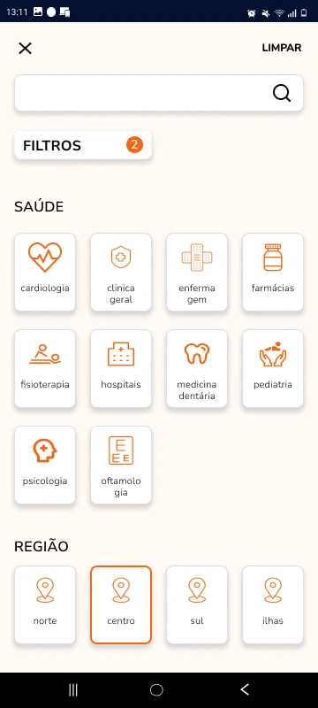
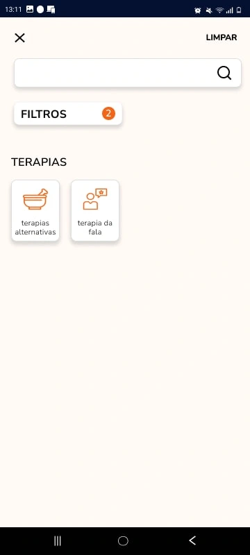
Because of the way the filter was made it was harder to find what you needed, so for that problem a decide after the research, that subdividing the filter would help the user decrease the time spent in that section. Also in terms of UI of thought or using icons to help the user navigate them.
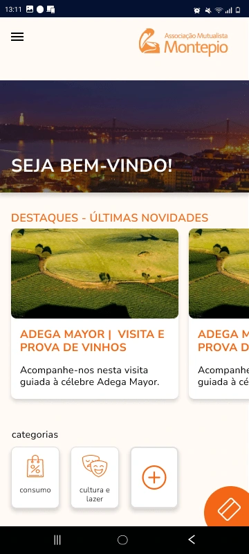
I also added the acess to the user cards on the main page, in the original version the card is in the user profile. The card is something that should be in hand of the user. Add a mensage that allows u to beware that u r in the homepage; I made the cards smaller in the homepage, added the logo to the homepage and gave the hole app a more minimalistic look.
I added a search option — I made this change after a design critique that point it out that a search bar would be a good addiction to help the user navigate the filters.
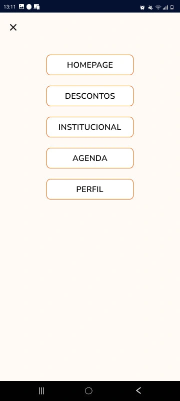
There were other things I would like to change, like the profile page and if I had time I would have done other versions of the mais page ( end up doing two).
Like this project
Posted Jan 8, 2024
I did a redesign of a mobile app - AMM. I used Figma, I did heuristtics evaluation and made the necessary changes to make it a better for the users in UX and UI
Likes
0
Views
1

