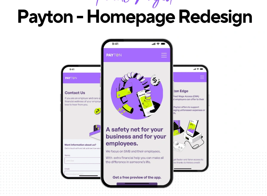
Payton Redesign Homepage
For my final project at Ironhack, I did a company challenge!
I picked Payton a London based fintech company founded in 2023 by Noam Clements; They have had other fintech business and for Payton they wanted to solve the problem of pay day loans in the UK. Why the UKm you ask — well in the rest of Europe that problem doesn’t really exist. So they decided based on the researched they themselves conducted that an app that would allowed the enployees to rerceive part of their paycheck before the payday — that would increase employee satisfaction, retation and it would be easier to hire people.
So they are developing the Payton App — this app has two features Isntapay where employees can get acess to their wages earlier, they frist need to request it fro the app to their employers.
On the employer side they have Instapp and CashAdvance. In Instapay the employer can change the amount the employee needs and when they need it. They added CashAdvance to give the employer ( in this case to focused on SMB — small and medium businesses) an advantage by offer lower rated loans. So Payton is an app with two features Instapay and CashAdvance;
The challenge was redesign their current site (a landing page for now) — but they wanted to increase their sales and market opportunities and needed a redsign to do so.
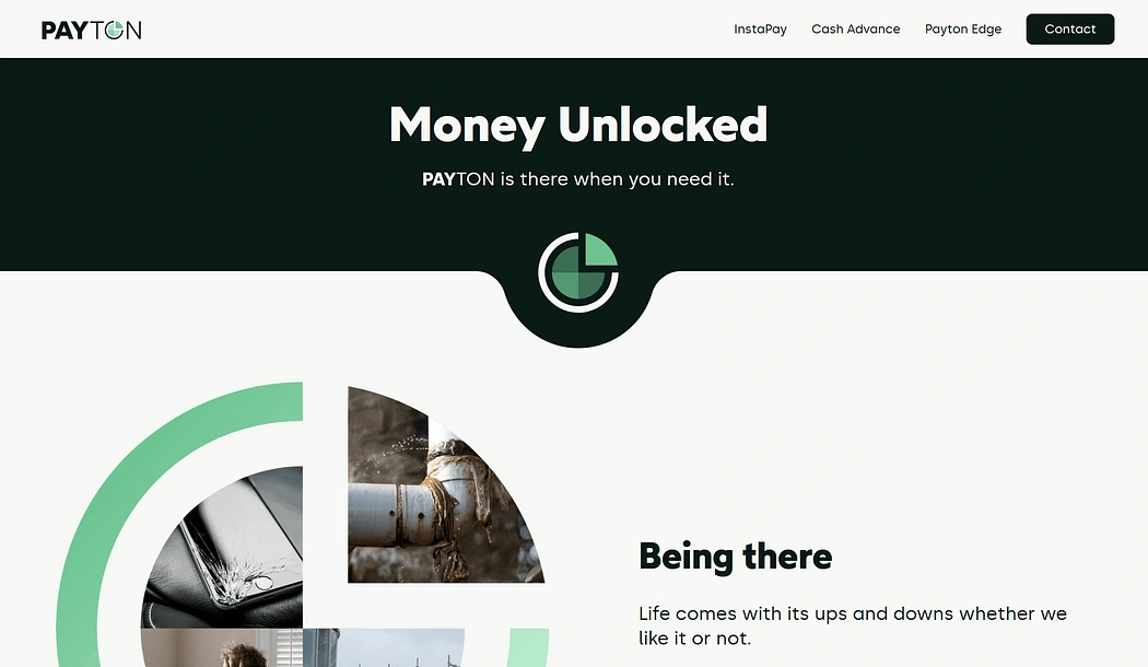
I had the stakeholder interview with Noam and Gutavo ( their product designer) — they want a modern and fresh site tagerting SMB and younger audinece, they also wanted to focus on the B2B, so this site had to be directed to other business or in others others I had to speak to the employers. They are focusing mainly on the hospitality sector, because of shits and covid this is the sector with bigger finacial problems
So to me this company was very aware of the social and job related issues that por finacial strutucter can cause people a lot of problems.
(during secundary research) — I focus maily on their competion because I got a lot of information from the stakeholder interview I felt I could move on.
I found a lot of information about financial wellness, some site were more generic and others focus on the hospitatility sector as their main target.
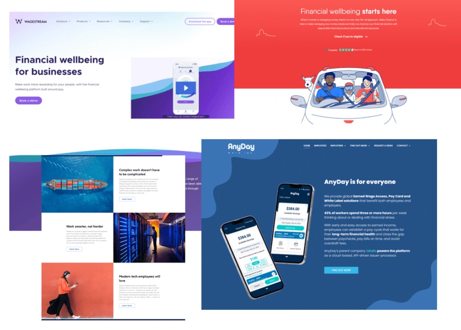
Competitor analysis — ( Wagestream, Hastee, Access, Salary Finance…) their sites have bold colors, CTA, header with hero image, UX writing focusing on helping their employees, images that convey good fellings and also some use mockups to show their apps.
Heuristics analysis —There were several problems found within the site, the images did not convey that this was a site featuring an app that helps people with financial isseus; The struture of the site was consufing to what the stakeholder or trying to sell, that they can help users with an app that has two features; the footer has spacing problems; in the mobile version of the site the hamburger menu didn’t have a close button the user had to click outside to leave the menu. This were to me the biggest problems, but I did user testing to understand what I missed from the heuristics analysis, the users told that the navbar/hamburger menu was confusing because it feautures three titles (InstaPay/CashAdvance and The Payton Edge) this Payton Edge title was confusing the users. They also told that the information display on the site was confusing.
So it became obvios from the heuristics analysis and the user testing that I had to fix the site information architecture, the images, the navbar and the footer. From the stakeholder interview I would have to change the colors and the UX writing.
With this in mid I decided to do a site map to construct a better site flow, even if there’s only one page.
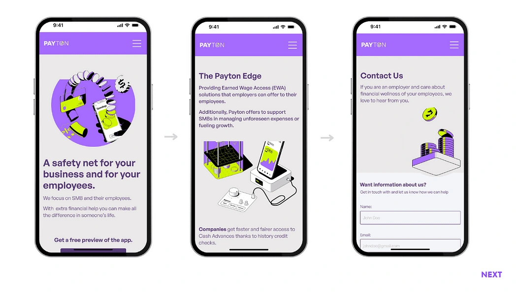
One way I fought I could solve the problem os the site over information was that I could create an extra page, an About page, I tested it druing the lo-fi phase and the results were positive, this way I could cut the extra information in the landing page and make more attractive. I also tried to find away to take that extra information in another way. I used two cards with Instapay and cashAdvance with only the title, images and a read more button, but users did not like this solution, it was still confusing to them what is Payton. So for the mid-fi I decided to try the same two cards but I would add a acordeon, I tested but the users still did not like this solution. So for the hi-fi I focus on adding only the necessry information and tried and write cathing and succinct phrases that would allow the user to understand what Payton ( more specifficly Instapay and CashAdvance) does and if they wnated more information they could click and navegate to the about page.
The other problem was the header — there was no CTA, the images convey a problem not a solution and the message was the problem not the solution.
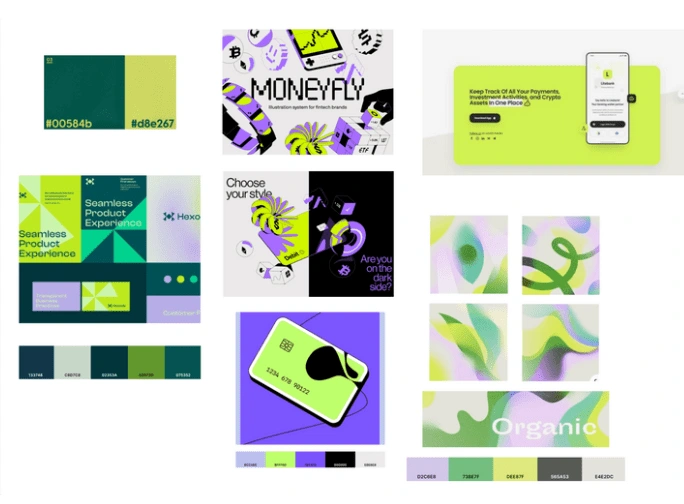
I found the imagery in Dribble while I was looking for inspiration for the moodboard. They convey fintech with an edge! I used the colors from the images to start the hifi I have to change the saturion but they worked very well when I tested for desirability. People thought they look modern and that was a exactly what the stakeholders wanted.
Conclusion:
For me the hardest part of this project was the UX writing I started it while doing the mid-fi and still I had to change it two times during the hi-fi after testing it with users. I had a lot of luck with my stakeholders they were very firendly and helpfull. I think I did a better job at time management and I’m happy with the final results of the redsign.
Like this project
Posted Jan 3, 2024
This was a redesign of the Payton homepage. Payton is a start up that works in fintech.
