Optiswift Dashboard Redesign
Francis Mensah
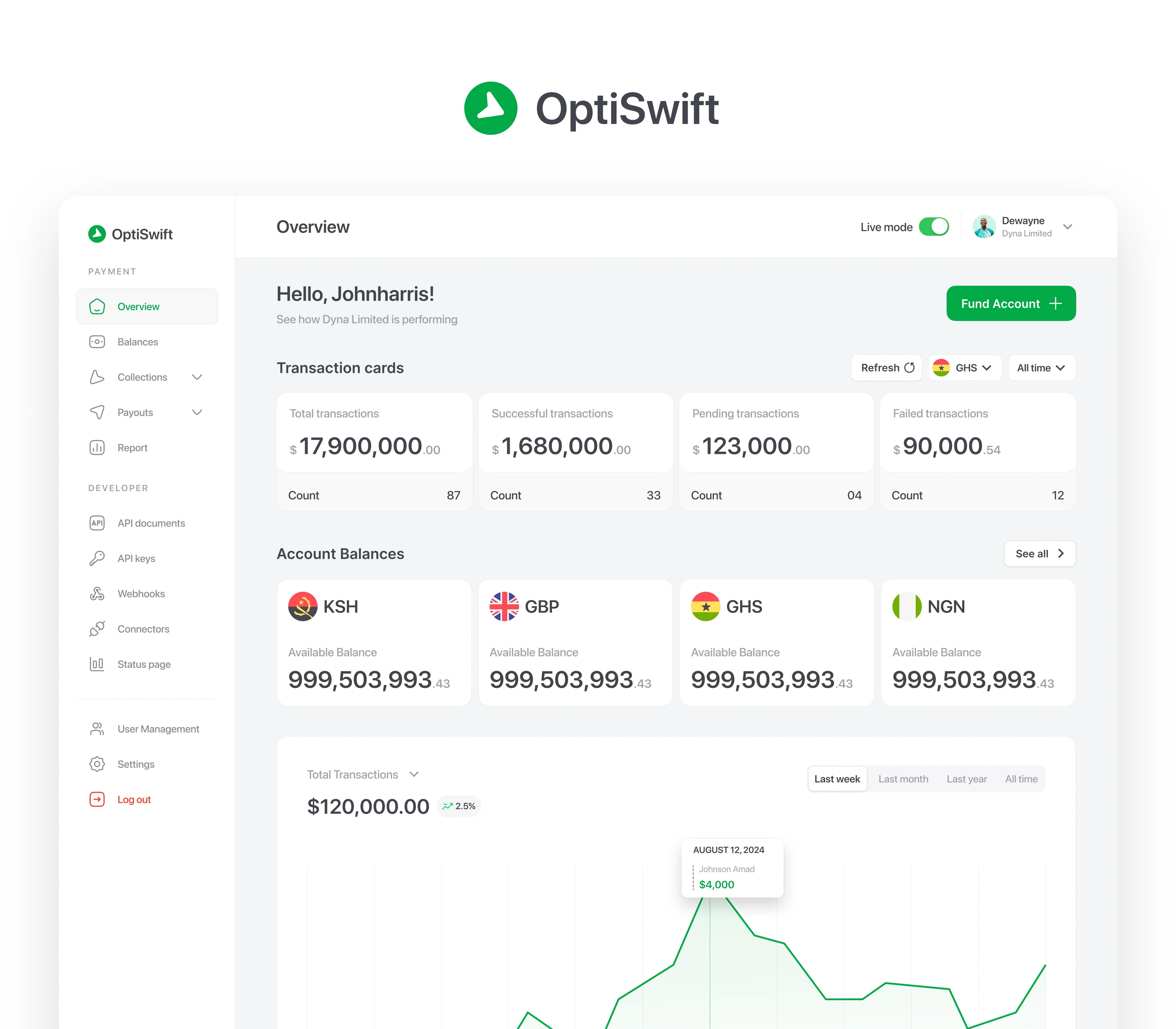
Optiswift Dashboard
🧠 Research & Problem Discovery
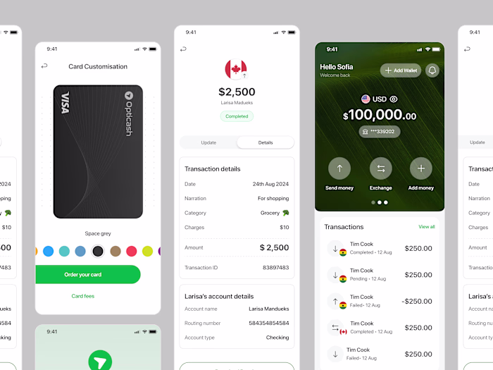
I led the redesign of the Optiswift fintech dashboard, a platform used by individuals and businesses to send, collect, and manage bulk payments.
We built upon existing research and customer feedback gathered from the previous version of the product. Key insights revealed that:
The UI felt outdated and cluttered
The sending flow was unintuitive, especially for bulk transactions
Data tables were hard to scan, slowing down user tasks
Users wanted easier access to reports and better developer tools
This feedback set the foundation for a user-focused redesign.
🛠️ Design Process
Using the Design Thinking framework, I approached the redesign with clear goals to improve usability, clarity, and performance. The process included:
Reviewing existing research and gathering internal stakeholder input
Mapping key user flows, especially for sending money and managing payments
Redesigning the dashboard UI for better visual clarity and navigation
Iteratively prototyping and testing updated layouts and components
Collaborating with developers to ensure alignment on new technical features
🎨 UI & Feature Improvements
Some of the most impactful changes included:
A refreshed UI with better spacing, hierarchy, and cleaner visuals
A simplified and optimized sending flow for both one-time and bulk payments
Redesigned tables that are now more readable, scannable, and sortable
Introduction of a Reports section where users can generate, download, and share payment insights
A Developer Tools section featuring documentation, webhooks, and API keys for seamless integration
📈 Outcome & Impact
The redesign made Optiswift more intuitive, especially for frequent users and business clients who rely on speed and clarity. Results observed post-launch include:
Higher engagement (20%) with the reporting and developer tools
Faster completion of bulk payment tasks
Positive internal feedback from both the support and dev teams due to reduced user confusion and clearer flows
This project reinforced how targeted design improvements—especially around usability and visual clarity—can elevate a complex product and meet both user needs and business objectives.
Like this project
Posted Jun 7, 2025
Redesigned Optiswift fintech dashboard for improved usability and performance.
Likes
0
Views
0
Timeline
Jan 7, 2025 - Mar 10, 2025