Brand Identity for Nail Art Studio
Shadi El Asaad
This project began with Thams, a talented nail artist in Berlin with a passion for culinary creations, tattoos, makeup and other creative outlets. They wanted a cohesive identity that could bring together their varied pursuits under a single, adaptable brand. The result was Thams Does—a brand name born out of the design process, allowing Thams to showcase their multifaceted artistry seamlessly: Thams Does Nails, Thams Does Tattoos, Thams Does Art. This unified approach eliminated the need for scattered messaging while celebrating their creative versatility.
Approach
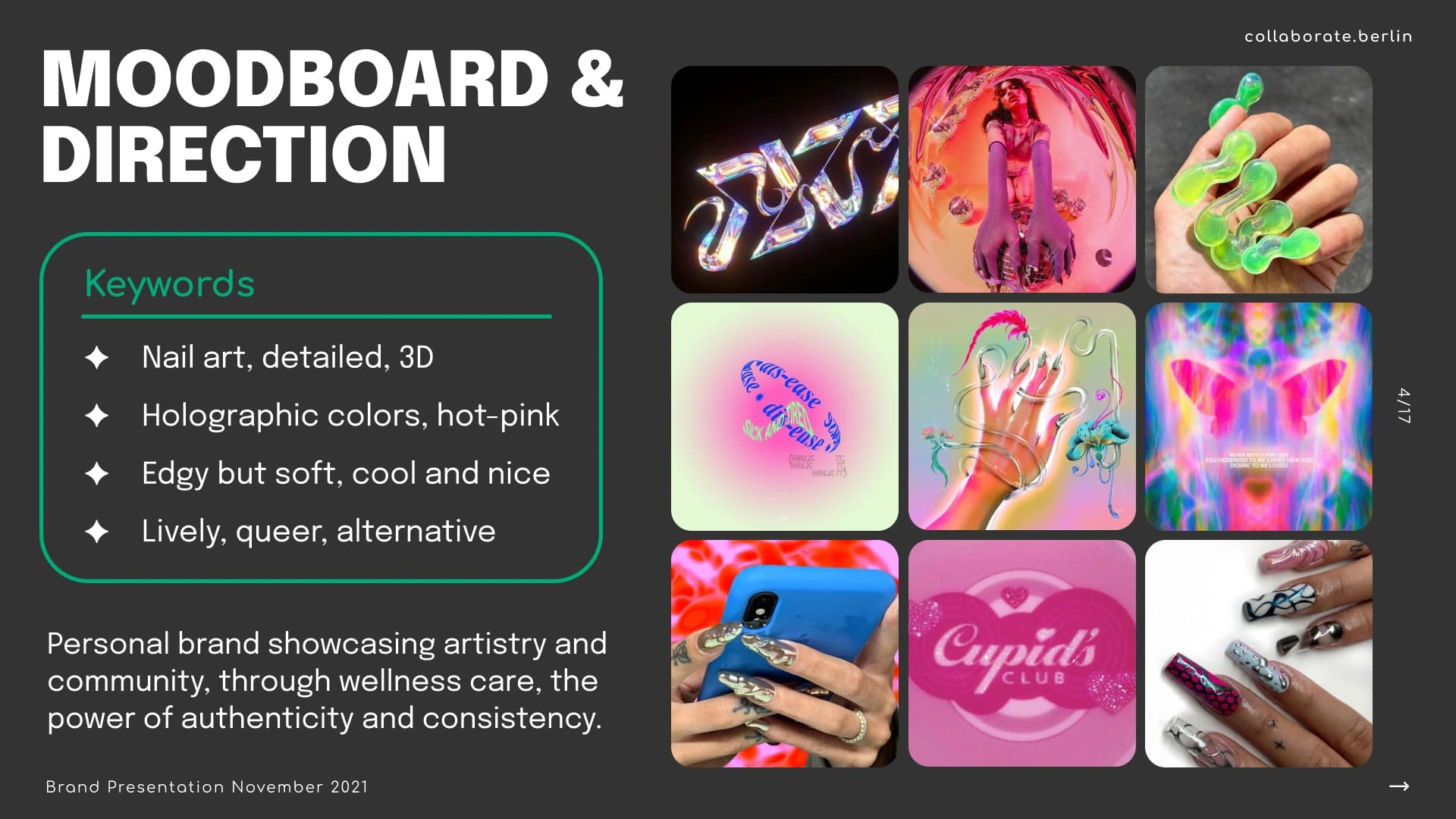
Moodboard & Direction
The goal was to design a brand that reflected Thams’ artistry and values while being adaptable to their diverse outlets. Key steps included:
Name Development: The name Thams Does was crafted to highlight the artist’s broad creative range, providing a platform that could easily adapt to various pursuits while maintaining a cohesive identity.
Logo Design: Inspired by transformation and individuality, the primary logo incorporates a butterfly motif with claw-inspired edges, reflecting both Thams’ nail artistry and the brand's mission of empowerment and creativity. Variants were designed to suit different mediums, such as social media, product packaging, and promotional materials.
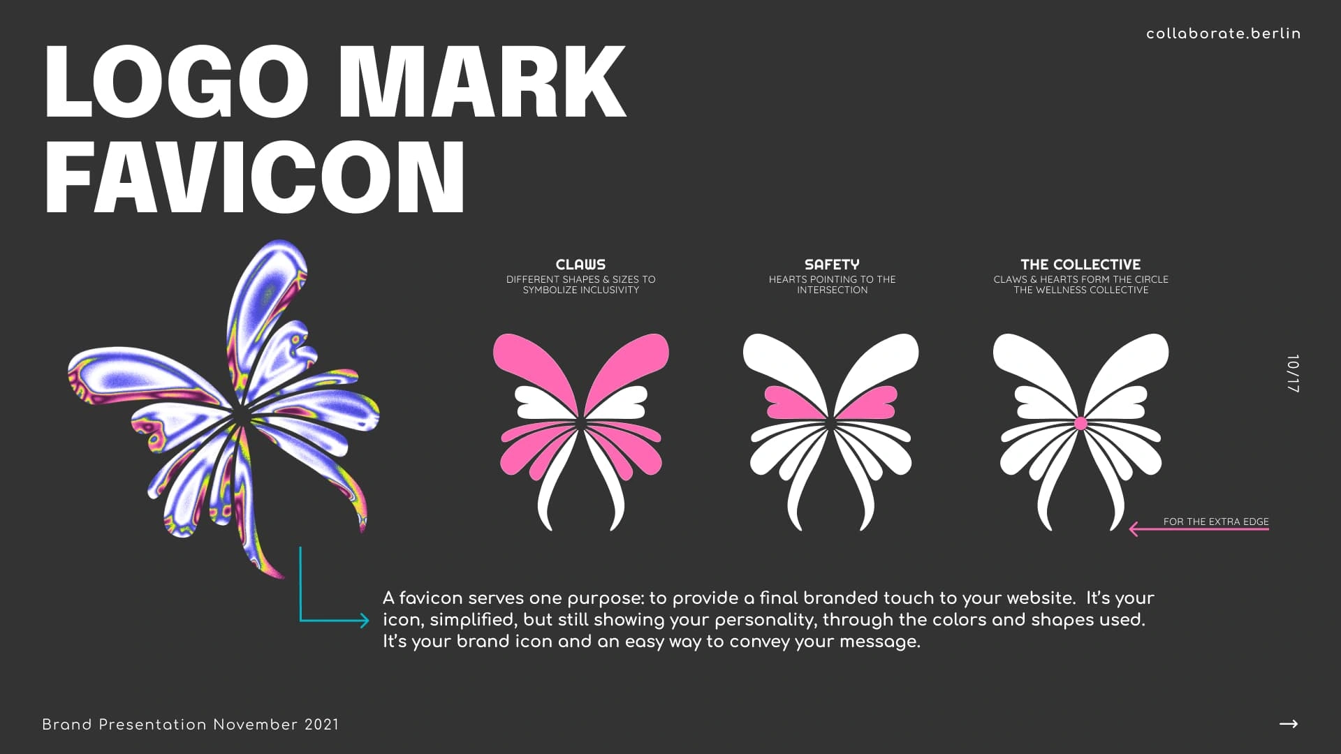
Logo Mark Favicon
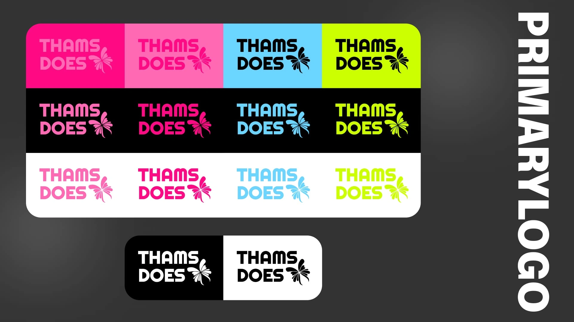
Primary Logo
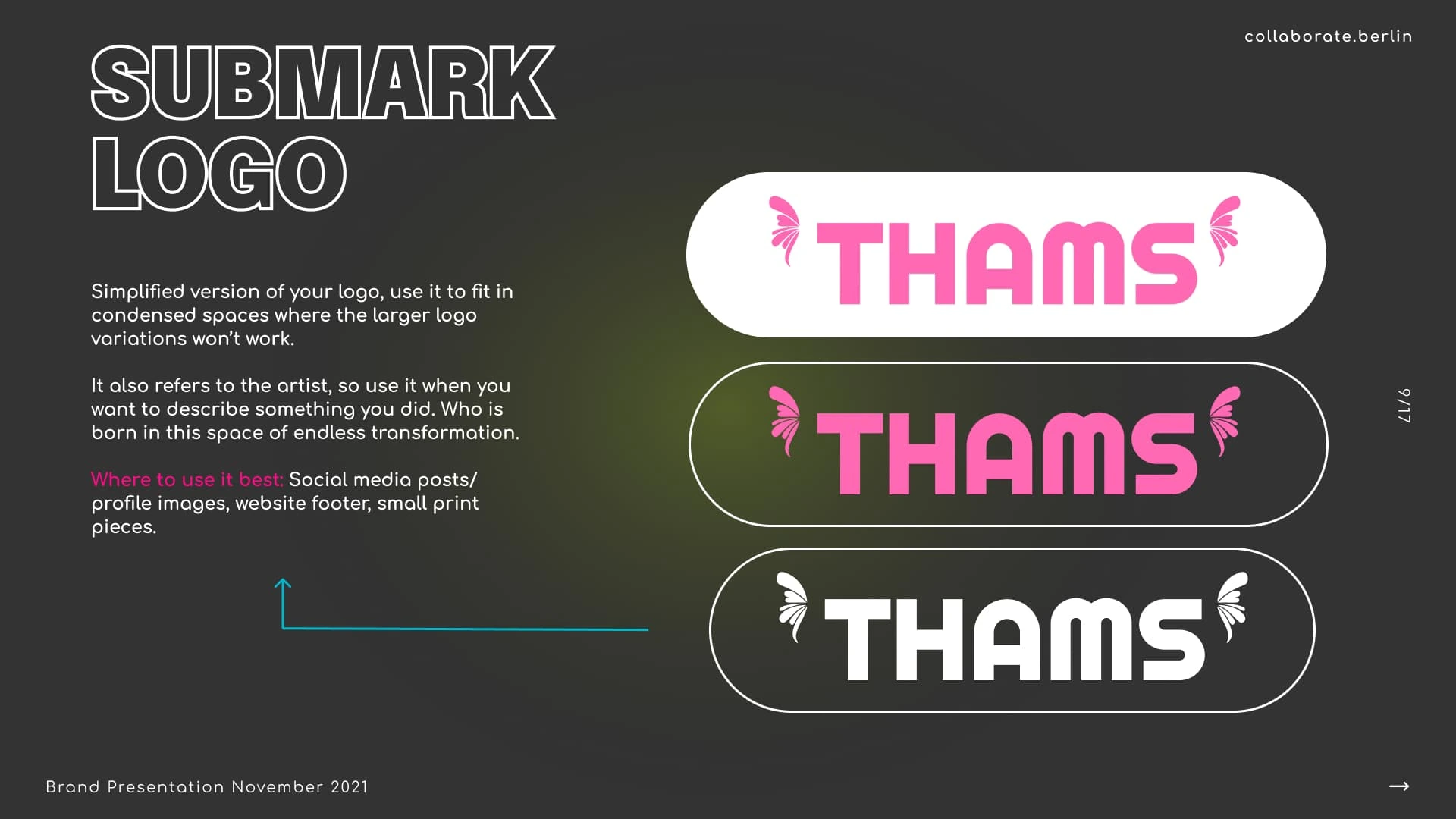
Submark Logo
Color Palette: A vibrant yet balanced combination of pinks, lime green, baby blue, and deep navy was chosen to reflect Thams’ bold, edgy, and welcoming personality. This palette transitions seamlessly across nails, food photography, and lifestyle content.
Typography: Bold, modern typography was paired with softer subtext fonts, ensuring a versatile yet cohesive voice for all creative endeavors.
Graphic Elements: Custom patterns and iconography, such as claw and heart motifs, were developed to symbolize inclusivity, self-expression, and the safe space Thams Does embodies.
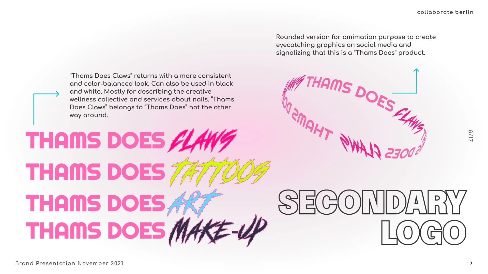
Secondary Logo
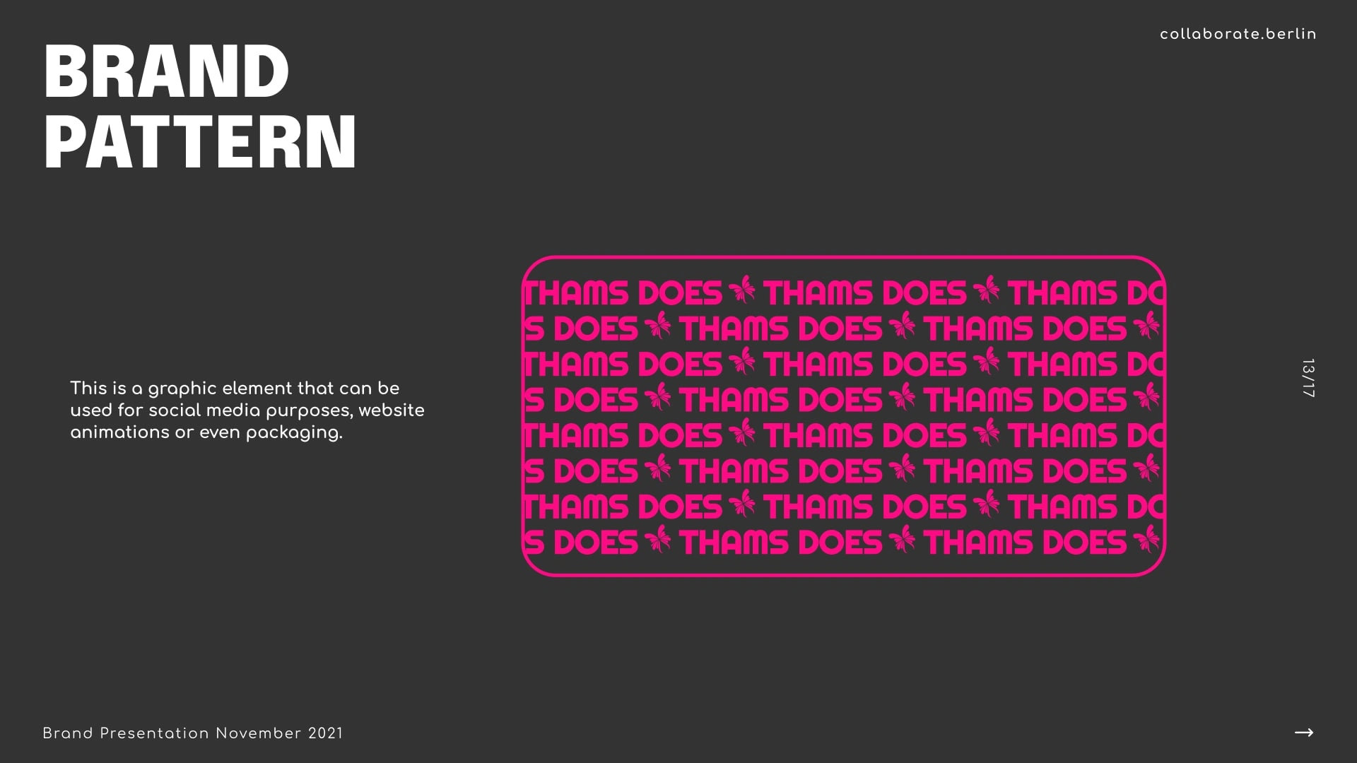
Brand Pattern
Implementation
The adaptable branding extended to:
Social media templates for posts about nails, food, and photography.
Packaging designs for potential product lines, such as nail care kits or culinary goods.
Website and marketing materials that seamlessly transitioned between Thams’ creative offerings.
Results
The branding design transformed Thams’ artistic identity into Thams Does—a dynamic, inclusive brand that resonated with their audience while allowing their passions to shine. By unifying their creative outlets under one adaptable identity, the brand empowered Thams to connect with their community and express their vision authentically.
Thams expressed excitement and pride in the new brand, praising its ability to seamlessly represent their varied talents while staying true to their values and creative spirit.
Like this project
Posted Nov 20, 2024
Crafted Thams Does, a versatile brand uniting Thams’ passions—nail art, food, photography—under one cohesive, inclusive identity.
Likes
0
Views
87