APARAN+, Redesigning Packaging Identity
Arlin Vartanian
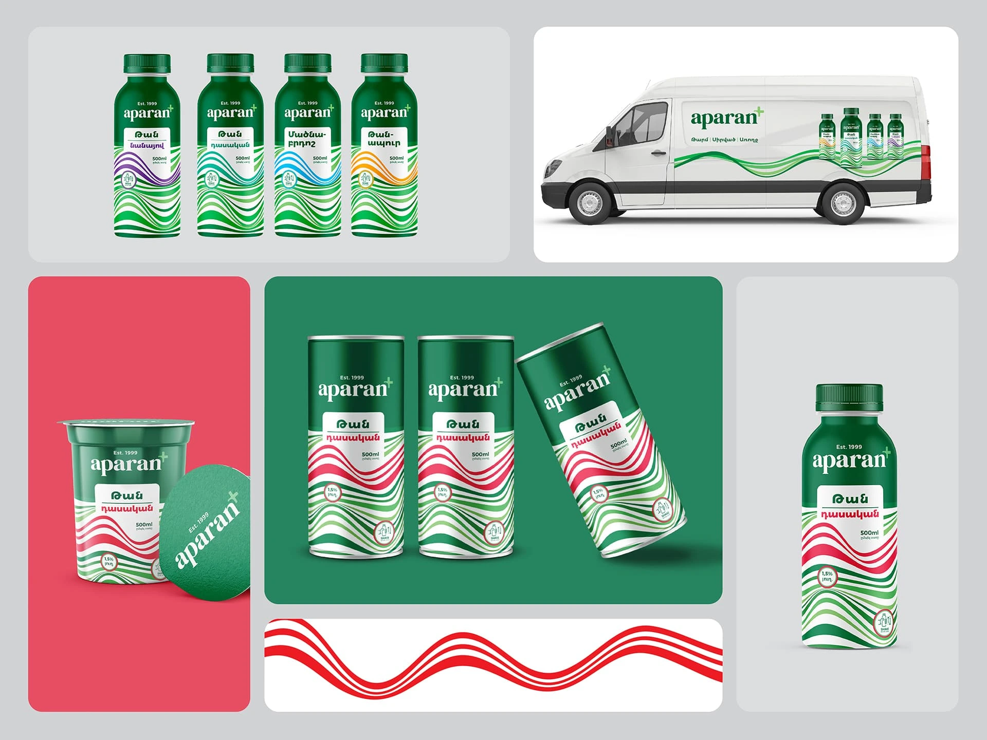
Rebranding Aparan+ Packaging,
Aparan+ is undergoing a packaging redesign to create a more modern, fresh, and visually appealing look. The new design aims to highlight the brand’s heritage while enhancing shelf presence with vibrant colors, clean typography, and a refined layout. Emphasizing quality and tradition, the updated packaging will improve brand recognition and better connect with consumers.
Visual Solution: Since TAN is a white liquid with no defined shape, I designed a floating, dynamic visual element to represent its fluidity and natural movement. To enhance differentiation across products, I created a vector wavy pattern where parts of the waves change color according to each product. I selected five distinct colors to establish a cohesive yet unique look, reinforcing the brand identity while adding freshness and visual appeal to the packaging.
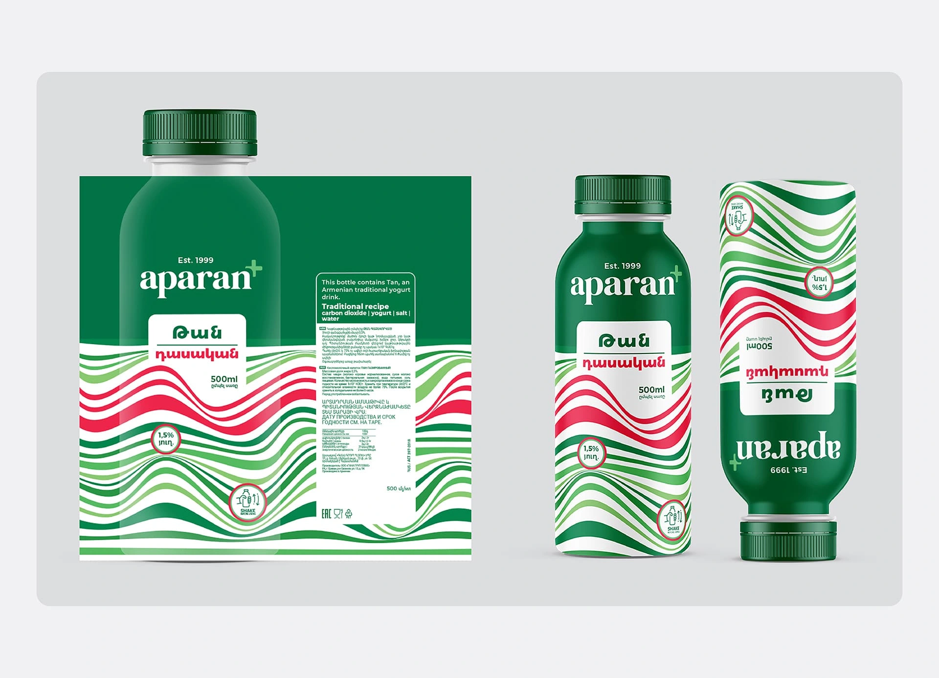
Aparan+ label design, front and back sides.
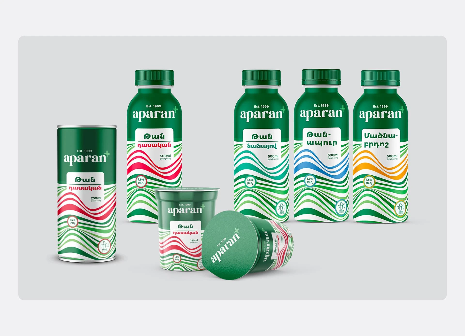
Aparan+, all products
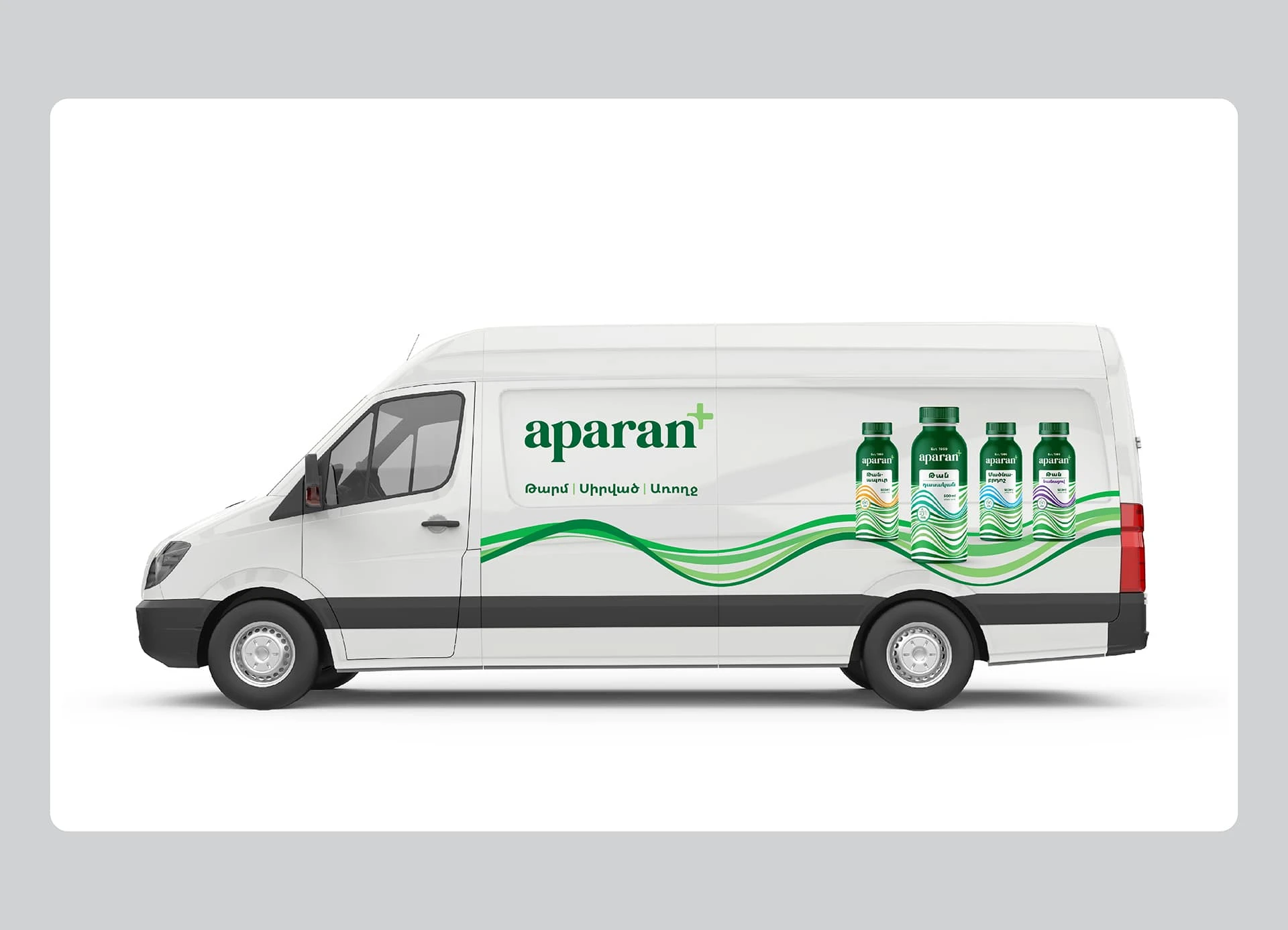
Aparan+ Car design
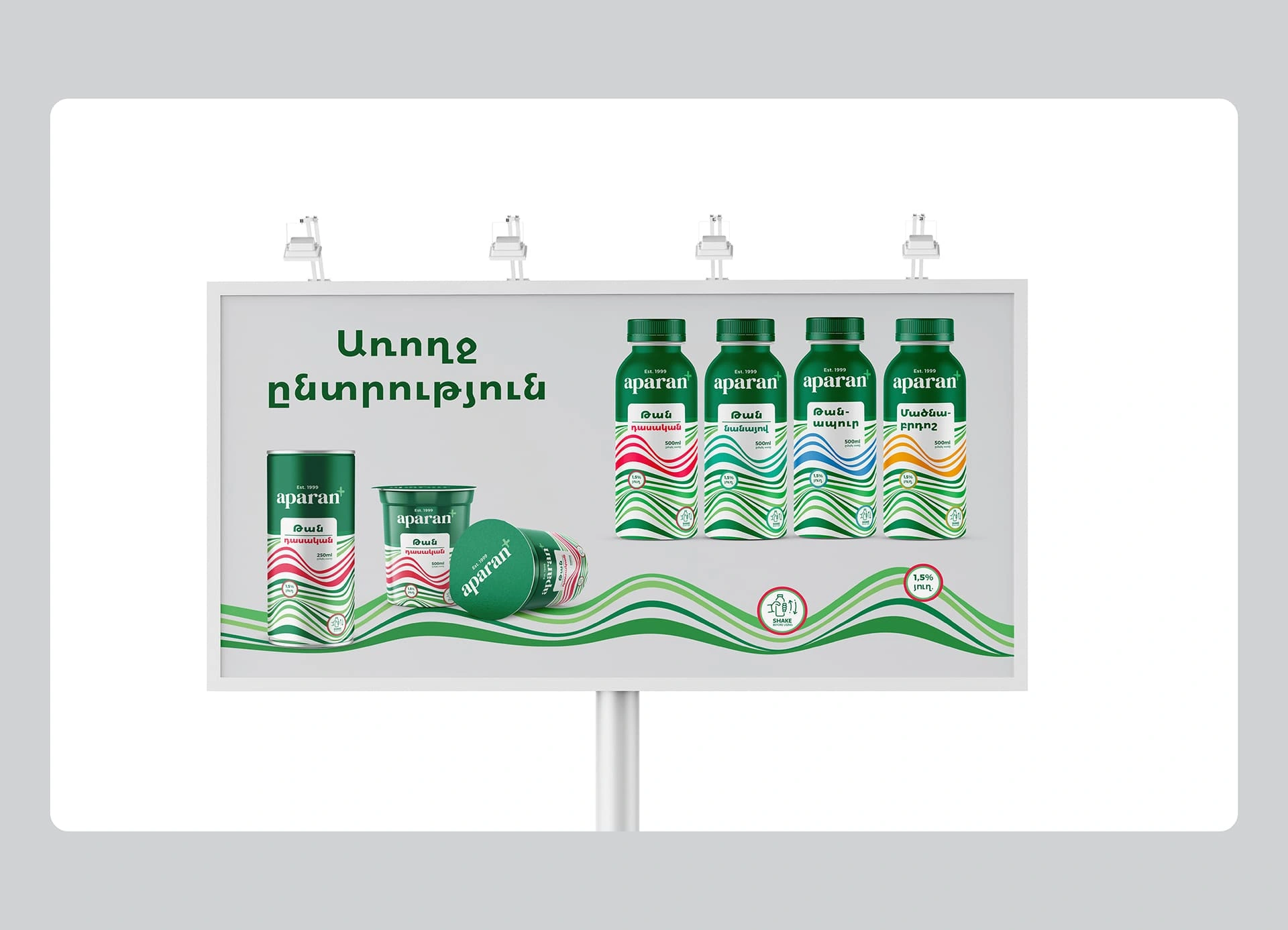
Aparan+ Billboard design
Like this project
Posted Feb 3, 2025
Rebranding and redesigning packaging design for Aparan+. Graphic designer: Arlin Vartanian Agency: Brand