Zenmai Hotel — Brand Identity & Hospitality Design System
CHENWEI FANG
Design strategy
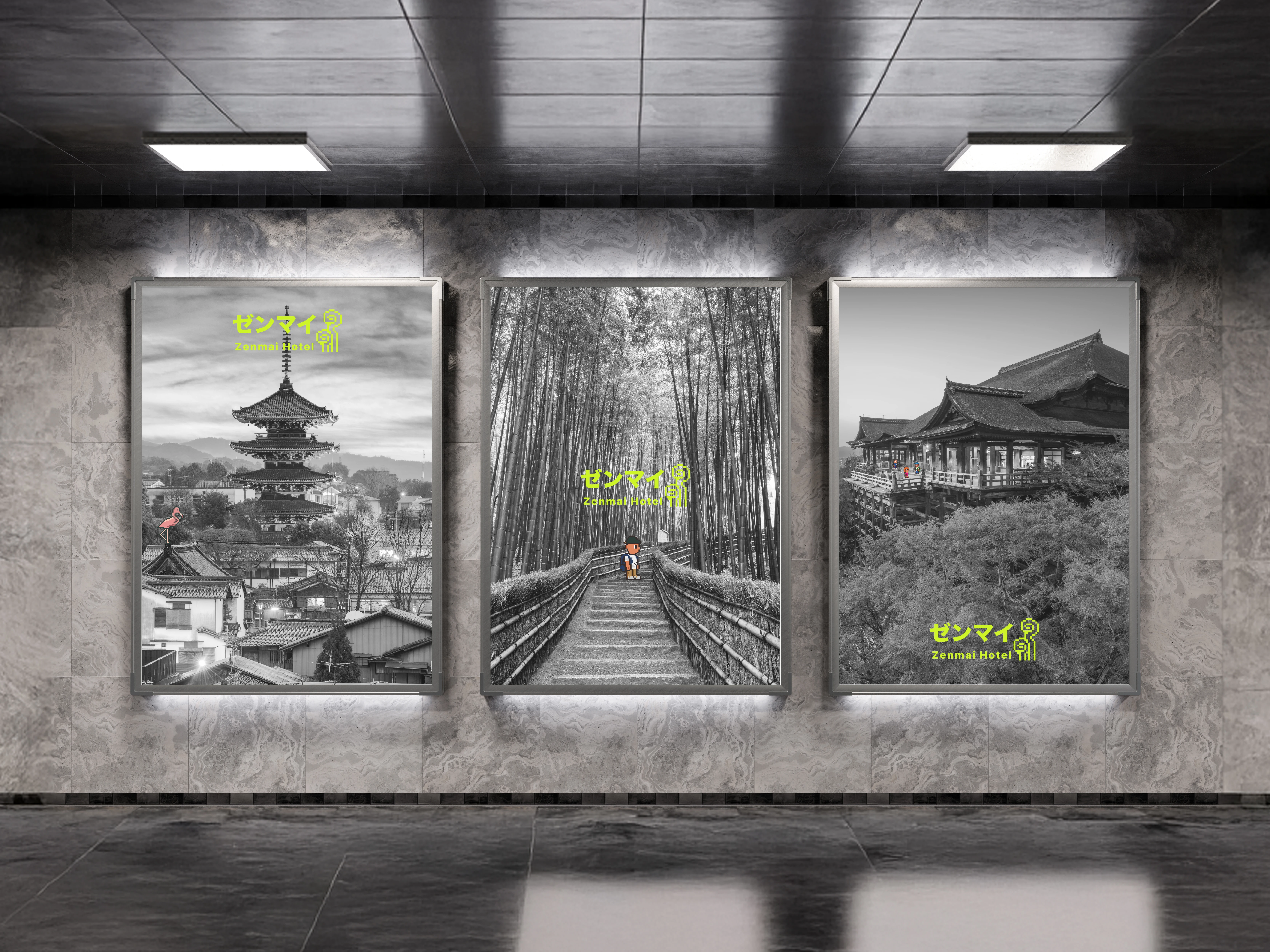
A deliberately virtual aesthetic was introduced to create subtle disruption, pixel elements that feel foreign at first glance, yet blend seamlessly into Kyoto’s calm visual language. This contrast became the brand’s signature rhythm: playful, quiet, and slightly uncanny. What seemed out of place became part of the place.
Identity
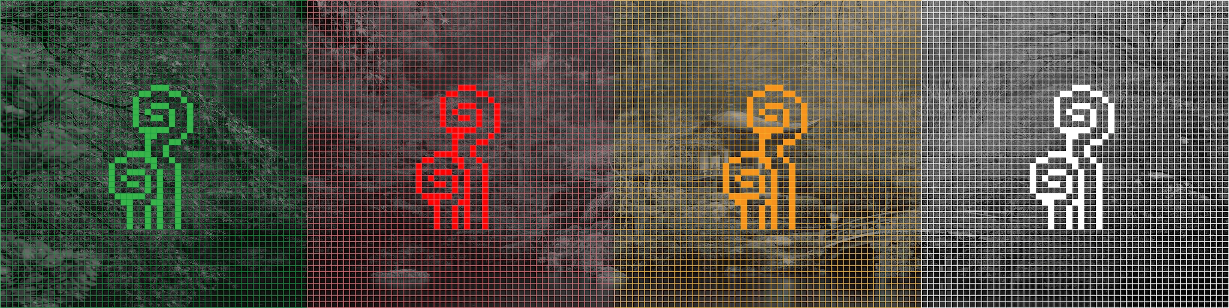
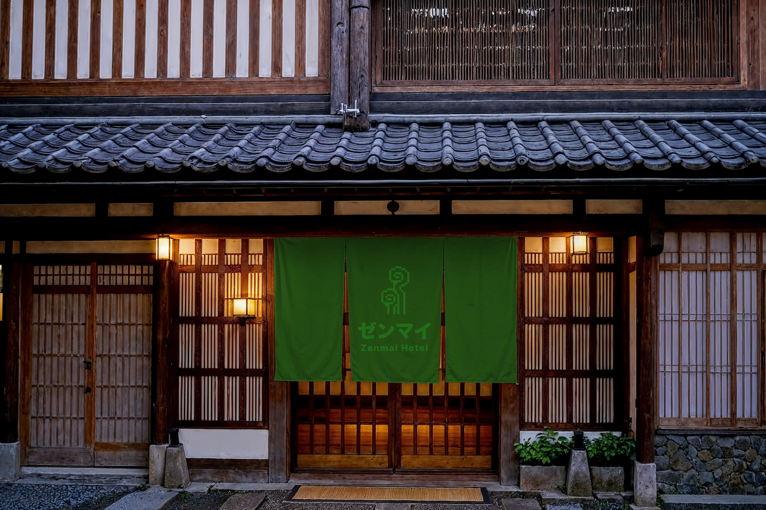
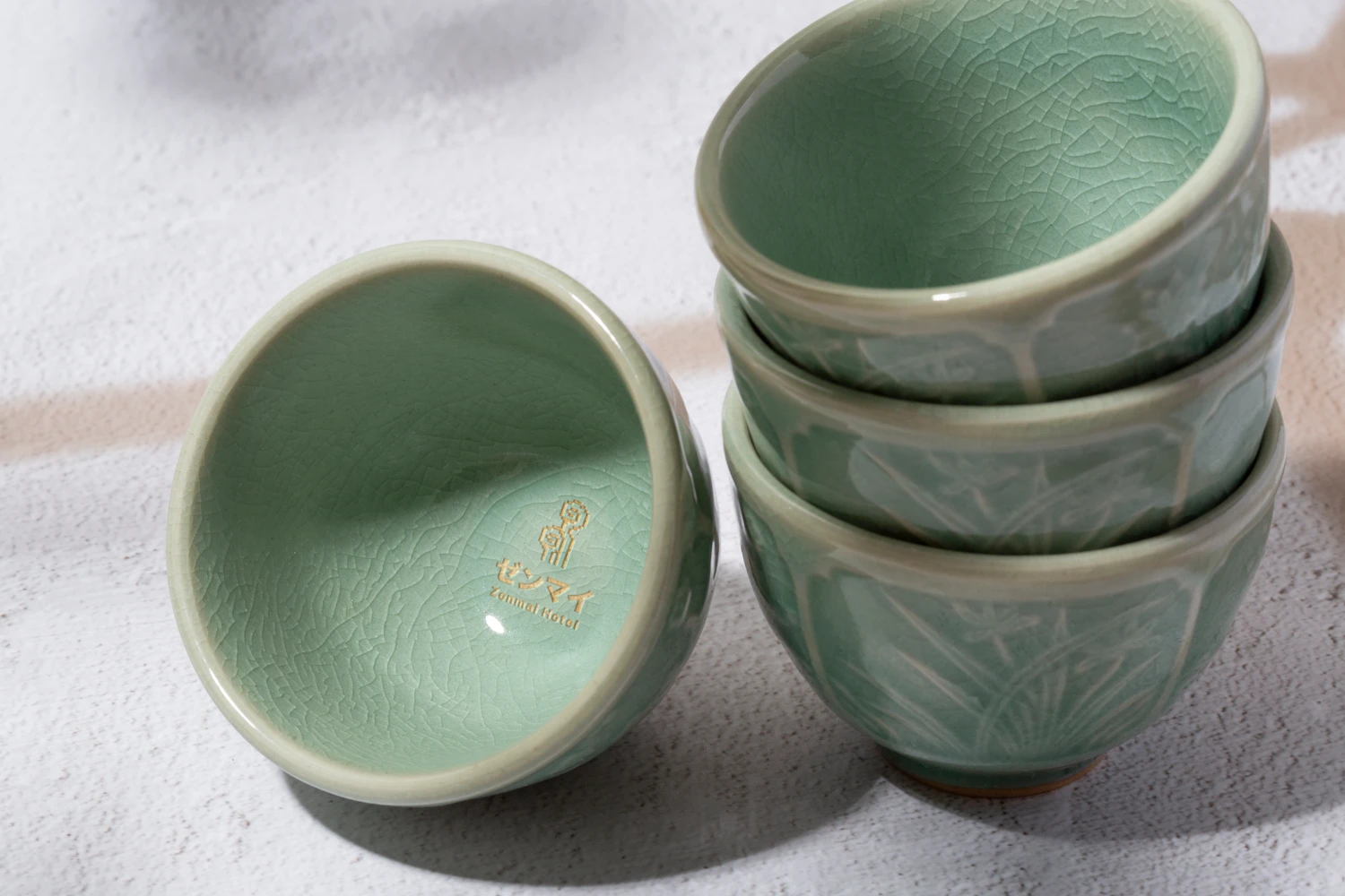
The pixelated fern logo transforms the hotel’s name into a symbol that feels at once organic and digital. Custom-designed icons follow the same logic, turning everyday amenities into a consistent low-resolution language. A pair of greens, drawn from early video game screens, brings a quiet glow of nostalgia to the system.


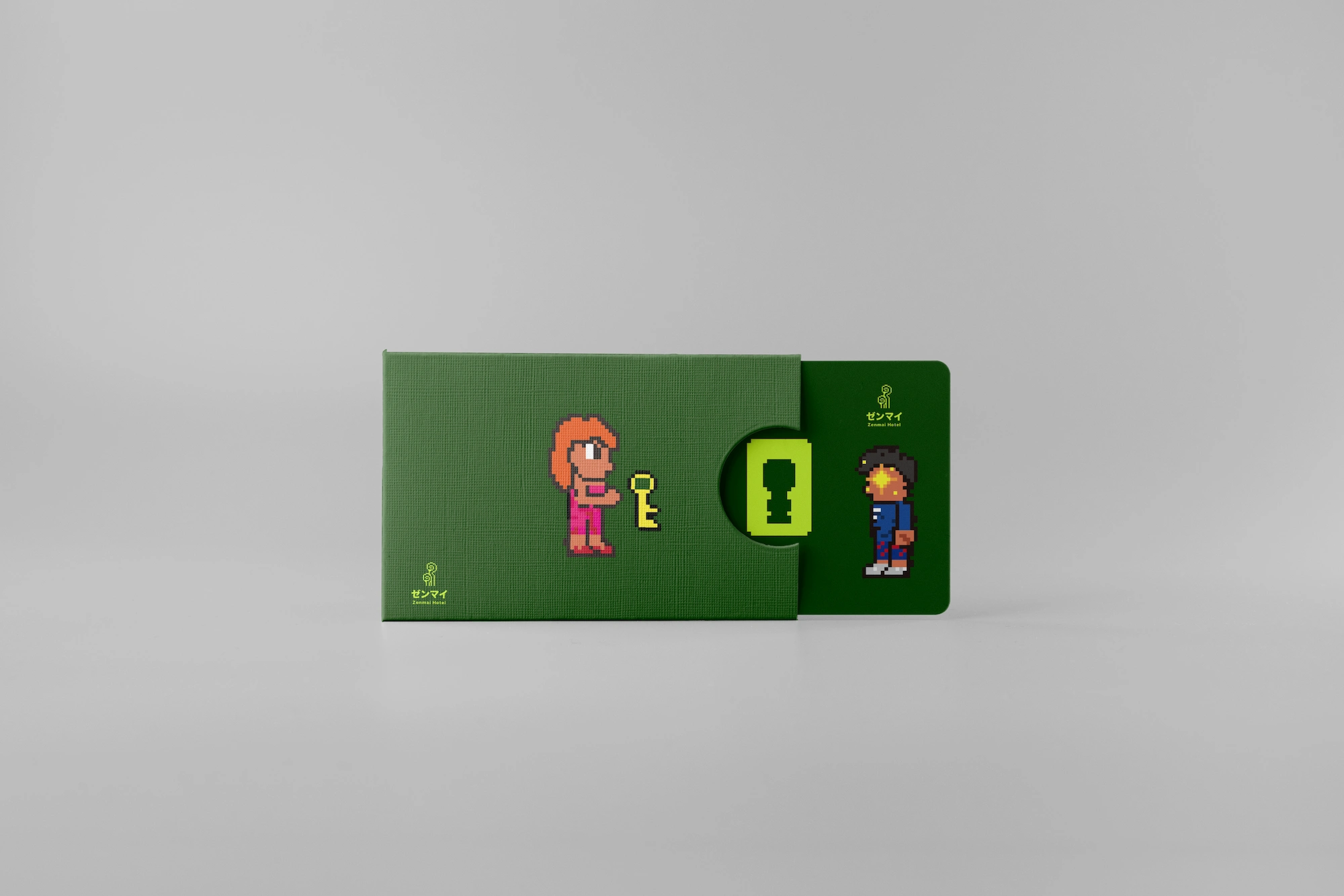
Spirits
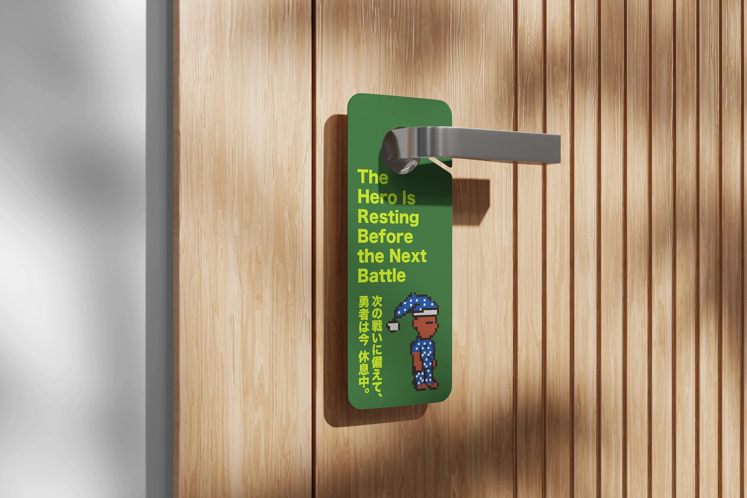
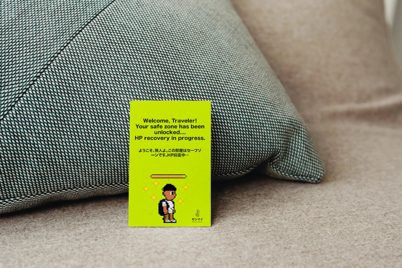
These pixel characters don’t explain how to use the hotel, they explain why you might love it. From signage to social posts, they act as quirky messengers that bring humour and warmth into the experience.
System
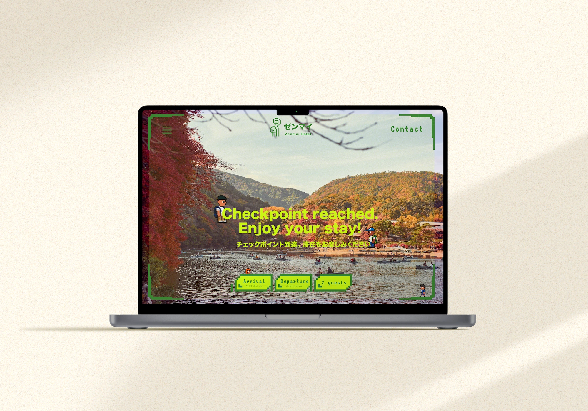
The brand extends naturally into screens— where pixel characters lead, icons clarify, and motion breathes life into each interaction. Every page is designed with familiarity and charm, balancing traditional calm with a digital spark. It’s a virtual Kyoto that invites exploration, one tap at a time.
Like this project
Posted Mar 13, 2026
Brand identity for a concept Kyoto hotel. Logo, iconography, wayfinding, packaging, and digital UI built around pixel art and Japanese calm.
Likes
0
Views
2
Timeline
Jan 13, 2024 - Aug 13, 2024