Routes for User — Flight Booking UX Redesign
CHENWEI FANG
Challenge
As flight booking becomes increasingly digitised, users are often left navigating complex, high-stakes decisions with limited clarity.
Between fluctuating prices, unfamiliar fee structures, and dense interfaces, booking a flight can feel more like risk management than planning a journey.
This project set out to explore those frictions and ultimately design a booking flow that feels seamless, empowering, and trustworthy from start to finish.
Reaserch
To explore what makes flight booking frustrating, I assessed 7 airline websites, surveyed 50 users, and conducted usability tests.
The findings revealed recurring friction points:
Misleading pricing — he homepage highlighted the lowest fare, but switching to the chosen travel date revealed higher prices tied to different days, creating confusion and disappointment.
Hidden fees — add-on charges appeared only at later stages, making users feel misled.
Disjointed navigation — users often had to backtrack across multiple pages to confirm flight and cost details.
While most users eventually completed their bookings, many did so with hesitation and reduced trust, signalling deeper gaps in clarity and confidence.
Analysis
I synthesised the findings through an affinity diagram and customer journey map, aligning behavioural feedback with booking stages.
Key insights included:
Pricing and upsell pages triggered the highest hesitation, with users second-guessing whether totals were accurate.
Seat selection and add-on services created emotional drop-off due to inconsistent layouts and last-minute cost increases.
These patterns defined where design needed to restore trust, streamline flows, and provide transparency, laying the foundation for design interventions.
Design
Research insights drove three key design decisions:
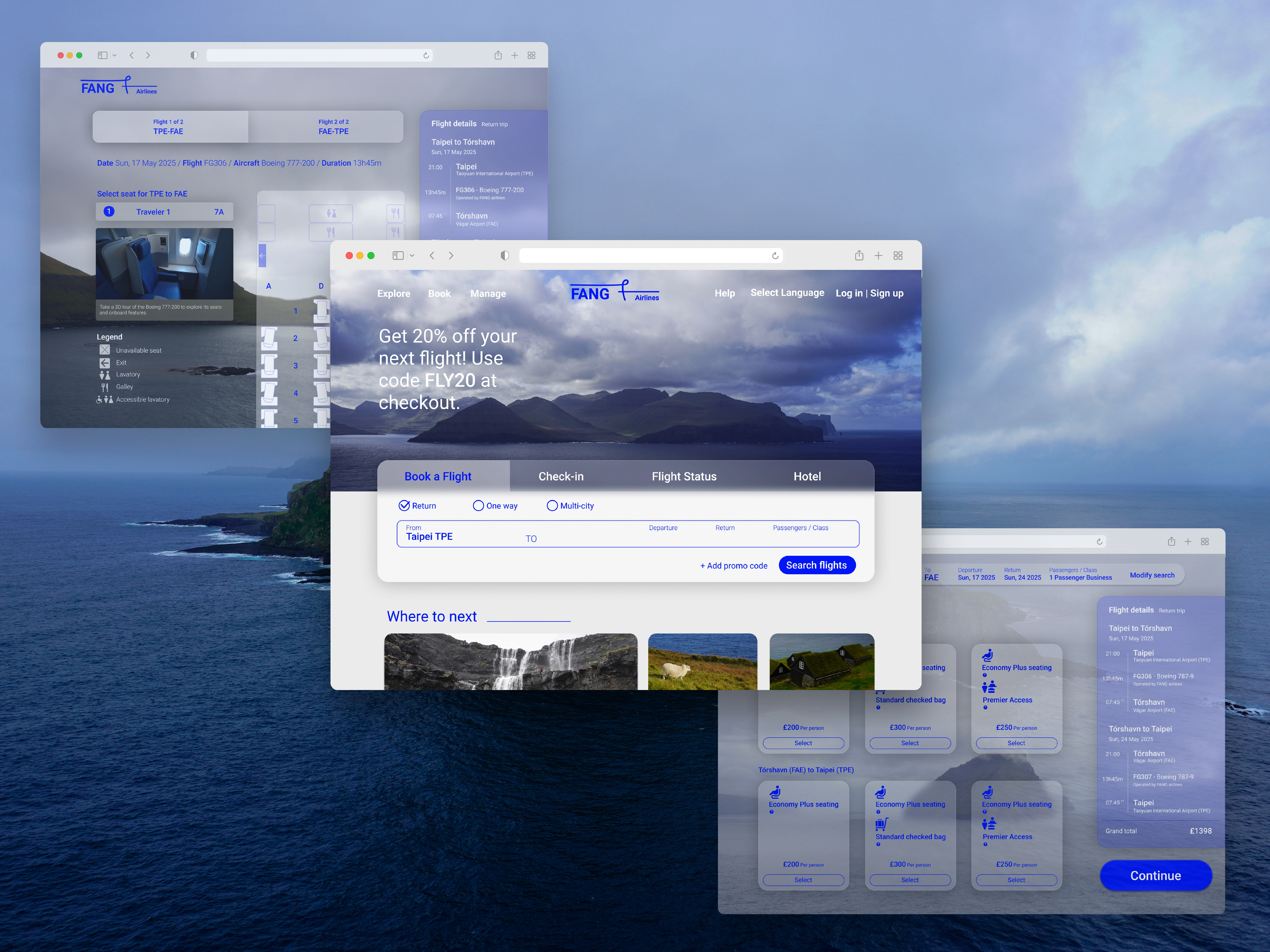
Persistent booking context — flight details and fare remained visible in a right-hand summary panel from fare selection through checkout, reassuring users they were always on the correct flight and price.
Clearer prioritisation of key information — enlarged typography for fares and departure times highlighted the details passengers cared about most, reducing misclicks and uncertainty.
Final confirmation step — before payment, users encountered one last review screen to verify flight details and costs, easing hesitation about moving into the payment stage.
Each intervention directly addressed specific friction points from research, transforming hesitation into confidence through strategic information architecture and visual hierarchy.
Prototyping
The interactive prototype demonstrates these design principles across 7 key screens, from search results through final payment. Notable features include the persistent flight details panel and contextual micro-interactions that guide users through complex decisions. Built to mirror real booking scenarios, the prototype validates how strategic design choices collectively create a more trustworthy experience.
Like this project
Posted Mar 13, 2026
From user research to high-fidelity prototype. Redesigning flight booking to reduce friction and restore trust at every step.
Likes
0
Views
3
Timeline
Dec 15, 2024 - Jul 13, 2025