FAJR — Brand Identity & Cross-Platform Banking UI
CHENWEI FANG
Design System
The design system focused on colour, typography, and icons to ensure clarity and consistency across devices.
Colours: A warm palette with tested contrast ratios to meet accessibility standards.
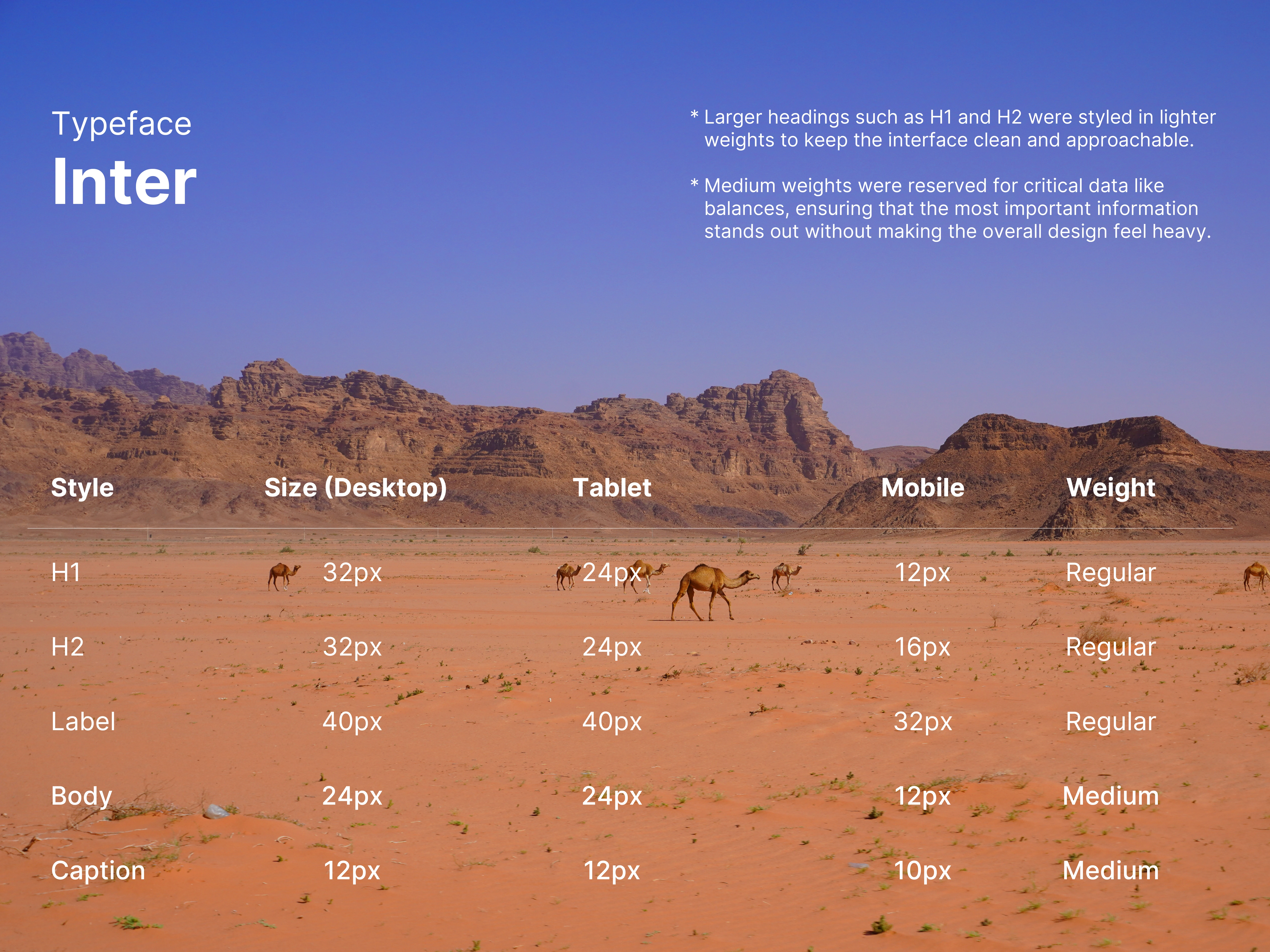
Typography: A clear hierarchy built with Inter, using varying sizes and weights adapted for desktop, tablet, and mobile.
Icons: Simplified geometric icons reduced to a single colour for visual coherence.
Visual & Intetaction Highlights
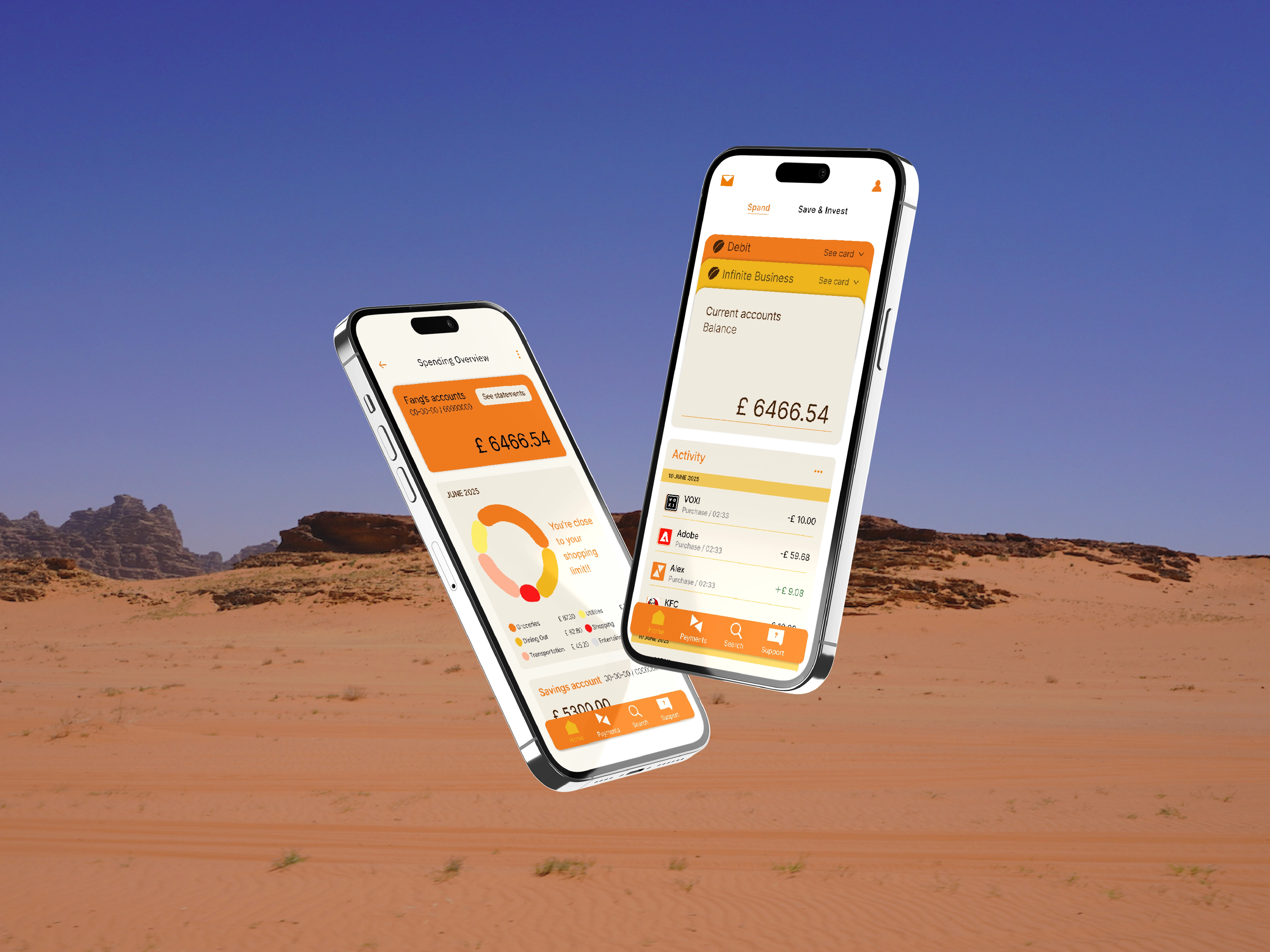
Key interface elements were refined with subtle motion and clear visual cues. From animated charts and progress indicators to simplified geometric icons, these details enhance clarity and create a cohesive, engaging banking experience.
Outcome
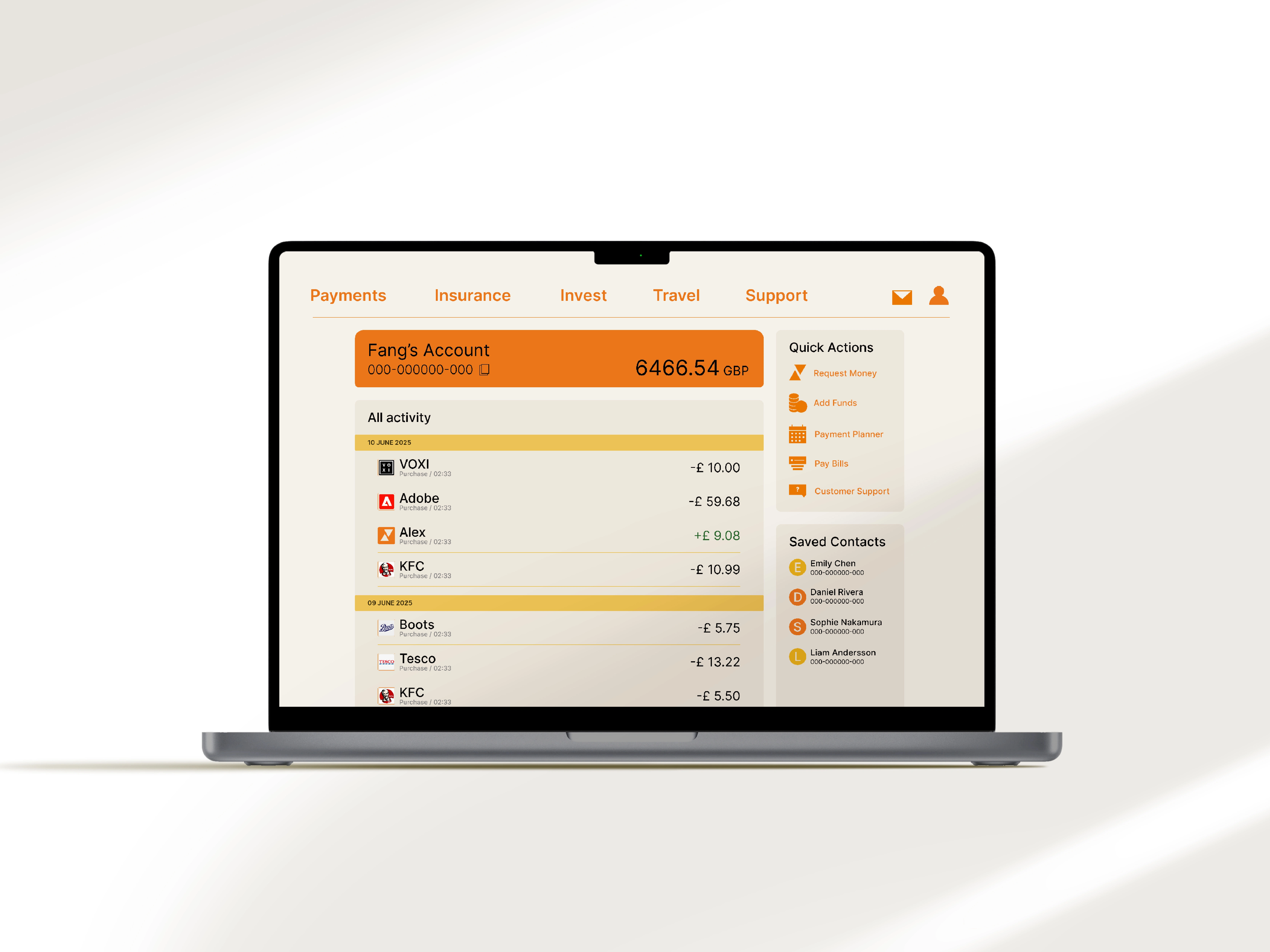
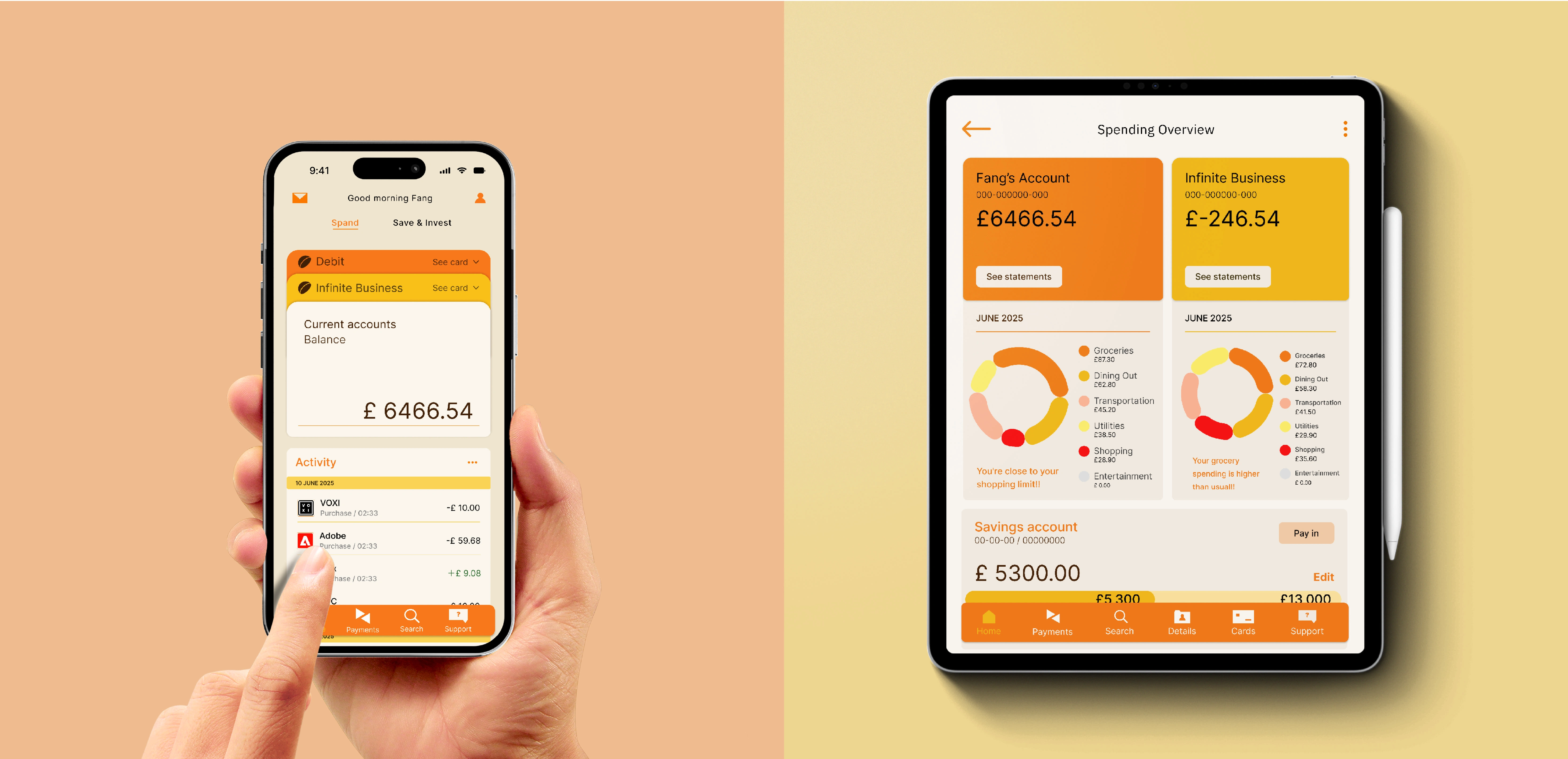
The final designs bring together three key banking functions: an account overview homepage for quick balance checks, a transaction history page for tracking spending activity, and a spending analysis dashboard with visual insights. These screens illustrate how the interface supports everyday banking needs with clarity and consistency.
Like this project
Posted Mar 13, 2026
A concept digital banking platform rooted in Arab cultural identity. Brand system, design language, and cross-platform UI across mobile, tablet, and desktop.
Likes
0
Views
2
Timeline
Jun 13, 2025 - Nov 13, 2025