Klari5 Skincare > Branding, Packaging, advertising, catalog
Singapore
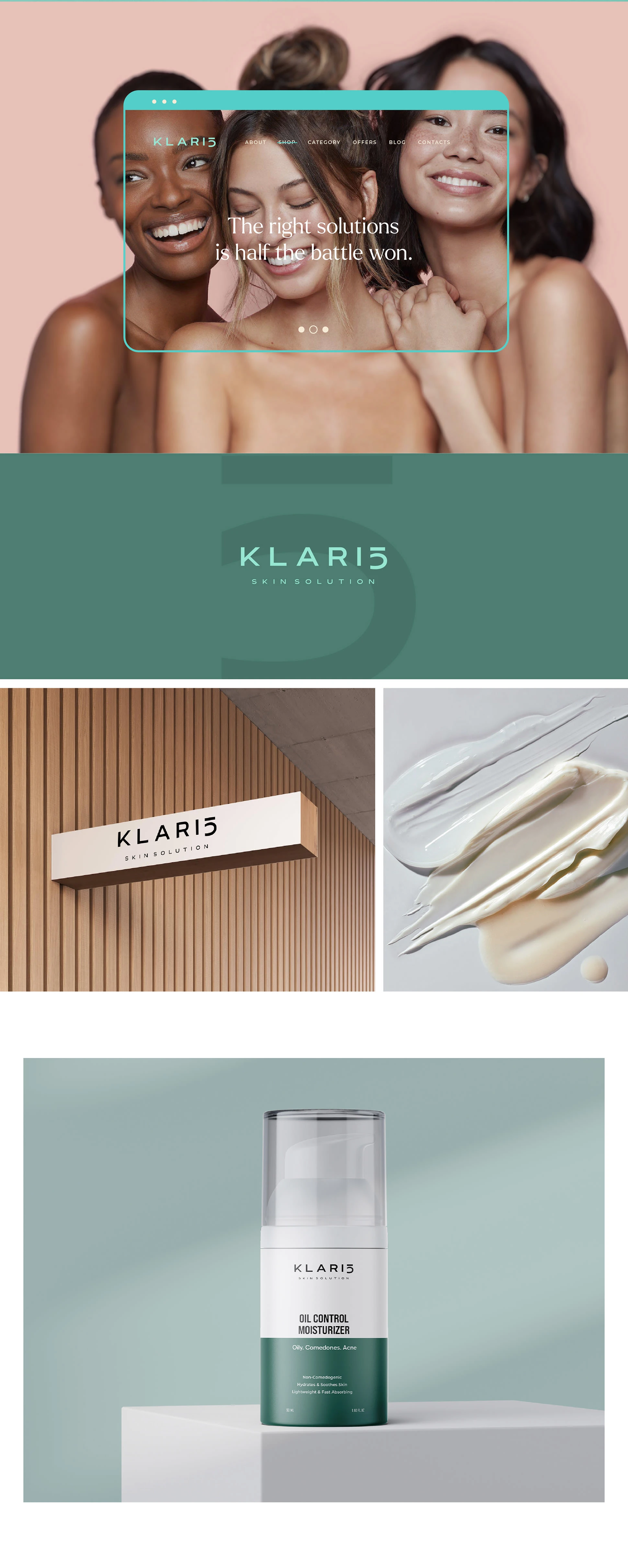
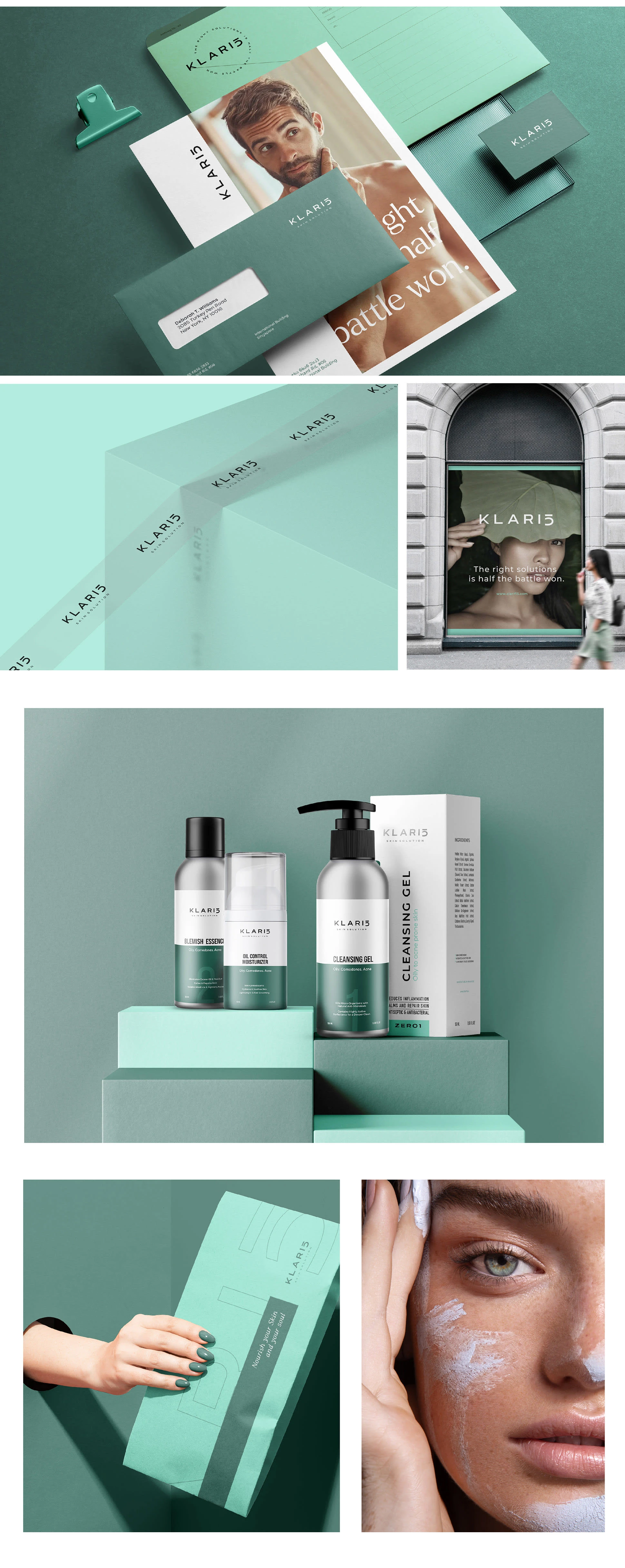
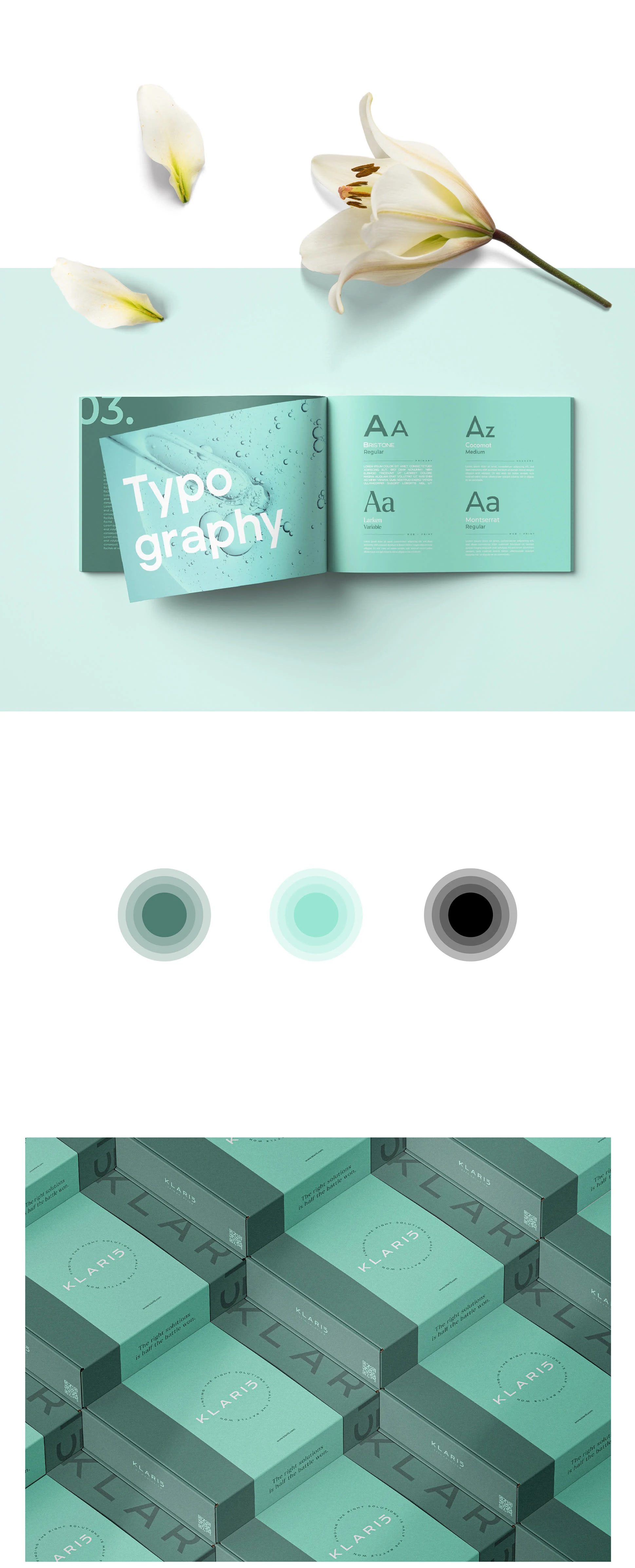
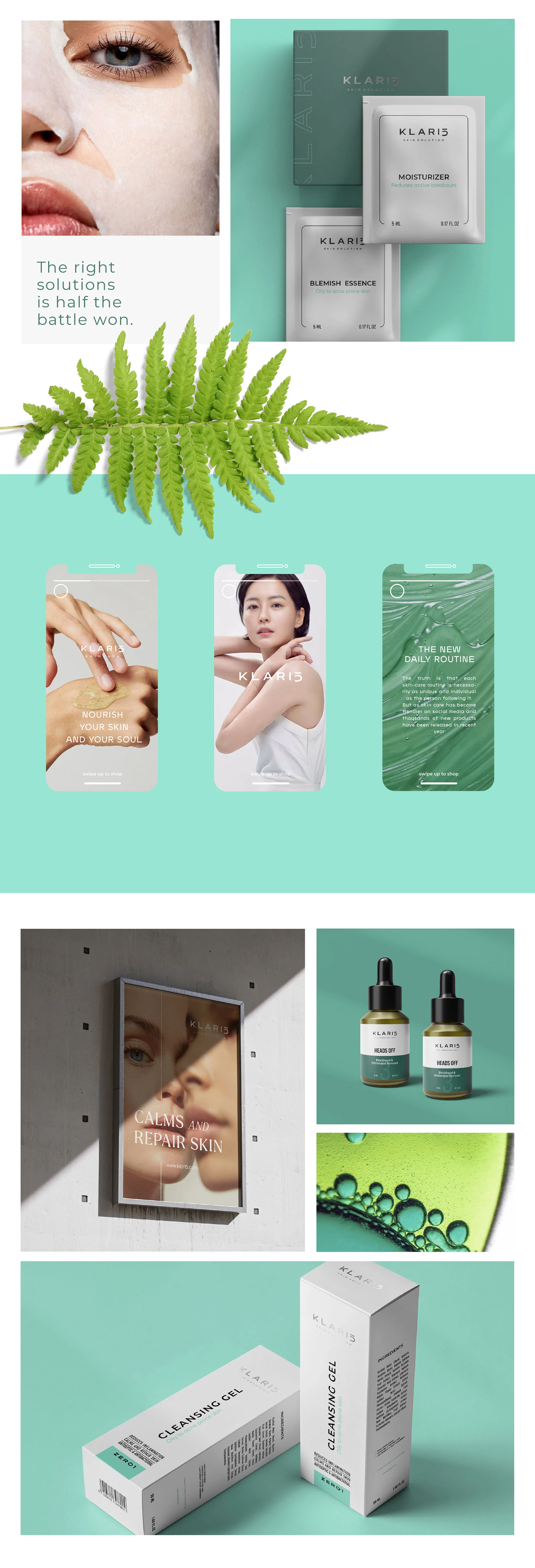
Klari5 is a brand designed to appeal to a younger audience, but even though the direction is much younger, we still want to be a bit cleaner, more modern, and not too loud. In terms of colors, we do not have any restrictions. Still, we are trying to communicate that we are marrying medical approaches with botanical solutions and focusing on troubled skin. We have a free hand with the color palette, but it can not be too gaudy or overbearing. With that said, I created a cosmetic packaging design that's both clean and minimalist, using modern font infused with a refreshing and unique color pallet. Just fitting for a cosmetic brand.
The long-term goal of our company is to offer a complete solution for people with skin problems. We also want to stand out from the watered-down skincare market in Singapore and be the expert solution for all people with skin problems.

Original project: www.giacomourgeghe.com
Like this project
Posted Oct 14, 2023
Based in Singapore, Klari5 is a skincare brand that offers expert solutions for individuals facing a range of skin issues.
