Brand Identity That Makes a DeFi Platform Feel Fast and Premium

MD Robin Islam


Flash.trade — A Brand Identity That Makes a DeFi Platform Feel Fast, Premium, and Unmistakable
Most crypto brands look the same: dark backgrounds, neon accents, a vaguely "techy" logo, and nothing you'd remember an hour later. For a Solana trading platform built to be genuinely fast, looking like everyone else wasn't an option.
So I led the brand identity for Flash.trade — the full system, from the logomark to the merch to the billboards. The goal: a brand that feels as fast and premium as the product, and is unmistakable in a category where everything blends together.
Full identity system Scope
Logo → UI → merch → OOH Applied everywhere
DeFi / Solana Industry
4-year partnership Relationship
Project:
Complete brand identity
My role:
Led brand & design
Client:
Flash.trade (a Solana perpetual-trading platform)
Context:
Part of a multi-year partnership
Boomdevs really felt like an extension of our own team. They understood what we were trying to build, and just made it happen. We've worked with a lot of teams before, but this collaboration stood out.
— Anas Khader, Co-Founder, Flash.trade
The challenge: stand out without losing trust
Trading brands have a hard balance to strike. Lean too playful and you look untrustworthy with people's money. Lean too corporate and you're invisible and forgettable. And in crypto specifically, almost everyone defaults to the same dark-neon template.
Flash.trade needed to feel three things at once: fast (speed is the product's whole promise), premium (people trade real money here), and distinctive (recognizable at a glance, in a crowded market). Holding all three in one system — and keeping it consistent from a trading dashboard to a water bottle — was the real design problem.
The logo: speed, built into the mark
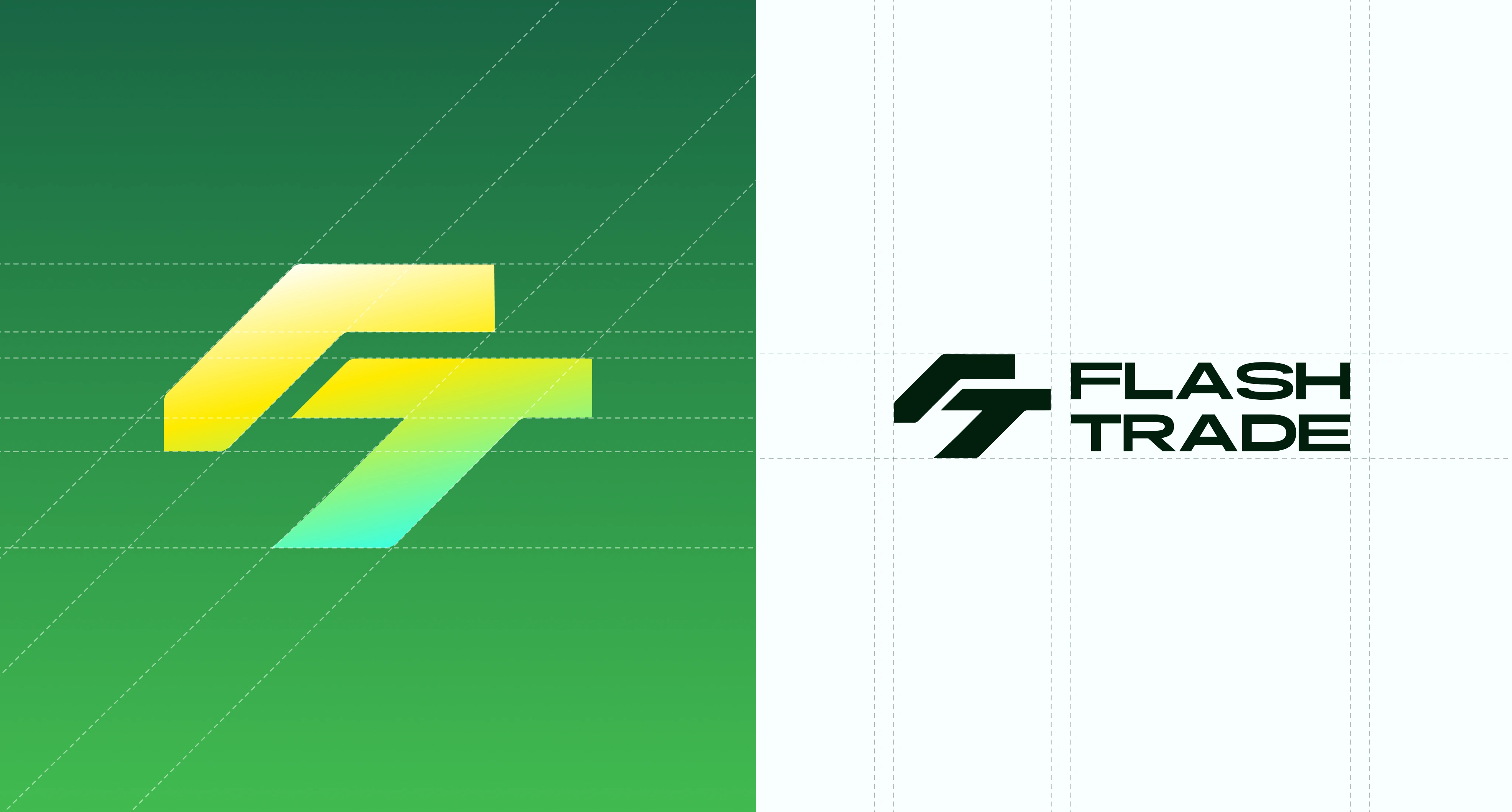
The FT monogram is built from forward-leaning, angular forms — it reads as motion, like the mark itself is moving fast. We constructed it on a strict grid so it holds up at any size, and designed it to work two ways: a vivid gradient version for expressive moments, and a solid single-color version for UI and small applications where clarity matters most. One mark, two registers — energetic when it needs to be, precise when it has to be.
The color system: energy with restraint
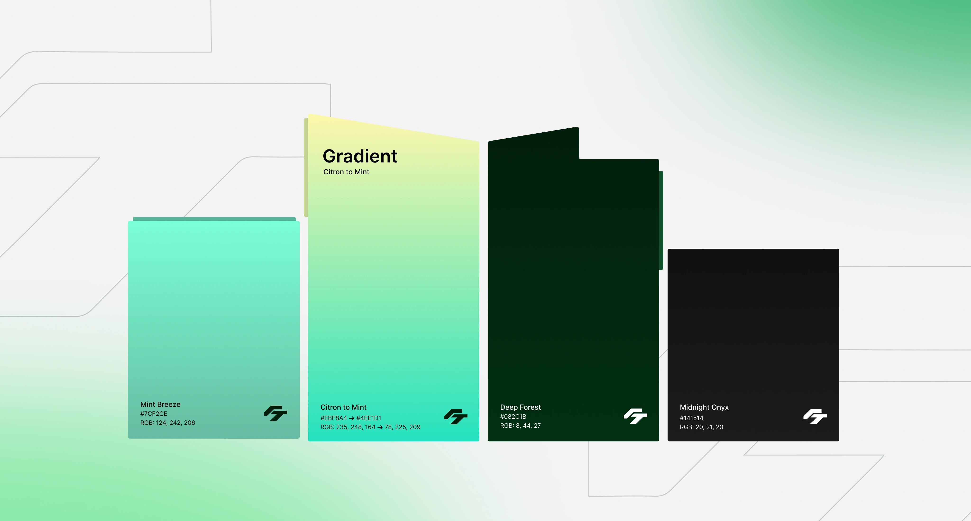
Color is where the "fast but premium" balance was won or lost. The signature move is the Citron-to-Mint gradient (
#EBF8A4 → #4EE1D1) — bright, electric, full of energy, and genuinely uncommon in a category drowning in the same blues and purples. That's the "fast."But energy alone reads as cheap. So the gradient is anchored by Deep Forest (
#082C1B) and Midnight Onyx (#141514) — rich, dark, serious tones that give the brand weight and make it feel trustworthy with money. The bright gradient pops because it sits against that darkness. Energy and restraint, deliberately balanced.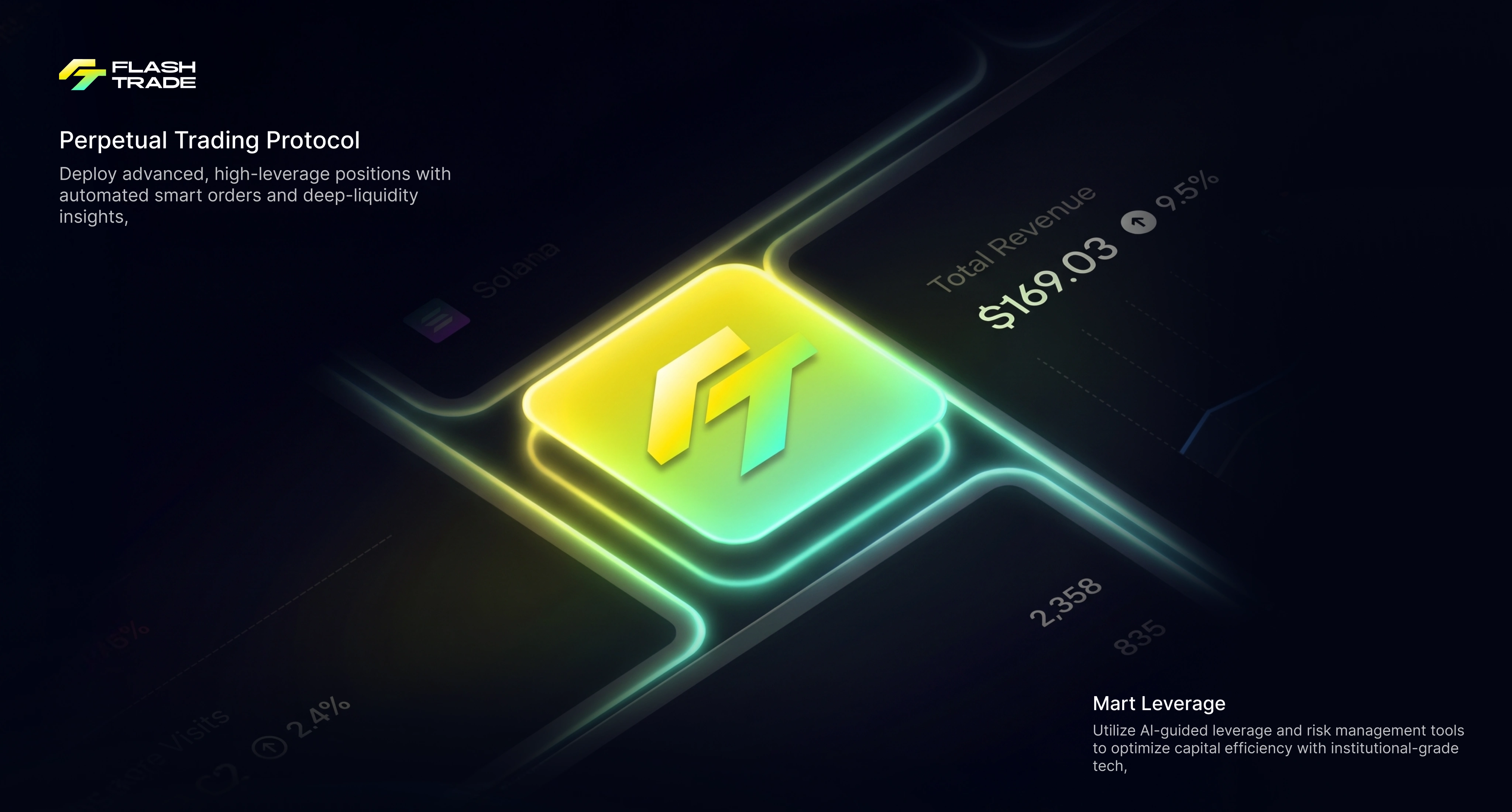
One identity, every surface
A brand only works if it holds together everywhere — so we applied the system across the whole experience, not just a logo file.
In the product, the identity drives the interface — the gradient logo as a glowing focal point, the dark palette letting data and trading UI breathe without visual noise.
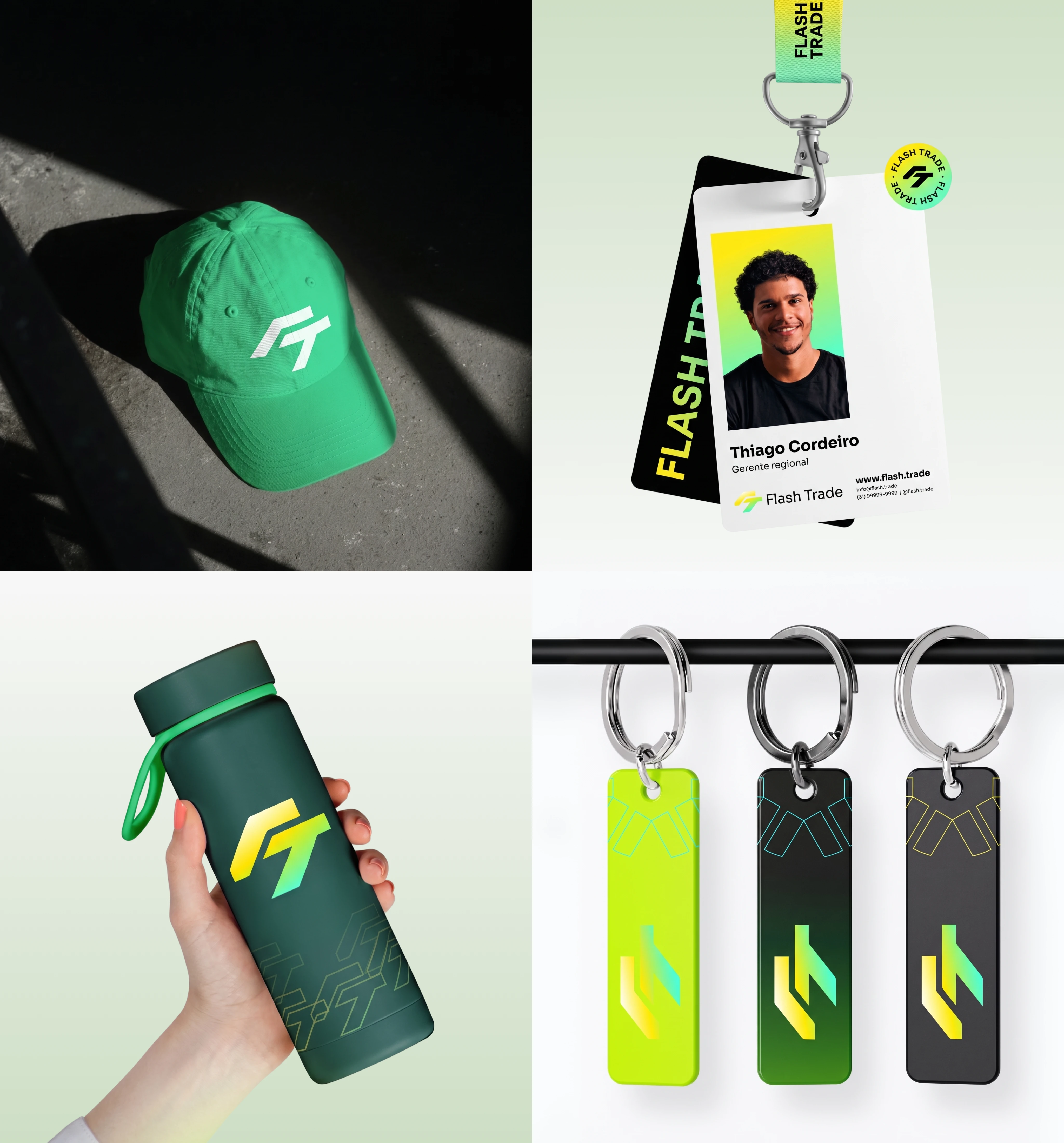
In the physical world, it translates to merch and brand collateral — caps, bottles, lanyards, ID badges, keychains across three colorways. Each one unmistakably Flash.trade, each one something you'd actually want to carry.
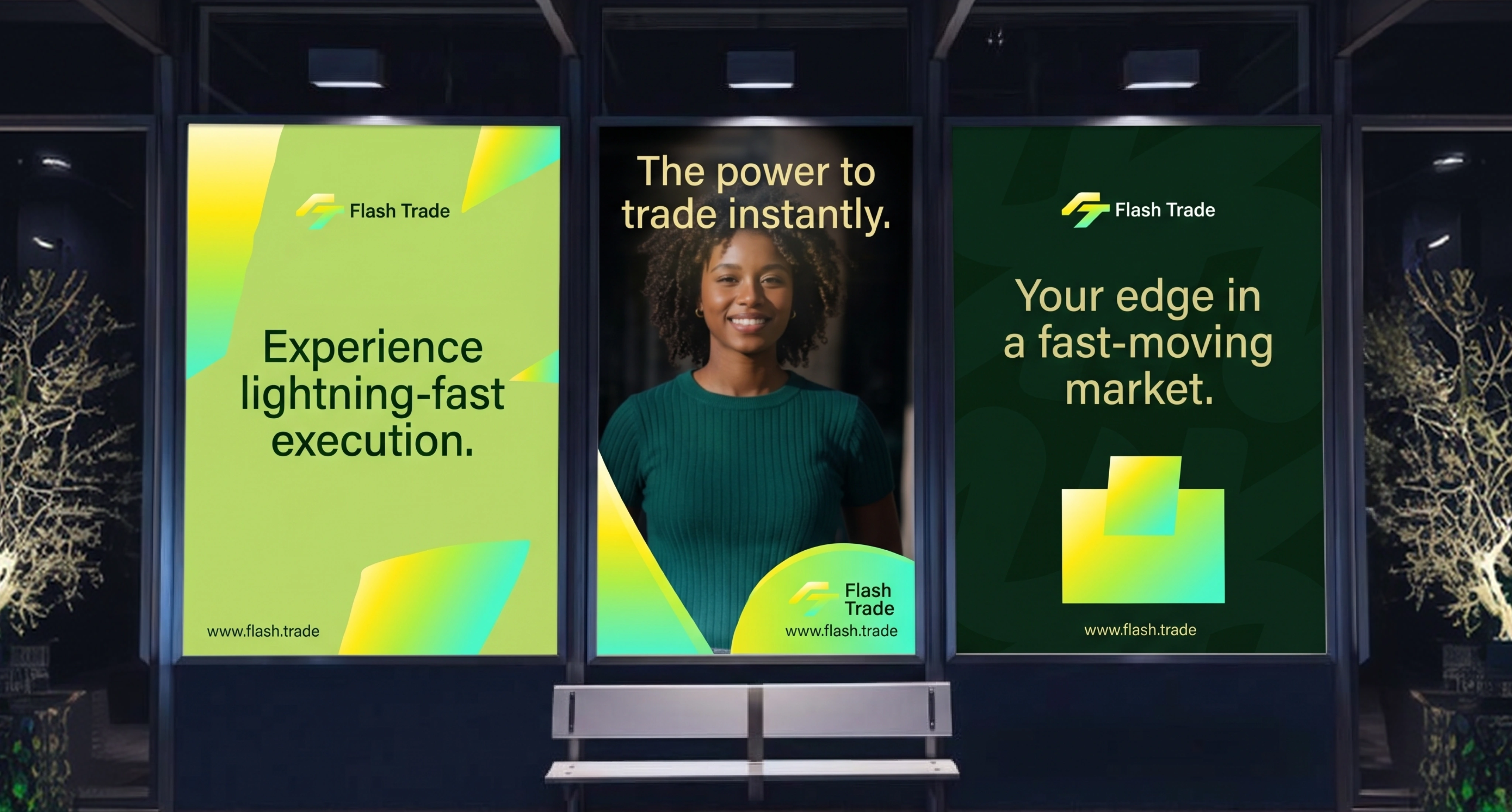
And out in the world, it scales to out-of-home advertising — bus-shelter campaigns where the brand has to stop a stranger in three seconds. The bright gradient does the attention-grabbing; the tight typography and messaging ("lightning-fast execution," "the power to trade instantly") do the convincing.
Where it got hard
The hardest part wasn't any single asset — it was consistency across wildly different contexts. A color system that looks electric on a billboard can look garish in a data-dense trading UI. A logo that works big on a hero can disappear on a keychain. Making one identity feel right on a screen full of live numbers and on a hat and on a 6-foot backlit ad meant designing the system with every one of those contexts in mind from the start — deciding where the gradient leads and where the dark tones take over, so the brand always feels like itself no matter where it shows up. That discipline is what separates a logo from a brand.
The outcome
A complete, cohesive brand identity for Flash.trade: a distinctive logo system, a color language that's energetic and premium at once, and a system that holds together from the trading dashboard to merch to out-of-home. In a category where most brands blur together, Flash.trade looks like itself — fast, confident, and unmistakable.
And it's part of a four-year partnership: the same relationship where I led the platform's development, extended into owning how the whole brand looks and feels.
In a market where every brand looks the same, the real win isn't a prettier logo — it's being the one people actually remember.
Like this project
Posted Oct 2, 2026
Complete brand identity for Flash.trade, a Solana DeFi platform — logo, color system, product UI, merch & OOH. Fast, premium, unmistakable.