Kelo — Wine Brand Identity & Packaging Design
Giacomo Urgeghe
18:54
Overview Kelo — Wine Brand Identity, Web Design & Packaging
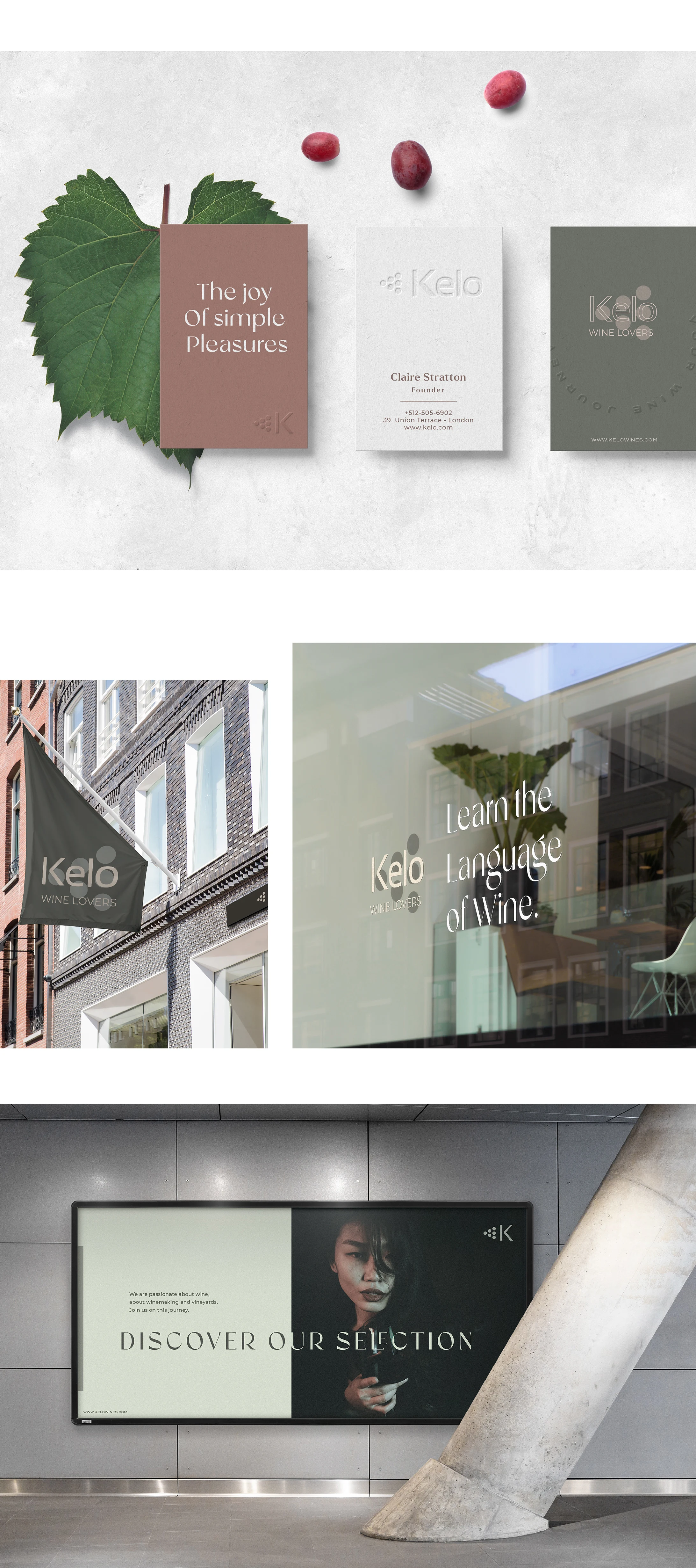
A wine platform built for women who know what they're drinking. Kelo is a blog, editorial destination, and e-commerce store covering wine in all its complexity — reviews, vineyard locations, winemaker interviews, and a curated shop. The project spanned the full brand system: logo, website UI, bottle packaging, catalog, and social media.
The Problem Wine content aimed at women too often defaults to one of two registers: oversimplified and patronizing, or aggressively gender-neutral in a way that ignores its audience entirely. Kelo needed to speak to a cultured, high-spending female readership with genuine sophistication — a visual language that felt as considered as the subject matter, without the stiffness of traditional wine branding or the noise of lifestyle media.
The Solution The palette was drawn directly from the vineyard itself — pale bud greens, dusty mids, and the deep warm browns of grape shoots at harvest. Colors with real provenance, applied with restraint. The visual system was built to carry both editorial and commercial weight: soft enough for long-form reading, structured enough for e-commerce. Every touchpoint — bottle label, UI layout, catalog spread, social crop — was designed from the same source material, giving the brand a cohesion that feels organic rather than engineered.
The Result A wine brand that treats its audience as it should be treated — as people with taste, curiosity, and no patience for being talked down to. Kelo looks exactly like what it is: intelligent, beautiful, and completely at home in a well-stocked cellar.
Like this project
Posted Mar 25, 2026
Wine brand identity and packaging for a sophisticated female audience — vineyard-inspired palette, editorial aesthetics, blog, e-commerce, and label design.