Dowson Consulting | Corporate Consulting Brand Identity
Giacomo Urgeghe
Dowson Consulting is a strategic consulting firm based in the heart of New York City, operating in one of the most competitive corporate consulting markets in the world. In a landscape where many firms rely on similar positioning and generic visual identities, the challenge was to create a brand that could clearly communicate authority, trust, and a long-term vision, while standing out with elegance and modernity.
Challenge
To distinguish itself in an environment where most consulting firms adopt similar positioning and generic visual identities. The goal was to create a brand that conveys authority, trust, and long-term vision, without sacrificing a touch of modernity and refinement.
Approach
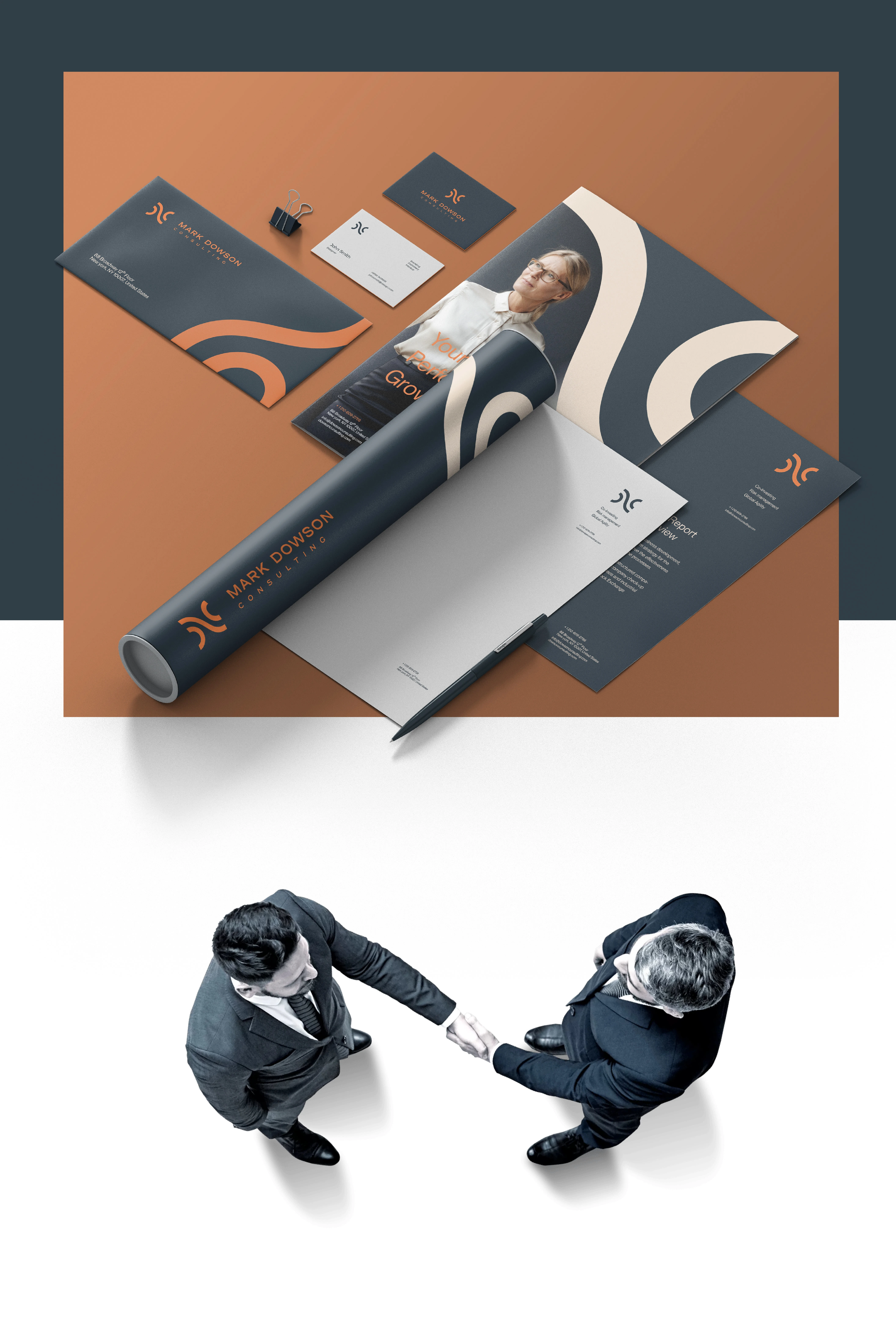
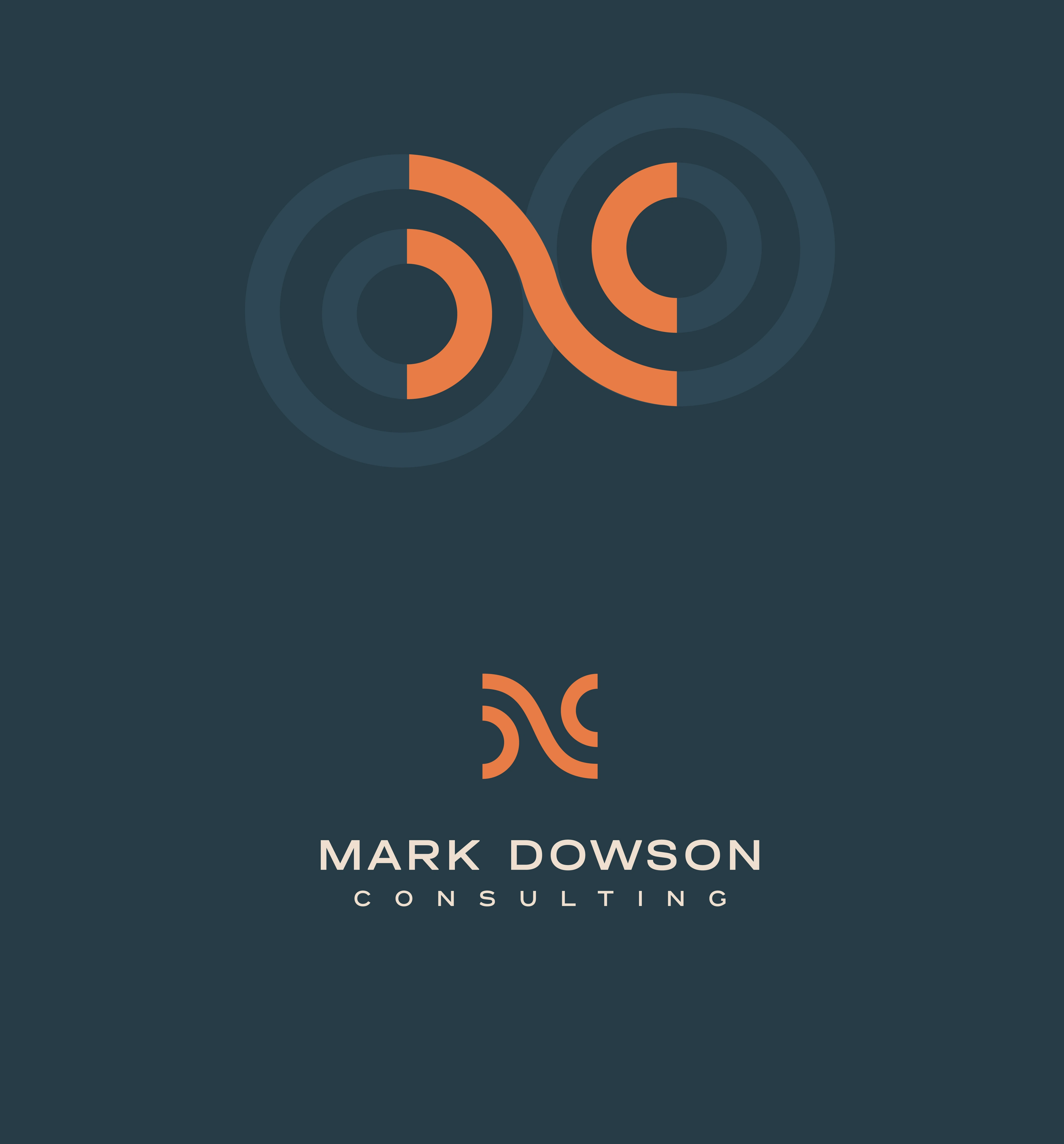
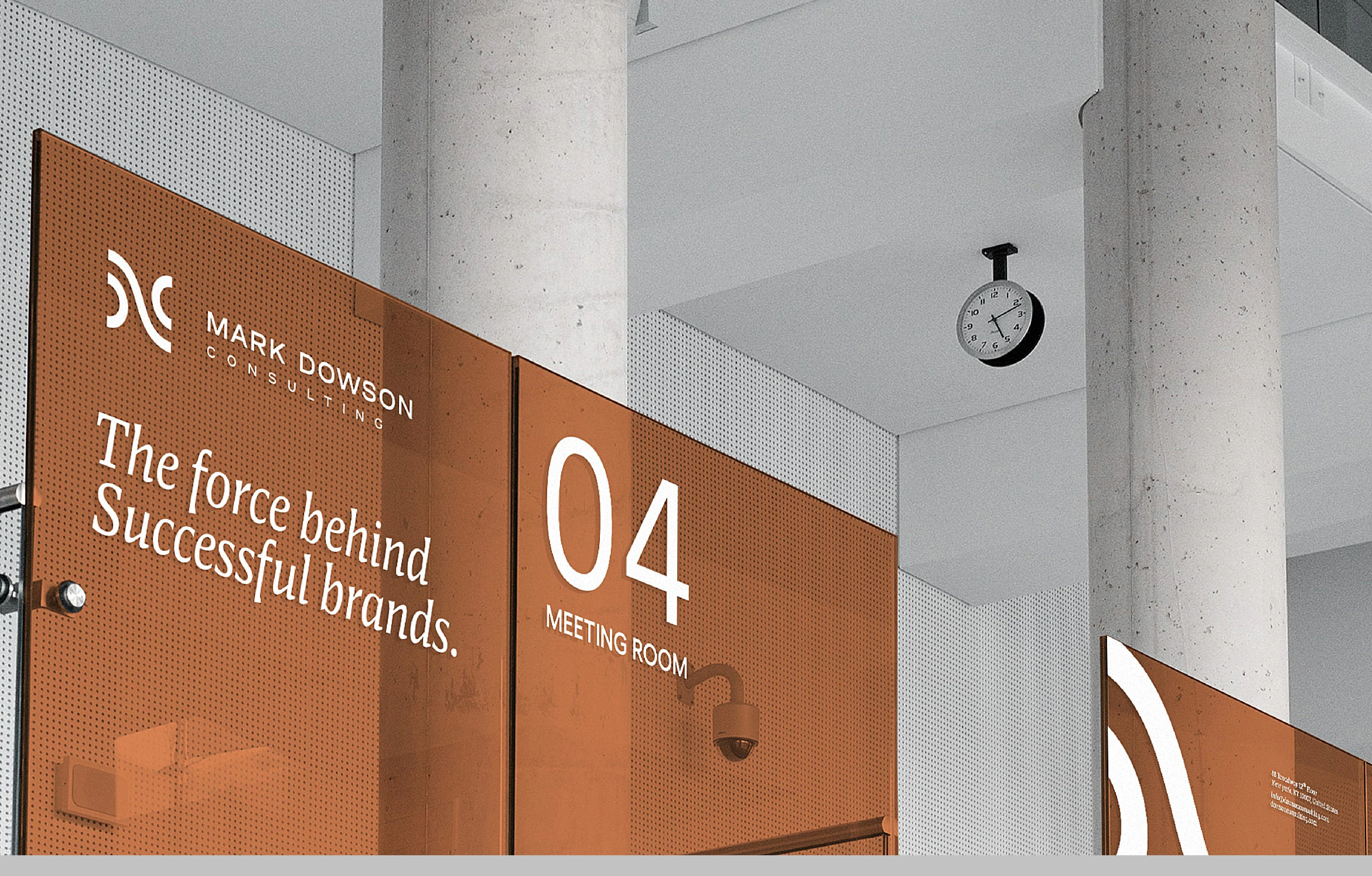
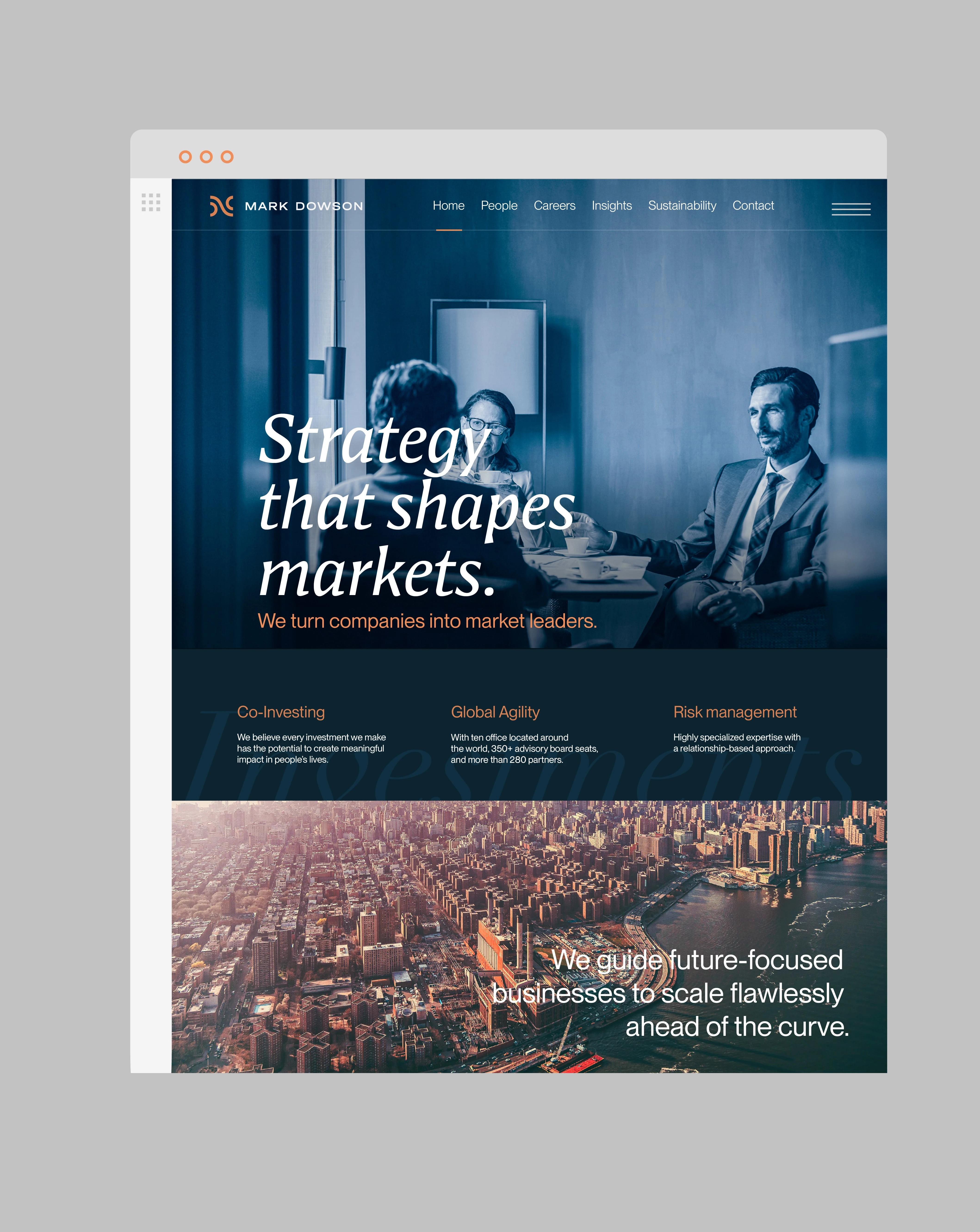
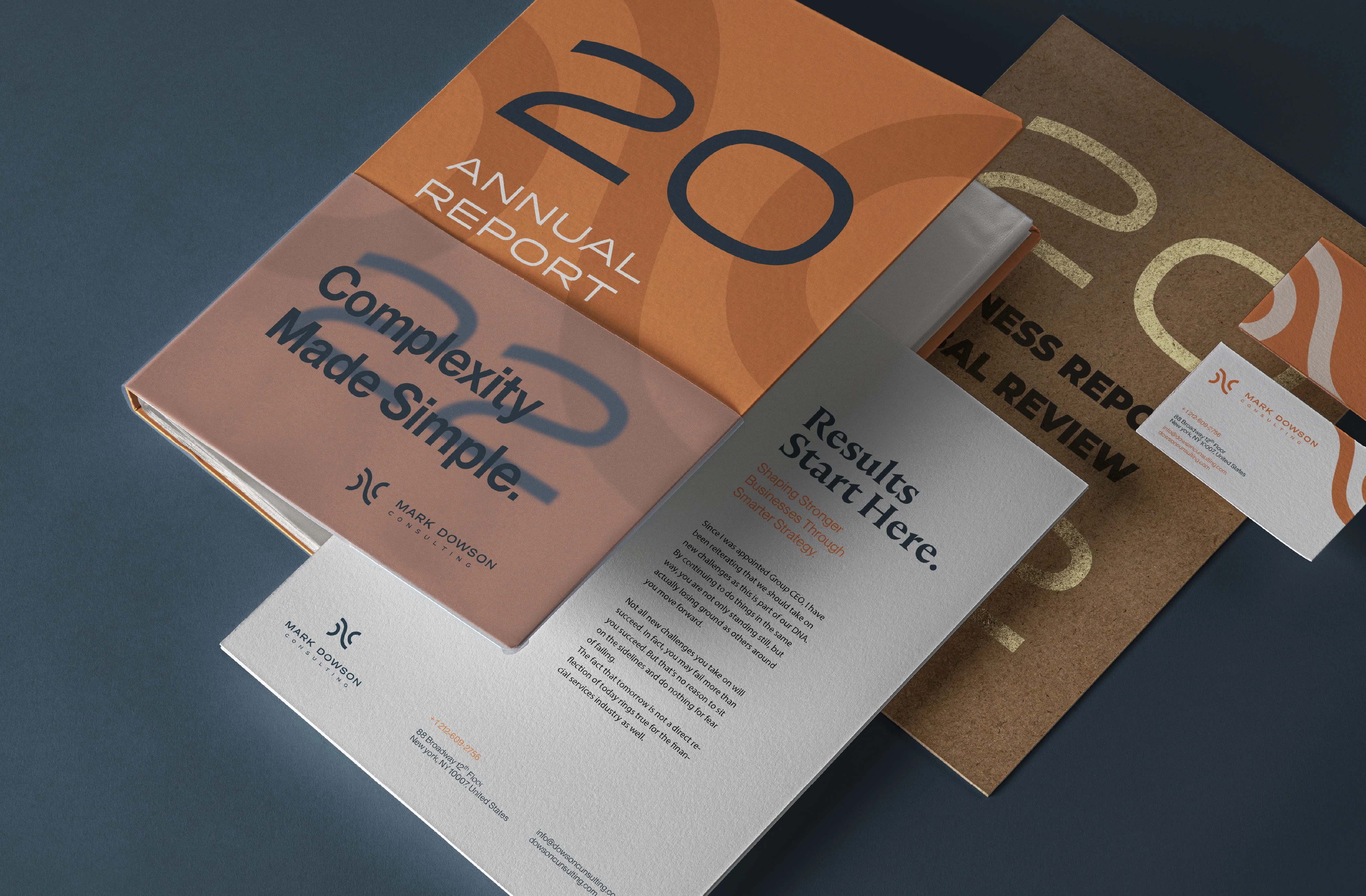
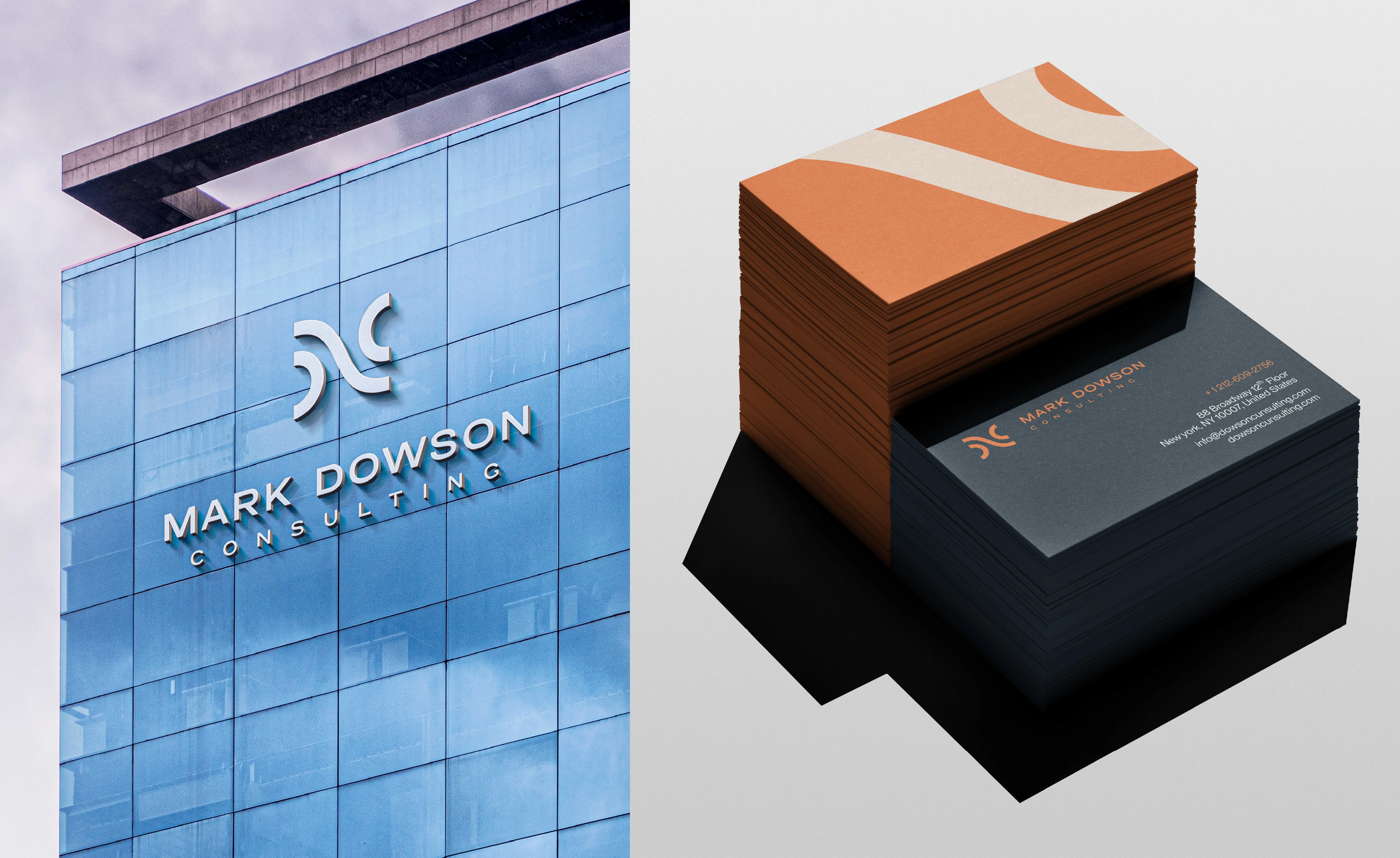
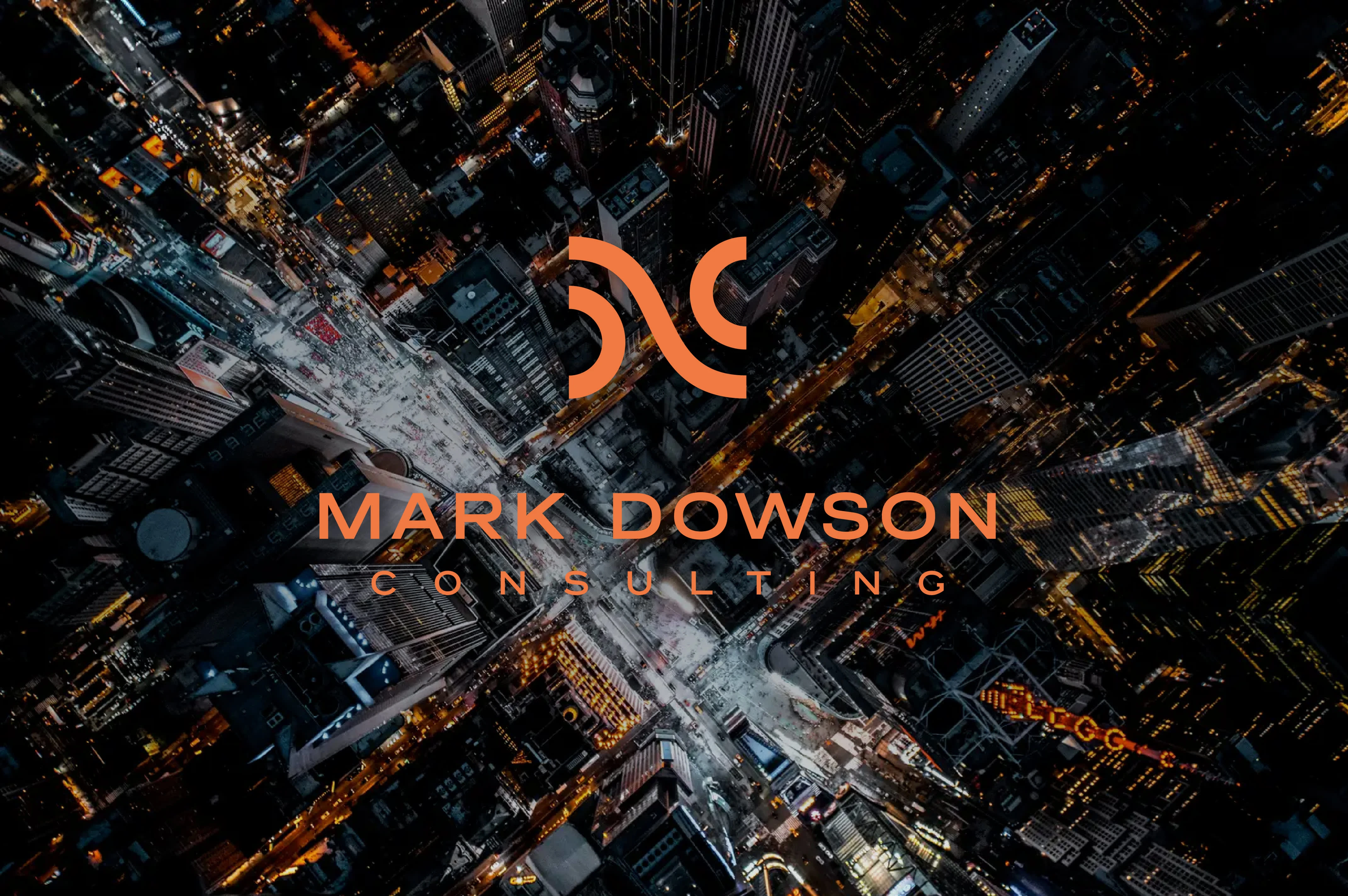
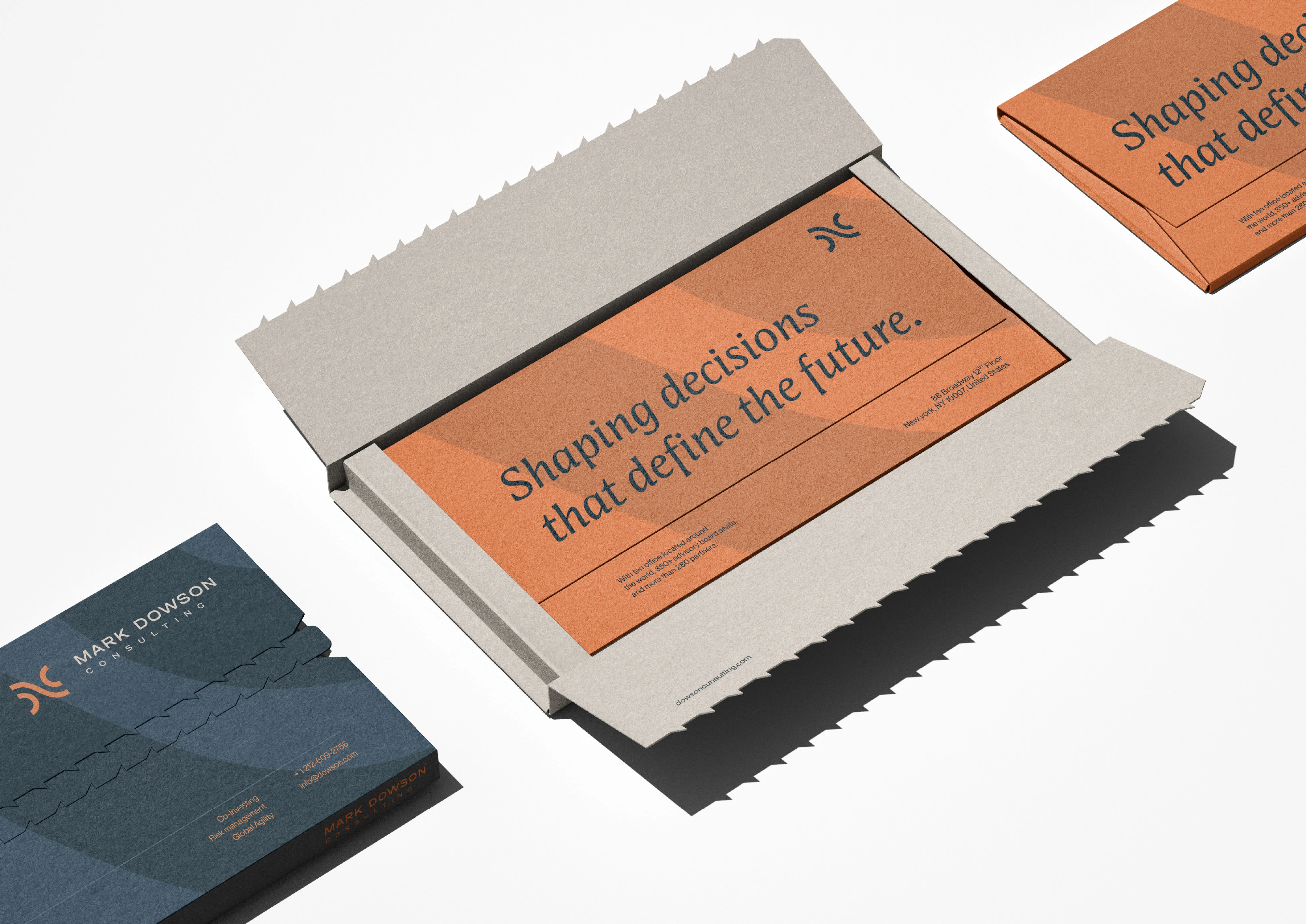
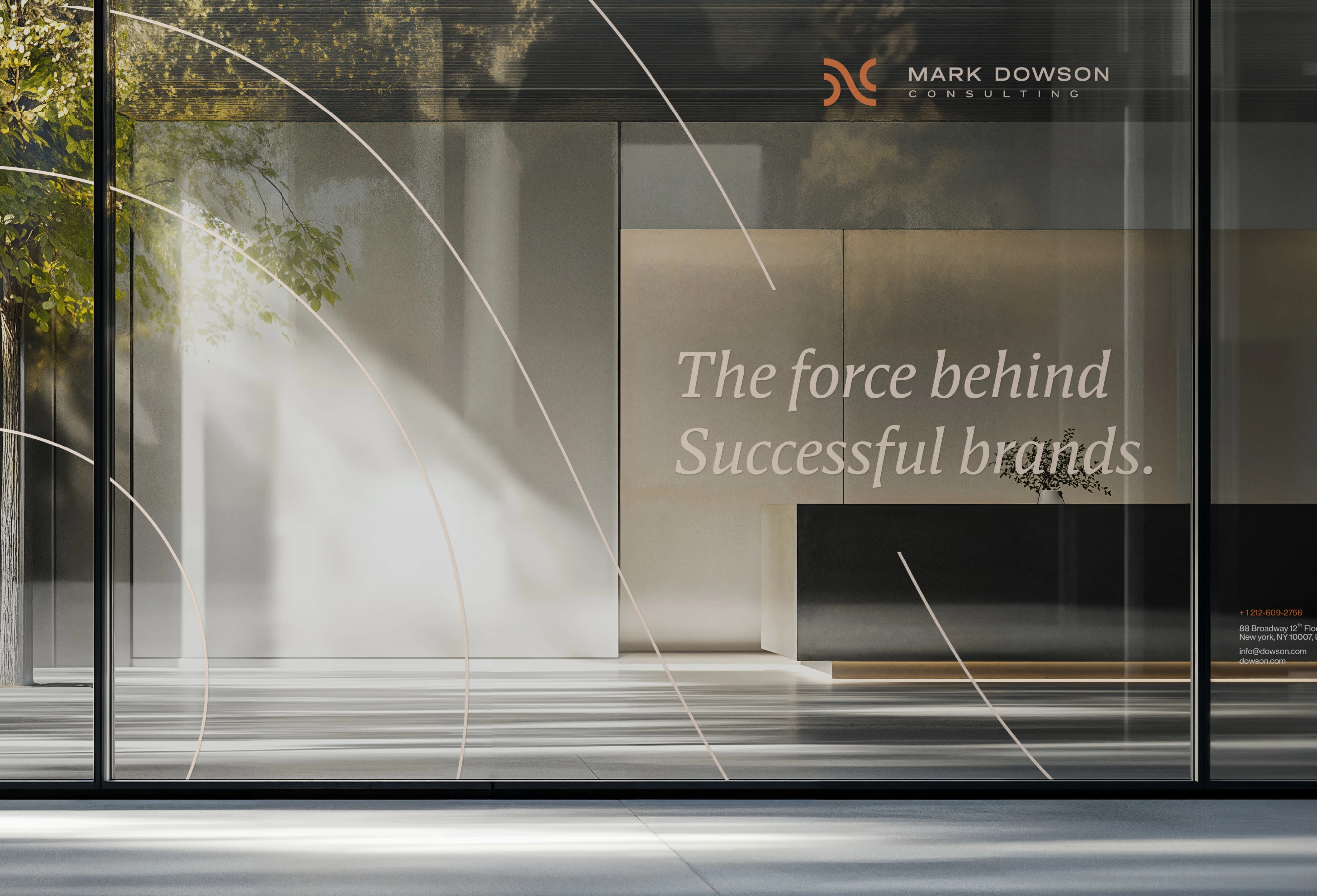
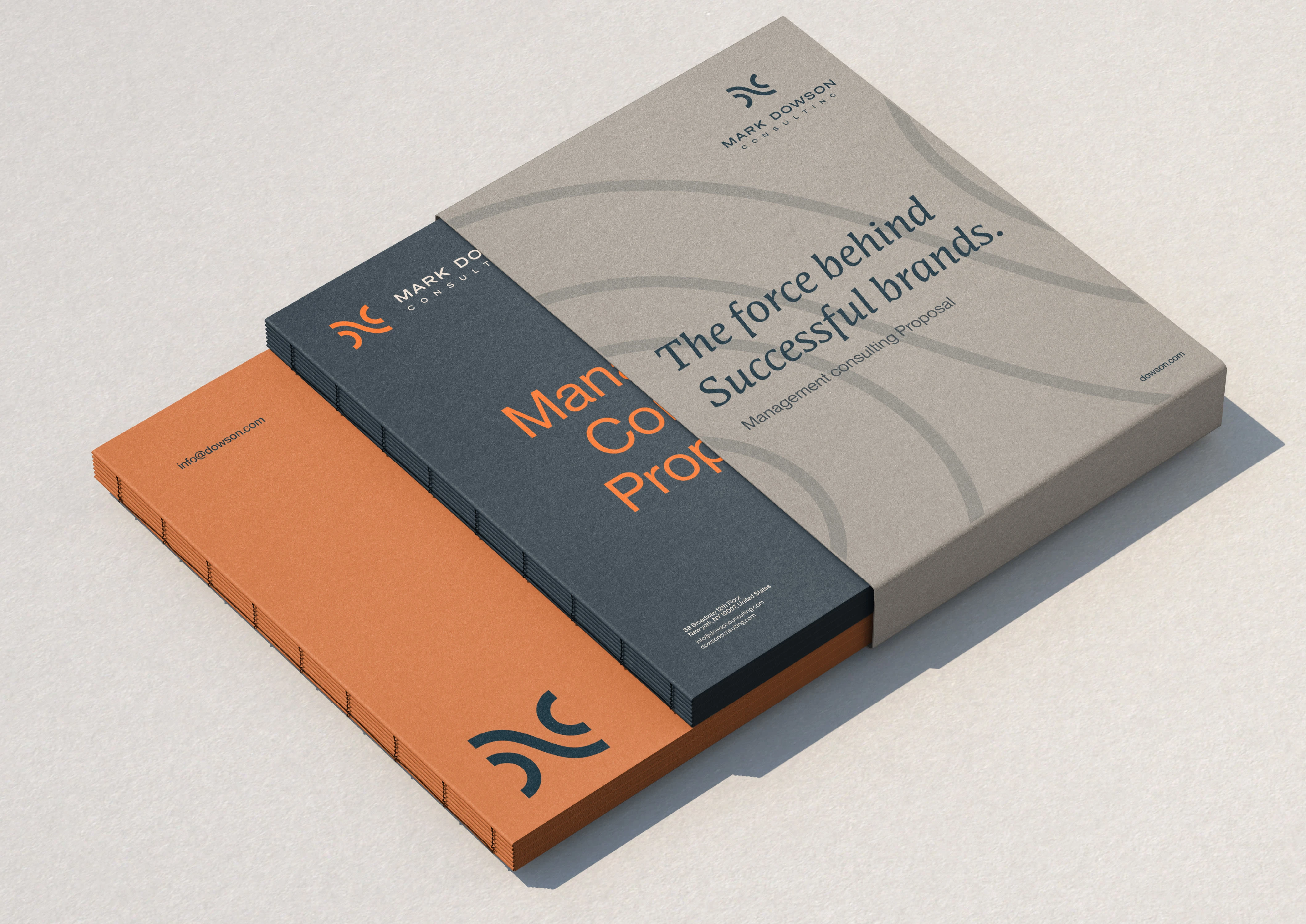
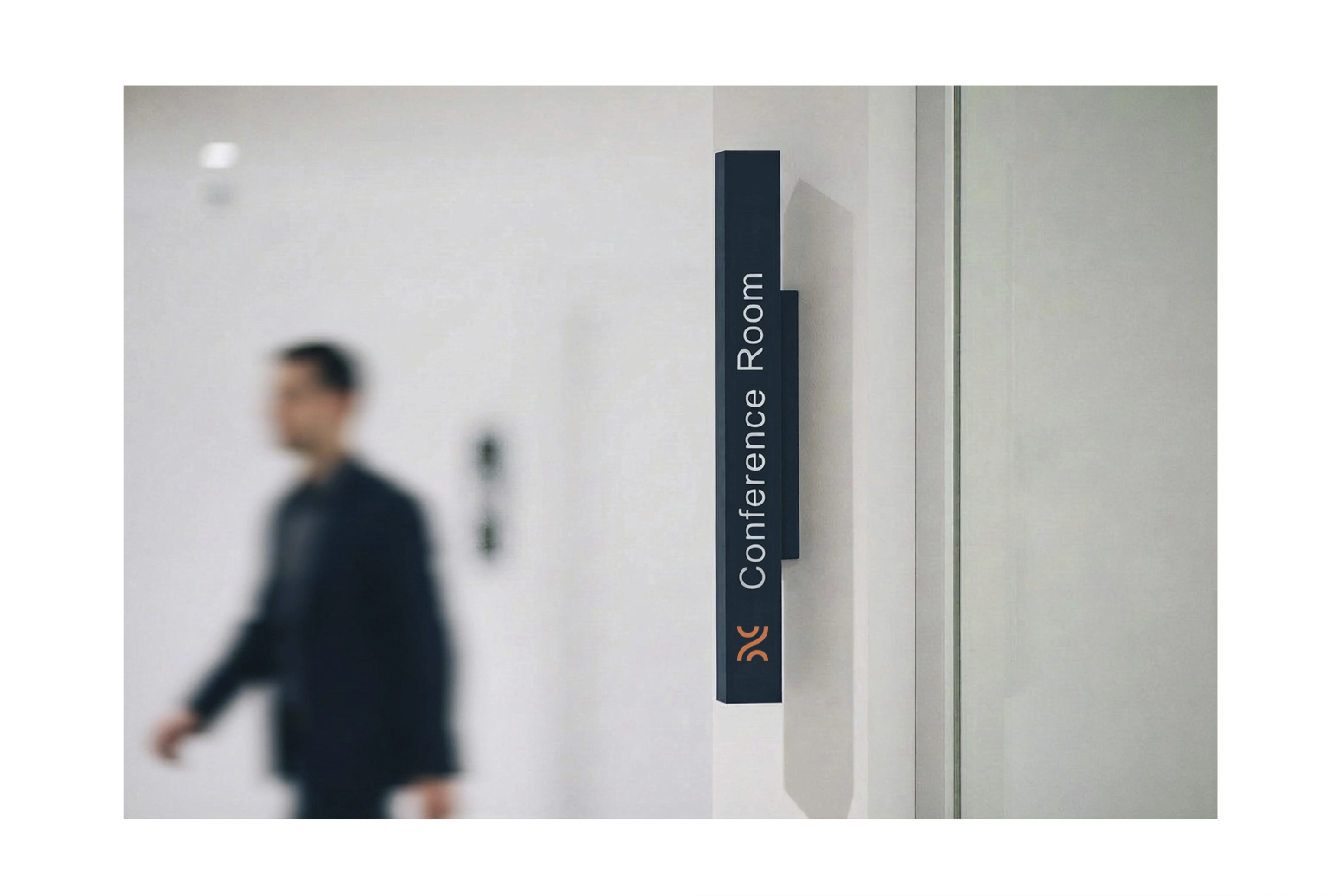
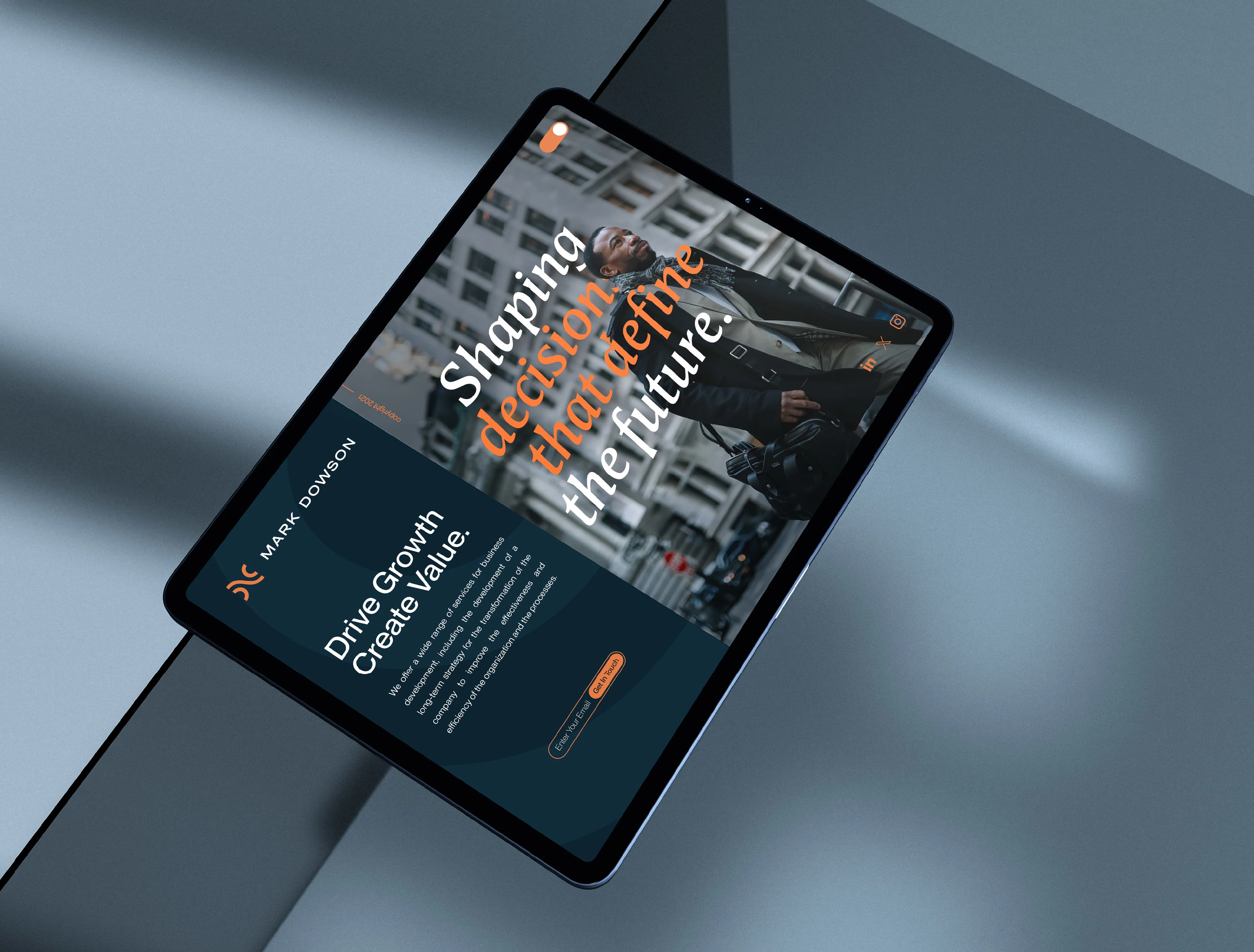
We developed a precise and essential brand identity, built on clarity and restraint. At the center of the system is a minimalist handshake symbol representing authentic partnerships, mutual trust, and shared outcomes. This element is paired with a contemporary typeface and a balanced palette of blues and oranges, chosen to convey stability, professionalism, and understated confidence. Every detail was designed to reinforce the perception of the brand as solid and forward-looking.
Outcome
The result is a cohesive and versatile brand identity system, designed to perform consistently across all touchpoints: from business cards to presentations, from printed materials to digital platforms. The new identity positions Dowson Consulting as a credible, modern, and forward-thinking firm, capable of standing out with elegance in a crowded and competitive market.


Like this project
Posted Mar 25, 2026
Created a distinctive brand identity for Dowson Consulting with minimalist logo, modern typography, and balanced colors to convey trust, and authority.