Klari5 | Brand Identity & Packaging for a Minimal Skincare Label
Giacomo Urgeghe
Overview
Klari5 is a Singapore-based skincare brand designed for a generation that refuses to choose between science and aesthetics. The brief called for a complete brand identity system — from visual language to full packaging architecture — that could sit at the intersection of dermatological credibility and contemporary design culture. Something young enough to feel native to the feed, and refined enough to mean something on shelf.
The Problem
Singapore's beauty market is one of the most competitive in Southeast Asia. The real risk for a new entrant isn't standing out — it's the pull toward safe middle ground. Most skincare brands targeting younger consumers land in one of two traps: clinical sterility that reads cold and unapproachable, or maximalist color and graphics that undermine any sense of scientific authority. Klari5 needed to be neither. The brand addresses troubled skin seriously, without the visual language of a pharmacy or the noise of a trend-chasing label.
The Solution
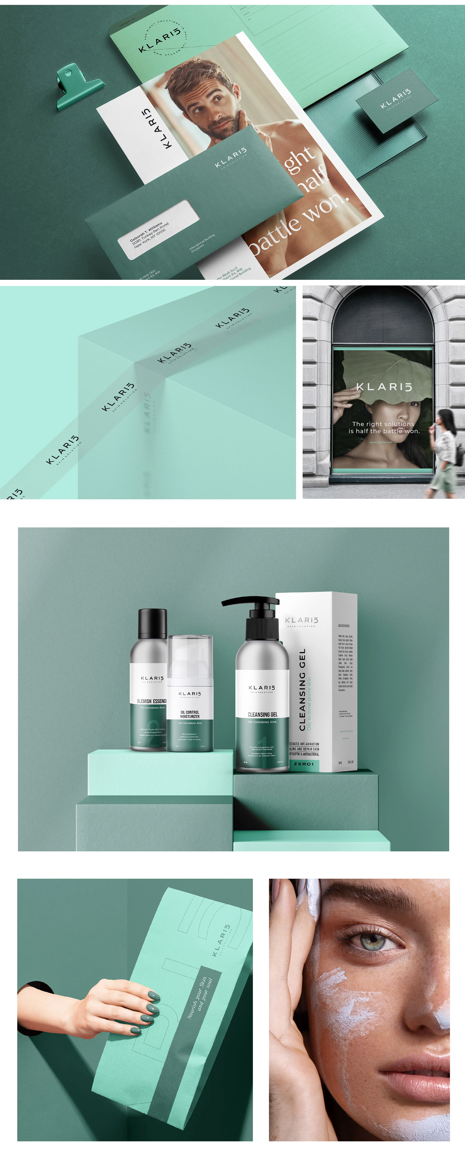
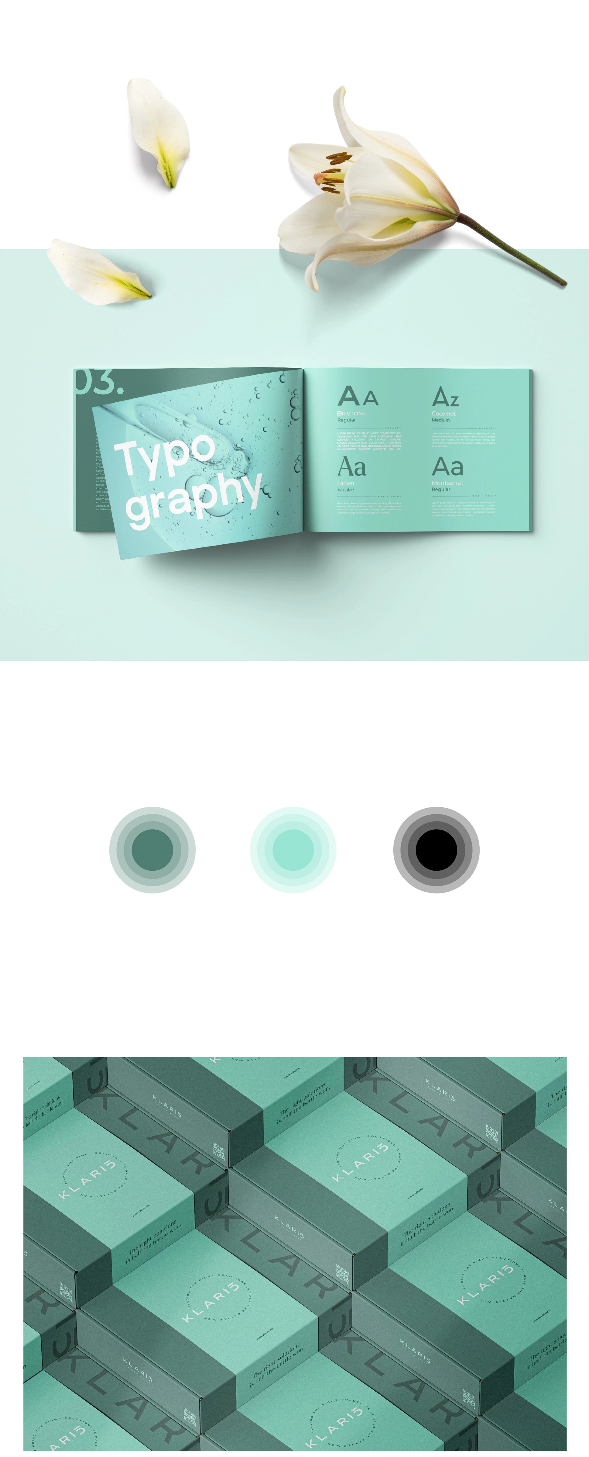
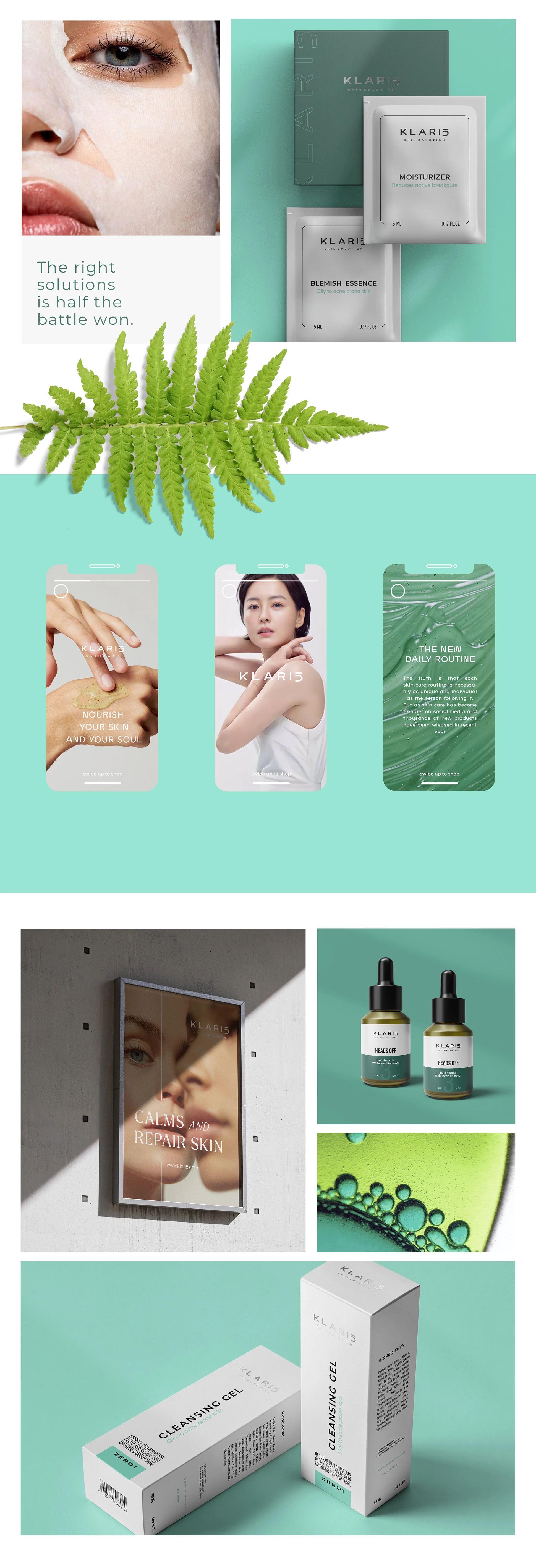
The design direction was built on restraint — not as an aesthetic default, but as a deliberate strategic position. Every element that didn't need to be there was removed. Everything that remained had to earn its place. The typographic system pairs a precise geometric wordmark with a secondary hierarchy that draws on both pharmaceutical clarity and editorial refinement — authoritative without feeling cold. The color palette was built around a tightly controlled set of neutrals with a single defining accent: present enough to be memorable, quiet enough to hold across physical packaging and digital surfaces without dating. The packaging architecture was designed as a system, not a collection of individual pieces. Each SKU shares the same structural logic — label zones, typographic scale, color application — so the range reads as unified on shelf while still letting product differentiation surface clearly.
The Result
Klari5 launched with a visual identity strong enough to hold its own against established prestige competitors and distinct enough to signal something new. The brand communicates exactly what it needs to: that science and aesthetics aren't in tension here — they're the same thing. Design as proof of quality, not decoration. A brand built not on loudness, but on the quiet authority of things done precisely right.
Like this project
Posted Mar 25, 2026
Modern skincare brand identity built on minimalism, clean aesthetics, and organic elements — sophisticated simplicity that lets the product speak for itself.