Brand Identity Rebranding & Packaging for a Logistics Startup
Giacomo Urgeghe
Overview
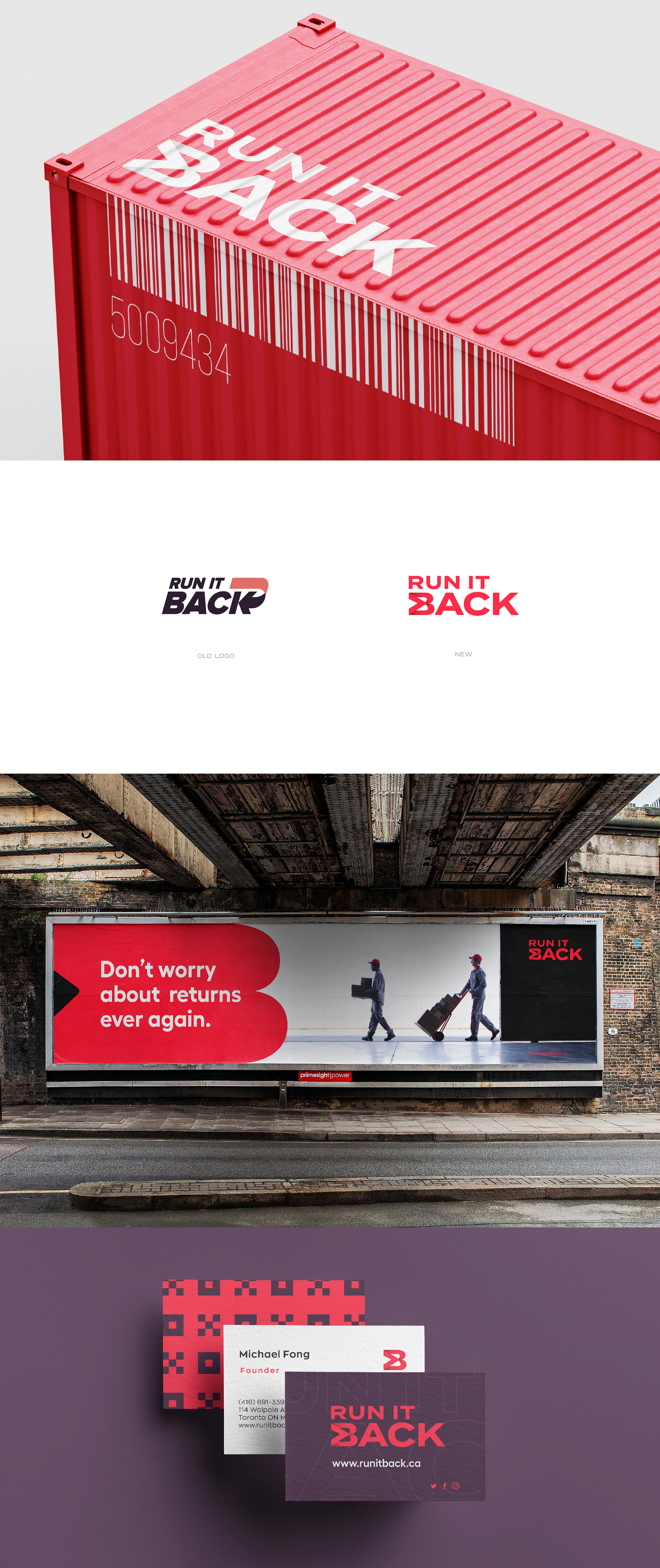
Run It Back — Brand Identity Redesign & Packaging Design
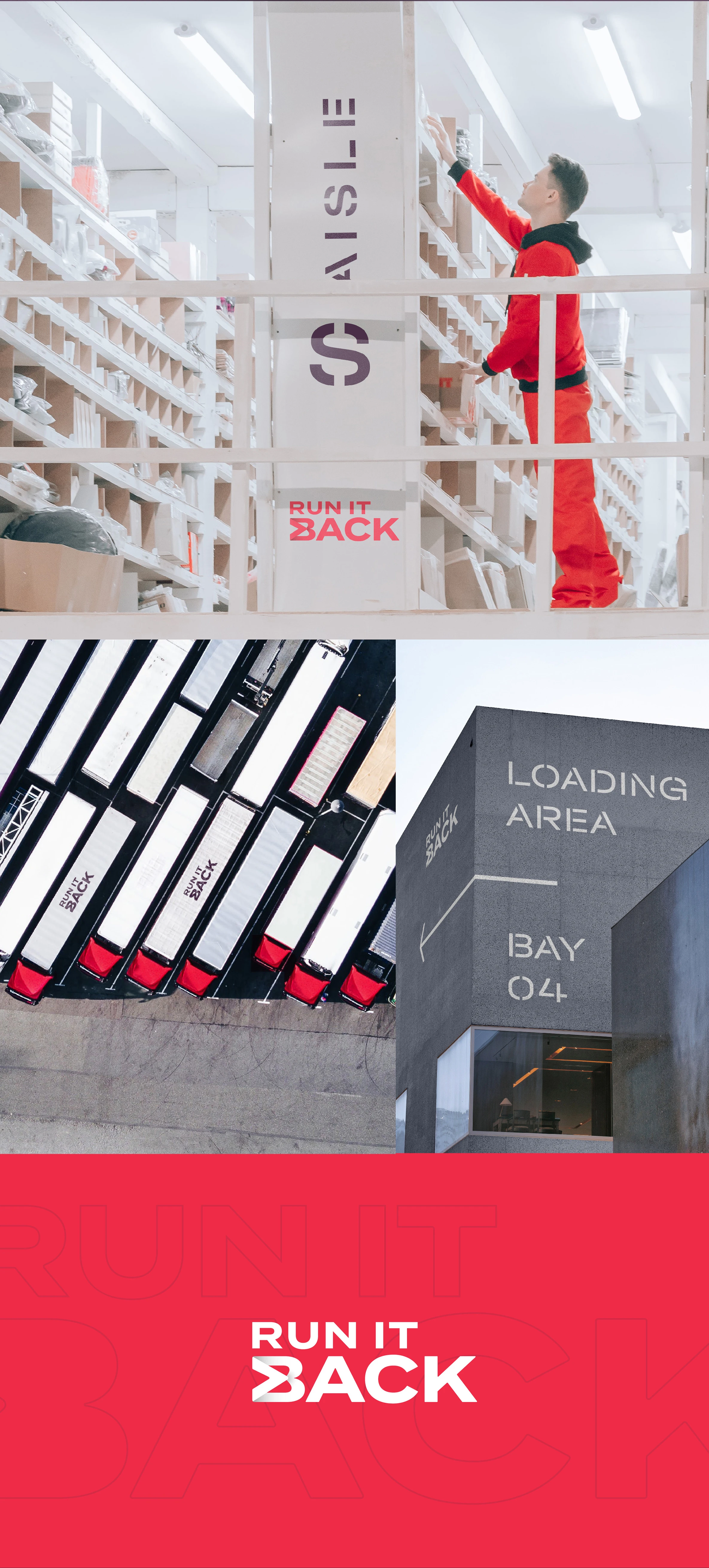
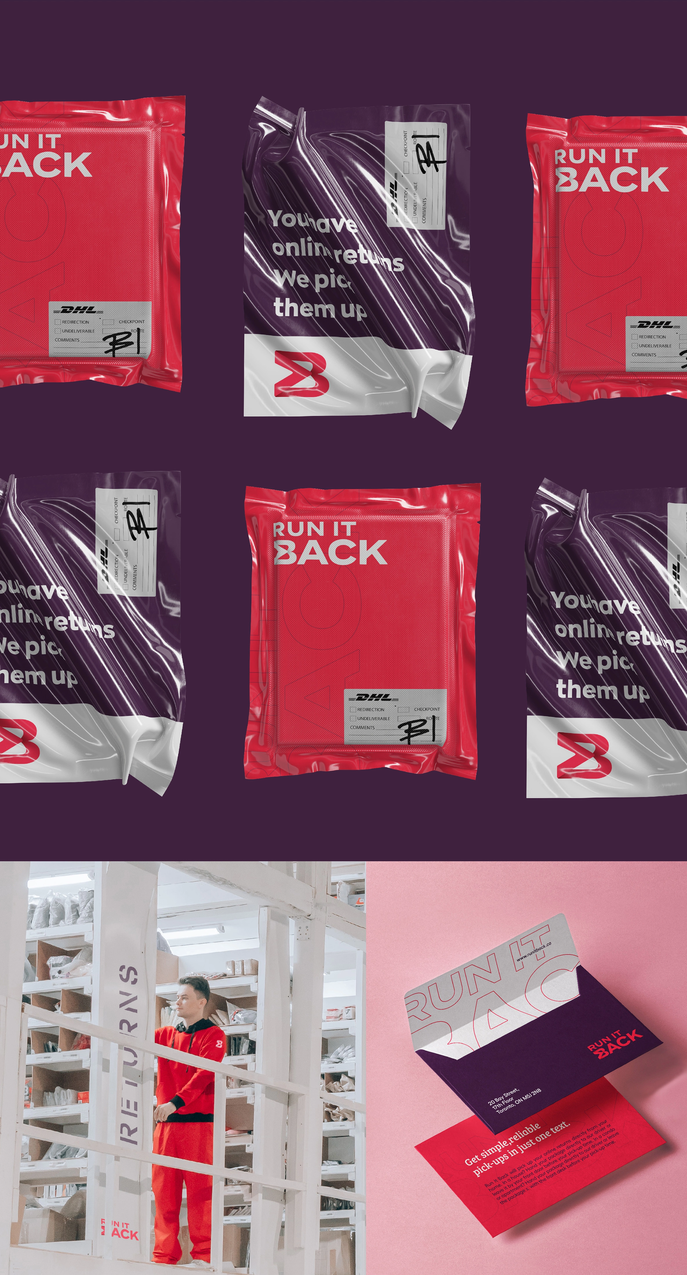
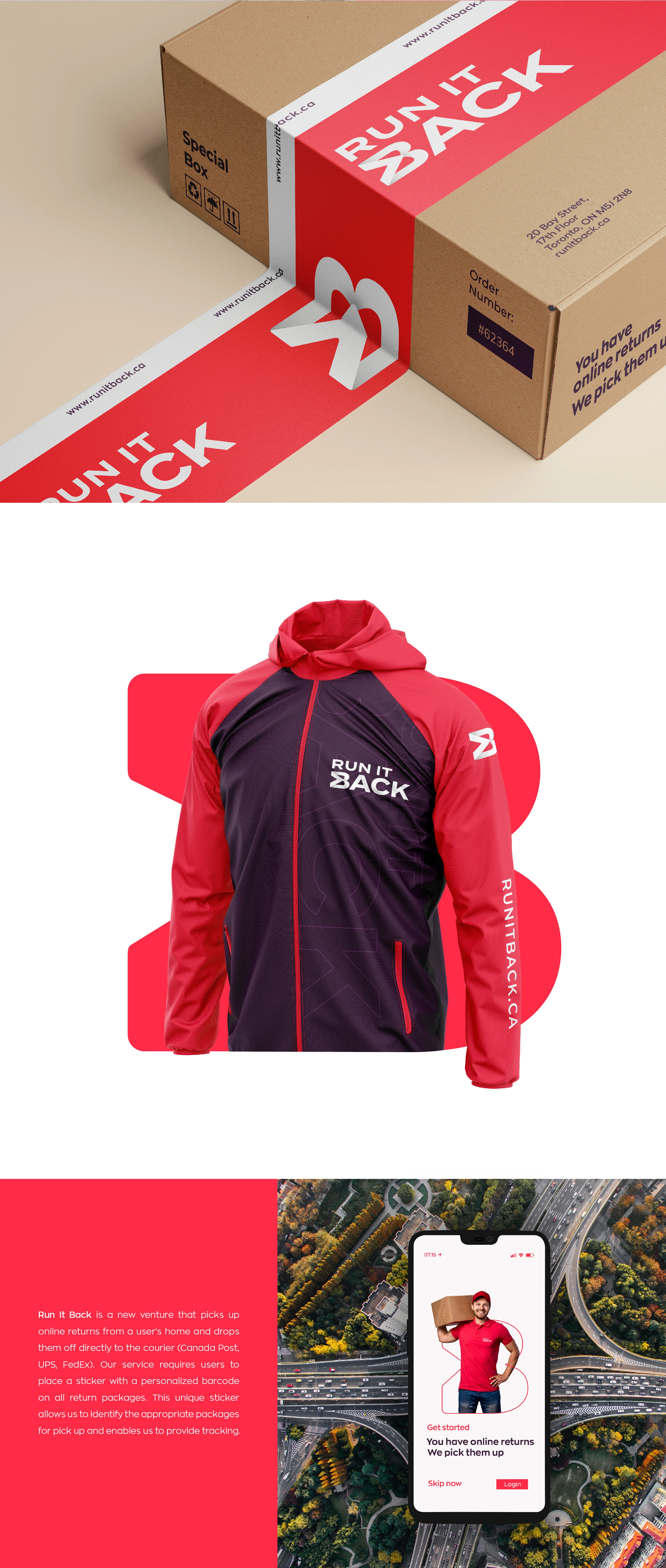
A full rebrand for a logistics startup redefining the returns experience. Run It Back picks up online returns directly from customers' homes and delivers them to the courier — removing the friction from a process everyone dreads. The project called for a complete identity overhaul: logo, color system, typography, packaging, and sticker system.
The Problem
The original identity was doing the brand a disservice — generic, forgettable, and visually out of step with a service that is genuinely innovative. In a logistics category dominated by corporate blues and safe neutrals, nothing in the existing mark communicated speed, modernity, or the cleverness of the model. A service this sharp needed a brand to match.
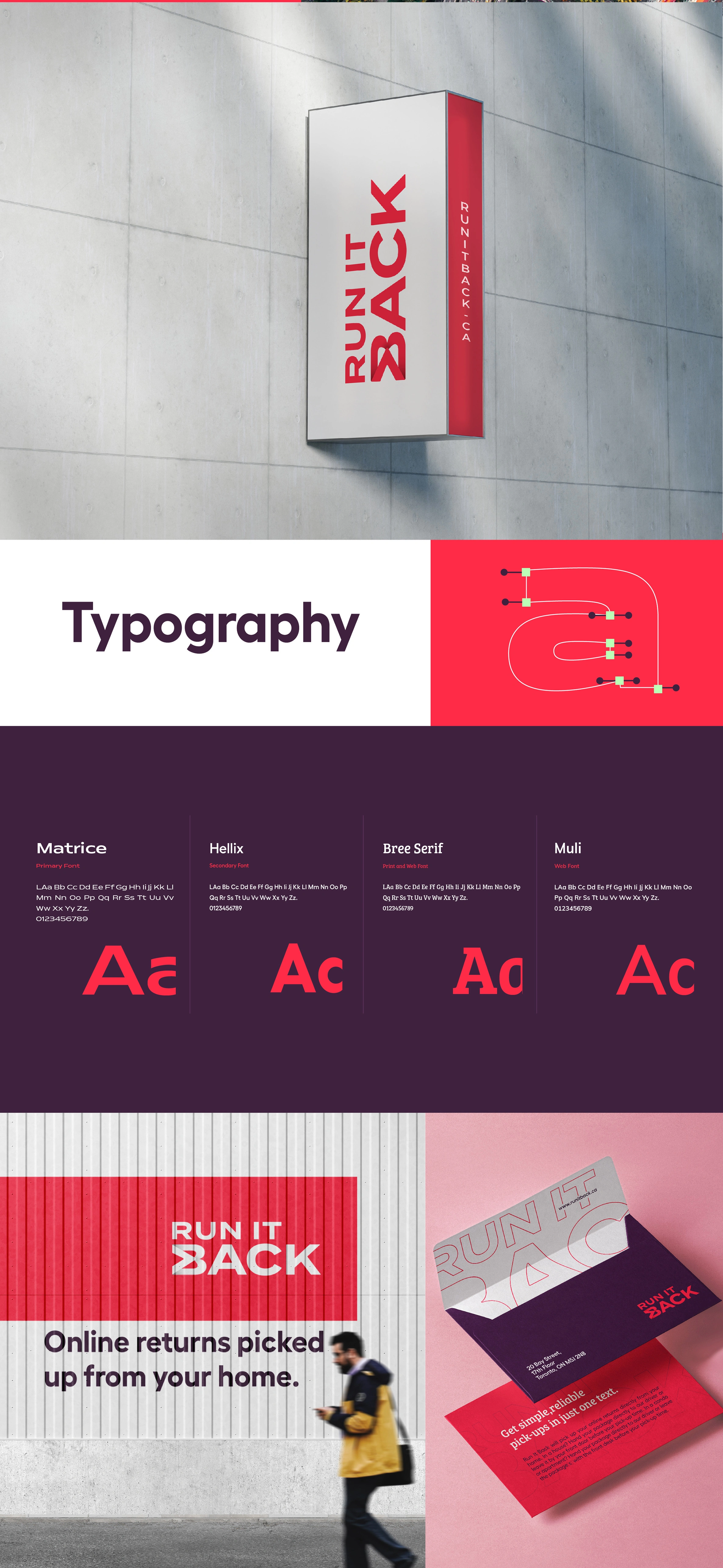
The Solution
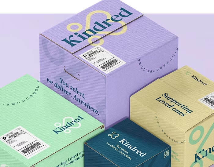
The new identity is built on a striking palette of white, bright red, and deep purple — unusual for logistics, immediately ownable. The mark centers on a typographic device: an arrow embedded within the letter B, carrying the concept of "back" directly into the letterform without laboring the point. Modern, confident typography does the rest. The sticker system — used by customers to tag each return package — was treated as a brand touchpoint in its own right, turning a functional object into a recognizable piece of the identity every time it appears at a front door or on a courier belt.
The Result
A brand that looks as innovative as the service it represents. Run It Back now holds its own in the logistics space — distinct, memorable, and built to scale.
Like this project
Posted Mar 25, 2026
Full rebrand for a returns logistics startup , typographic arrow device, and a packaging system that turns every return into a brand touchpoint.