Motivee - Landing Page | UI/UX Design

Al Razi Siam


📌 Project Overview
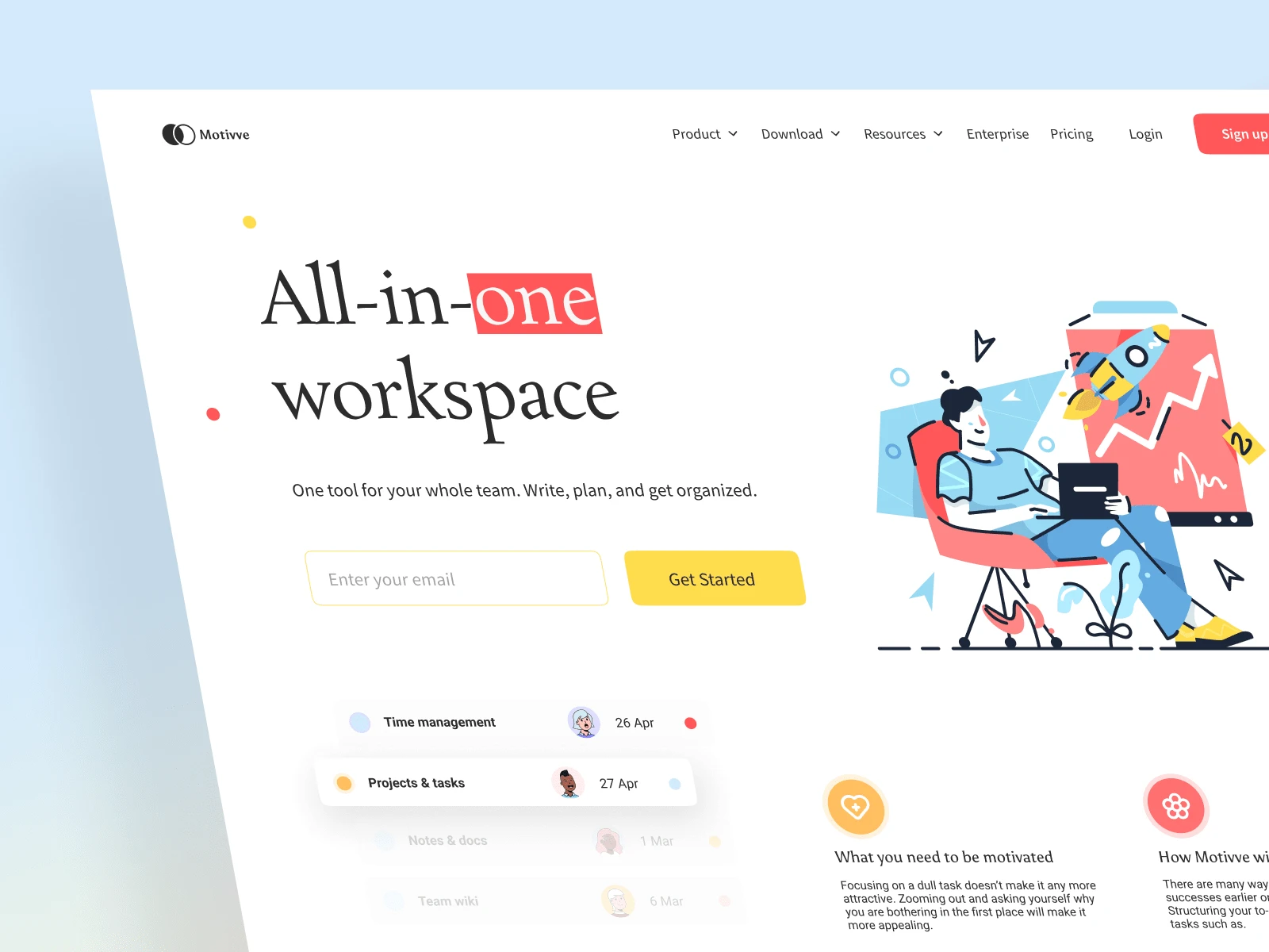
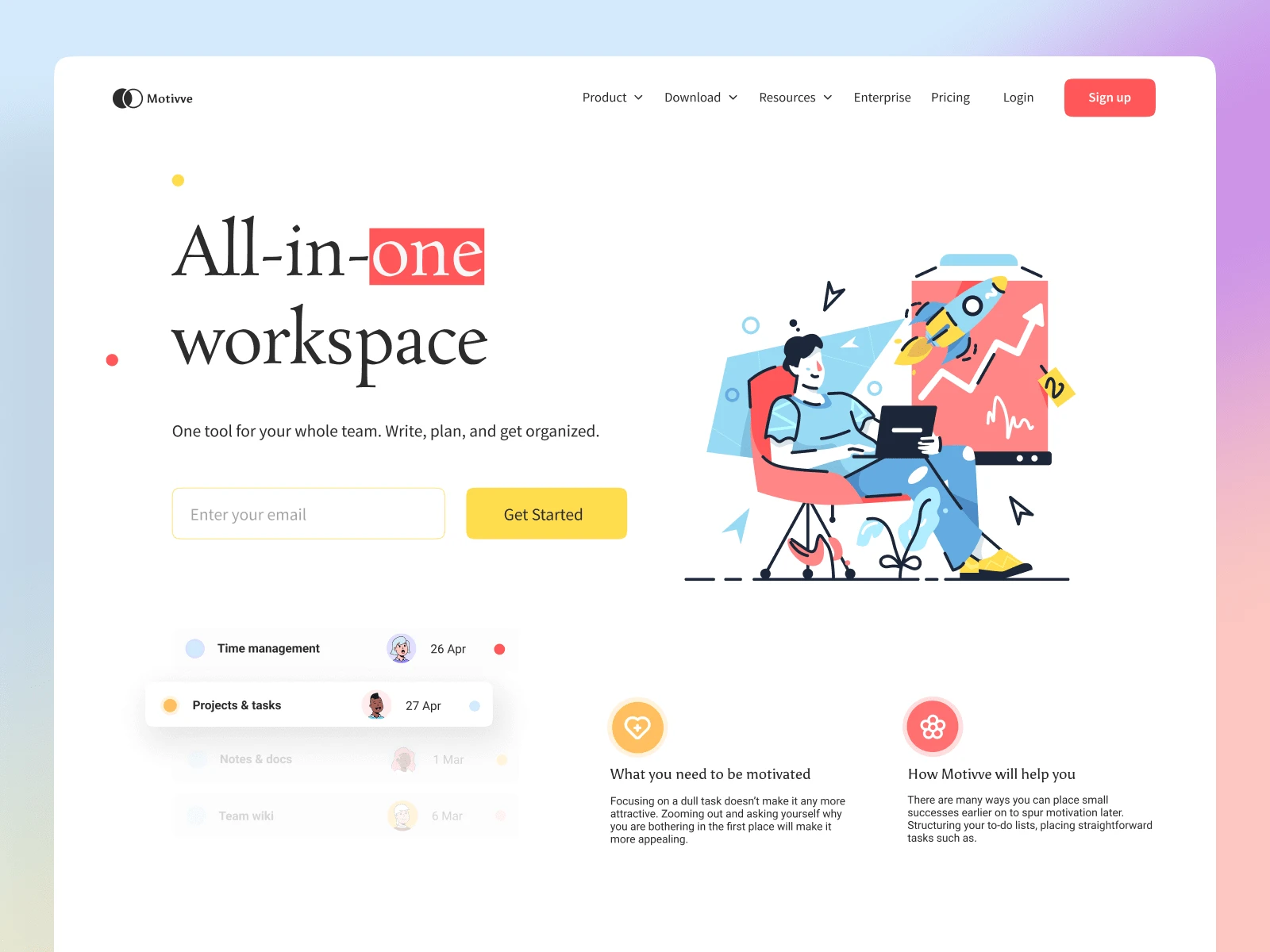
Project Name: Motive – Hero Section Design
Role: UI/UX Designer
Tools Used: Figma
Timeline: 2 Days
Design Type: Web – SaaS Landing Page Hero Section
🎯 Objective
Design a clean, conversion-oriented hero section for a productivity SaaS tool called Motive that provides an all-in-one workspace solution for teams.
The hero section needed to:
Clearly communicate the value proposition
Be visually engaging without overwhelming
Drive user action (via email capture & CTA)
Align with a fun, modern, and collaborative brand tone
🧩 Problem Statement
SaaS landing pages often suffer from one of two problems:
Cluttered information with too much text upfront
Generic designs that don’t differentiate the brand
Goal: Design a hero section that solves both — clear in communication and distinct in visual tone.
🧠 UX & UI Approach
My approach focused on balancing marketing effectiveness with user engagement:
1. Headline & Subtext
Main Message: “All-in-one workspace” — bold and typographically playful
Visual emphasis: The word “one” is highlighted with a red background for visual punch and emphasis
Subheadline: Direct, friendly, and benefit-driven – “Write, plan, and get organized”
2. Email Capture CTA
Simple email field with a bright yellow “Get Started” button
Encourages frictionless onboarding
Above-the-fold CTA boosts conversion potential
3. Hero Illustration
Custom vector-style illustration of a user at work with rising metrics and a rocket launch
Symbolizes productivity, success, and simplicity
Adds character and warmth to the page
4. Micro UI Elements
Floating task cards for categories like “Time management” and “Projects & tasks”
Adds a soft motion and depth without being distracting
Reinforces product use cases visually
5. Informational Callouts
Small text blocks like “What you need to be motivated” and “How Motive will help you”
Educate users without slowing down the experience
🎨 Visual Design Choices
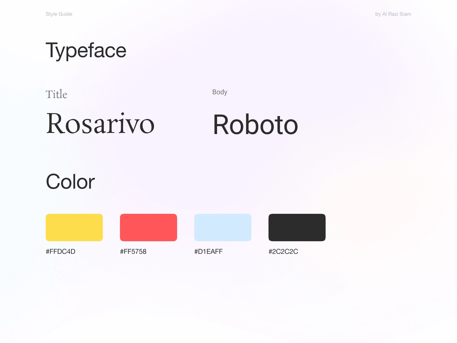
Typography: Playful serif-sans combo to strike a balance between creativity and professionalism
Color Palette: Bright and optimistic — red, yellow, blue accents against a clean white background
Layout: Generous white space for breathing room and visual clarity
Gradient Background: Subtle background gradient adds energy without overpowering content
✅ Outcome
The hero section immediately communicates the product’s unique value in a visually delightful way
Strong focus on user acquisition through a minimal and focused CTA
Adaptable for desktop and mobile layouts with responsive scalability
Design Style Guide
I've provided a style guide with font color and breakpoints for responsive variations.
📷 Final Design Preview
Like this project
Posted Apr 29, 2025
Redesigned Motivee's hero section with a fun and friendly UI.
Likes
1
Views
3


Earbuds-Product Landing Page
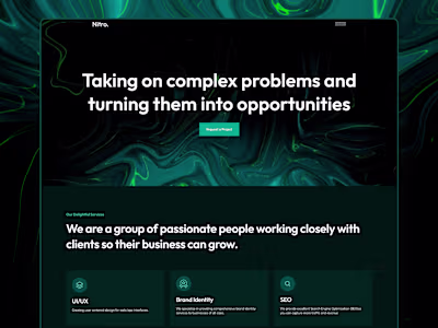
Nitro - Web Design Agency | UX/UI Web and Webflow Development
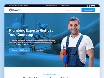
Housefix - HVAC Website | Design and Webflow Development
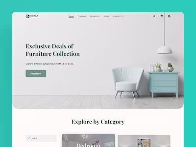
InWood - Furniture Store | eCommerce | UX/UI Design