Narvo — Visual Identity & Brand Assets

Kaya Durmus


Narvo — Visual Identity & Brand Assets
Brand Concept
Narvo positions itself as a connector: bridging security with openness, complexity with clarity, and legacy systems with future-forward architecture. This duality informed every part of the identity — from its structured layout to its cool, calculated color palette. At the heart of the system is a commitment to trust and technical clarity — values that are reflected in the tone of voice, the visual rhythm, and the modular structure of the brand elements.
Logo & Symbol
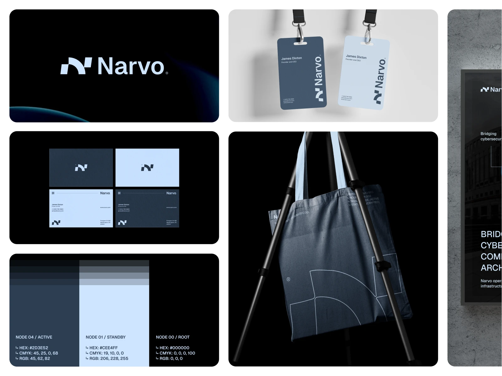
The Narvo logo mark is built from a set of geometric forms that represent connectivity, data flow, and engineered balance. It’s abstract but deliberate, with curves and cuts that feel both human and systematic. The logotype complements this with a confident, neutral typeface — minimal, but far from generic. Its proportions make it legible across formats, from digital interfaces to print systems and physical signage. Together, the symbol and wordmark form a unit that’s highly scalable and instantly recognizable.
Color System
The color palette is clean, technical, and modular — reflecting the architecture of the system itself. Tones are named as "nodes," reinforcing the platform’s infrastructure-first thinking:
Node 00 / Root: Absolute black — foundational and stable.
Node 01 / Standby: Cool light blue — clear and quiet.
Node 04 / Active: Deep marine blue — strong, secure, and intentional.
This modular color logic makes the identity feel engineered and expandable — like the systems Narvo aims to support.
Applications
The Narvo identity was designed with practical use in mind. Everything from employee ID cards to tote bags and signage has been considered — and tested for clarity, consistency, and professionalism.
Business cards follow a strict, modular layout with sharp alignment and high legibility. Event passes are clean and bold. Even brand collateral like tote bags carries the mark with confidence, applying elements of the logo in large-format detail. The system is built to scale — visually and technically.
Design System
Typography, spacing, and color usage are built around a grid-based structure that reflects Narvo’s own internal logic. There’s very little ornamentation — instead, focus is placed on efficiency and legibility. Each brand asset feels like it belongs to the same system: structured, no-nonsense, and ready for production.
Final Note
Narvo is a conceptual identity that explores how serious technical platforms can still feel sharp, modern, and carefully branded. It doesn’t try to impress with trends — it builds trust through consistency and precision.If you're building something in infrastructure, cybersecurity, or systems architecture and need a brand that reflects clarity, depth, and control, feel free to reach out.
Like this project
Posted Jul 28, 2025
Developed a cohesive brand identity for Narvo, focusing on clarity and scalability.
Likes
1
Views
0
Timeline
Mar 4, 2025 - Jul 18, 2025