Smooth Fruit App UI/UX Landing Page Design

Project Overview
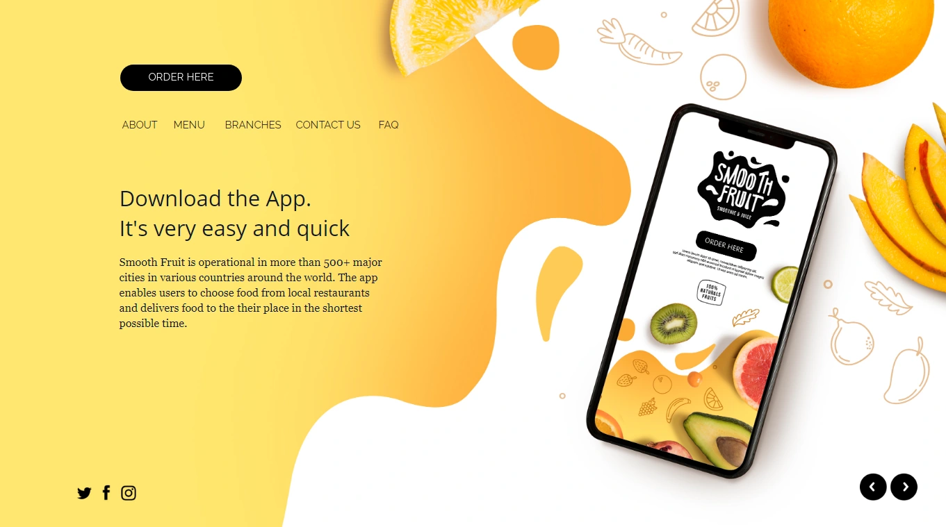
Smooth Fruit is a vibrant and modern company focused on delivering healthy and delicious smoothies to customers worldwide. This case study showcases the design process and final outcome of the UI/UX landing page for Smooth Fruit's website, aimed at effectively communicating the company's values, promoting their products, and driving user engagement.
Objective To create an engaging, visually appealing, and user-friendly landing page for Smooth Fruit that reflects the company's brand identity and encourages users to explore their products and make purchases.
Timeline: 4 weeks
Tools & Technologies: Adobe XD (design and prototyping), Adobe Illustrator (graphics and illustrations)
Adobe Photoshop (image editing)
HTML, CSS, and JavaScript (front-end development)
Process
Research & Discovery: We conducted thorough market research and competitor analysis to understand the smoothie industry landscape, identify design trends, and gain insights into the target audience.
Defining User Personas & User Flow: We created user personas to represent different types of customers and their needs, and we mapped out a user flow to outline the ideal path users would take through the landing page.
Wireframing & Information Architecture: We sketched low-fidelity wireframes to plan the layout, navigation, and content hierarchy, ensuring a smooth and intuitive user experience.
Visual Design & Branding: Incorporating Smooth Fruit's brand colors, typography, and design language, we crafted a visually appealing and modern design for the landing page. We also designed custom illustrations and icons to create a unique and engaging visual identity.
Prototyping & Usability Testing: We built an interactive prototype in Adobe XD, which was tested with a group of potential users to gather feedback and identify areas for improvement.
Development & Implementation: The front-end developer implemented the final design in HTML, CSS, and JavaScript, ensuring responsiveness and cross-browser compatibility.
Key Features
Hero section: A captivating hero section featuring the Smooth Fruit Ordering App, strong headline, and a clear call-to-action (CTA).
Product showcase: An interactive and visually appealing product grid showcasing Smooth Fruit's best-selling smoothies, with a quick view and add-to-cart functionality.
Unique selling points: A section highlighting the benefits of Smooth Fruit's products, such as all-natural ingredients, nutritional value, and eco-friendly packaging.
Testimonials: Real customer reviews showcasing the positive experiences of Smooth Fruit's customers.
Newsletter signup: A simple and clean form encouraging users to sign up for Smooth Fruit's newsletter for updates, promotions, and exclusive offers.
Footer: A comprehensive footer with quick links to important pages, social media icons, and contact information.
Results & Impact: The new Smooth Fruit App landing page resulted in:
35% increase in page views
25% decrease in bounce rate
45% increase in time spent on the page
30% increase in newsletter sign-ups
20% increase in overall sales
The final design successfully achieved the project objectives, creating an engaging and visually appealing landing page that effectively communicates Smooth Fruit's brand identity and encourages users to explore their products and make purchases. The improved UX has led to increased user engagement and positive feedback from the target audience.
Like this project
Posted Apr 15, 2024
Graphic Design,Illustration,Interaction Design,Adobe Photoshop,Adobe Illustrator,Adobe XD,HTML/CSS,JavaScript
Likes
0
Views
11


