Shopee's mobile app home page redesign
Overview 🔎
This project was the submission that I and my team proposed for the Shopee Product & Design Challenge. The proposed solution aims to improve Shopee’s user experience and interface in order to increase users’ interest in using the application.
My role ✨
Product designer, Visual designer, UI/UX designer, User discovery and researcher
Problem & Solution 🤝
Shopee is the top e-commerce platform in Southeast Asia and Taiwan, launched in 2015. As part of maintaining its presence, they aim to enhance its mobile app's user experience by either adding new features or improving current ones.
Our solution is to redesign Shopee's home tab to create a positive first impression for users and improve their experience. We focused on the Indonesian market, which is the most profitable country for Shopee.
Research: Understanding users' pain points 📑
I conducted surveys and interviews with Indonesian Shopee users to understand their opinions on the Home tab's layout, design, and features. I surveyed 61 users between the ages of 17 and 24 and interviewed 3 people with different demographics and shopping behavior.
Based on the survey and interviews, I identified several pain points that users experienced while using the app:
Cluttered Home tab with too much information
Hard-to-find category section
Confusion about the purpose of Shopee Feed and Shopee Live, and
Difficulty accessing the "My Favourite" tab.
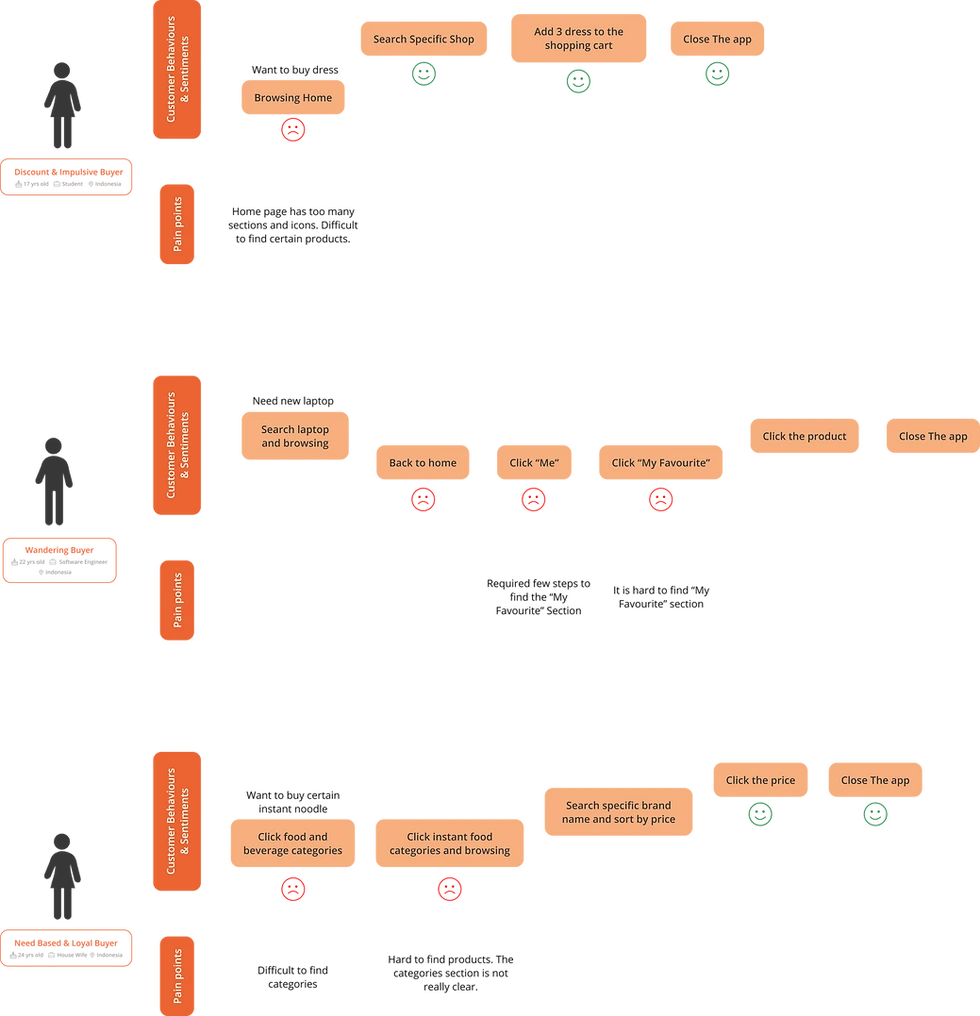
User Journey Map of the 3 interviewees
User Personas & Empathy Maps 👤
Based on our interviews and surveys, we created 3 user personas that represent our target customers. Moreover, we also developed empathy maps to better empathize with the problems of the users.
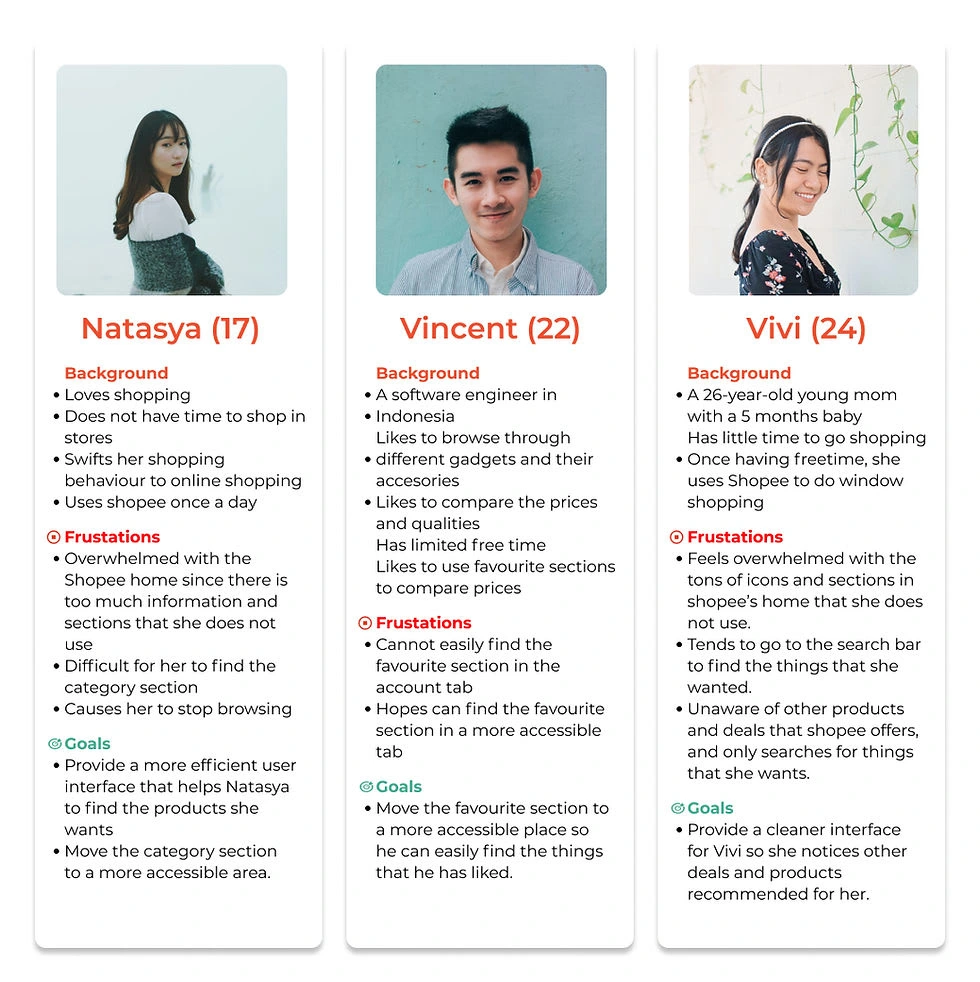
User personas
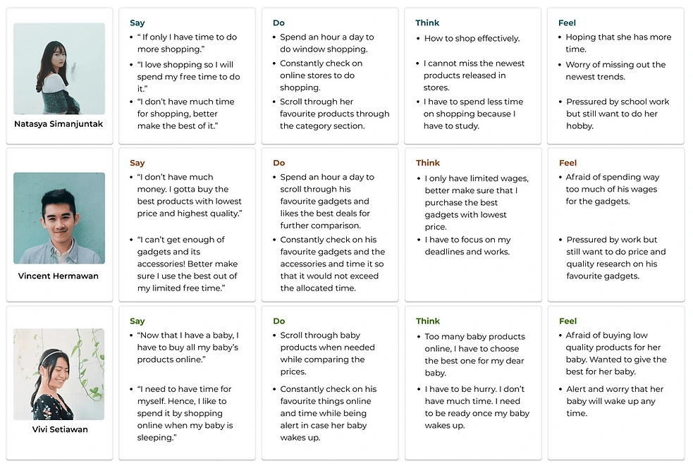
Empathy Maps
Final Design 🖼️
After completing our sketches and wireframes, we created high-fidelity prototypes using Figma.
Home Tab:
To address the cluttered Home tab, I removed some icons and sections based on feedback from our survey. I aim to make users feel less overwhelmed by the interface. I also noticed that many users relied on the "My Favourite" section to save and access liked items, so I moved this section to the Home tab header for easier access.
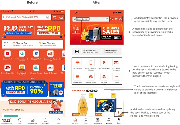
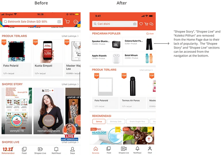
Shopee Home page before and after
Search Bar:
We moved the category section to a more accessible location at the top of the page when accessing the search bar. This change makes it easier for users to find what they want by giving them recommendations while using the search bar.
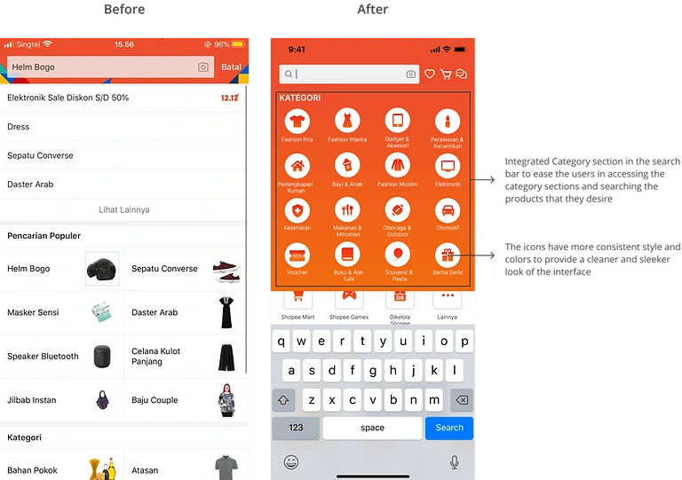
Shopee's Category section before and after
Shopee Feed & Shopee Live:
We found that some users were unaware of the existence and purpose of Shopee Feed and Live features, despite their popularity in Indonesia. To increase usage, we proposed providing explanations of the features when users access them. This can be done through explanations on the page or step-by-step descriptions of the usage of each feature.
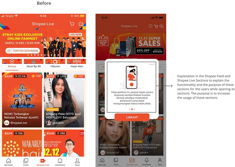
Shopee Live before and after
Results 🎁
As a result, we are announced to be the top 15 teams from more than 700+ teams competing.
Takeaways 📣
Importance of conducting user research to understand user pain points and preferences
Focus on user needs and prioritize them over personal preferences
Opportunity to expand software knowledge, particularly with Figma and its features.
Like this project
Posted Apr 7, 2023
Acquire more users by redesigning the home page of an E-commerce
Likes
0
Views
168

