Excel Data Cleaning & Interactive Reporting

Geethasree Naguboina

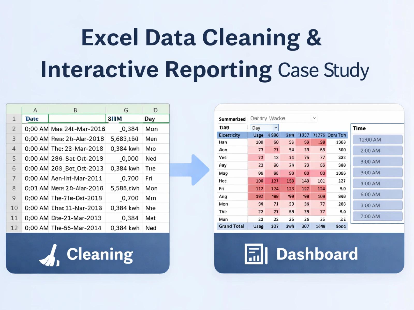
Excel Data Cleaning & Interactive Reporting Case Study
📌 Overview
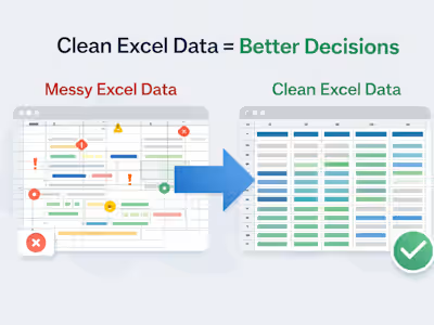
This case study demonstrates an end-to-end Excel workflow where raw electricity consumption data was cleaned, structured, and transformed into an interactive report. The project focused on making messy, unstructured data analysis-ready and easy to explore using Excel-based reporting tools.
❗ The Problem
The dataset was provided in a highly unstructured format, with date, time, and electricity usage values combined into a single column.
With over 8,700 rows, the data could not be filtered, analyzed, or visualized effectively in its original state.
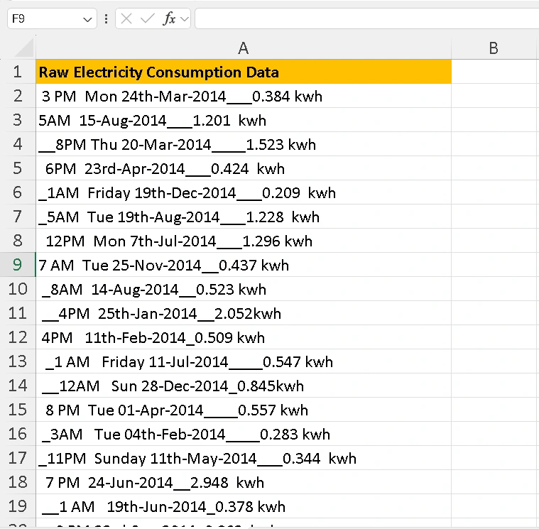
Messy Data
🧹 What I Did
1. Data Cleaning & Structuring
Cleaned and structured 8,700+ rows of raw data
Extracted date, time, and KWH values into separate columns
Standardized formats to ensure consistency and accuracy
Prepared the dataset for analysis using Excel formulas and AI-assisted features
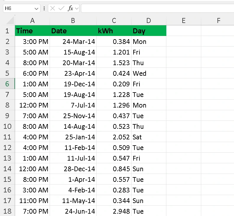
Data Cleaning
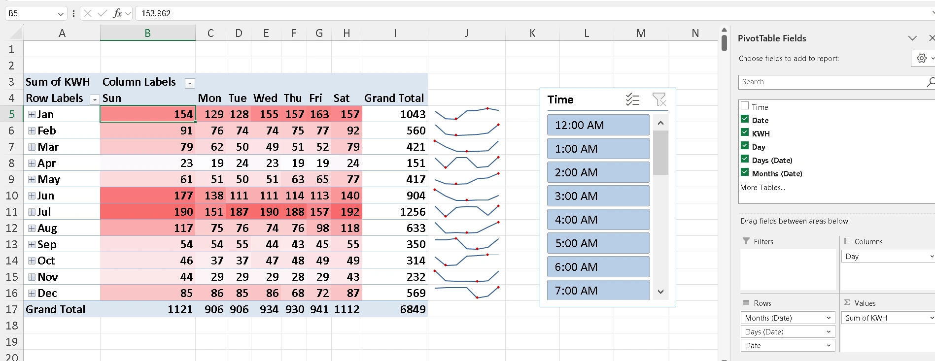
2. Analysis & Dashboard Creation
Built pivot tables to analyze electricity usage by month, day, and time
Added slicers for interactive filtering
Applied conditional formatting to highlight usage patterns
Designed a clean, readable dashboard for quick insights
Interactive Report
✨ Final Outcome
Completed the full workflow in ~20 minutes
Cleaned and structured 8,700+ rows of data
Delivered a fully interactive Excel dashboard
Converted raw data into a client-ready reporting solution supporting faster decisions
Like this project
Posted Jan 14, 2026
Cleaned and structured 8,700+ rows of Excel data and built an interactive dashboard with pivots and slicers for fast, reliable reporting.