MyOutreach: Banding fun
TL;DR
This case study showcases the branding process for MyOutreach, a B2B lead generation portal focused on the technology sector. The challenge was to create a scalable and user-friendly brand identity that communicated knowledge-sharing while allowing for future expansion into other industries. Four unique concepts were explored, ultimately leading to the selection of "The Grimoire," a design that conveys arcane wisdom and expertise.
Introduction
In the world of branding and visual design, clients often have their preferences and ideas, but they may overlook the needs of their target audience. Conversely, designers must tap into the valuable knowledge possessed by clients, who intimately understand their industry, to create effective solutions. This case study highlights the approach and process followed to deliver a successful branding project for MyOutreach.
The Process
The branding process begins with thorough desk research and gathering relevant information from the client. Consulting with the client throughout the design journey ensures a comprehensive understanding of their perspective. Moodboards and concepts are created, and feedback is sought through workshops involving various stakeholders. The chosen concept is then developed into a fully defined branding system with guidelines and content.
Initial Desk Research:Gather valuable insights from internet sources and client discussions to understand the industry, target audience, and competitors.
Distilling Information:Consult with the client to gain a comprehensive perspective, refining the gathered data and aligning with their vision.
Building Moodboards and Artistic Direction:Create moodboards to establish the right artistic direction and narrative for the visual communication design.
Generating Concepts:Produce quick, wild sketches for logo, typography, and color palettes to lay a strong foundation for the design.
Styletiles for Real-Life Context:Utilize Styletiles to showcase design ideas in practical scenarios, ensuring better client visualization.
Conducting Workshops:Organize workshops with key stakeholders to refine concepts and ensure alignment with project goals.
Final Concept Selection:Based on workshop insights, select the best concept as the final direction for the branding system.
The MyOutreach project successfully applied this approach, resulting in the selection of "The Grimoire," a design conveying knowledge and expertise while accommodating future expansion.
Project Background
MyOutreach is a B2B lead generation platform that specializes in the technology sector. Their goal was to build a knowledge-sharing portal while expanding their reach into other industries. The branding needed to be clear, scalable, and easily recognizable to users in various sectors.
The "Why?"
The challenge was to create a brand identity that effectively communicated knowledge-sharing while being adaptable to diverse industries. The client's wealth of knowledge and valuable information needed to be conveyed in a way that appealed to their target audience—the users of the platform.
The Challenge
The primary challenge was to strike a balance between incorporating the client's expertise and understanding with the designer's creative vision. Additionally, the branding had to be easily scalable to accommodate future expansion into other sectors while being crystal clear to users about the portal's purpose.
Concepts
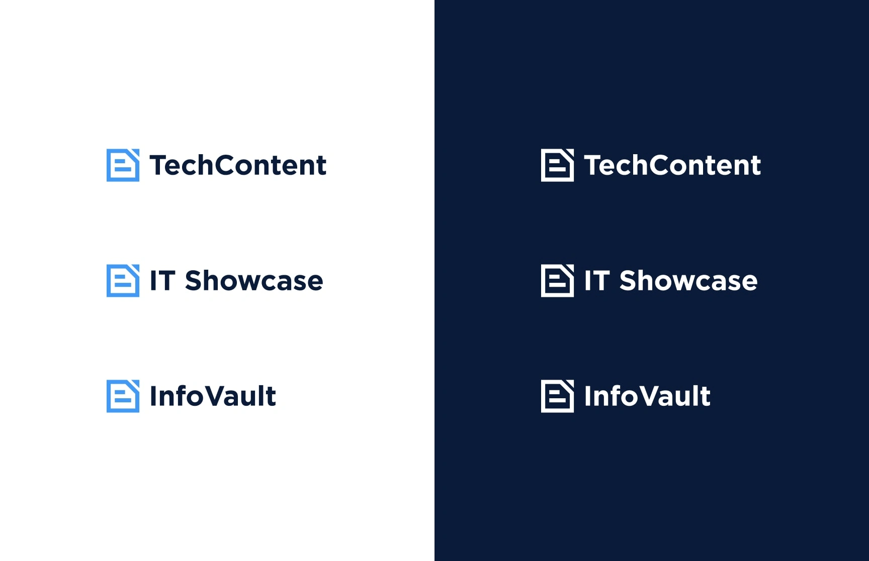
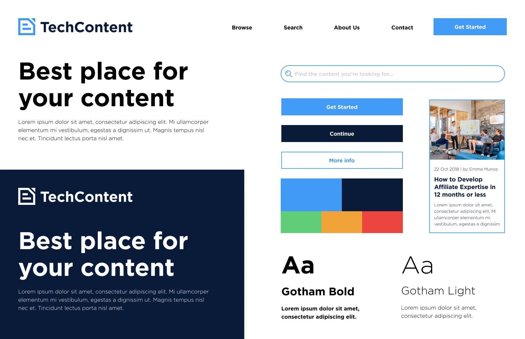
Four distinct concepts were explored during the creative process:
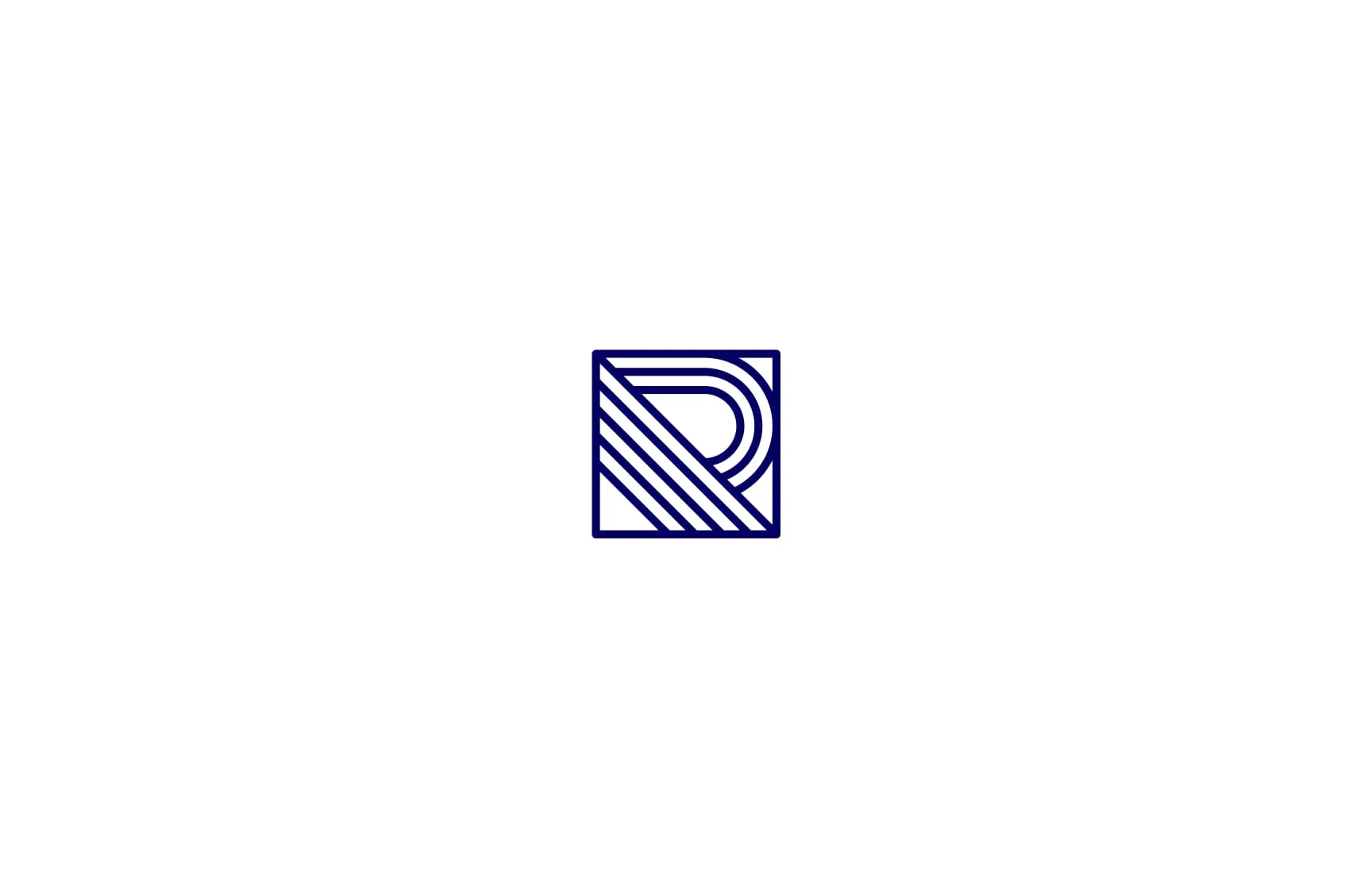
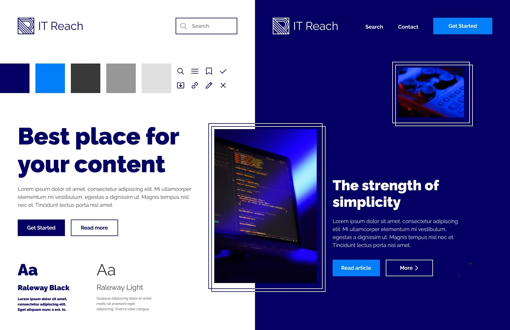
Concept 1: The Distinguished Library
A design inspired by art deco, utilizing simple lines and blue colors. Subtle decoral elements highlight points of interest, symbolizing the importance of knowledge.

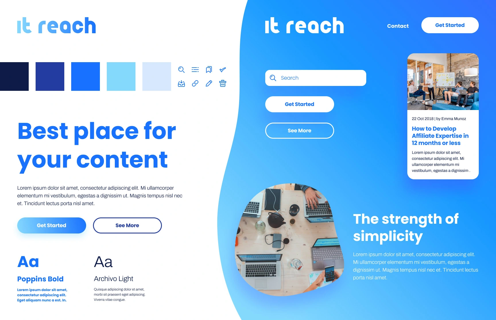
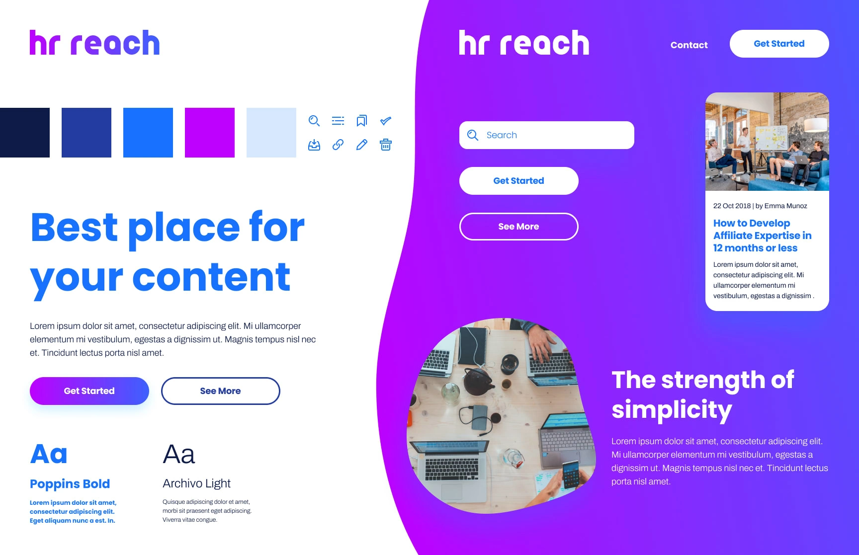
Concept 2: The Organic Form
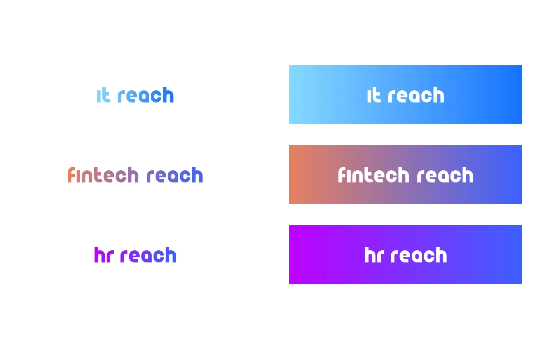
A futuristic concept featuring curved lines and round elements, creating a harmonious and peaceful brand identity.

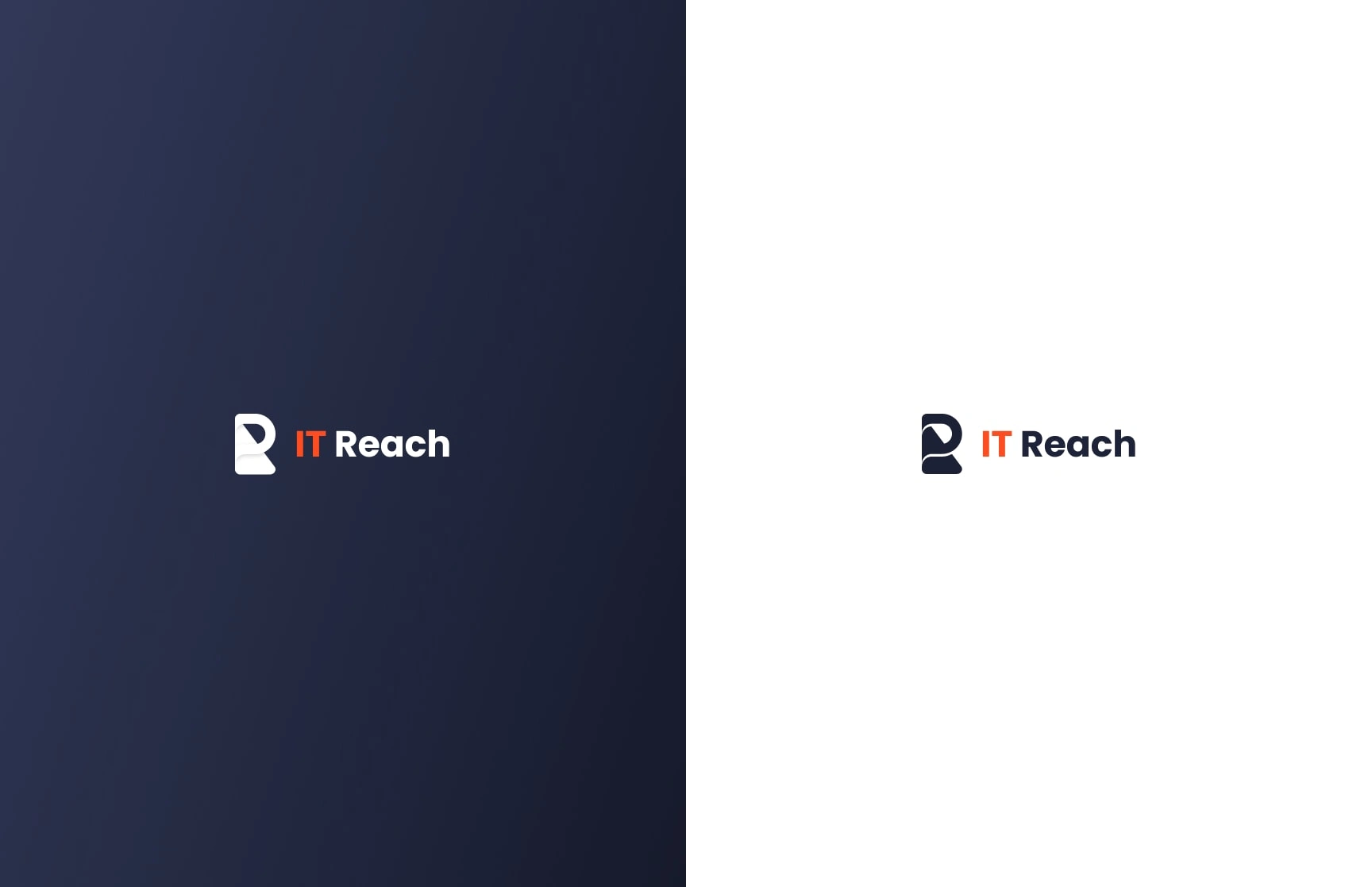
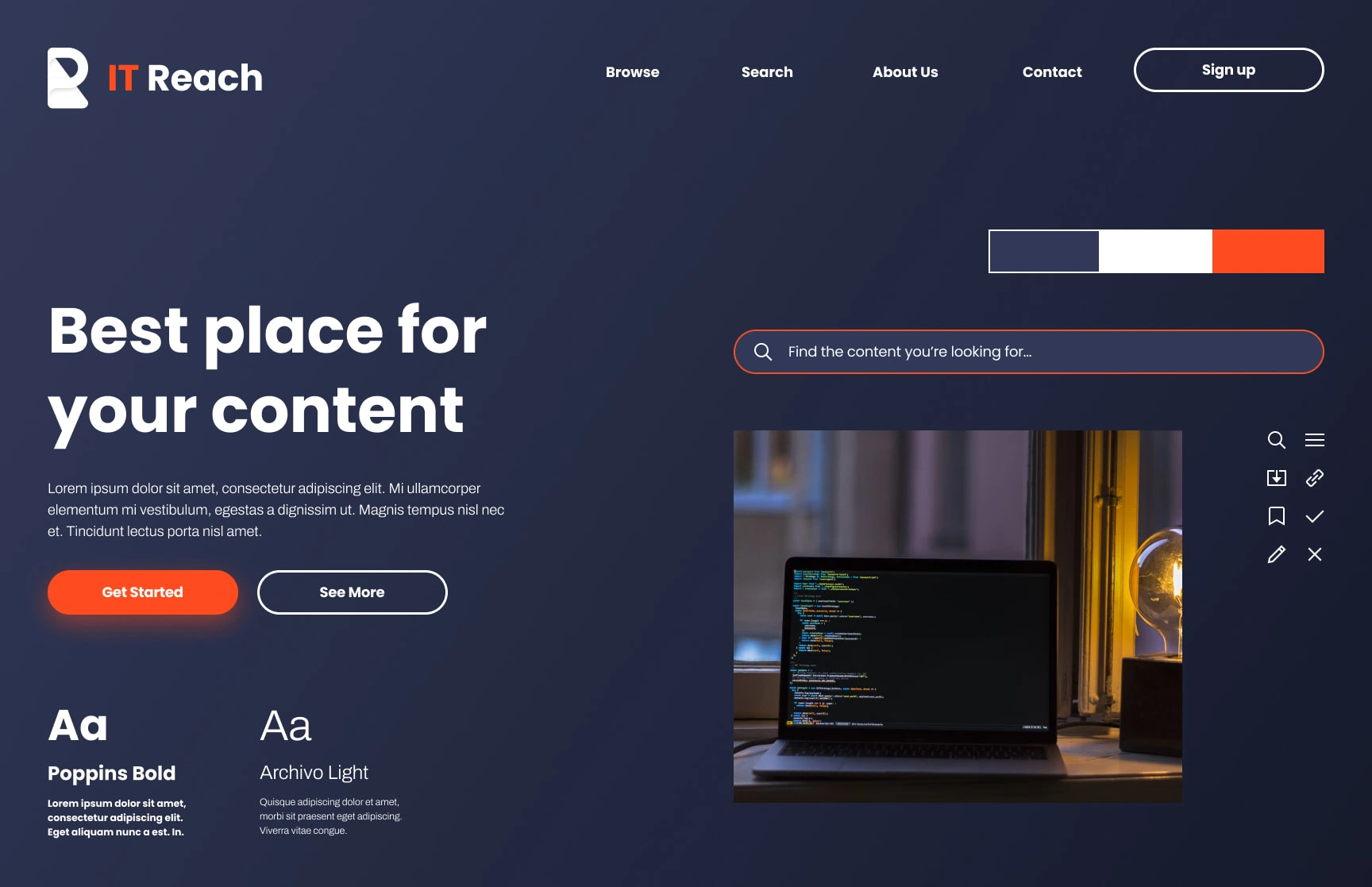
Concept 3: The Dark Elegance
A minimalistic and clean approach with subtle leather and steel textures. A dominant glowing red color draws attention to essential elements.

Concept 4: The Engineers Order
A professional and straightforward design with straight lines, conveying a no-nonsense attitude.

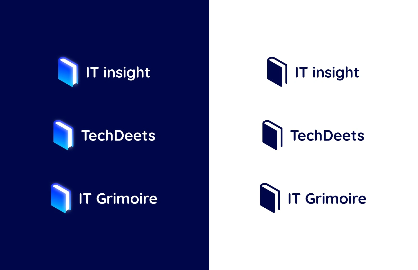
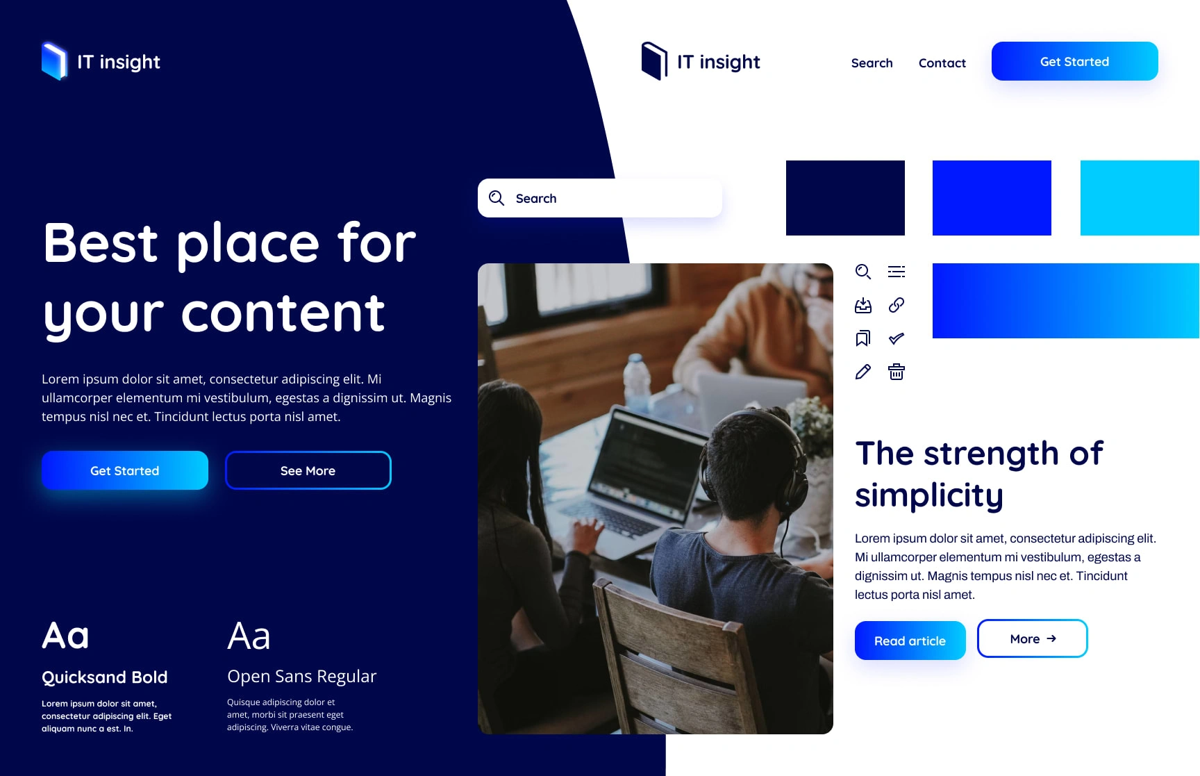
Final Design: The Grimoire
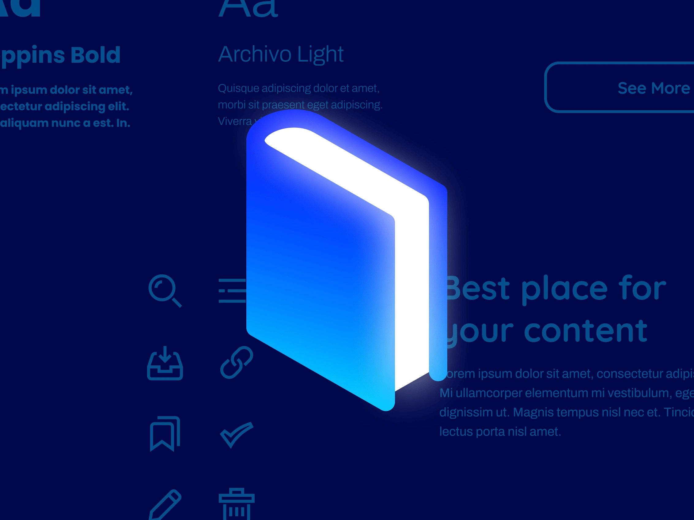
The selected concept, "The Grimoire," stood out as the optimal choice. It effectively communicated the portal's purpose of sharing arcane wisdom and valuable knowledge. This concept created an air of mystery and expertise, reflecting the client's industry experience and high-quality information.

Summary
The MyOutreach branding project presented an exciting challenge to create a scalable and user-friendly identity for a B2B lead generation portal. By blending the client's expertise with creative vision, the "Grimoire" concept was born—a design that encapsulates the mystical and valuable knowledge that the platform offers. This project was completed within one week, showcasing the ability to produce exceptional work under tight timelines and delivering an innovative brand identity.
Like this project
Posted Aug 3, 2023
Discover the mystical journey of branding for MyOutreach - a B2B lead generation portal. Unveil the secrets behind 'The Grimoire' concept.
Likes
0
Views
24
Clients
Netguru
MyOutreach

