Brand Identity | Monkey Pankey Crepes
Alec Minimalec
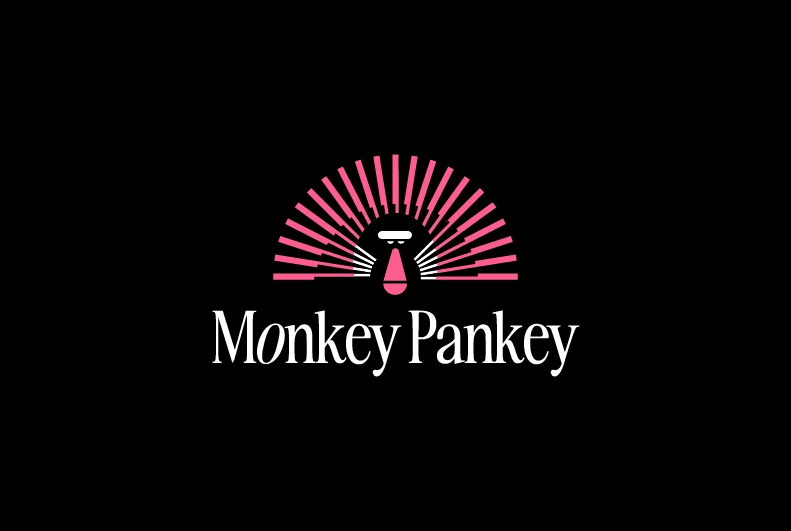
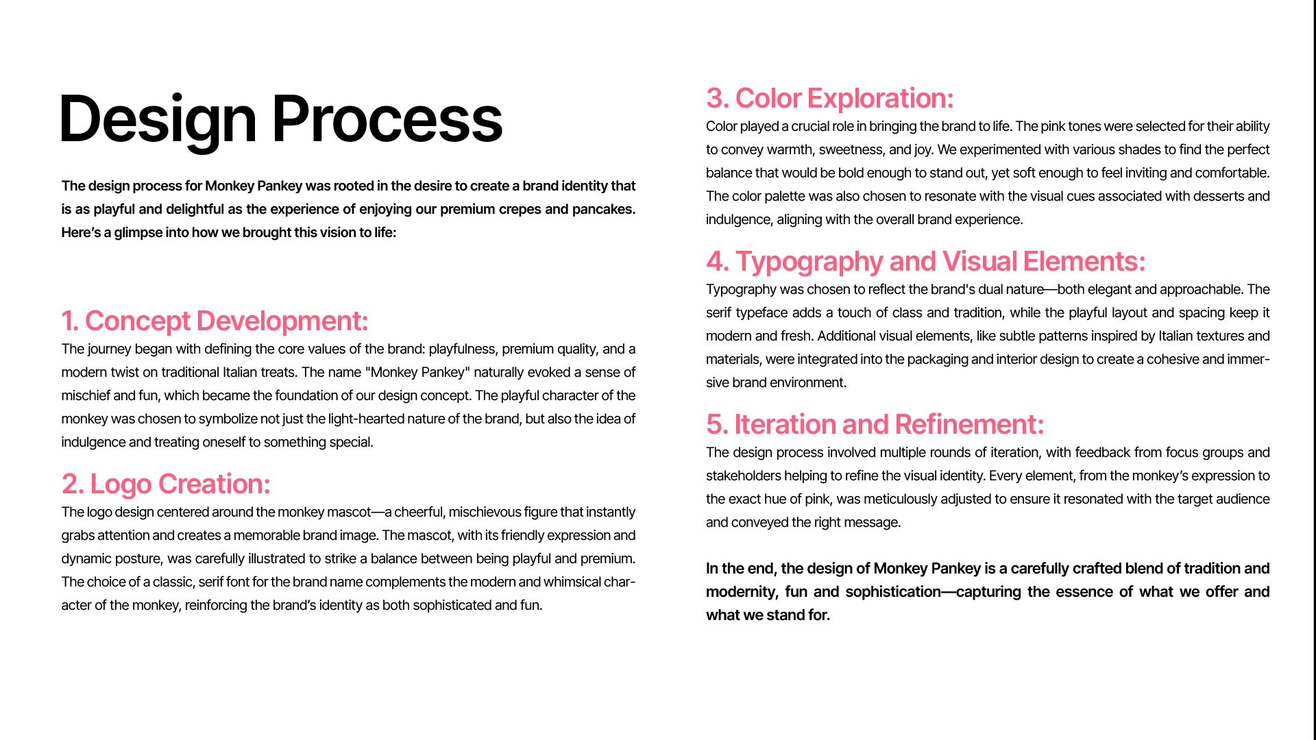
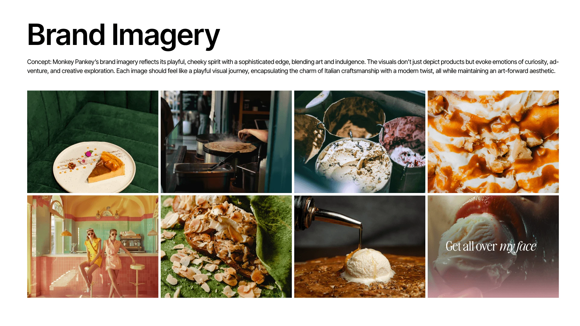
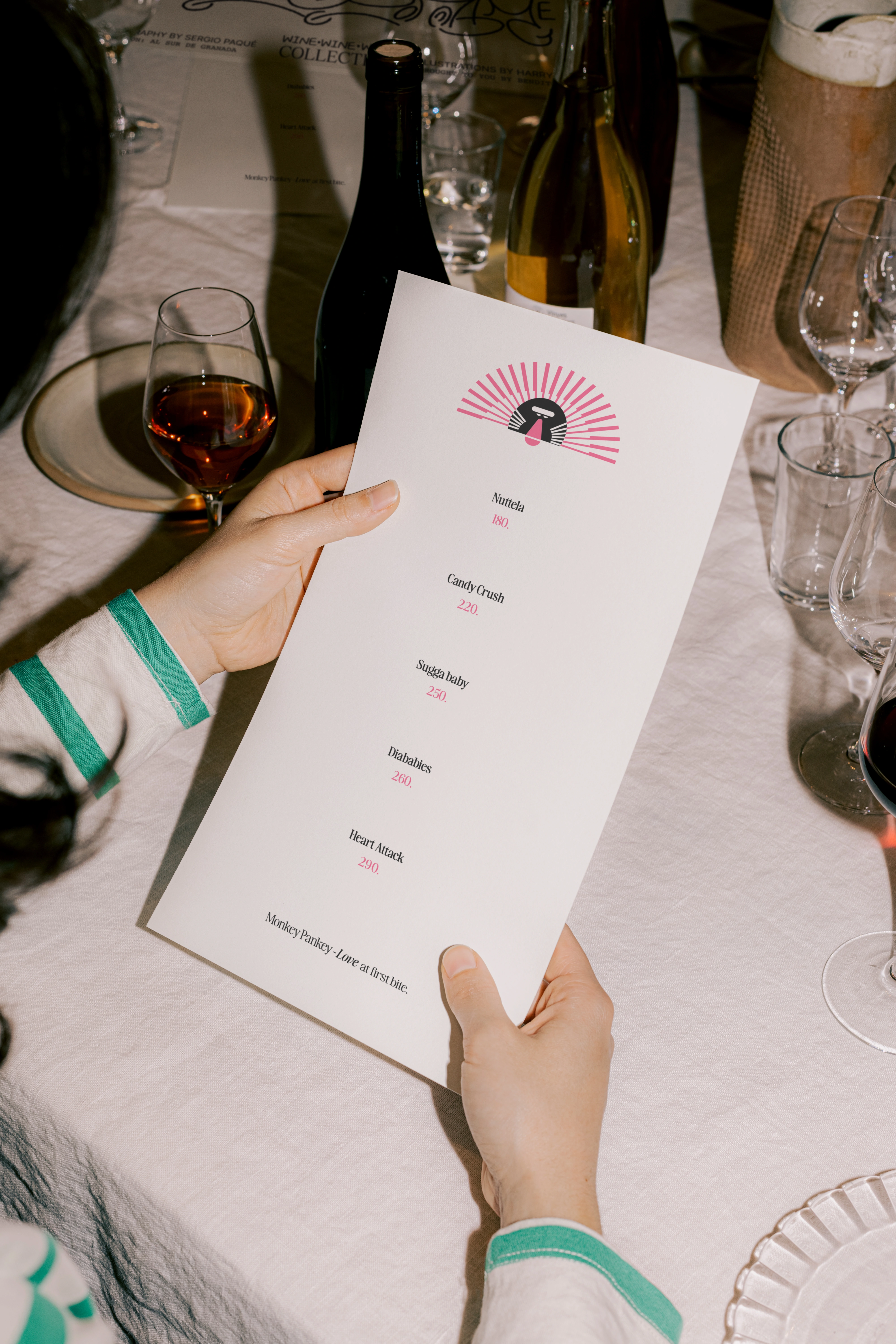
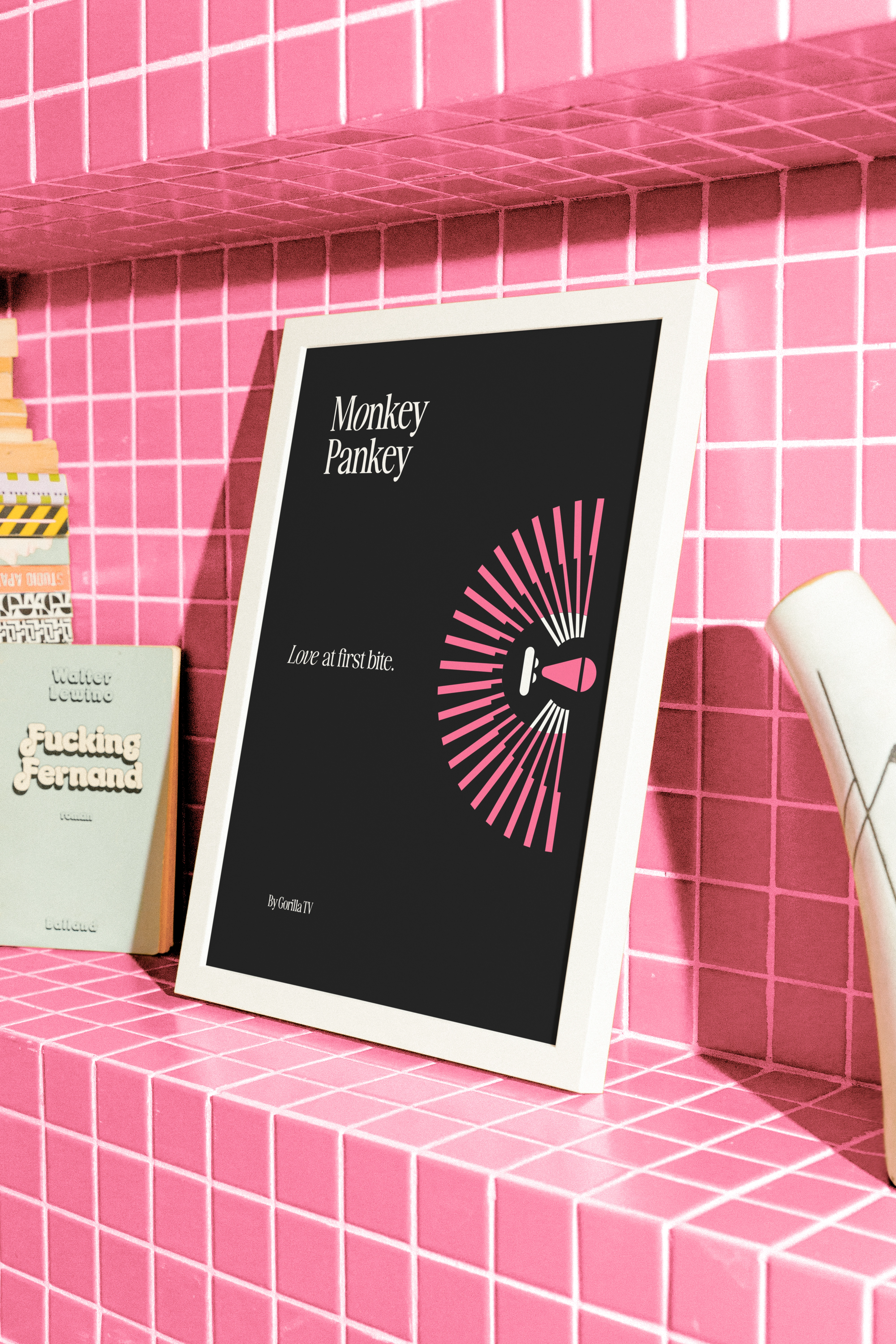
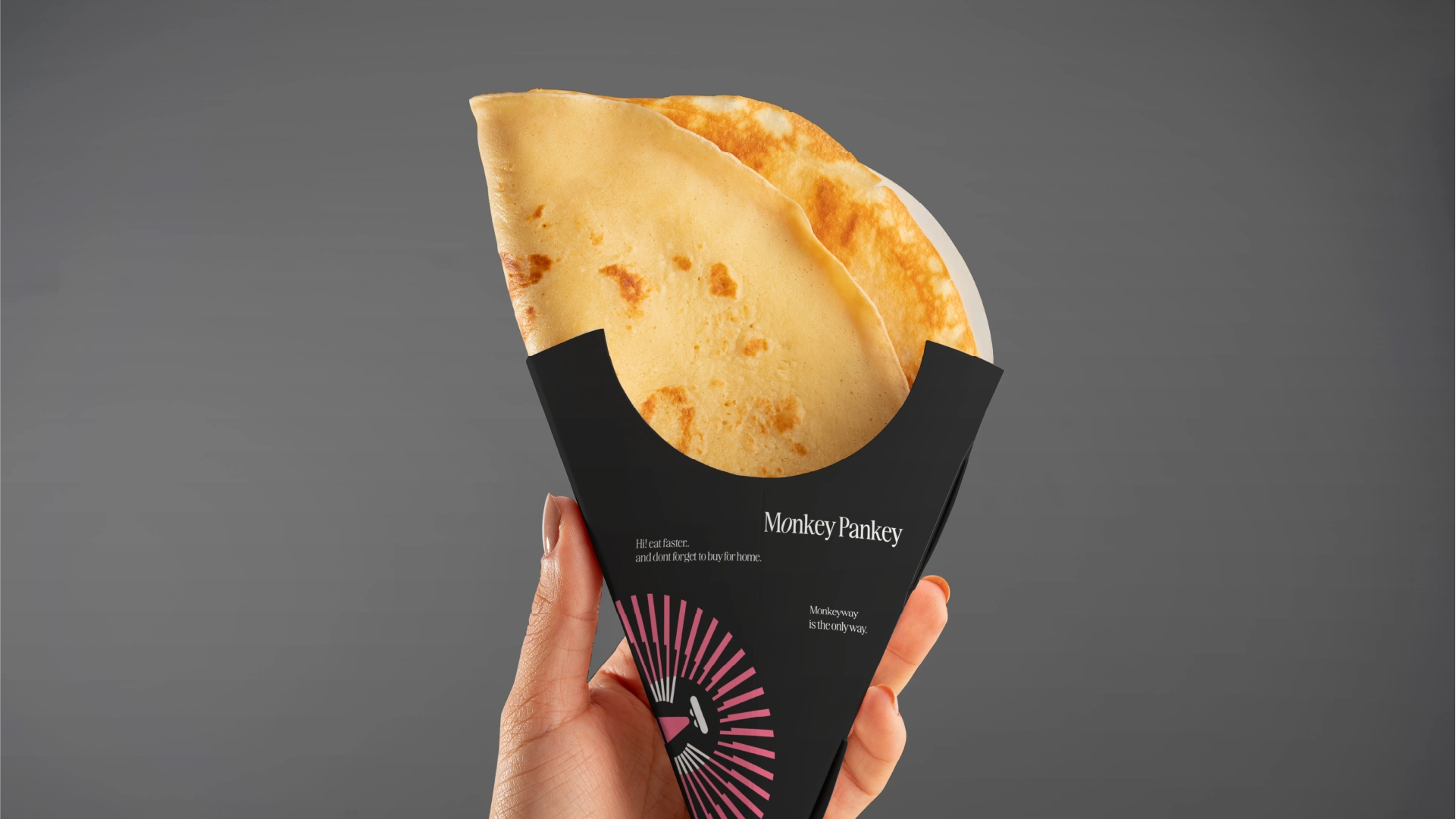
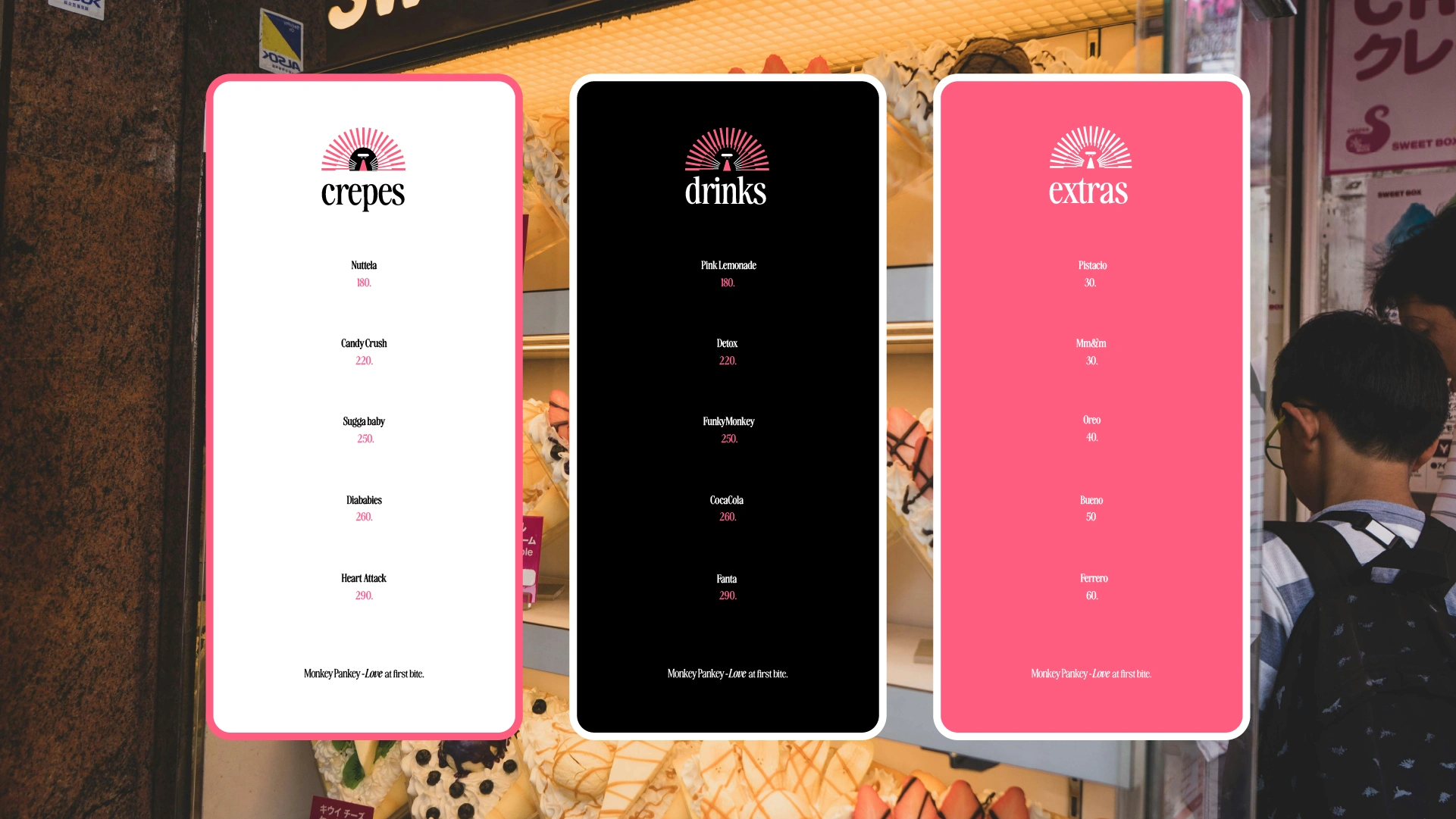
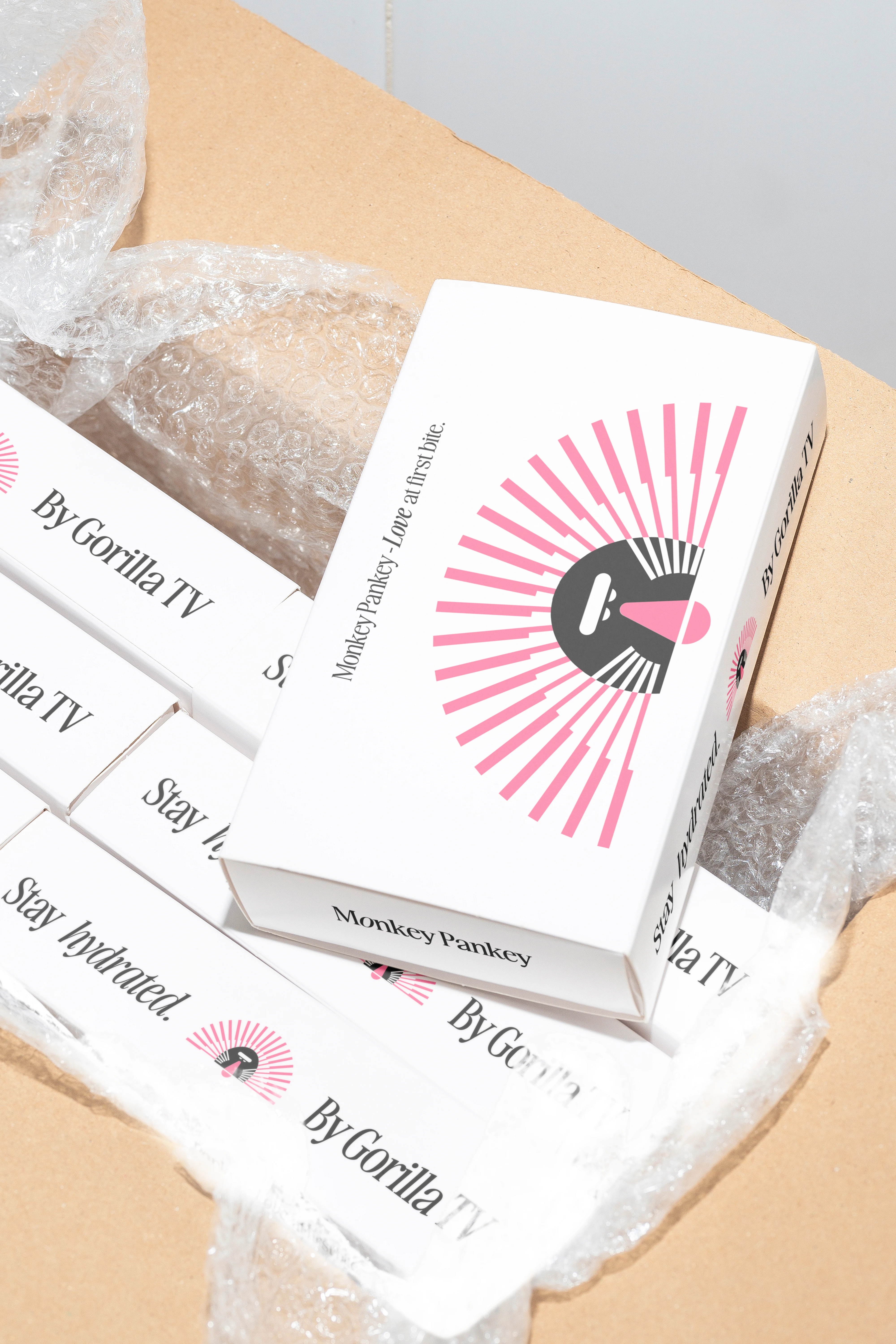
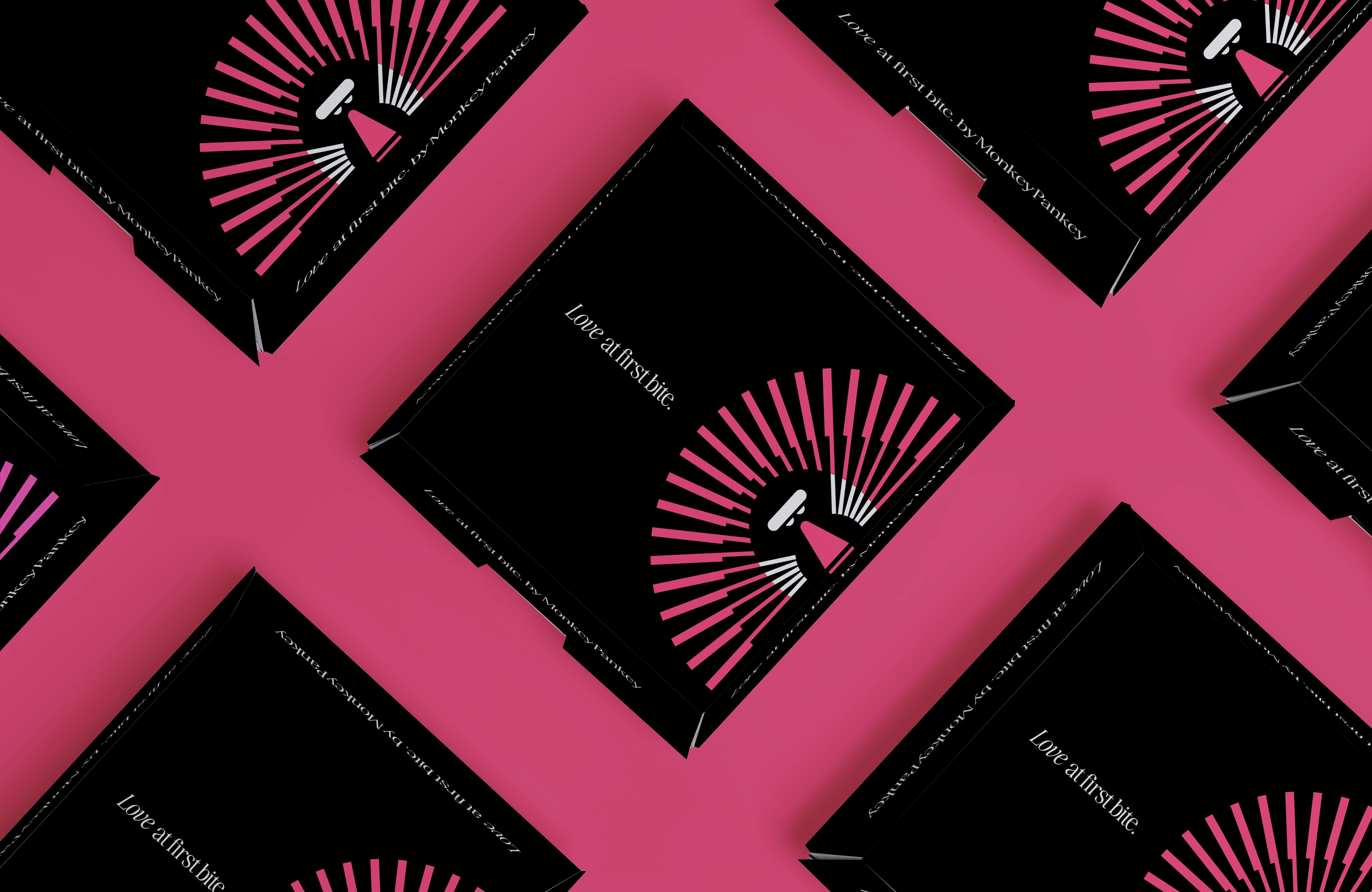
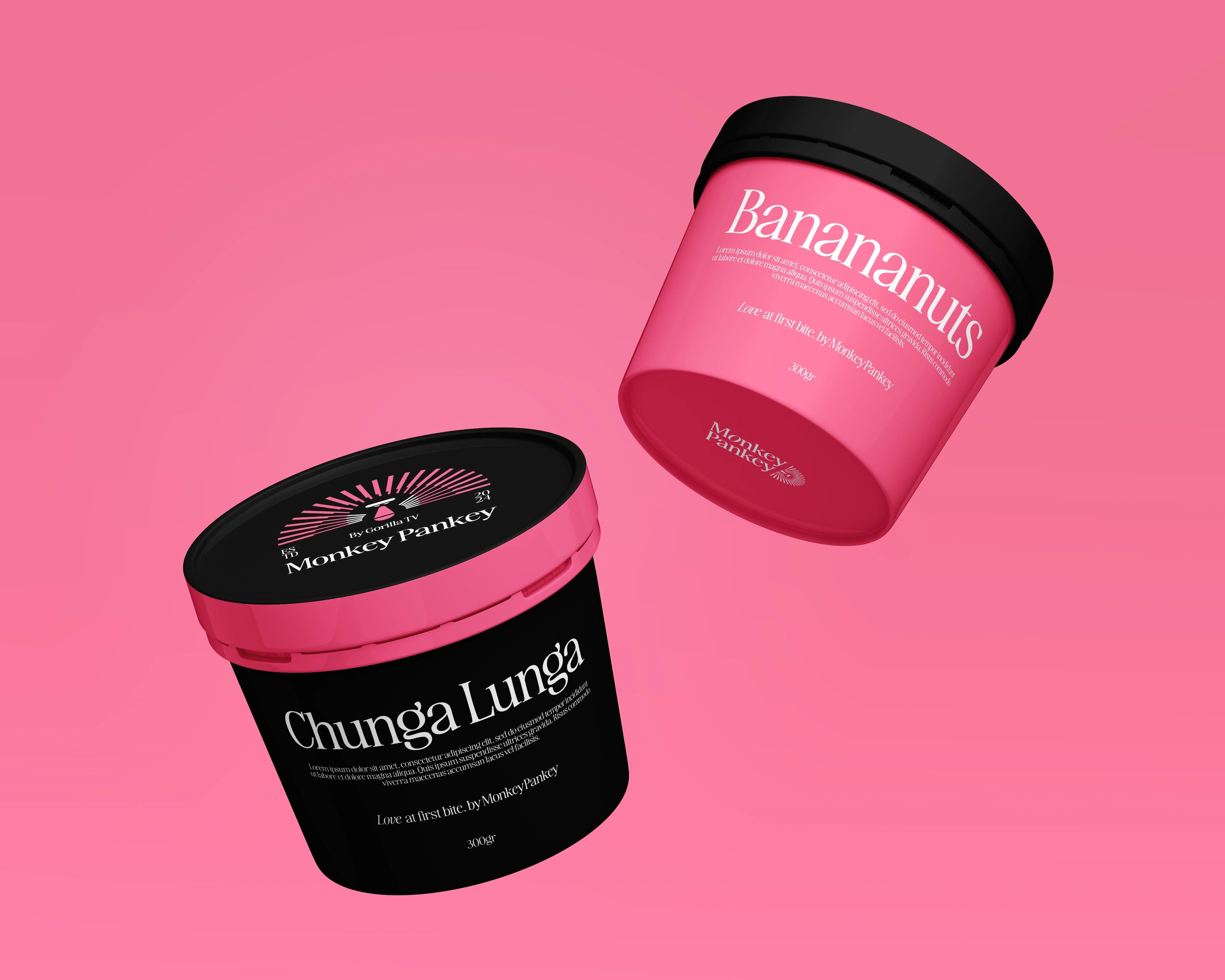
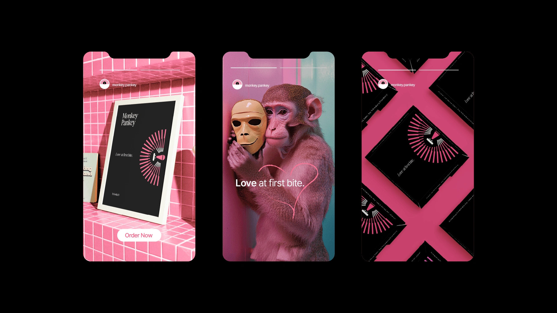
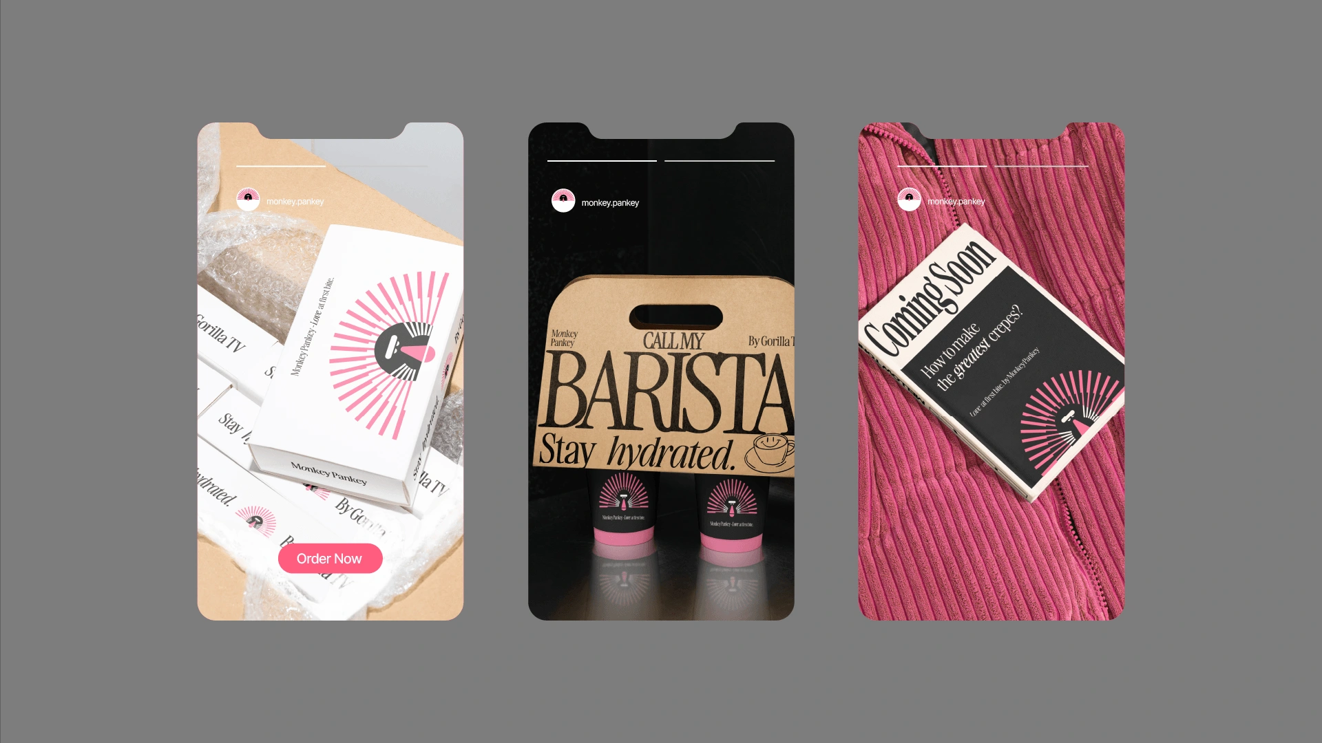
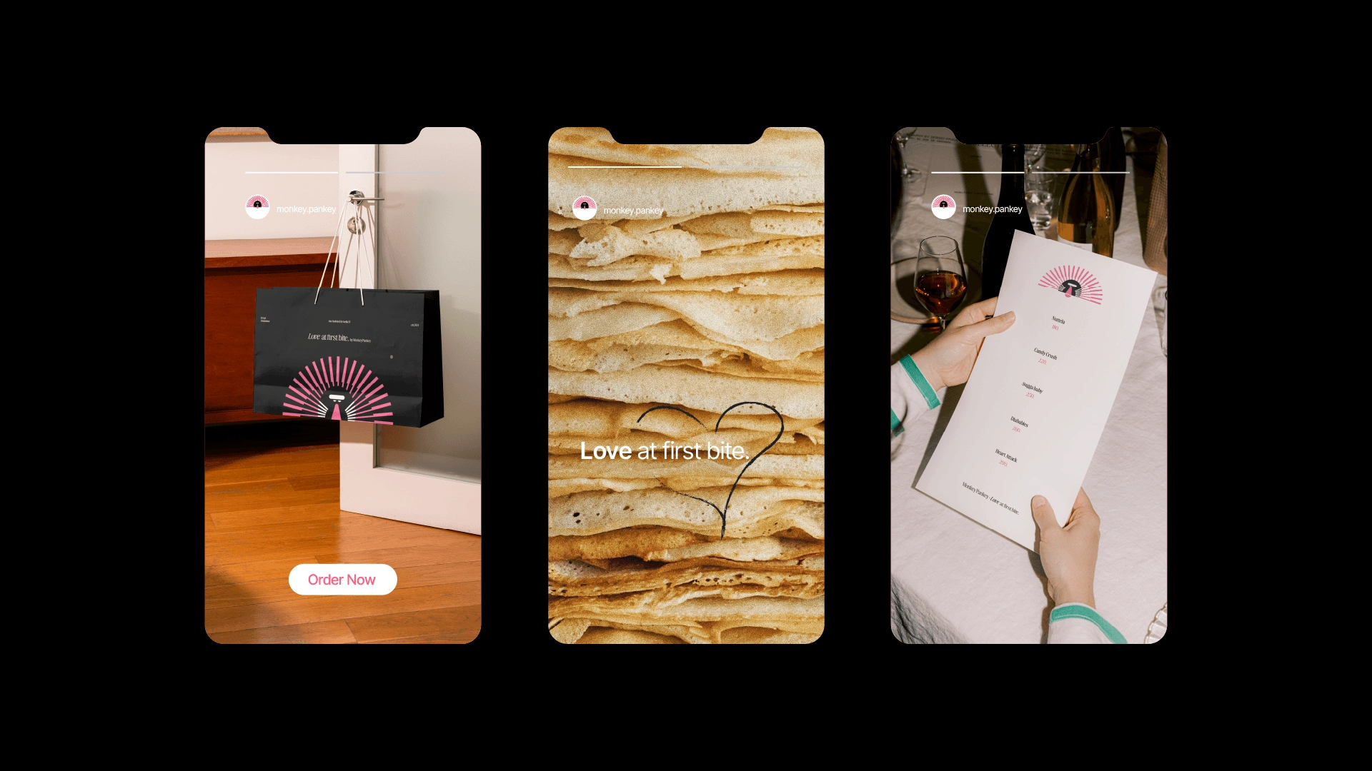
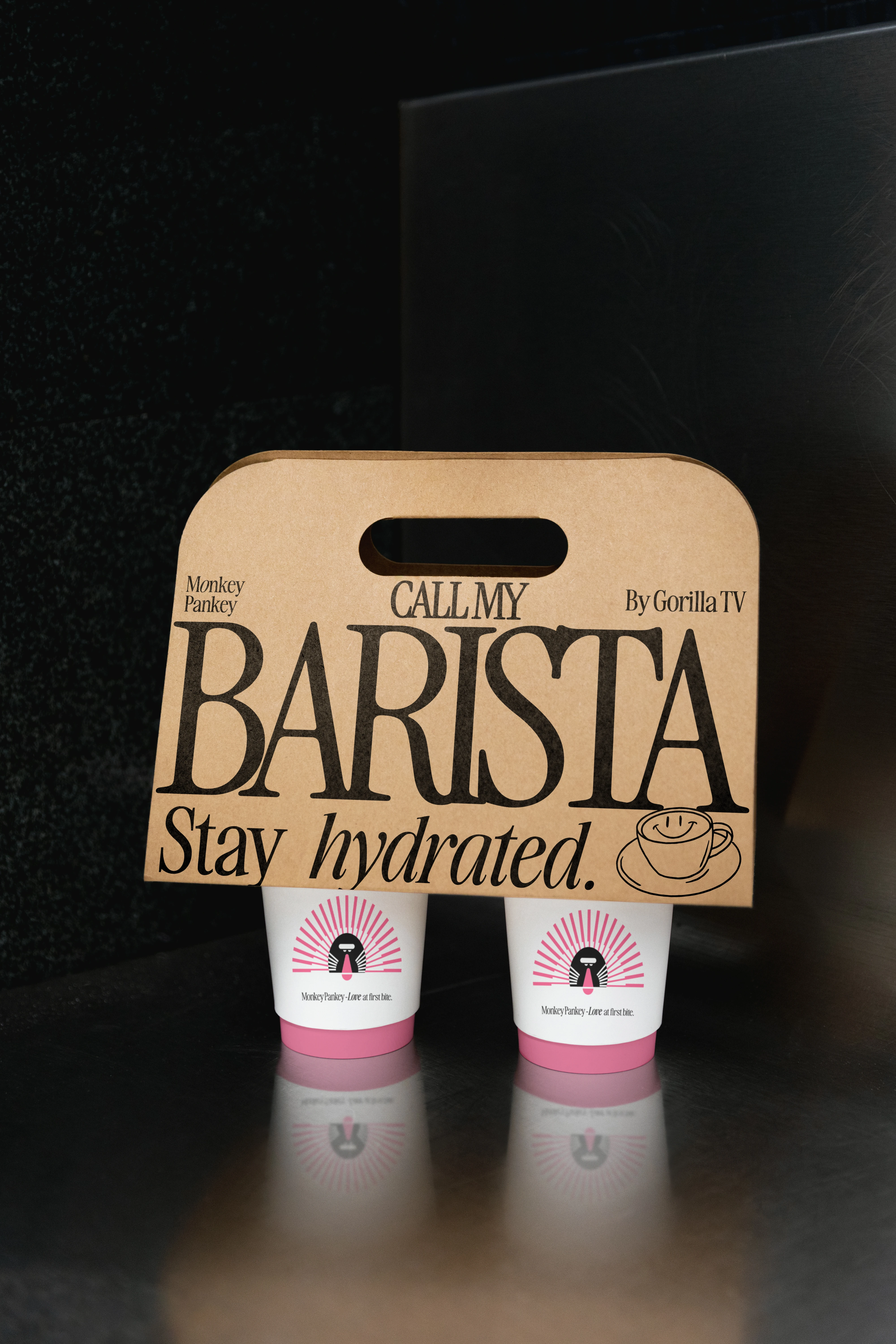
Monkey Pankey needed a brand that felt bold, playful, and instantly recognizable.
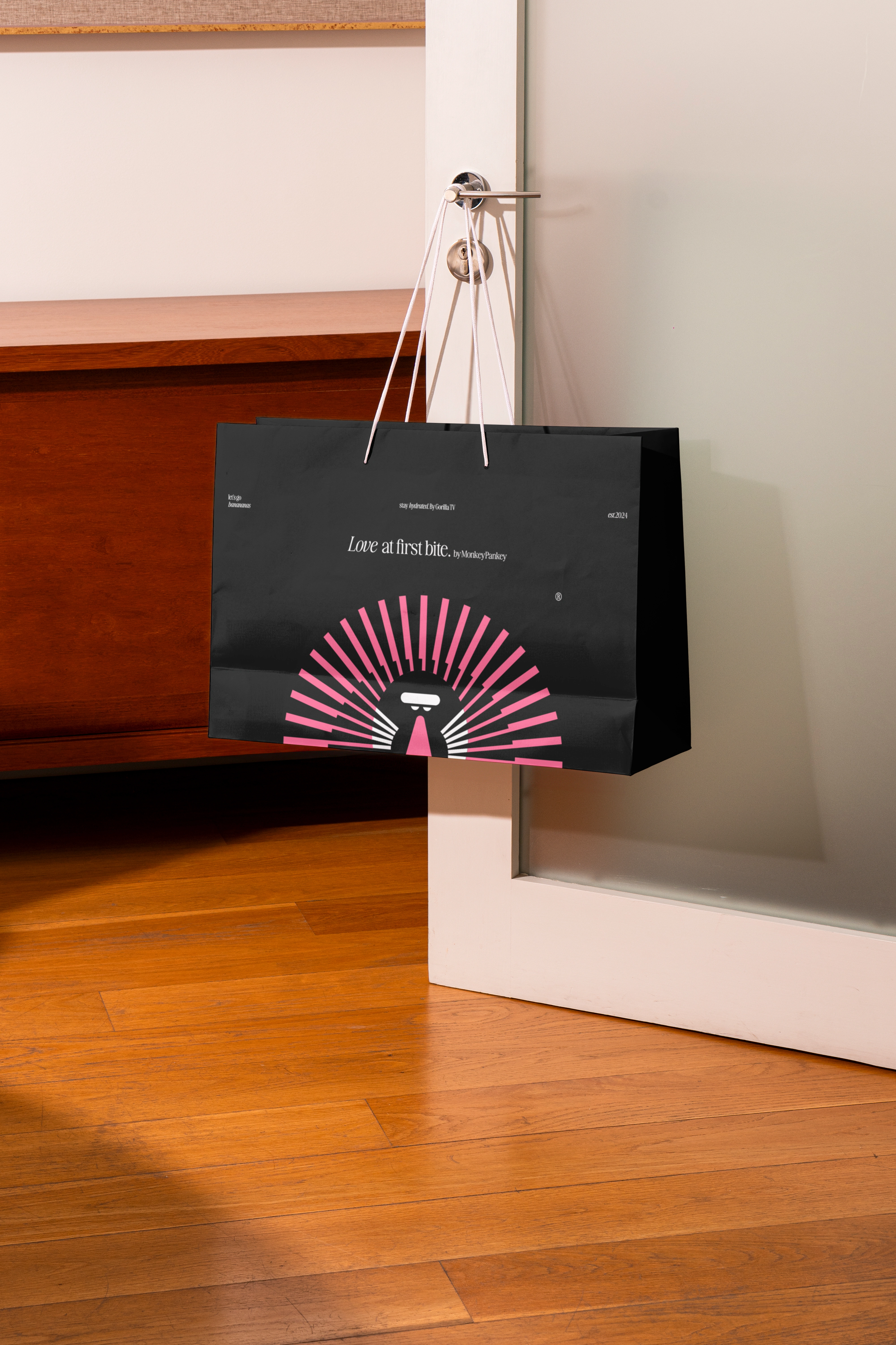
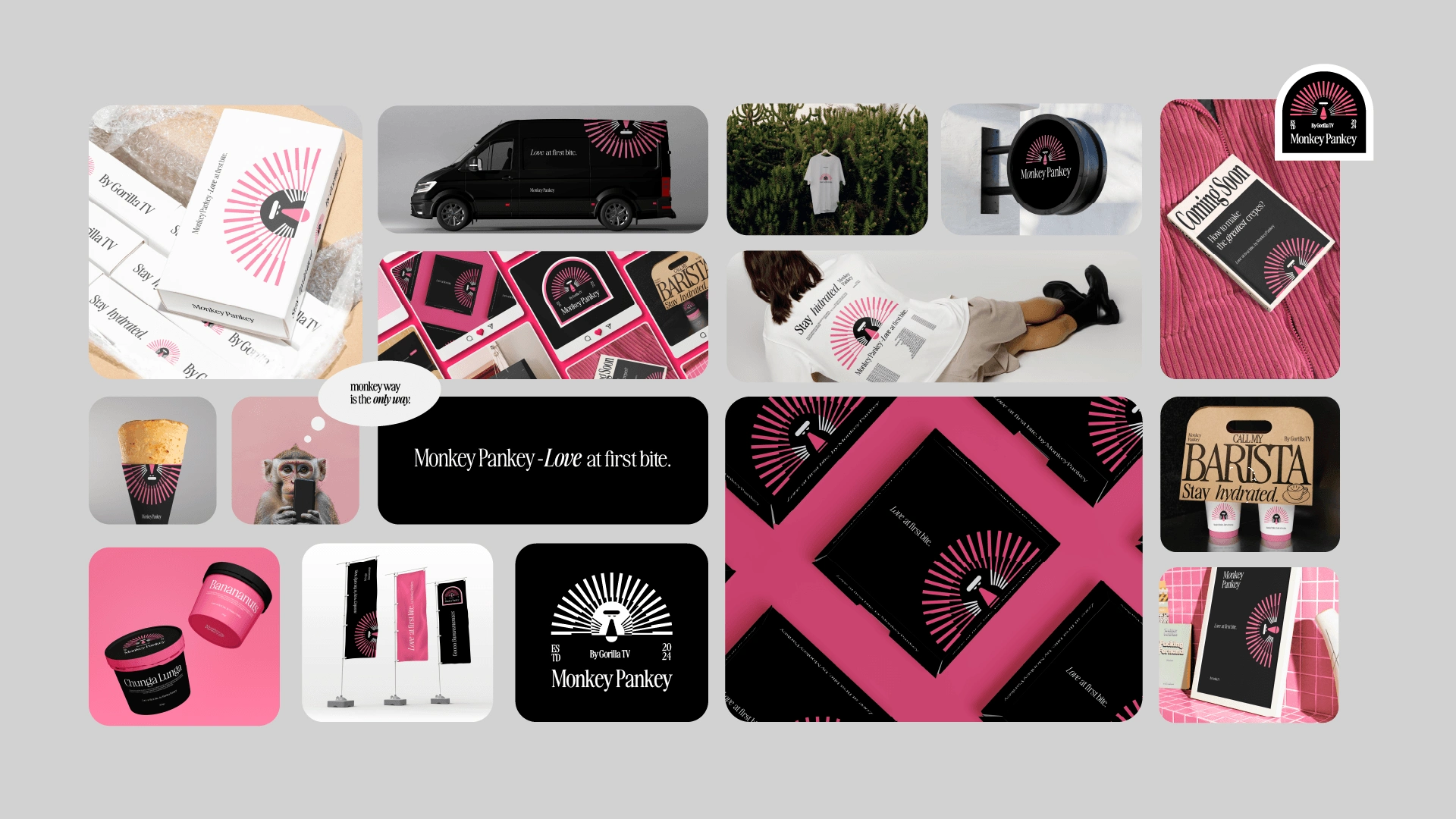
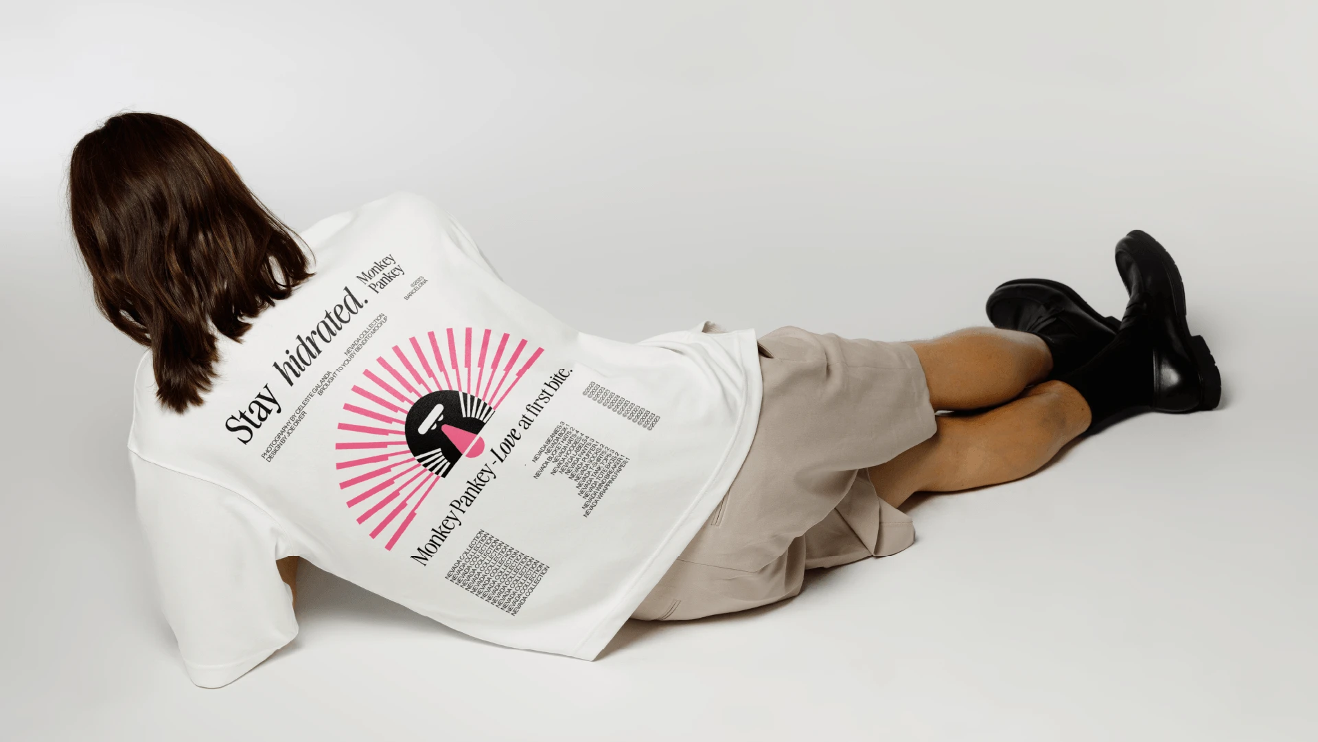
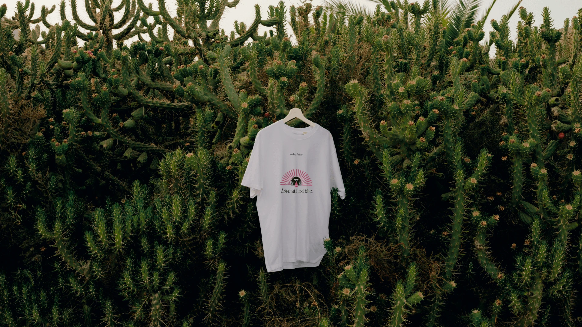
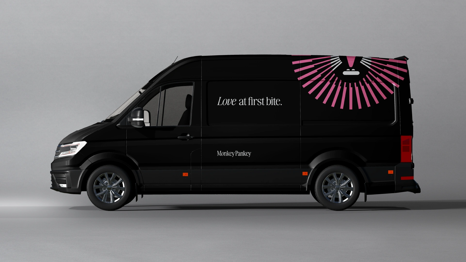
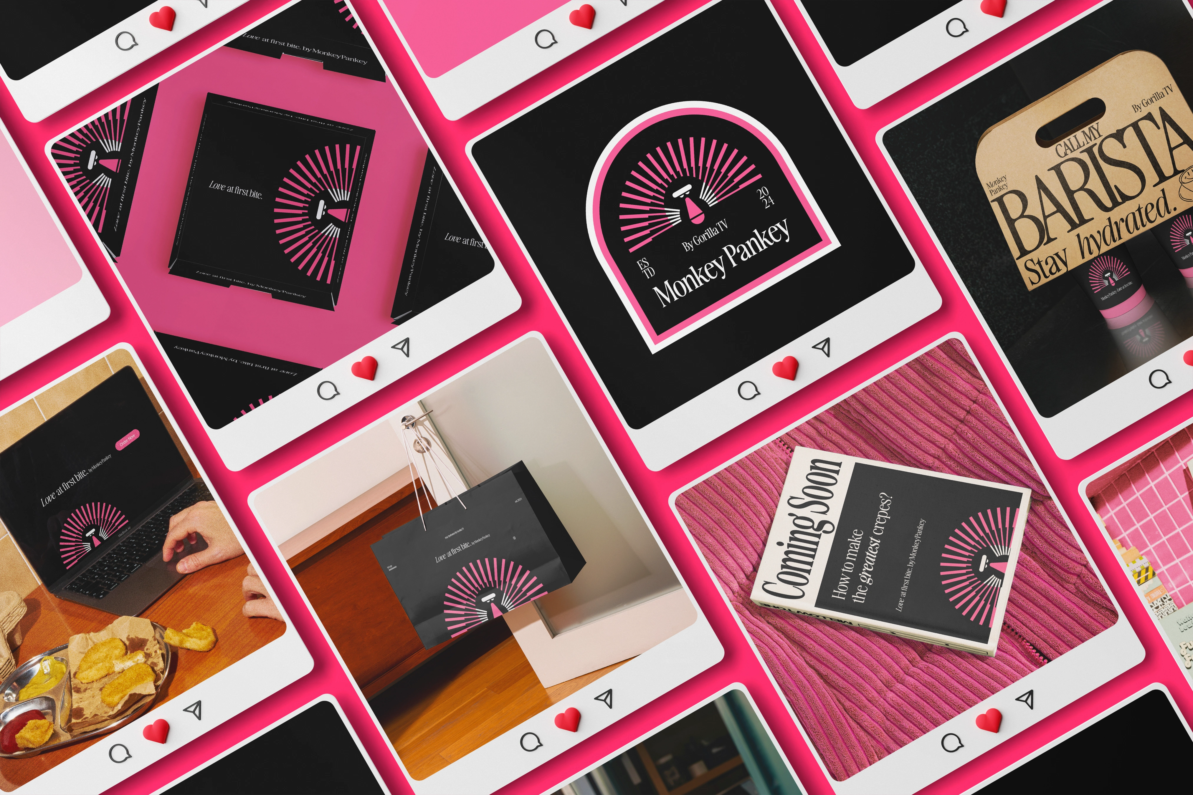
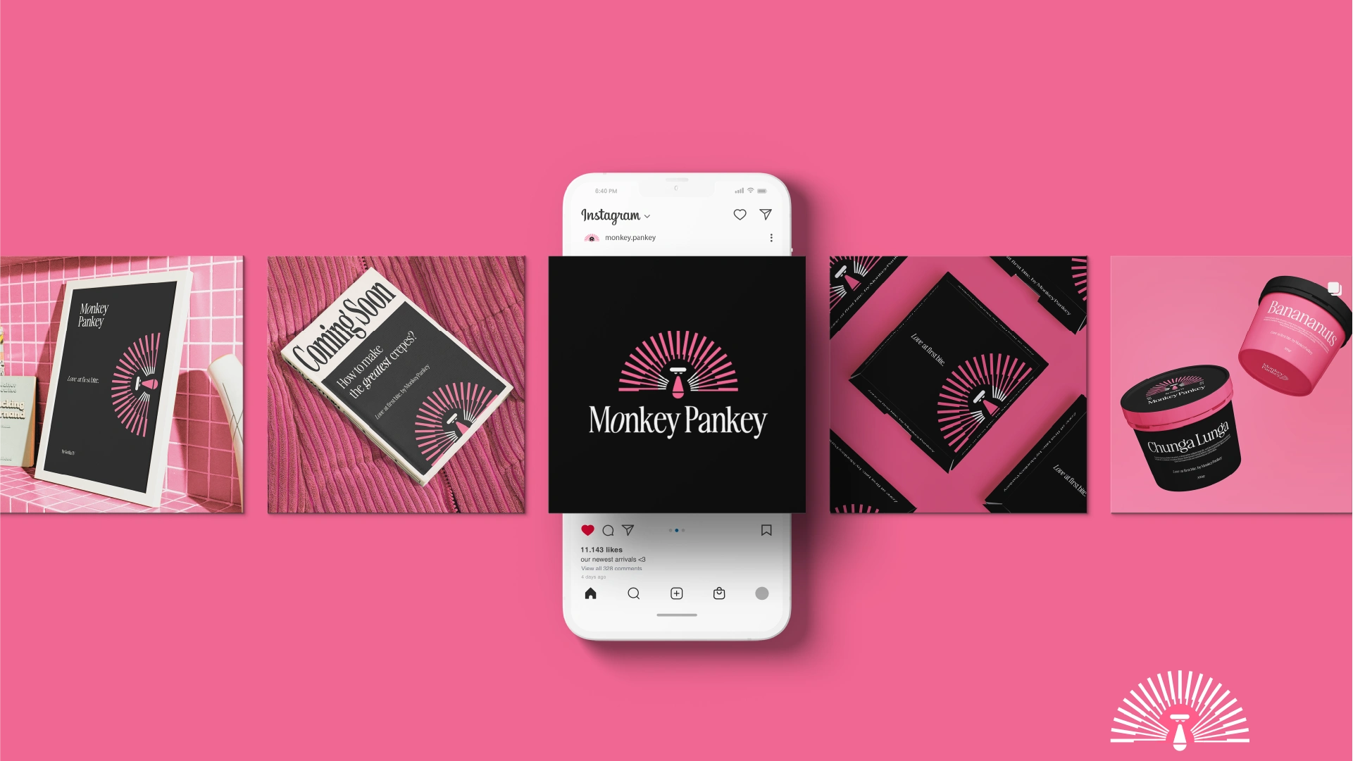
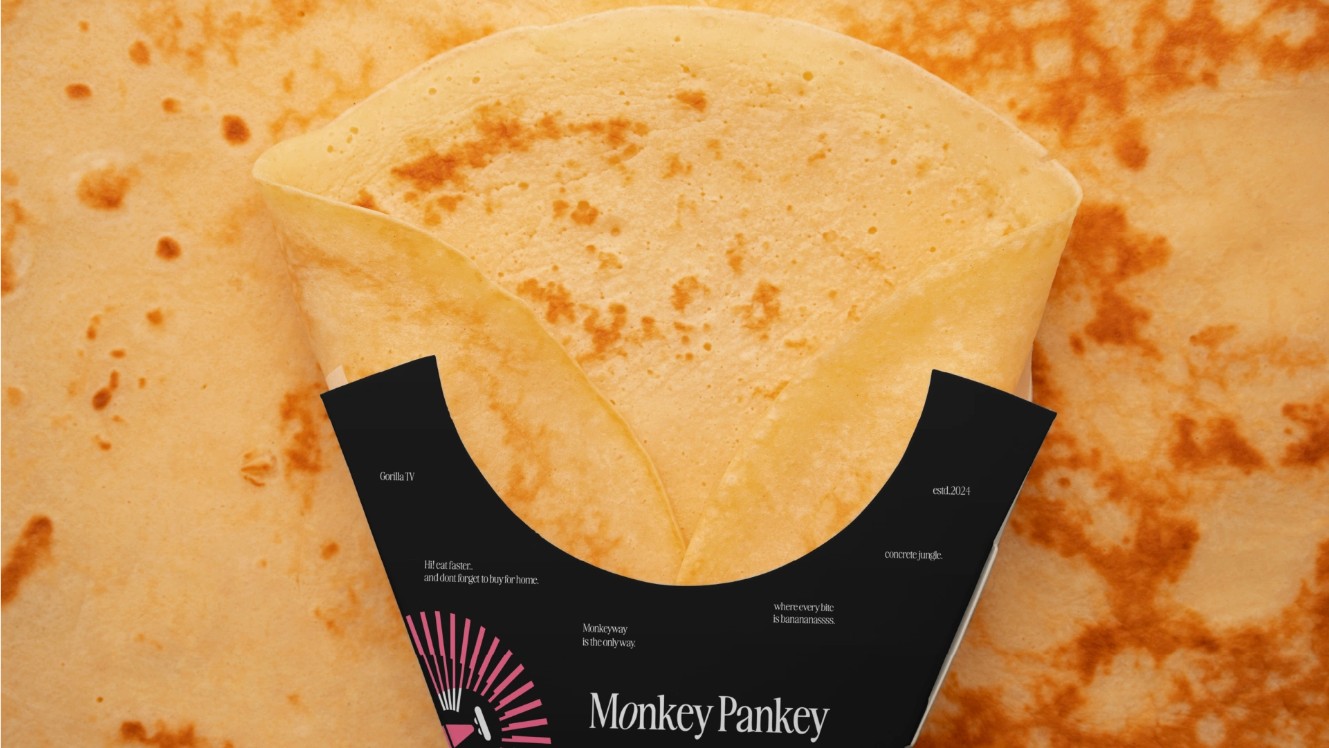
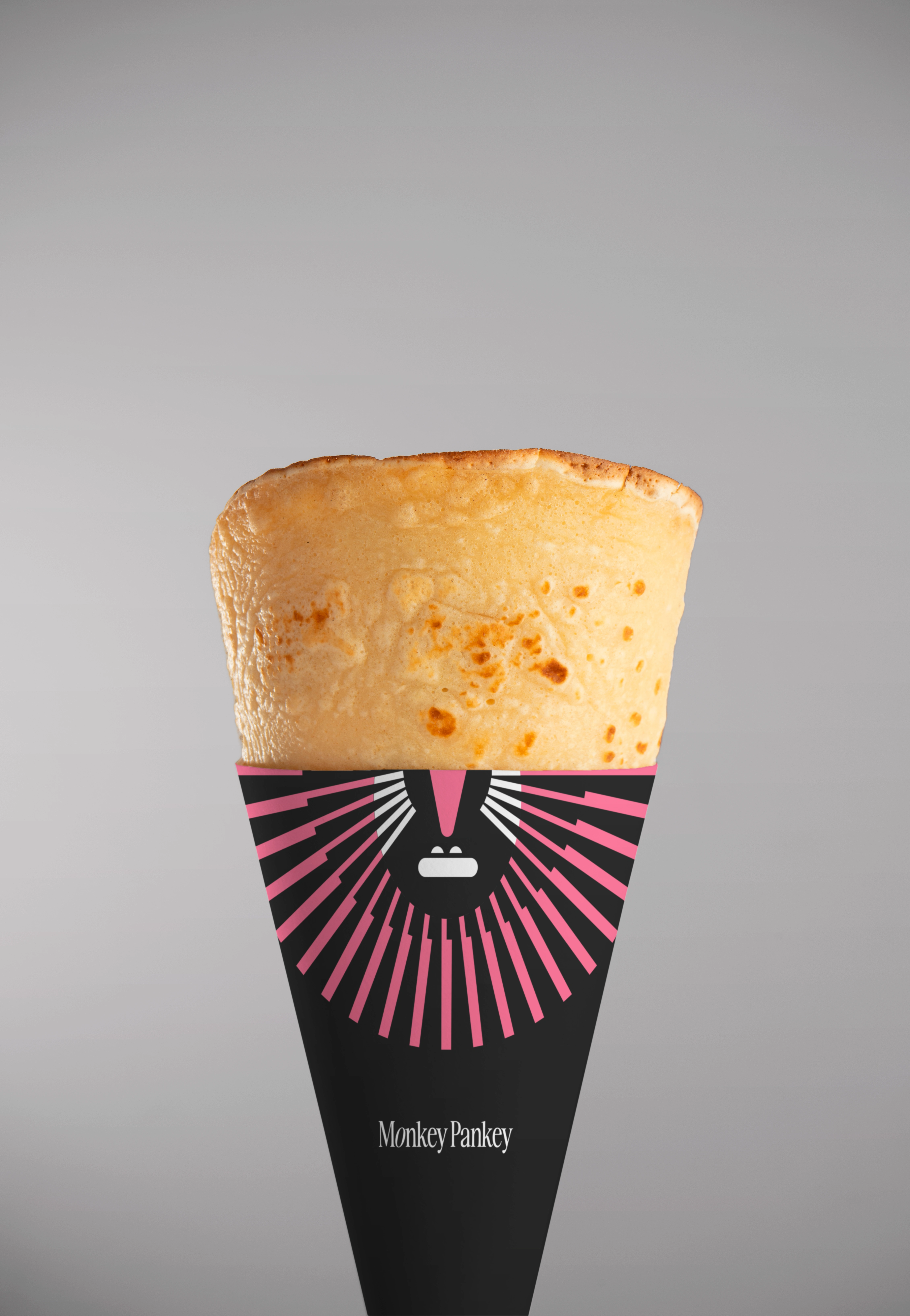
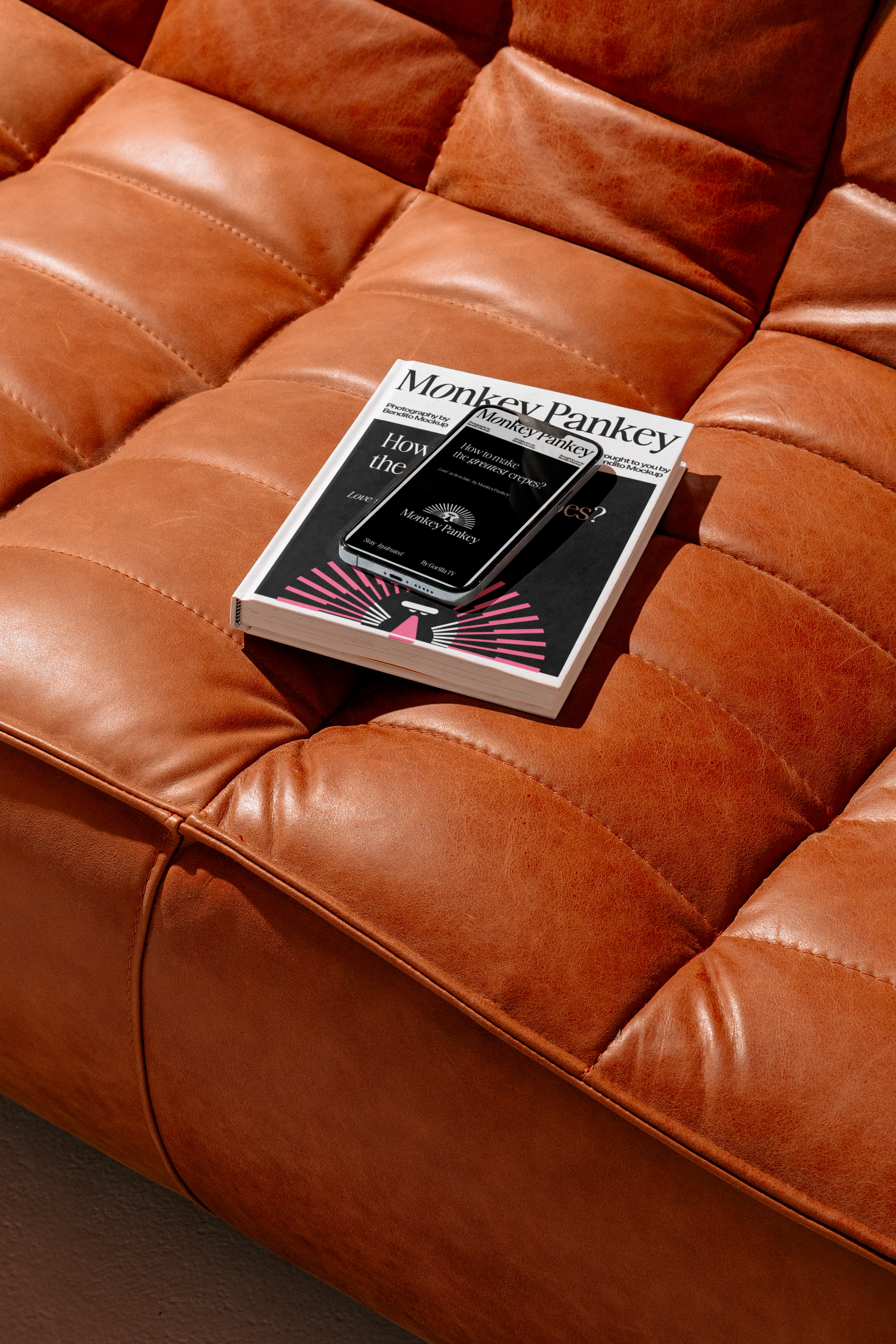
The identity system balances strong color blocking with expressive typography — designed to stand out in-store and across digital touchpoints. From logo to packaging and social, the system was built to feel cohesive, energetic, and memorable.
Fun, but structured.
Playful, but controlled.

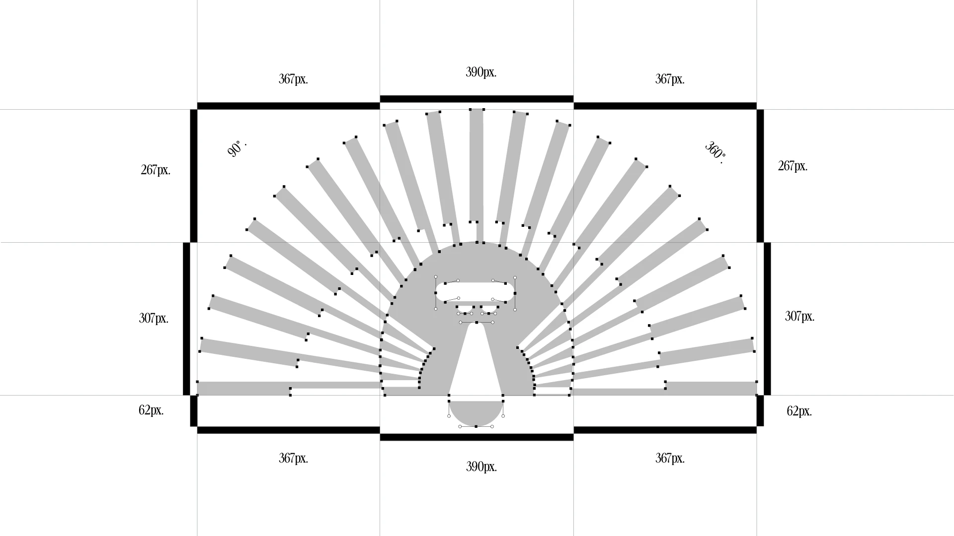
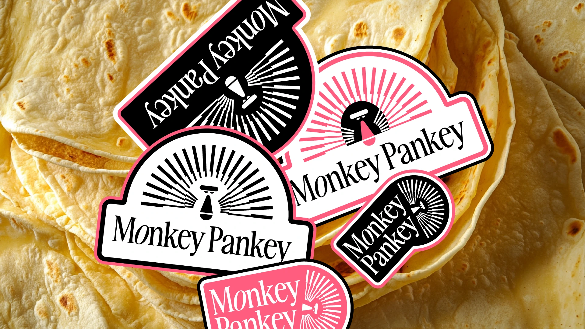

When scale matters, clarity matters more.
Let’s build an identity strong enough to support growth.
Like this project
Posted Jan 28, 2025
Bold and playful identity system for an Italian crepe concept. Vibrant color, expressive typography, and cohesive brand guidelines.