Packaging Design | Chia Drinks
Alec Minimalec
Chia Drinks needed more than a redesign — it needed presence.
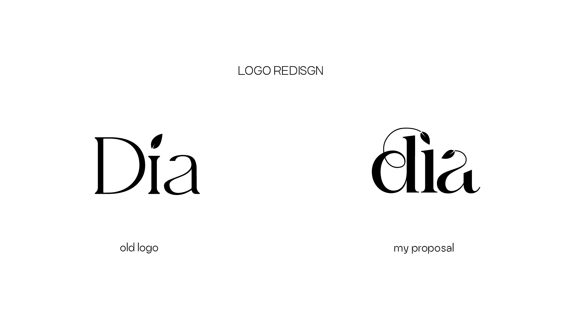
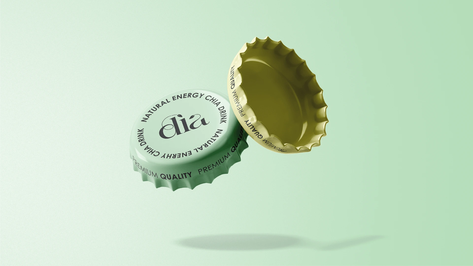
The direction focused on reduction and shelf clarity. A refined logo, softened tones, and a structured layout system create a modern, health-forward identity without falling into generic wellness tropes.
Minimal composition. Strong hierarchy. Built for real retail environments.
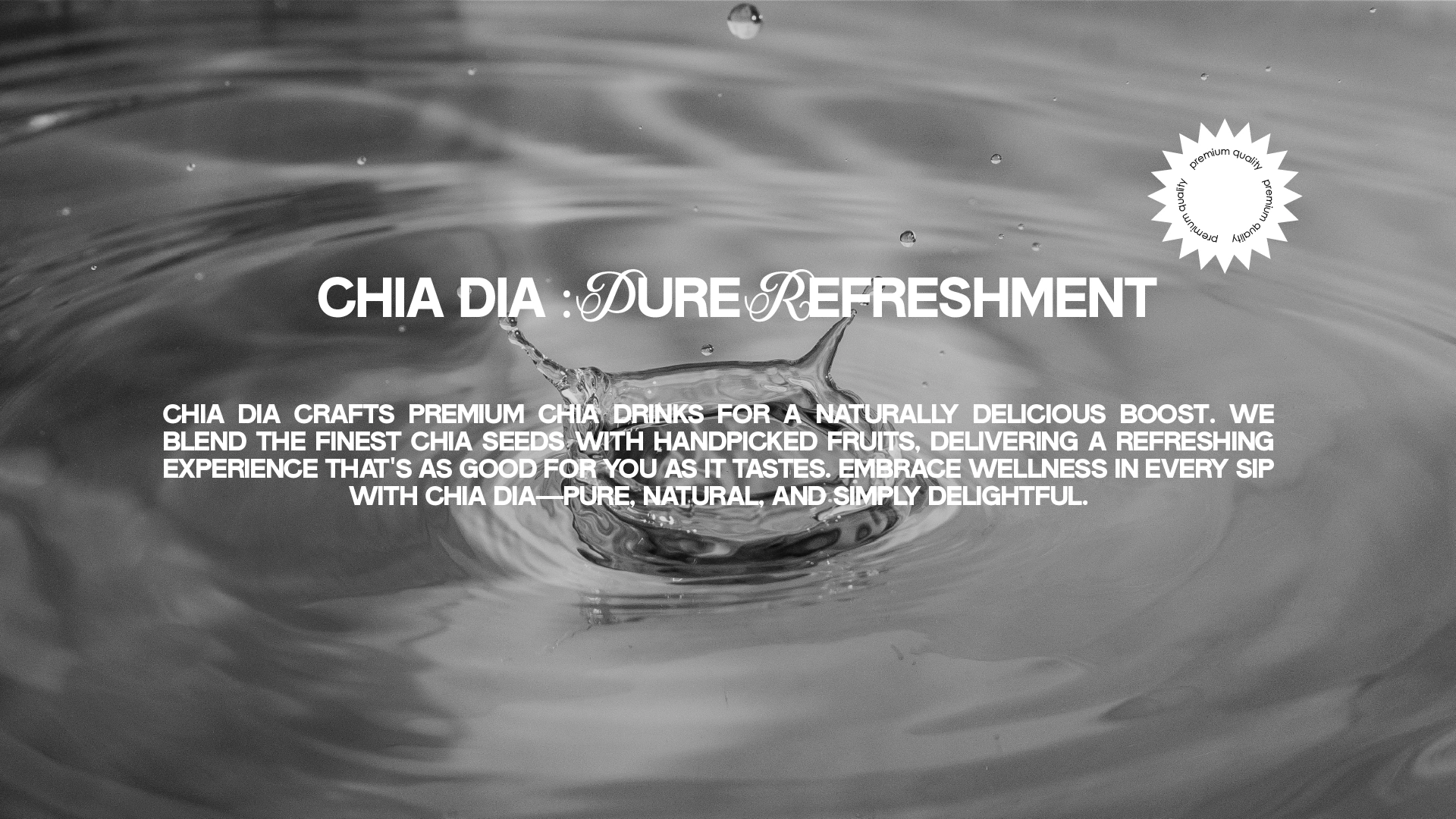
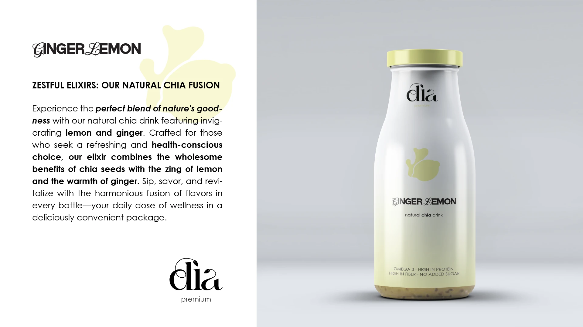
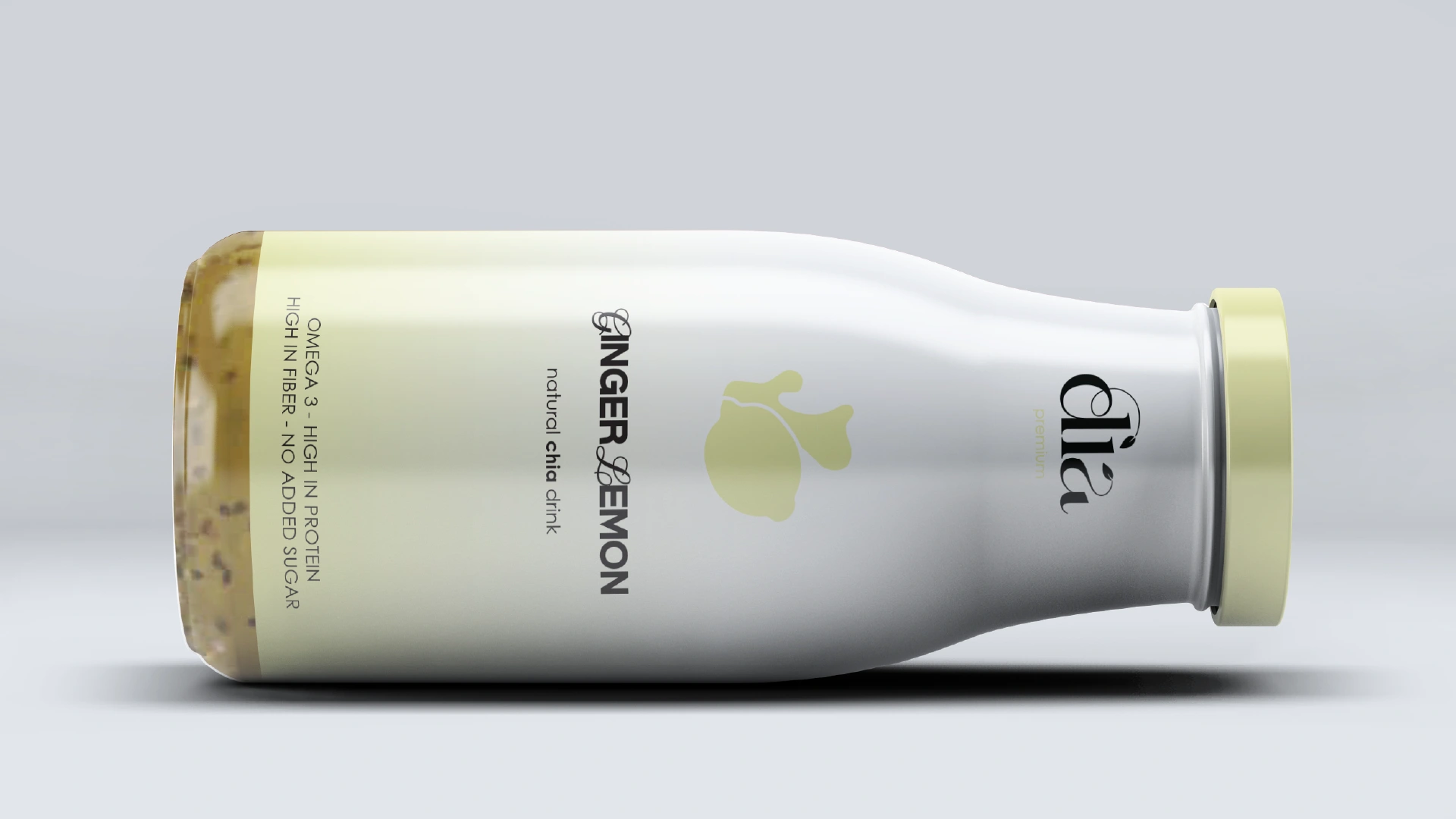
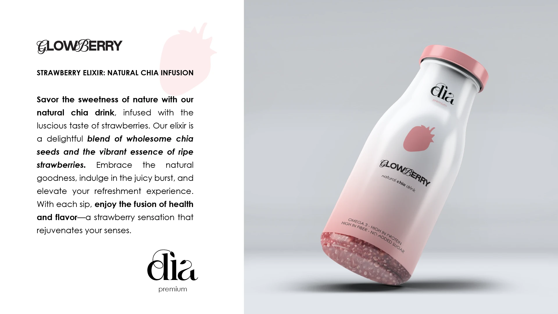
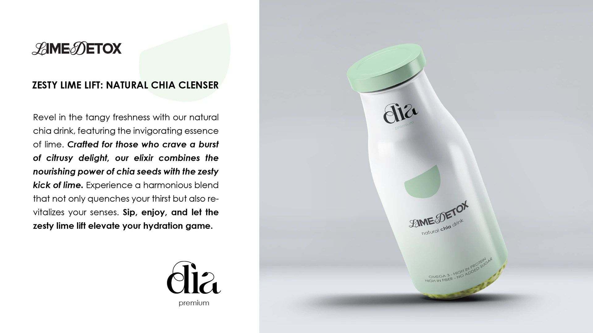
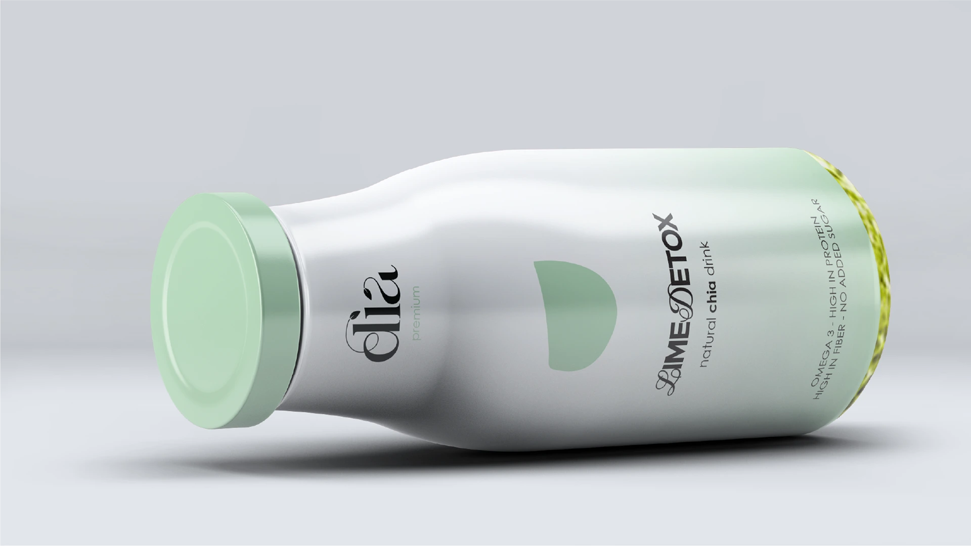
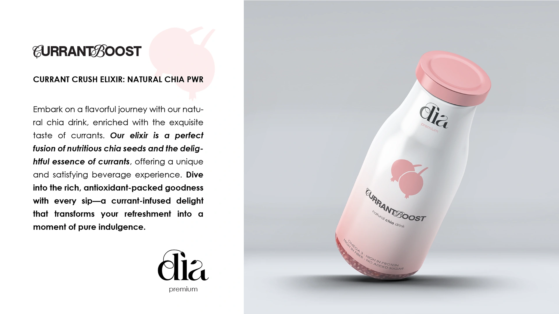
Chia Dia is positioned as a premium natural chia drink.
The packaging system was designed around softness and clarity — muted tones, minimal typography, and gentle gradients that reflect freshness without overwhelming the shelf.
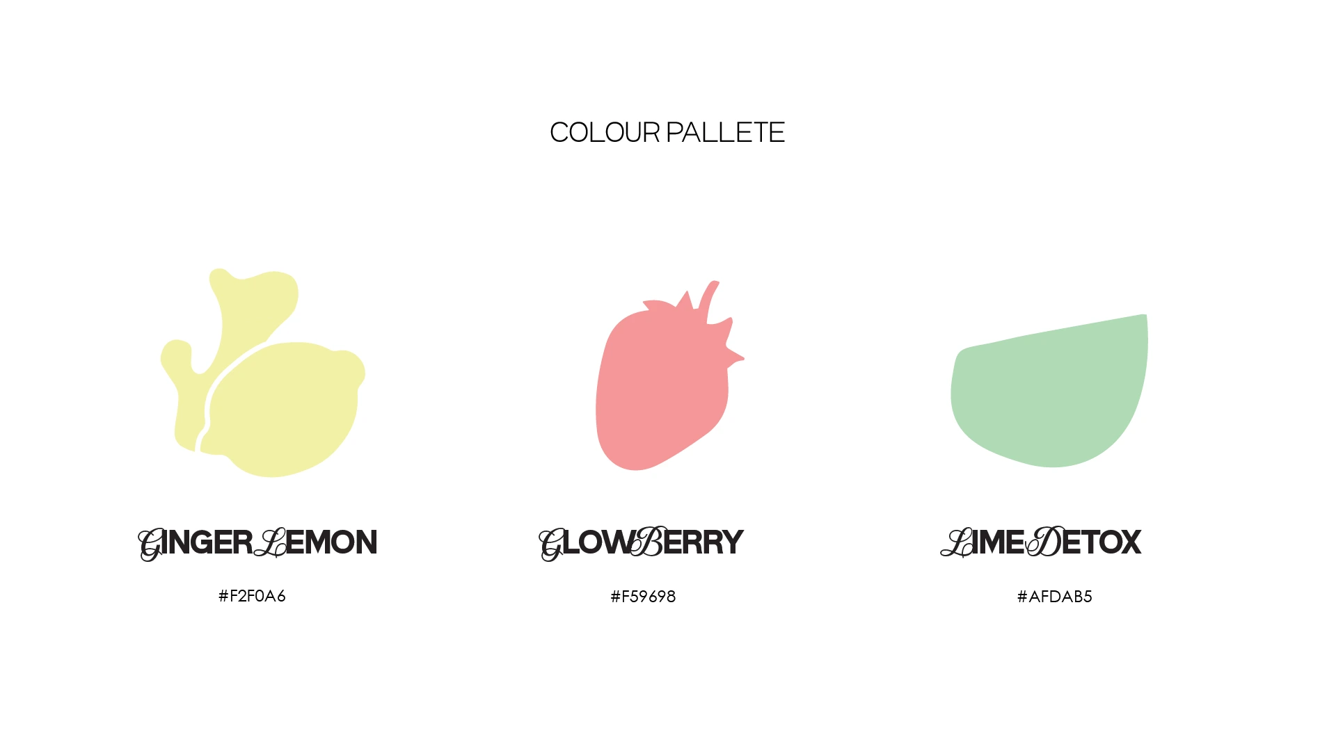
Each flavor is differentiated through controlled color blocking while maintaining a cohesive visual language across the range.
The goal wasn’t to look “healthy.”
It was to feel refined, modern, and trustworthy. Clean hierarchy. Balanced composition. Shelf presence without noise.
Like this project
Posted Mar 19, 2025
Minimal packaging system for a premium chia drink brand. Soft tones, refined typography, and cohesive flavor differentiation.