

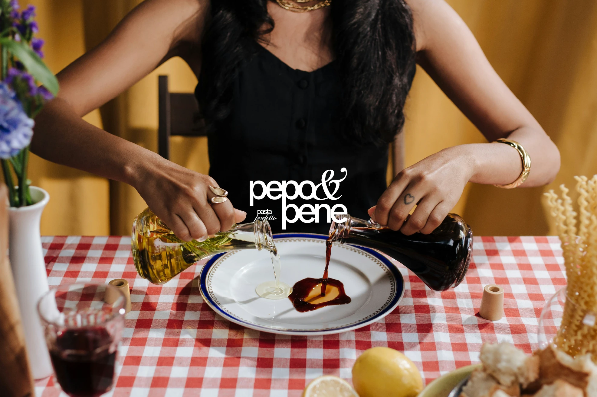
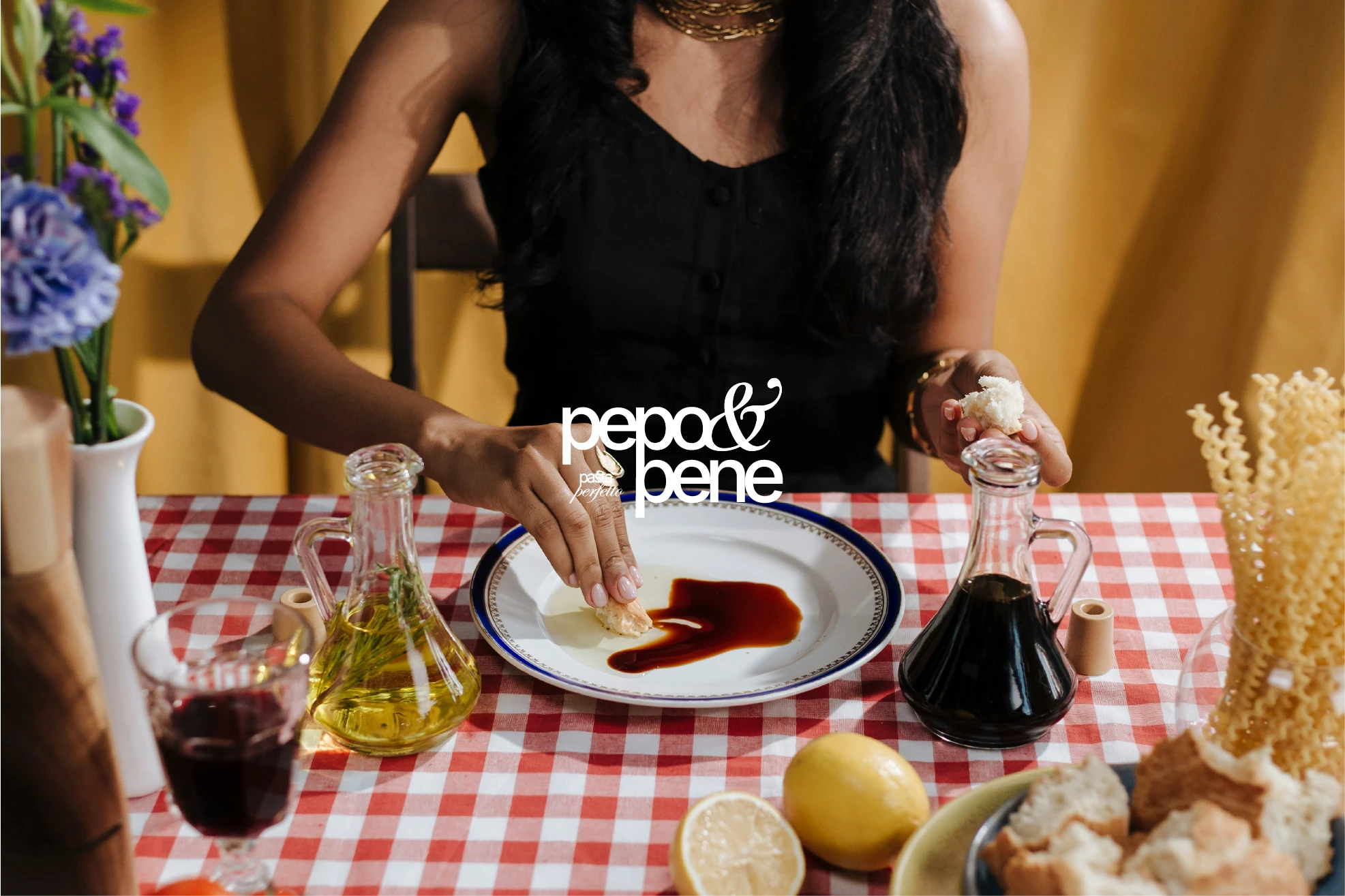
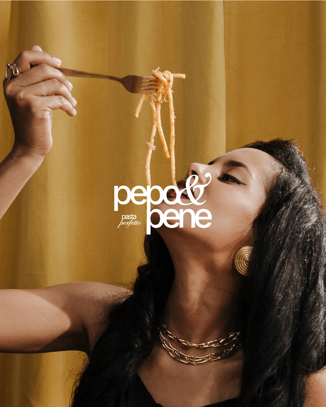
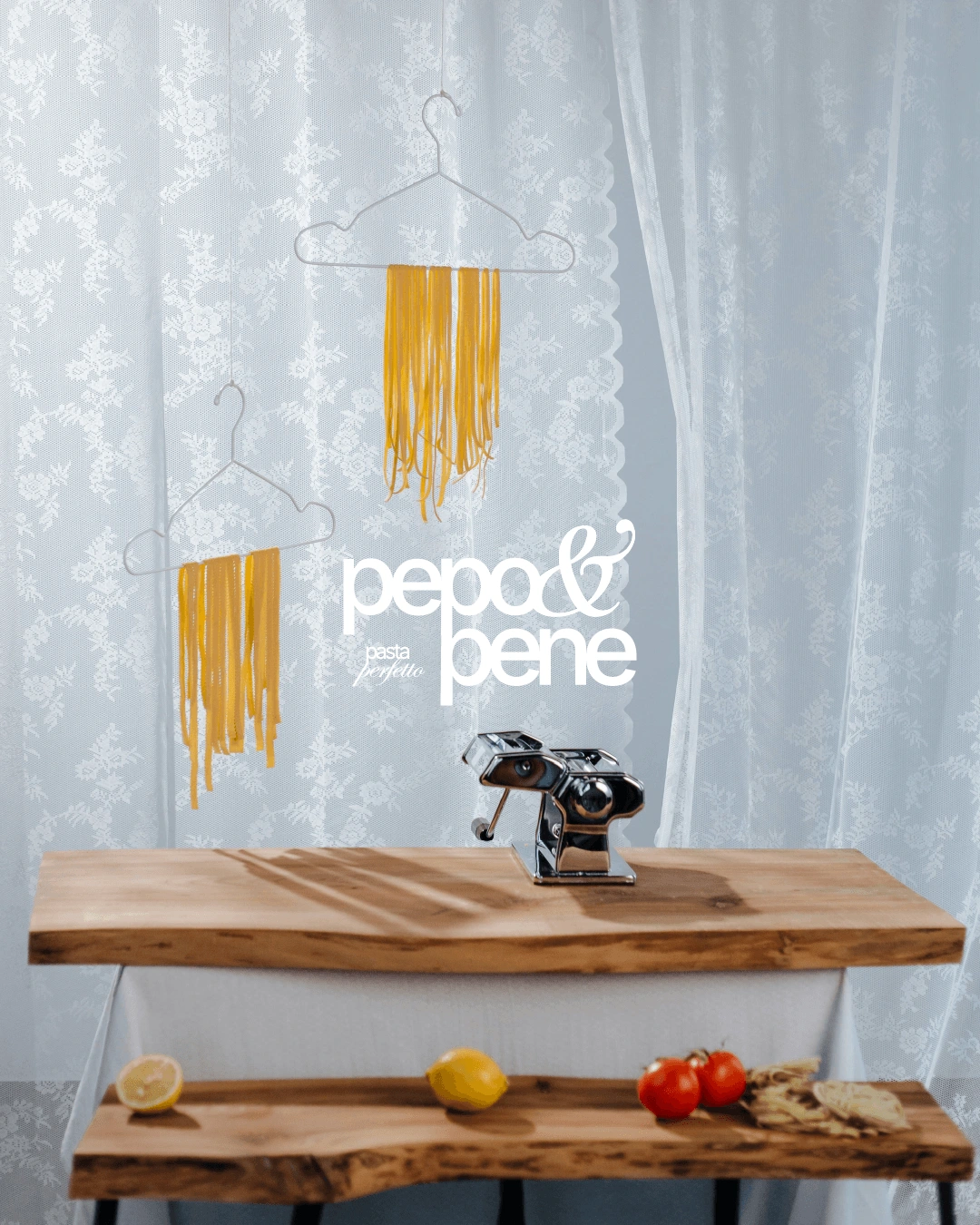
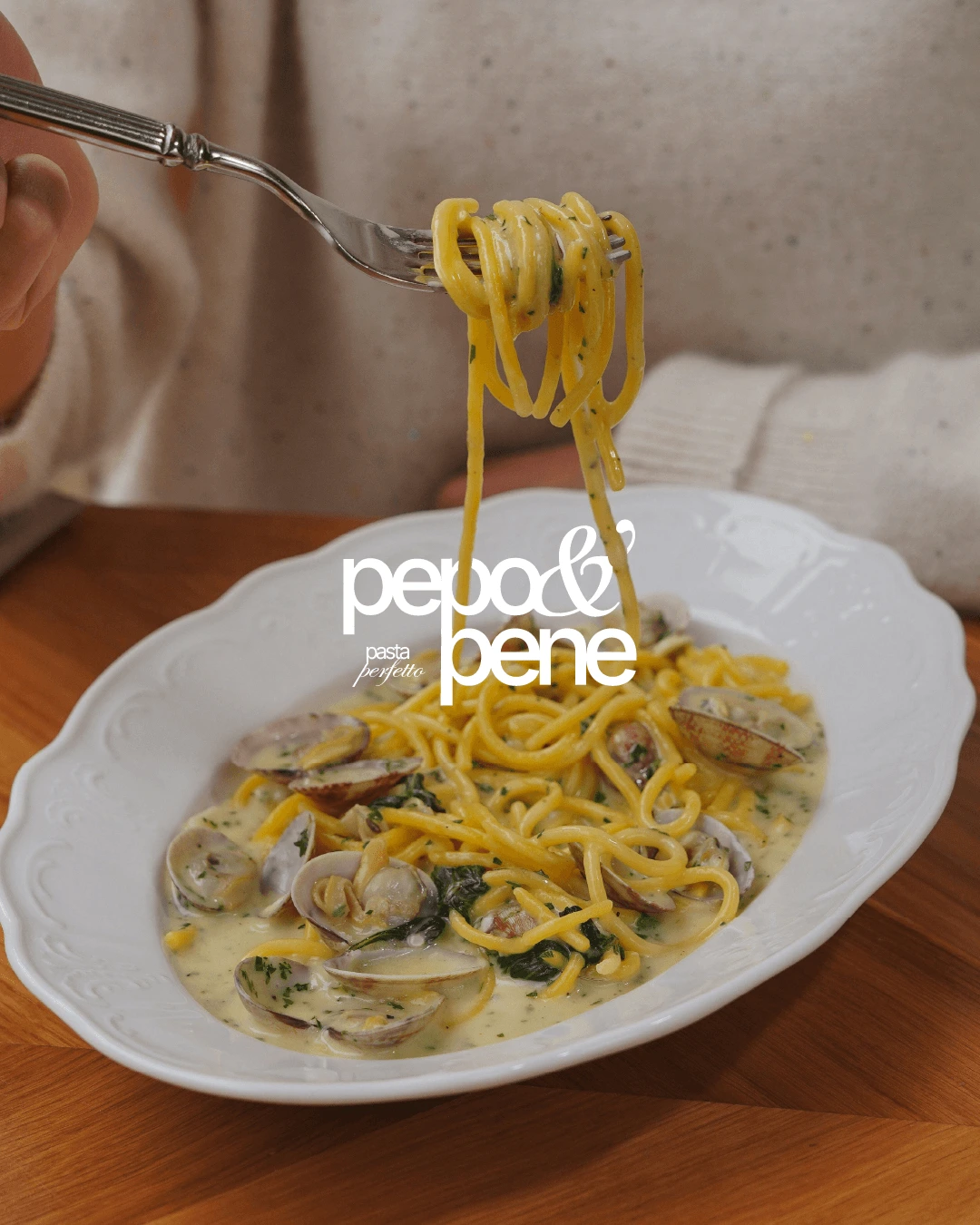
Pepo & Pene is built on movement and expression.
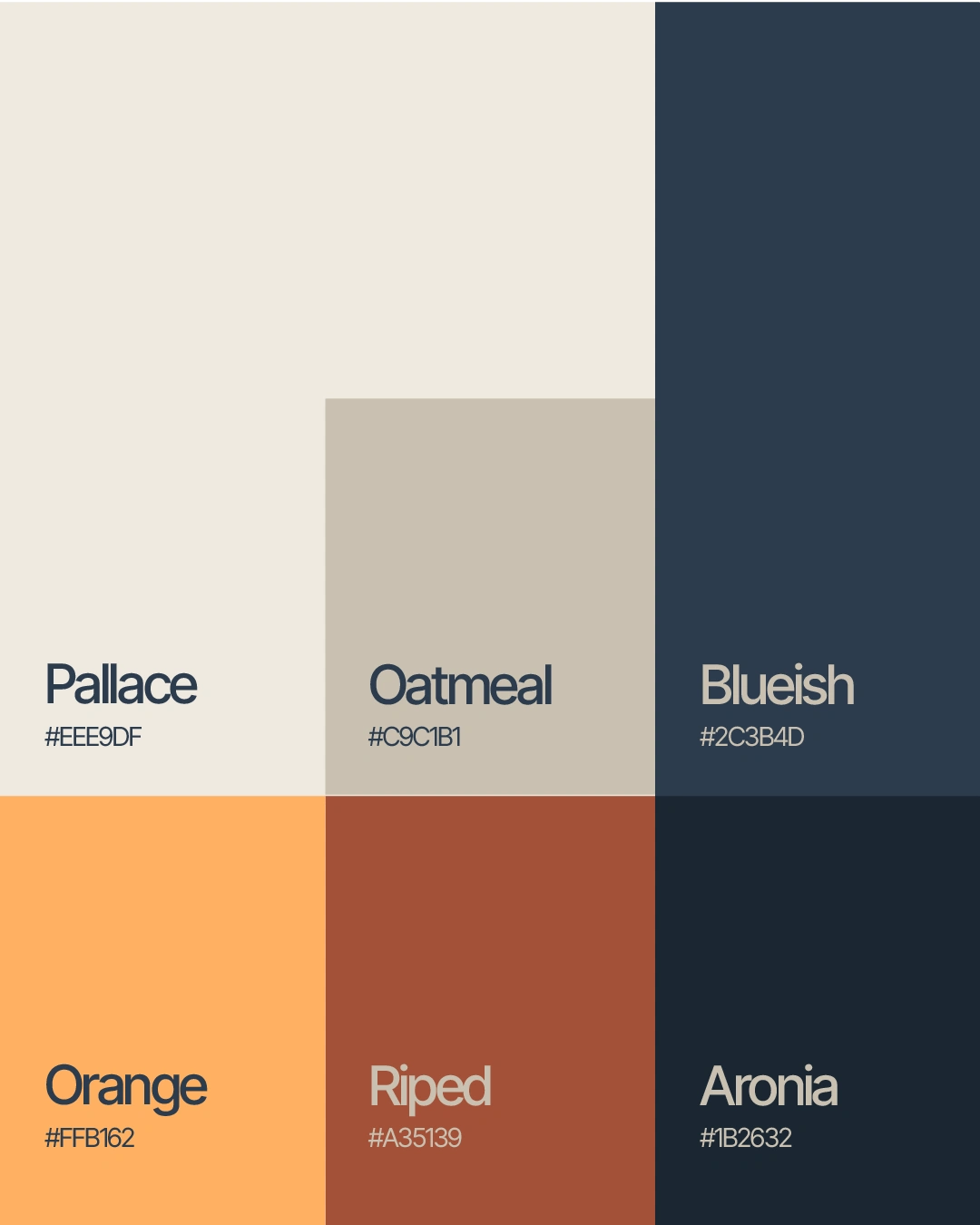
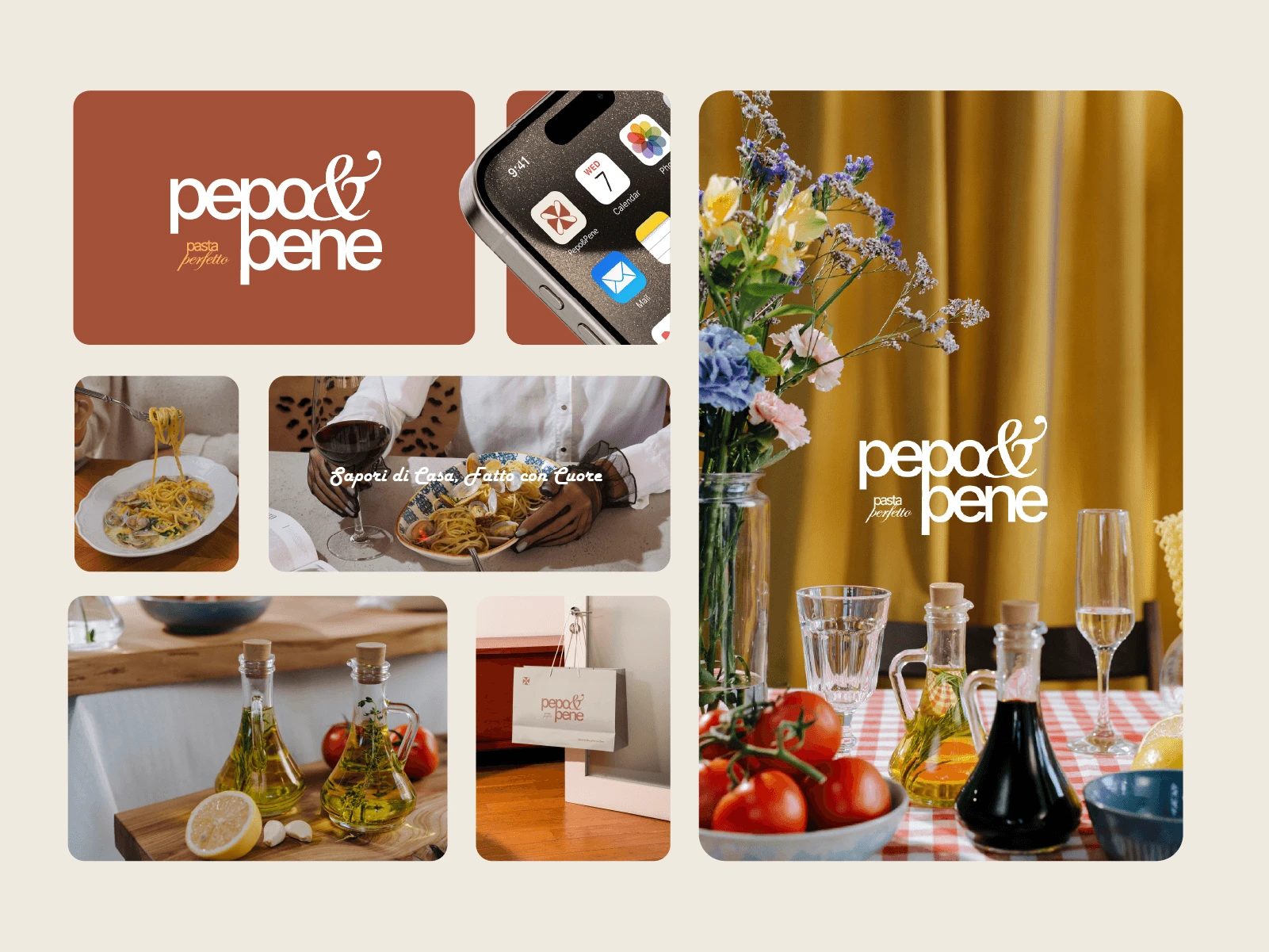
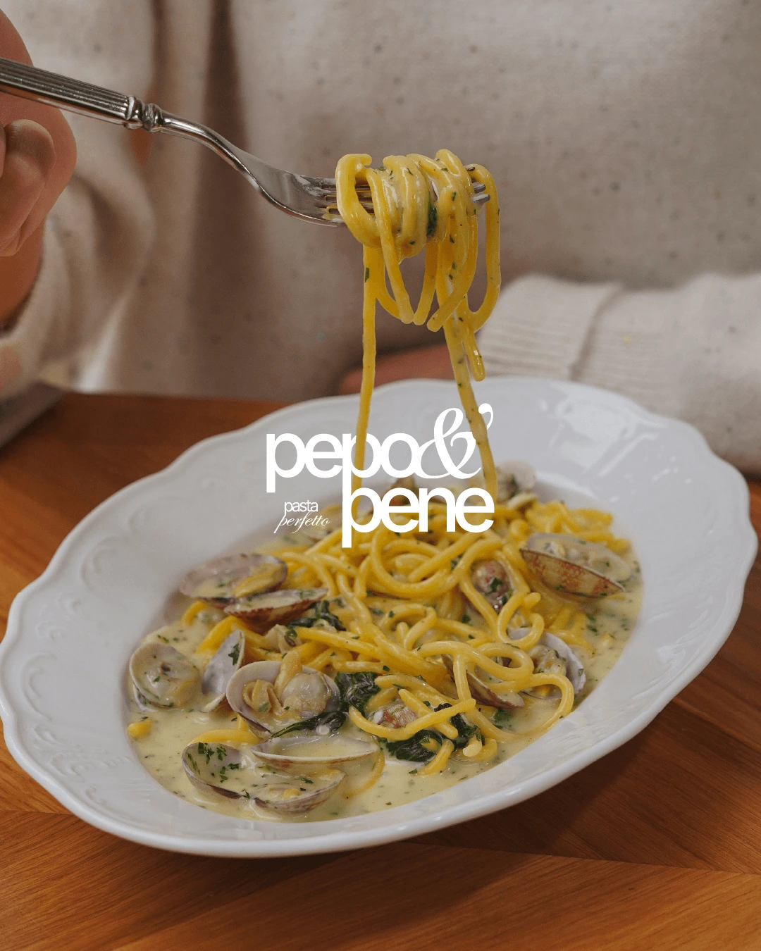
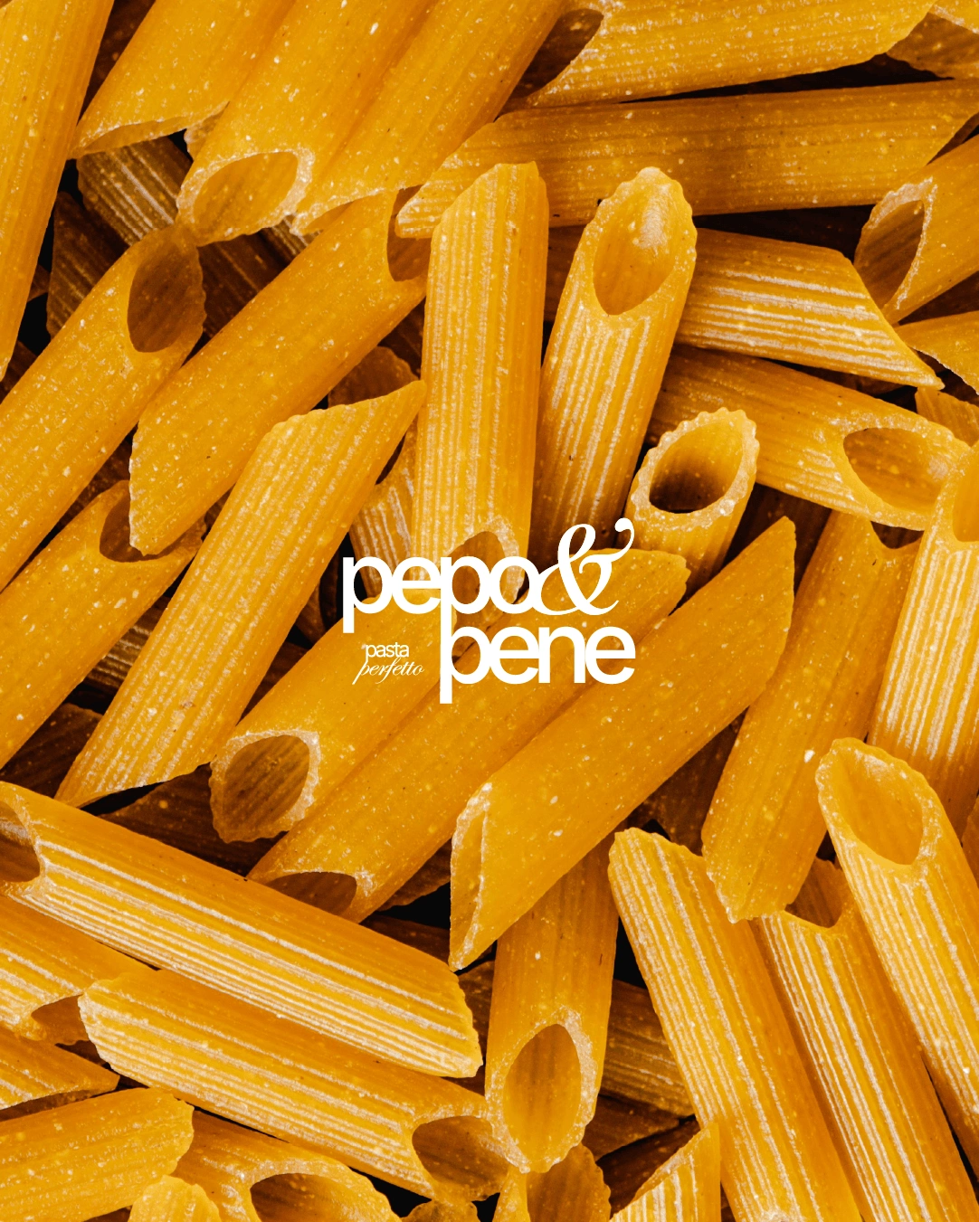
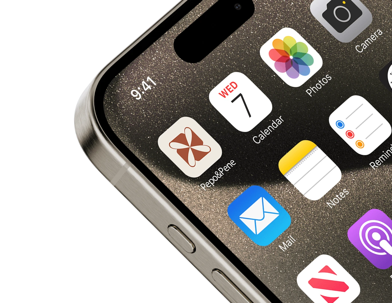
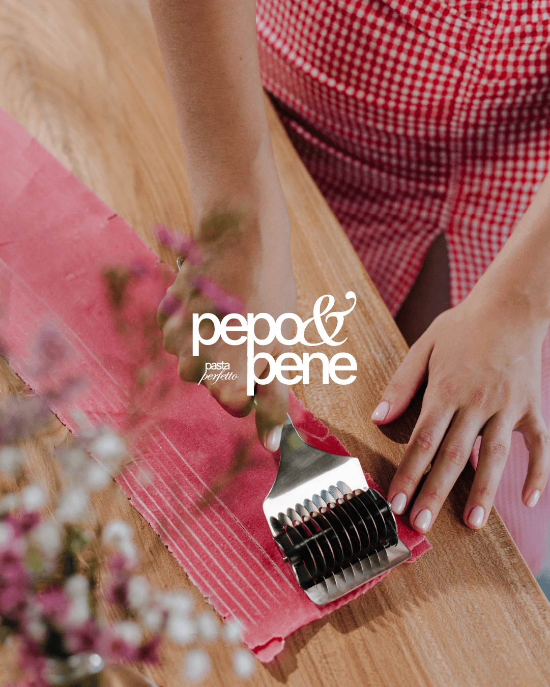
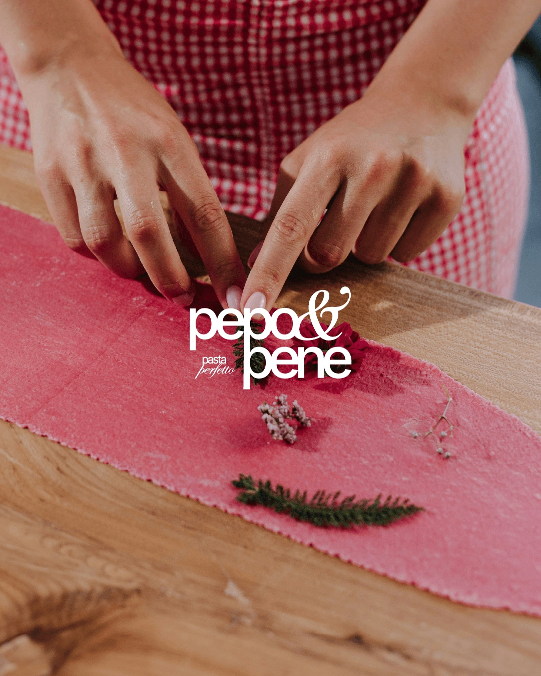
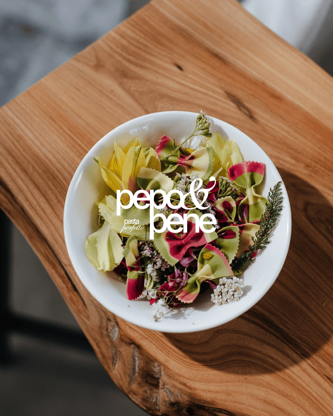
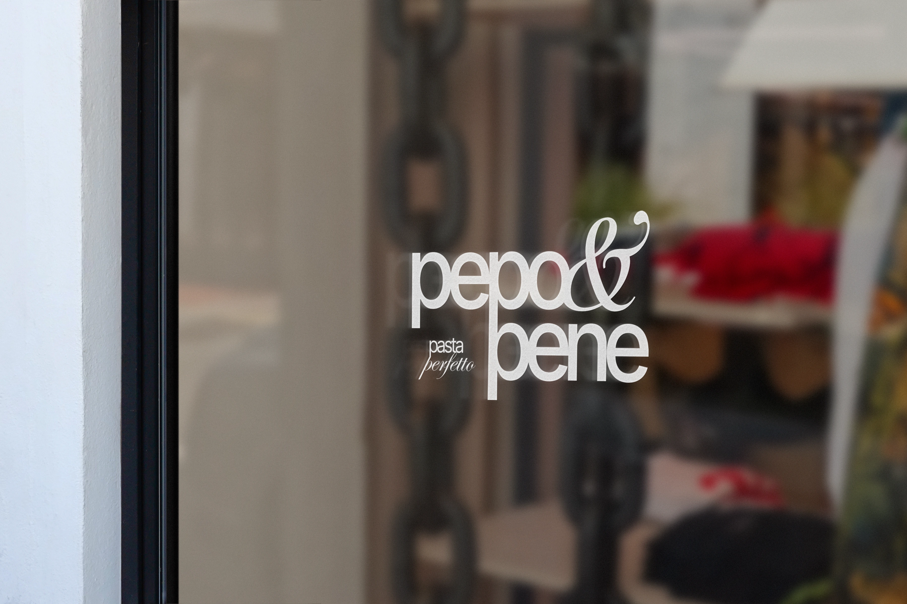
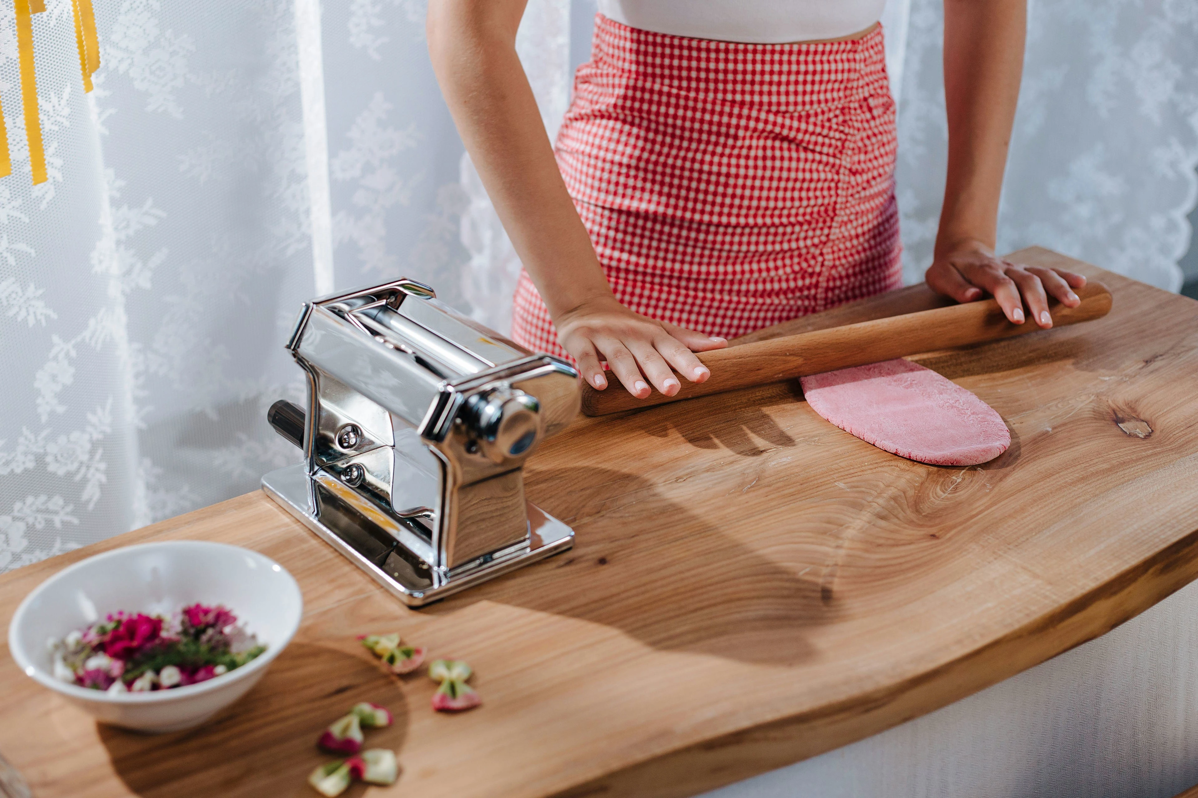
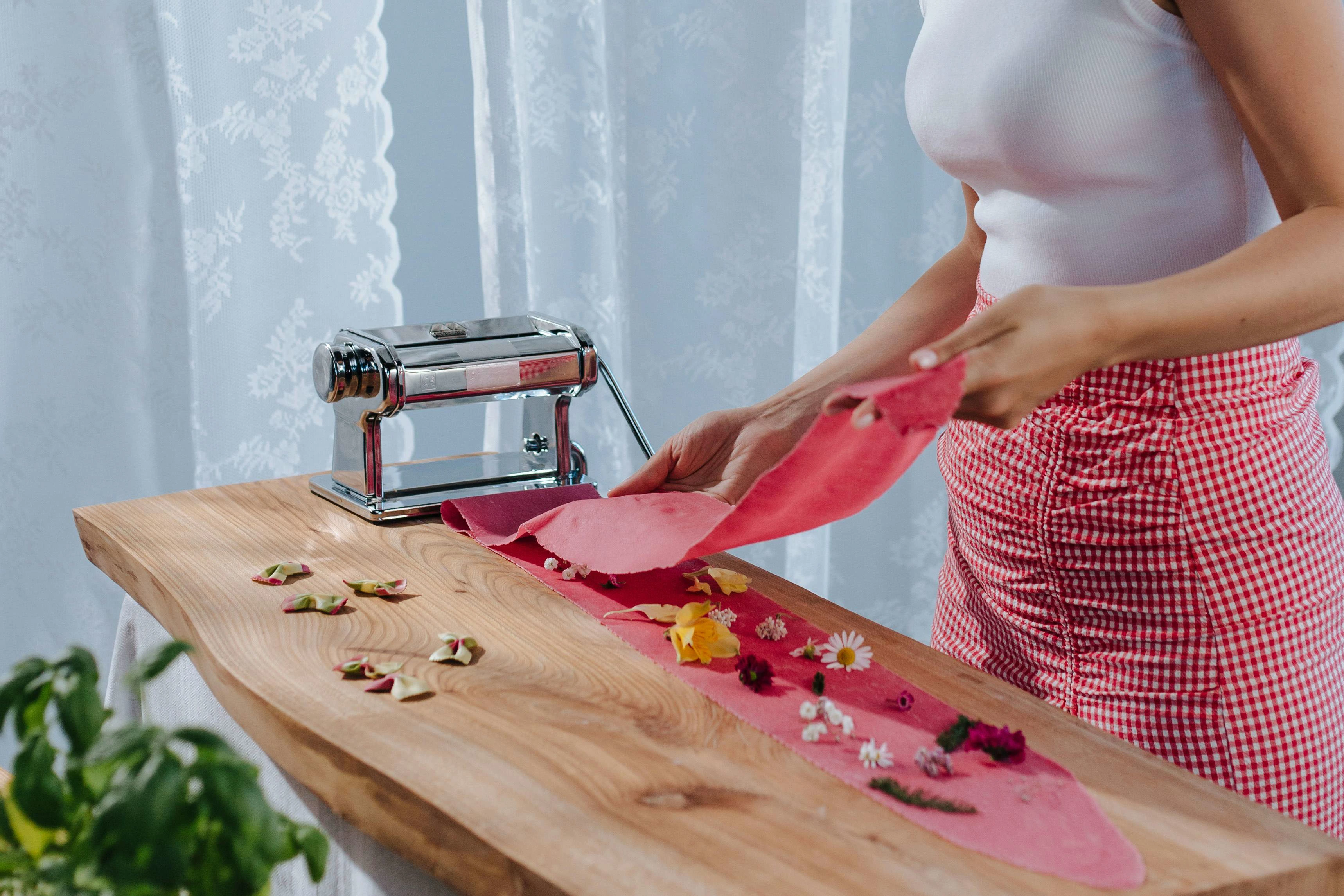
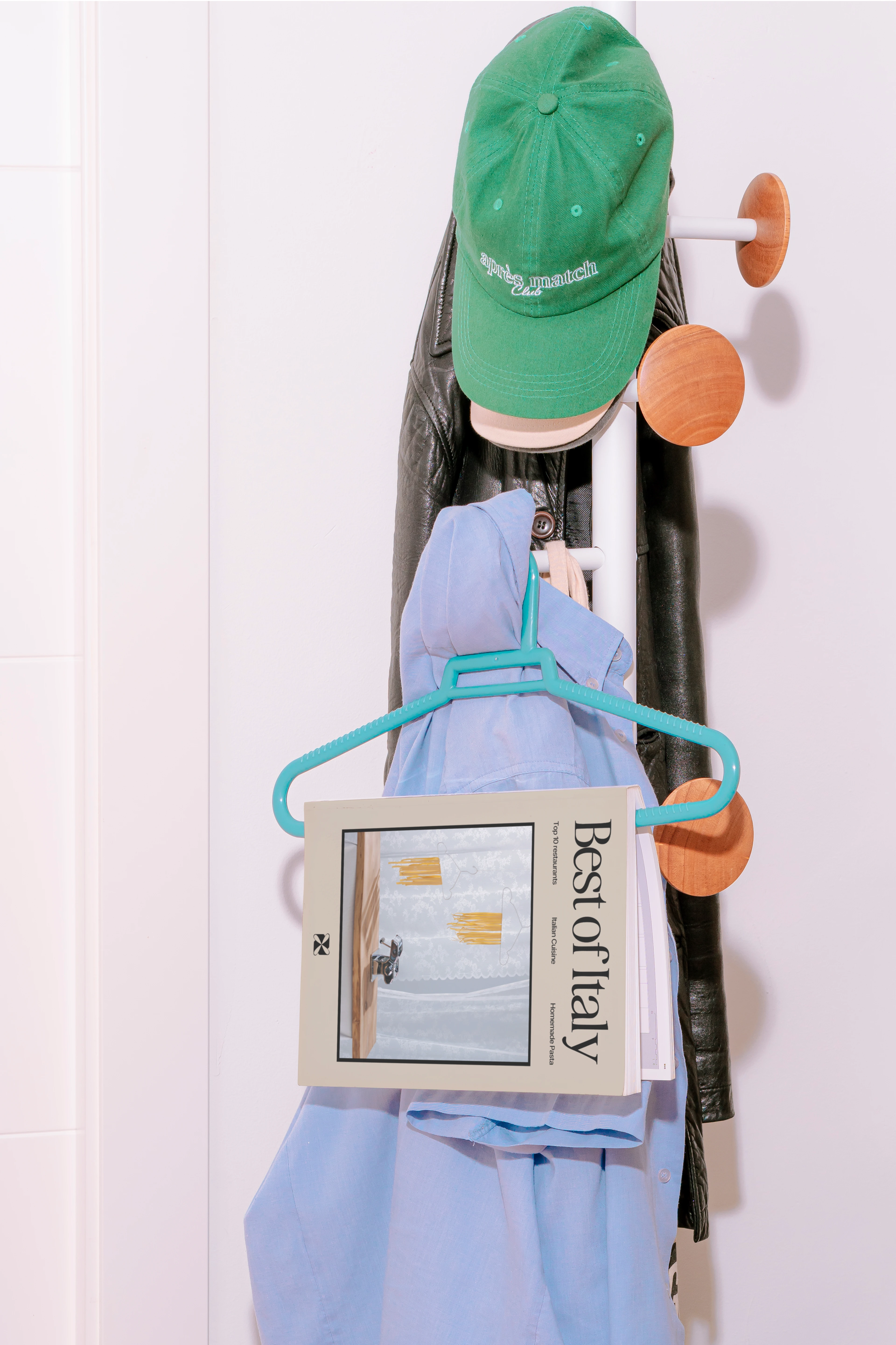
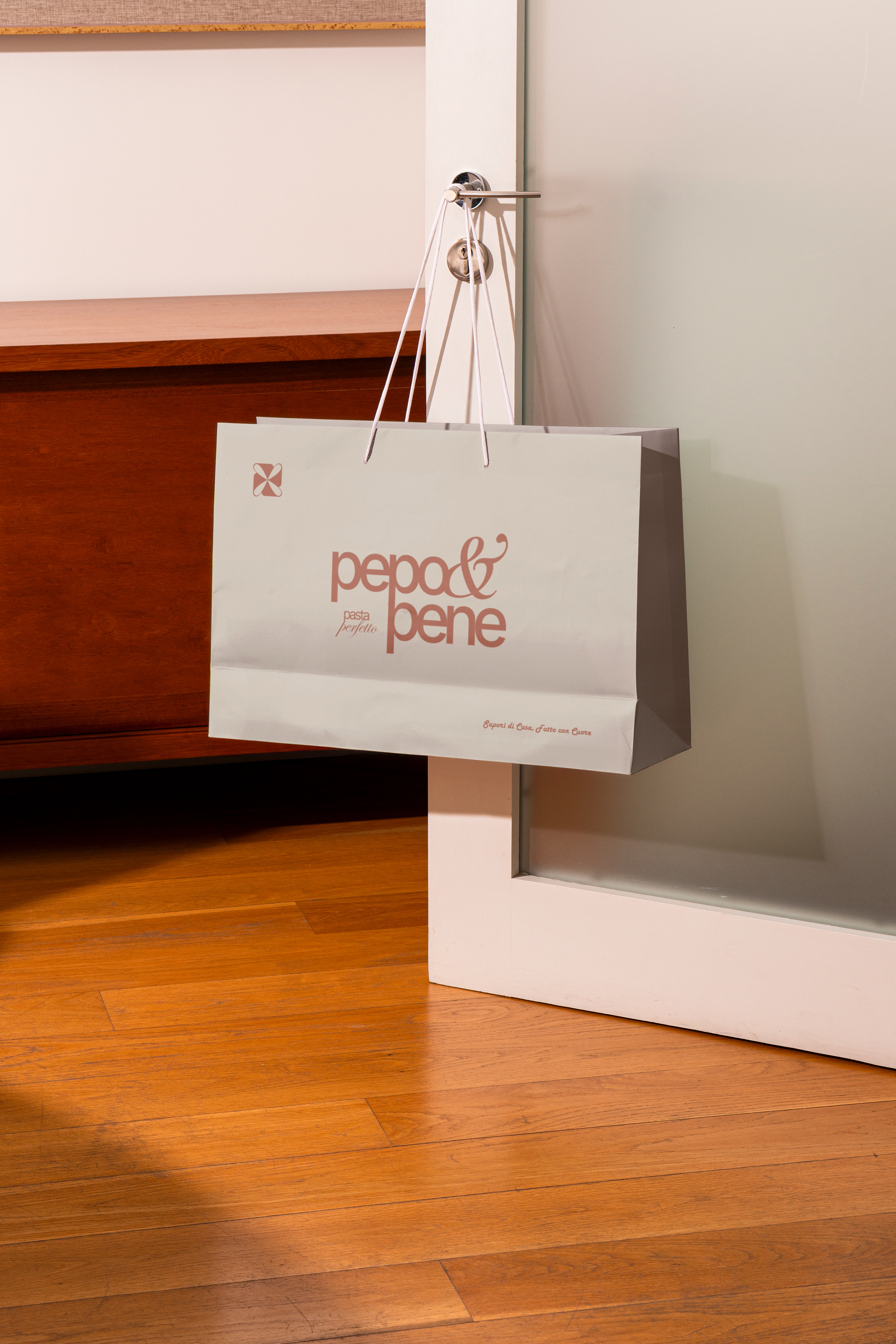
The identity explores bold typographic play, dynamic layouts, and a vibrant yet controlled color system — designed to translate energy across packaging, digital, and in-store.
Expressive, but intentional.



6 likes · 110 views · Oct 4, 2024
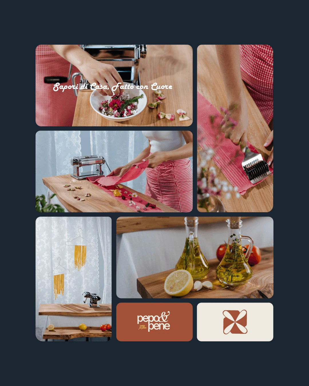
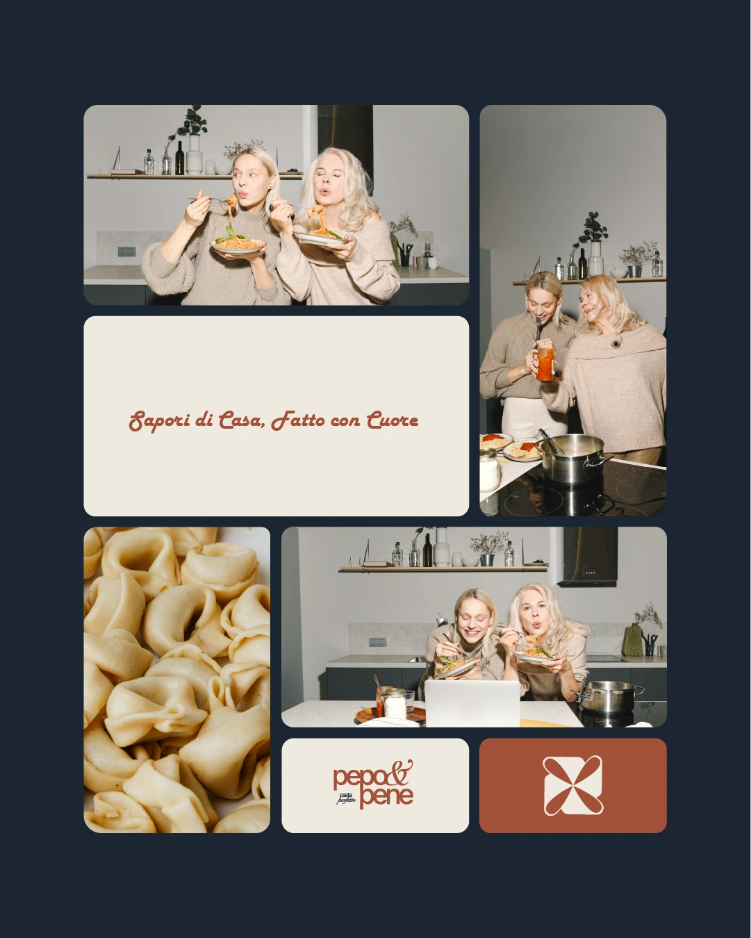
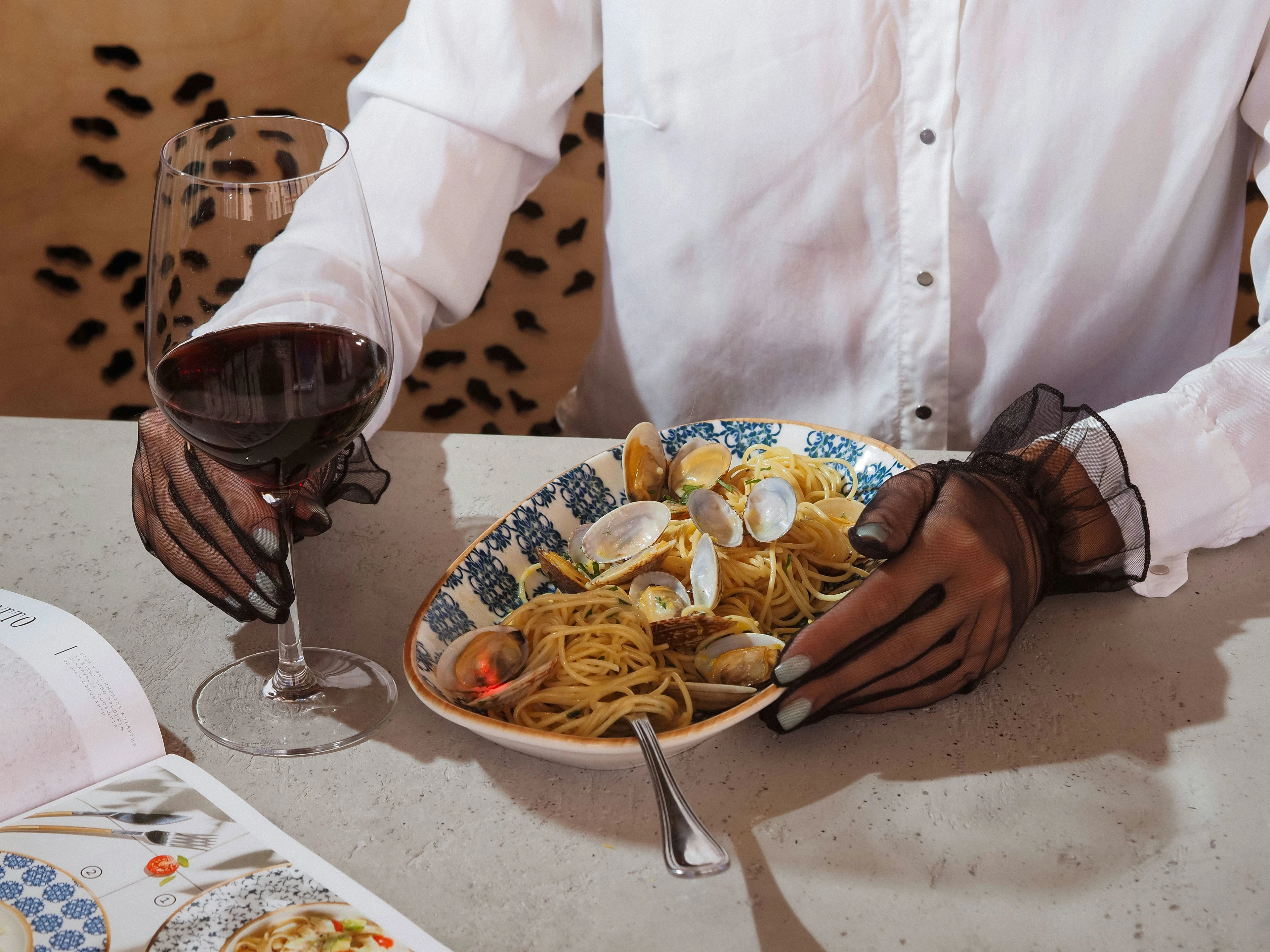
Bold, expressive identity system combining dynamic typography and vibrant color for a lively, modern food brand.


