Pixura Mobile App • AI Image Generation
Moyin Ipinmoroti
Overview
Pixura is a next-gen AI image generation app that allows users to create, customize, and edit AI-generated visuals from their phones. Our goal was to design a seamless mobile experience that merges powerful tools with a clean, approachable interface.
Onboarding Screens
Goals
Create an intuitive interface for both new and advanced users
Build a modular, scalable design system
Optimize the image generation process for mobile constraints
Balance minimal aesthetics with advanced functionality
Support features like image editing, prompt input, and credit management
Account Setup Workflow
Discovery & Research
We began by analyzing leading AI and image-based apps to identify common usability patterns and gaps. A few insights emerged:
Users value simplicity but don’t want to feel limited
Many AI tools lacked visual polish on mobile
Prompt input and result previews needed to feel fluid and responsive
Visual feedback was crucial in building trust in the AI process
We also gathered input from beta users and creatives who frequently use AI tools in their workflow.
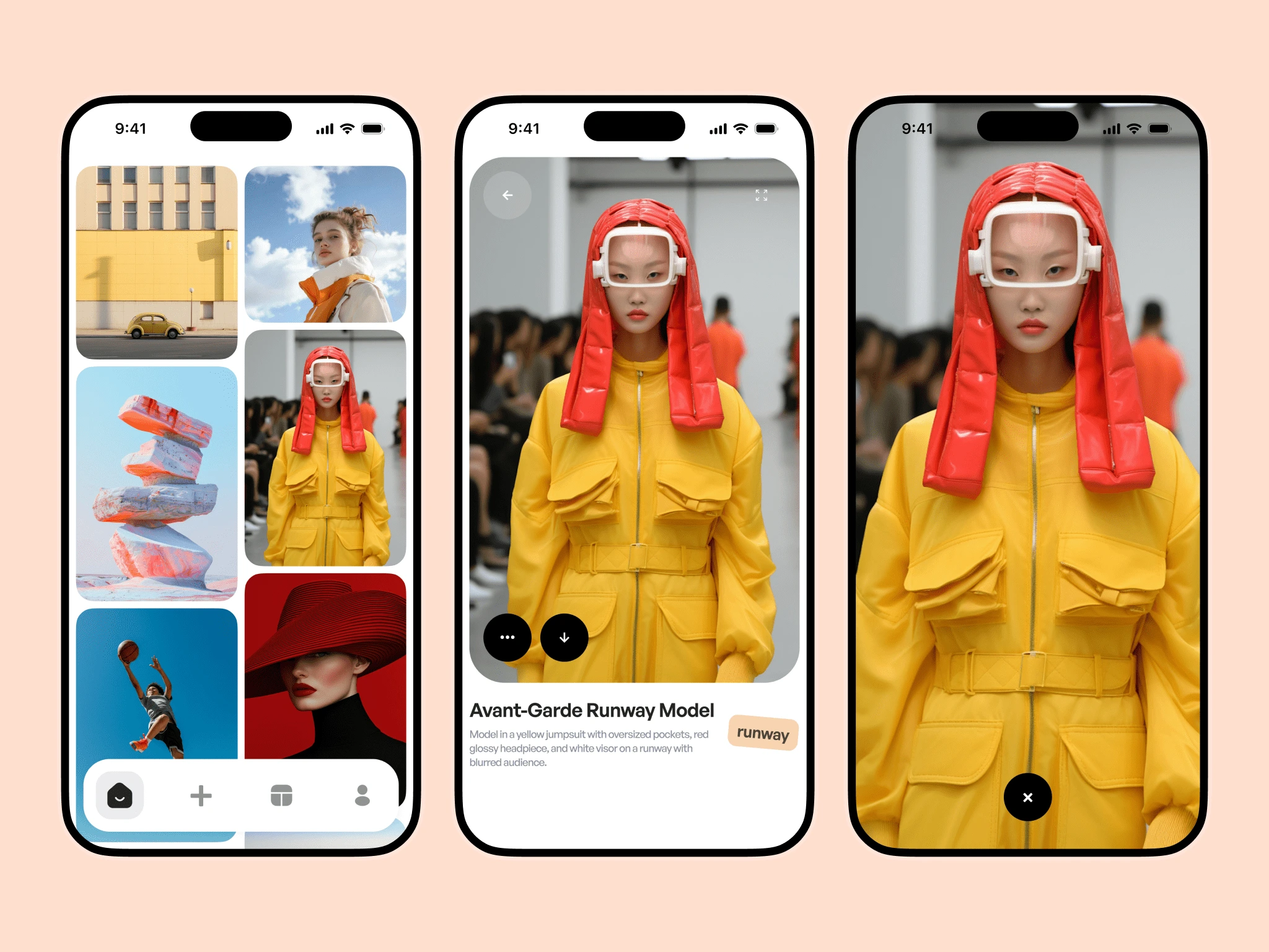
Homepage Interaction
Wireframing & UX Flows
We mapped out the user journey in five key stages:
Onboarding
Prompt Creation
Image Generation
Editing & Export
Account Management
Wireframes helped us explore interactions such as swiping through variations, editing prompts inline, and managing AI credits without friction.
We prioritized keeping the UI lightweight—focusing on one core action per screen to reduce overwhelm.
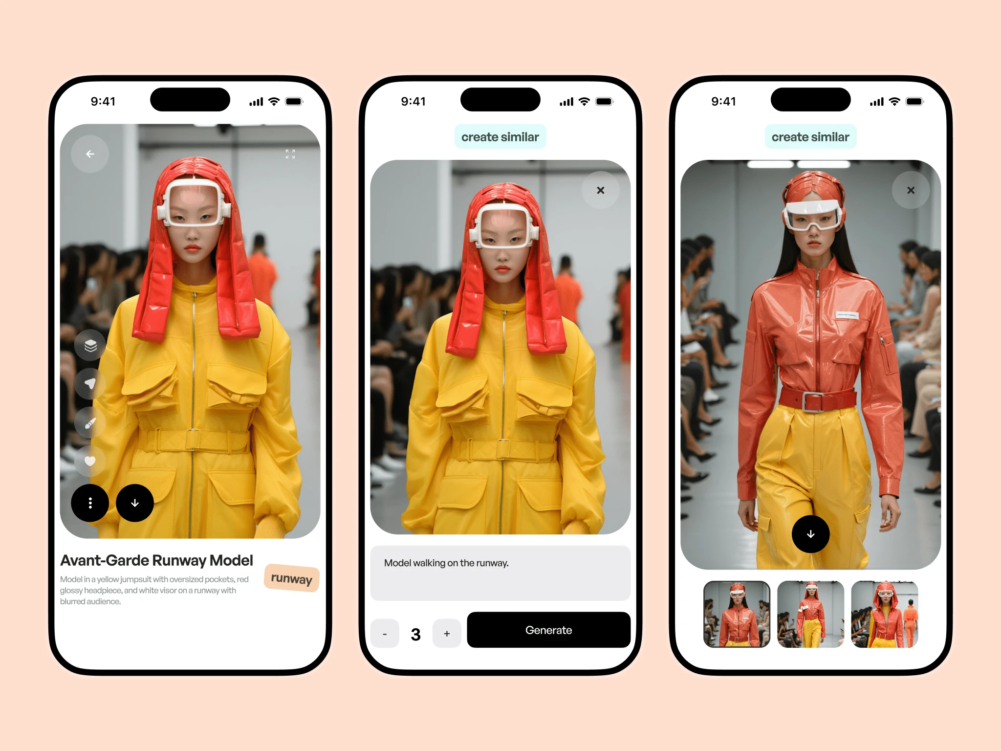
Create Similar Interaction
Visual Design
Pixura’s visual identity draws from its web counterpart—clean lines, high contrast, and monochromatic tones—with subtle pops of color for action feedback.
Typography: Neutral and modern, optimized for mobile readability
Colors: A black-and-white core palette with accent colors for state changes (e.g. success, error, active)
Icons: Custom-drawn to match the minimal aesthetic
Buttons, sliders, toggles, and cards were all designed in alignment with Pixura’s component system to ensure consistency.
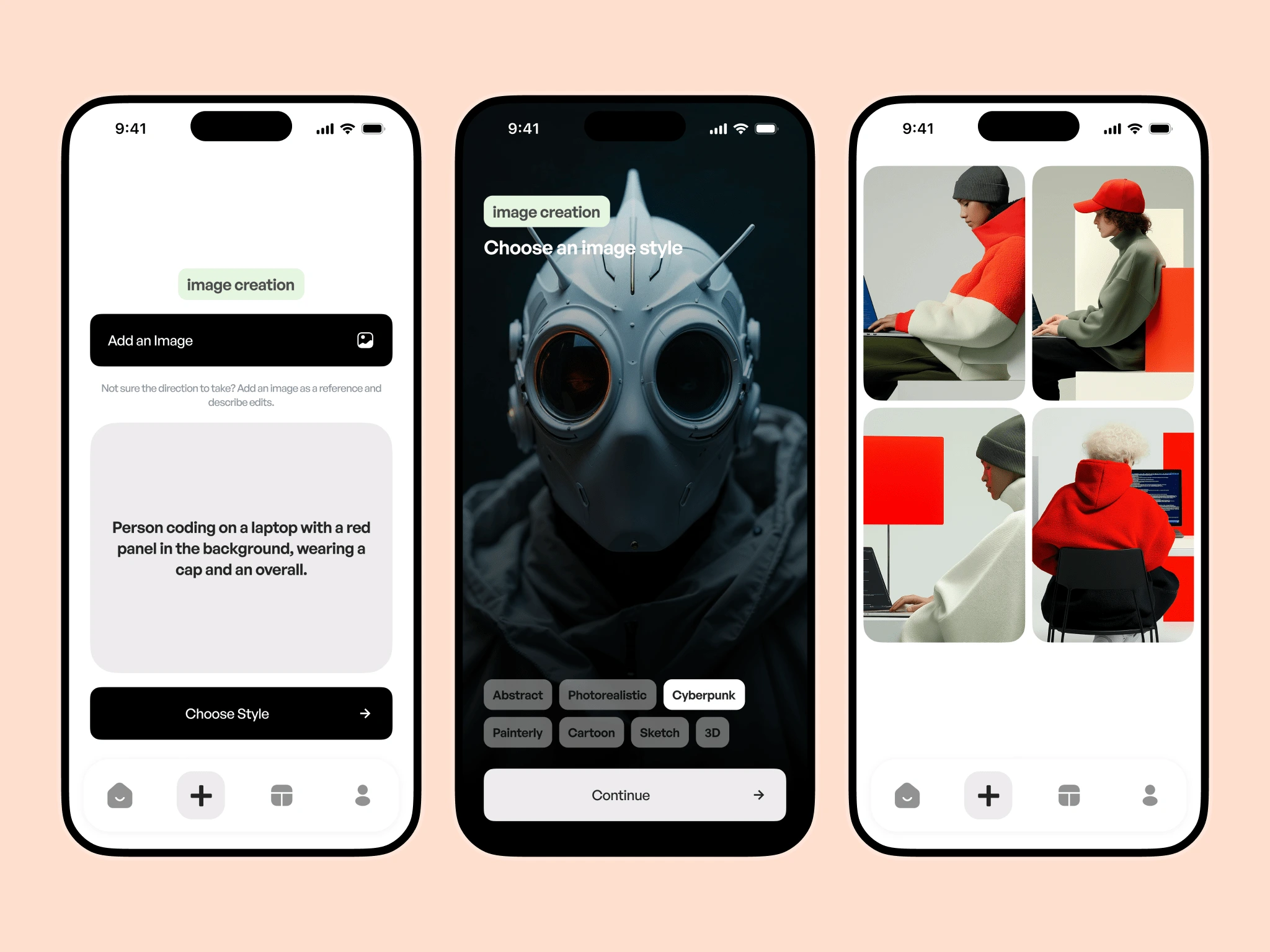
Image Creation Interaction
Components & Reusability
We built a flexible component library using Auto Layout and Design Tokens, making it easy to adjust sizes, spacing, and colors across the board.
Every component—buttons, modals, image cards, settings menus—was structured for quick duplication and adaptation. This also made developer handoff much smoother.
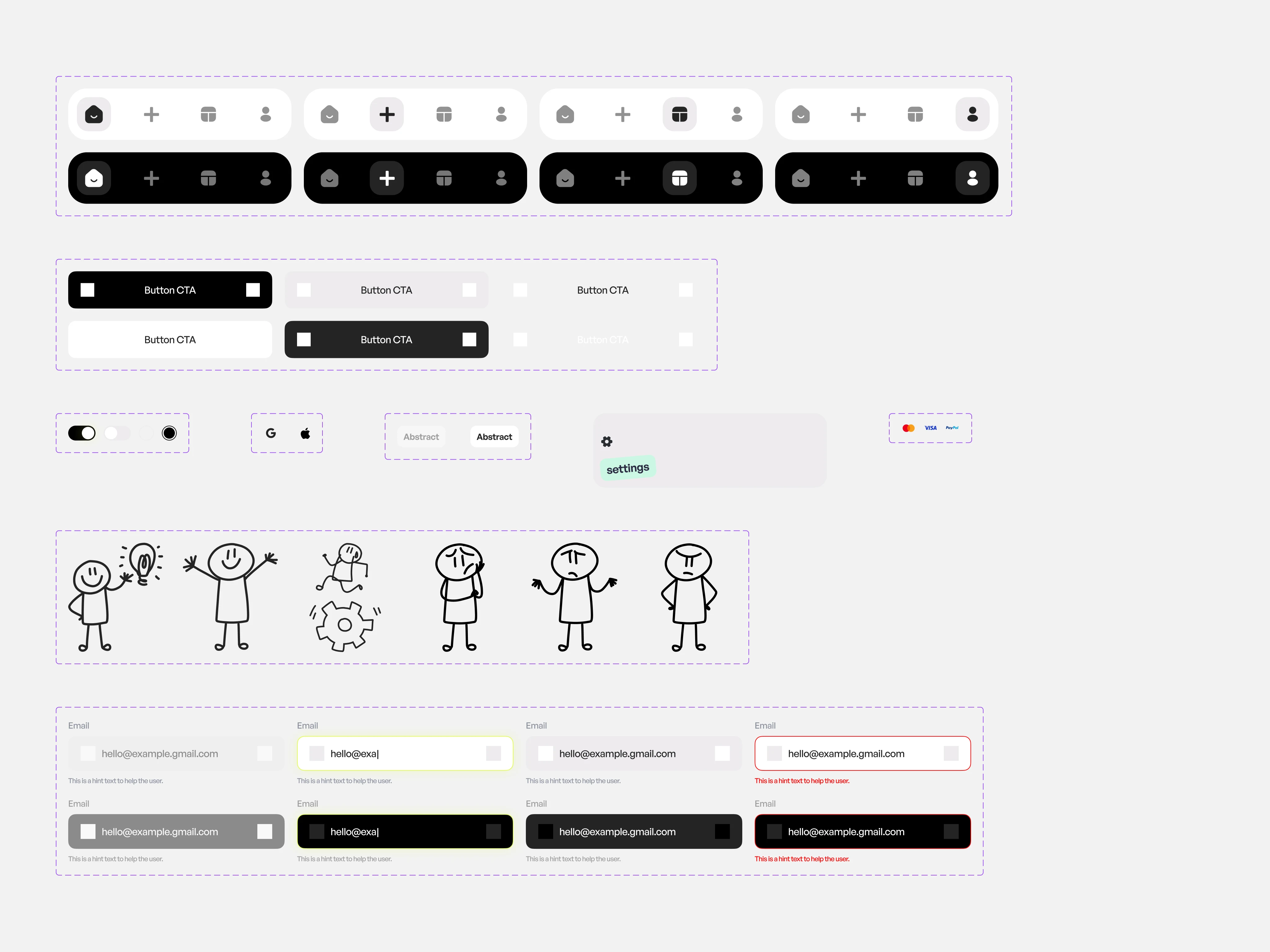
Snapshot of some components in Figma
Challenges
Balancing minimal UI with complex tools like in-image editing
Making AI status feedback feel instant without overloading the screen
Ensuring accessibility while maintaining the visual aesthetic
We tackled these through careful spacing, clear progress states, and optional advanced settings tucked behind expandable menus.
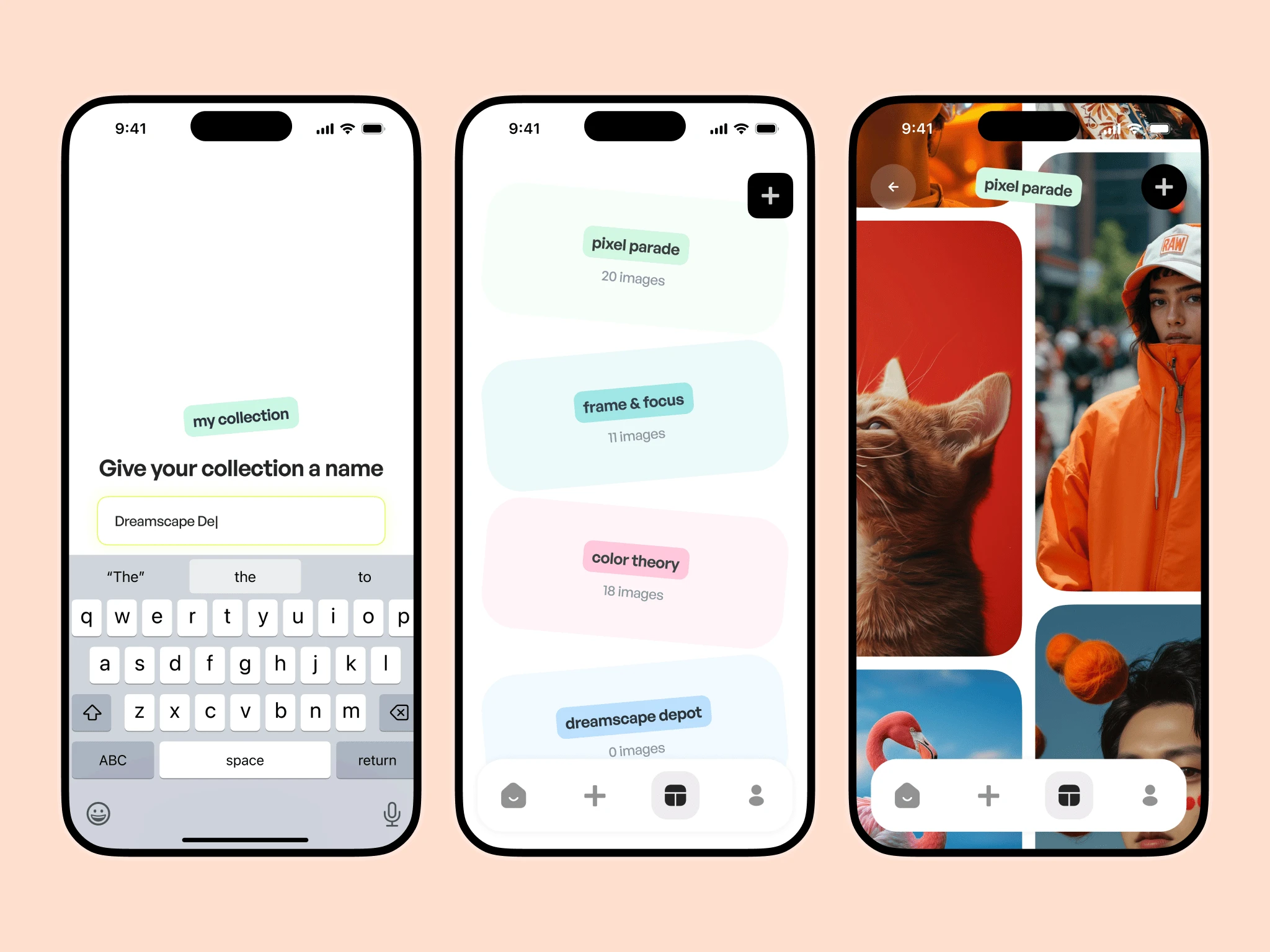
Collection Section
Outcome
The final app delivers a calm, focused experience that lets users move from idea to image with confidence. Every interaction feels purposeful, every screen optimized for clarity and flow.
Pixura’s mobile experience has already been praised by early testers for its speed, aesthetic, and ease of use—even for non-technical users.
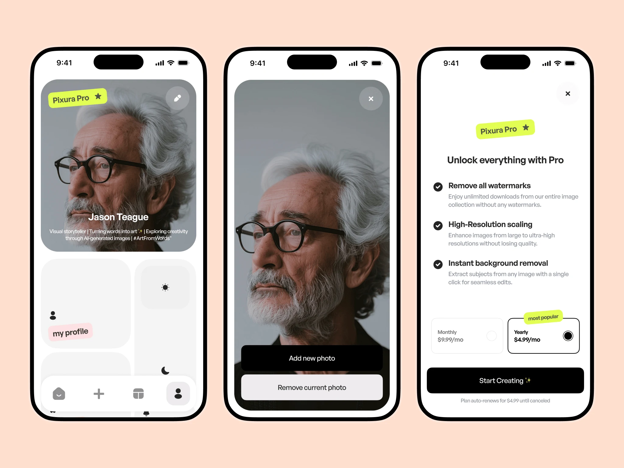
Settings Section
Takeaways
Keep complexity behind clarity: Powerful tools can feel simple with the right UX layers
Design for scaling: Modular components and tokens were crucial as new features were added
Mobile-first mindset: Designing for limited space helped us focus on what mattered most
Dark Mode
Want Your Mobile App to Look as Good? Get started in less than 10mins;
Like this project
Posted Apr 7, 2025
A clean, intuitive mobile app that makes AI image generation simple, fast, and accessible—designed for creativity, clarity, and effortless user flow.
Likes
8
Views
153
Timeline
Mar 14, 2025 - Apr 30, 2025