Capital Outline Brand Identity Designs
Elijah Adesina ✦︎
Project Overview
Industry: Finance & Investment
Services: Branding, Graphic Design, Logo Animation
Year: 2025
Summary:
Capital Outline is an investment company focused on simplifying wealth creation for young professionals and entrepreneurs. The goal was to create a visual and motion identity that embodies clarity, trust, and forward movement — positioning the brand as modern, intelligent, and accessible.
The Challenge
The finance space is crowded with cold, complex brands. Capital Outline needed to stand apart by being credible yet human, premium yet approachable.
The challenge was to communicate financial expertise without overwhelming or intimidating the audience.
Research & Insights
Analyzed modern finance brands like Bamboo, Risevest, and Cowrywise. Most emphasized minimalism but lacked emotional warmth.
Discovered that Capital Outline’s target audience values transparency, simplicity, and results.
Insight: people don’t just want to invest, they want to understand where their money is going and feel in control.
Strategy & Concept
The brand idea: “Clarity Builds Confidence.”
The identity needed to communicate precision, balance, and growth — showing that smart investing starts with clear direction.
We built the visual language around “outline” as a metaphor — every strong structure begins with one.
Design Development
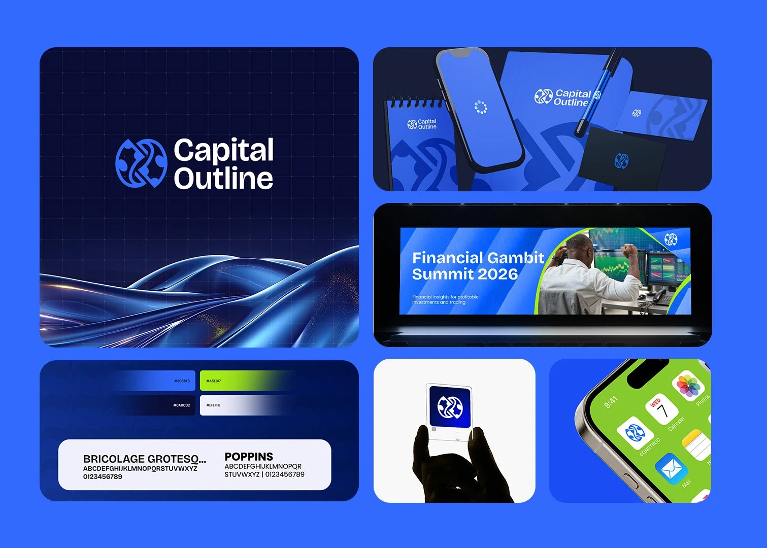
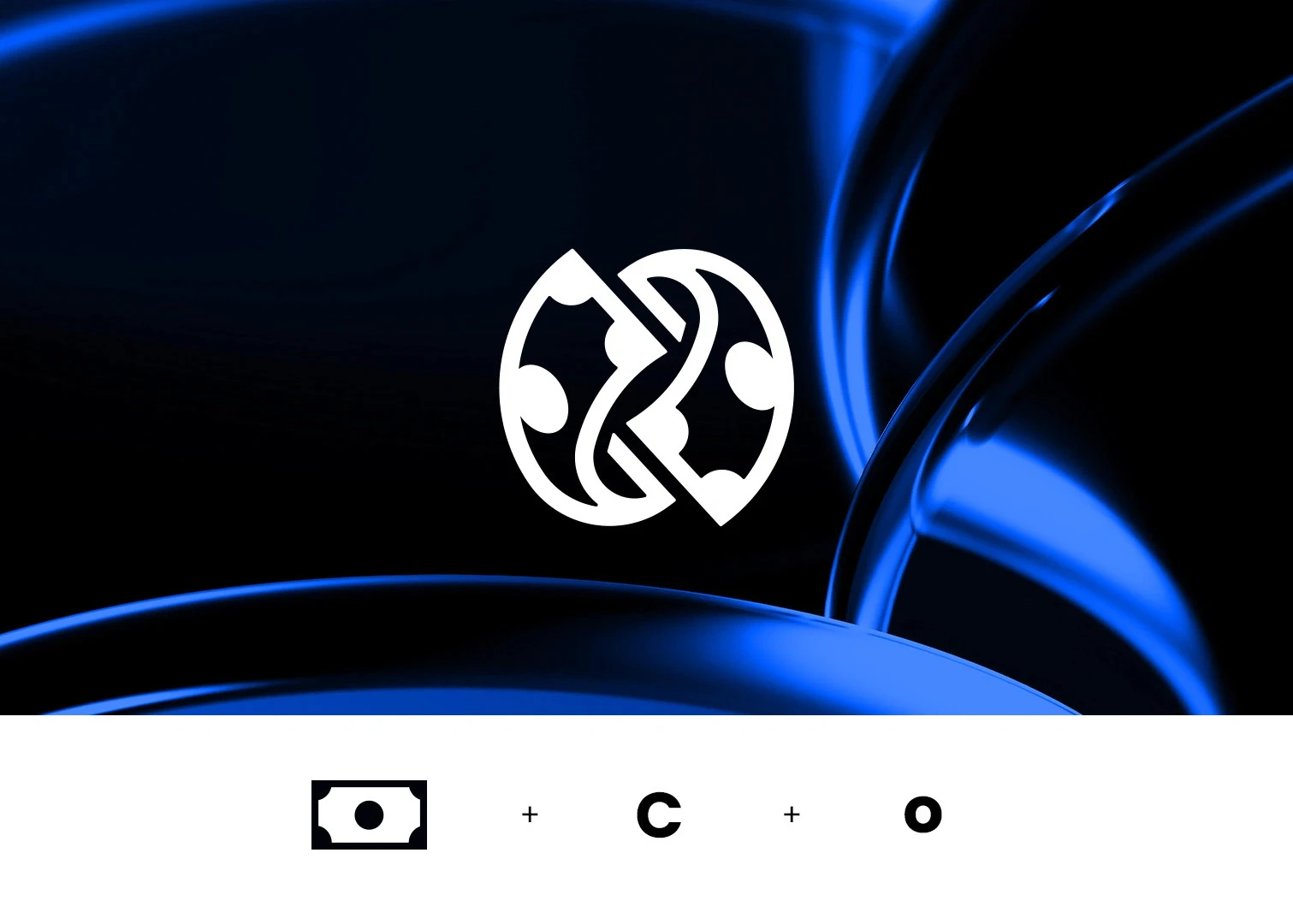
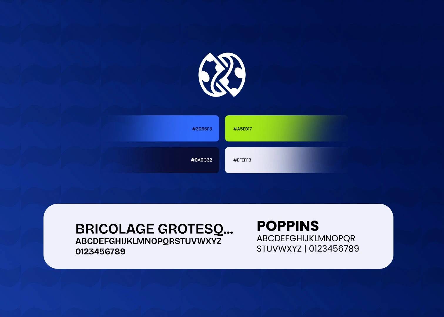
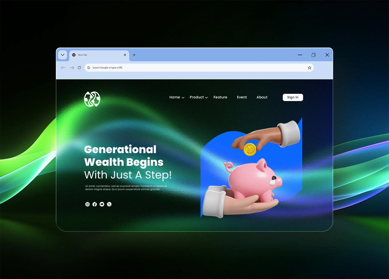
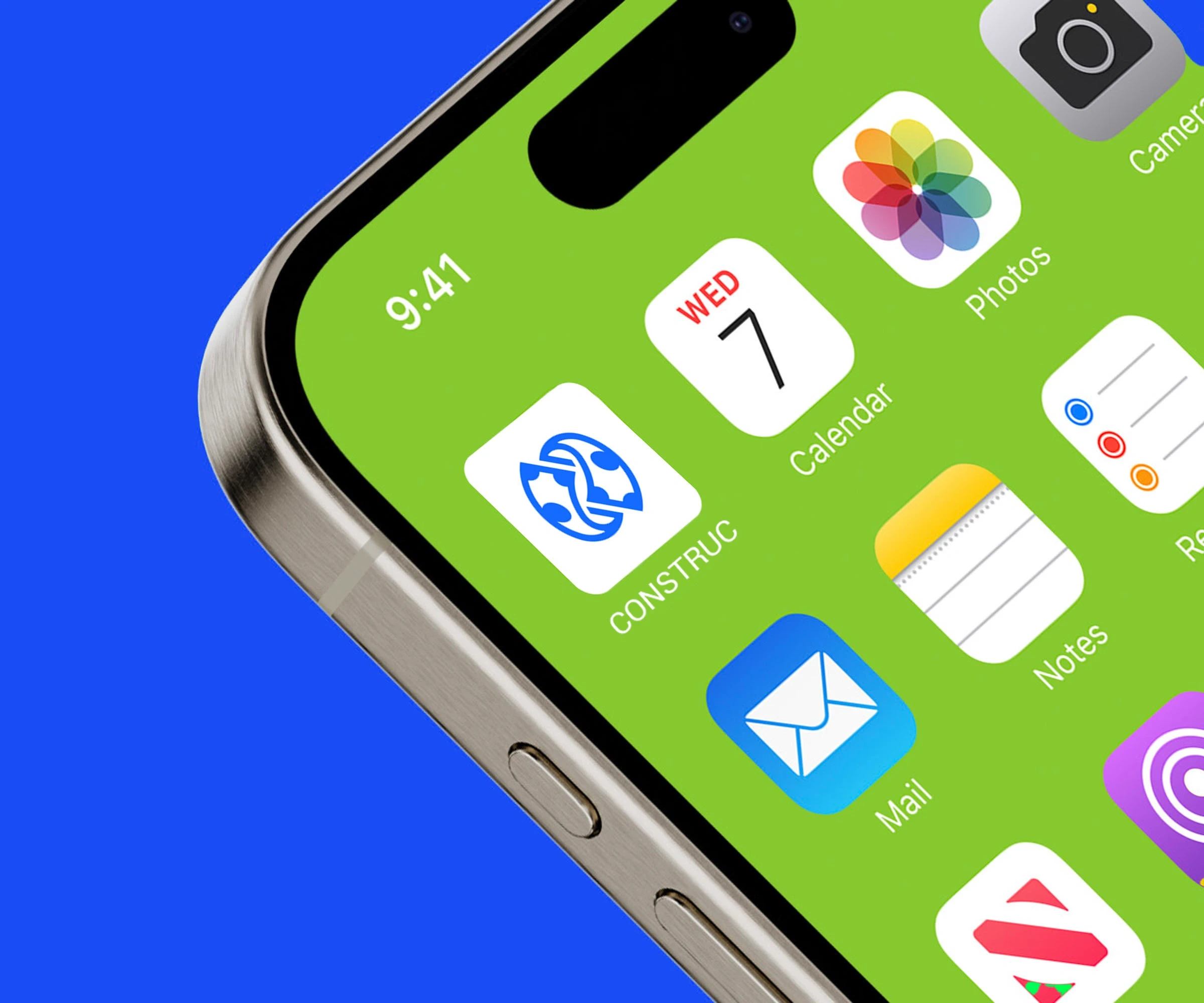
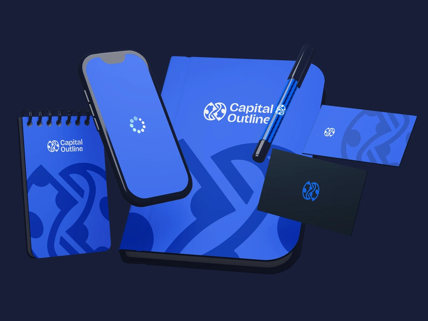
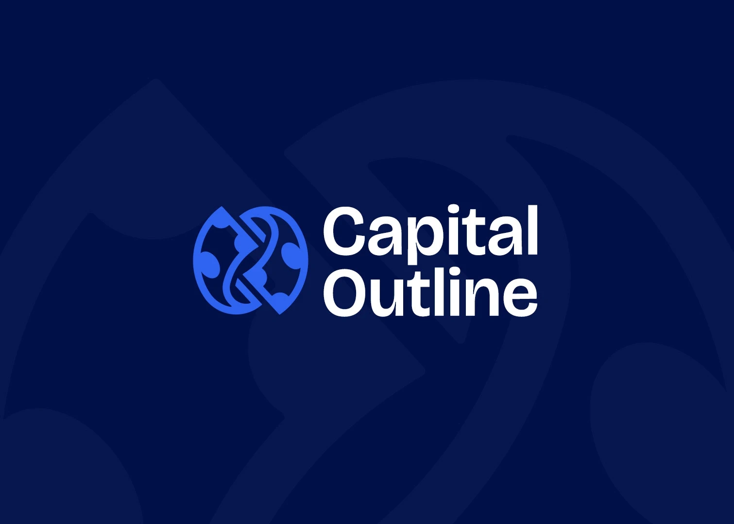
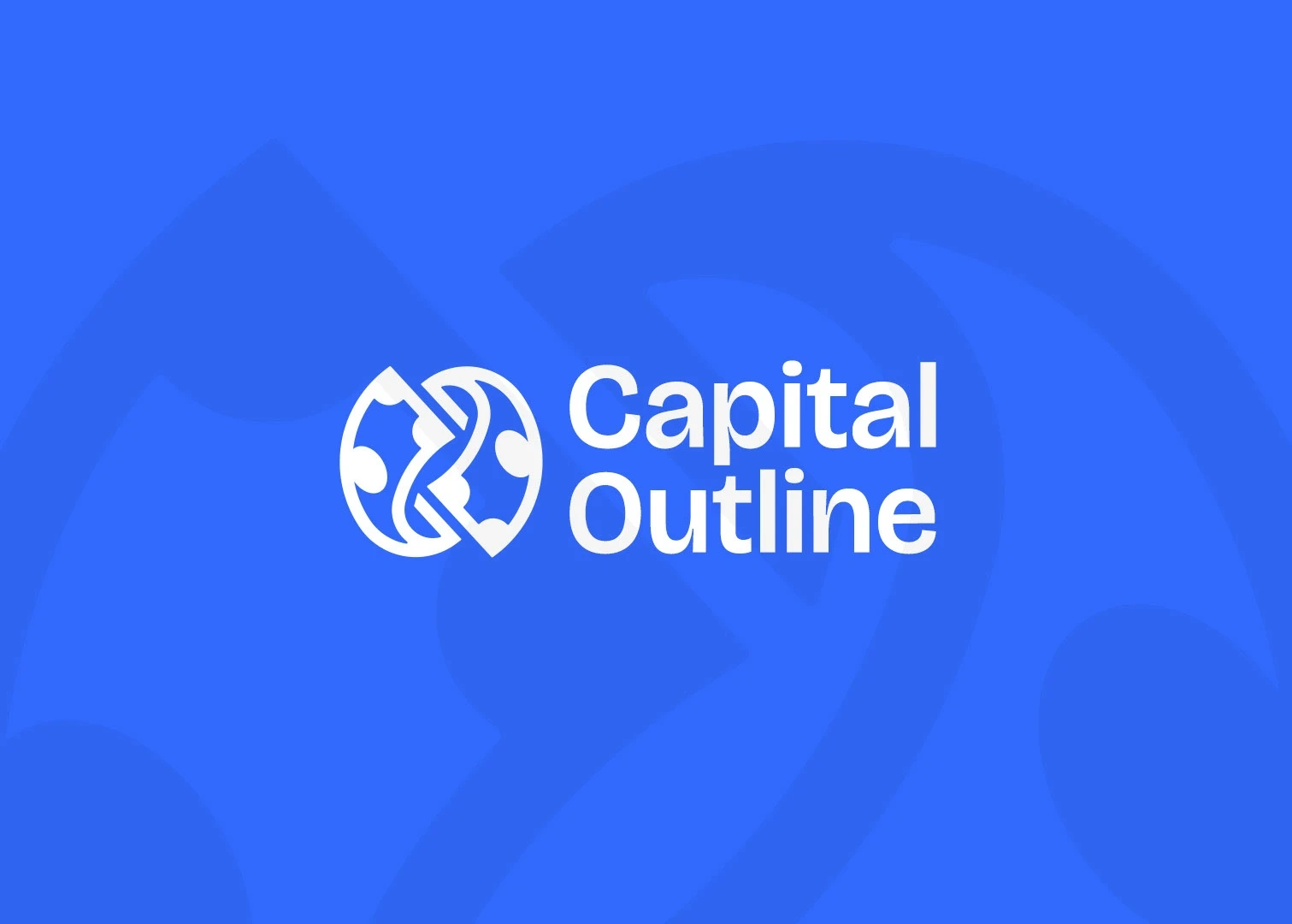
Logo: A refined monogram built from folding a currency bill to from C and O, symbolizing wholesomeness, clarity, and forward momentum.
Typography: Modern sans-serif type with subtle sophistication, reflecting intelligence and accessibility.
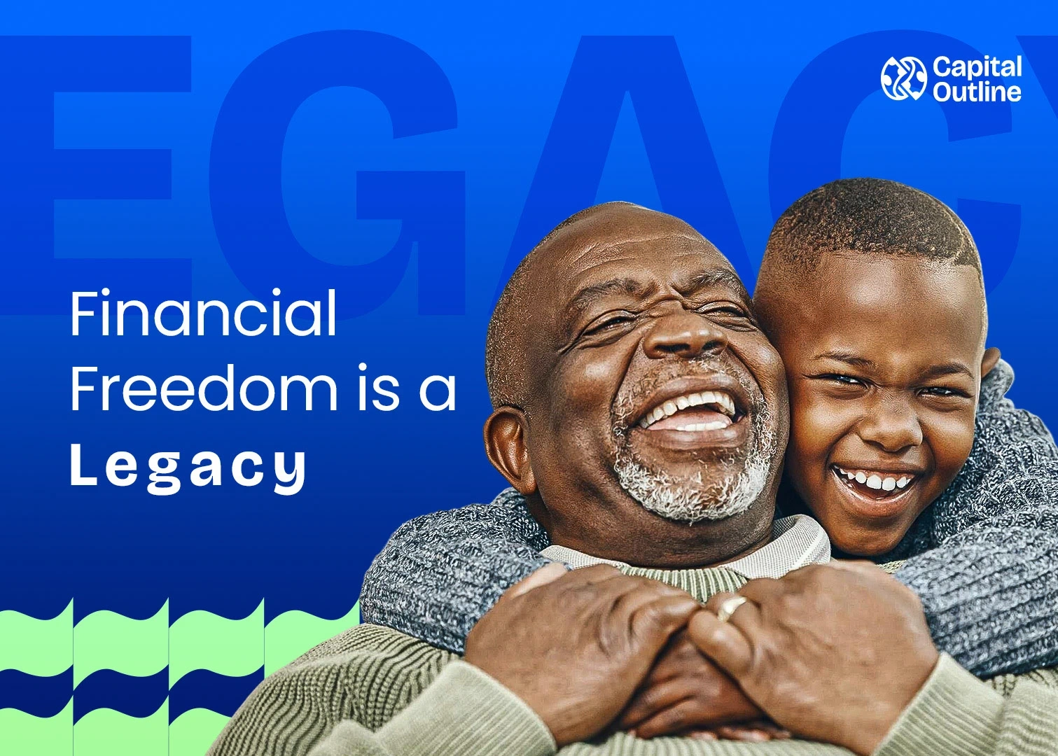
Colors: A palette combining Corporate blue (expertise), deep navy (trust), white (clarity), and lime accents (growth and optimism).
Graphics: Minimalist outlines and line-based patterns to reflect structure and transparency.
Motion Design
Motion was used to extend the brand’s theme of clarity and growth.
A bouncing ball that symbolises coin transforms into debit card.
The loose coins turns into an institutional asset that can be recorded and managed.
Smooth transitions mirror steady financial progress.
The motion tone is deliberate, confident, and precise. No unnecessary effects, just purpose and rhythm.

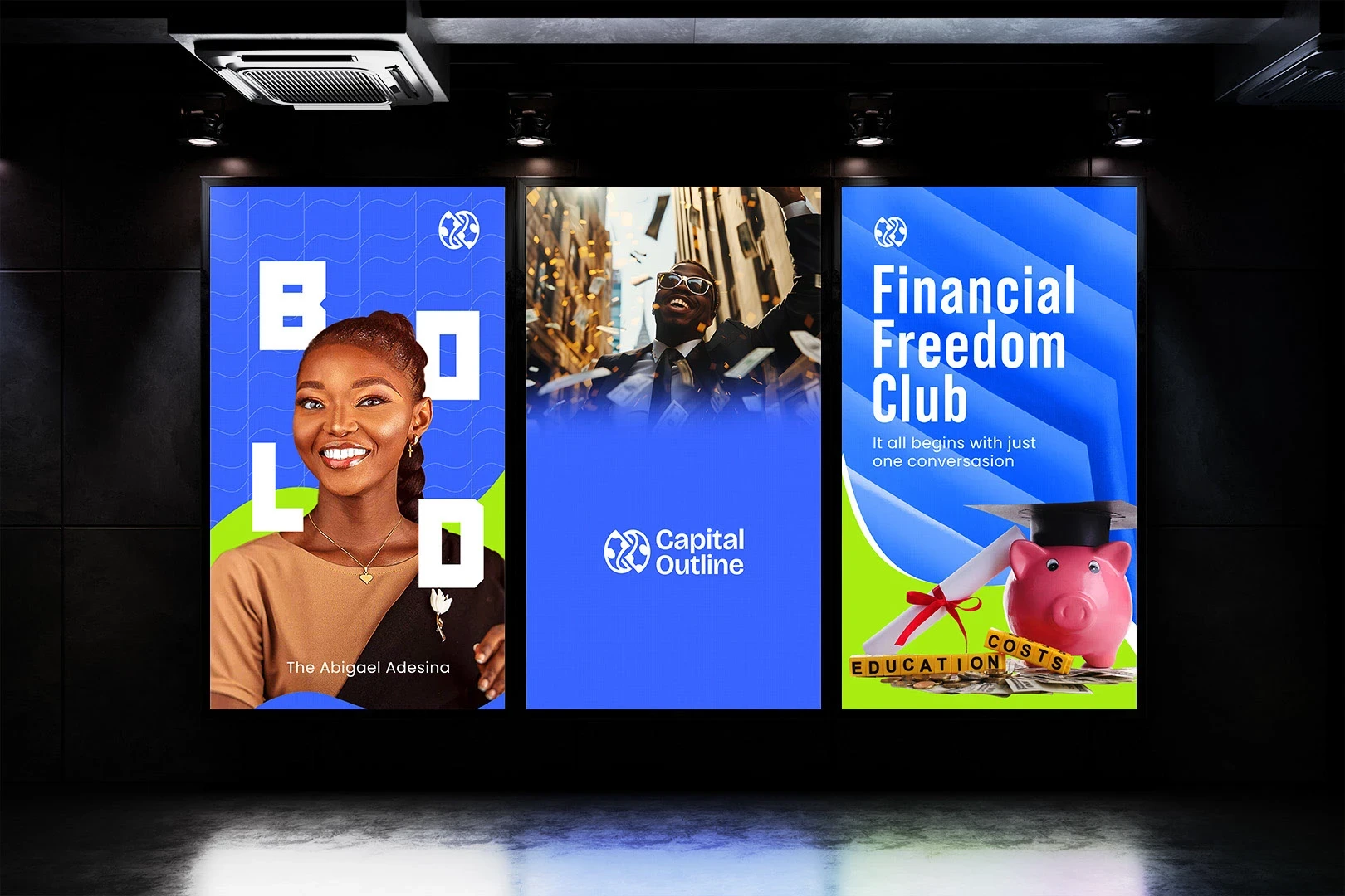
Implementation
The new identity was applied across:
Pitch decks and investor documents
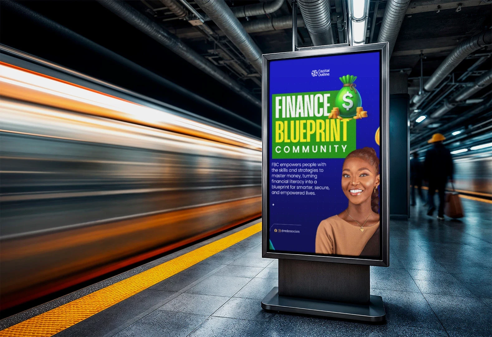
Social media visuals and explainer videos
Website headers and onboarding animations
Motion-driven ads showcasing brand benefits
Outcome
The refreshed Capital Outline brand exudes modern credibility. It tells investors and partners: We make complex finance simple, structured, and transparent.
The identity system became a strong foundation for the company’s content and campaigns, helping build trust and recognition.


Reflection
Capital Outline taught me how design clarity drives business clarity. The process reinforced that simplicity is the highest form of sophistication, especially in industries where trust and transparency define success.
Like this project
Posted Oct 8, 2025
Building Capital Outline, a bold and modern brand identity I designed to reflect confidence, clarity, and forward-thinking creativity in finance and design.
Likes
5
Views
15
Clients
Capital Online