Biuda Limited Product demo
Project Overview
Industry: EdTech
Services: Branding, Graphic Design, Motion Design
Year: 2024
Summary:
Biuda is a child-focused tech education brand that trains children in coding and creative technology through fun, story-based learning. The goal was to craft a visual identity and motion language that would make tech approachable, exciting, and trustworthy for both children and parents.
The Challenge
How do you design a tech education brand that speaks to kids and parents at once?
The challenge was to balance playfulness with professionalism — bright enough to attract young learners, yet refined enough to win parents’ and schools’ trust.
Design Development
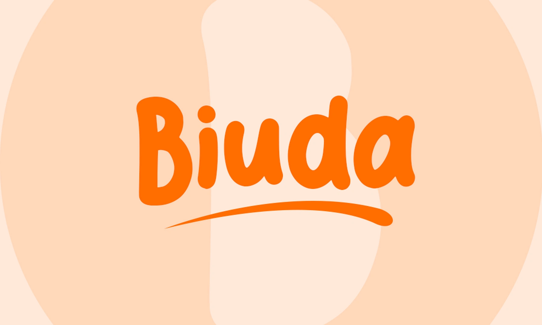
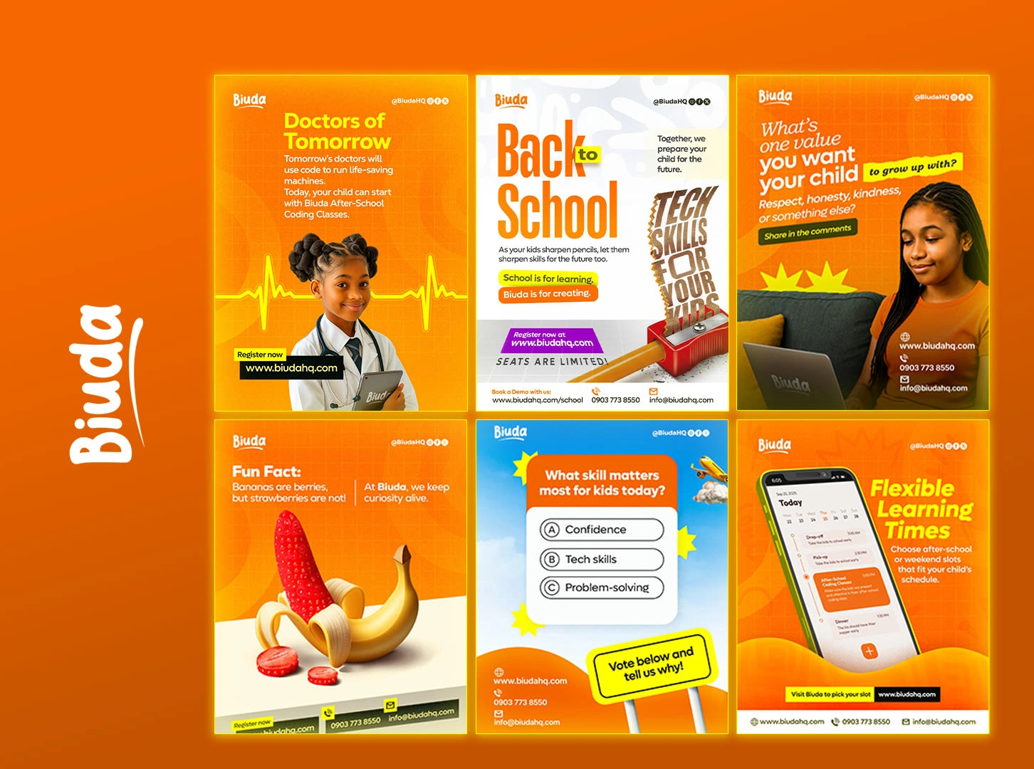
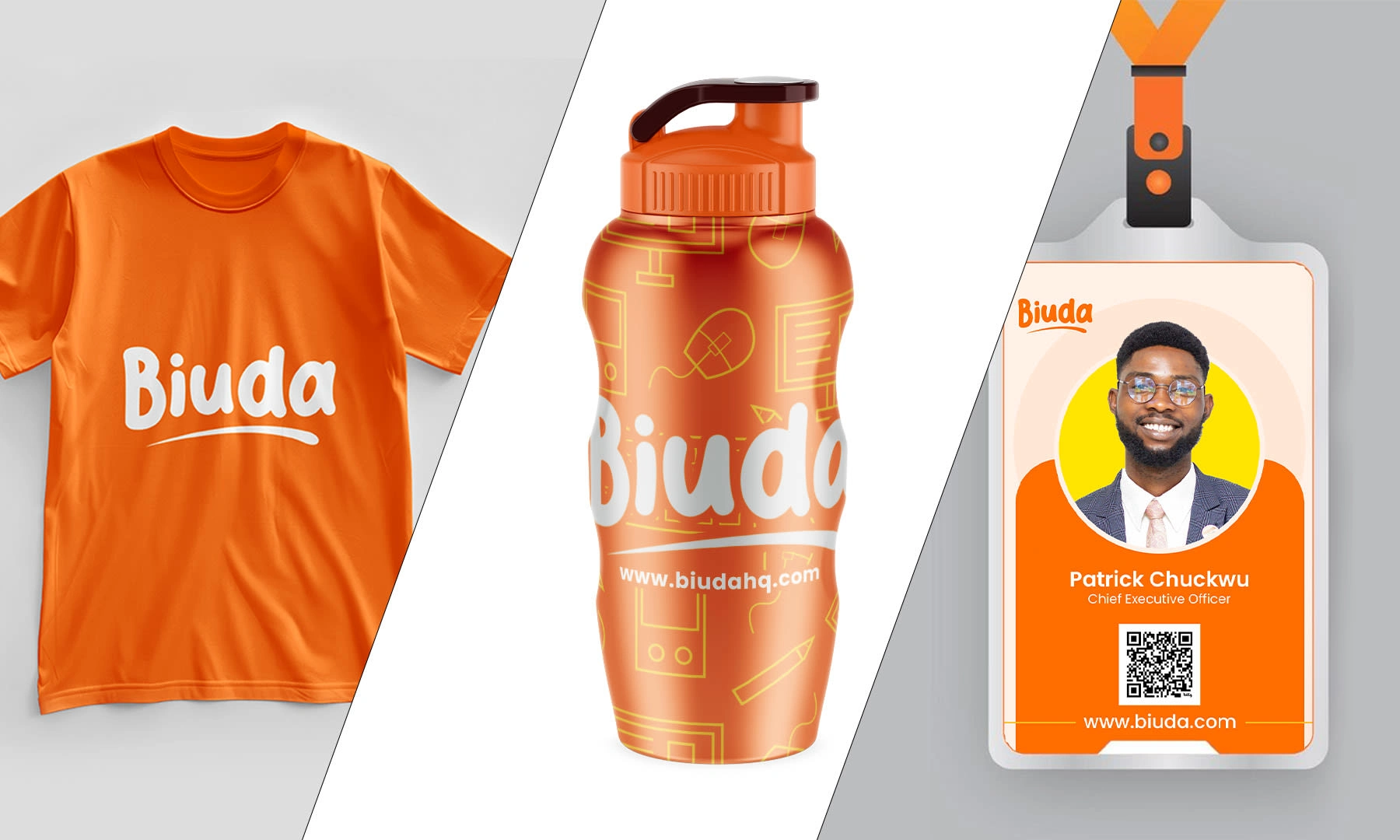
Logo: Modern wordmark with rounded terminals and clean geometry, symbolizing creativity and structure.
Typography: Friendly sans-serif fonts for headlines, paired with readable body fonts for education materials.
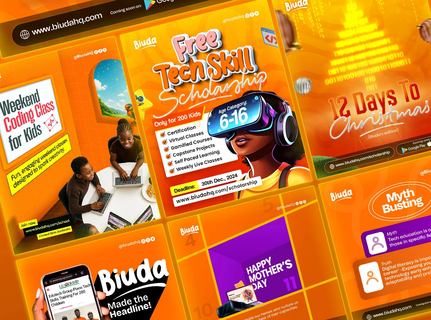
Colors: A bold palette mixing tech orange, sunny yellow, and vibrant purple.
Graphics: Bold and creative pieces inspired by digital circuits and childhood play.
Motion Design
For videos and social content, the motion language reflected energy and curiosity.
Smooth bouncy transitions symbolizing exploration.
Character animation (Biuda Bee) introduced coding lessons in a fun and memorable way.
Motion identity followed a rhythm of discovery. every frame had intent and delight.
Implementation
The new identity was rolled out across:
Website and social media visuals.
Animated contents for YouTube and app
Promotional motion videos and ads.
Class materials and digital certificates.
Outcome
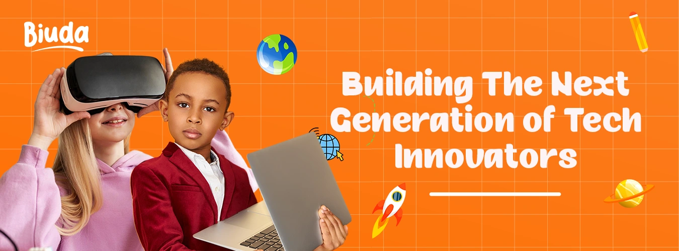
Biuda’s refreshed identity positioned it as a vibrant, forward-thinking brand in African tech education. It communicates trust to parents, excitement to children, and credibility to schools.

Reflection
This project taught me how powerful emotionally intelligent design can be in education. Balancing play and professionalism helped Biuda stand out, not just as a tech brand, but as a movement shaping Africa’s next generation of innovators.
Like this project
Posted Oct 8, 2025
Transforming kids’ learning through Biuda: A playful, tech-driven brand identity that sparks curiosity, creativity, and a love for coding in young minds.
Likes
6
Views
13
Clients
Biuda

