Designing a Simple Payment Solution for Small Businesses.
Overview
Eazipay is a co-operate payment platform that enables micro-and small businesses to keep stock of their record and also pay employees' salaries with just one click.
The Problem
Payroll, Invoices & Inventory processes are one of the major activities that occur within an organization and oftentimes companies find it difficult to manage these processes.
Project Goal
The goal of the project is. to create a one-stop system that provides all the necessary means for companies to perform their necessary organizational activities on.
My Role
As the sole designer on this project, I went through an end-to-end process. I made more use of information gotten from the market survey and the requirement based on insights from users to design the product.
Although I was the sole designer on the project, I collaborated closely with the Business managers, the Project manager, and the development team.
RESEARCH AND PROBLEM DEFINITION
To ensure the mobile app meets the needs of the target audience, I employed the design thinking methodology as defined by the Nielsen-Norman group for the entire project.
User Research
I started out the project by conducting initial user research to find out what the target users' current payroll, invoice & inventory process is like and also to discover the difficulties they experience using their current preferred method. I used an online survey to achieve this.
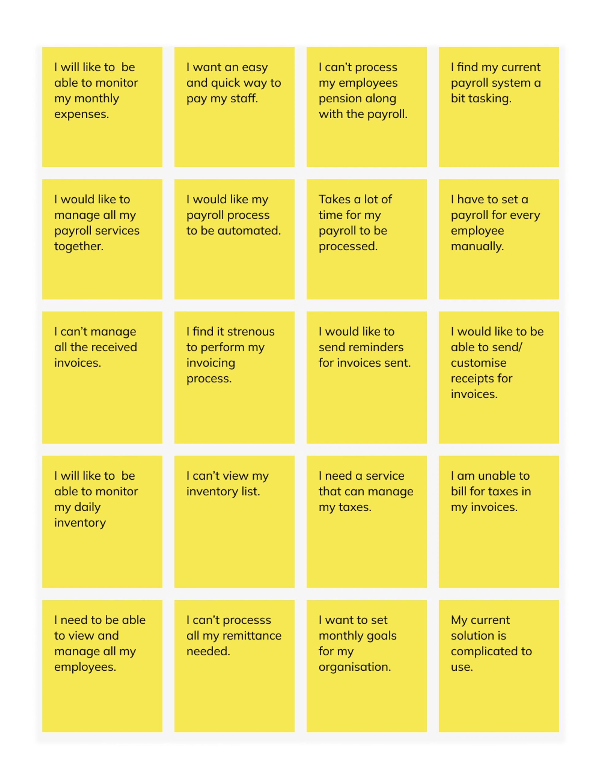
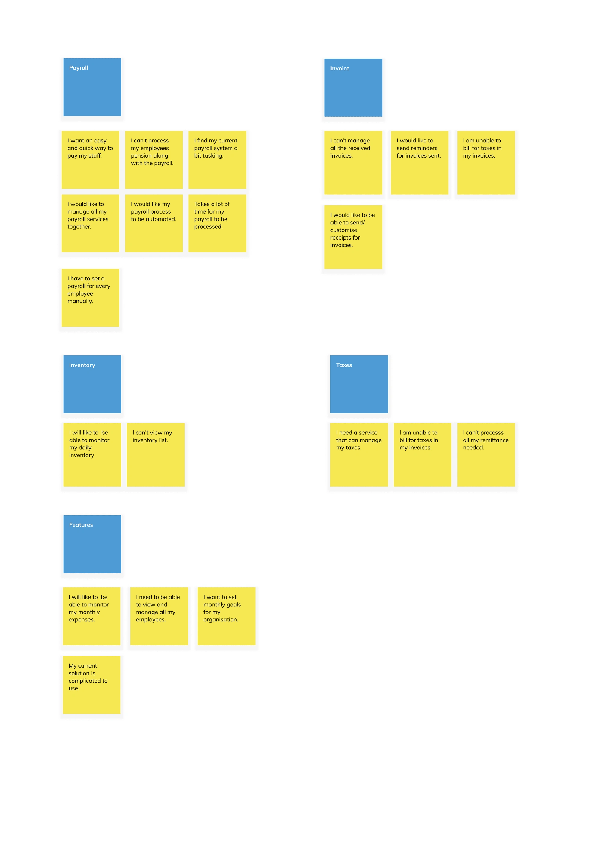
Affinity Mapping
I analyzed the results of the survey and used affinity mapping to group-related observations. This helped me uncover the pain points users encounter as they used the current product. With this in place, I had a better understanding of the needs of the target audience.
Painpoints
The pain points uncovered are as follows:
Users found the payroll flow complicated and strenuous to use.
They are unable to manage their tax payment and billing.
Users found the flow of transactions too long.
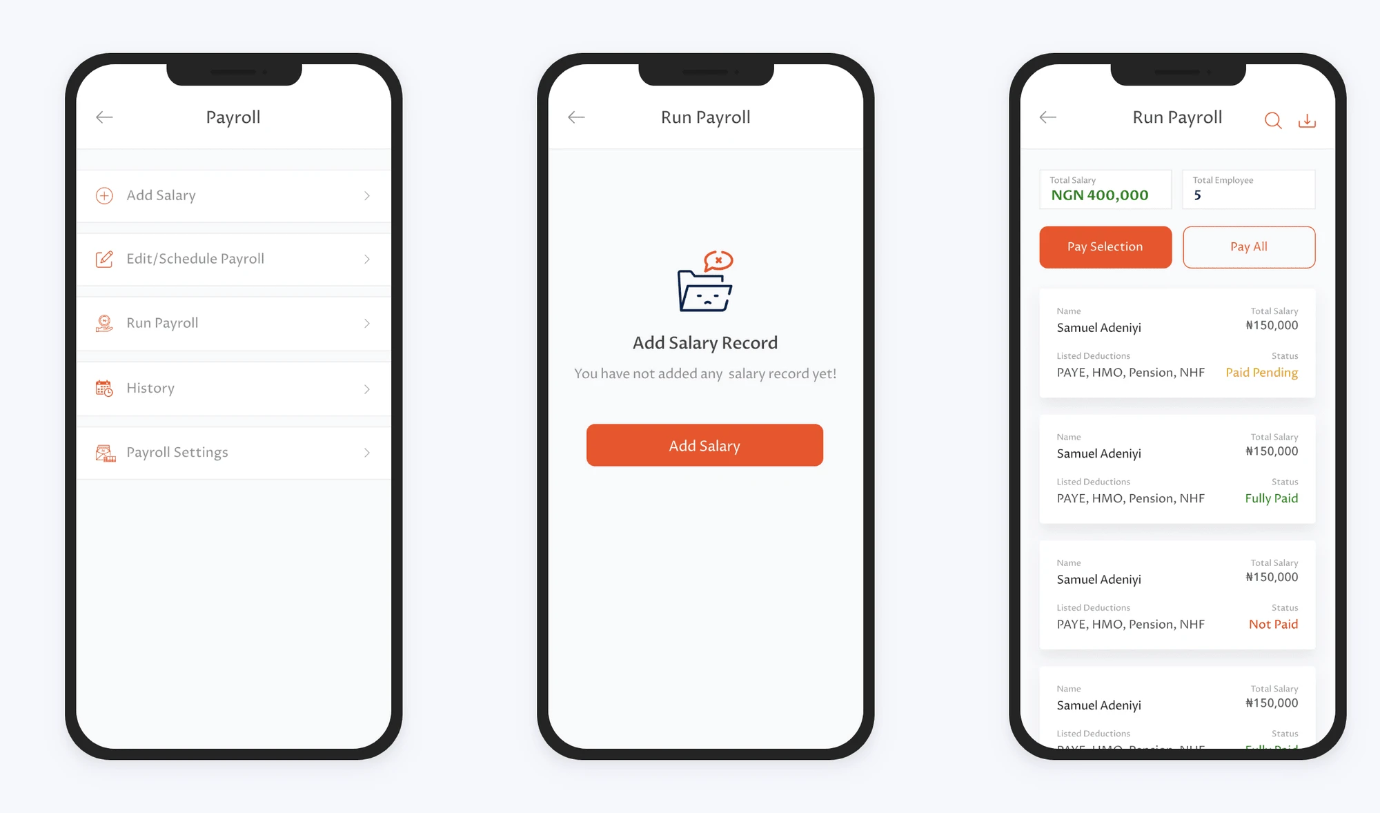
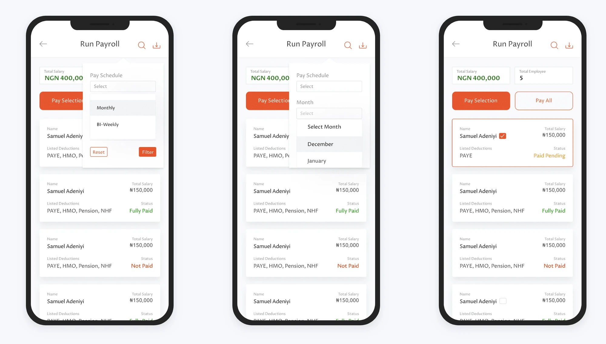
Unable to schedule the payroll process or automate it.
Unable to easily manage employee profiles and payment histories
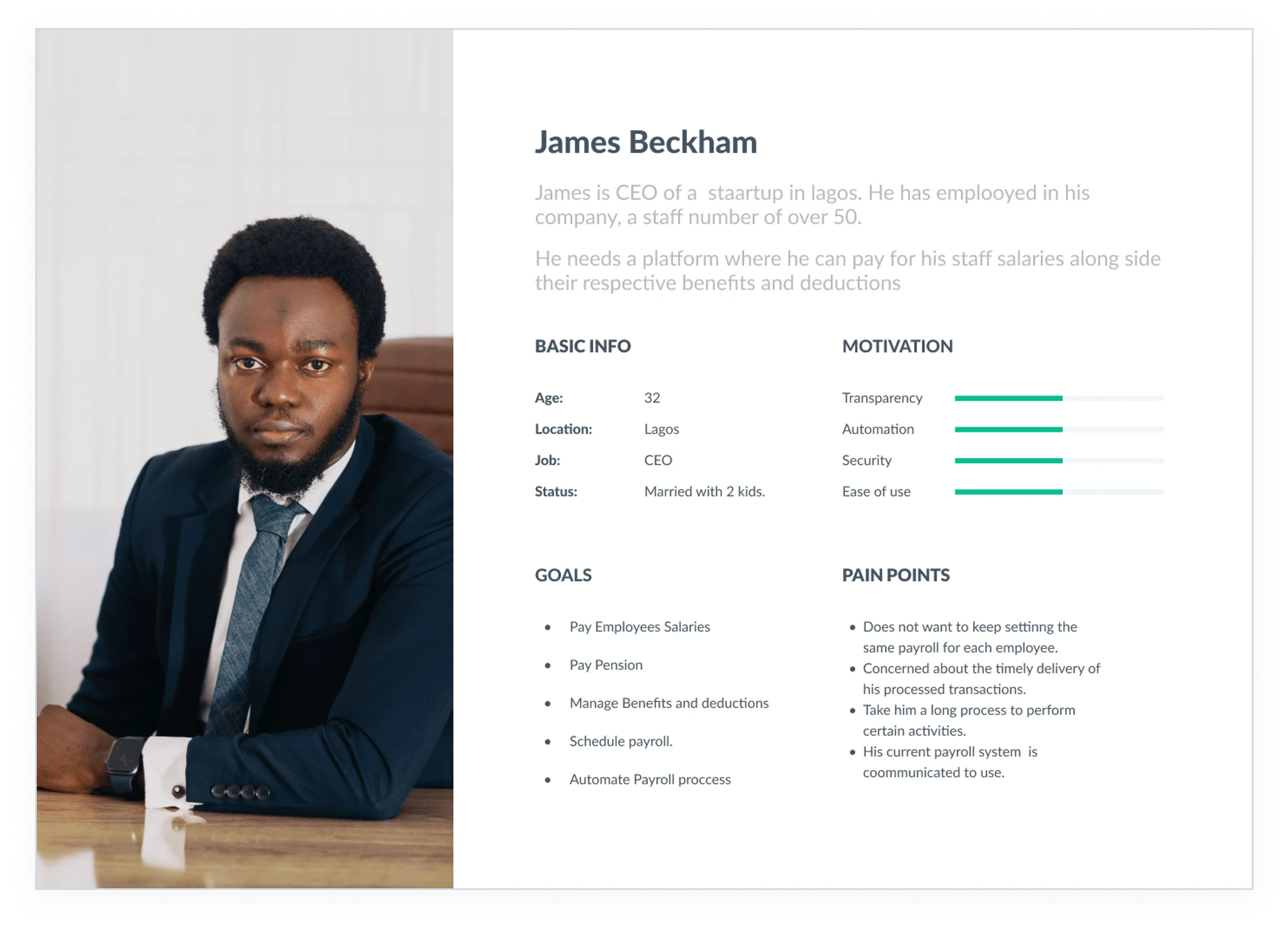
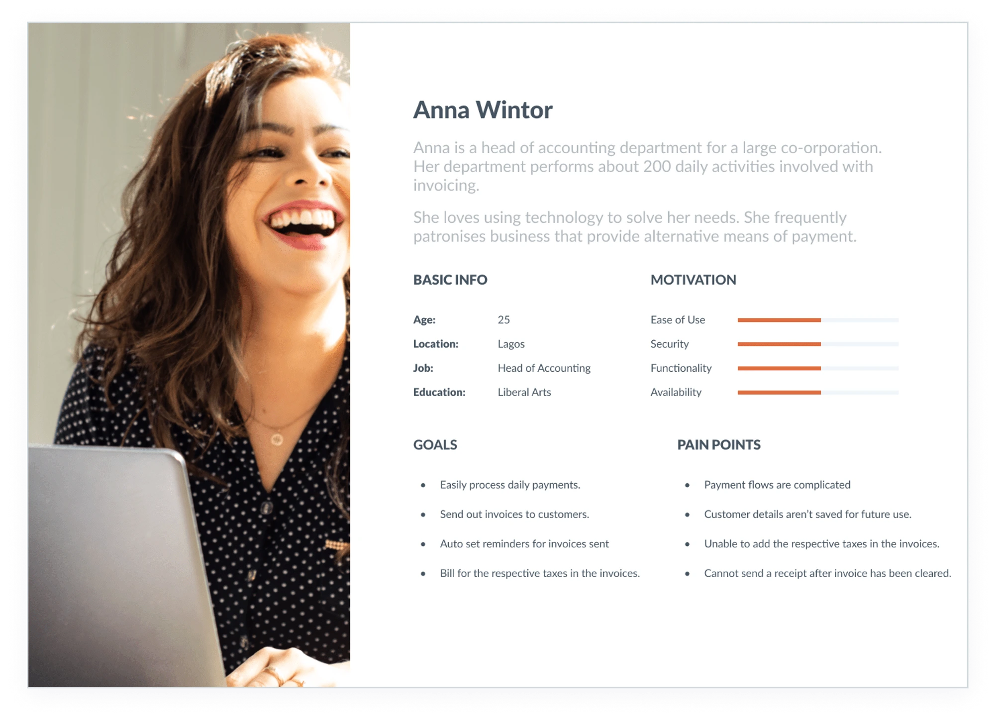
Personas
Using the results of the survey, I created two personas that embody the traits of the target audience.
Market Research
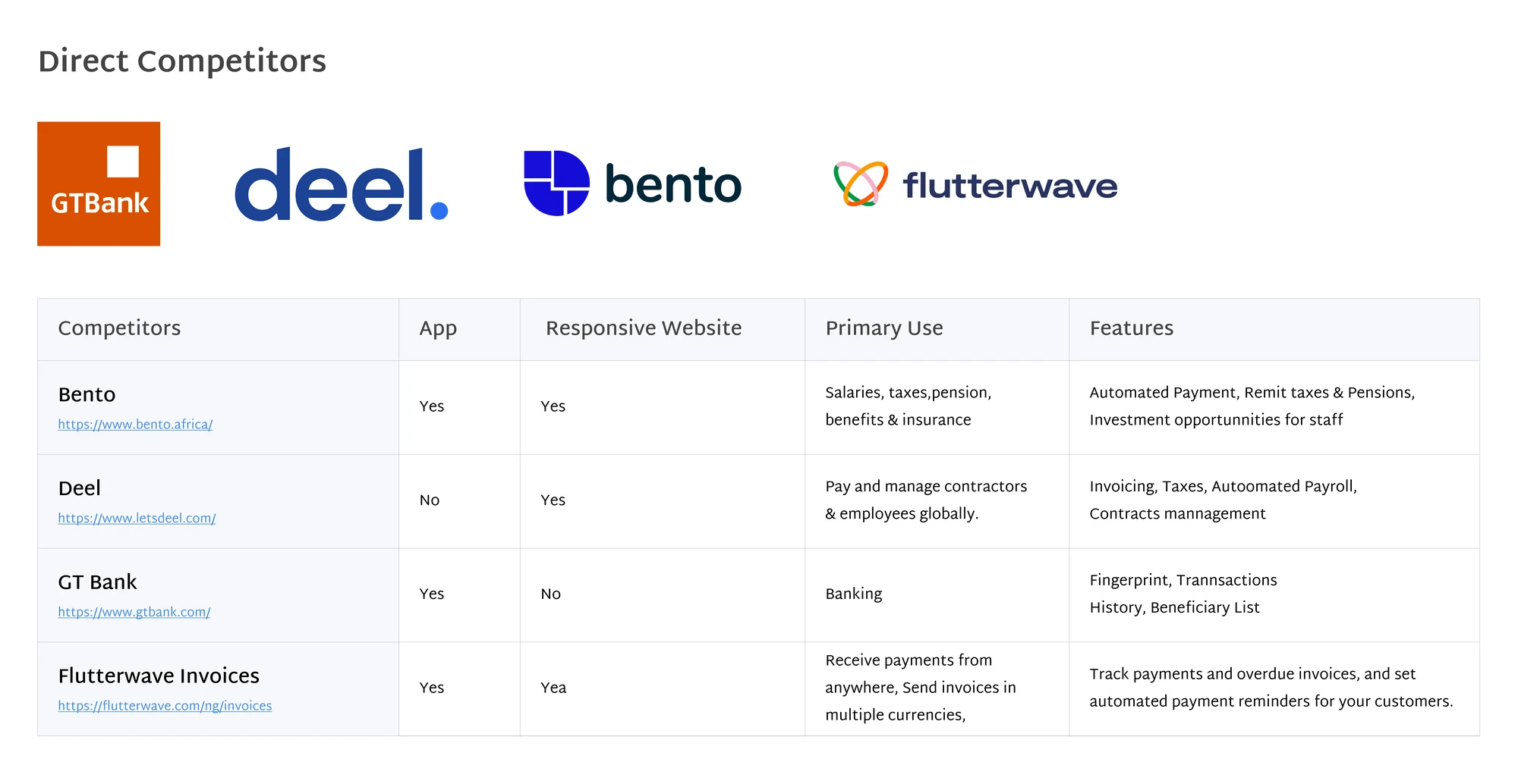
With insight from the user research, I needed to do a competitive analysis of popular similar applications on what they provide and how they compare.
Getting familiar with the ways and needs with which users interact with other similar products in the market gave me insights into common setbacks people encounter and also the kind of features or strategy in place that fosters a good user experience. This helped me define solutions/features to include in my designs, as well as aspects users, are familiar with in a fintech application.
Insights
From the information gathered on the direct competitors, I found that they had the following features in common:
Automated Payroll Process.
Taxes Management
Pension Remittance
Automated Reminders for Invoices.
Receipts for invoices.
Design Exploration
Ideation
Finally, after I found out the pain points to work on and I started a brainstorming exercise to identify a better way to provide a solution to the issues the users were encountering and had pointed out during the interviewing processes. My ideas were:
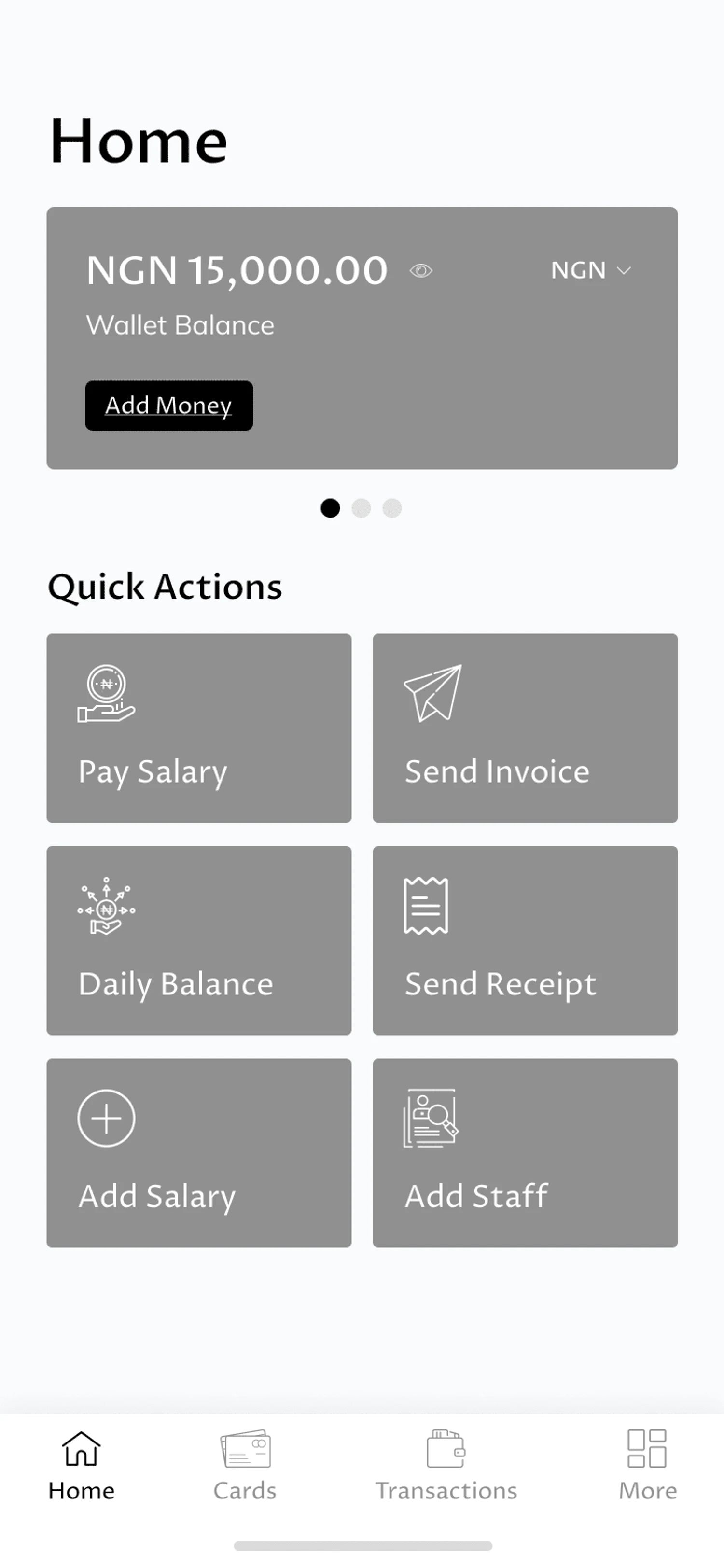
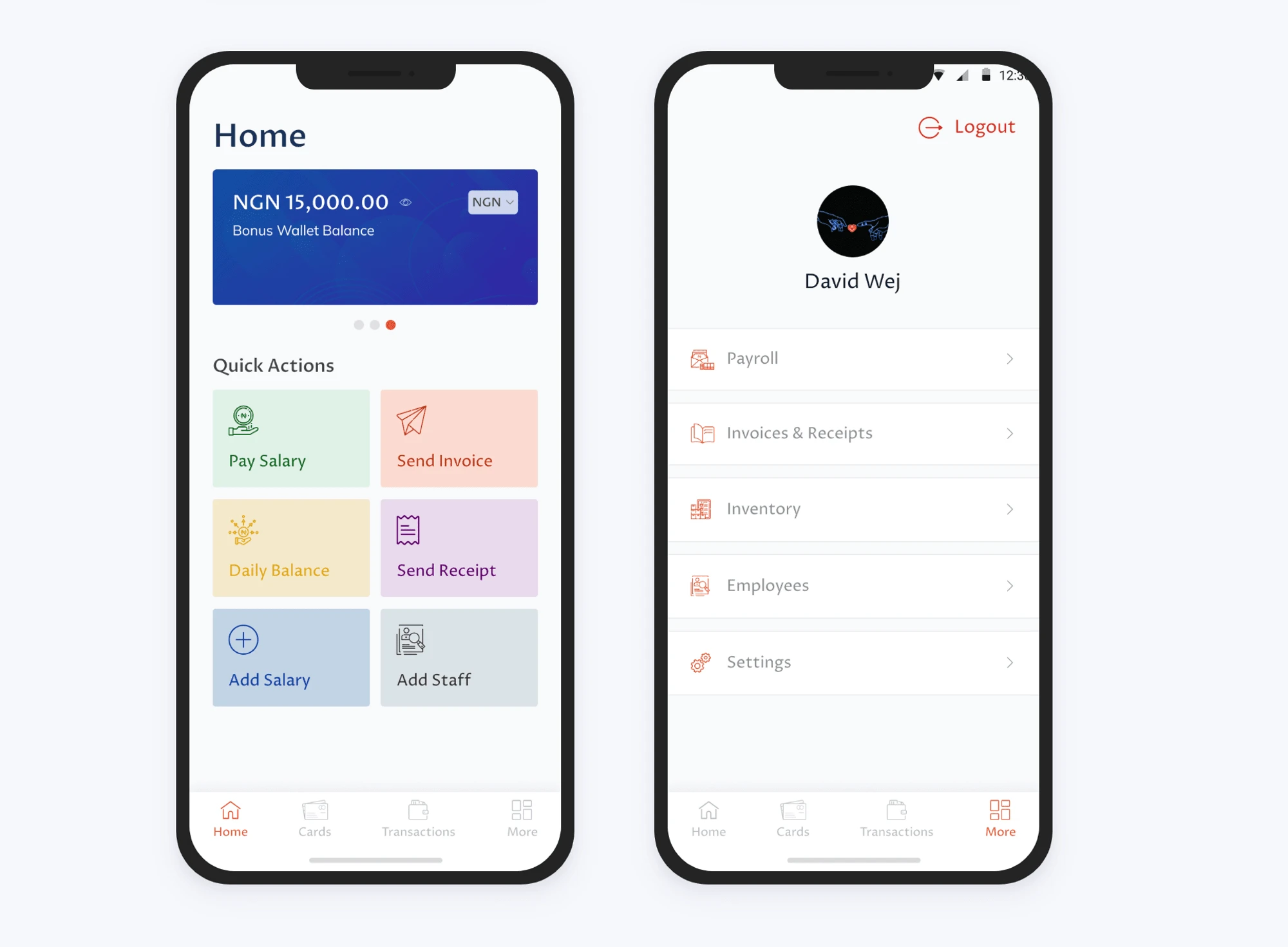
Quick access to the major activities right from the Home.
Automatic reminders are sent for invoices past the due date.
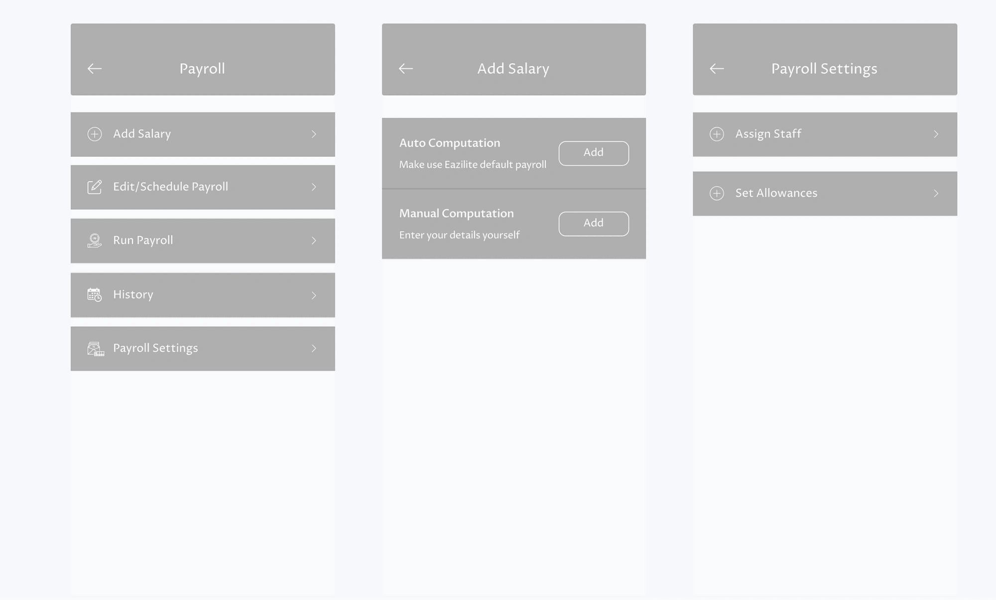
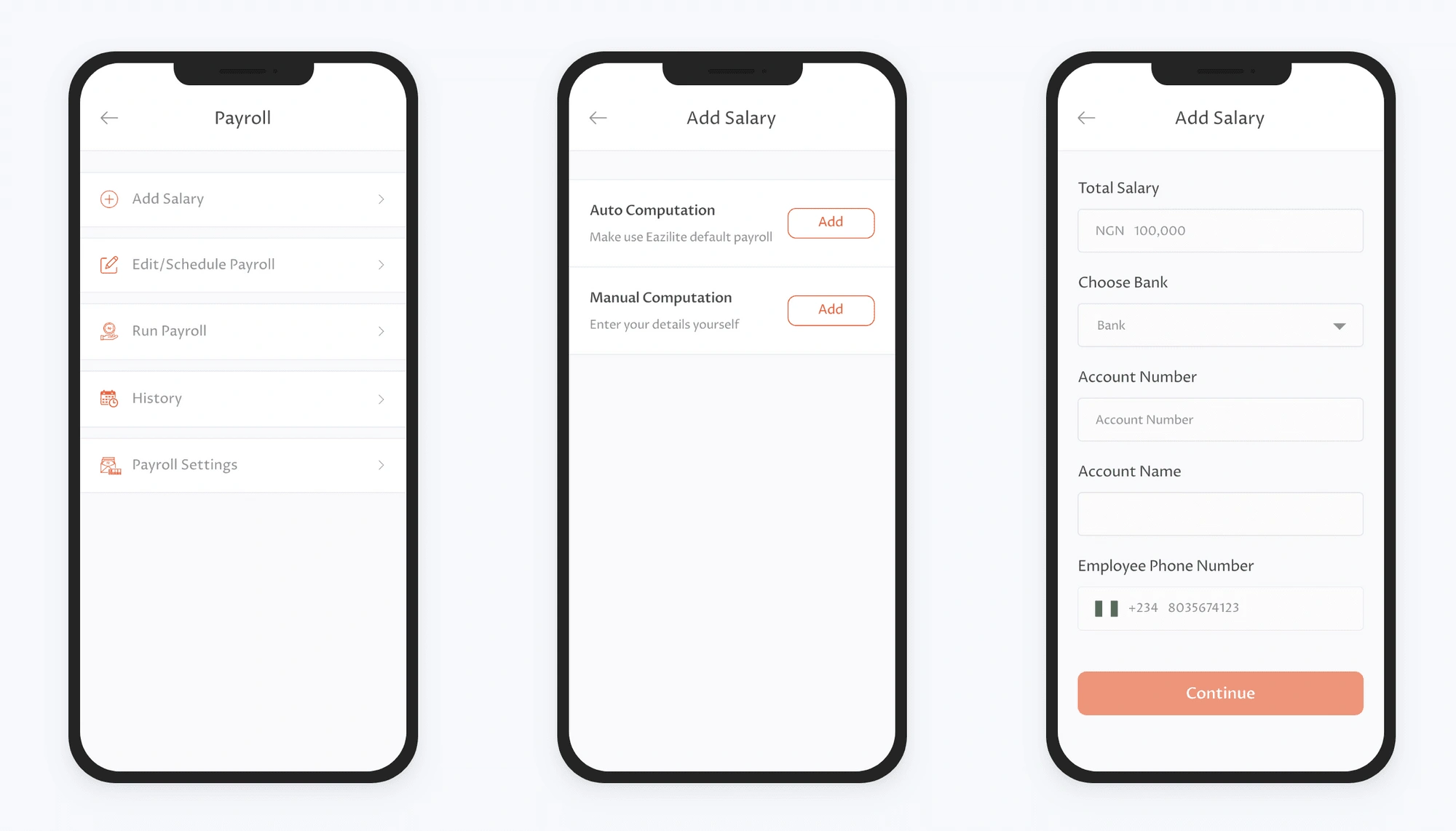
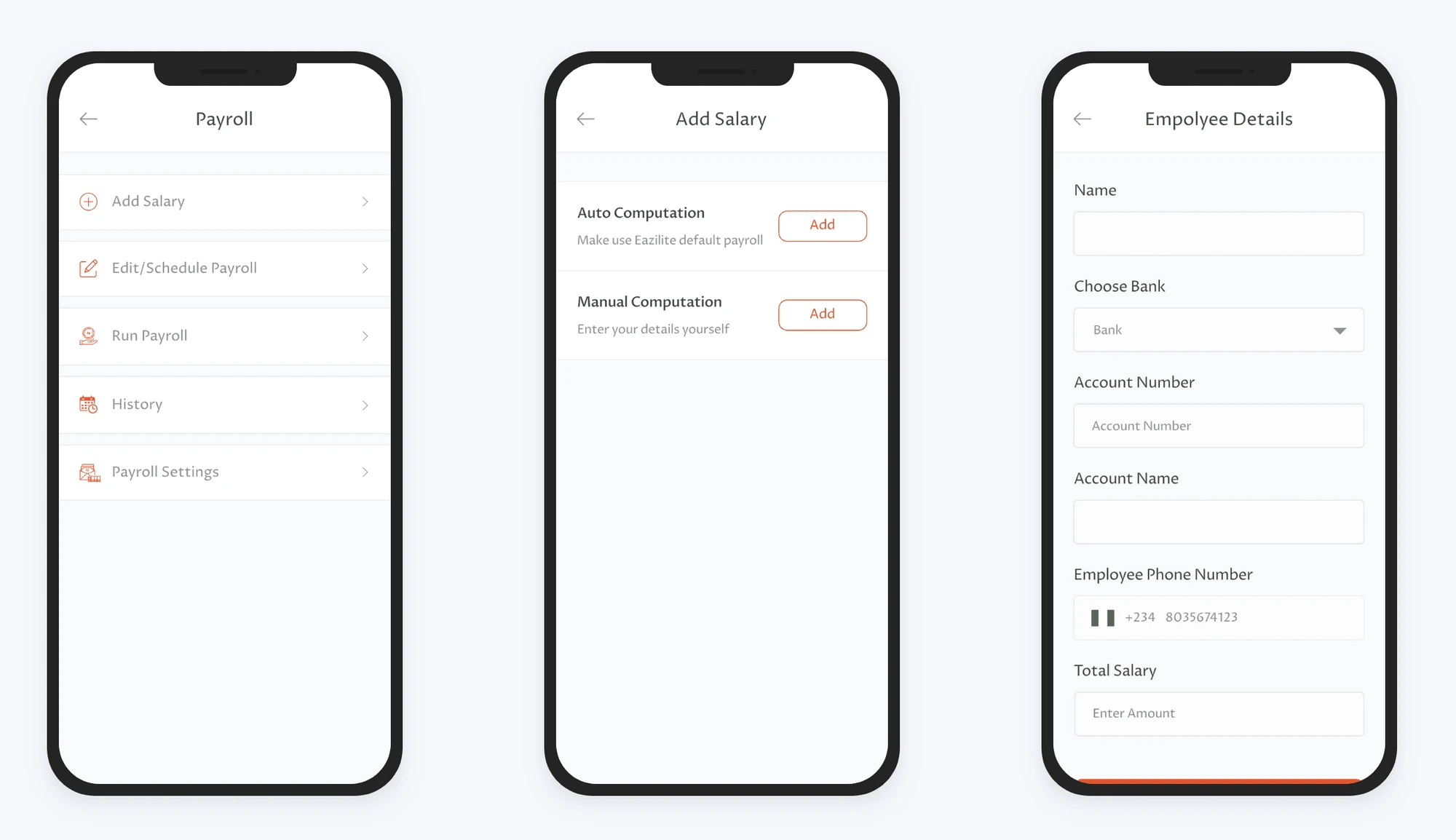
Option for users to either manually set the payroll or make use of a default format.
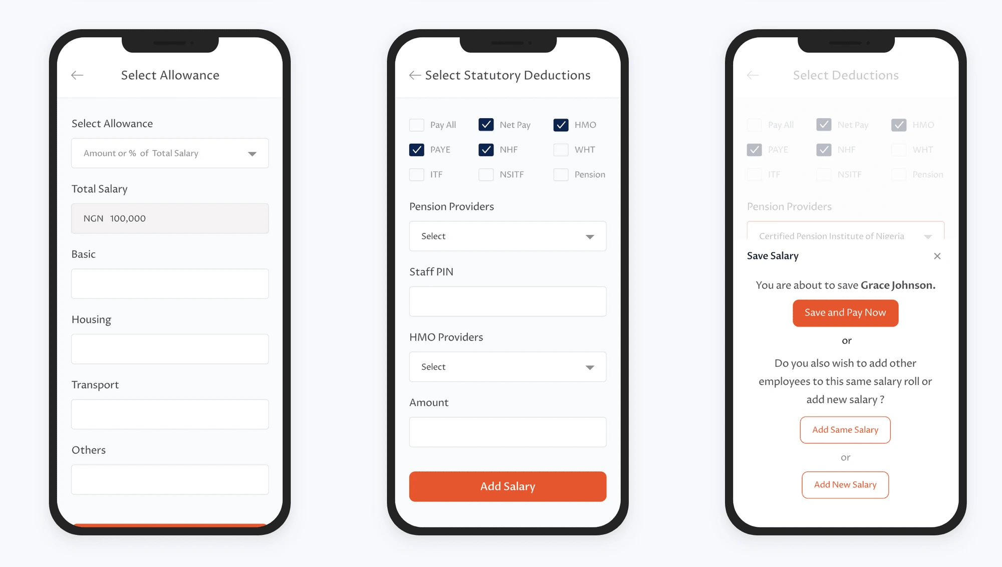
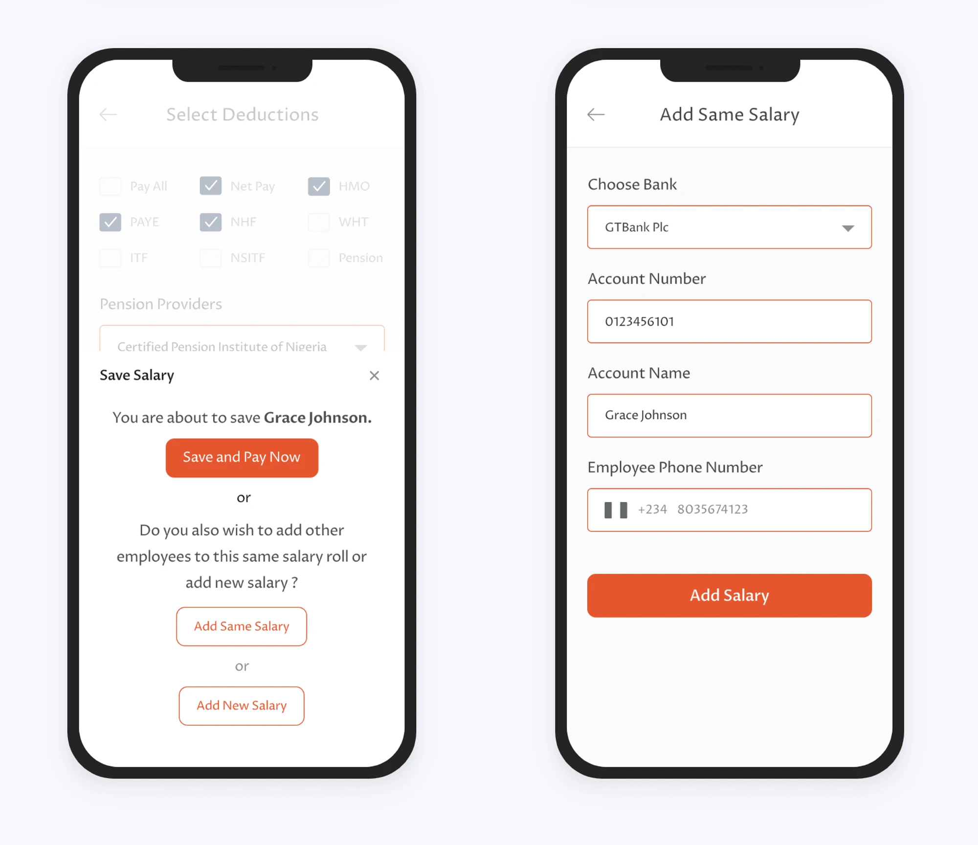
Ability to assign staff to an already existing payroll.
One-click "Send Receipt" flow for paid invoices.
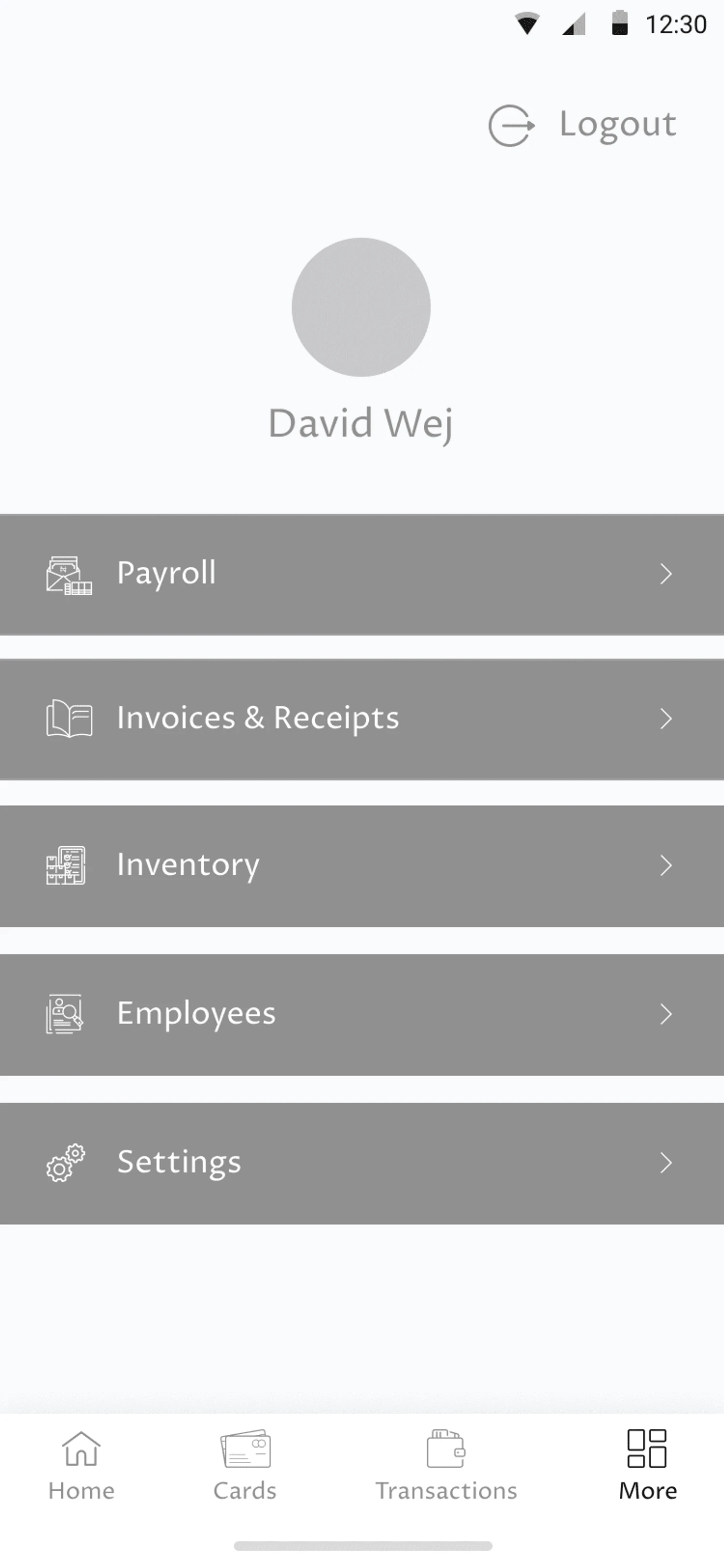
Special attention was given to the Information architecture of the application, similar features were grouped together to ensure easy use of the mobile application.
I had a meeting with the team on the project to go through my findings with them and recommended solutions to ensure everyone was on board with it including the developers.
Sketches and Brainstorming
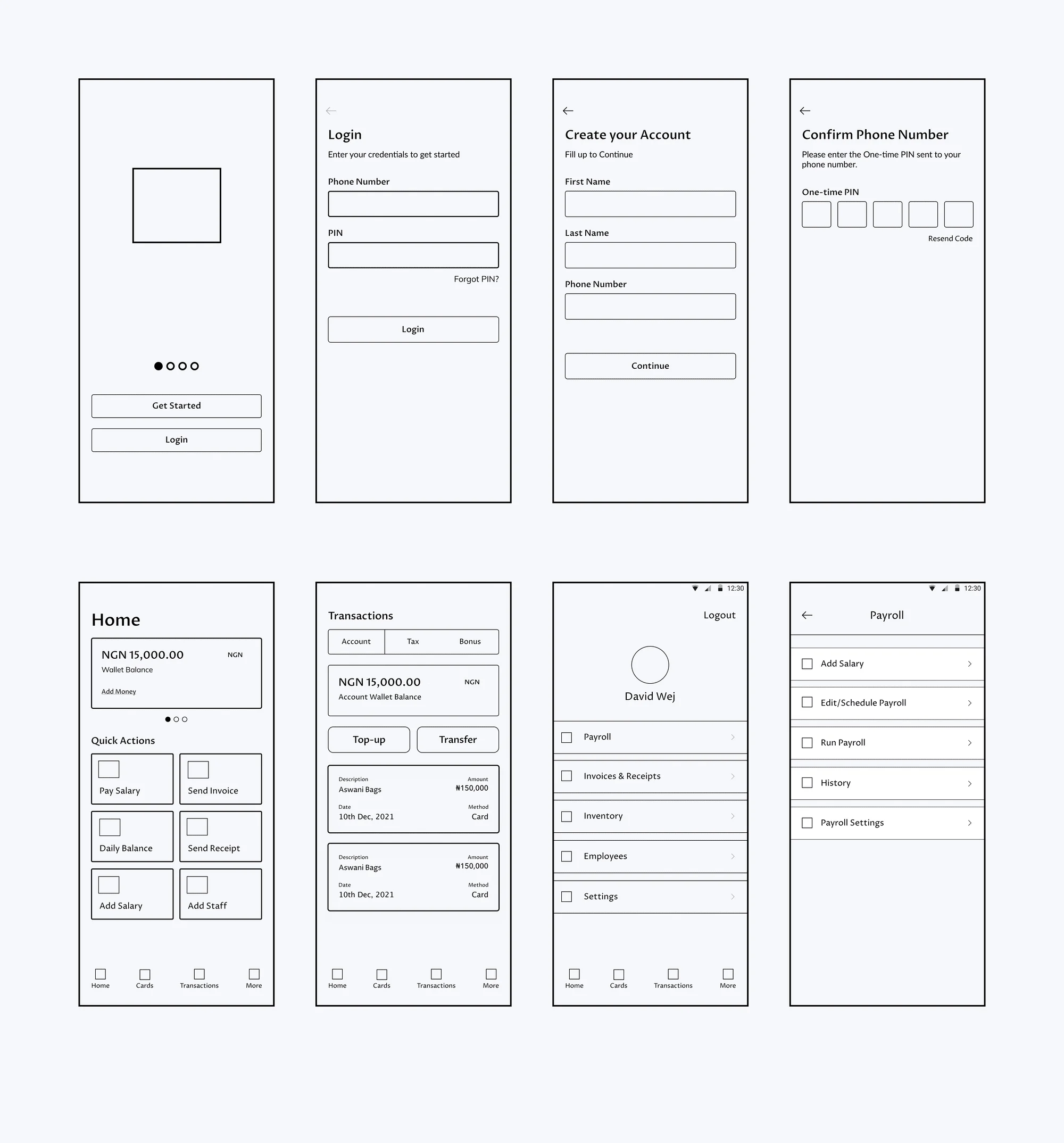
To gain a better understanding of how the platform would work and have some understanding of the flow, I sketched pages to better illustrate it, this also allows for many leading iterations through varying design options.
Wireframes
My goal was to provide design solutions for the pain points uncovered in the initial research. While the sketches provided a broad user flow, the wireframes refined the details and functionalities users have for the platform. This includes more details:
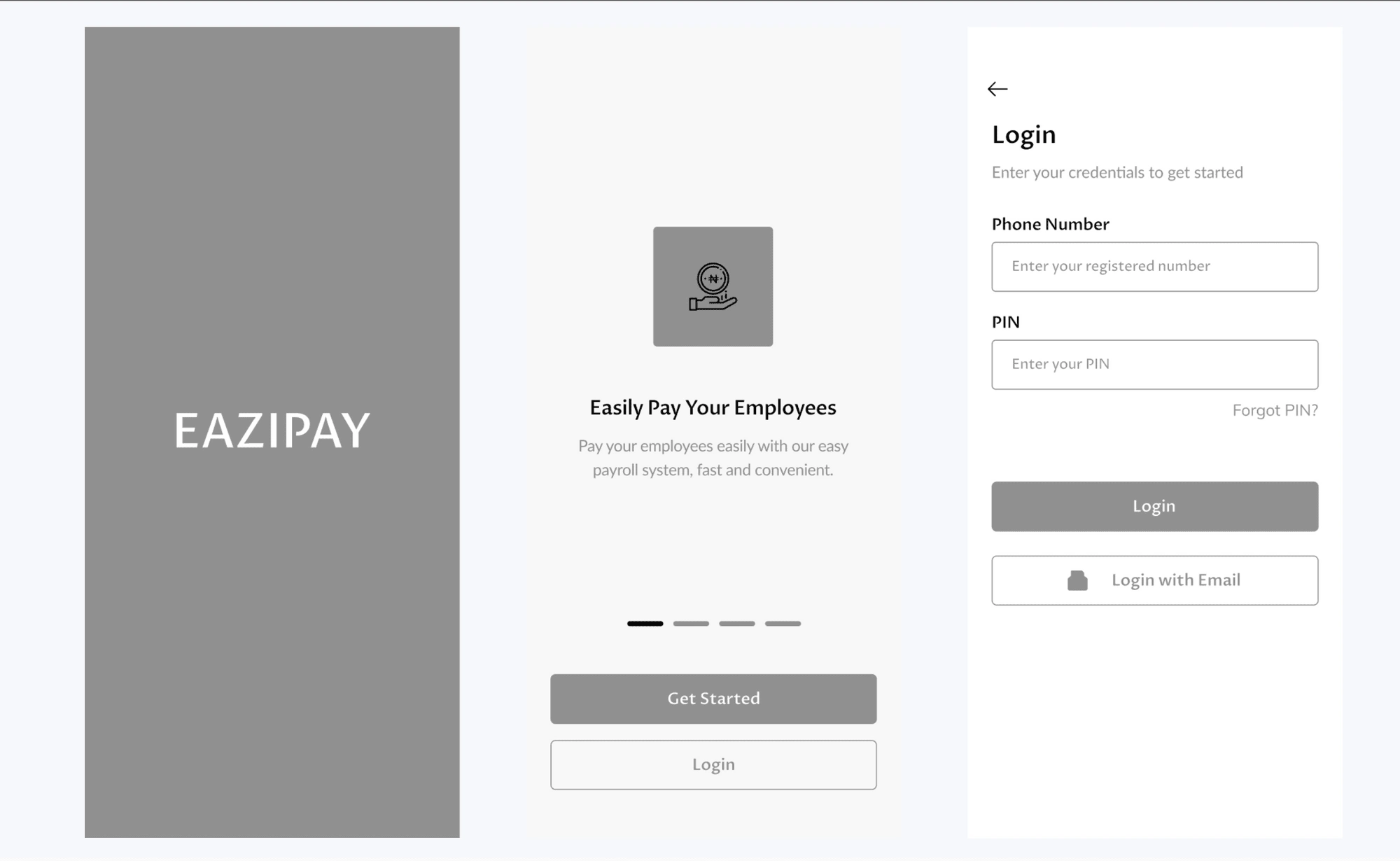
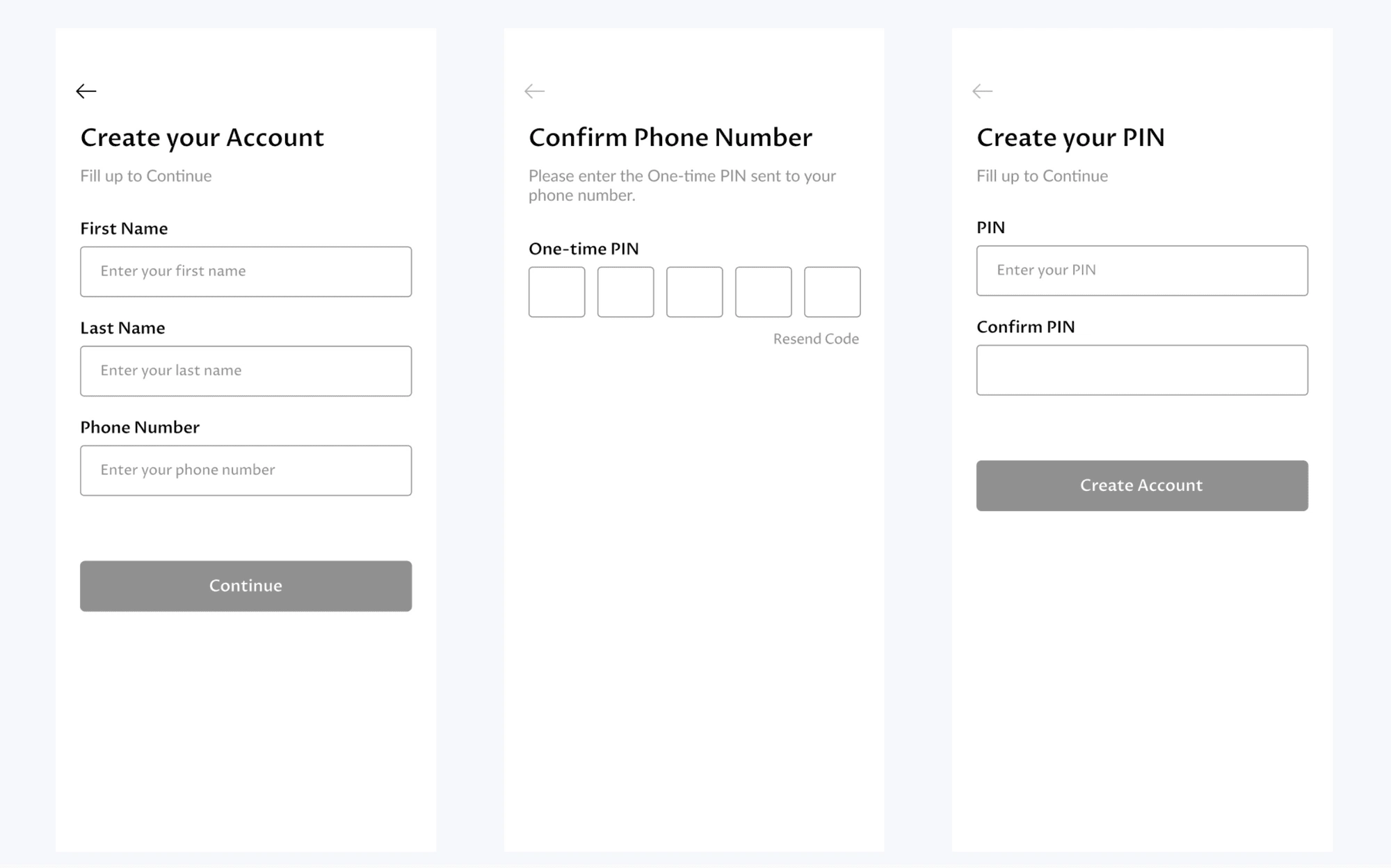
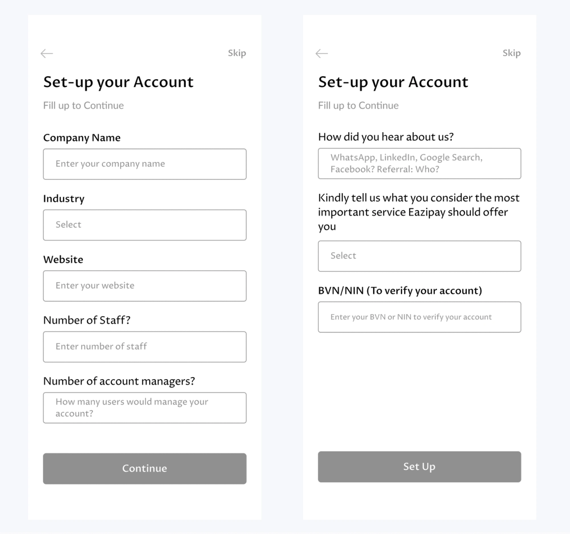
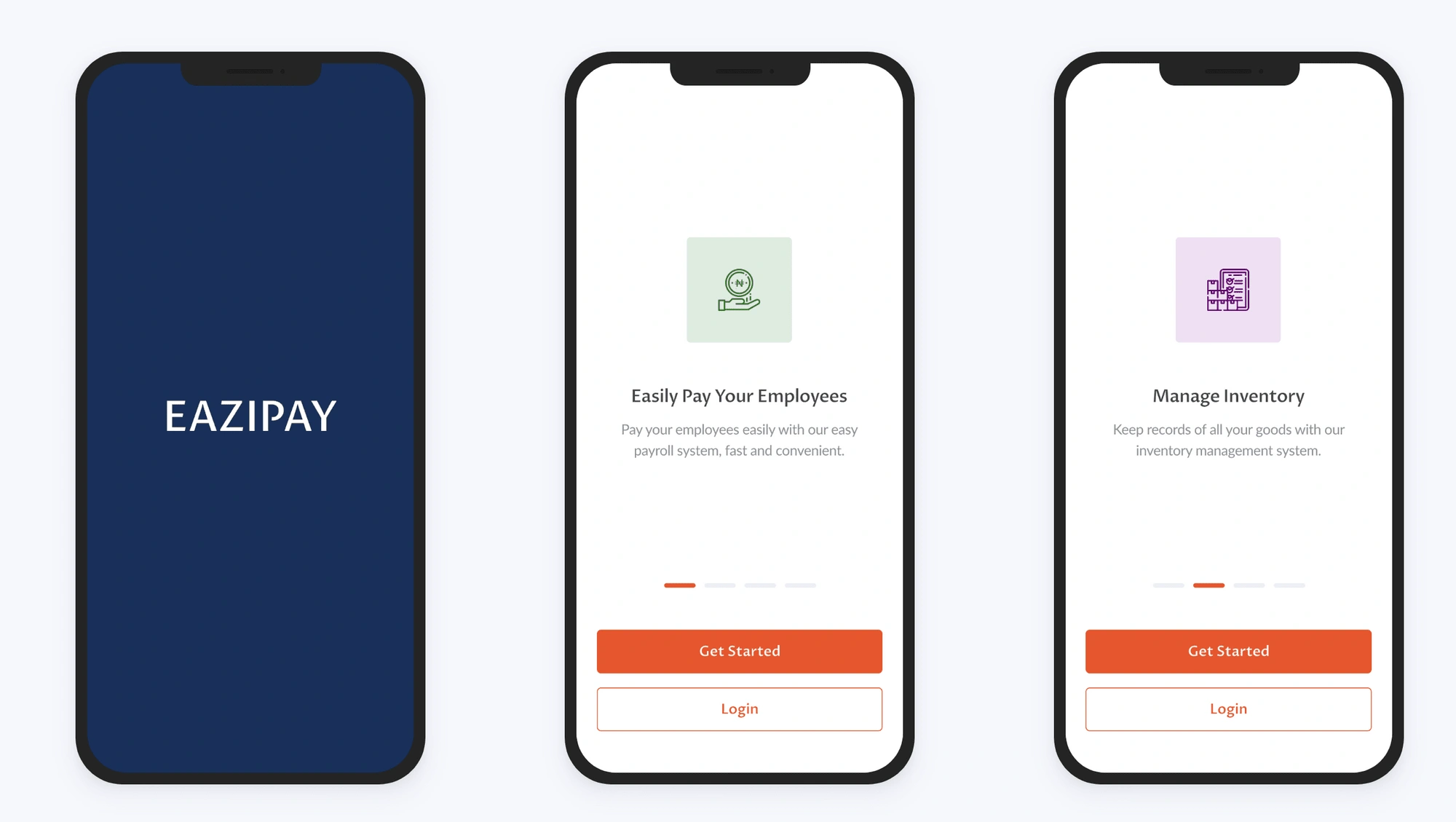
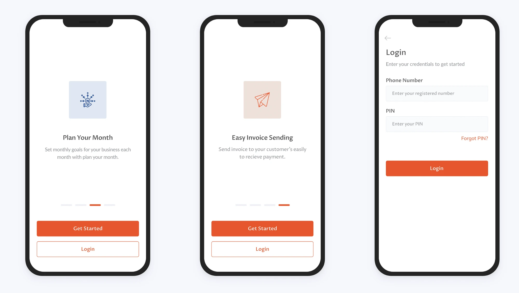
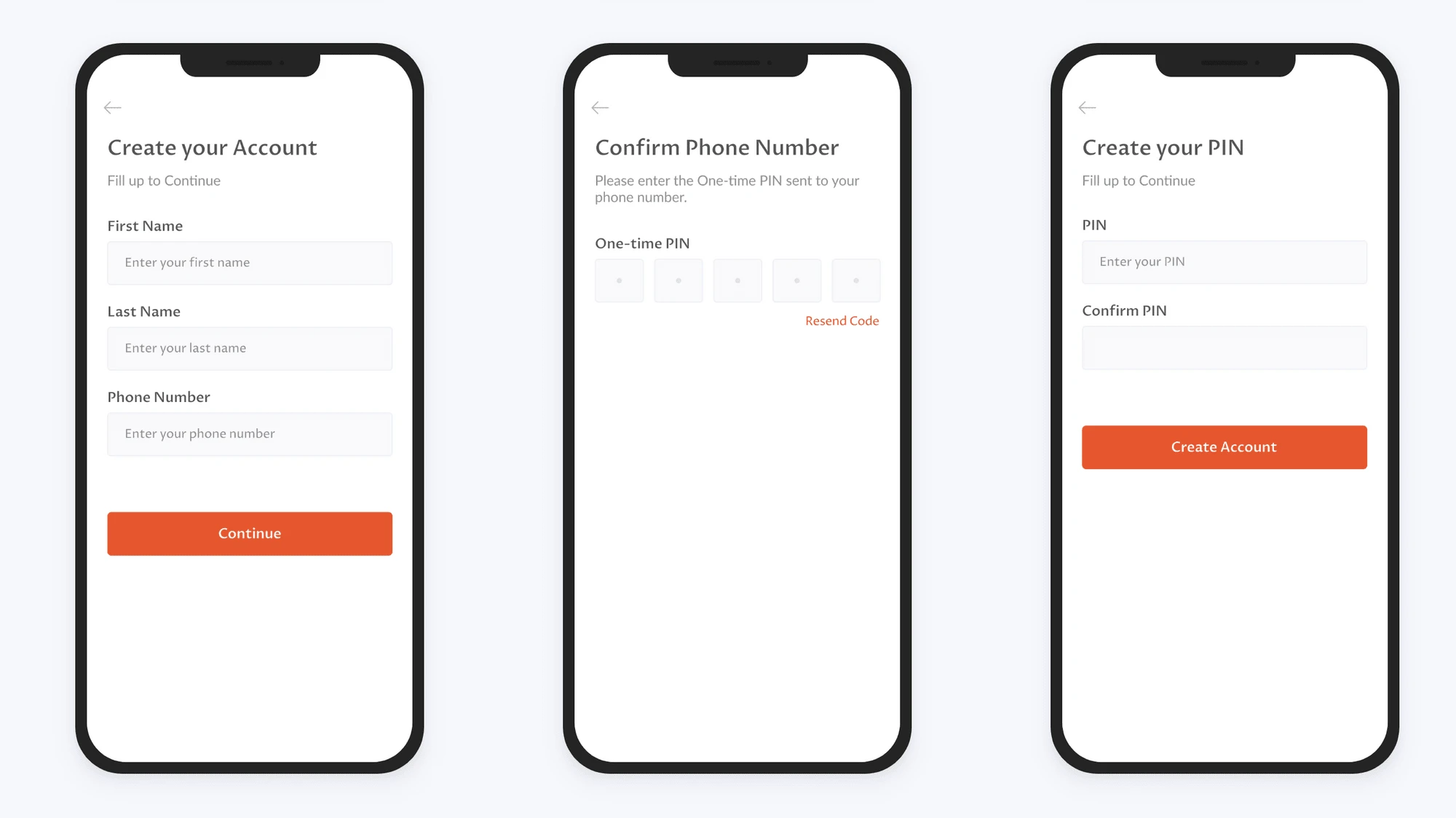
1. Onboarding and Authentication Flow
There's an onboarding flow preceding the login/join now, which is meant to give users a quick overview of the application.
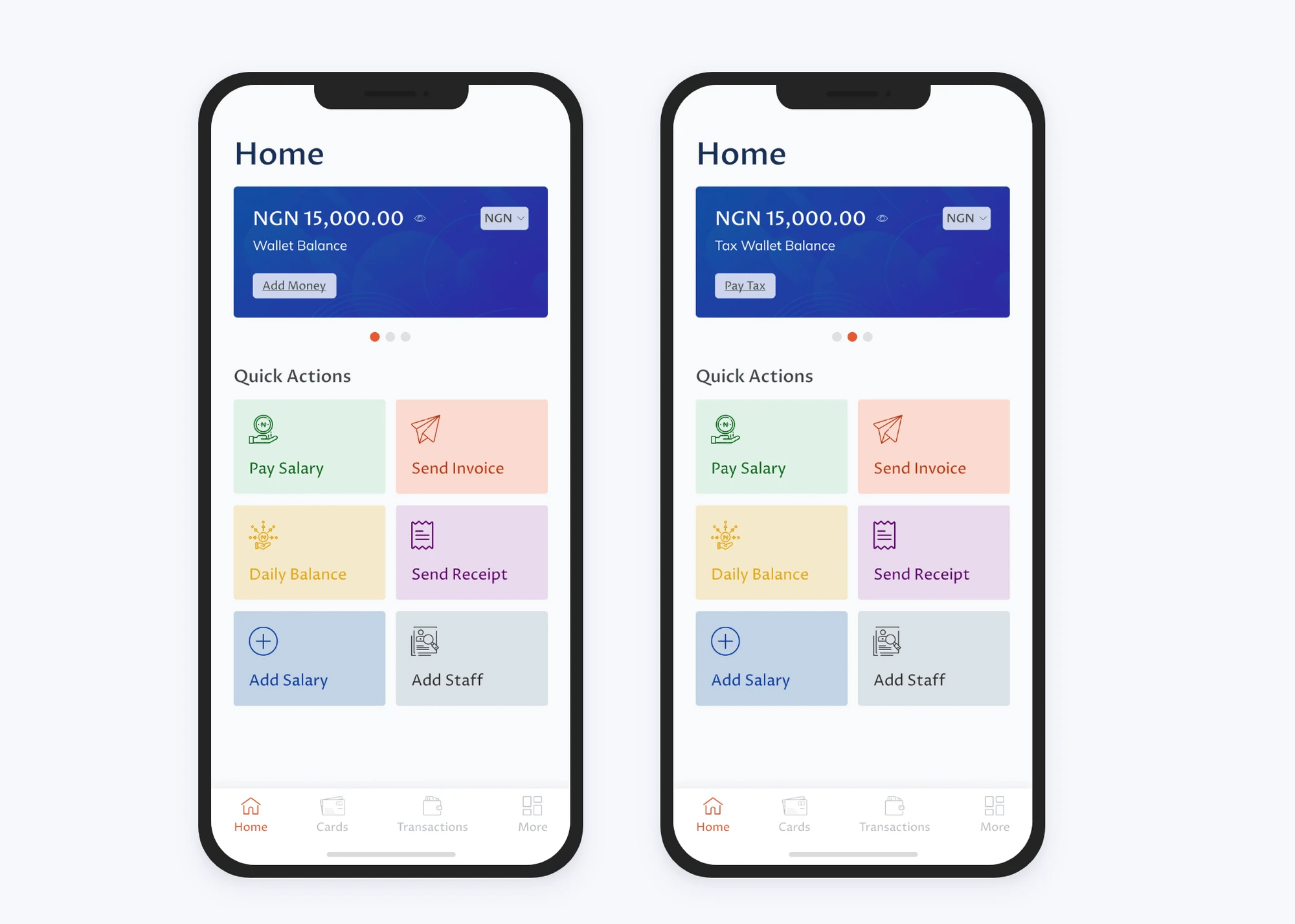
2. Homepage
The wallet and "fund" are made easily available on the homepage. There's also a quick action menu with all the major features, so as to reduce the flow users take to perform these actions and improve their respective experiences.
The Menu list is also grouped and well distinguished to ensure good user navigation of the product.
3. Other Features
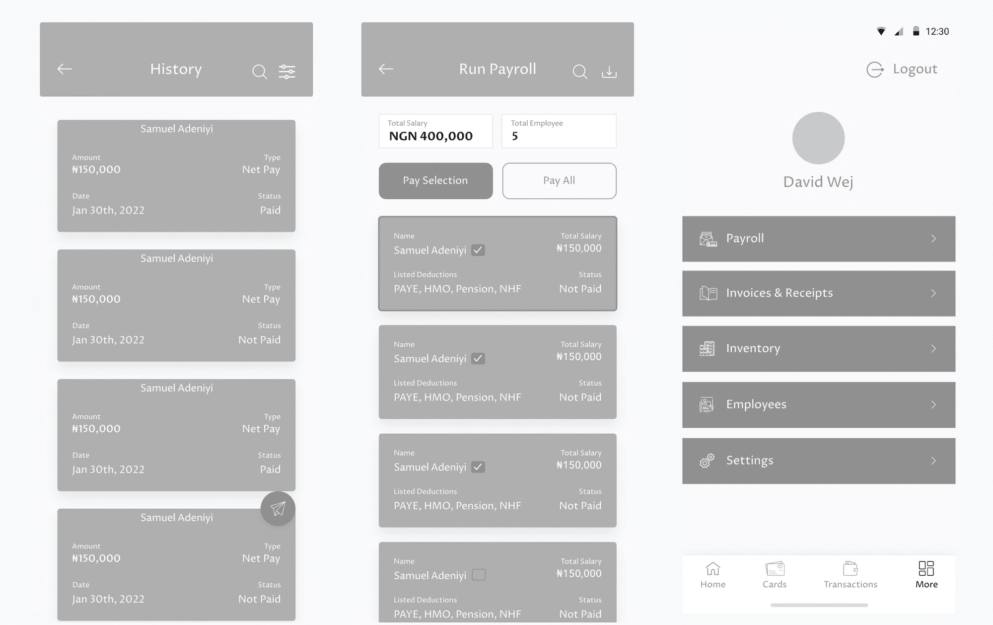
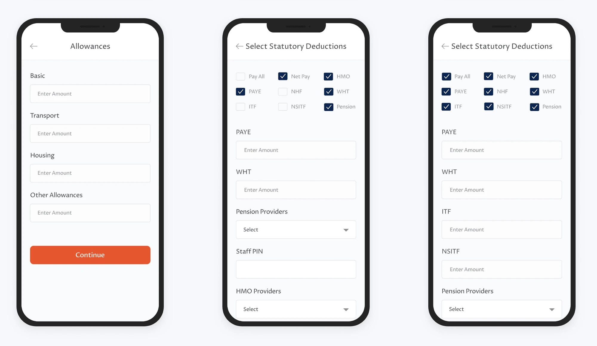
Payroll - Auto computation, for users that would like to make use of a default format and manual computation for users that would like to create.
Users can set their default allowance in the payroll settings, they are also able to assign benefits. to staff.
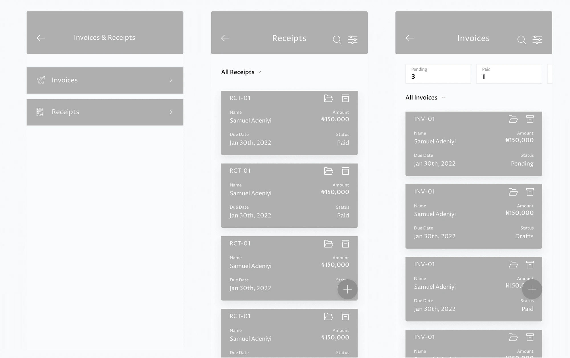
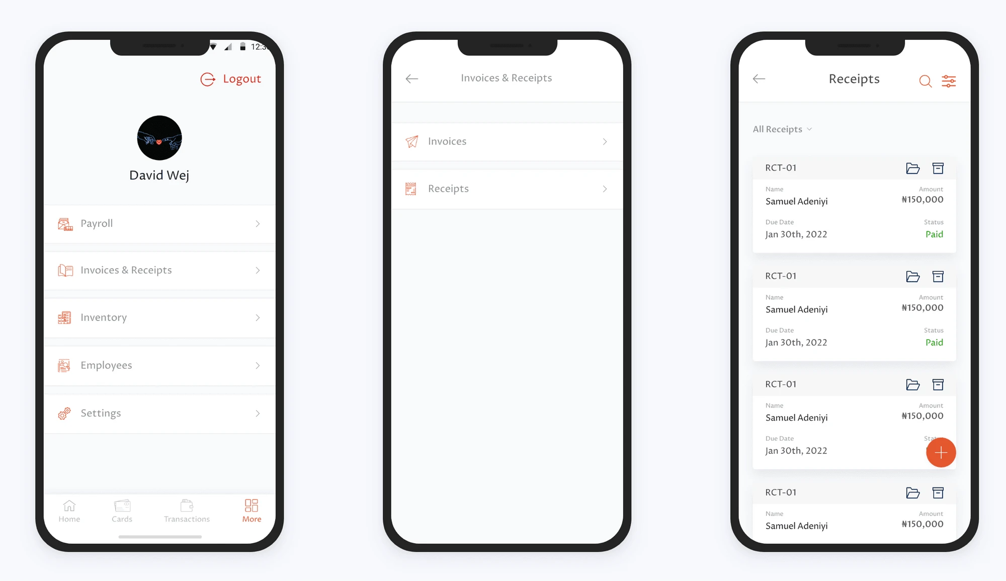
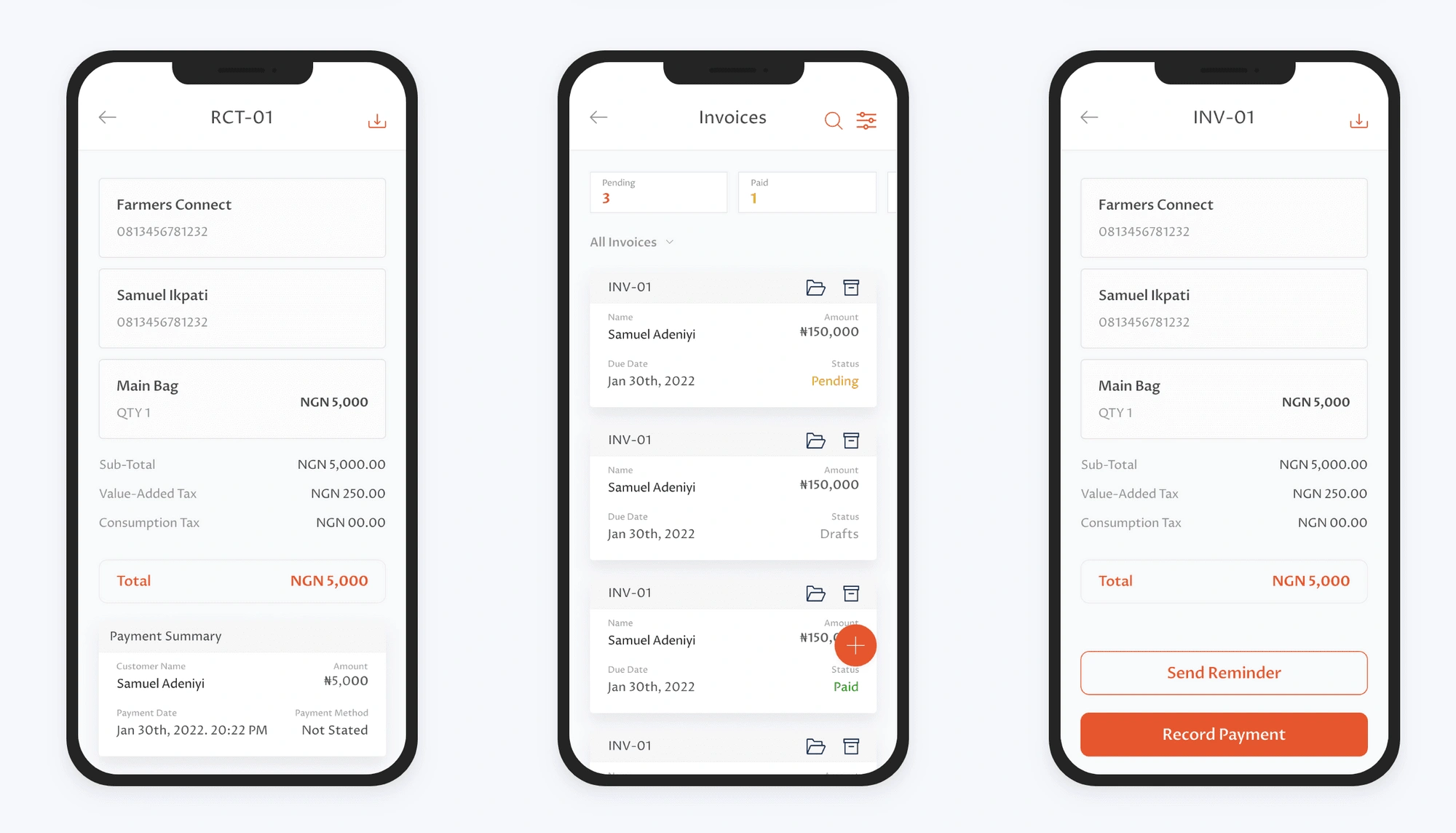
Invoices - Users are able to filter their invoices based on the status and an overview of all invoices is provided on the page. Auto reminders are also set for every invoice sent.
Receipts - Users can generate receipts for each invoice sent, these are stored in the receipt page.
Prototype and user testing
The Low fidelity wireframe designs were presented to the team of developers, PM, and Business managers for feedback, correction and to get a good direction of the project. The inputs and suggestion updates were reflected in the High fidelity design.
I tested the low Fi wireframes with some users to take notes of their reactions to the new features and pre-existing fixes.
High Fidelity Design
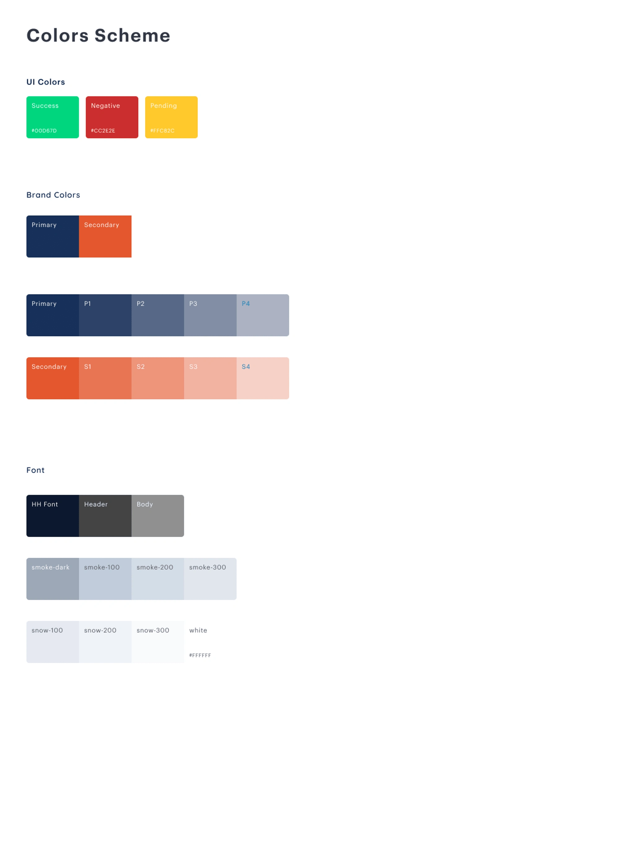
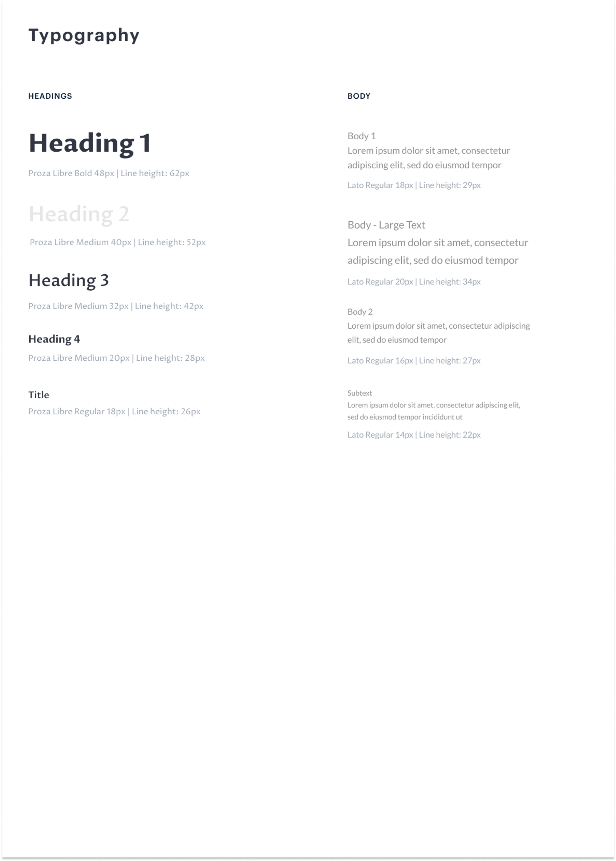
Style Guide
Colors & Typeface
1. Onboarding and Authentication Flow
2. Homepage
3. Payroll ( Auto-Computation )
4. Payroll ( Manual Computation)
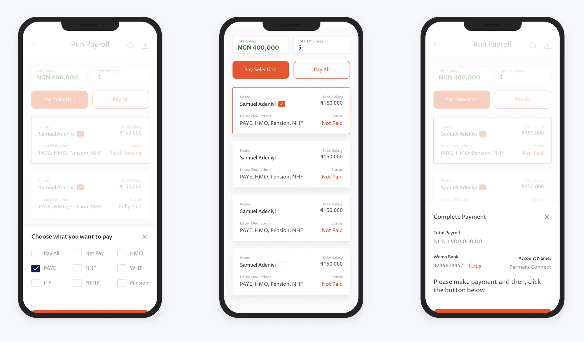
5. Run Payroll
6. Invoices & Receipts
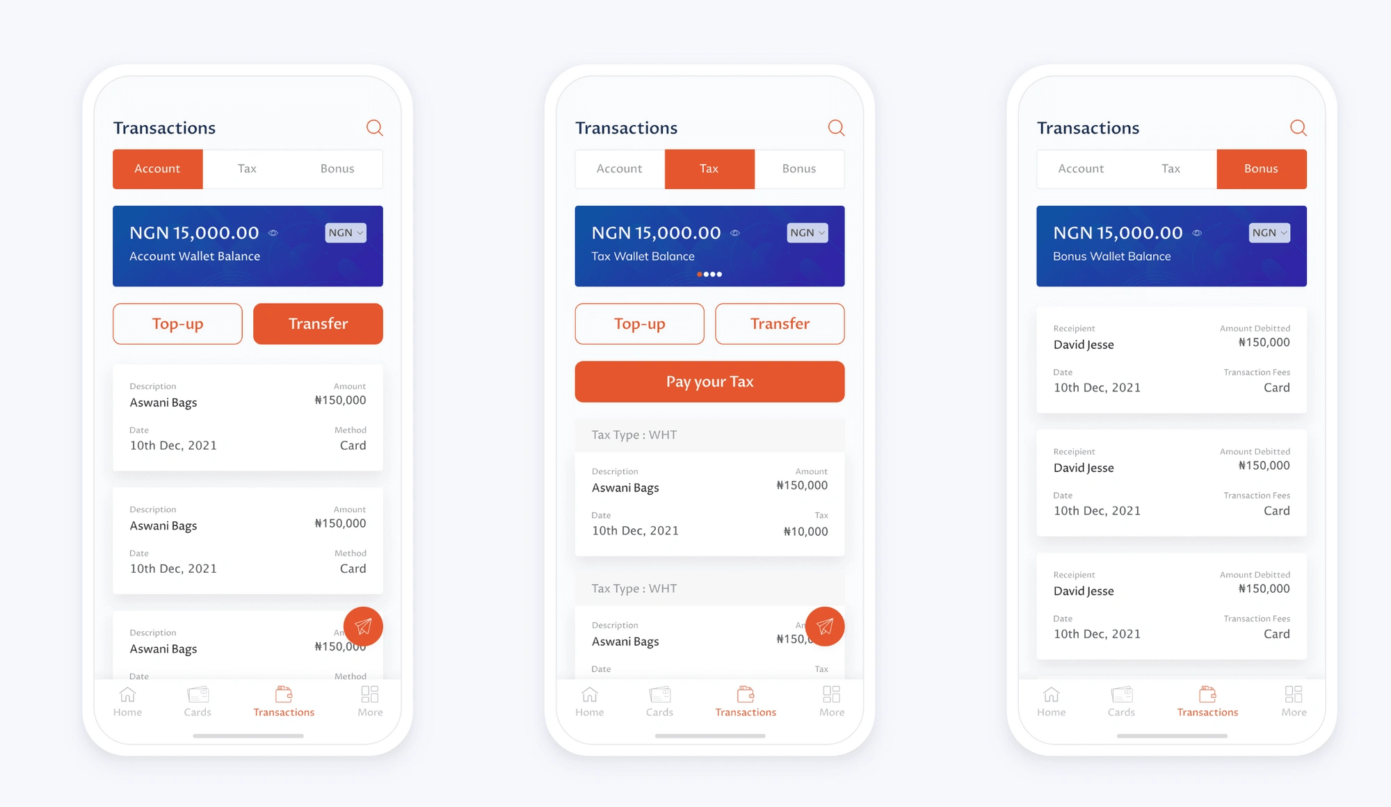
7. Transactions
Conclusion and Project Learning
In the course of my training, I learned how important it was to follow a user-centered design process and this project further solidified that thinking.
The project was a career-defining one, I’m pleased with the outcomes. The journey was also a major learning point for me. One of the key parts of the process was interacting with the users and not relying on my intuition.
I also had to be able to properly relay my ideas and plan with the team and to take not only the PM but also the developers along my design process. These had a huge impact on the product.
Like this project
Posted Aug 20, 2023
Best Outsource Online Payrolls & Book Keeping Specialist.
Likes
0
Views
10

