Designing a payment system for both Customers and Businesses
Olawale Onifade
Overview
KongaPay is a safe and secure method of online payment. Some of the major features include Payment for items & TV Subscriptions, Sending & Receiving Money, Buy Airtime, etc.
This project is about revamping the whole system ( Webpage, Web app, Mobile web app & Mobile app), giving it a better User experience, and introducing new features based on user demand.
Problem Statement
KongaPay was initially created as a payment gateway for the company's e-commerce product (Konga), it was later refurbished to be used as an internal payment solution used majorly by the staff of the company. It, later on, transitioned into a fintech product used by different people in the country.
In recent years, with more Fintech apps entering the market, the existing system became obsolete and wasn't built to adapt to new changes. This prompted the need to understand how the current product fairs in the fintech market and how we can upgrade the product, and introduce new features so it can have a competitive edge to attract more users in the market.
Project Goal
The first goal of this redesign project was to figure out where the product currently stands in the market and devise a plan to help it stand out.
The second goal was to identify several pain points users have with the current product and find ways to improve the current user experience and make the product more attractive to both new and existing users.
User Research
The KongaPay Team on interacting with the product feedback noticed a lot of drop-offs of users when using the product, after registration, and before completing their activities.
Before moving forward, I figure out who my target users were. How users are able to navigate through the current system and the experience making use of the current product.
The research method that I chose to use to answer these questions was conducted as a survey. My objective here was to get an idea of how people were currently navigating their various needs with KongaPay or other products. What they enjoy and feel could be improved with their current flows, and to also get an idea of what features they would like to see on the system.
User Survey
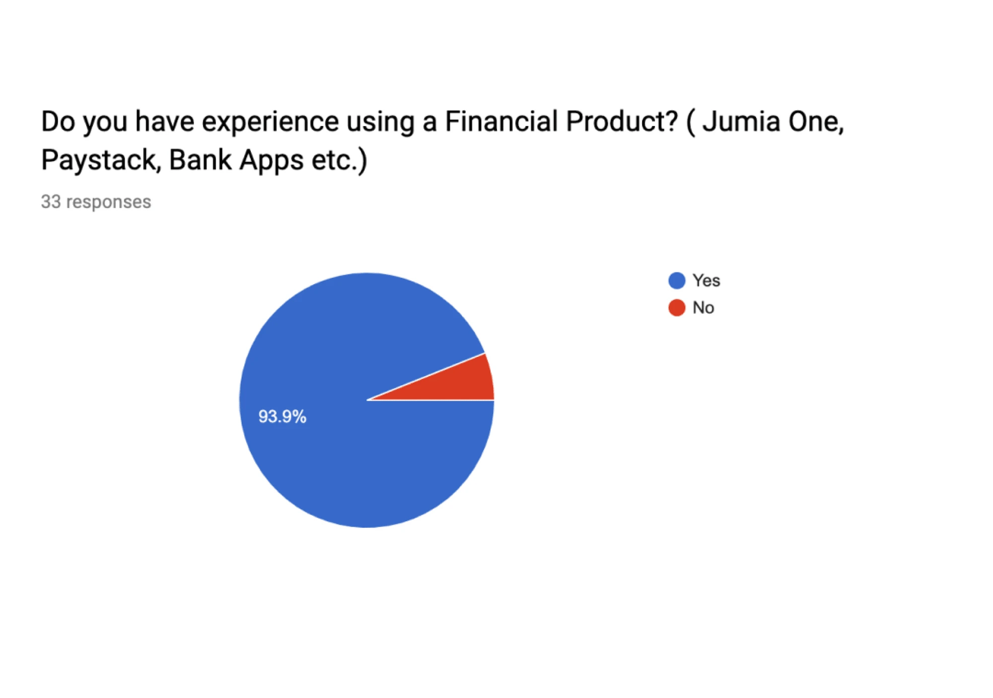
A key insight from our screening survey was how many of the users make use of financial apps and how often they make use of the product.
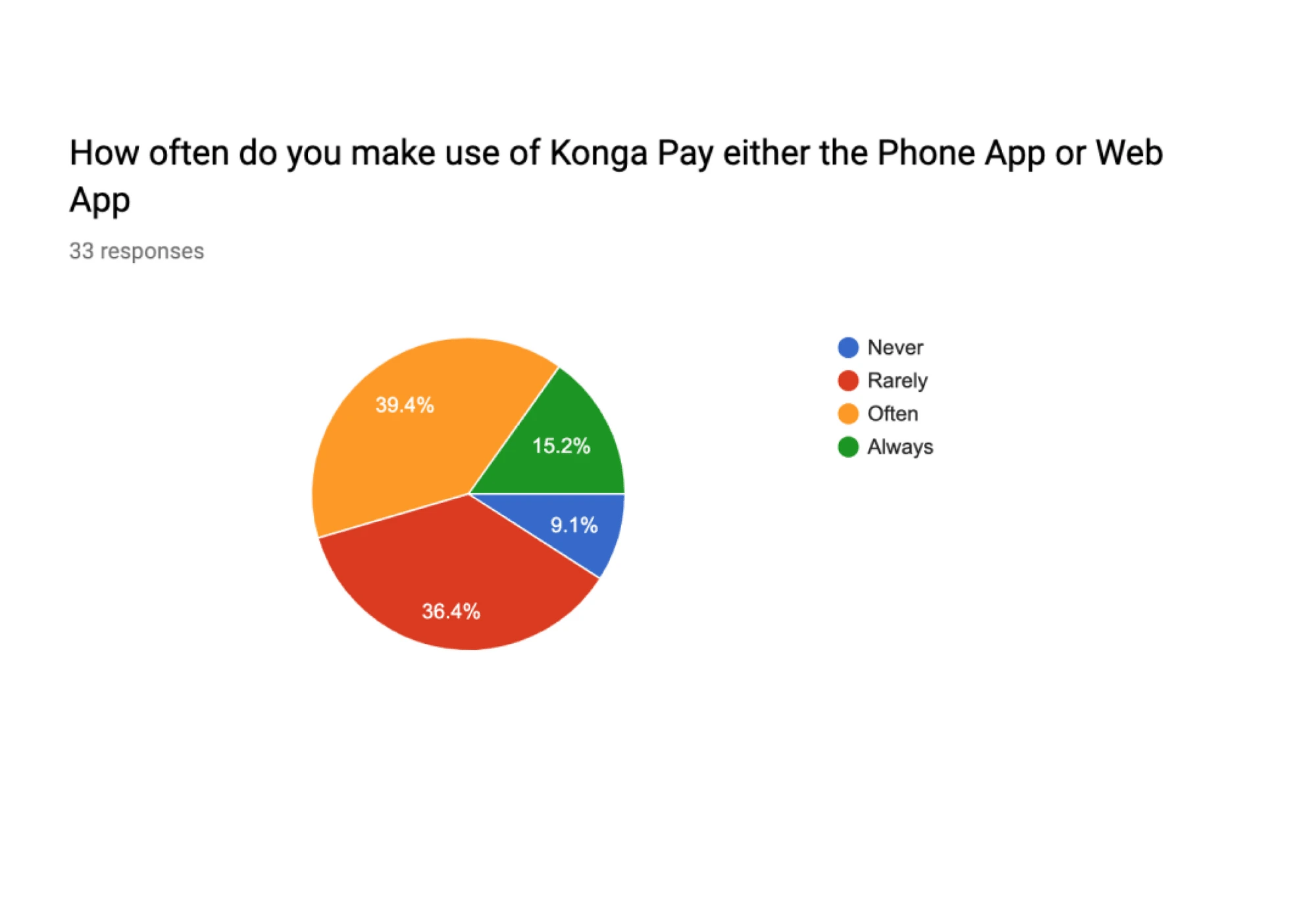
Results also supported our choice of the platform with 53% of users on the Andriod app, 42% of users on the Website application while IOS was around 4%. Results also highlighted that the major use of the product was, For transfers, such as payments for merchants, Bill payments, with 28% of users using it mainly for transfers.
Affinity Mapping
I analyzed the results of the survey and used affinity mapping to group-related observations. This helped me uncover the pain points users encounter as they used the current product. With this in place, I had a better understanding of the needs of the target audience.
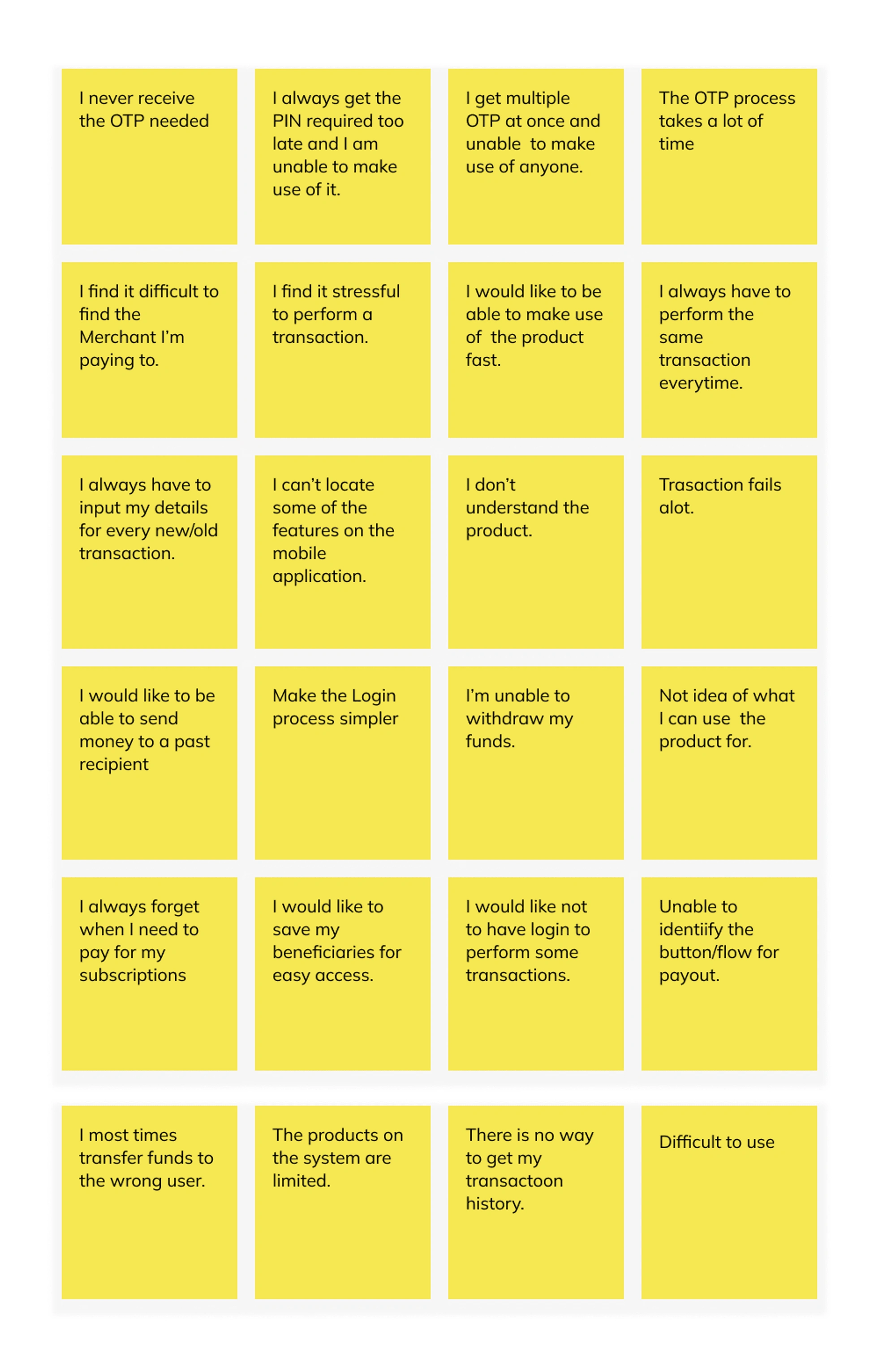
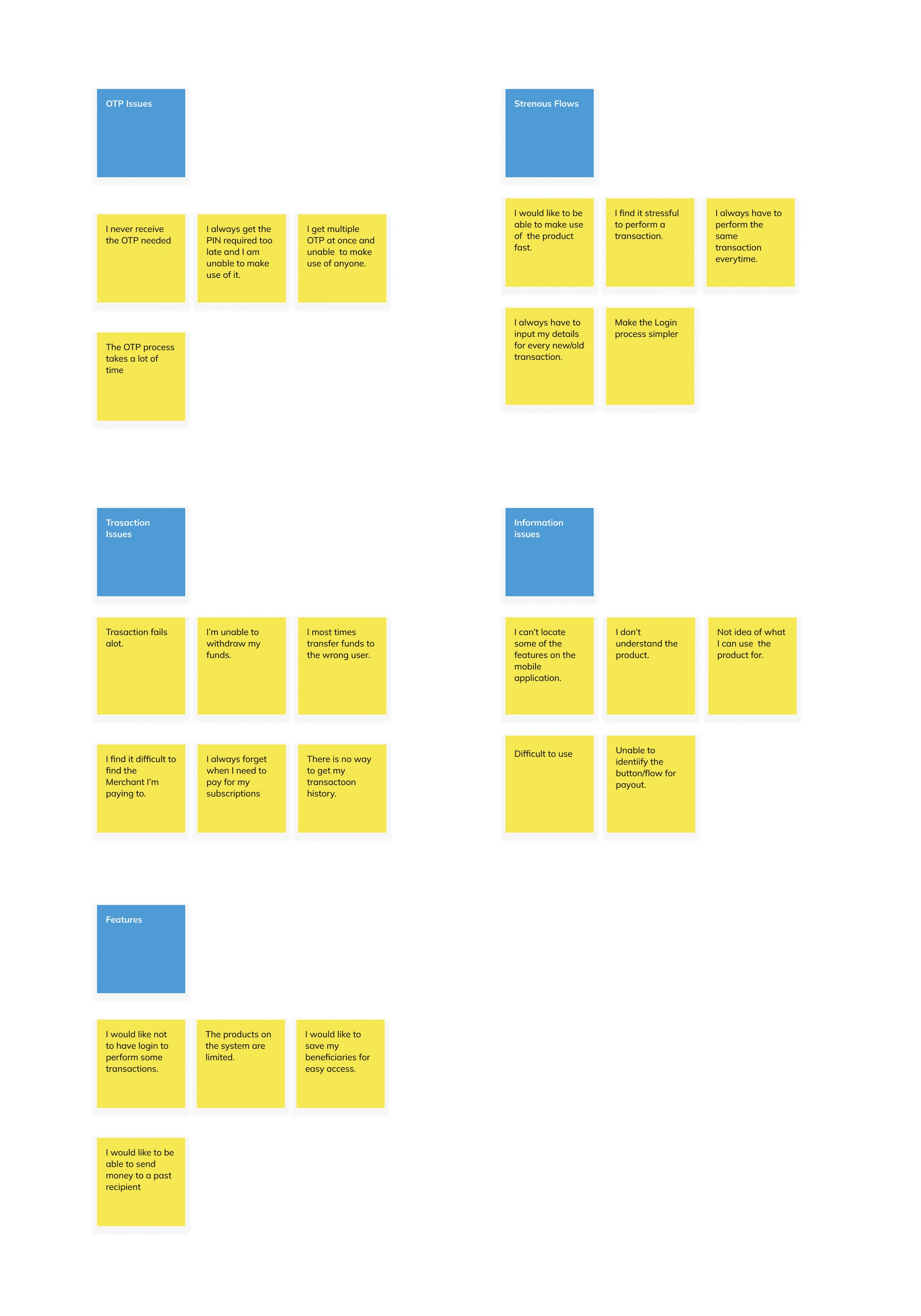
Painpoints
The pain points uncovered are as follows:
Users found it stressful having to provide OTP for every transaction.
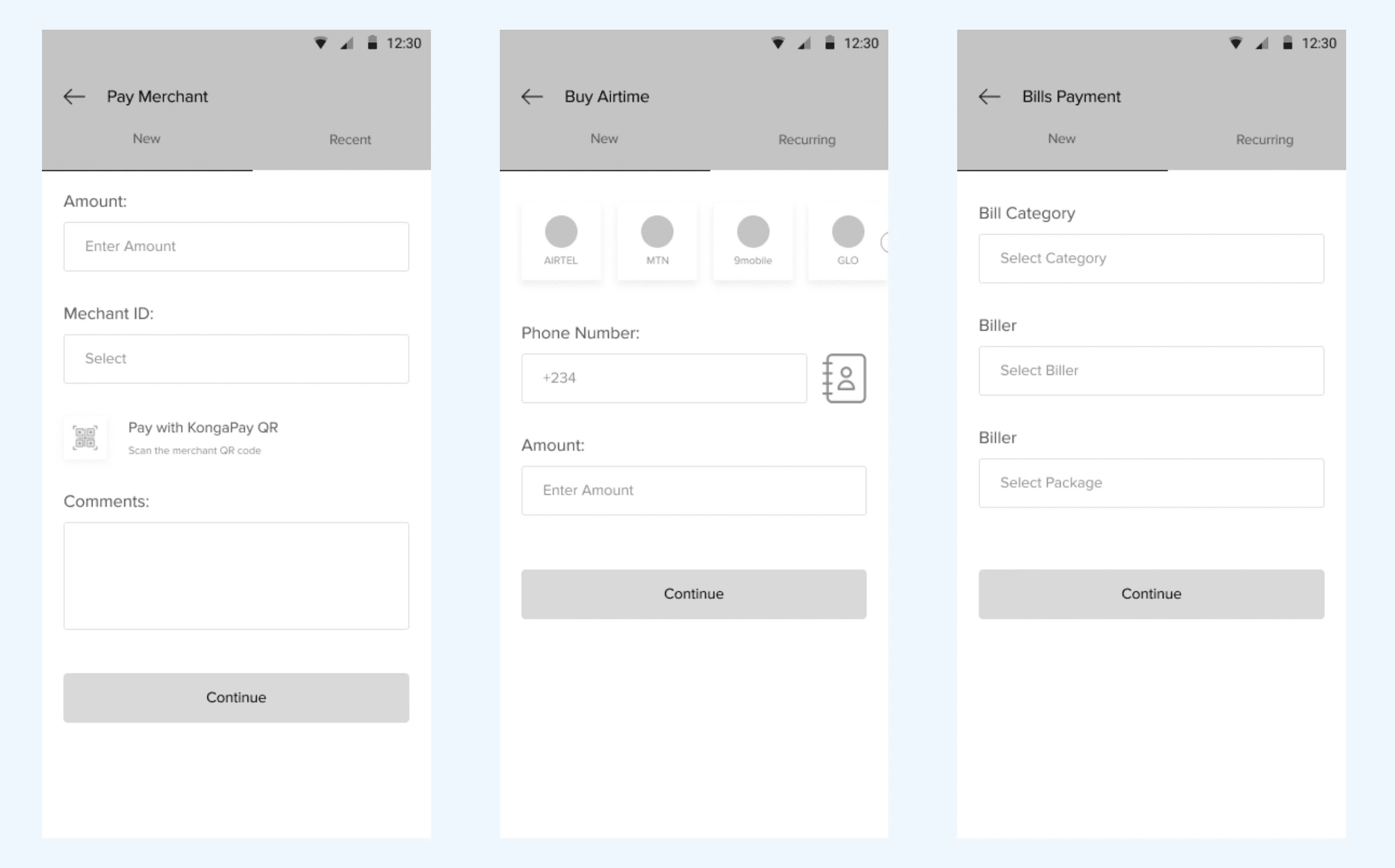
The flow for merchant payment required entering the full Merchant ID which they found as a pain point
Users found the flow of transactions too long.
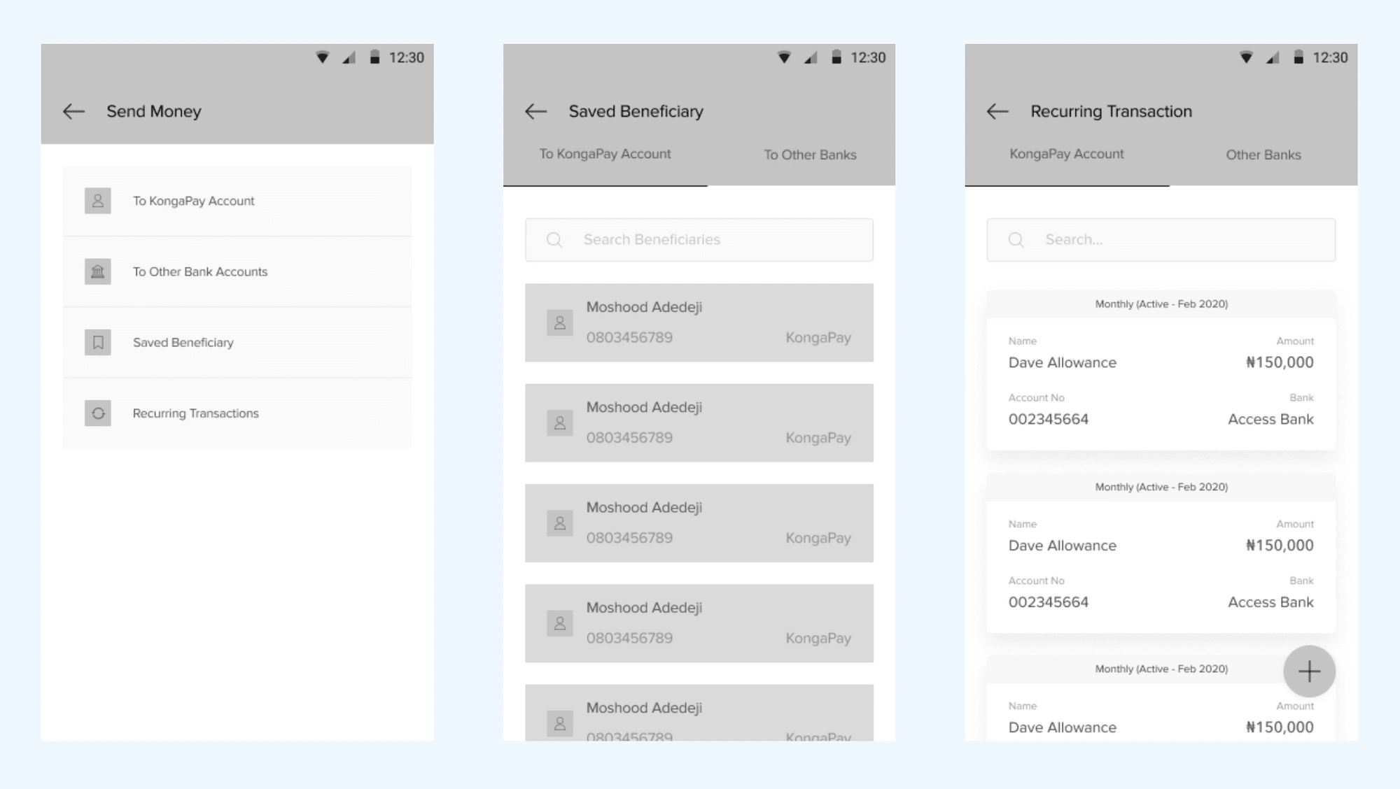
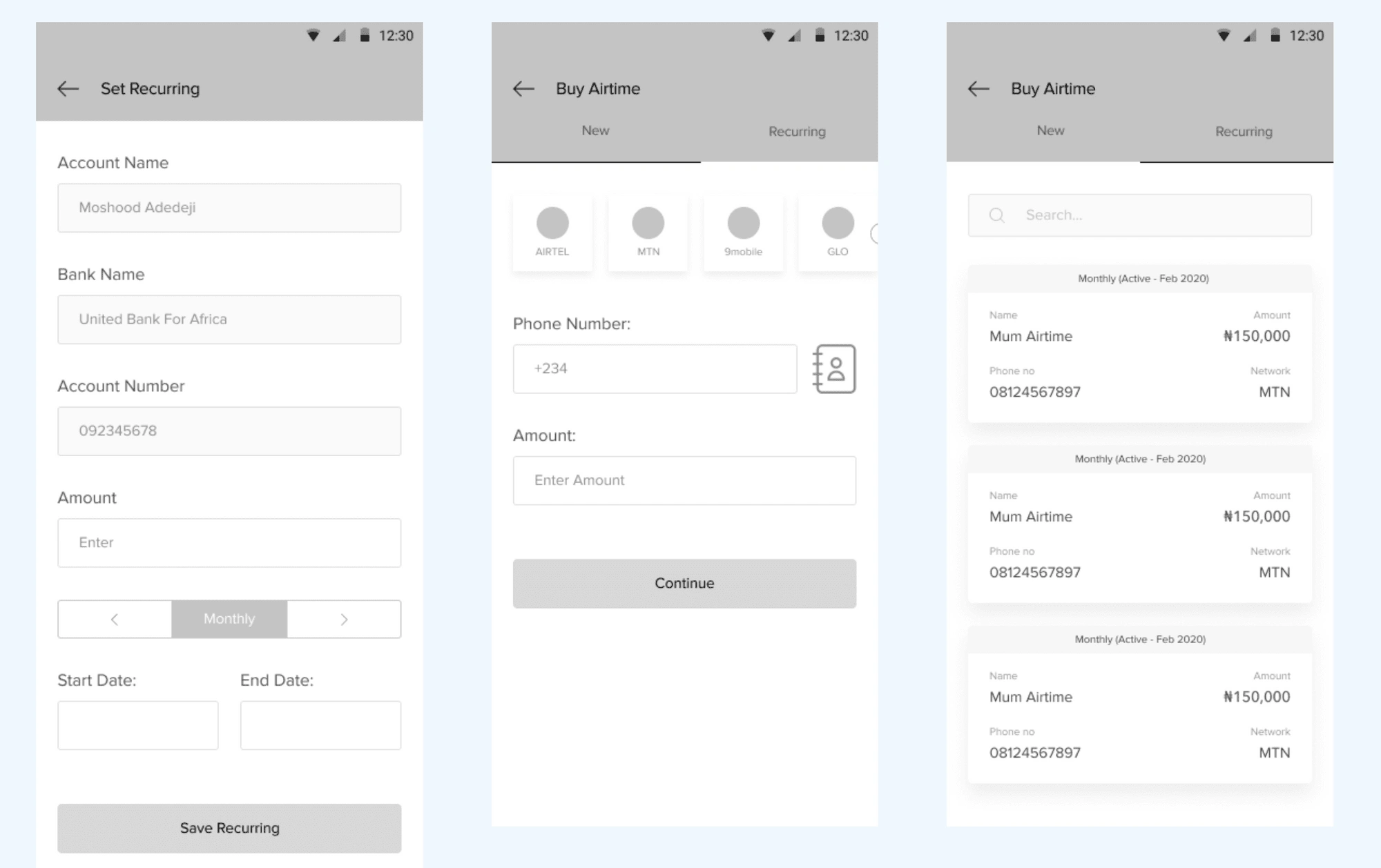
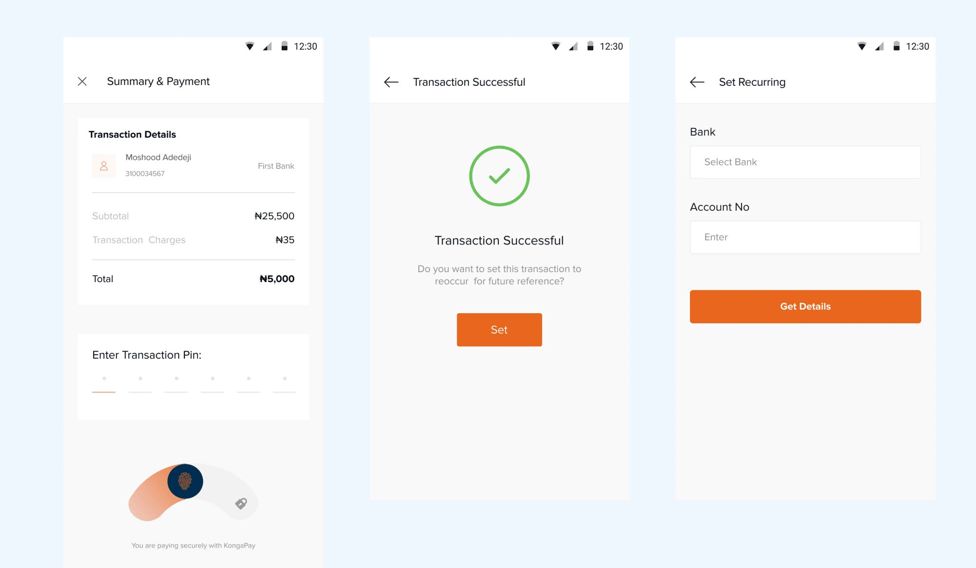
The need to log in for every recurring transaction.
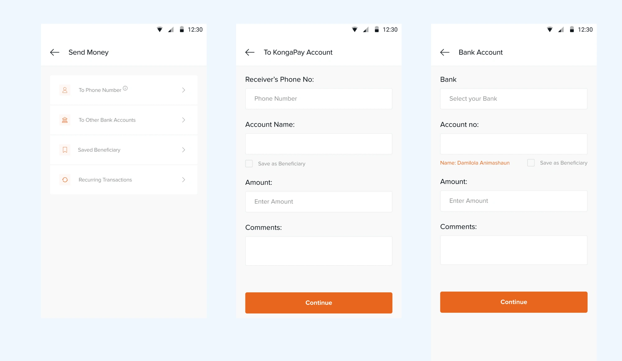
The lack of a beneficiary list for faster flow.
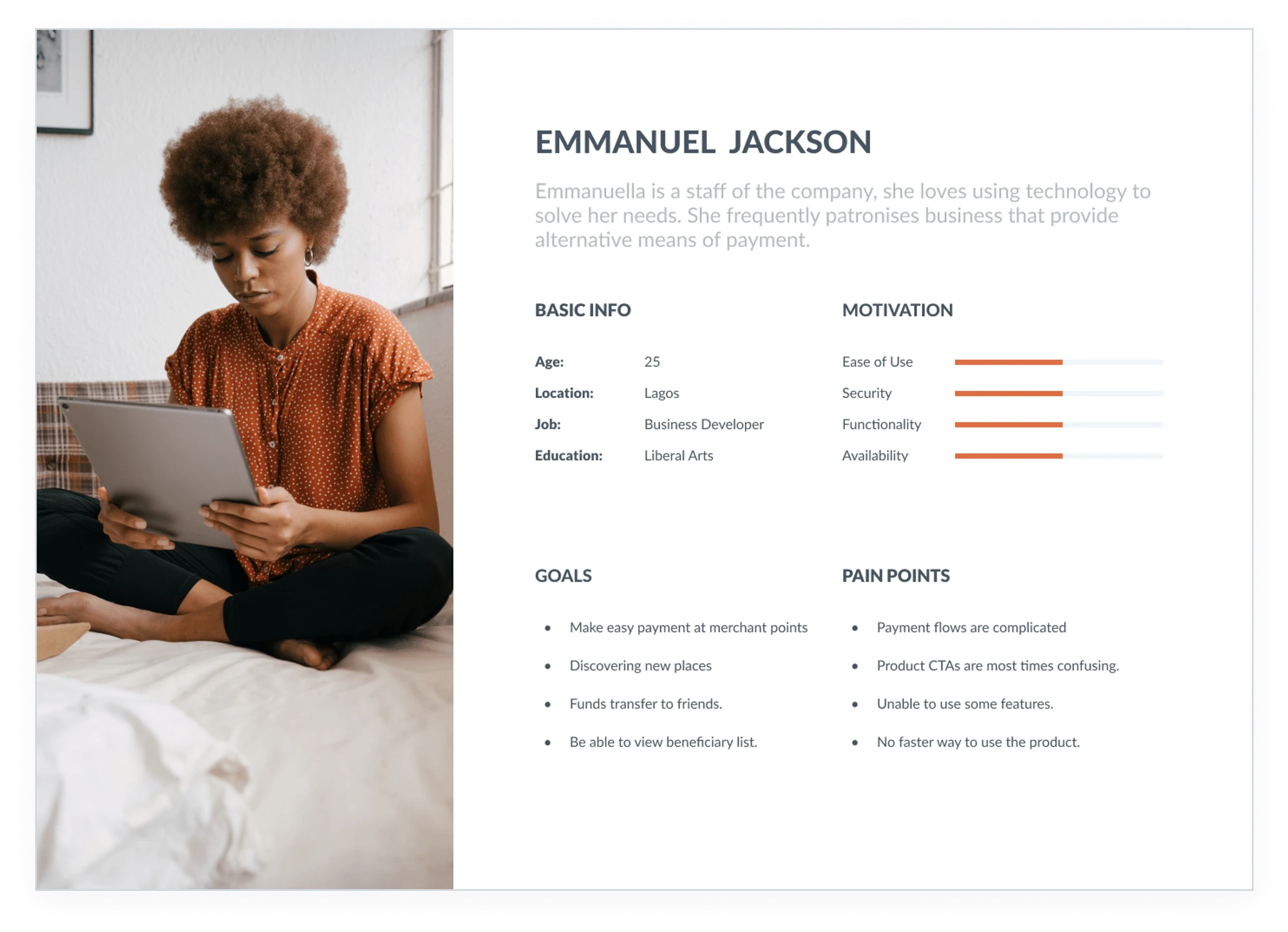
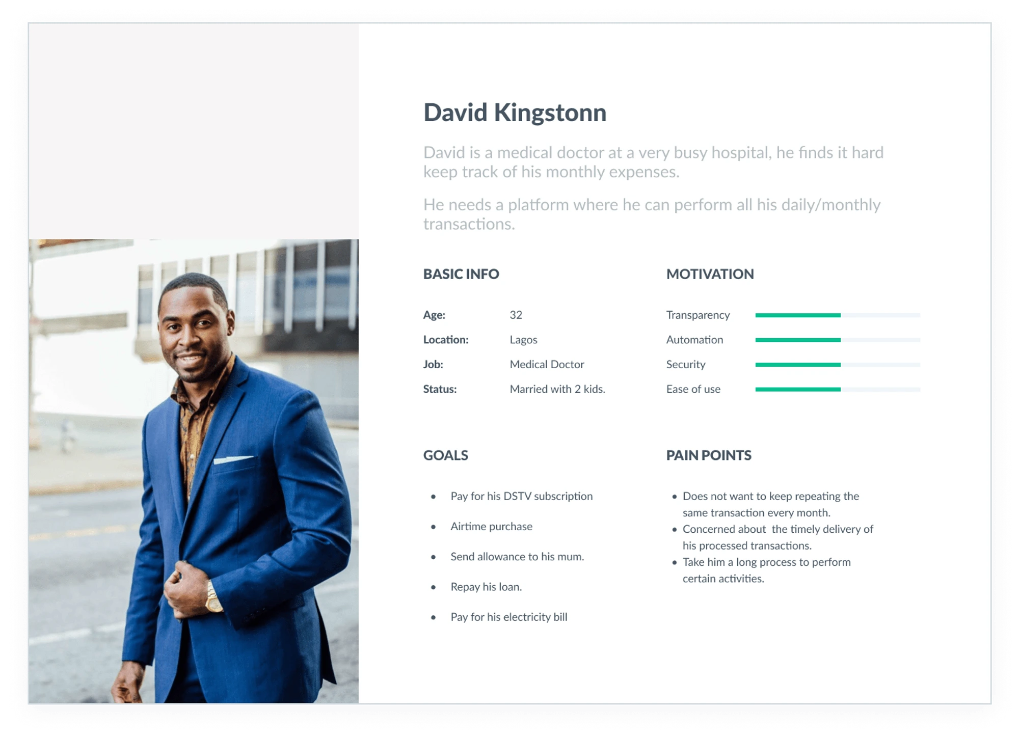
Personas
Using the results of the survey, I created two personas that embody the traits of the target audience.
Market Research
With insight from the user research, I needed to do a competitive analysis of popular fintech applications on what they provide and how they compare.
Getting familiar with the ways and needs with which users interact with other similar products in the market gave me insights into common setbacks people encounter and also the kind of features or strategy in place that fosters a good user experience. This helped me define solutions/features to include in my designs, as well as aspects users, are familiar with in a fintech application.
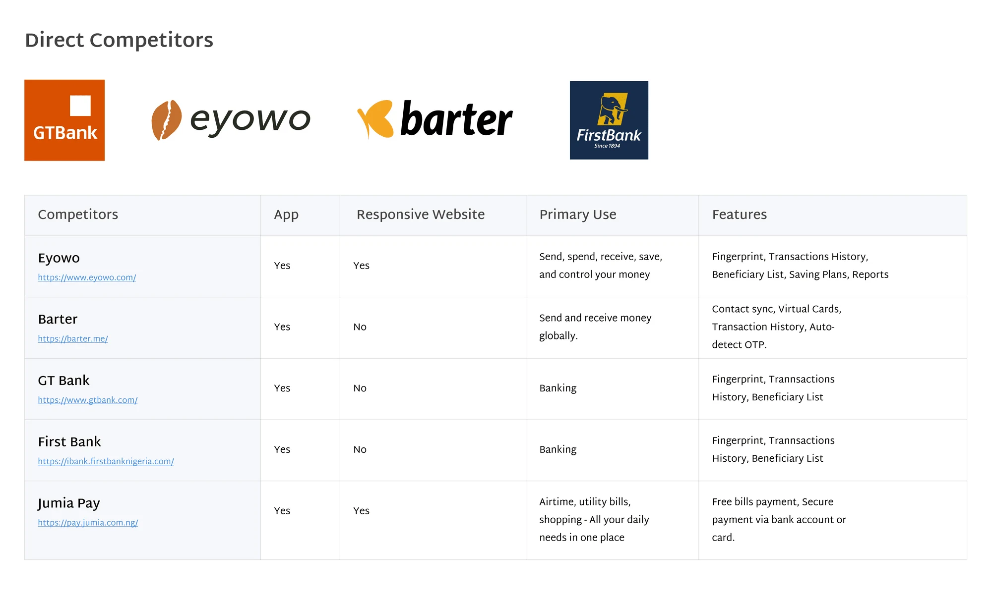
Insights
From the information gathered on the direct competitors, I found that they had the following features in common:
Alternate Login Process
Homepage Quick View
Auto-detect OTP
Beneficiary List
Transaction History Breakdown
Ideation
Finally, after I found out the pain points to work on and I started a brainstorming exercise to identify a better way to provide a solution to the issues the users were encountering and had pointed out during the interviewing processes. My ideas were:
Introduce fingerprint authentication for login and transaction processes.
Quick use feature on the application.
Ability to save beneficiary and common transactions performed.
Auto detect OTP for Mobile.
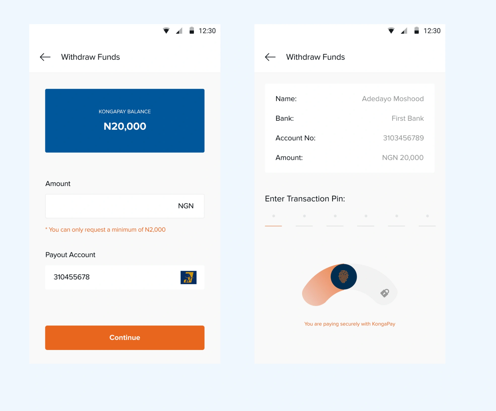
Introduction of Transaction PIN in place of OTP in case of failures.
I had a meeting with the team on the project to go through my findings with them and recommended solutions to ensure everyone was on board with it including the developers.
Information Architecture
Before sketching and designing, we came together to decide on features and pages that would be more valuable for users based on the research found. Below is the structure of the platform we ended up agreeing on.
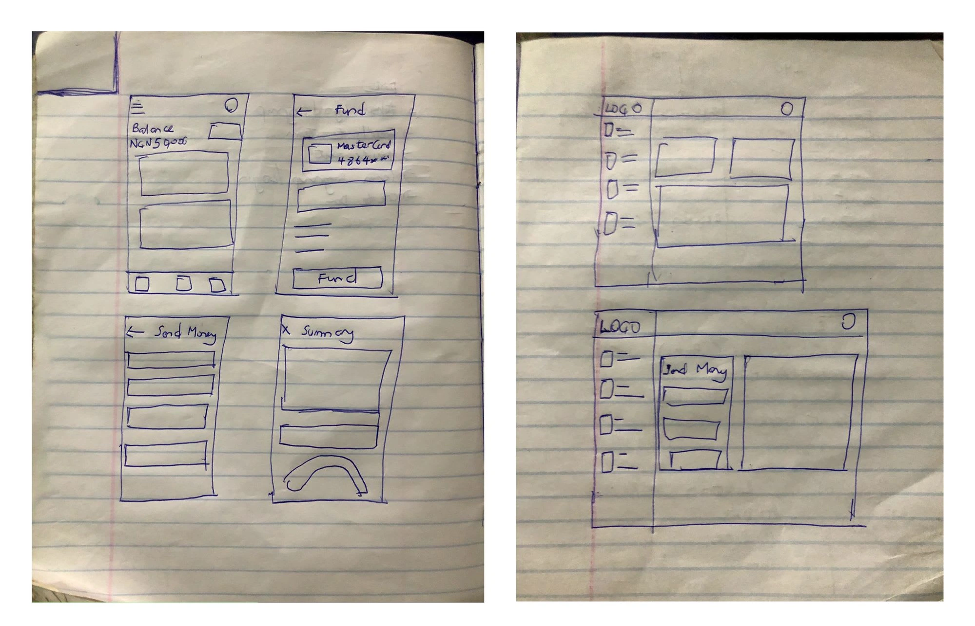
Sketches and Brainstorming
To gain a better understanding of how the platform would work and have some understanding of the flow, I sketched pages to better illustrate it, this also allows for many leading iterations through varying design options.
Design Solution
Wireframes
My goal was to provide design solutions for the pain points uncovered in the initial research. While the sketches provided a broad user flow, the wireframes refined the details and functionalities users have for the platform. This includes more details:
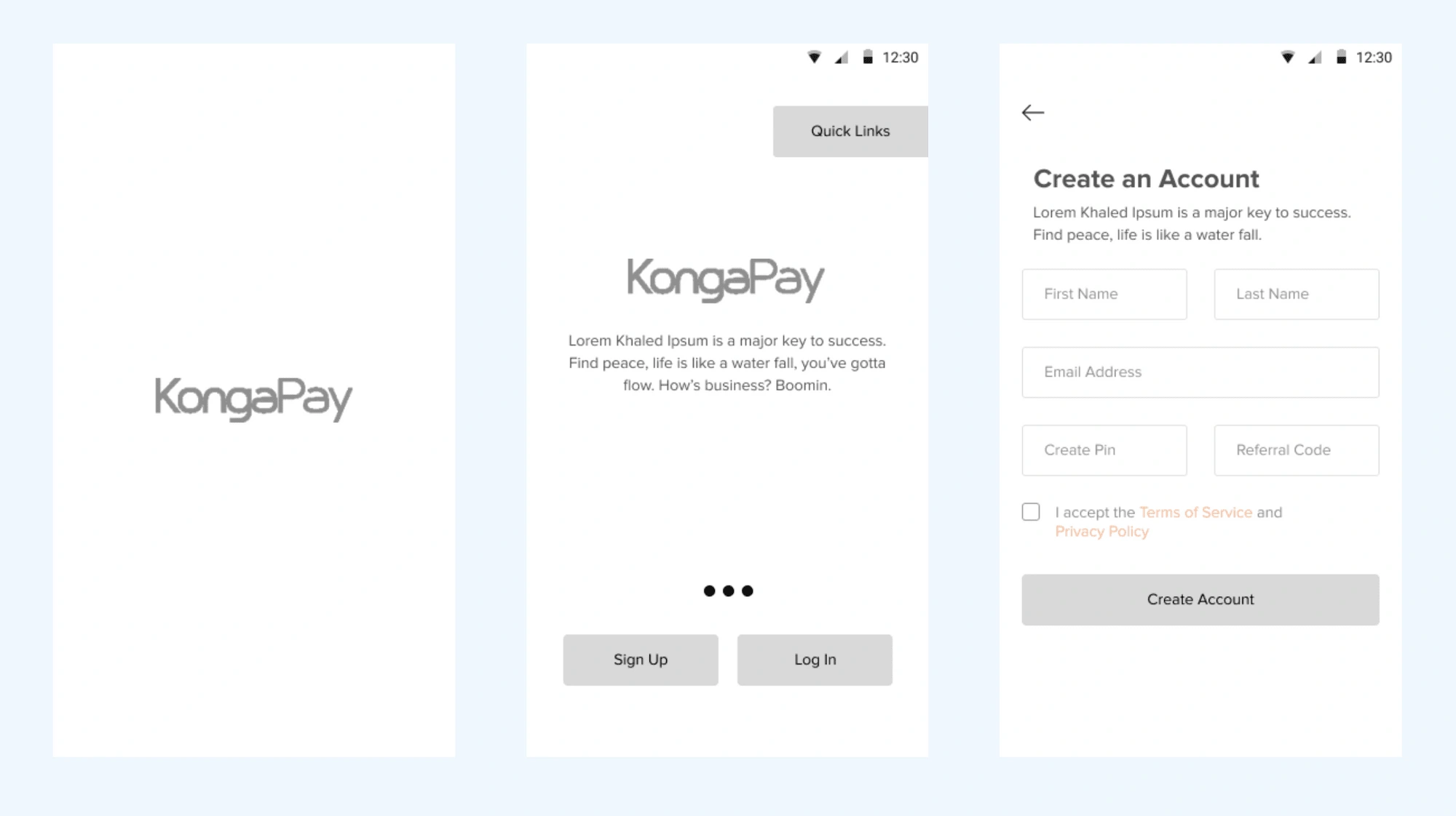
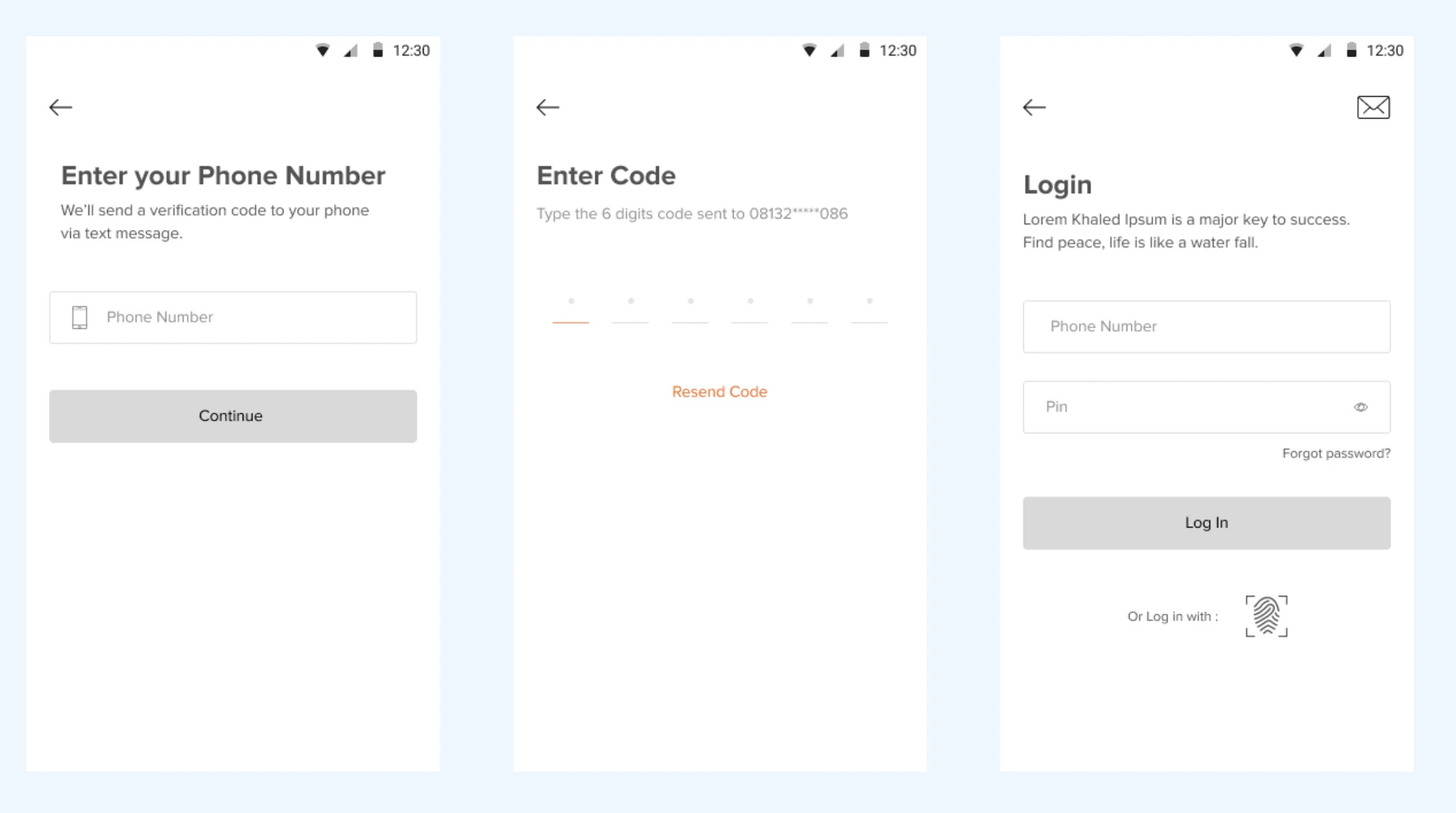
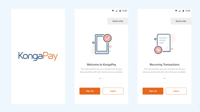
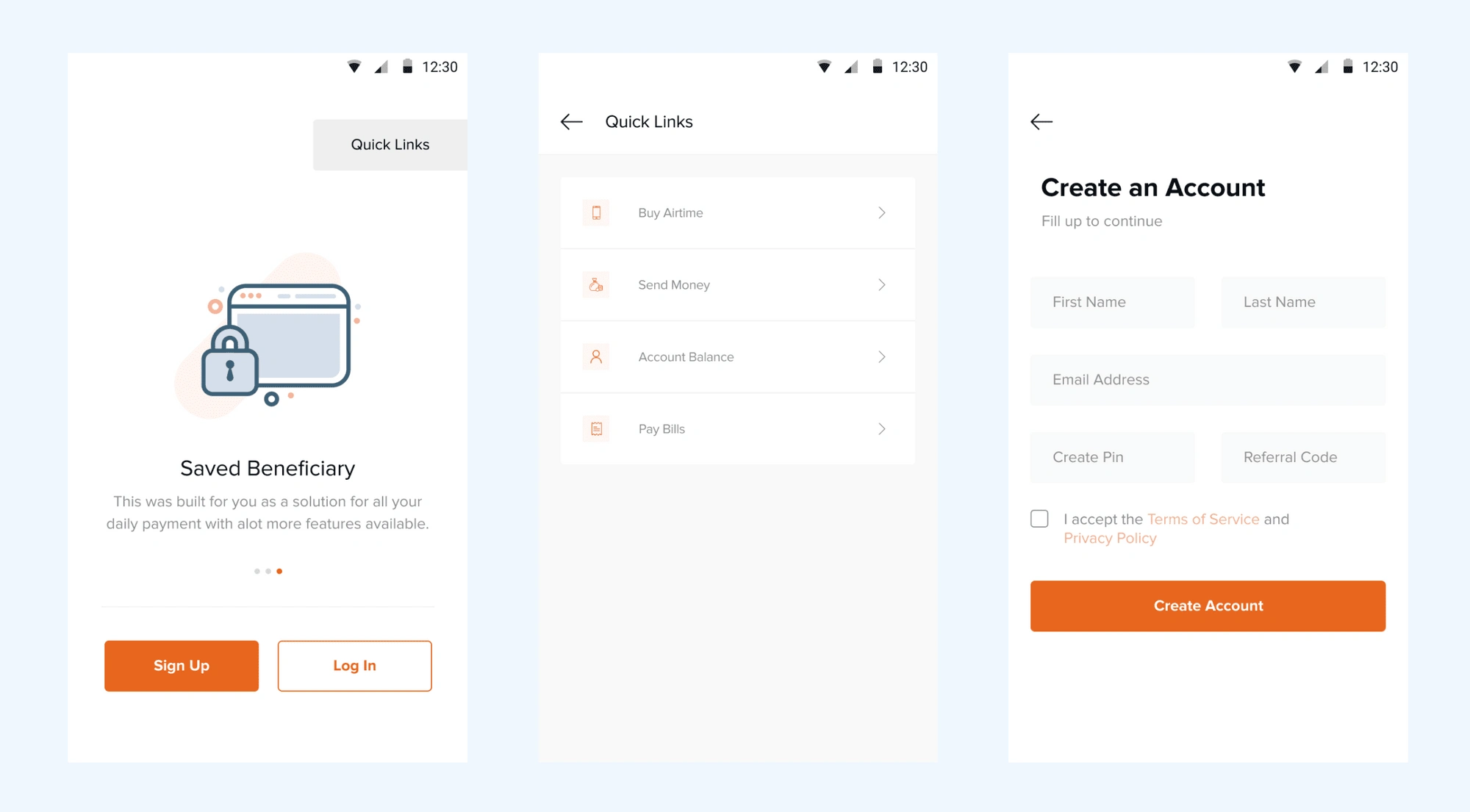
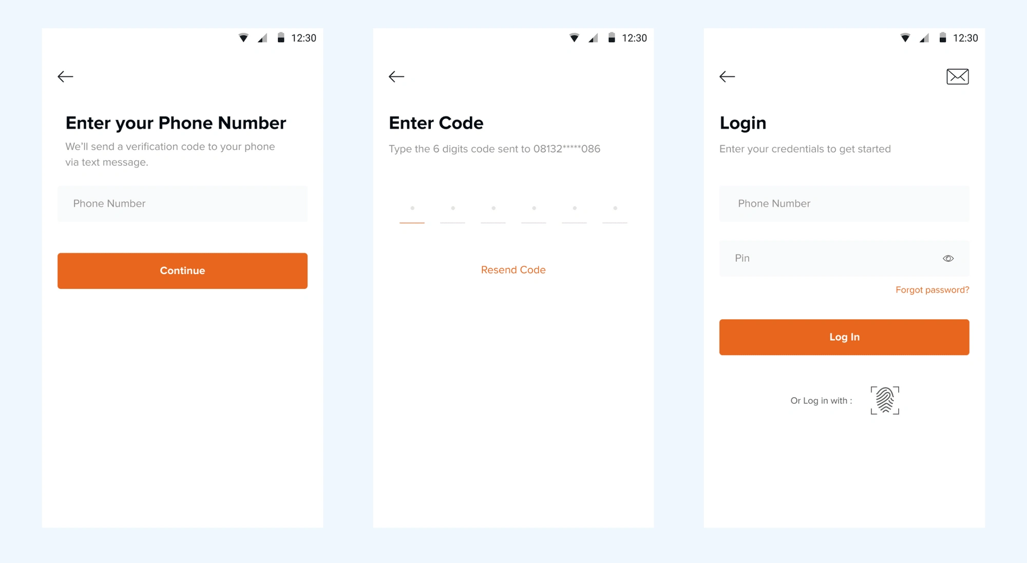
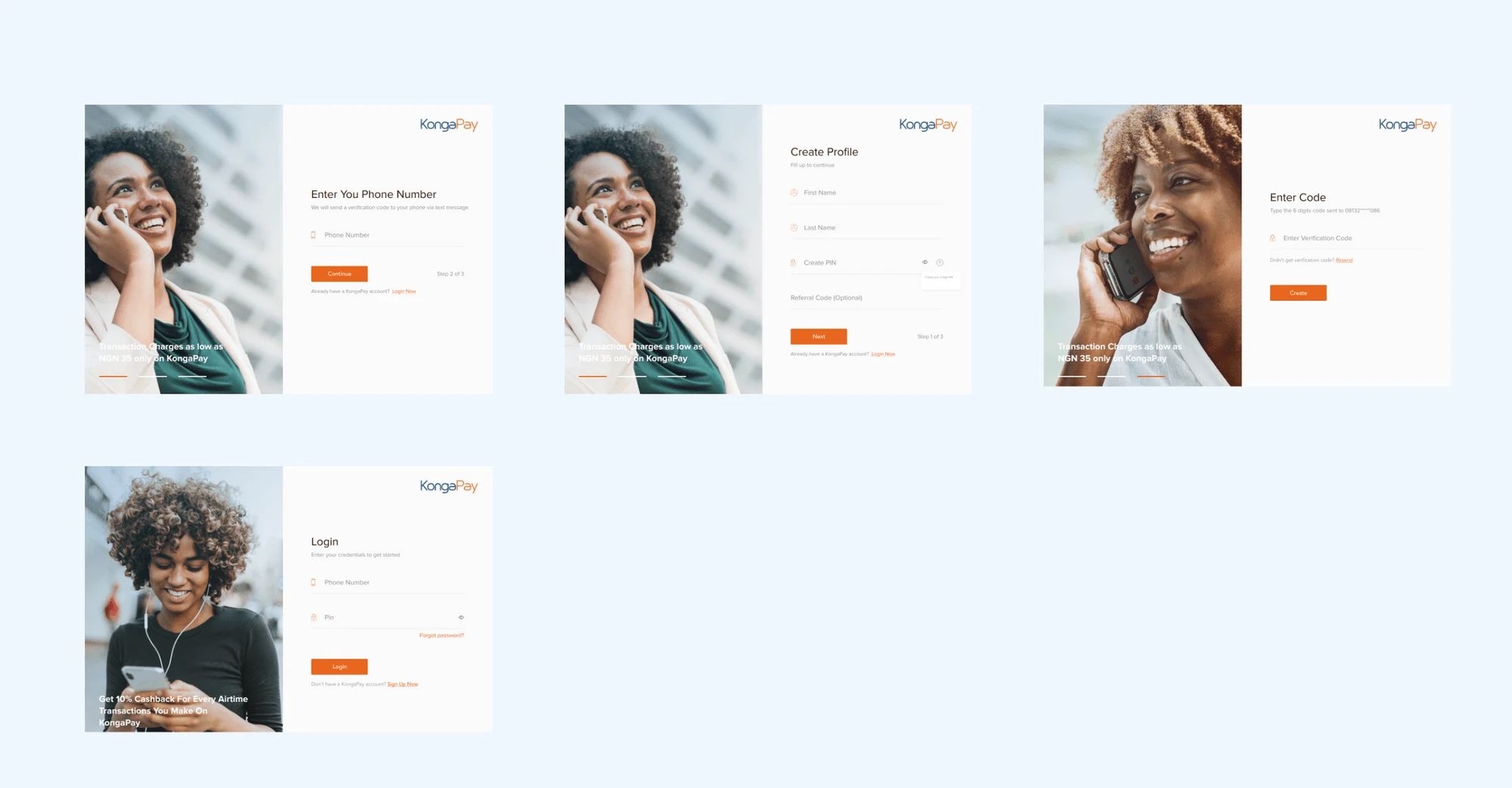
1. Onboarding and Authentication Flow
There's a "Quick link" CTA on the onboarding which gives users fast access to their most-used feature, this is to help solve the need to always log in to the system to perform these actions.
On the login page, I introduced the fingerprint/face ID authentication method for a quicker login process. The OTP input field is also customed for the number of digits required.
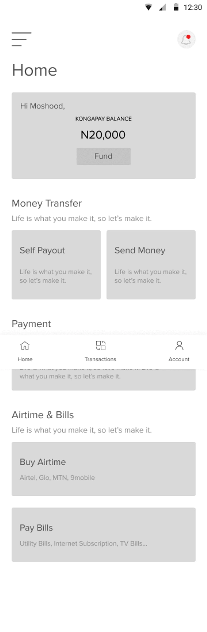
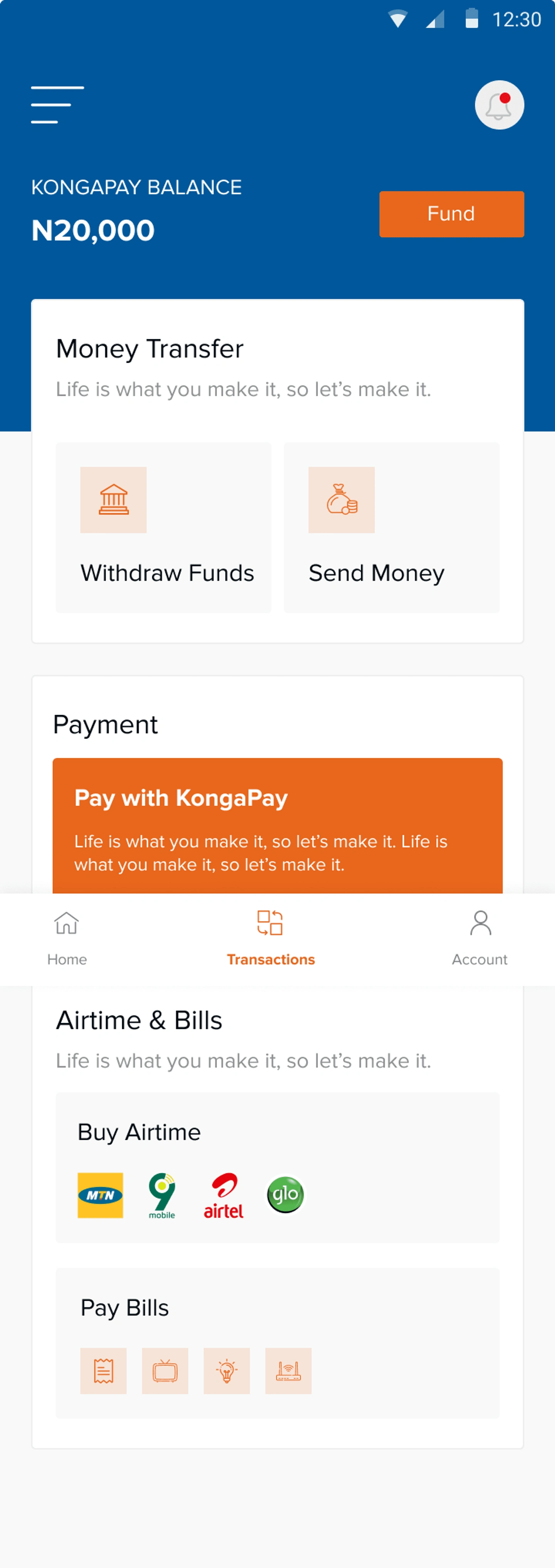
2. Homepage
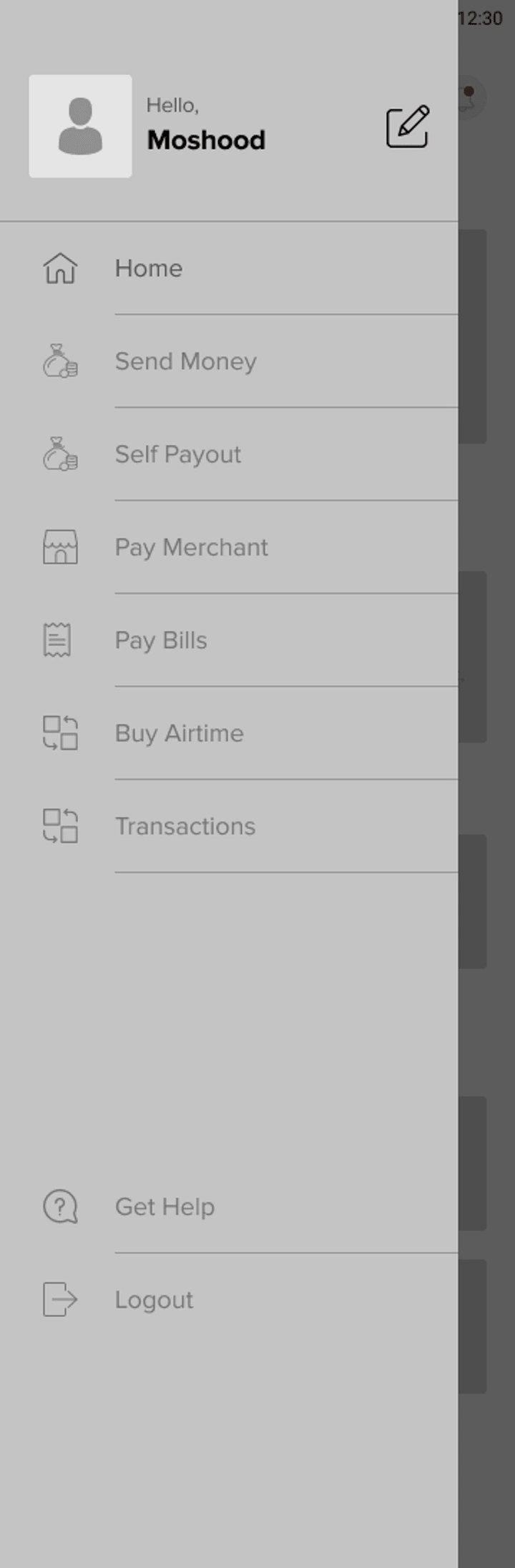
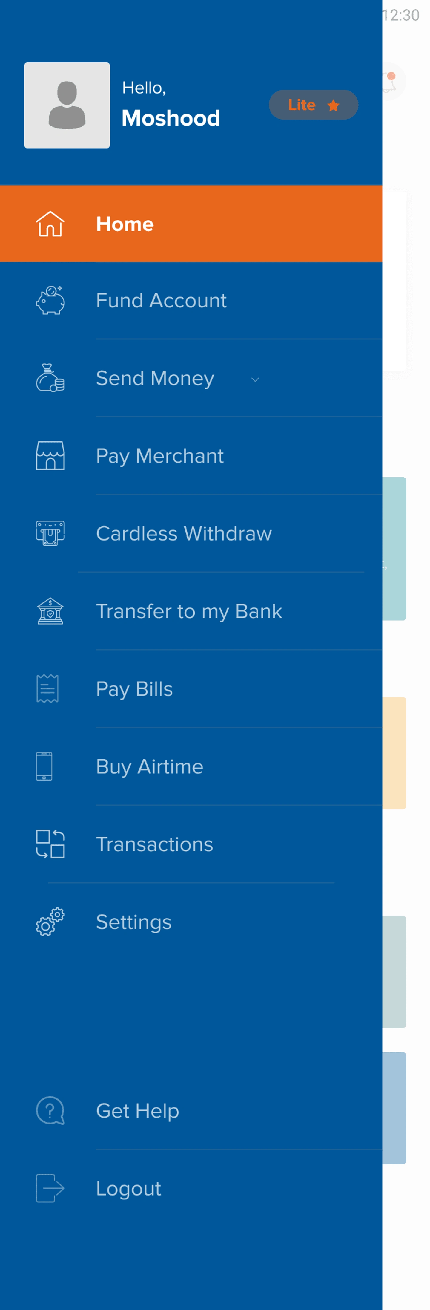
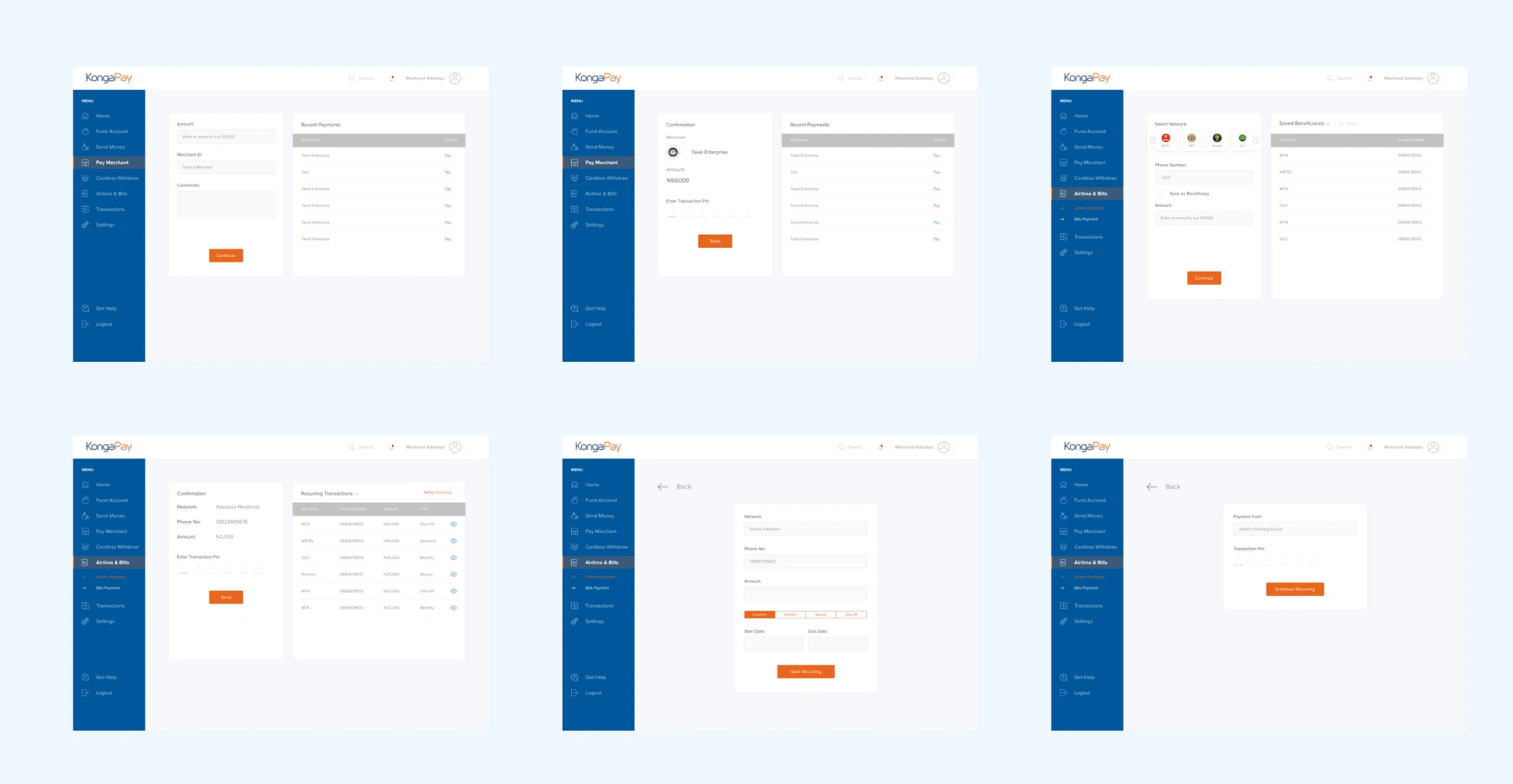
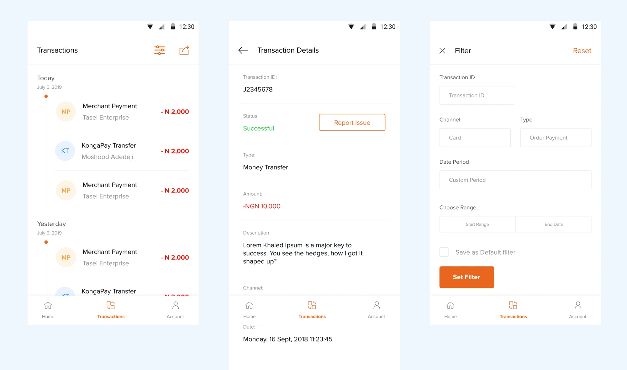
The features were all grouped relatively and shown on the homepage for easier access. The Homepage is also designed to be customizable by the user. The bottom nav included: Home, transaction, and profile. This is to ensure it's easier for users to view and interact with their transaction history.
3. Other Features
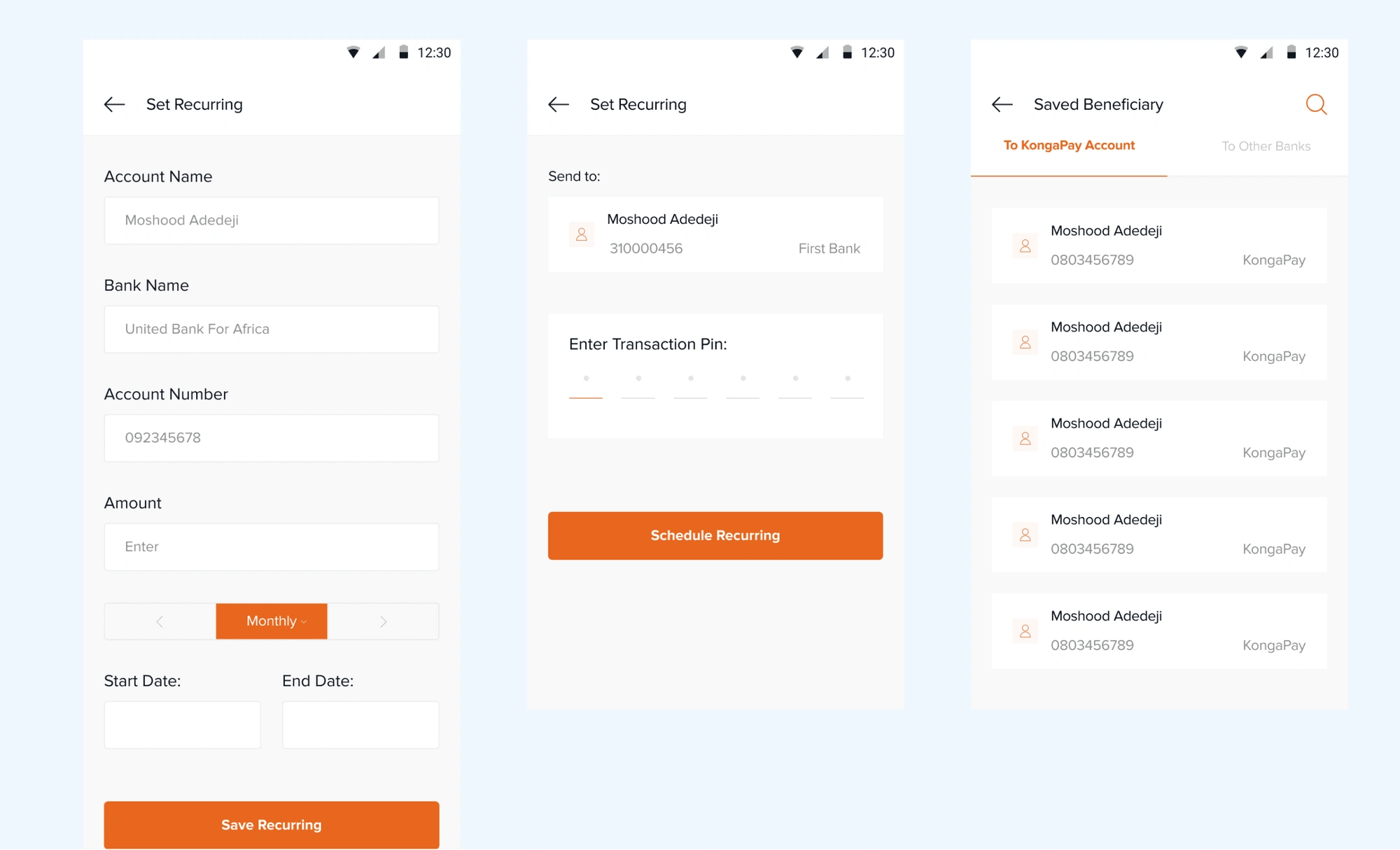
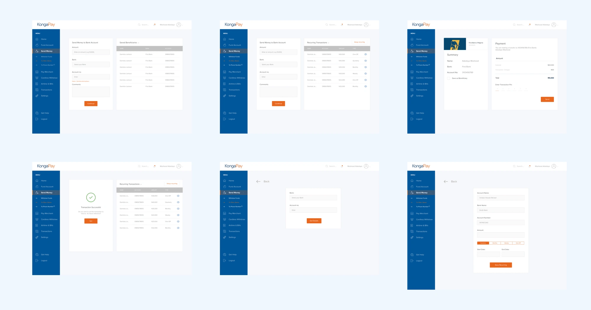
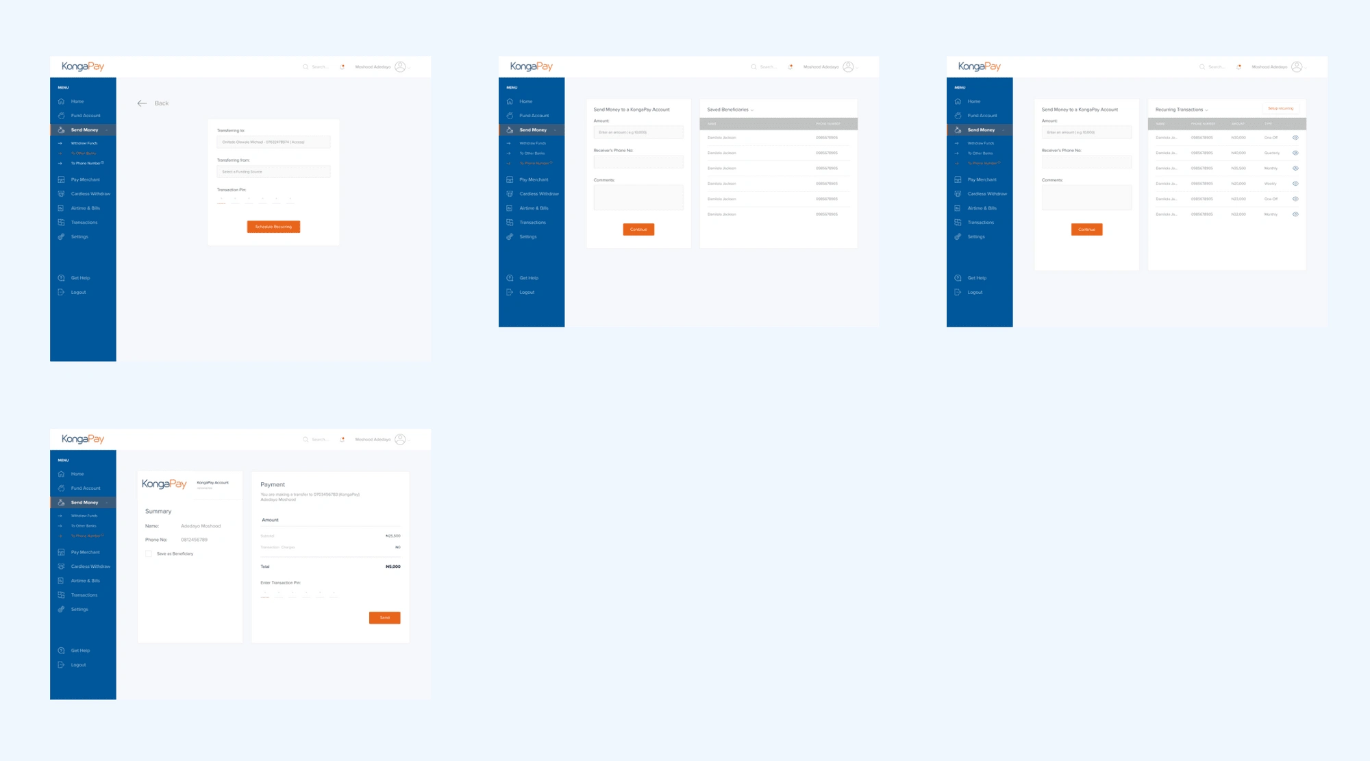
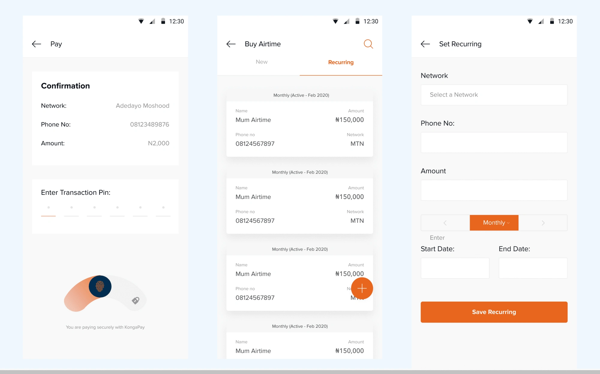
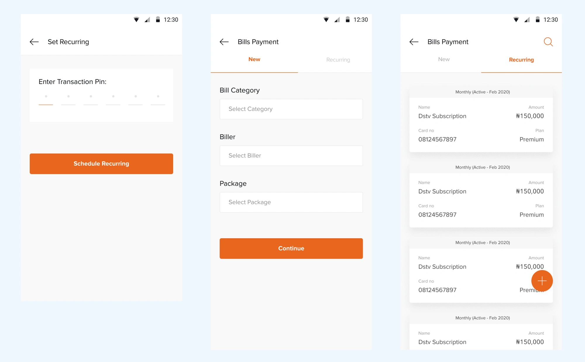
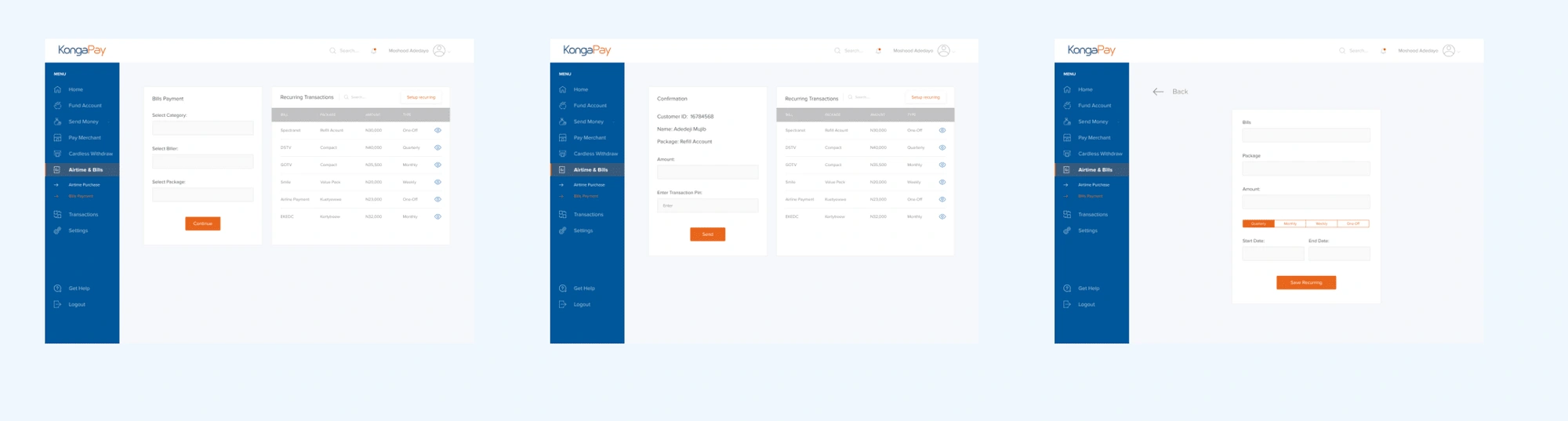
I introduced "Saved Beneficiaries" for users to have quick access to their transfer beneficiaries, "Recurring Transaction" for users to set certain transactions that they perform regularly so as to eliminate the pain points regarding that.
Prototype and user testing
The Low fidelity wireframe designs were presented to the team of developers, PM, and Business managers for feedback, correction and to get a good direction of the project. The inputs and suggestion updates were reflected in the High fidelity design.
I tested the low Fi wireframes with some users to take notes of their reactions to the new features and pre-existing fixes.
Visual Design
1. Onboarding and Authentication Flow
2. Homepage
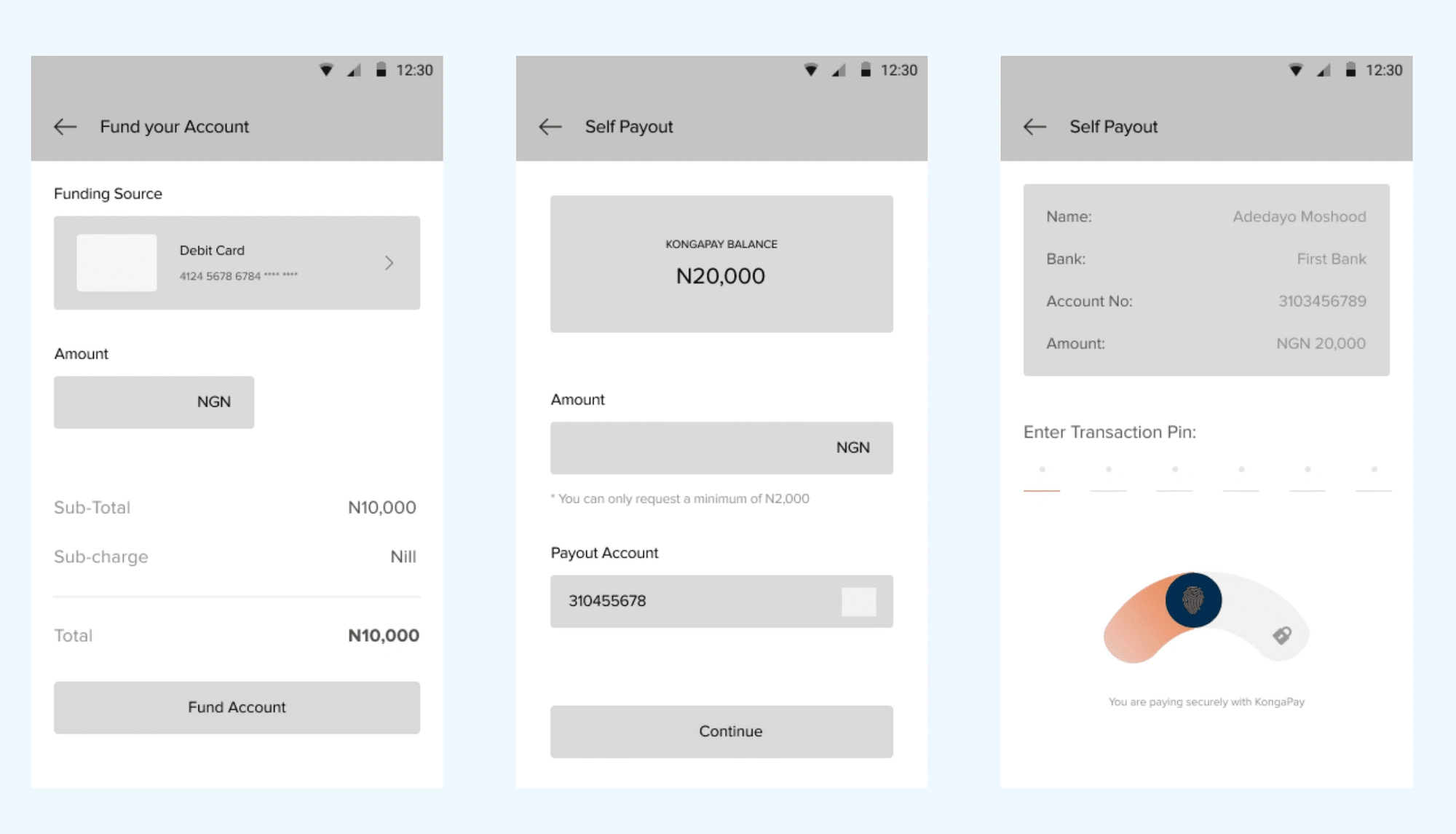
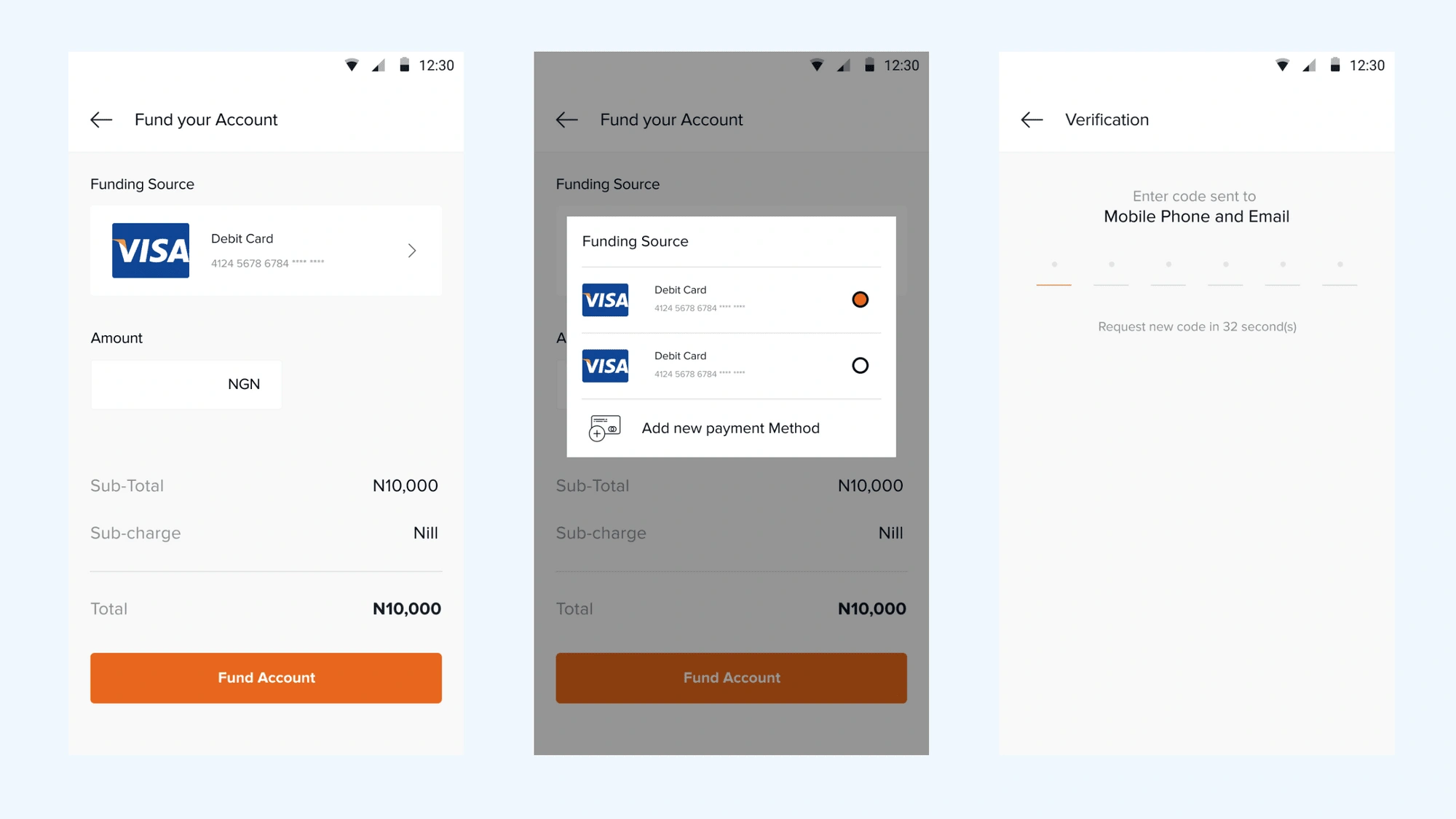
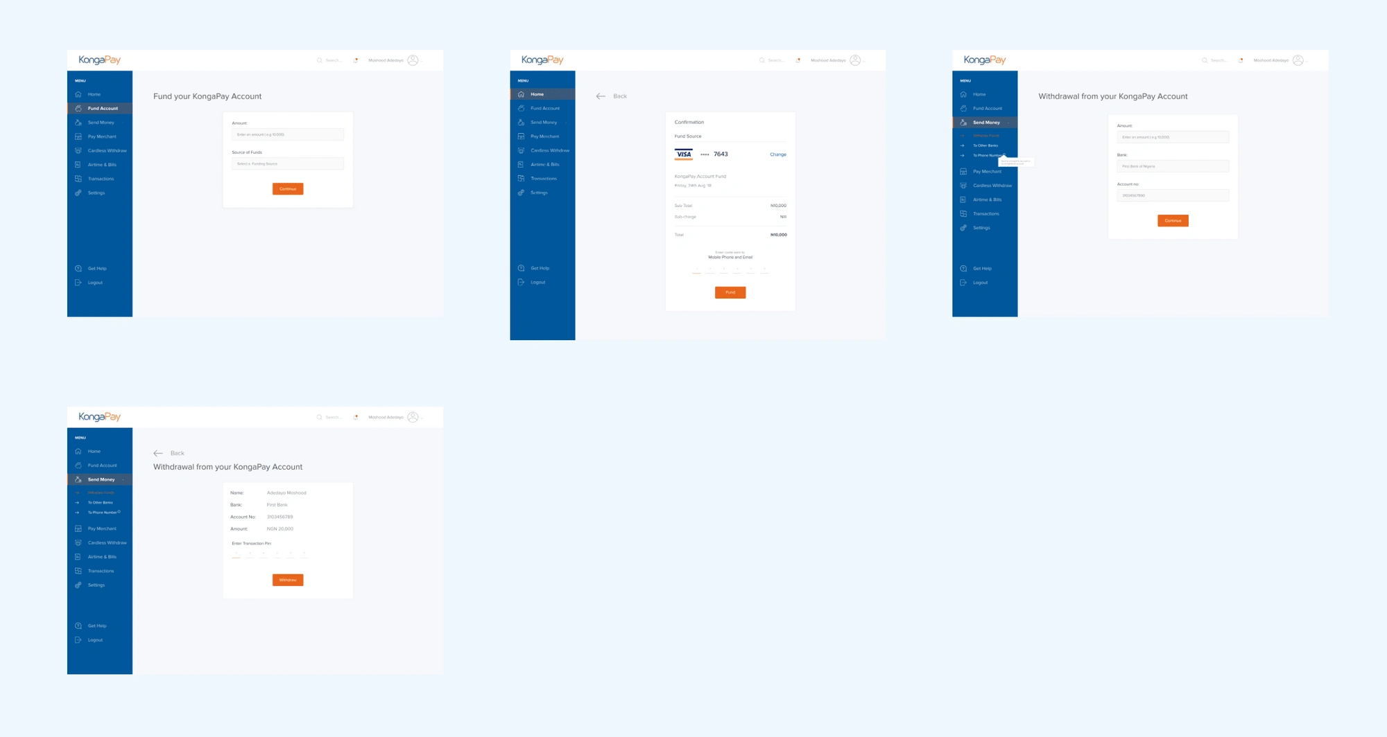
3. Fund Account & Withdrawal
4. Send Money
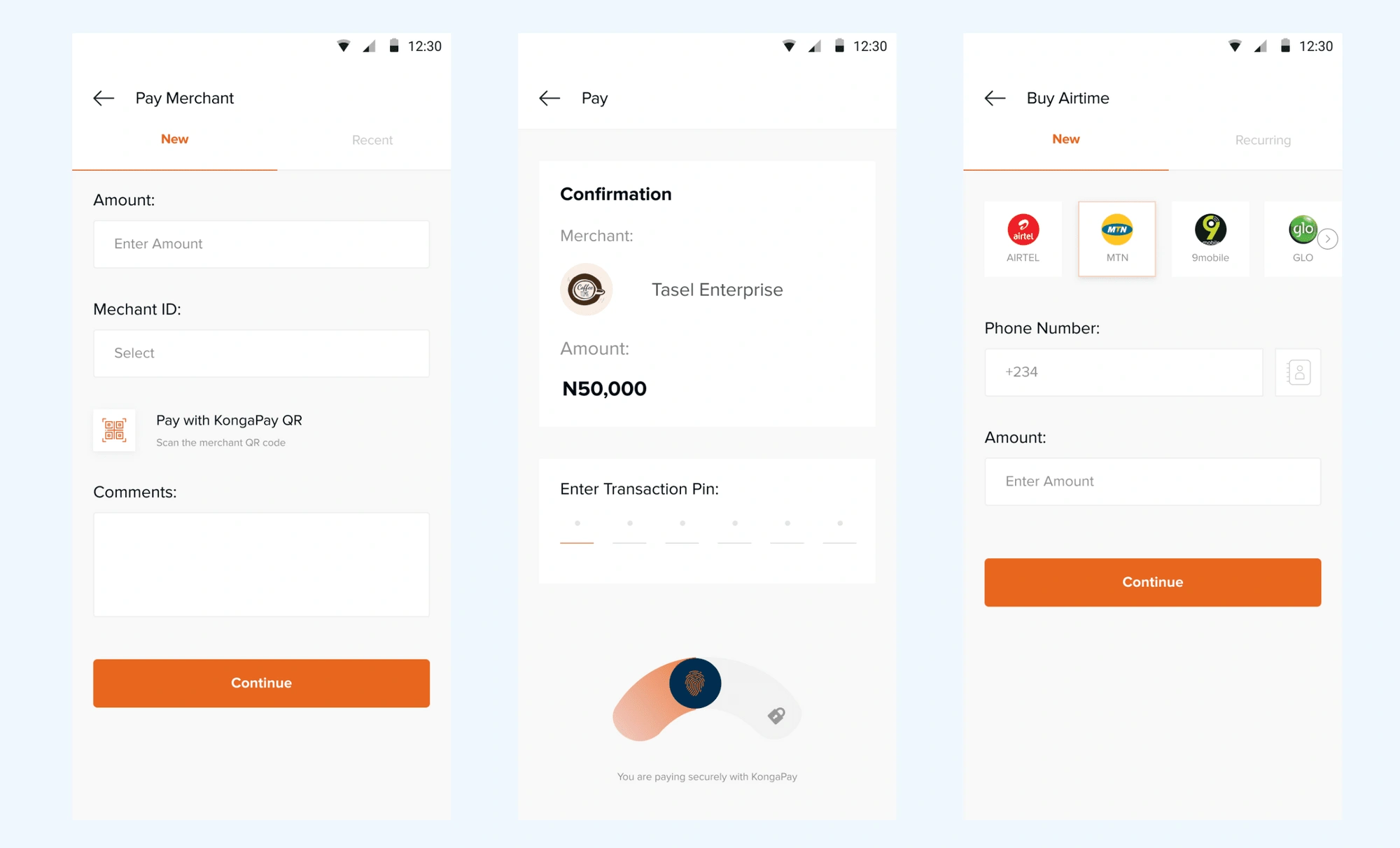
5. Pay Merchant, Bills & Airtime.
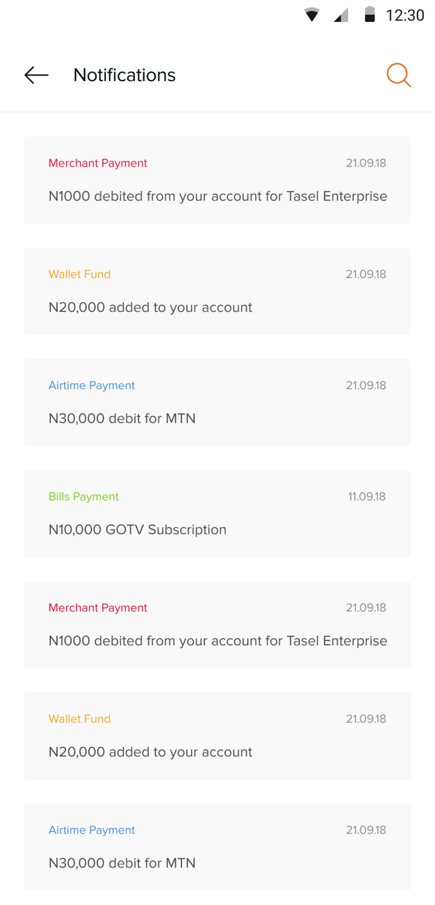
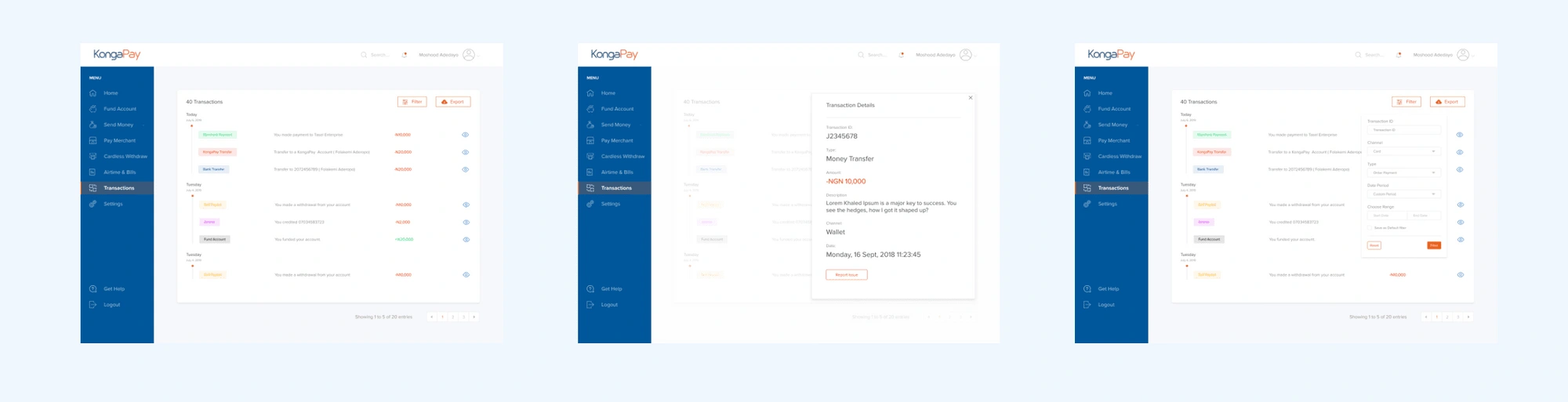
6. Transactions
Project Learning
In the course of my training, I learned how important it was to follow a user-centered design process and this project further solidified that thinking.
The project was a career-defining one, I’m pleased with the outcomes. The journey was also a major learning point for me. One of the key parts of the process was interacting with the users and not relying on my intuition.
I also had to be able to properly relay my ideas and plan with the team and to take not only the PM but also the developers along my design process. These had a huge impact on the product
Like this project
Posted Aug 20, 2023
It's a safe and secure method of online payment. Pay for items & TV Subscriptions, Send & Receive Money, Buy Airtime, No Hidden Charges.
Likes
0
Views
22