An E-Commerce Mobile Site
Olawale Onifade
Overview
ABiT is a pan-African company focused on exploiting creative opportunities of technology in the African regions.
The Problem
The e-commerce sector is still an undeveloped region in the country. Users require a system that can deliver quality products at a reasonable price while also eliminating issues with delivery and payment.
Project Goal
The goal of the project is to create a one-stop mobile product that provides all the necessary means for a seller to market their products and where these audiences are able to purchase quality products, secure transaction flow, and have a good shopping experience.
My Role
As the sole designer on this project, I went through an end-to-end process. I made more use of information gotten from the market survey and the requirement based on insights from users to design the product.
RESEARCH AND PROBLEM DEFINITION
To ensure the mobile app meets the needs of the target audience, I employed the design thinking methodology for the entire project.
User Research
I started out the project by conducting initial user research to find out how the target users currently shop and the difficulties they experience using their current preferred method (both online and offline). I used an online survey to achieve this. I used an online survey to achieve this.
Affinity Mapping
I analyzed the results of the survey and used affinity mapping to group-related observations. This helped me uncover the pain points users encounter as they used the current product. With this in place, I had a better understanding of the needs of the target audience.
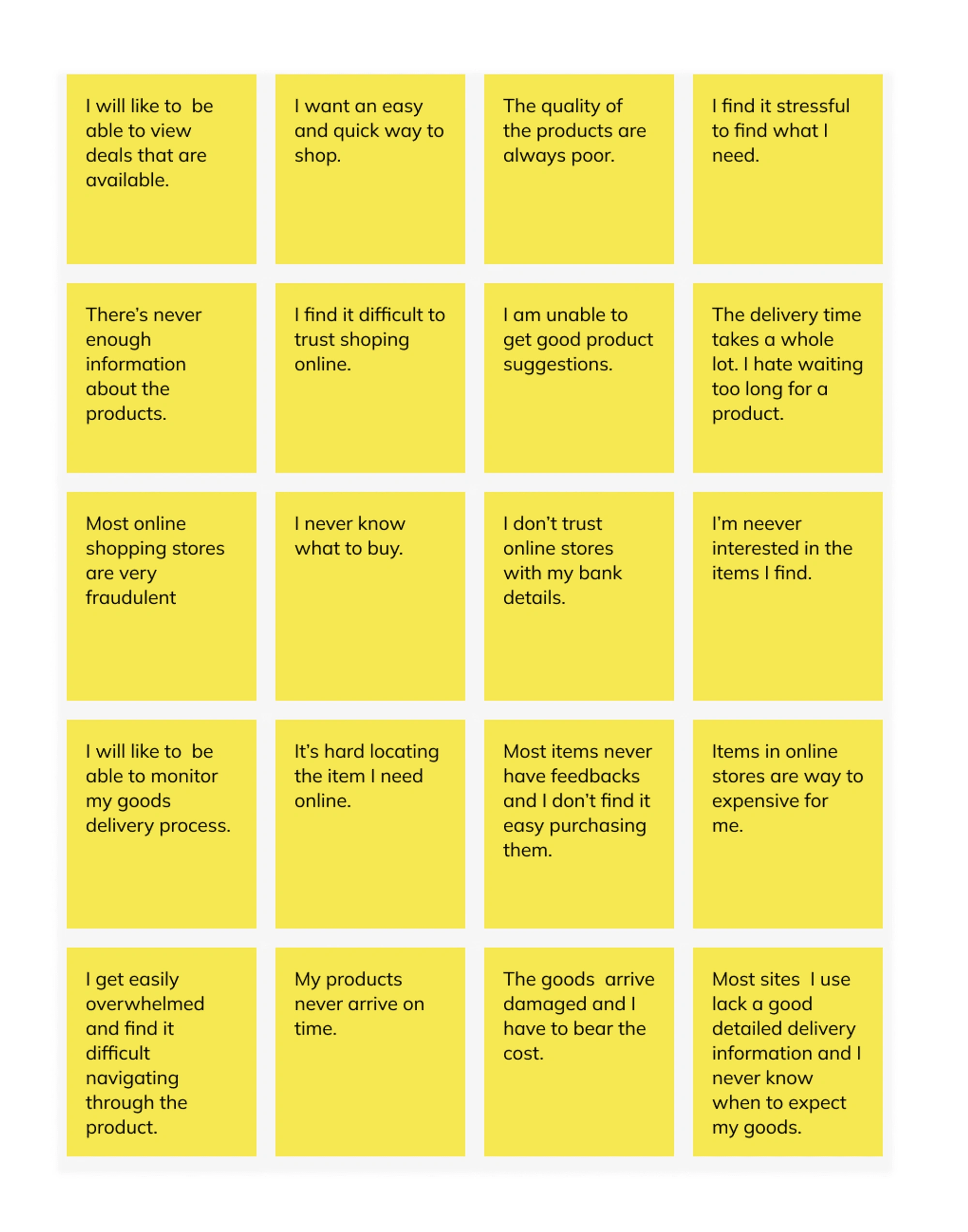
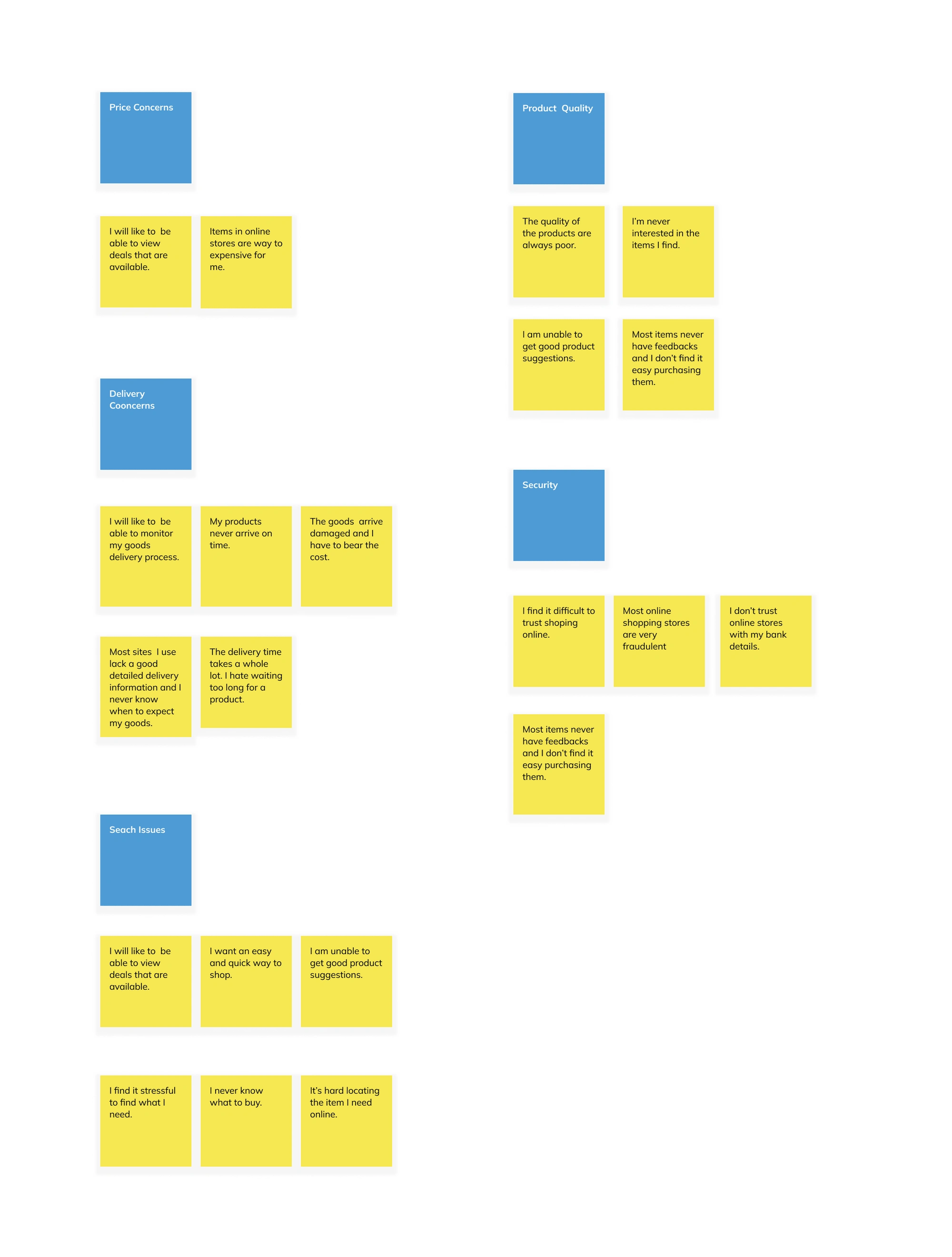
Painpoints
The pain points uncovered are as follows:
Users want to know that the things they're paying for are good quality and will arrive on schedule.
Most users have issues with their details online
Online products are relatively much more expensive.
Difficulty locating the items needed.
The information provided about the items is limited.
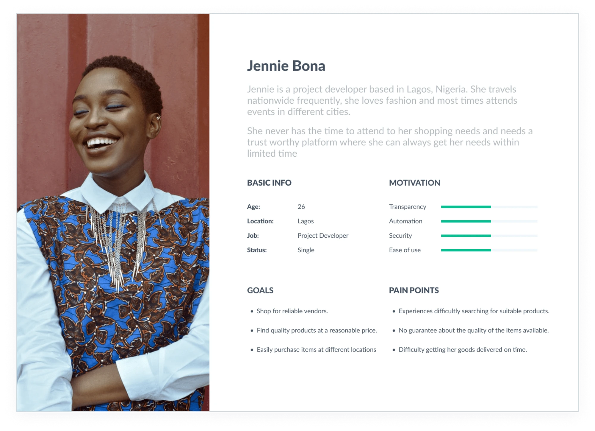
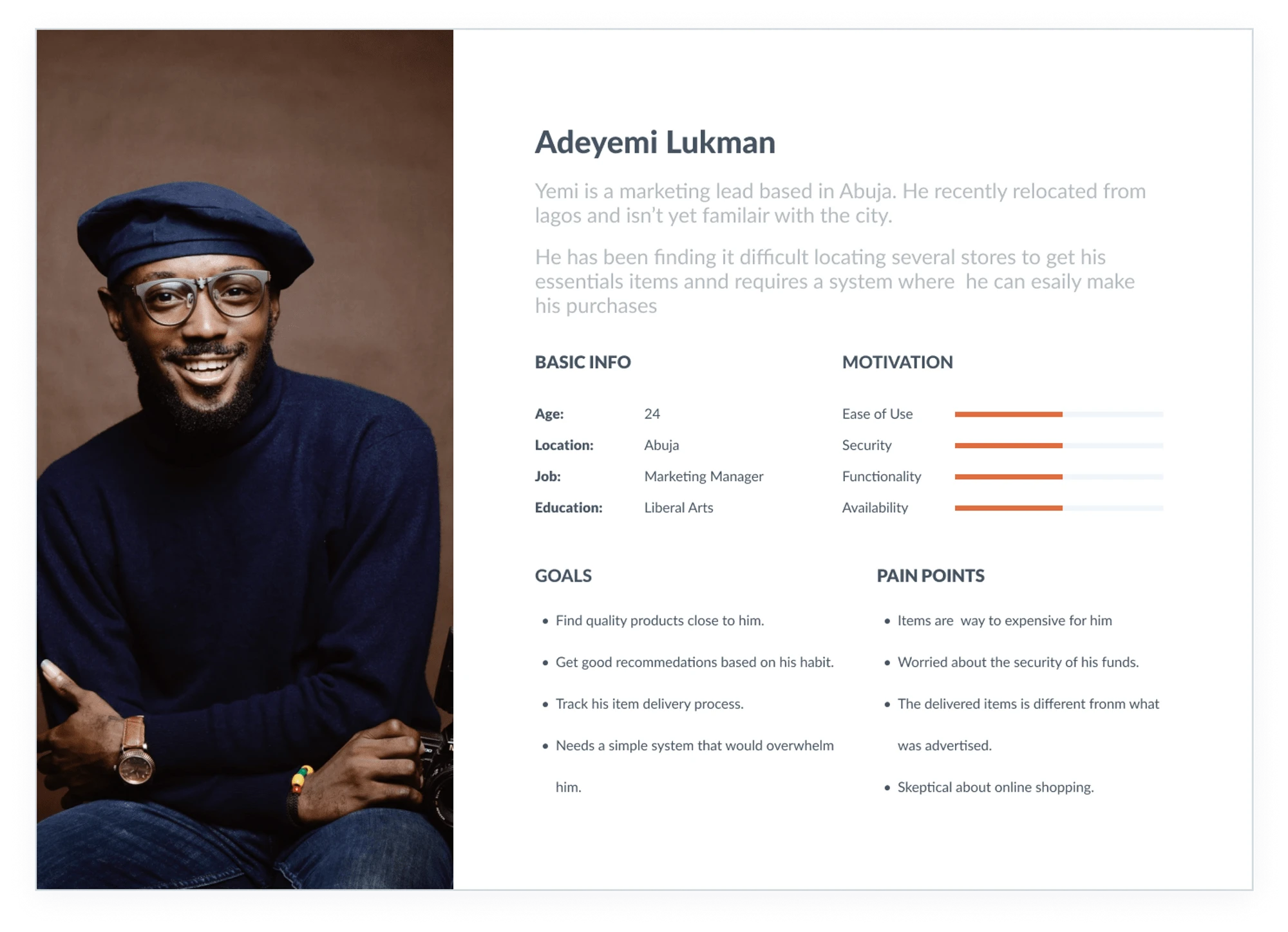
Personas
Using the results of the survey, I created two personas that embody the traits of the target audience.
Market Research
With insight from the user research, I needed to do a competitive analysis of popular similar applications on what they provide and how they compare.
Getting familiar with the ways and needs with which users interact with other similar products in the market gave me insights into common setbacks people encounter and also the kind of features or strategy in place that fosters a good user experience. This helped me define solutions/features to include in my designs, as well as aspects users, are familiar with in a fintech application
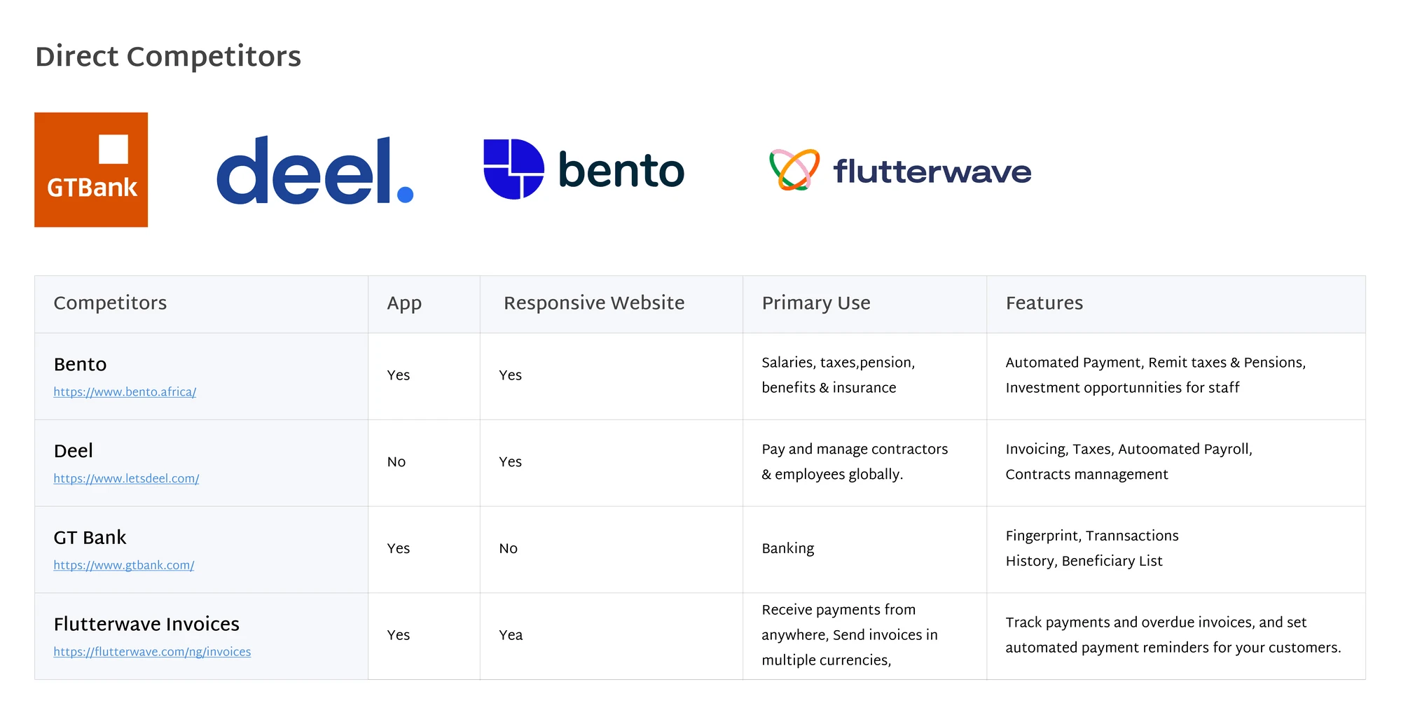
Insights
From the information gathered on the direct competitors, I found that they had the following features in common:
Recommendation list based on product picked.
Deals page to view all current and upcoming offers
Seller's review page and ratings
A simplified and refined category list.
Design Exploration
Ideation
Finally, after I found out the pain points to work on and I started a brainstorming exercise to identify a better way to provide a solution to the issues the users were encountering and had pointed out during the interviewing processes. My ideas were:
Deals page to advertise current promotions and discount.
Escrow payment method.
Tracking system to keep updated on order deliveries.
Location-based categories to view sellers/items within your region for after delivery.
Advanced filtering system.
Auto-complete search result.
Search recommendations and history
Sketches and Brainstorming
To gain a better understanding of how the platform would work and have some understanding of the flow, I sketched pages to better illustrate it, this also allows for many leading iterations through varying design options.
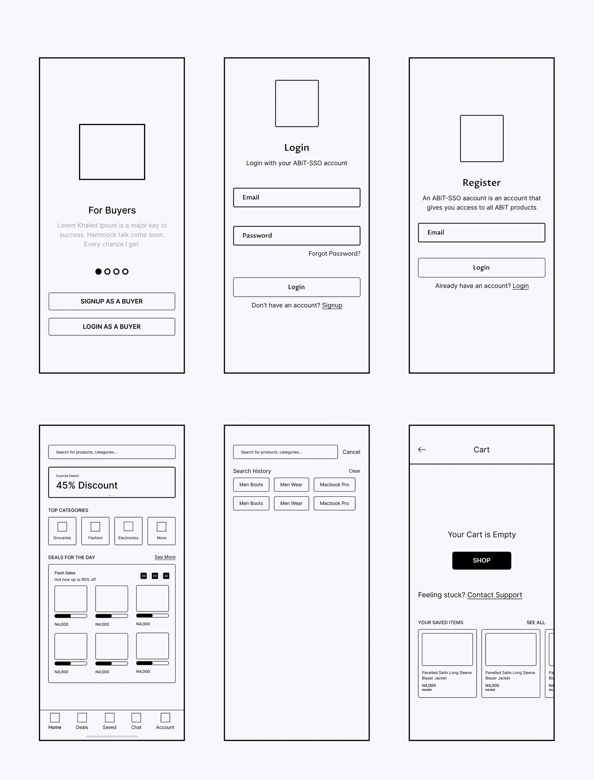
High Fidelity Design
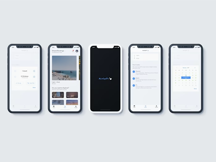
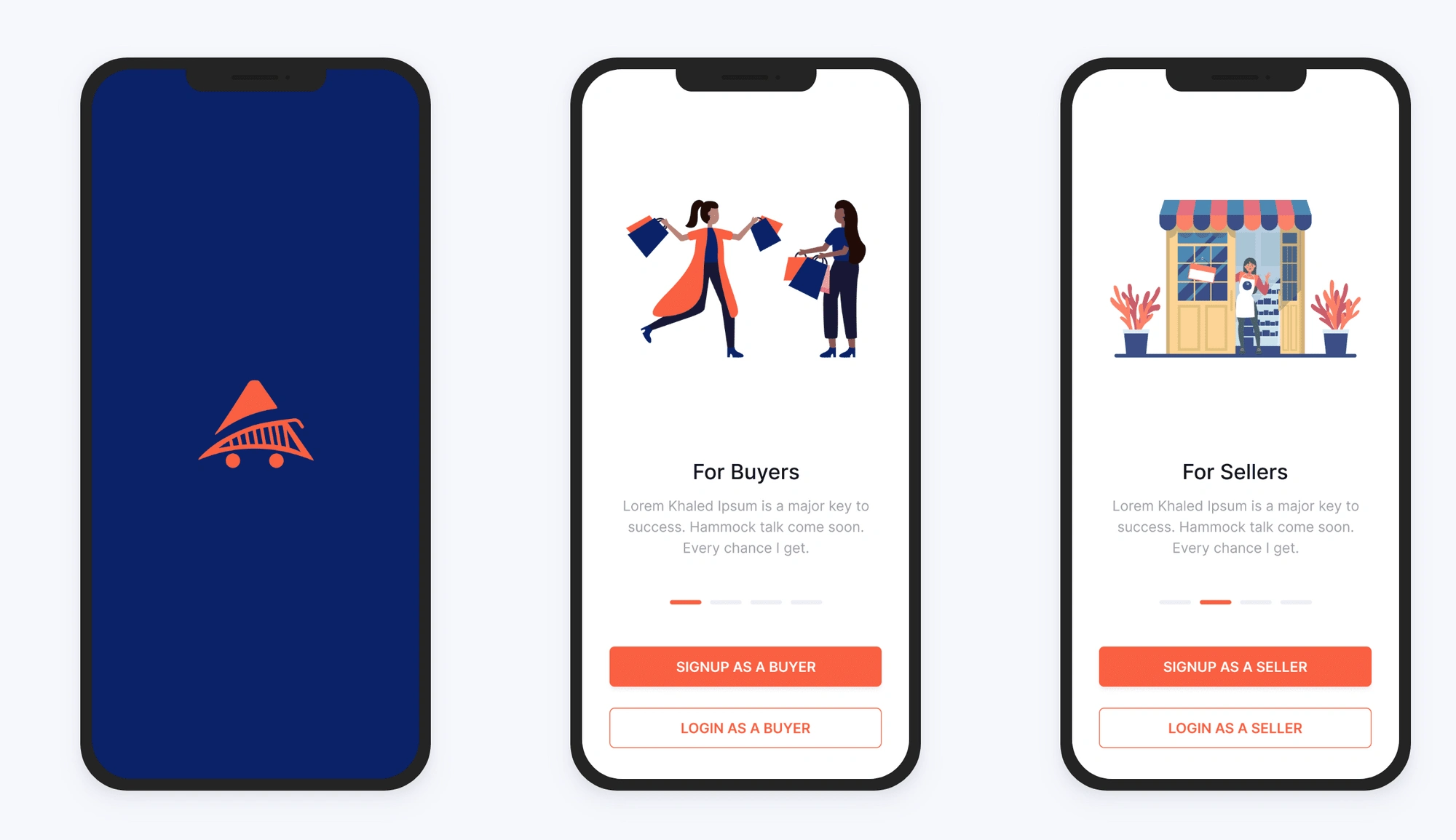
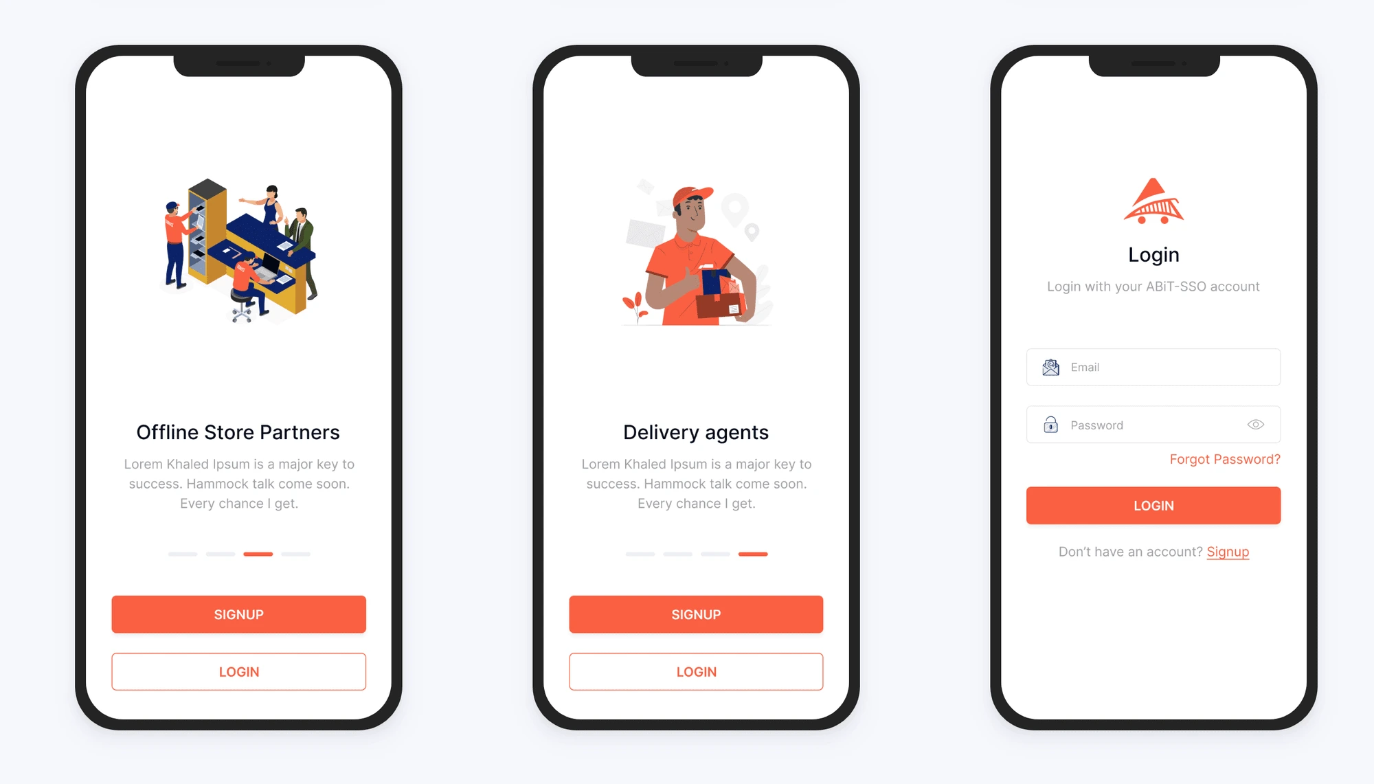
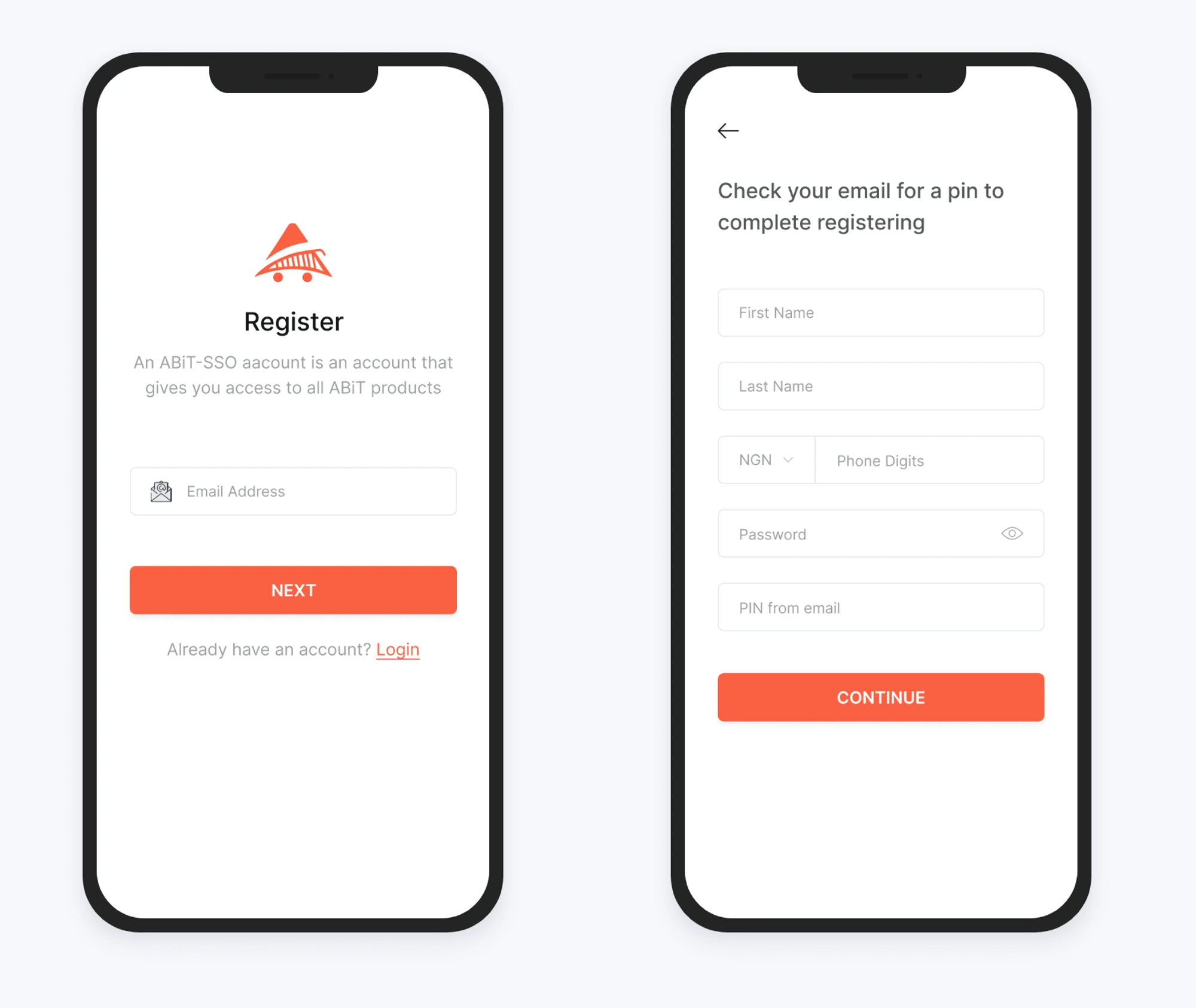
1. Onboarding and Authentication Flow
A single flow that allows for multiple ranges of users ( for other projects)
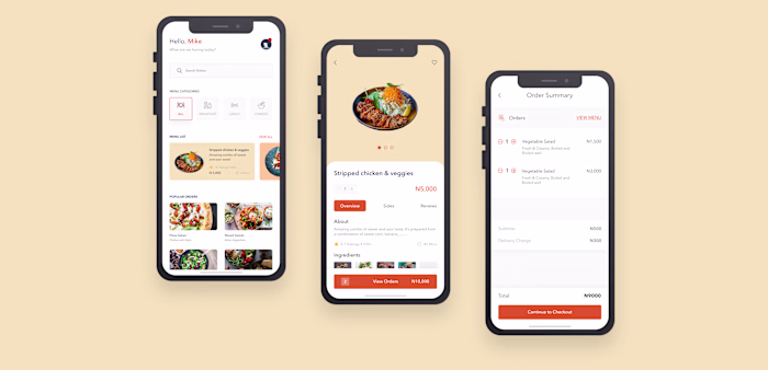
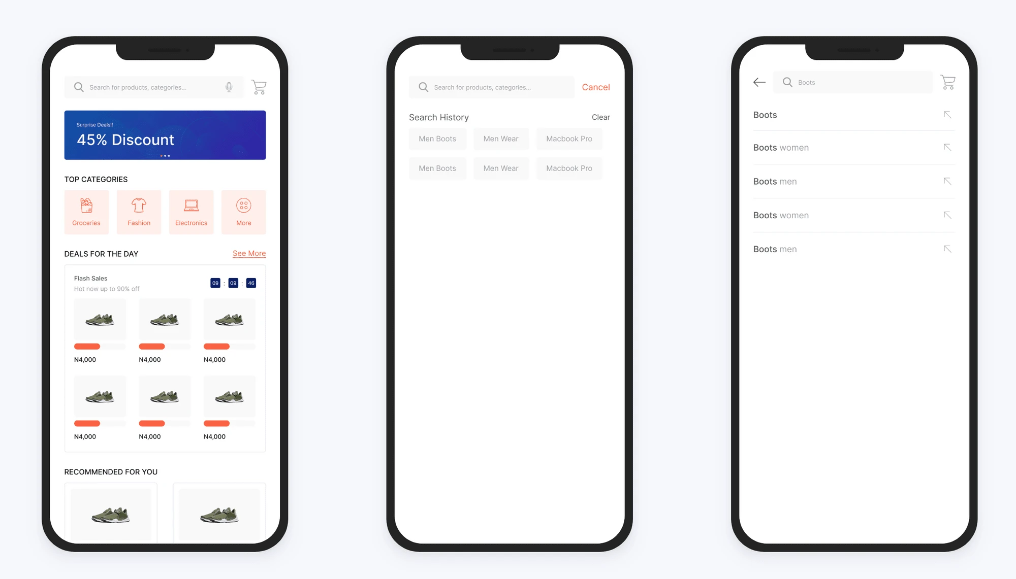
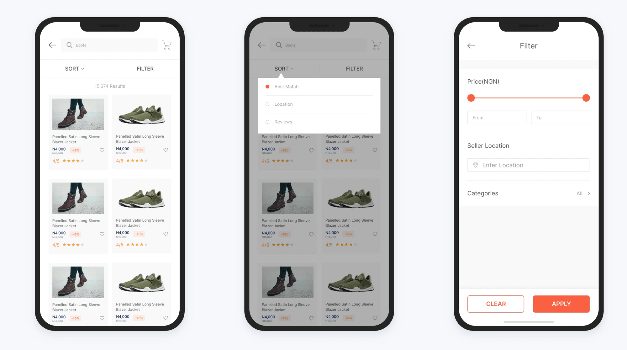
2. Home, Search, Filter system, Ratings & Reviews, and Product Information.
Deals that are currently running are shown on the homepage for easy accessibility. The search bar is customized to show the history and shows suggestions for possible search options.
Users are able to sort the search list by location, showing the items that are closer to their location. There's also an advanced filtering system for a better experience.
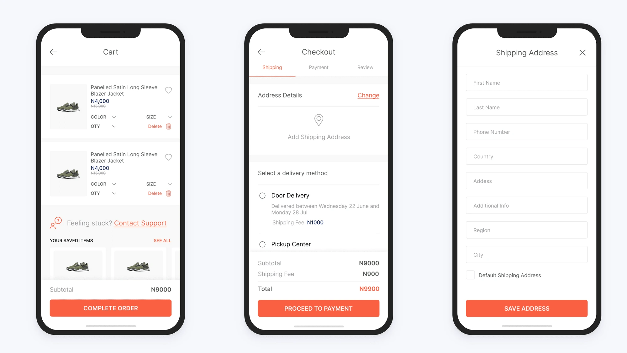
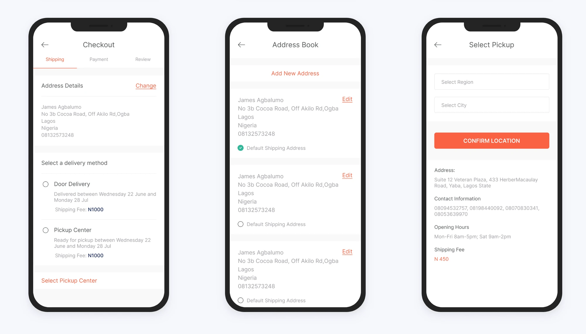
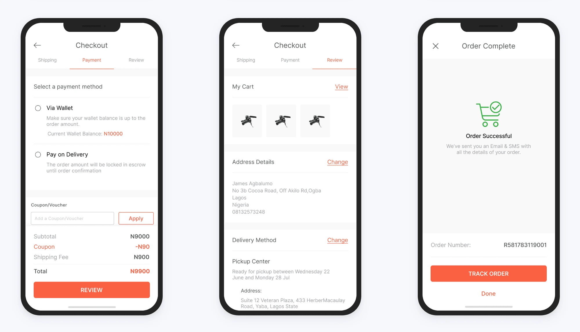
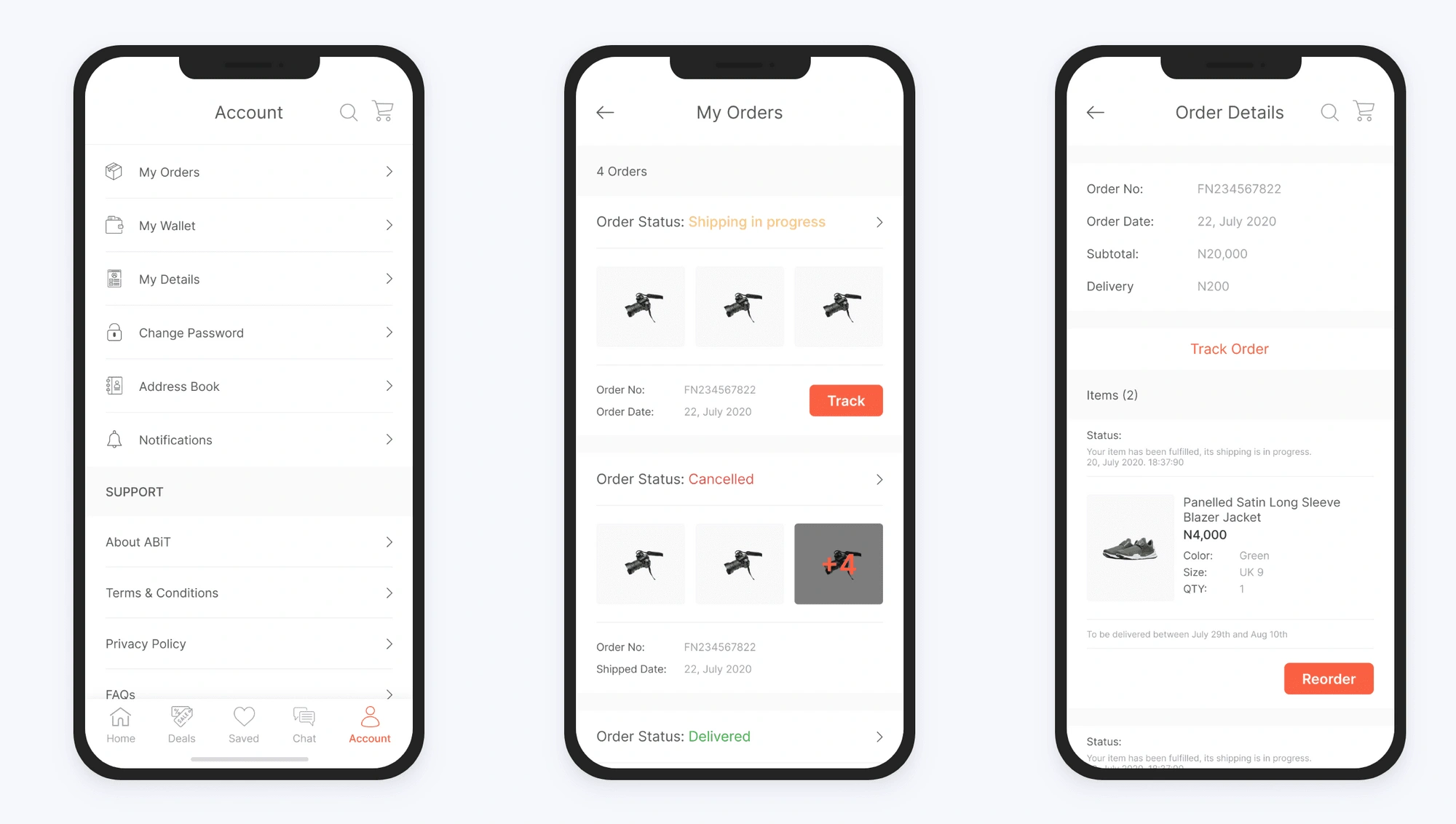
3. Checkout Flow
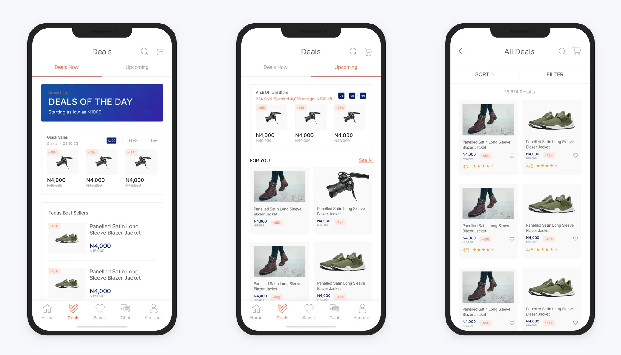
4. Deals
The deals page gives a simple overview of all. the current and upcoming deals/discounts. It also shows users which items are being purchased more often.
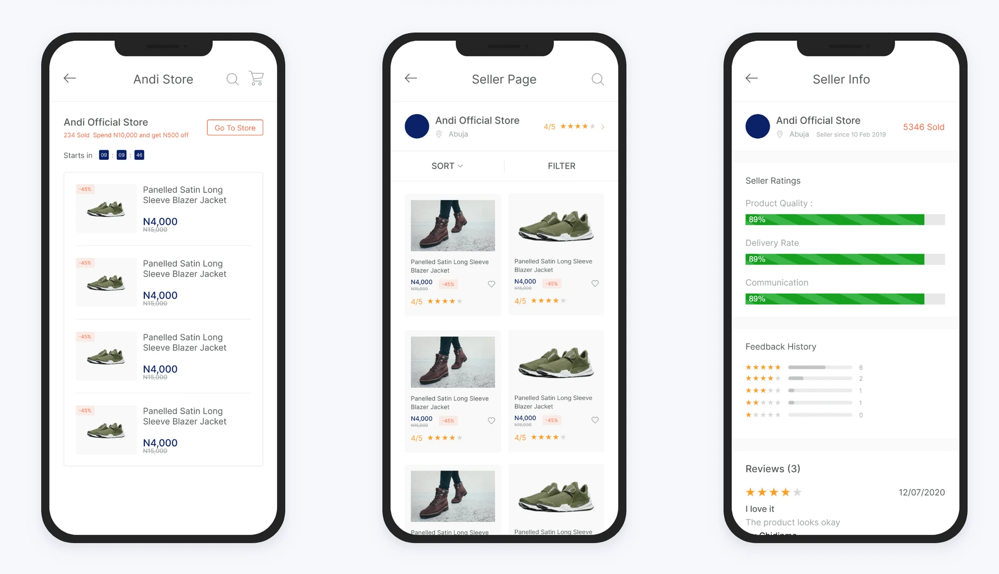
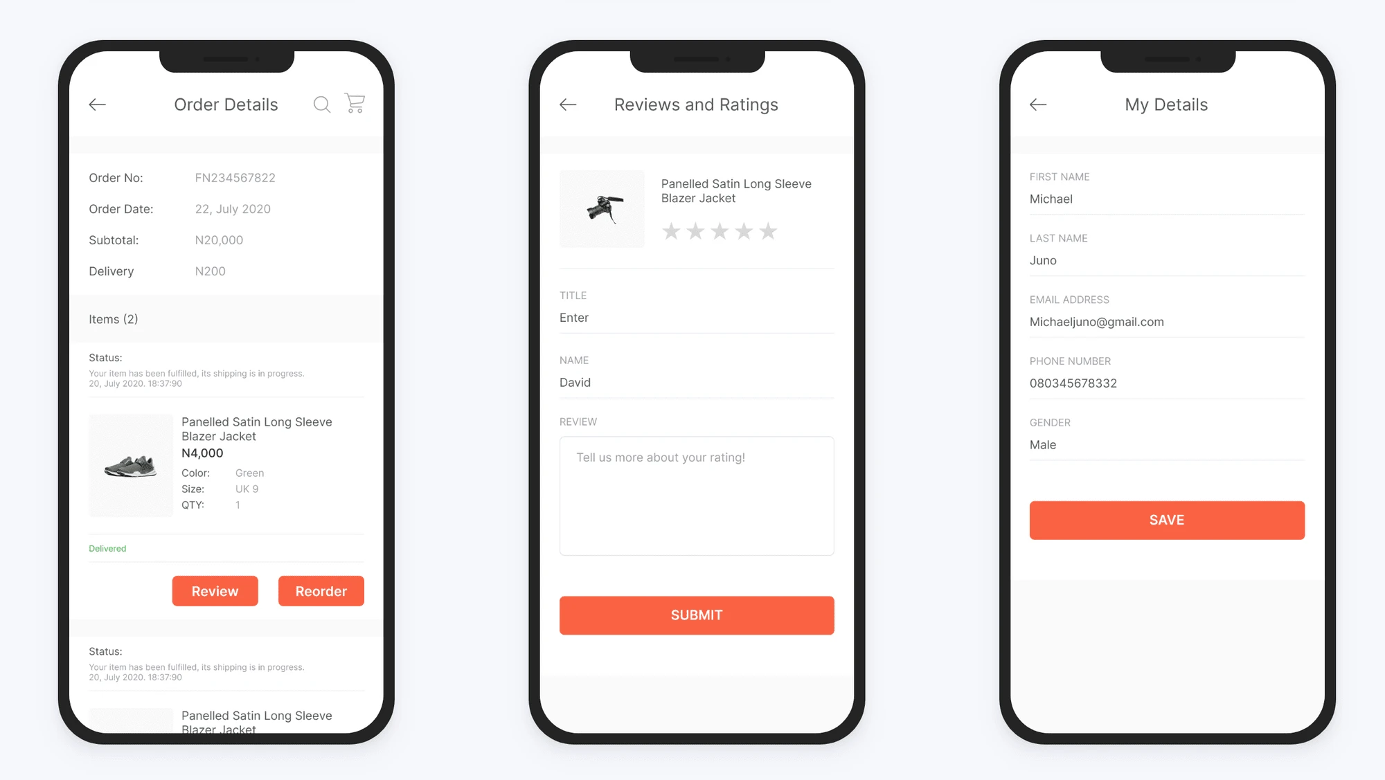
Users are able to visit a seller's page which shows all the current items available,any available discount offers, and a view of all their ratings & reviews gotten.
5. Account
Conclusion and Project Learning
In the course of my training, I learned how important it was to follow a user-centered design process and this project further solidified that thinking.
The project was a career-defining one, I’m pleased with the outcomes. The journey was also a major learning point for me. One of the key parts of the process was interacting with the users and not relying on my intuition while also ensuring I follow the industry-standard processes for E-commerce
Like this project
Posted Aug 20, 2023
A Discount Shopping Application
Likes
0
Views
6