Chiang Mai Design Week
A New Navigation Experience and Rebranding for a Regional Design Festival
About
Chiangmai Design Week, an exciting annual event in Chiangmai, Thailand, is a vibrant celebration of creativity and design that unites artists, designers, and creatives worldwide. Organized by the Creative Economy Agency of Thailand, the event showcases the work of both local and international artisans and creatives through exhibitions, workshops, talks, and installations.
Challenges
The festival aims to create a timeless and recognizable image while setting itself apart as an artisan festival. The branding efforts aim to strengthen the festival's ties with the local community and showcase its rich cultural heritage. Additionally, the search experience is not synchronized between print and digital platforms, resulting in difficulties when searching for information.
The process involved conducting a design audit of the previous identity and the local cultural heritage. Inspiration was drawn from these sources to discover ways to incorporate and elevate local wisdom within a contemporary context.
Solution
The new identity involves simplifying the brand identity while creating a flexible system. The emphasis is placed on the unique voices within the community and the showcasing of the craft community, aligning with the festival's new focus on elevating both local and global craft communities. For the user experience, the objective is to improve searchability. This is being achieved through the redesign of a digital website and Google Maps integration to enhance user-friendliness and accessibility for non-technical users.
01 New Identity
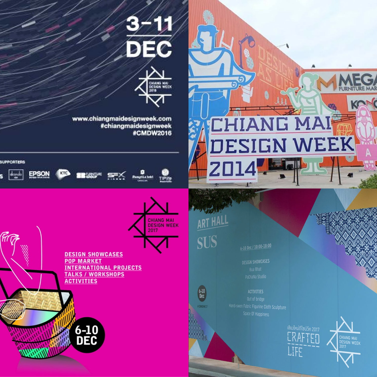
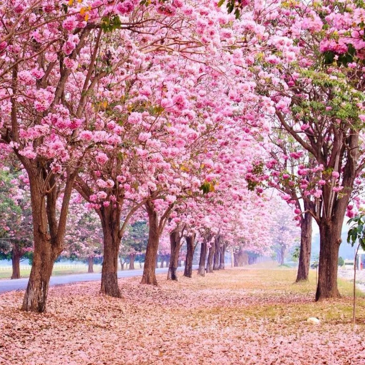
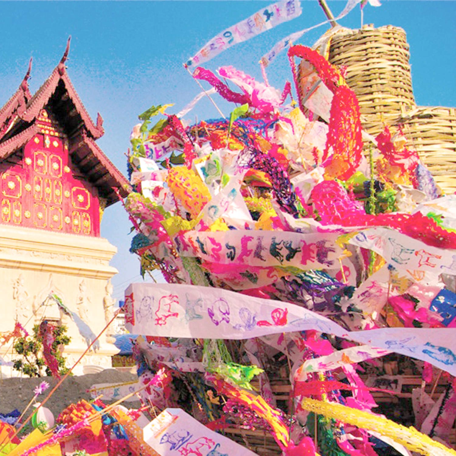
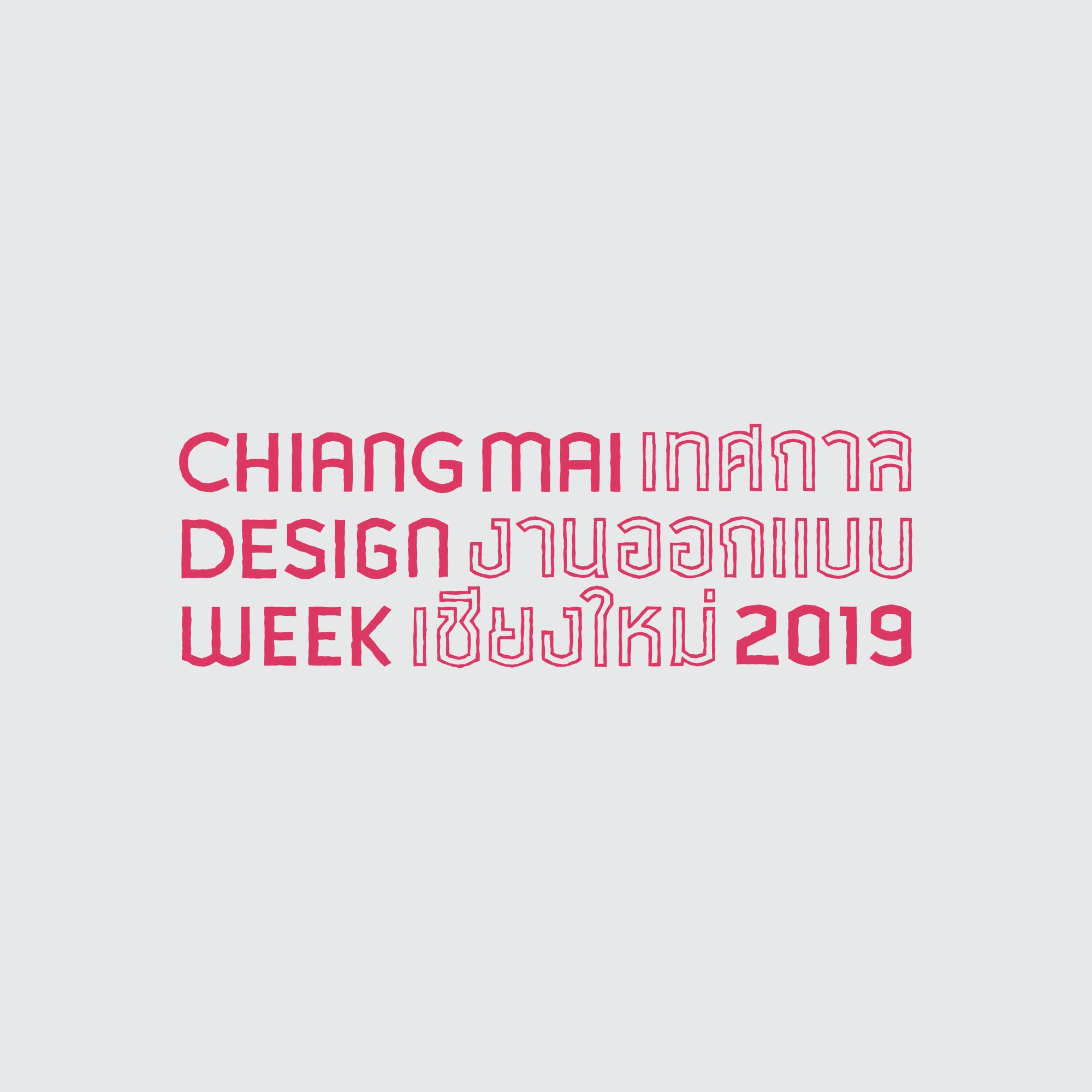
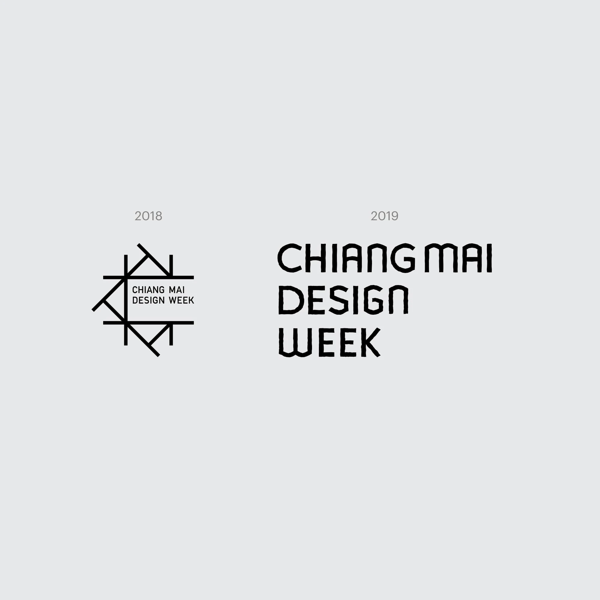
The logotype was simplified by removing unnecessary elements and establishing an adaptable structure to fit various use cases. Inspiration was drawn from "tung," an artisan papercraft known for its continuous expansion, mirroring a grid-like pattern in the grid system. Furthermore, the color palette was taken from the natural beauty of Chiang Mai for the color palette, incorporating the distinctive pink shade found in the native flower known as "Prunus ceramides."

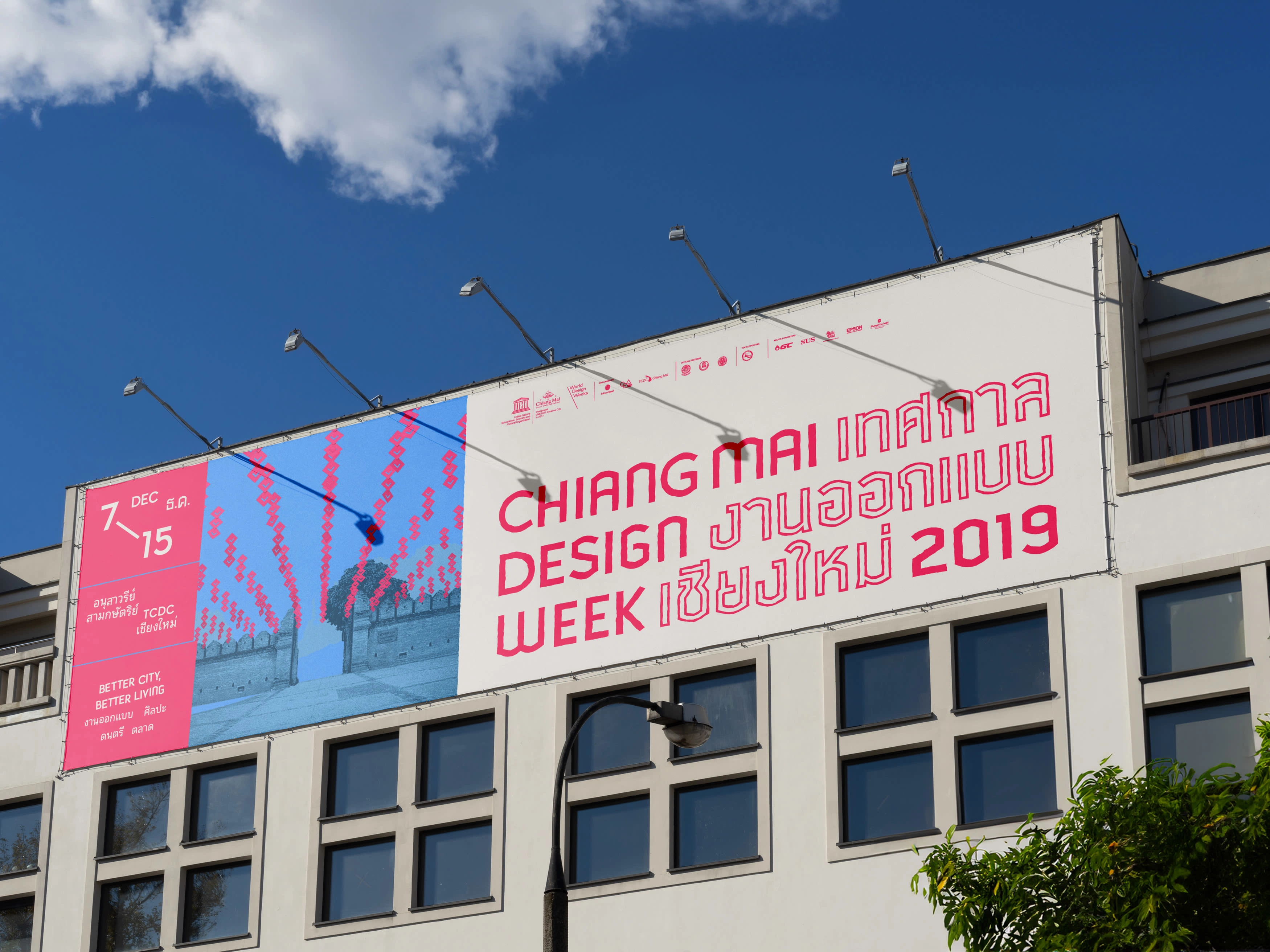
02 Introducing the Lanna Typeface
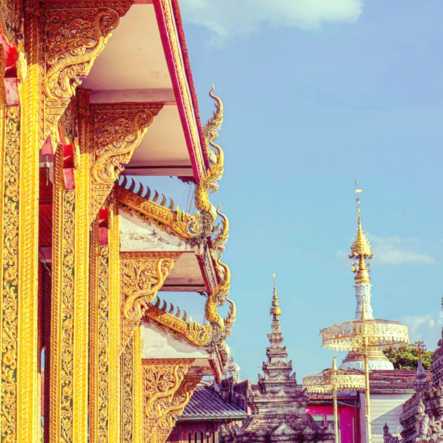
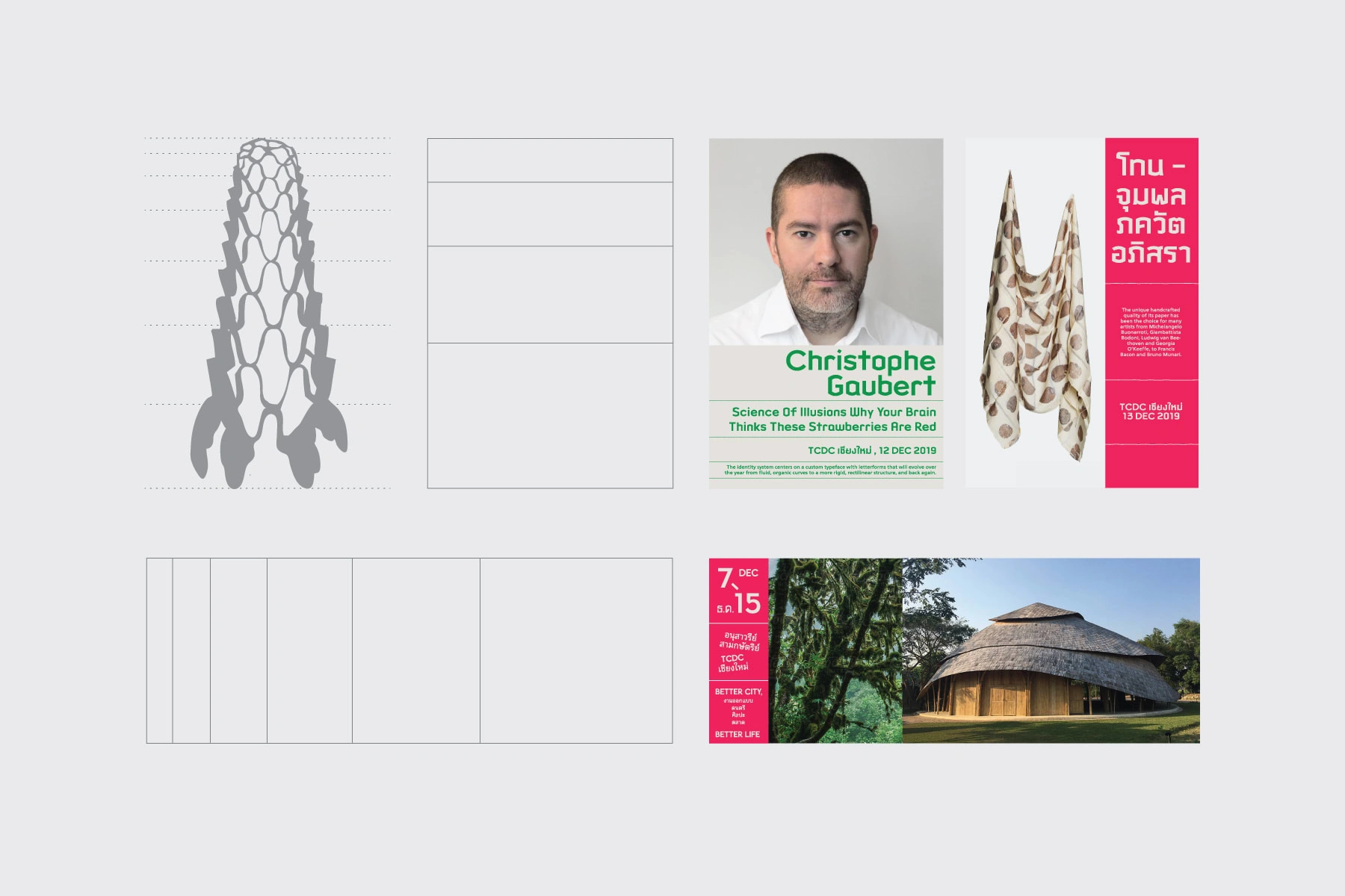
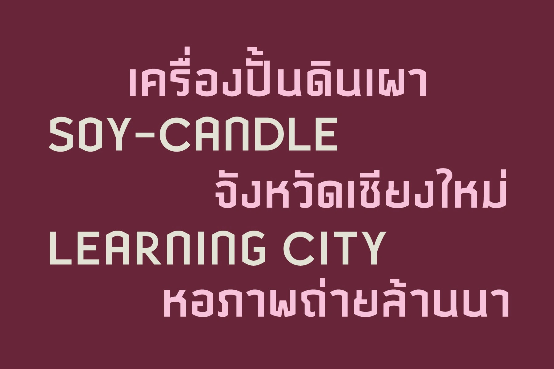
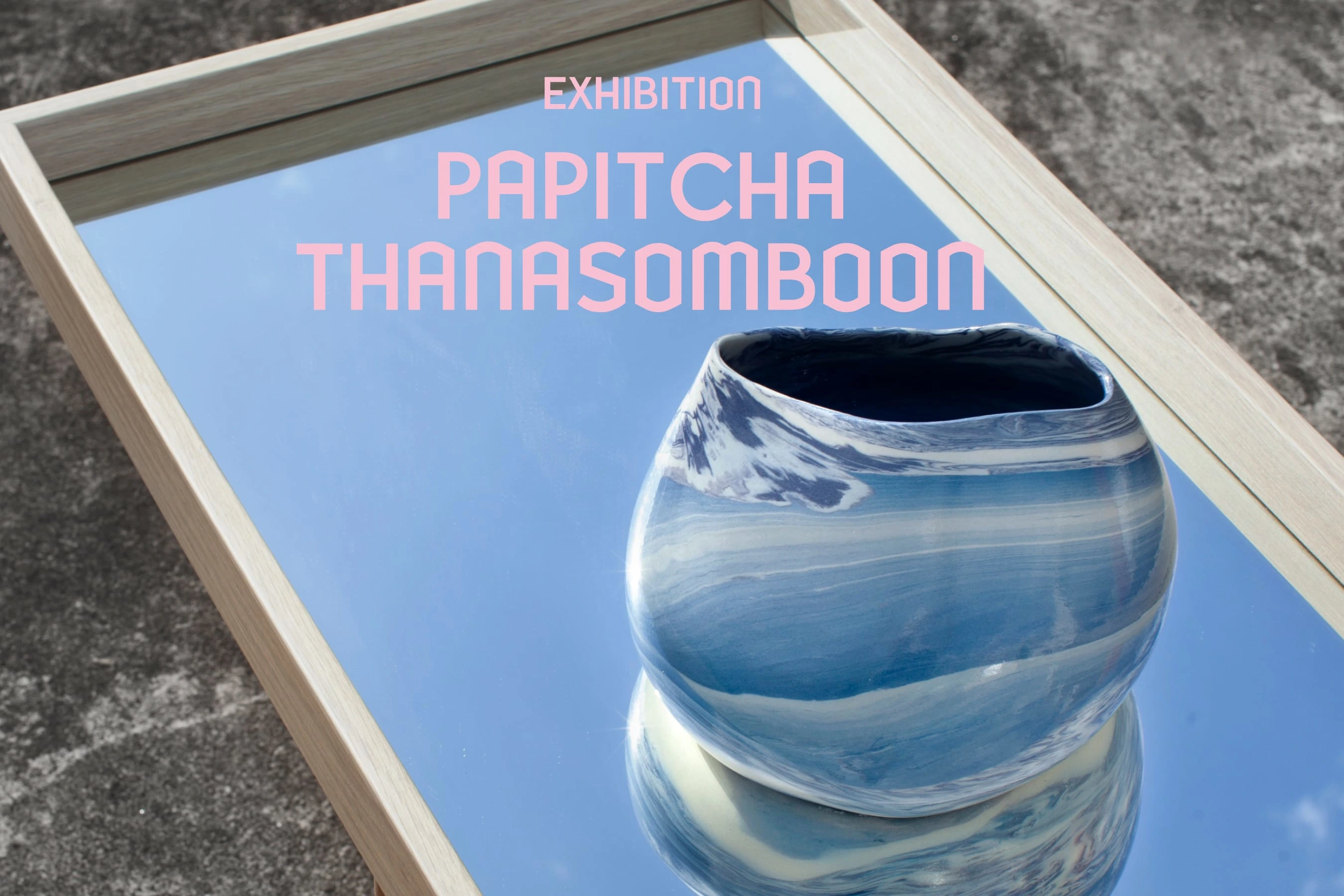
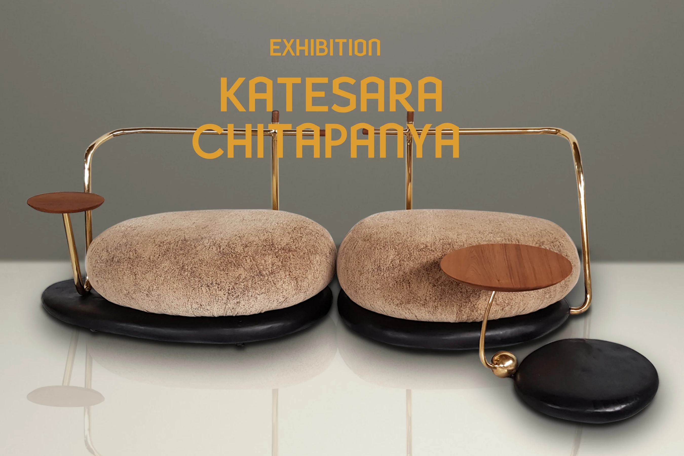
Replaced the yearly typeface with a new primary identity typeface, "Lanna." This typeface takes inspiration from the unique architectural style found in Northern Thailand. Lanna is accessible for use in both Latin and Thai alphabets, ensuring a consistent brand voice and fostering a sense of ownership within local communities.
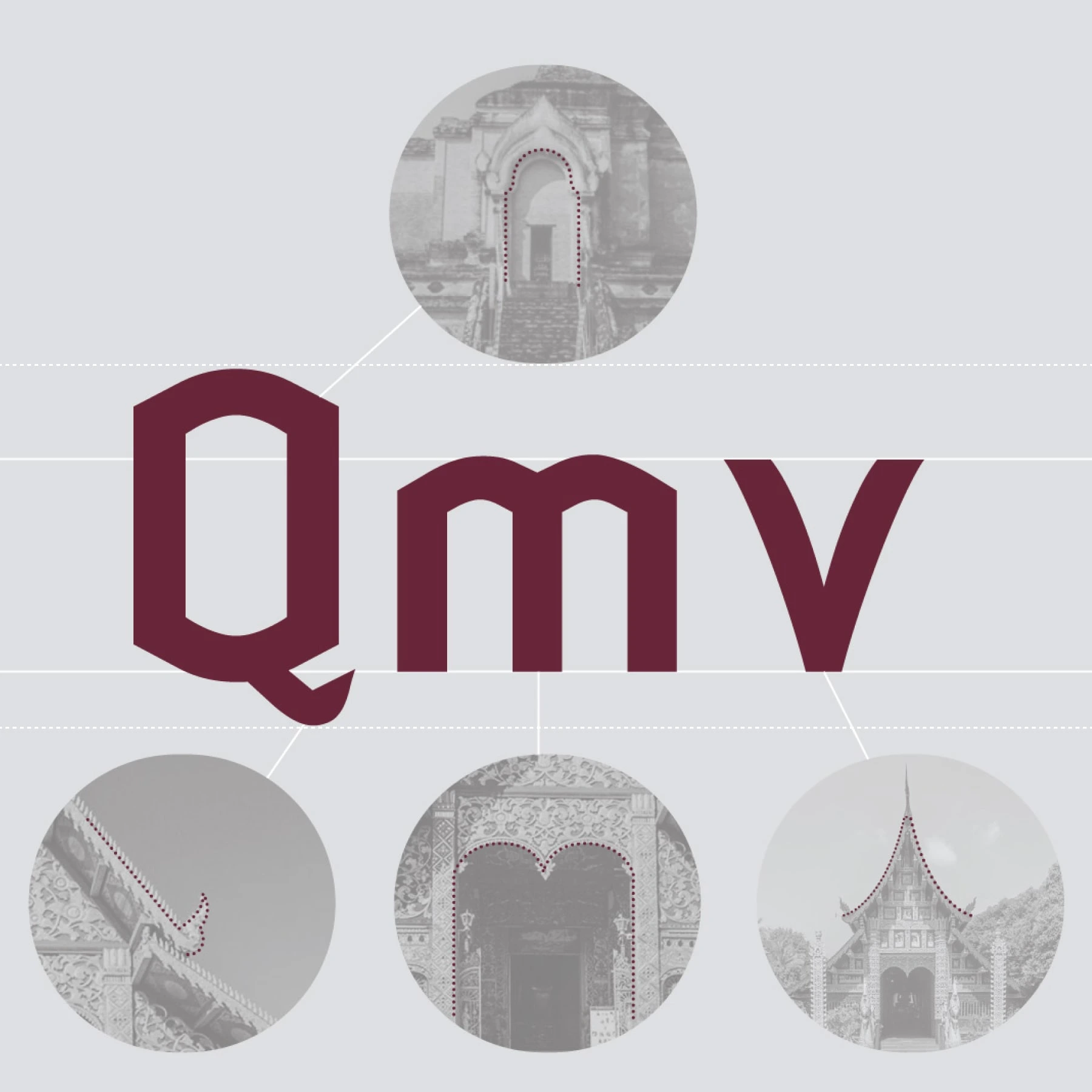
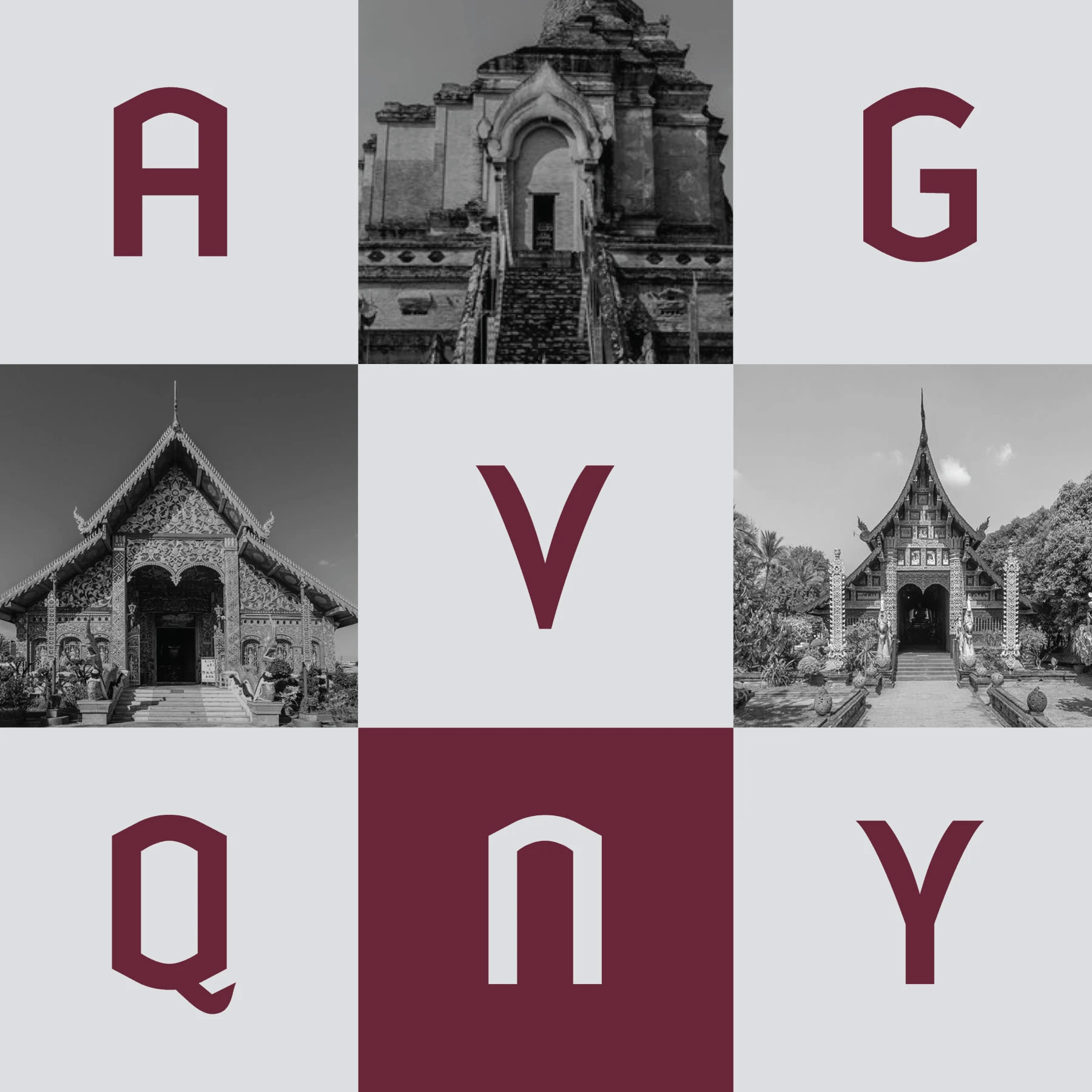
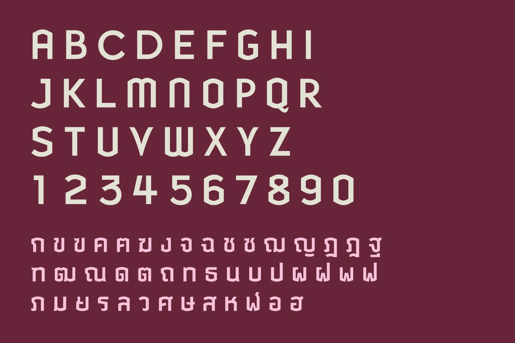
03 Solving the Navigation Challenge
Research findings indicated that locating exhibition venues during the festival presented a challenge. To address this issue, the digital experience was improved through the introduction of a new website featuring a user-friendly search filter and the incorporation of Google Maps for seamless navigation, with the goal of enhancing accessibility for both local residents and non-technical users. Additionally, the new brand system was integrated into the 2019 design festival materials.
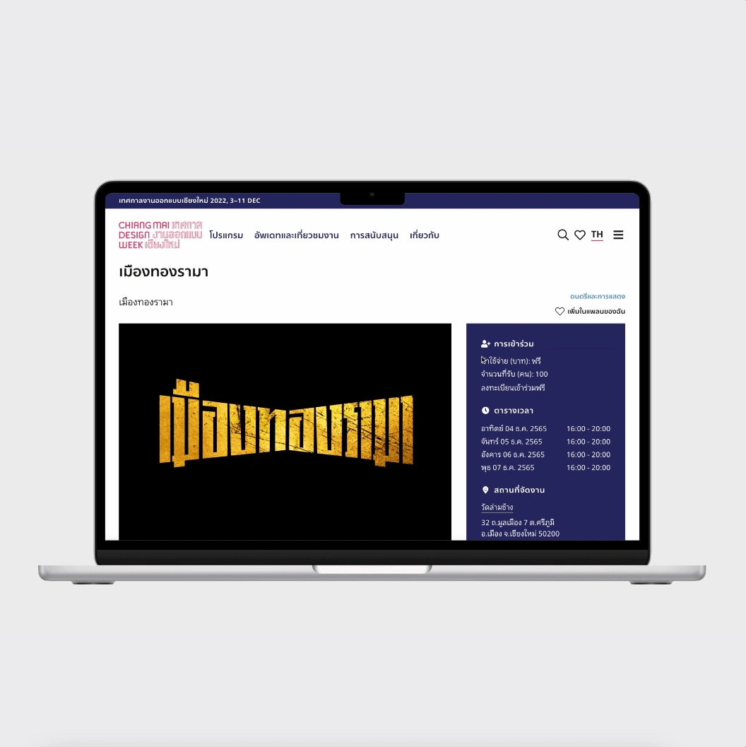
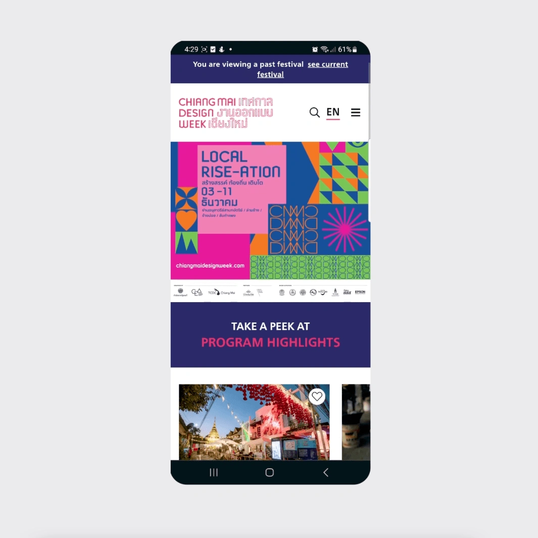
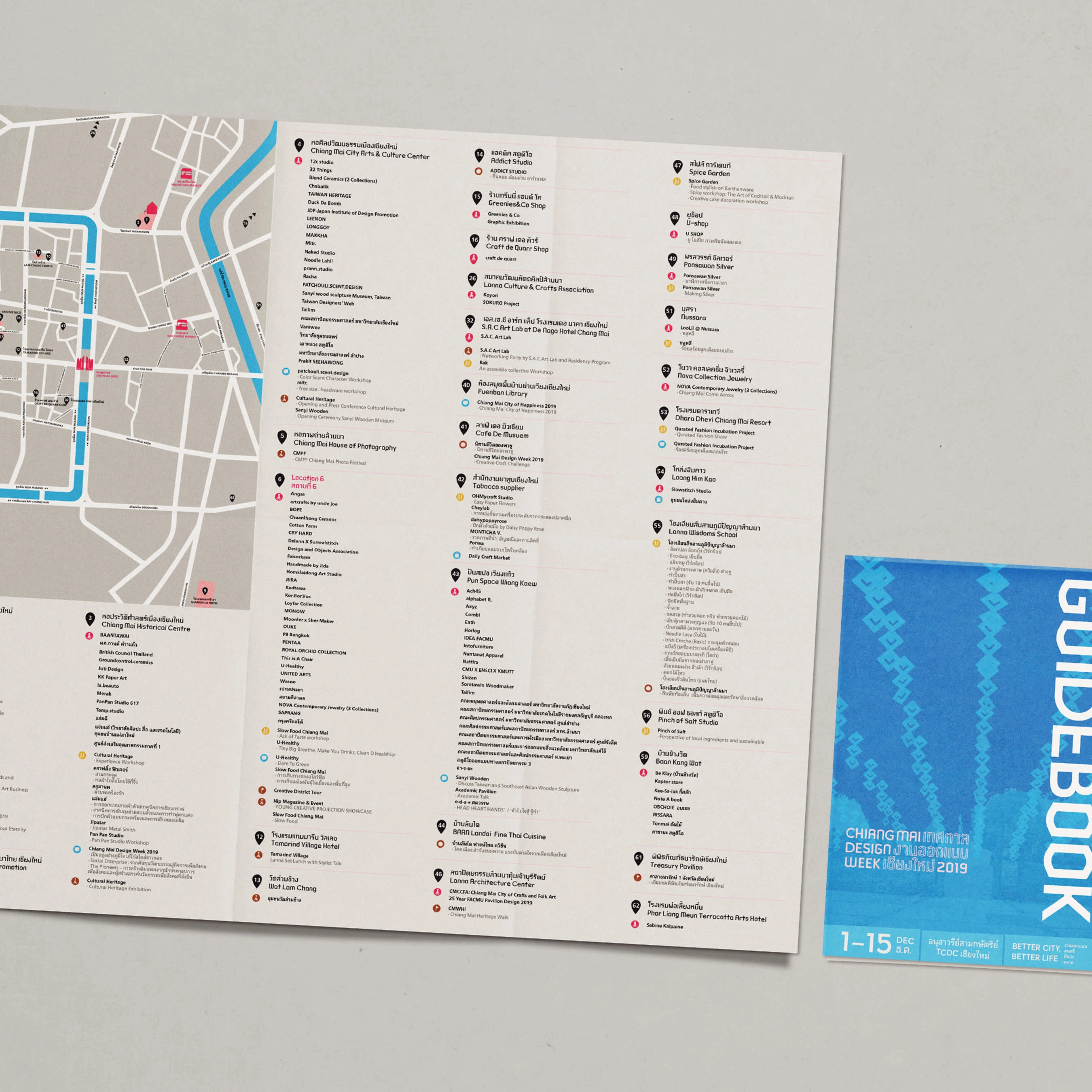
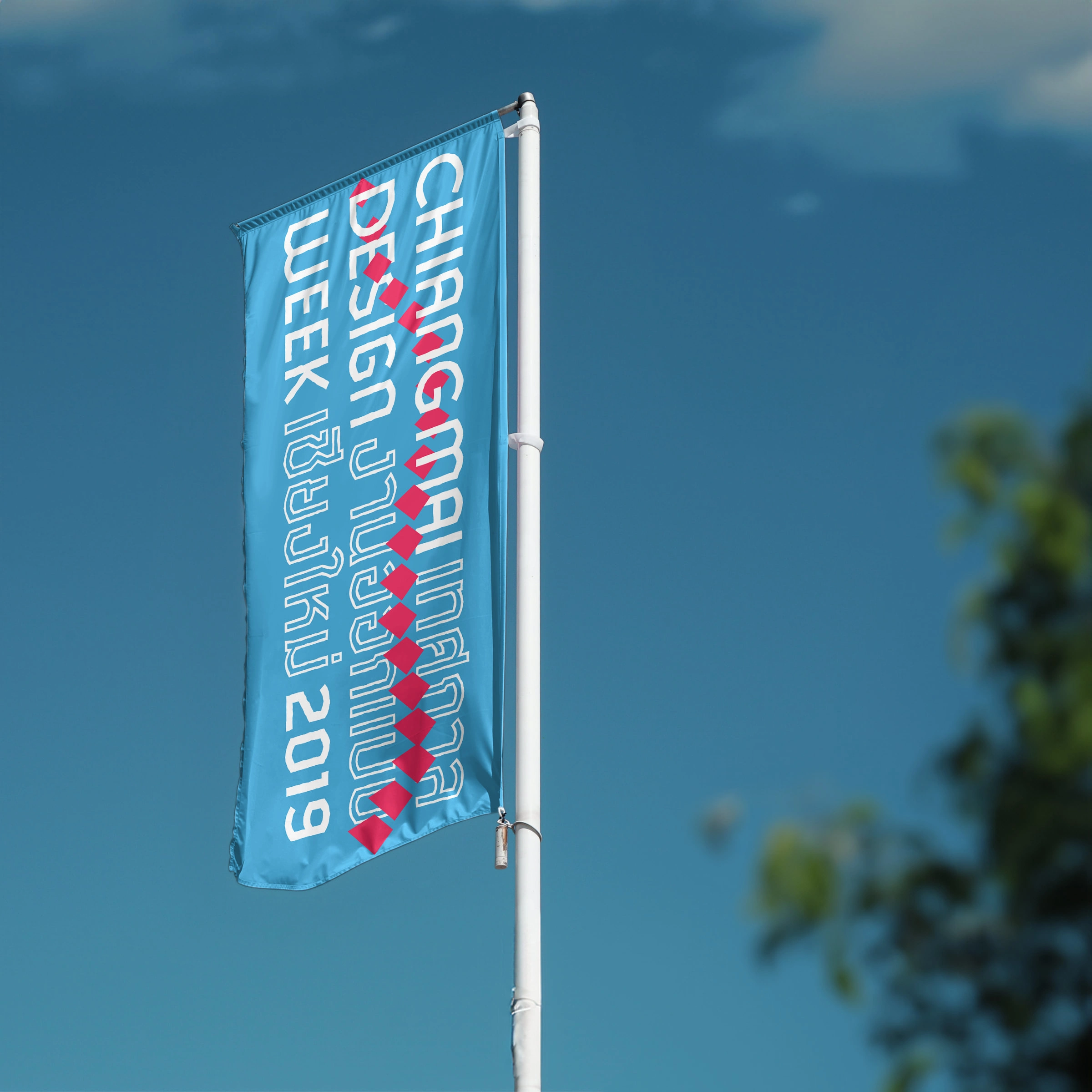
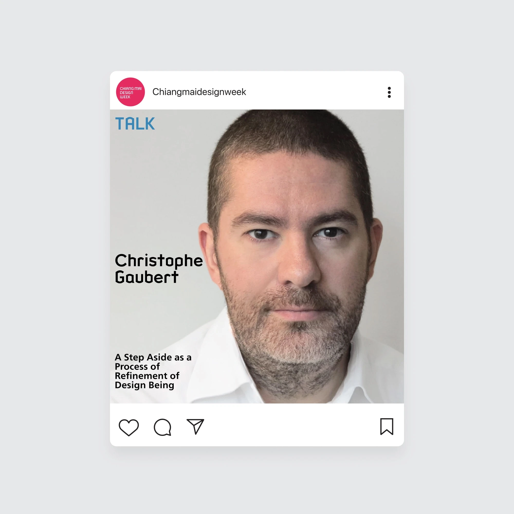
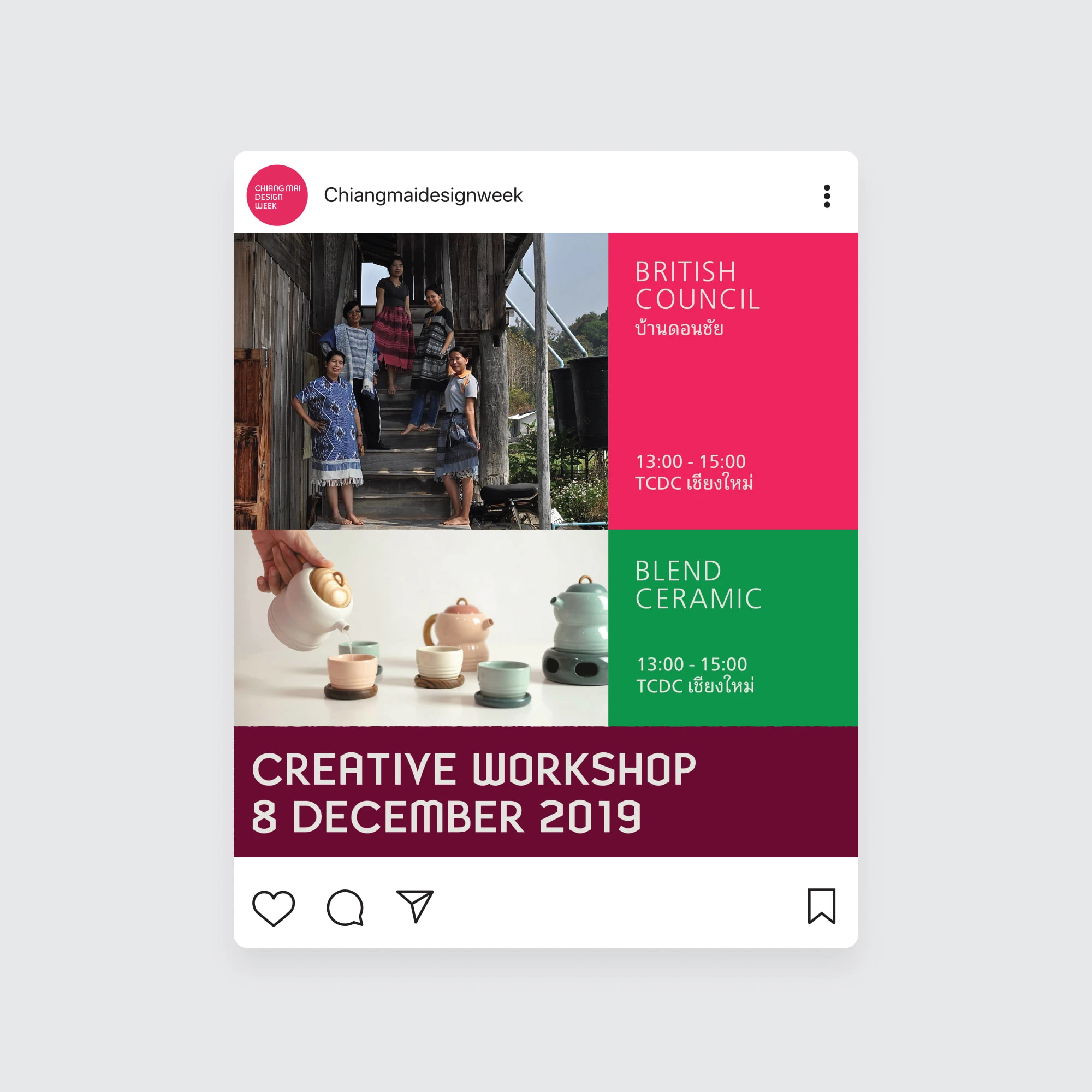
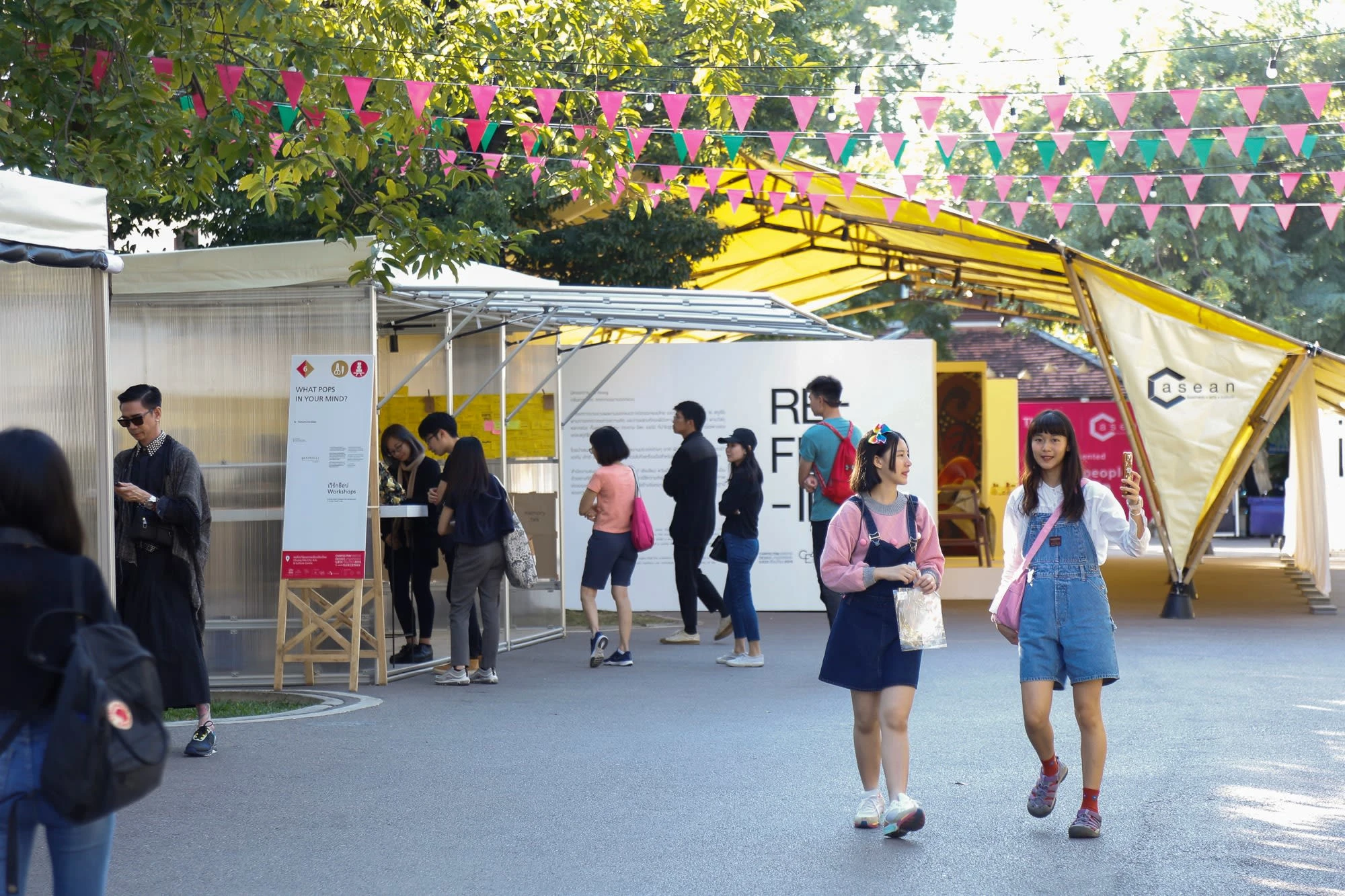
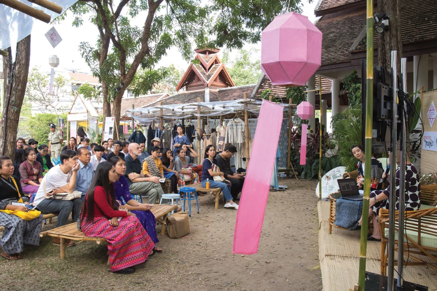
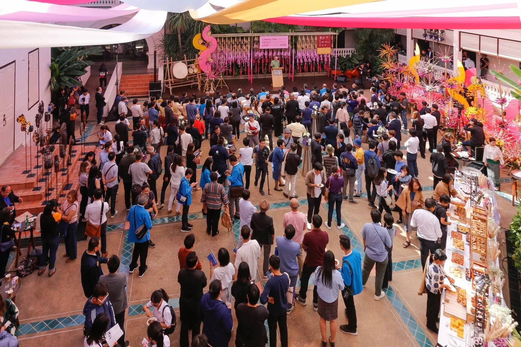
In addition to the core brand elements, various collateral materials such as maps, brand flags, and social media posts have been created.
Impact
In 5 months, our team of 8 designers completed branding, collateral materials, and web design for a project. Their promotional materials increased event attendance by 250%, resulting in an economic value of 12 million USD. Further, our design work was recognized with a prestigious DEmark design award in 2022.
Like this project
Posted Jan 28, 2024
A New Navigation Experience and Rebranding for a Regional Design Festival
Likes
0
Views
23


