Stori by Chaptr
Kirilo Sztarcsak
Project Overview
Chaptr is an AI startup focused on developing innovative solutions for the publishing sector. I joined the team as a Senior Product Designer to lead the design of an AI-powered children’s storytelling app, Stori. Once the design was completed and the app built, Stori was showcased on Google’s main stage during a Google Bard presentation, where my design was introduced to a global audience.
Key Highlights
Crafted a meticulous design system, including a comprehensive component library, style guides, and design rules.
Collaborated closely with a renowned Creative Director to shape the app’s vision, aesthetic, and micro-interactions.
Designed a visually engaging native application for both iOS and Android platforms.
Gained early experience with AI before its mainstream adoption, developing expertise in integrating AI from both a design and technical perspective.
Deep Dive
Problem: Design a visually captivating children’s app that’s easy for both kids and parents to use. The app should assist parents by providing story options for bedtime, while offering children an intuitive, engaging way to build reading skills through creative and interactive stories.
Step 1: Solution Design
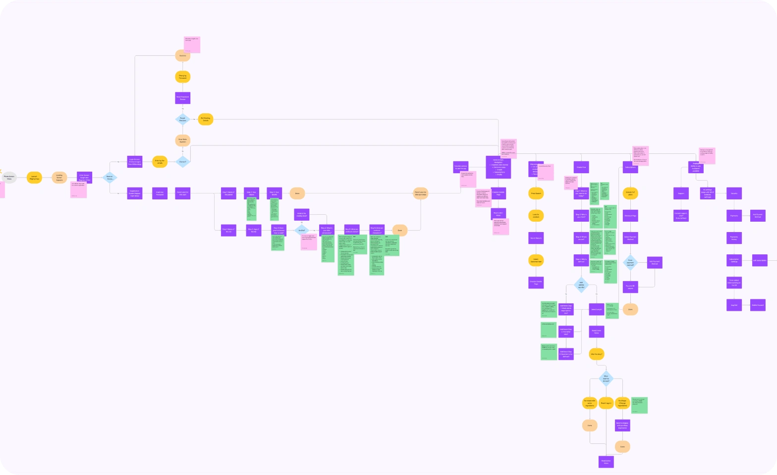
Research, Flows and Wireframes: Conducted extensive research on children’s apps to identify key usability features. Developed user flows and high-fidelity wireframes that clearly defined the app’s structure, reducing the need for rework by 95%.
Step 2: UI Design
Design Style Exploration: Explored and tested various style options, conducting research and presenting multiple design concepts to stakeholders. Together, we selected the optimal style that best aligned with the project’s vision.
UI Rollout: After receiving sign-off from stakeholders, I initiated the styling phase, applying final visual elements to the high-fidelity wireframes. This structured approach significantly streamlined the implementation process, reducing development time by half. The UI rollout also involved creating a robust component library, defining consistent styles, and establishing clear design guidelines, all of which ensured a cohesive and adaptable design system. These assets provided a strong foundation for future scalability and enabled a smoother handoff to the development team, supporting efficient and accurate implementation.
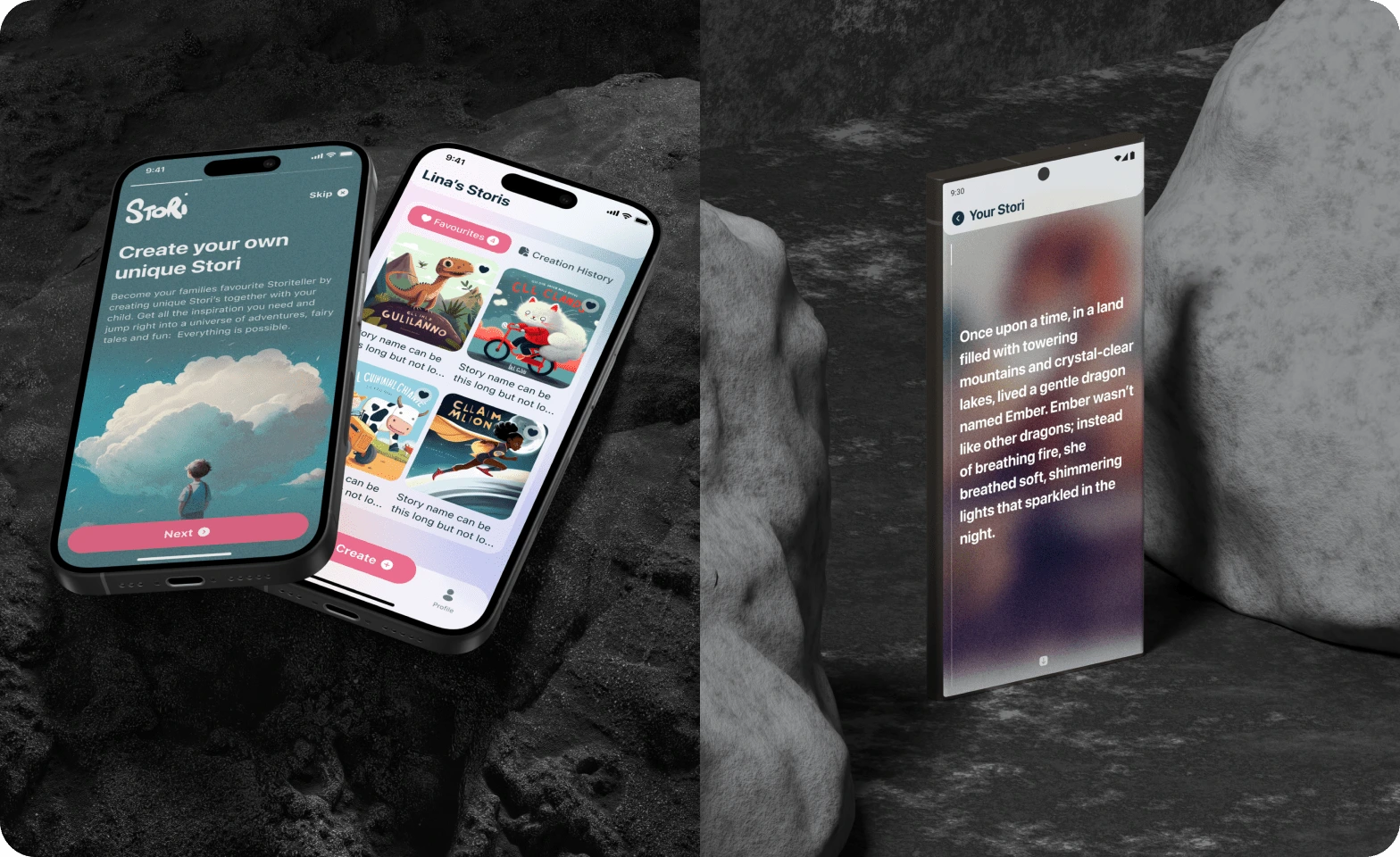
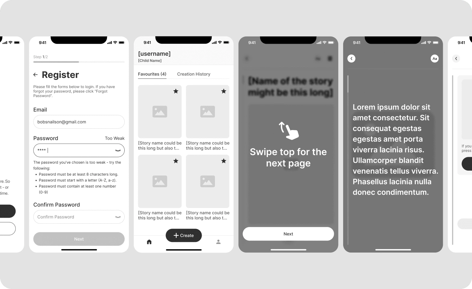
Interactions: During the UI rollout, I focused on visualising key interactions to guide users through the app’s functionality. This involved designing intuitive, step-by-step interactions to help users easily navigate features, such as viewing and hiding images, moving between pages, and previewing images. The interactive elements were carefully crafted to enhance the learning experience for both children and parents, with micro-interactions adding subtle yet engaging feedback throughout the interface. The example below demonstrates these interactions, showcasing how each movement is optimised for clarity and ease of use.
Learnings & Takeaways
User-Centred Interaction Design: Designing for children and parents emphasised the need for clear, guided interactions. Crafting intuitive, step-by-step user flows taught me the importance of balancing functionality with simplicity, ensuring that users of all ages could easily engage with the app.
Design Systems Drive Efficiency: Establishing a comprehensive design system with components, styles, and interaction guidelines streamlined the handoff process, significantly accelerating development. This experience highlighted the value of building scalable, reusable assets for rapid iteration.
Stakeholder Collaboration Enhances Outcomes: Collaborating closely with stakeholders during the style exploration and UI rollout stages was essential to aligning the design with the app’s vision. Frequent presentations and feedback sessions ensured that the final product met both user needs and business goals.
Early Testing and Validation Reduce Rework: The careful planning and prototyping of user flows reduced rework by 95%, underscoring the impact of early testing and validation. Engaging users early on helped create an interface that was intuitive from the start, minimising friction.
Micro-Interactions Add Meaningful Depth: Crafting micro-interactions taught me the value of these subtle details in creating a delightful user experience. These interactions provided feedback and guidance, making the app more engaging and enjoyable.
Like this project
Posted Nov 13, 2024
Chaptr is an AI startup focused on developing innovative solutions for the publishing sector.
Likes
1
Views
25