Built with Jitter
Givell
Kirilo Sztarcsak
Project Overview
Givell is a web application designed for content creators, enabling them to receive donations through task completion. This marks my first startup venture, where my co-founder Klym and I aimed to enhance the lives of content creators by helping them generate additional revenue and fostering direct engagement with their audiences. In this project, both Klym and I contributed to the design process.
Key Highlights
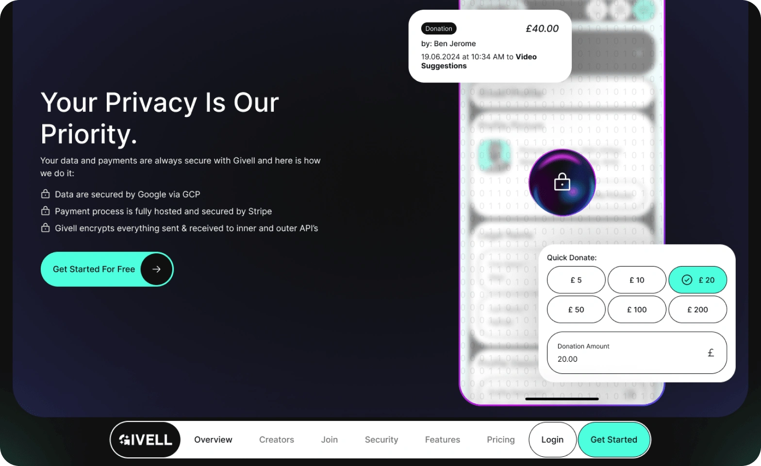
Developed Givell's branding, including colour schemes, logo, and brand fonts.
Created comprehensive design systems and platform designs.
Iteratively refined the landing page to enhance the click-through rate and improve the overall explanation of Givell's purpose. Notably, the initial version of the Givell website received an Honourable Mention at Awwwards.
Designed and recorded marketing content, with Klym handling video editing.
Deep Dive: Landing Page
Problem: Create a landing page that clearly explains Givell's innovative donation solution through tasks, while achieving a strong click-through rate (CTR) from marketing content.
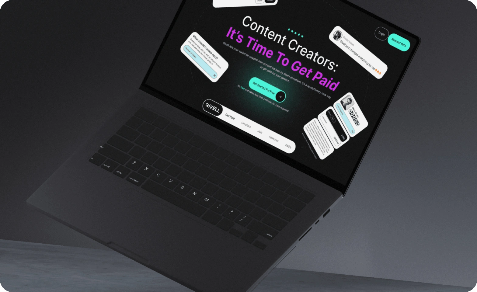
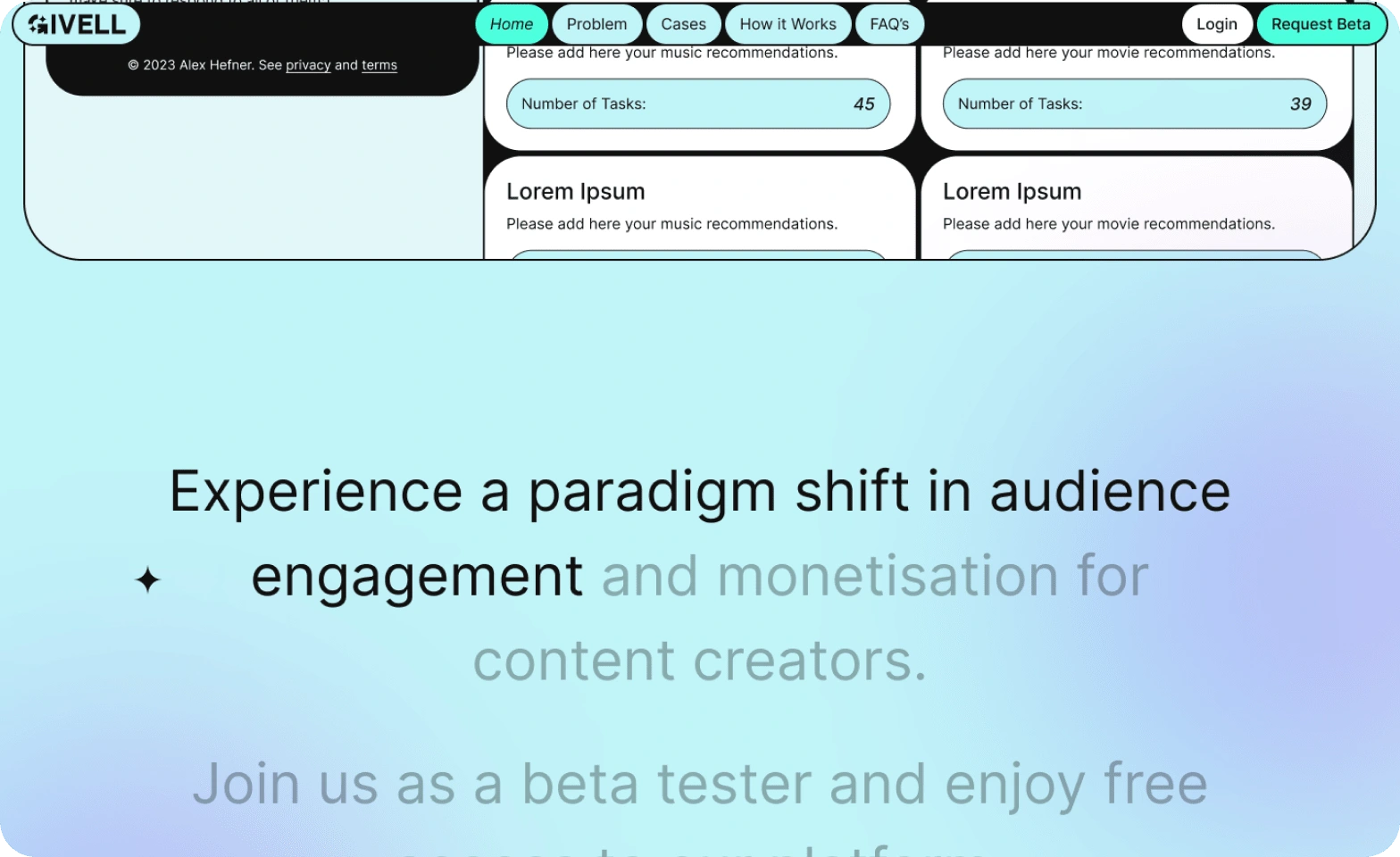
Iteration 1: Designed and developed a highly interactive website aimed at leaving a lasting impression on content creators through a non-conventional approach. The design featured descriptive and self-explanatory content, structured to provide ample breathing room for easier content consumption.
Result: The website received an Honourable Mention at Awwwards, significantly increasing traffic. However, the visitors were not the targeted audience. After several marketing campaigns and analysing data, heat maps, and user recordings on Clarity, as well as gathering feedback from willing users, we identified that the website felt "too much" and failed to clearly communicate the product's purpose.
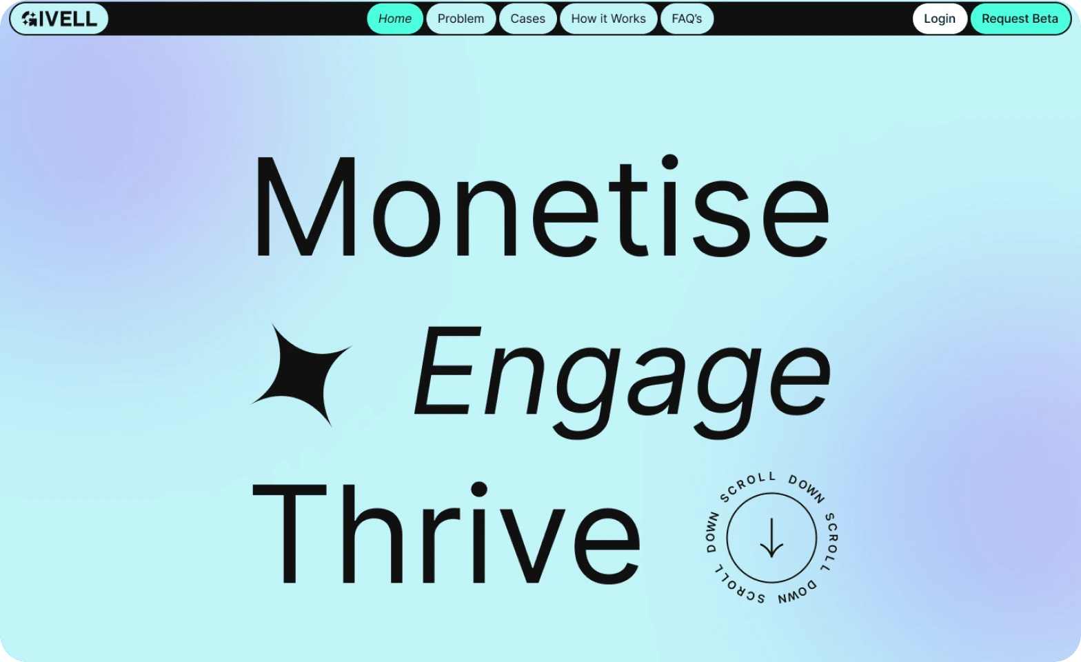
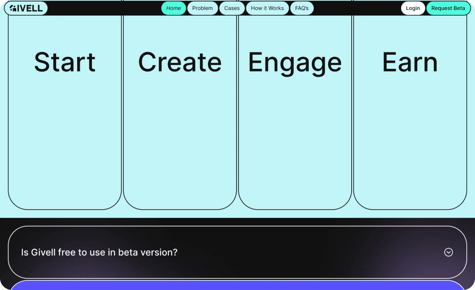
Iteration 2: Completely re-designed the website to adopt a more conventional layout for digital products, making it more familiar and intuitive for users. This redesign led to a significantly improved understanding of the product. Iteration 2 also included several revisions to the copy and layout sections.
Result: The website's conversion rate increased by 5%, resulting in a surge of new requests for beta access and significantly enhanced user feedback.
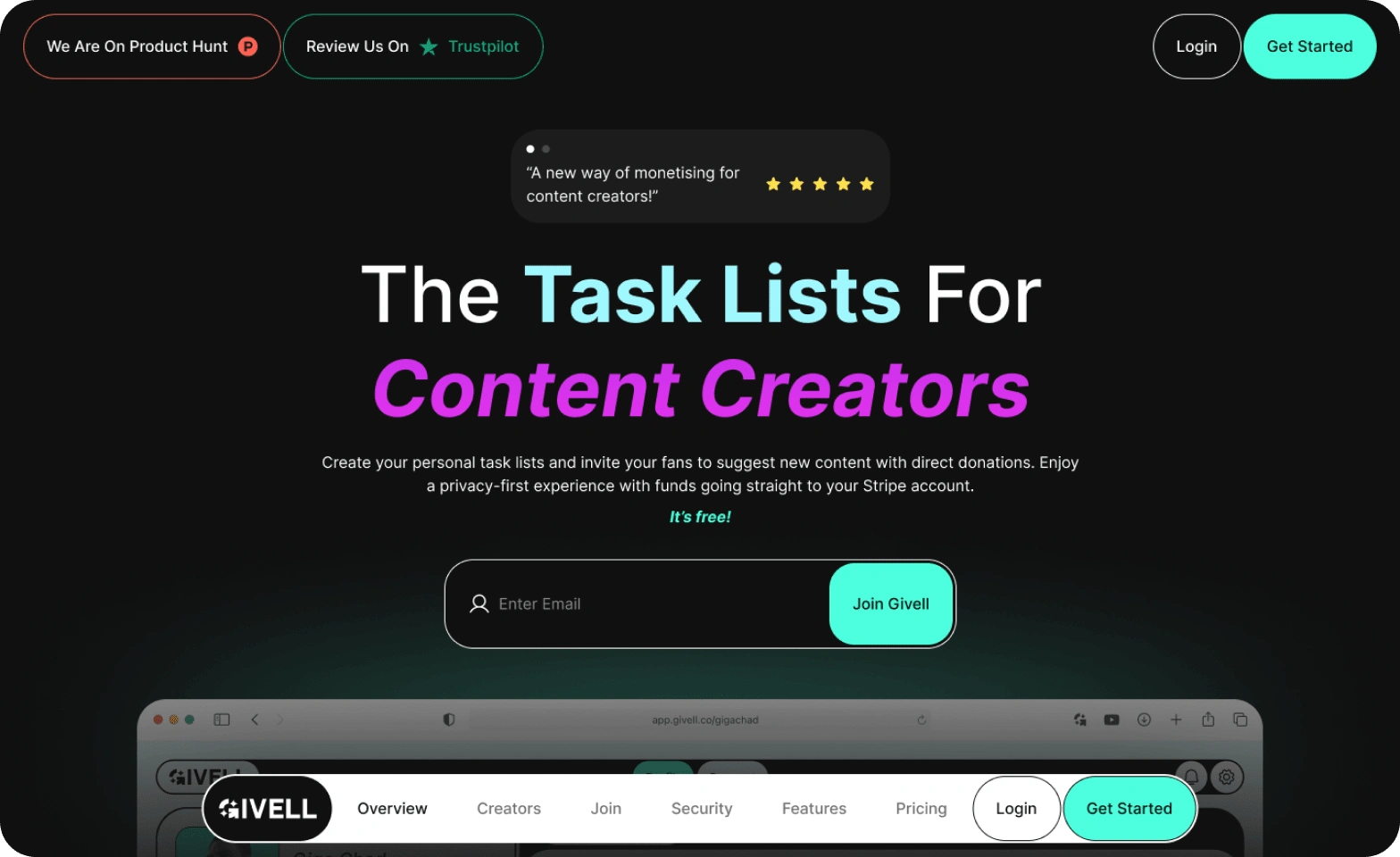
Deep Dive: Web App
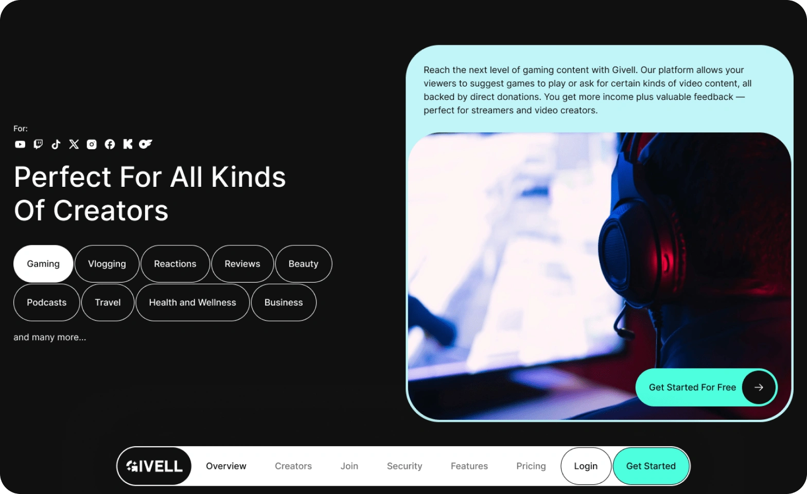
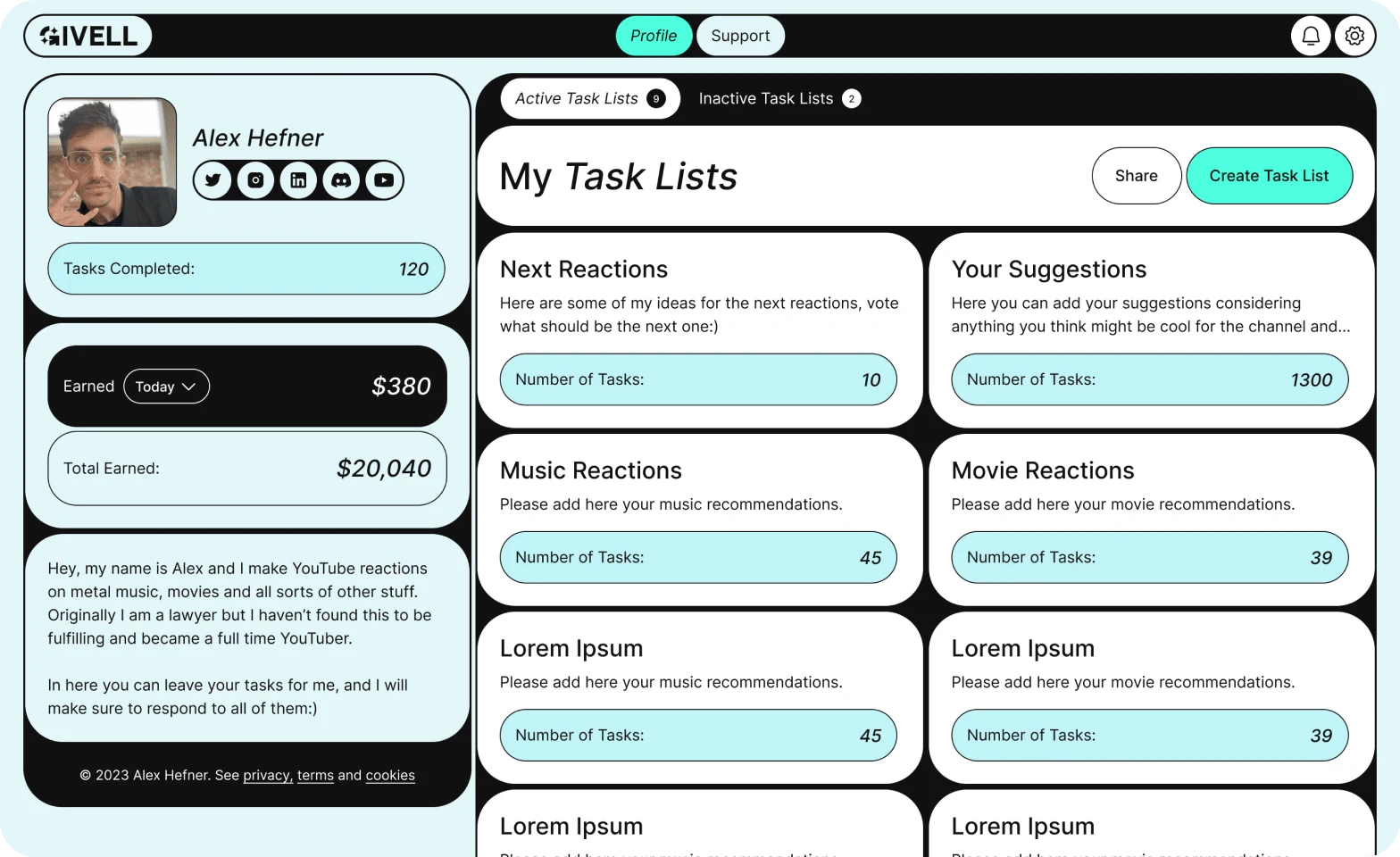
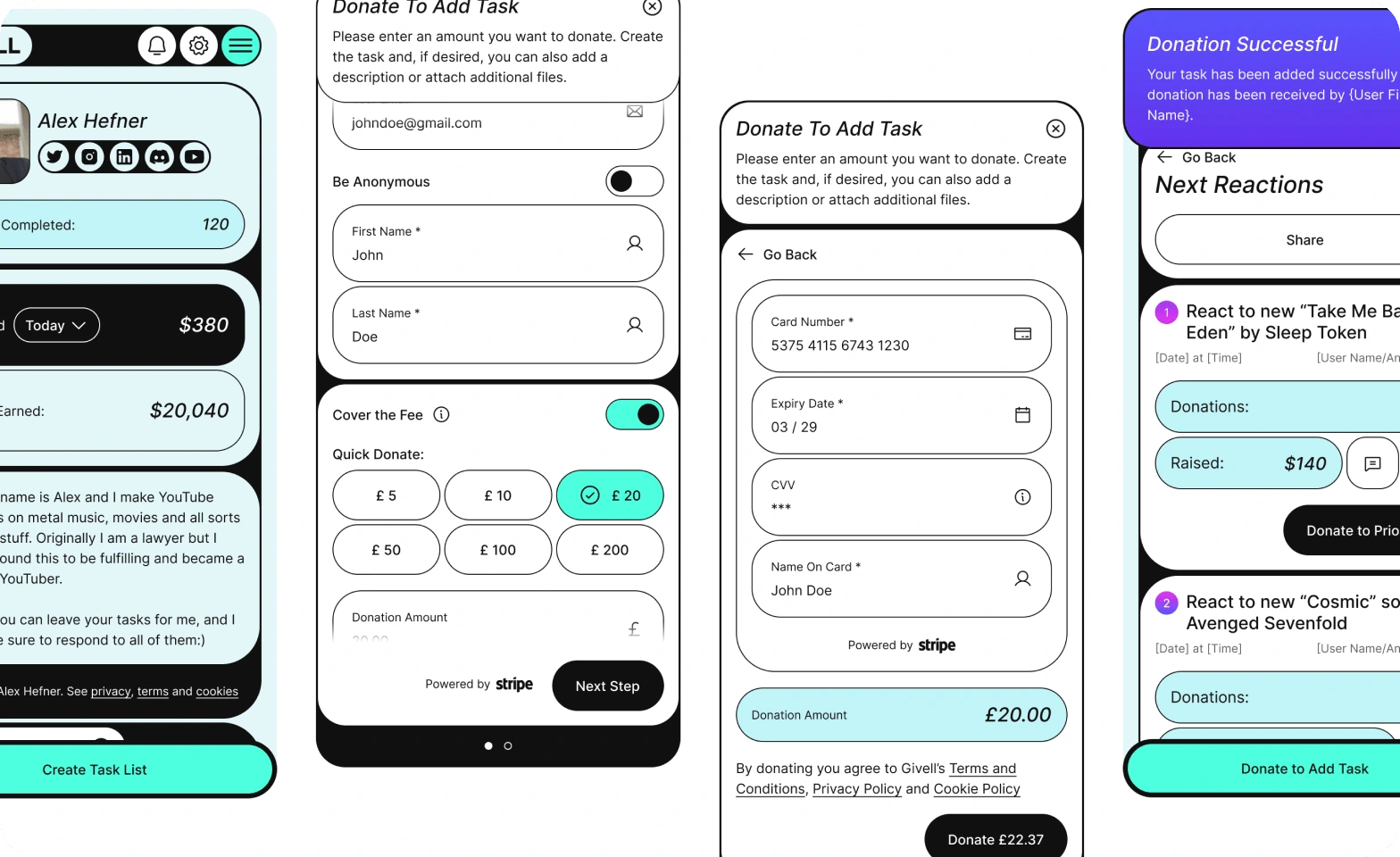
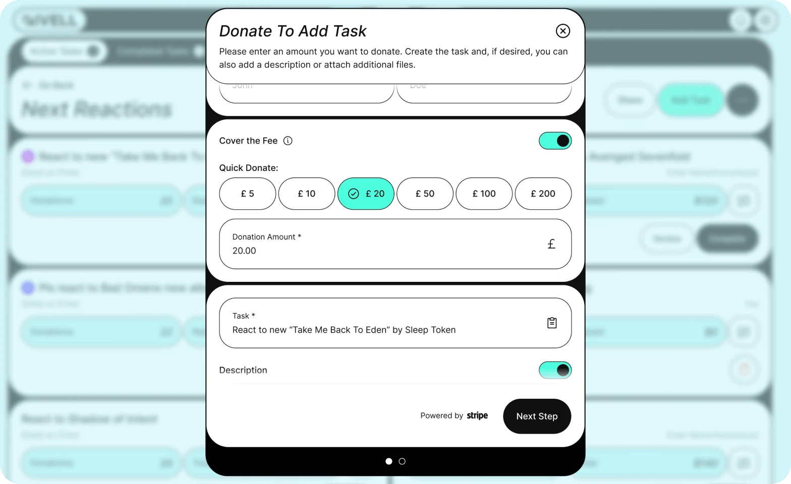
Problem: Design and develop a platform that is user-friendly for both content creators and their donors. The platform should feature an intuitive and highly optimised task creation flow for donations, SEO-optimised profiles, and easily scannable task lists for donors.
Solution Design:
UI Design: To expedite our market entry, we prioritised the UI stage, enabling us to quickly iterate on the platform based on user feedback. The initial design was thoughtfully crafted, drawing from our understanding of user needs and leveraging our prior experiences to inform our assumptions about potential problems and solutions.
The UI was designed with user-centric principles, emphasising clarity and ease of use. We focused on creating an intuitive layout that guided users seamlessly through the platform, ensuring that the interface was both visually appealing and functional. This approach allowed for a rapid feedback loop, enabling us to make informed adjustments that enhanced the user experience and engagement.
Final Implementation: Hired and worked closely with developers, conducting design QA at each platform section to create a pixel-perfect production website without bugs.
Learnings & Takeaways
Users are Central to Success: Users are the most critical component of any product. Without them, there is no product. Our experience as a failed startup taught us that building a product without engaging in conversations with users significantly increases the likelihood of failure.
Creative Design Doesn’t Guarantee Conversions: A visually appealing design does not automatically translate to higher conversions or click-through rates (CTR). Users often prioritise familiarity over novelty, making it essential to strike the right balance in design.
Initial Positive Feedback Isn’t Enough: Despite receiving no negative feedback from donors and creators on our initial design, the platform failed to gain traction. This highlights that positive responses do not always equate to user engagement or platform success.
Marketing Metrics Don’t Always Reflect Real Users: Effective marketing doesn’t guarantee a strong user base. We conducted multiple campaigns with excellent cost-per-click (CPC) metrics, attracting many visitors to our site, yet only a handful expressed interest in beta access—ultimately, just one user engaged with the platform.
Value Proposition vs. Switching Costs: The perceived value of our platform was insufficient compared to the effort required for users to switch from their existing solutions. This disparity led us to the decision to cease active development on the platform and maintain it instead.
Like this project
Posted Nov 13, 2024
Givell is a web application designed for content creators, enabling them to receive donations through task completion.