Anchor Recruitment Landing Page Design
Bamidale Ajibulu
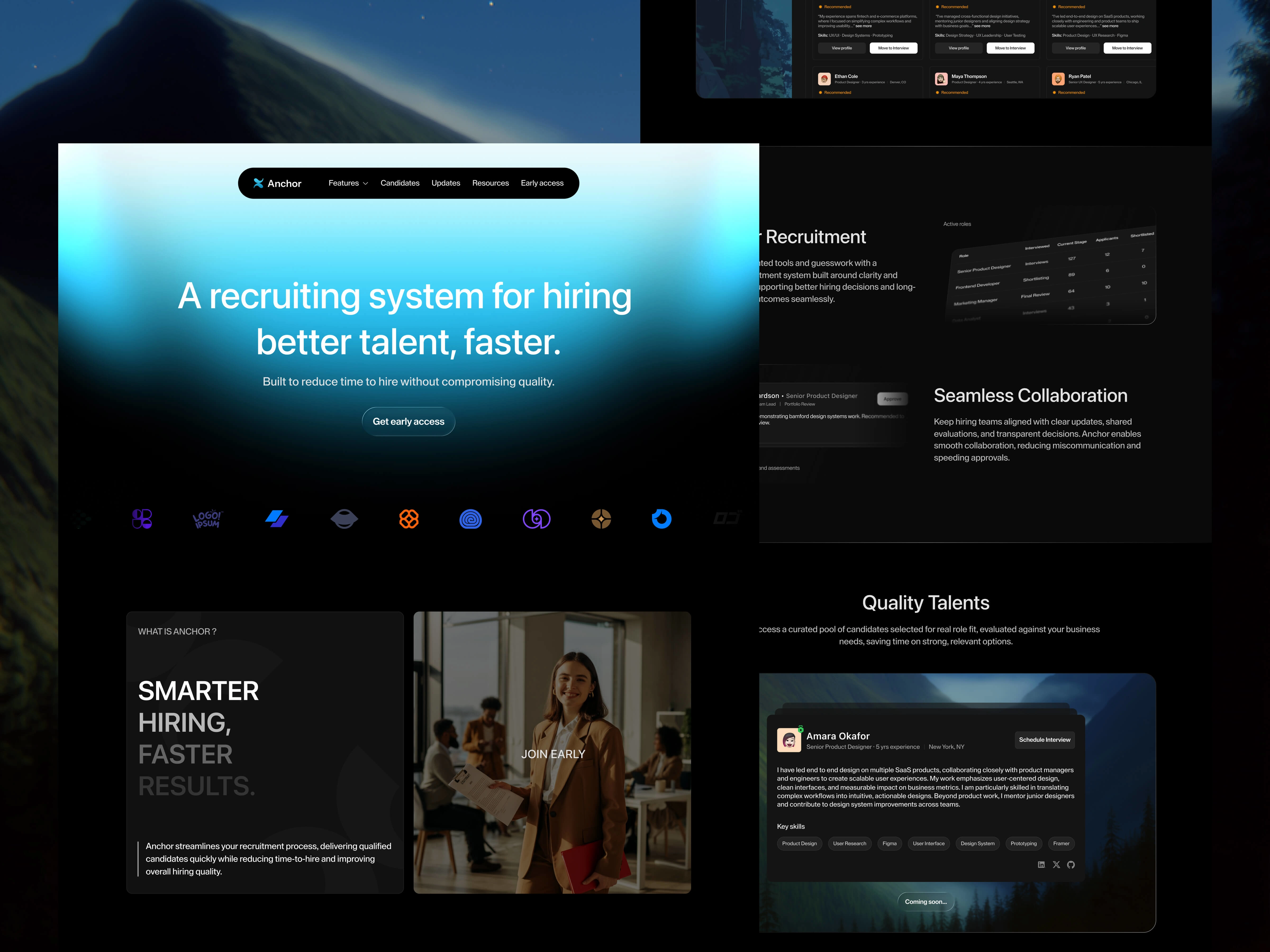
Anchor — Recruitment Landing Page
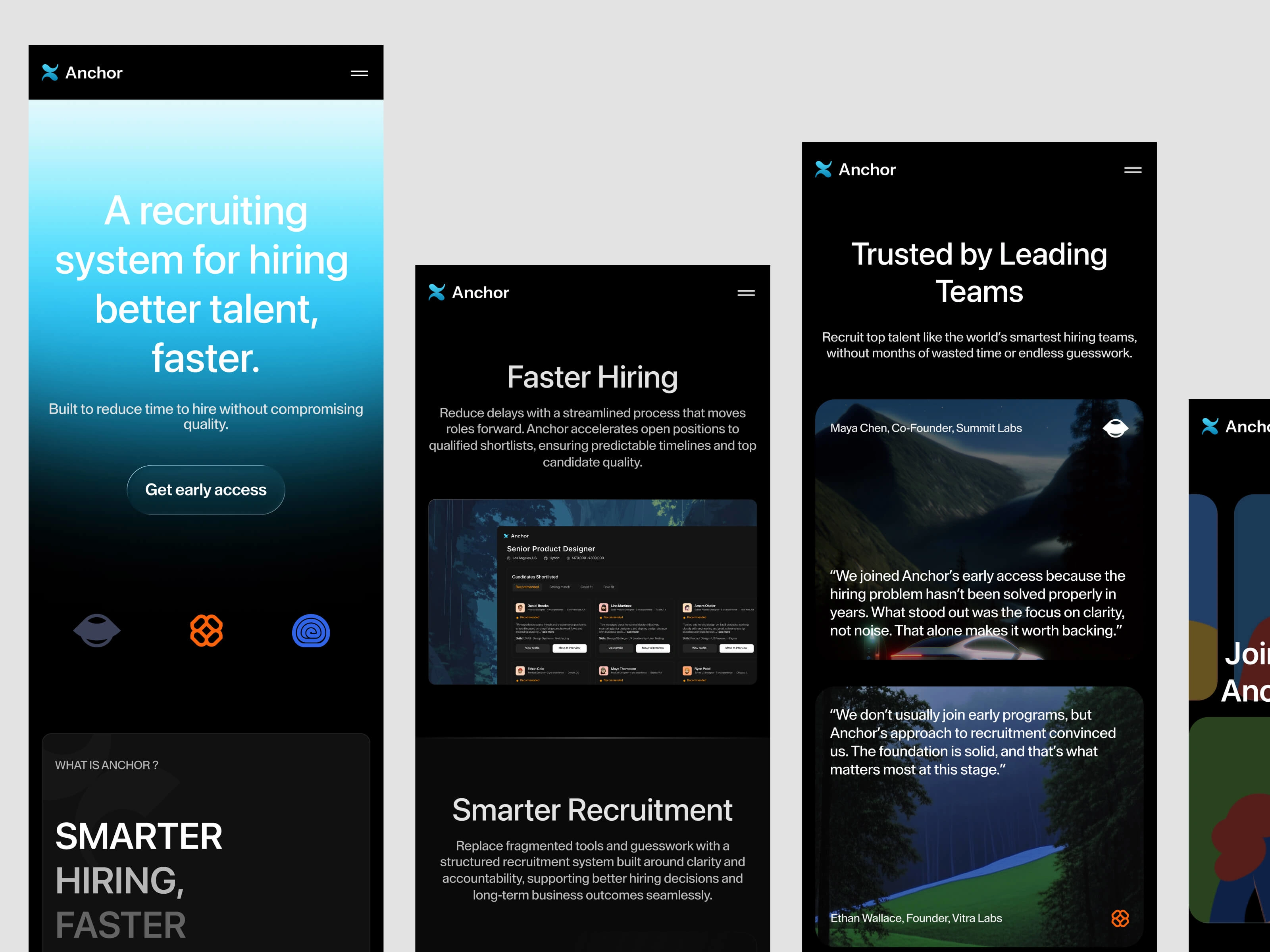
Anchor is a recruitment platform designed to connect talent and organizations with clarity and confidence. The goal of this project was to design a landing page that communicates value quickly, reduces hesitation, and guides two distinct audiences toward a clear next step without fragmenting the experience.
The Problem
Most recruitment landing pages either suck people into brand storytelling or dump a long list of open roles with no context. That disconnect creates hesitation: candidates don’t know what Anchor stands for, and employers don’t signal what makes working with Anchor different or worthwhile.
image
The landing page was designed to be fully responsive from the outset, with layout decisions made around content priority rather than breakpoint-specific rearrangements. Sections were structured to scale cleanly across screen sizes, ensuring key messages and calls to action remain clear on mobile, tablet, and desktop. The workflow moved from Figma to Framer to live production, allowing design decisions to be validated in a real, interactive environment. This reduced the gap between concept and implementation, ensured responsiveness behaved as intended, and enabled faster iteration based on real-world behavior rather than static mockups.
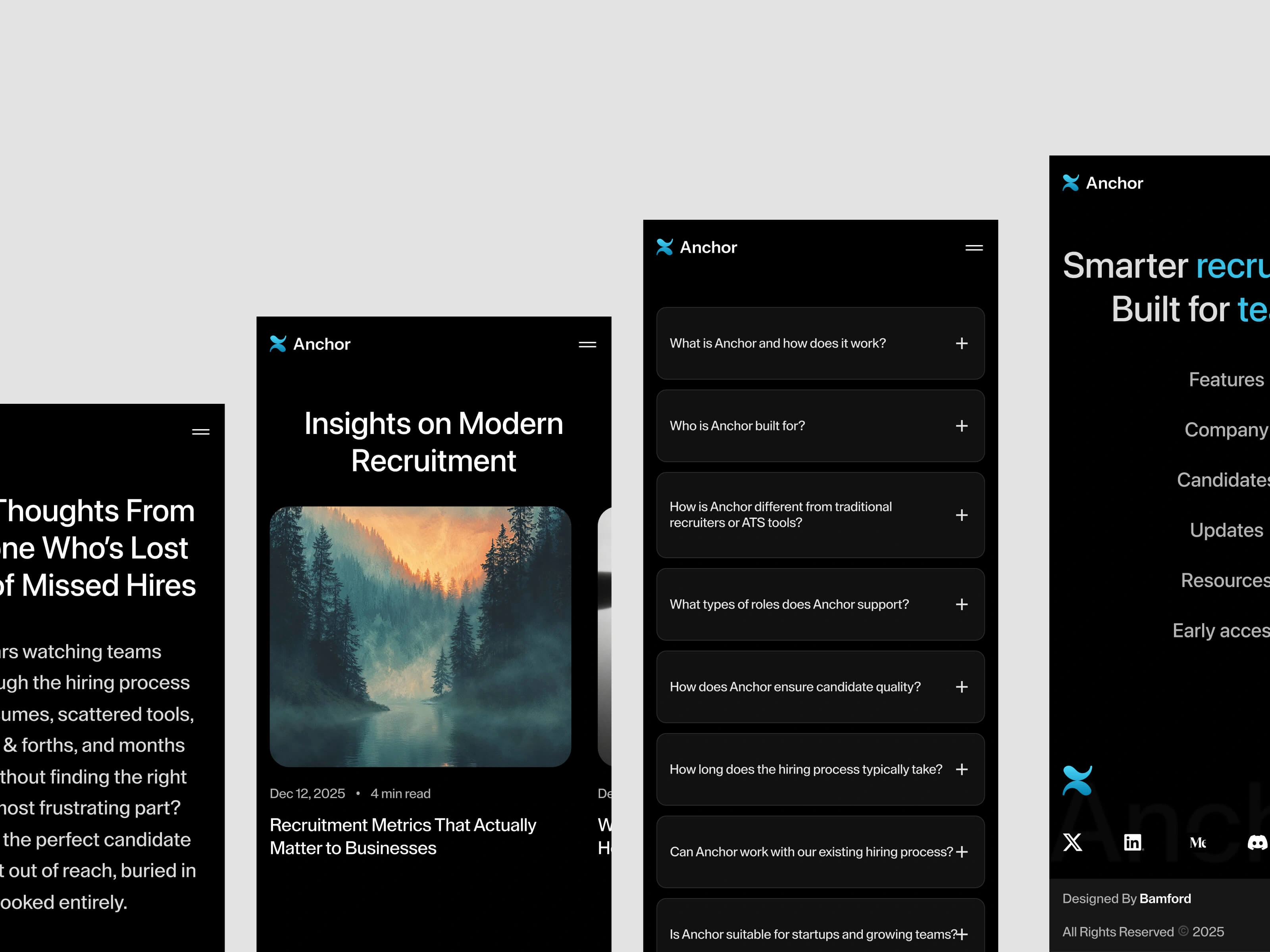
How Anchor works : breaking down the process into digestible steps, so both talent and recruiters can immediately see their path forward.
Primary value proposition : tied to outcomes (quality matches, streamlined process), not features.
Navigation was scoped to remove noise: a single primary CTA (Apply or Partner) kept eyes on mission instead of burying users in secondary links.
The layout reinforced progressive disclosure: basic context up front, deeper rationale as the user scrolls, and strong action cues at transition points. This pacing helps psychologically commit the user to conversion rather than abandonment.
My Role
UX Strategy | Information Architecture | Content Hierarchy | Product Design | Visual Direction
Outcome & Learnings
The final page is built on a single guiding idea: earn trust before asking for action. By simplifying choices and anchoring every section in user motivation, the experience feels purposeful rather than pitchy. This reinforced for me that in recruitment and human-centered products alike, clarity isn’t a visual choice, it's strategic framing.
Like this project
Posted Jan 3, 2026
Introducing a modern recruiting landing page concept, designed to reduce noise and build trust at first glance.