Finora - Finance Dashboard
Bamidale Ajibulu
Finora — Finance Dashboard & UIUX Design
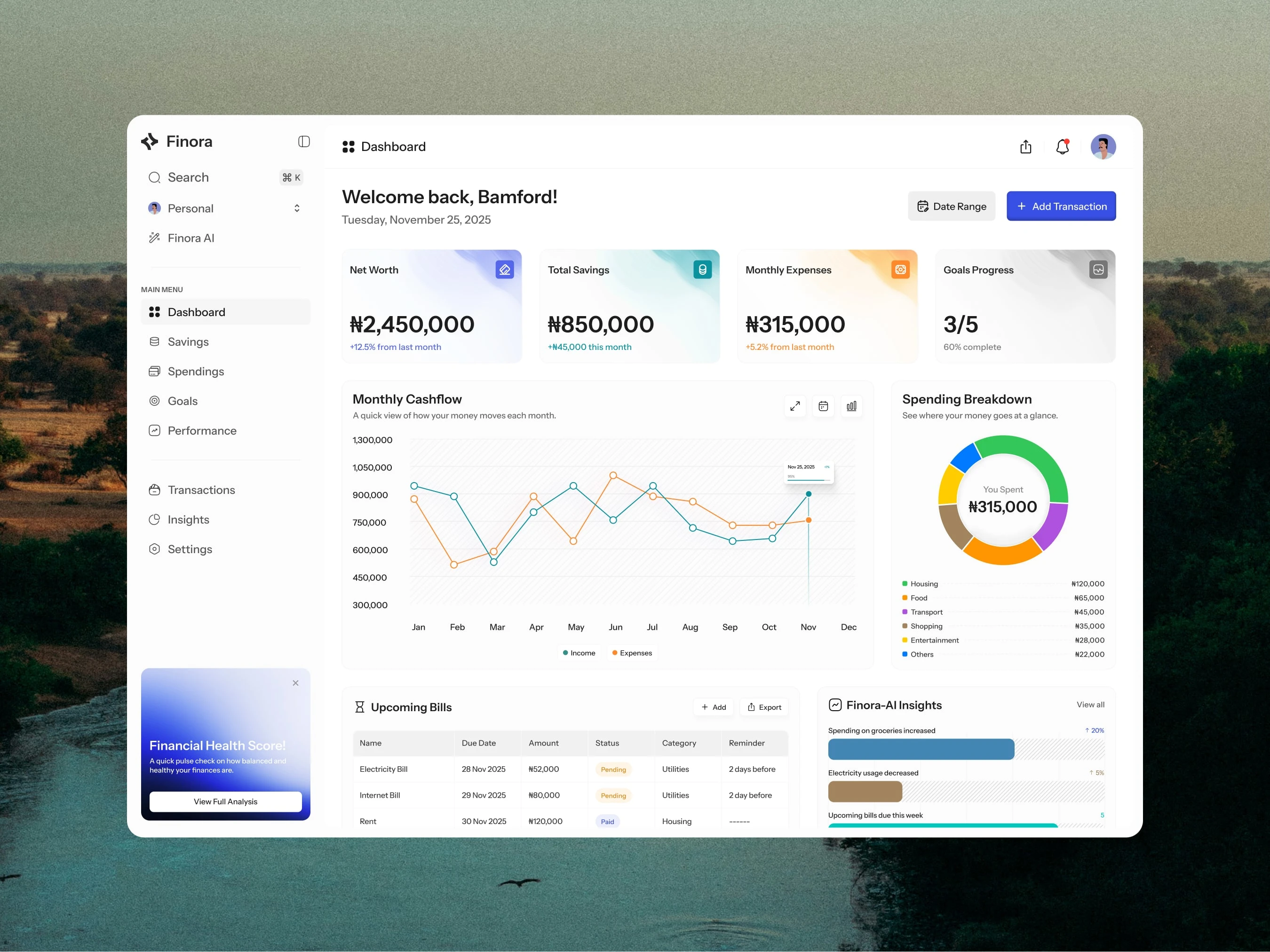
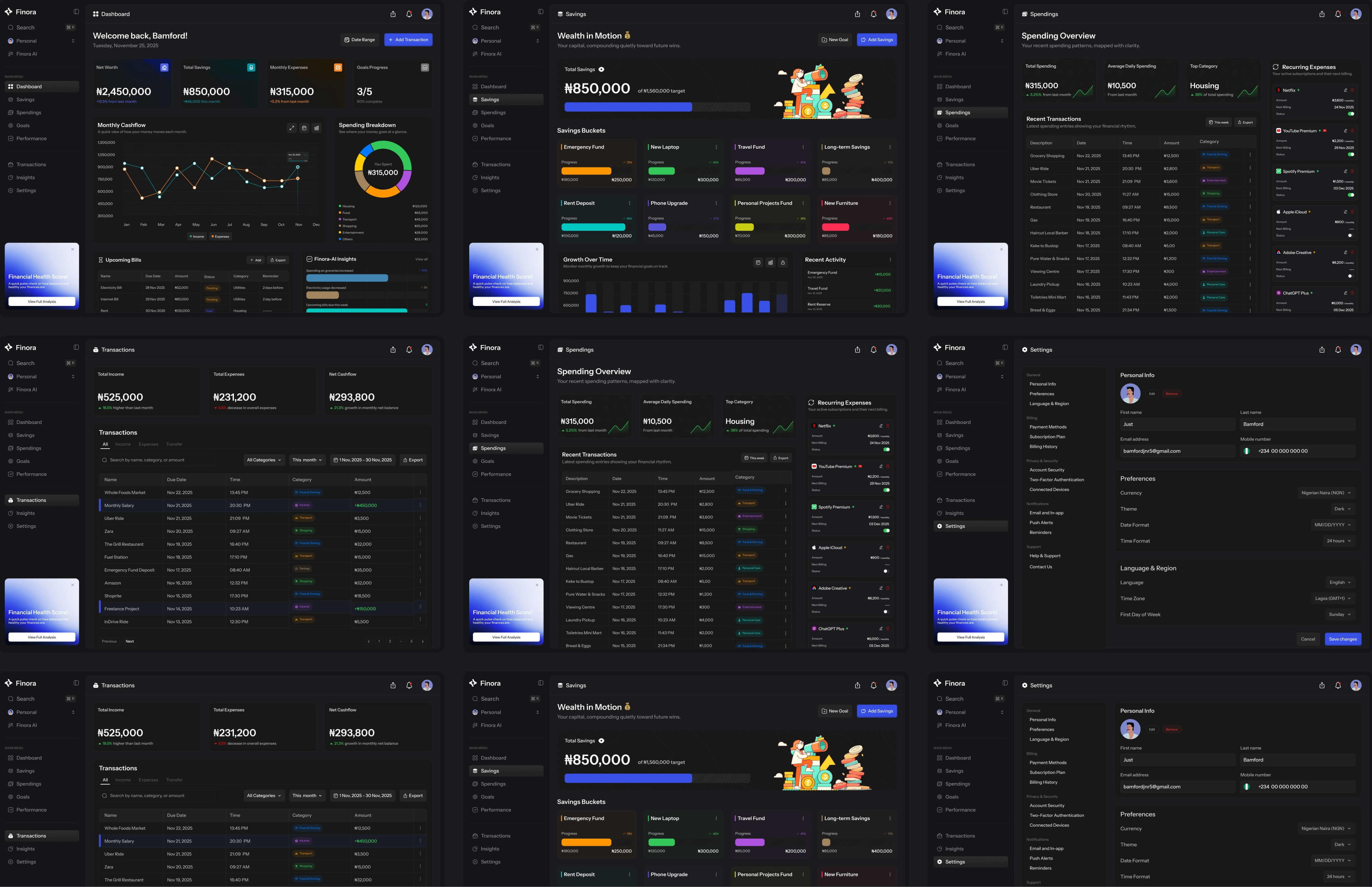
Finora is a personal finance dashboard built to help everyday users understand their money without financial jargon or decision paralysis. In many existing solutions, data density becomes a barrier: users first need to interpret, then decide. Finora flips that sequence users should be able to interpret through action.
The Problem
People want financial clarity, not raw data. Traditional dashboards dump numbers and charts without guiding the user toward meaning or action. This creates a paradox of choice: more information leads to less decisiveness. Many users disengage because they don’t trust what they see or don’t know where to start.
Strategic UX Decisions
Design for Intent Before Information. I structured information flow to answer three core questions in order:
Where am i now? (status)
What's chnaged? (trand)
What should i act on? (priority)
This framing allowed cognitive load to stay low while still surfacing key signals.
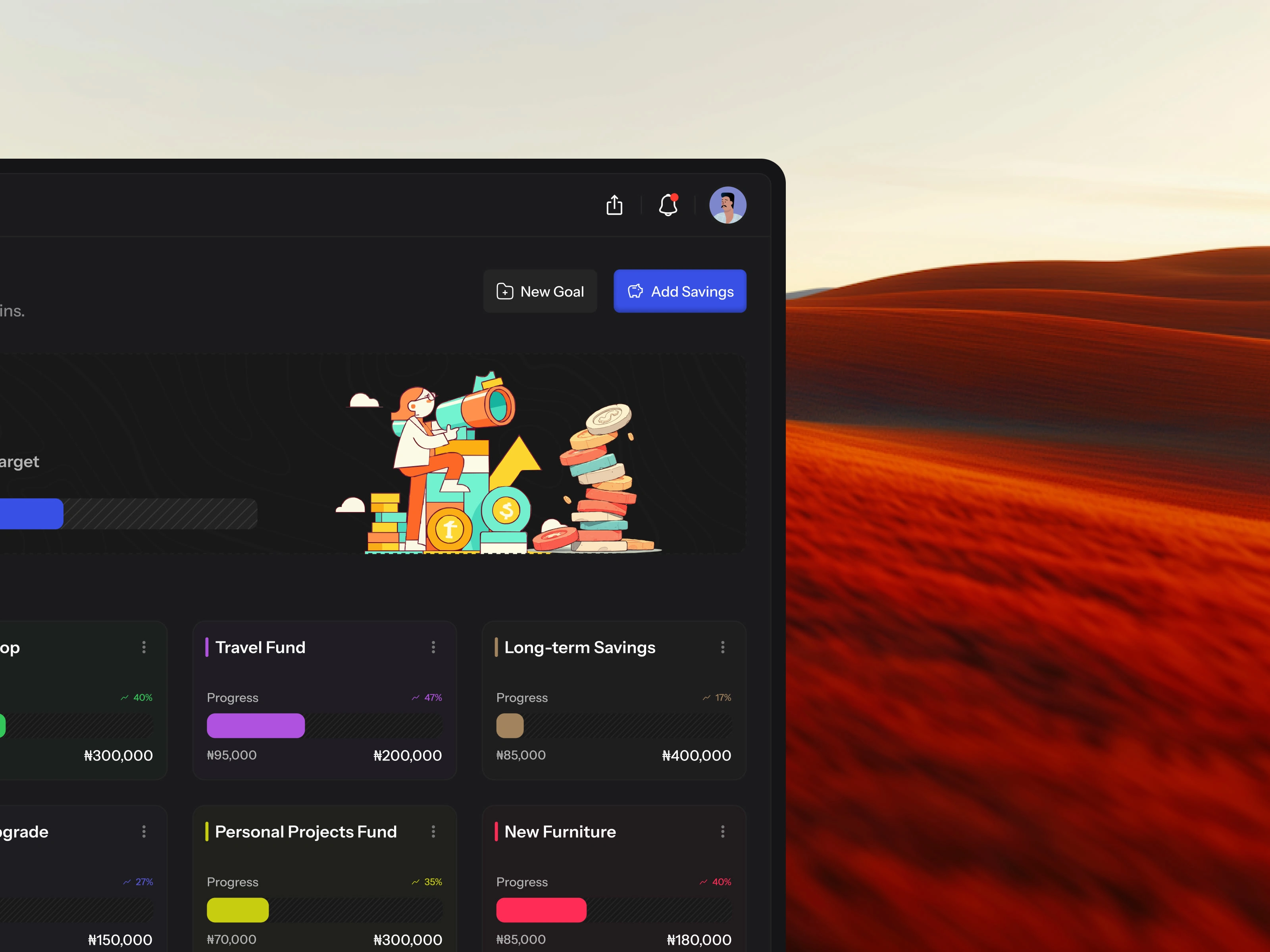
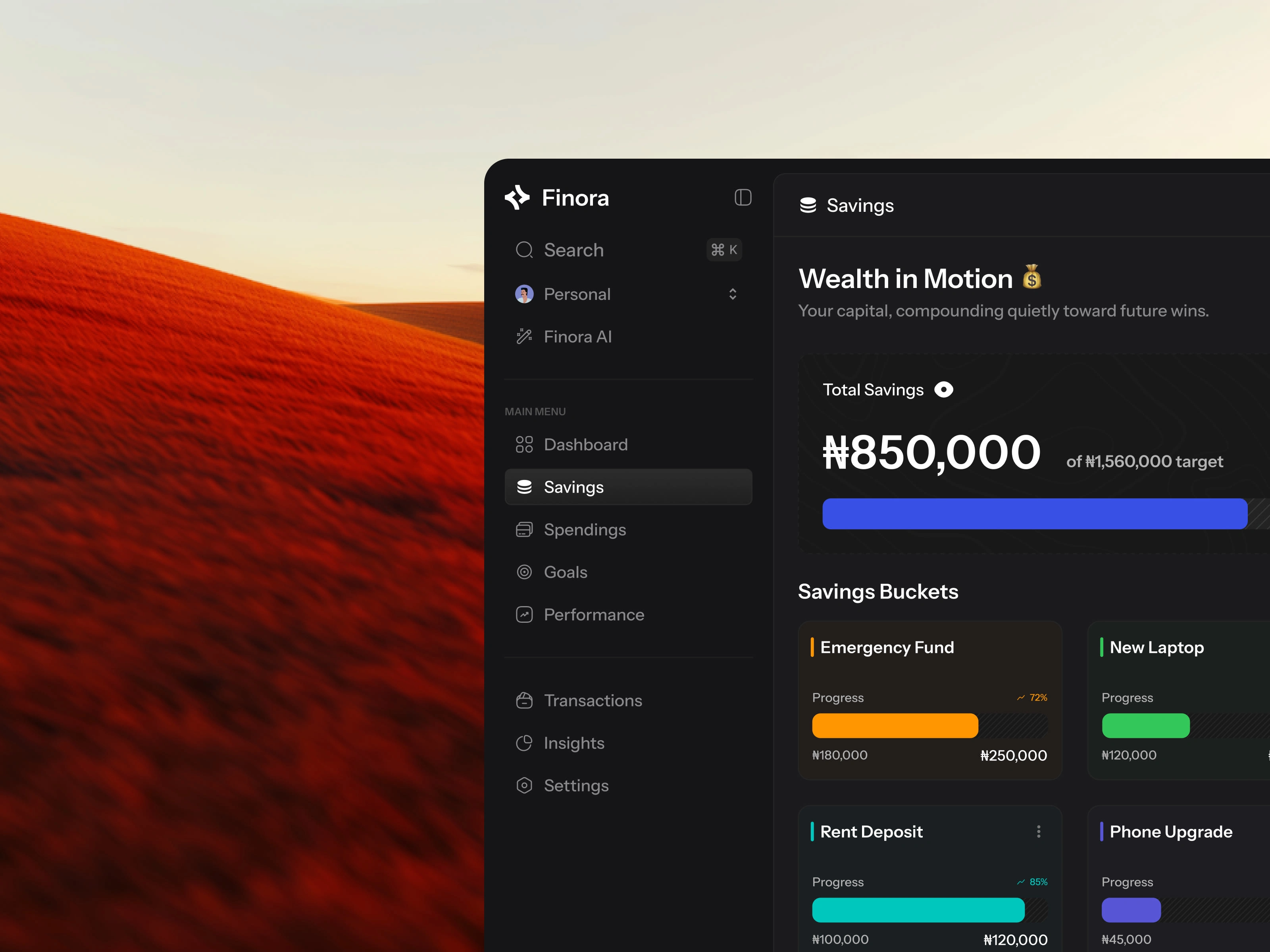
Hierarchy Without Hiding Depth
The dashboard foregrounds net worth, savings, expenses, and goals which address mental models users already hold. Secondary views like cashflow trends and spending breakdowns are presented with clear temporal context, using simple annotations rather than forcing users to decode numbers themselves.
Temporal Anchors for Pattern Recognition
Patterns matter more than isolated numbers. By showing month-to-month comparisons and highlighting recent deltas (e.g., “Expenses up 5.2% from last month”), users can see change rather than static figures. These signals help users build financial intuition over time.
Actionability Over Completeness
Upcoming bills, reminders, and AI-powered insights were positioned as gentle guidance. The goal wasn’t to automate decisions, but to support confidence. This distinction shaped how prompts and summaries were worded nudges rather than alerts.
Problems Solved
Reduced overwhelm by surfacing what matters first and hiding noise.
Improved comprehension by structuring data for human intuition instead of analyst interpretation.
Increased engagement through actionable insights and temporal context.
Built trust with pattern-based cues instead of abstract metrics.
Finora supports both light and dark modes to accommodate different usage contexts and reduce visual fatigue in a product meant for frequent check-ins. Light mode prioritizes clarity and readability for focused, daytime use, while dark mode is optimized for low-light environments and longer sessions. Both modes were designed intentionally rather than as simple inversions, ensuring hierarchy, contrast, and critical financial signals remain consistent to preserve trust and minimize cognitive friction when users switch contexts.
My Role
UX Strategy || Information Architecture || Product Thinking || Interaction Design || Visual Design
Outcome & Key Learnings
Finora moves beyond dashboards that show data: it teaches financial context. Users don’t just see their money they understand it. The biggest lesson was how restraint and sequencing in interface design can outperform complexity. A calm, thoughtful experience increases both comprehension and confidence.
Like this project
Posted Jan 3, 2026
Finora is a financial command center, an app designed to give users a clear, centralized view of their money.