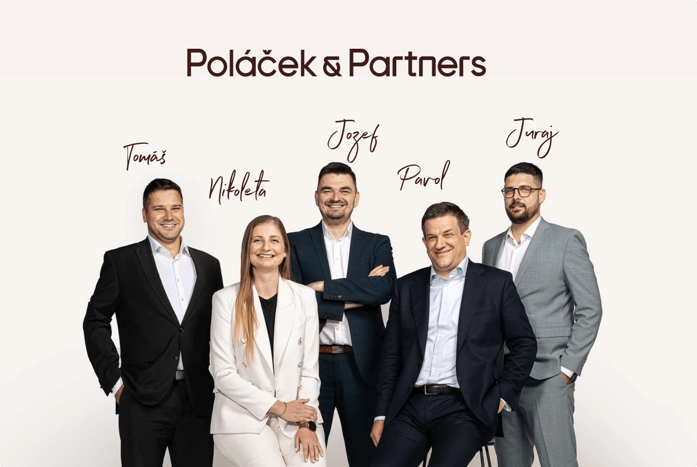
Poláček & Partners – Law Firm
Jakub Had
Visual Identity Redesign
& Web Design
Poláček & Partnerts cover image
Client
P&P is a renowned law firm based in Bratislava, Slovakia. They are well-known for their expertise and successful law cases, but most of all, they are known for their human approach. As they like to say, "We translate legalese into simple human language."
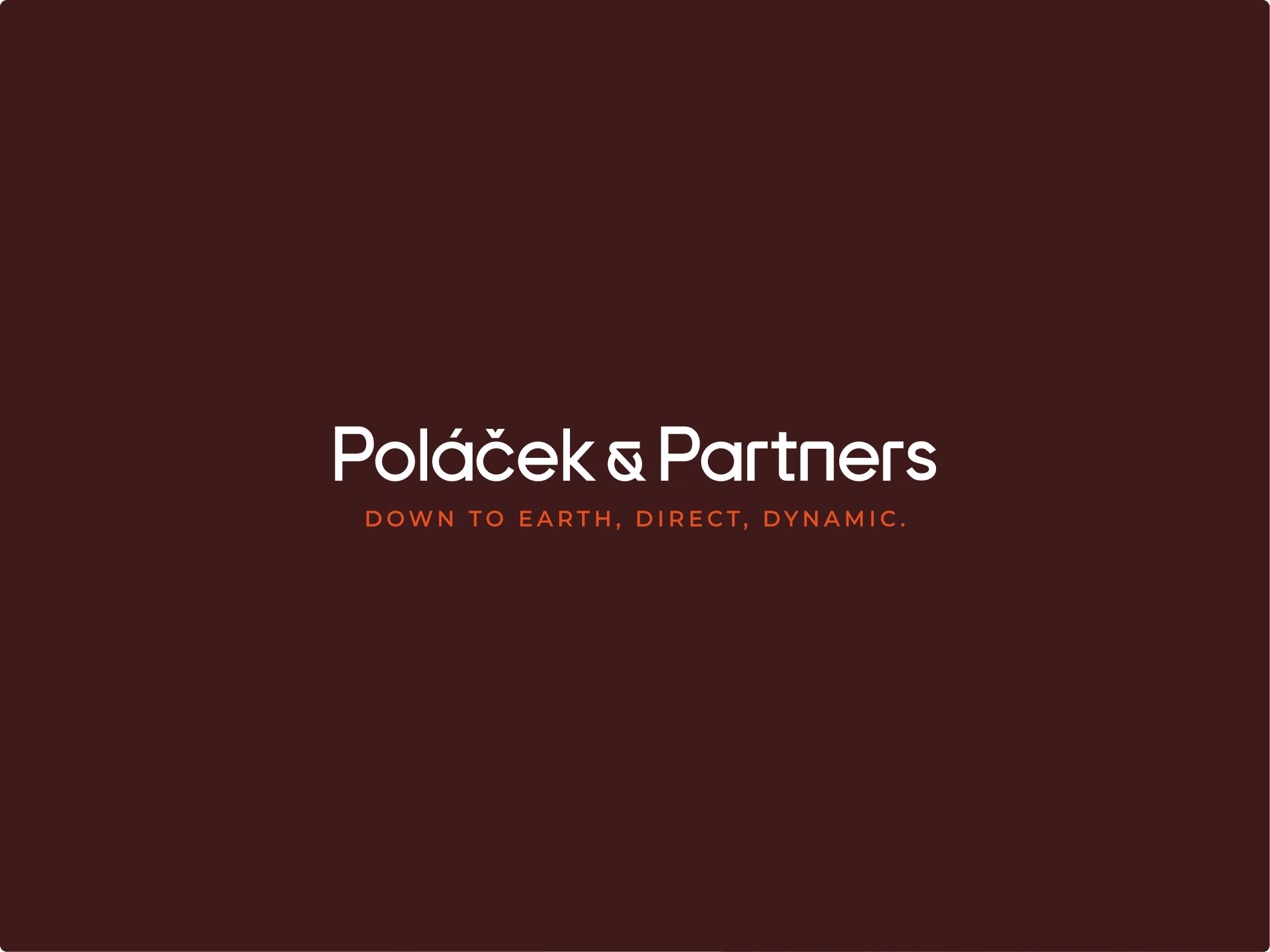
Main logotype
Problem
My team's task was to differentiate P&P from their otherwise monotone, serious and very formal competition, and communicate their unique characteristic "human approach" not only in written word but also visually.
Solution
We developed a distinctive visual identity and website that reinforced P&P's character and solidified its unique market position, setting it successfully apart from their competitors. Now customers could see their human approach in their visual communication instead of just hearing about it.
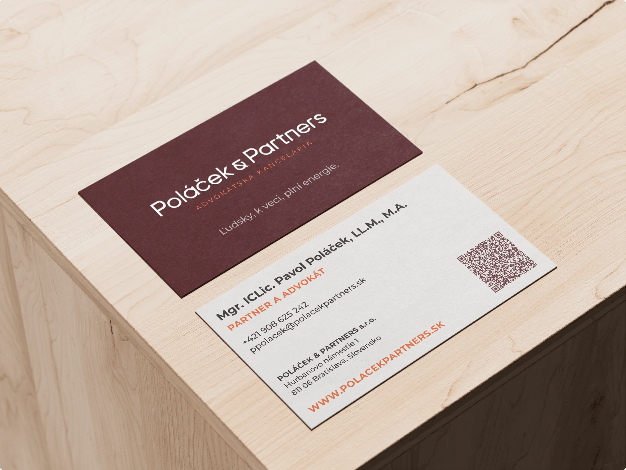
Business cards

Photography style
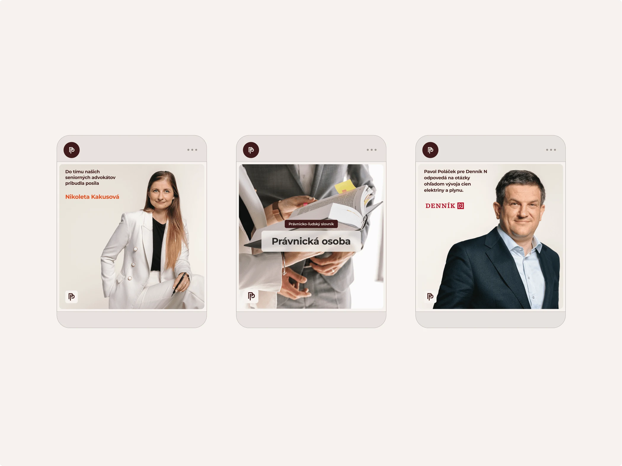
Layout for social media

Rollup design

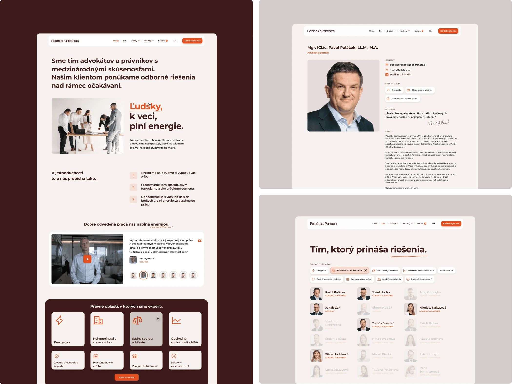
Webdesign layout
Homepage design

Pin of symbol P&P
Like this project
Posted Apr 10, 2025
Complete Rebrand and New Website for One of the Most Prestigious Law Firms in Central Europe
Likes
0
Views
10
Timeline
Feb 1, 2024 - Dec 1, 2024