Mental Health Cooperative – A Cohesive Brand System
Ken Uzoma
Mental Health Cooperative (MHC) Brand Identity
Mental Health Cooperative (MHC) is a nonprofit serving more than 40,000 Tennesseans annually with community-based mental health services. Their mission is simple but profound: to meet people where they are and walk with them on their mental health journey.
The MHC brand identity was built to visually express the organization’s mission of dignity, accessibility, and person-centered care. My goal was to create a system that felt human, approachable, and compassionate—a reflection of how MHC meets people where they are and walks with them through their mental health journey.
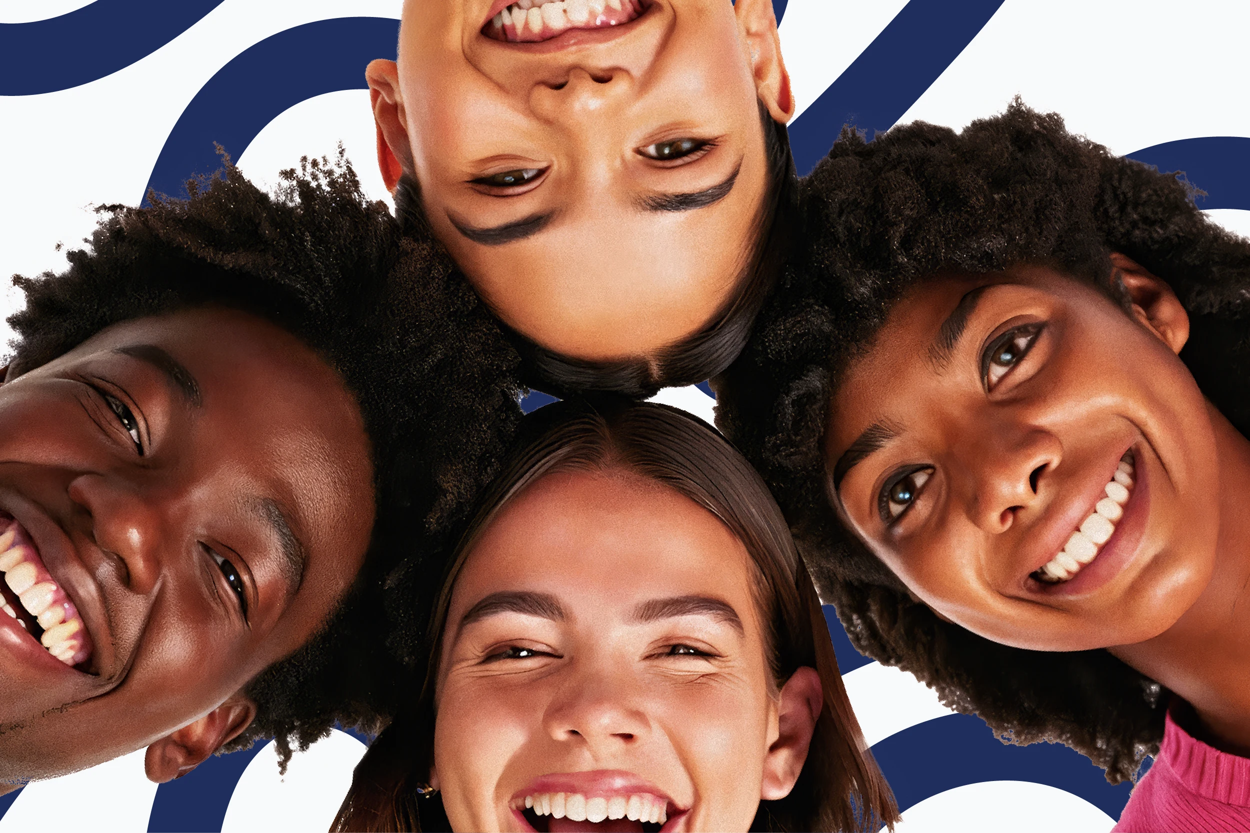
diverse photo of young adults
Logo Exploration
The project began with exploration of logo concepts, where I developed multiple directions to visually express MHC’s values.
Designs incorporating people, hands, care and pathways to symbolize compassion and growth.
Wordmark explorations where the “MHC” integrated subtle symbols like hands, smiles, or pathways.
By showing a range of refined drafts, I worked with the client to narrow in on a direction that is easy to read and felt both trustworthy and human.
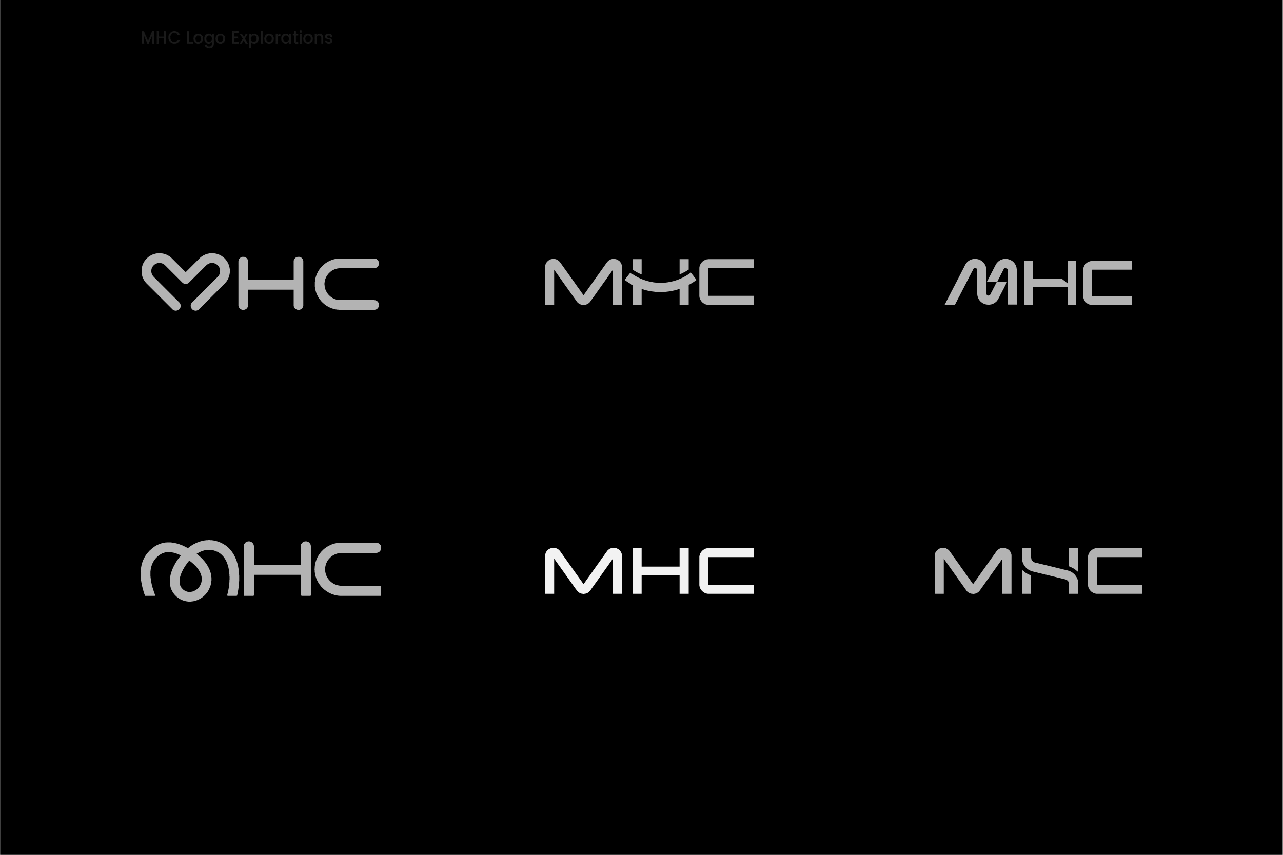
Exploring different ways to express MHC’s mission, connection, care, and community. From hearts and pathways to human figures, these early concepts helped refine the final logo
Final Logo
A logo that feel clear and accessible, mirroring the way MHC communicates with the communities it serves.
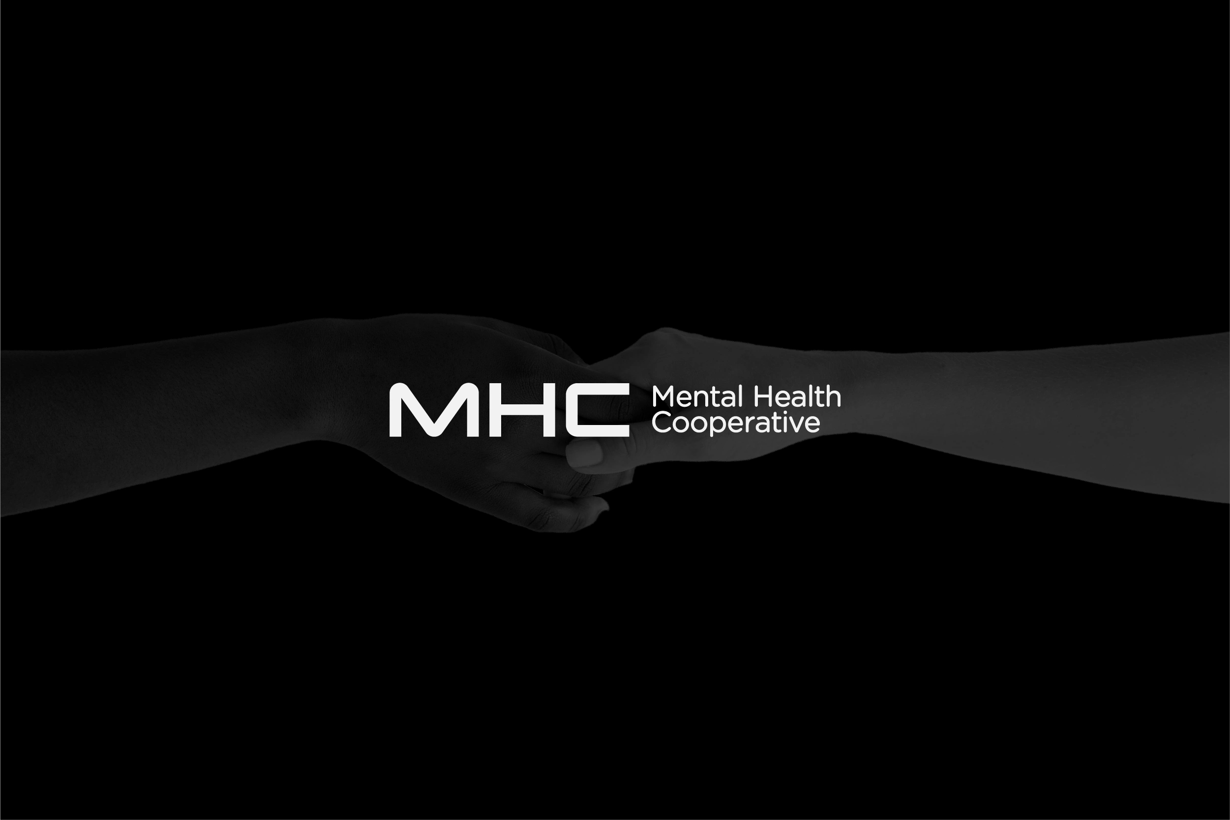
approved logo

MHC Lettermark
MHC logotype
Color Palette
The color palette was provided by the client, designed to communicate calmness, trust, and inclusivity. My role was to ensure the colors were applied consistently across all assets, balancing contrast and accessibility for both digital and print applications.
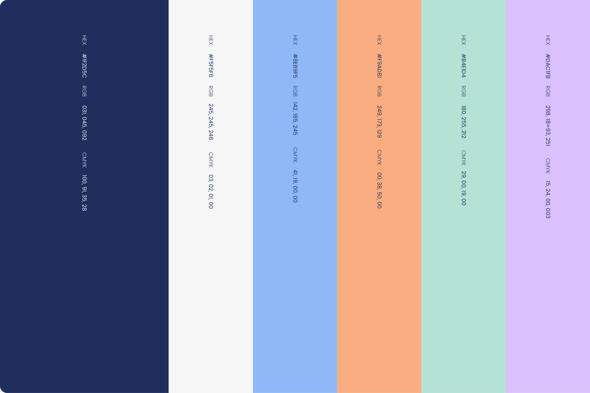
The chosen palette inspire trust and stability
Typography
I selected Poppins as the primary typeface, with clean, rounded forms that feel accessible and modern. Its readability makes it perfect for both digital and print applications. It reinforces the idea that MHC’s communication should always feel open and easy to engage with.
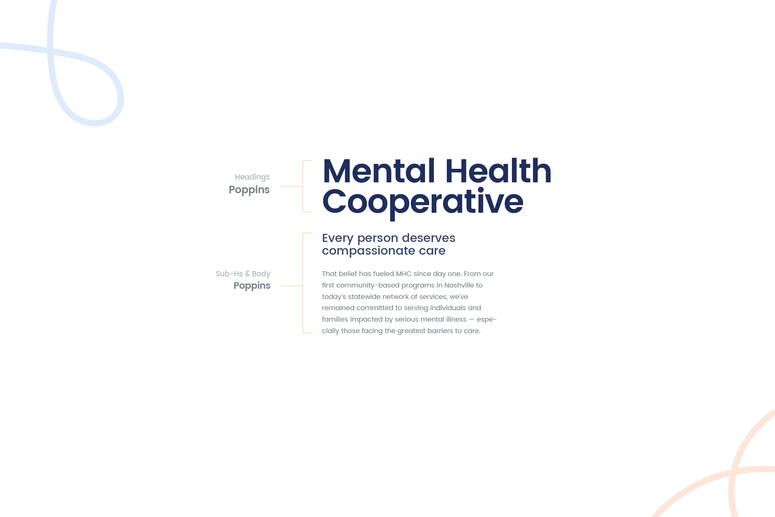
Poppins was chosen for its clean, rounded forms and modern readability, making MHC’s communication approachable and clear
Patterns
The brand patterns were inspired by two ideas central to MHC’s mission:
Care: Represented through soft, organic shapes that convey empathy and calm.
Connection: Expressed through interwoven lines that symbolize the network of support MHC provides within the community.
These patterns serve as a flexible design element—used to enrich layouts, add depth, and bring a sense of cohesion across materials without overpowering content.

brand patterns were inspired by two ideas central to MHC’s mission
Imagery
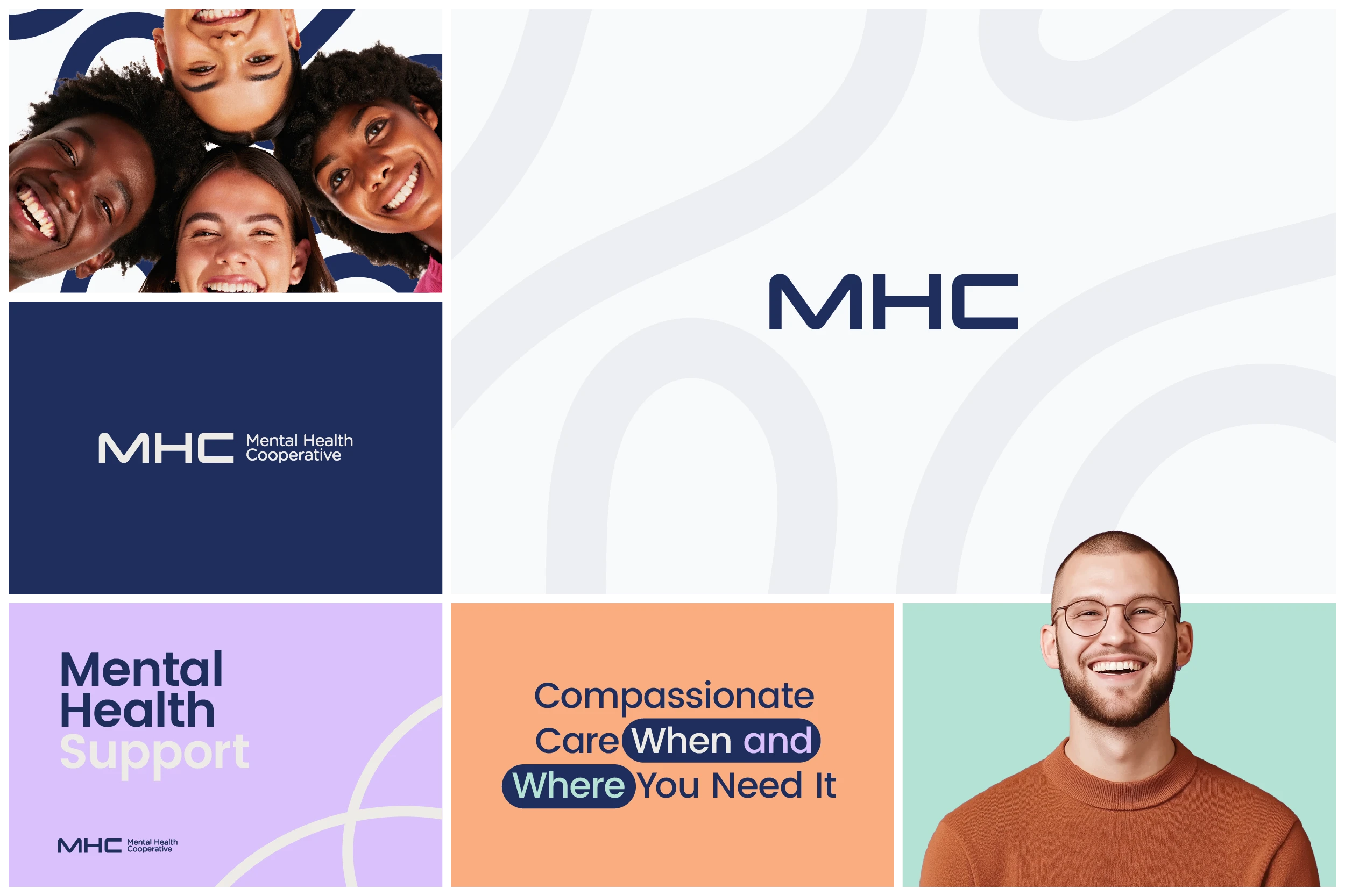
A critical element of this identity was representation. I curated photos of people across diverse races, ages, and abilities, including children, adults, parents, seniors, and people with disabilities. Smiling, candid imagery was chosen deliberately to reflect the positive outcomes of working with MHC and to combat the stigma of mental health visuals that often feel clinical or isolating.
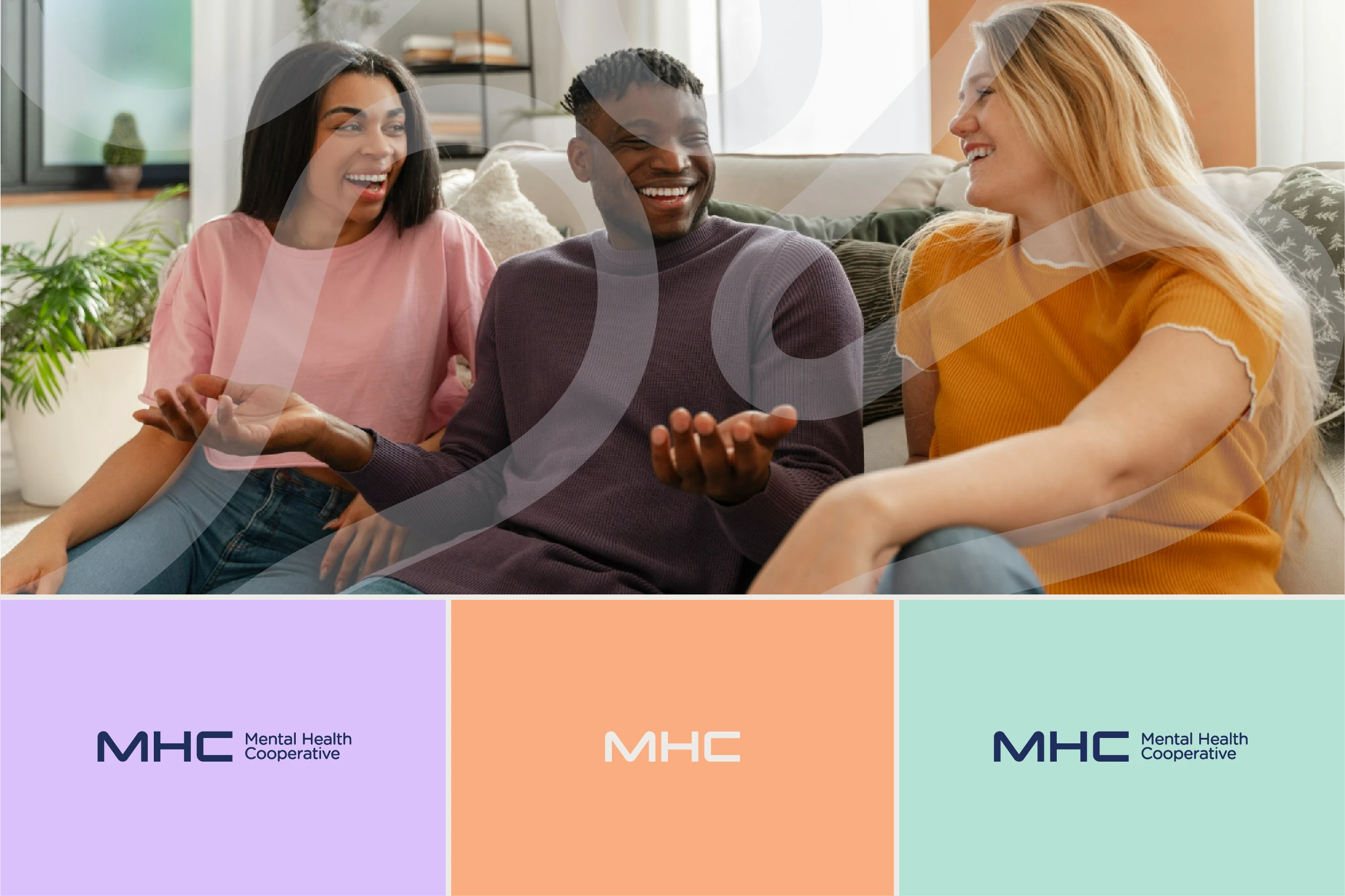
Curated authentic, diverse photos of children, adults, parents, seniors, and people with disabilities, always smiling, to reflect positive outcomes and dignity.
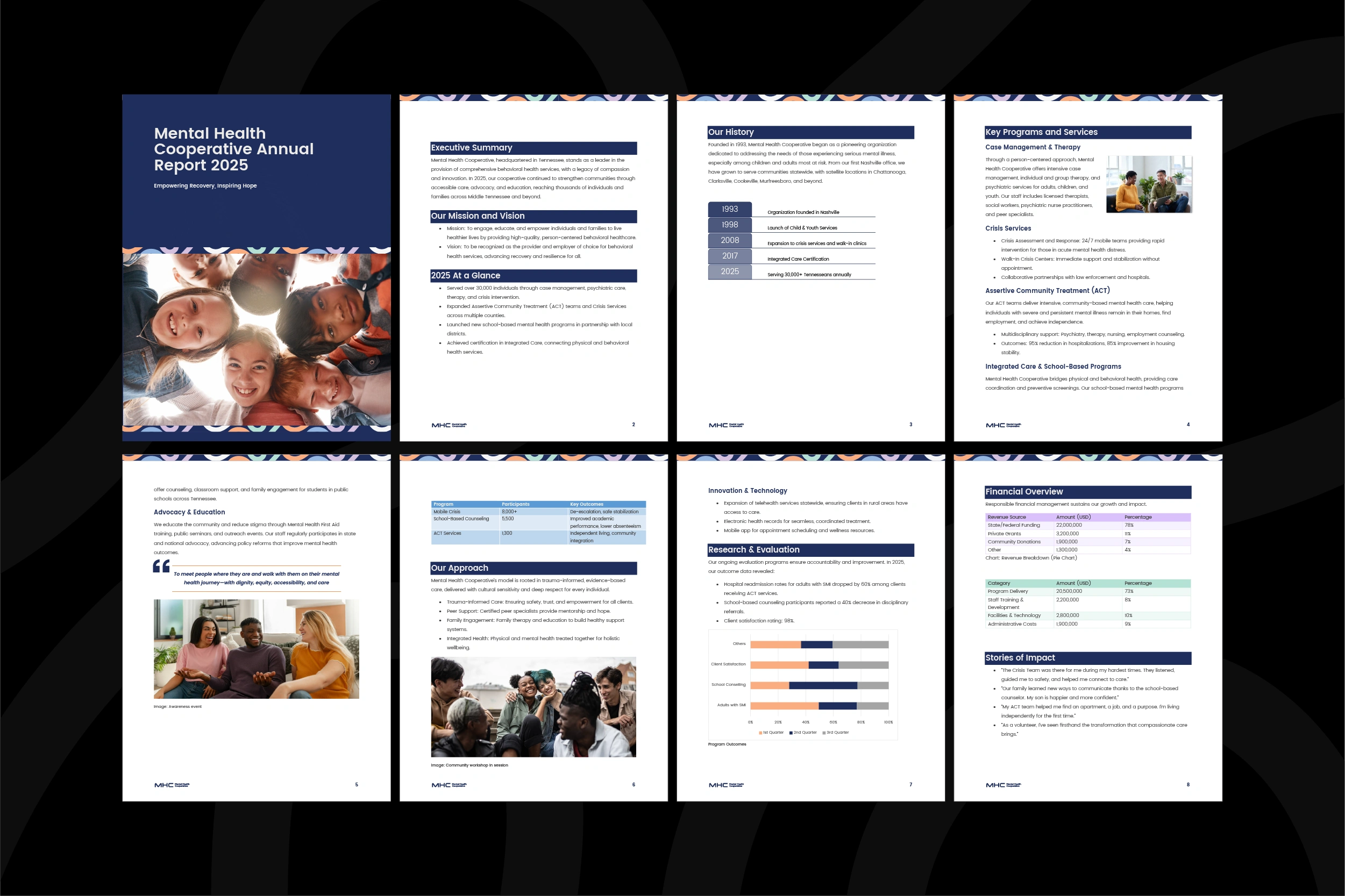
Brand Presentation
A branded presentation showcasing the full identity system—logo, color palette, patterns, and curated imagery. Designed to demonstrate how each element works together to create a consistent, human, and hopeful visual language for MHC.
brand application
The presentation walked through the logo explorations that shaped the final mark, the carefully chosen color palette designed to balance calmness with optimism, the patterns inspired by connection and community, and the curated imagery representing diverse, smiling individuals across all walks of life.
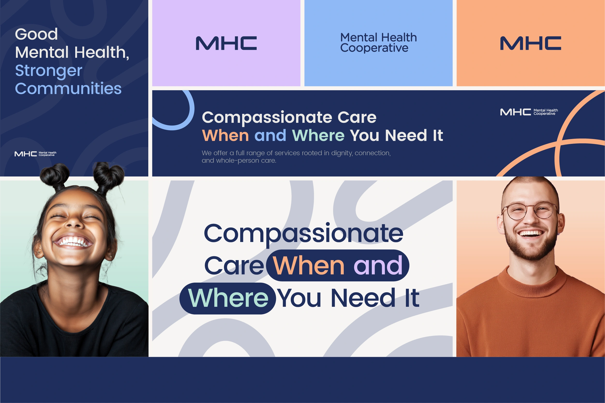
brand application
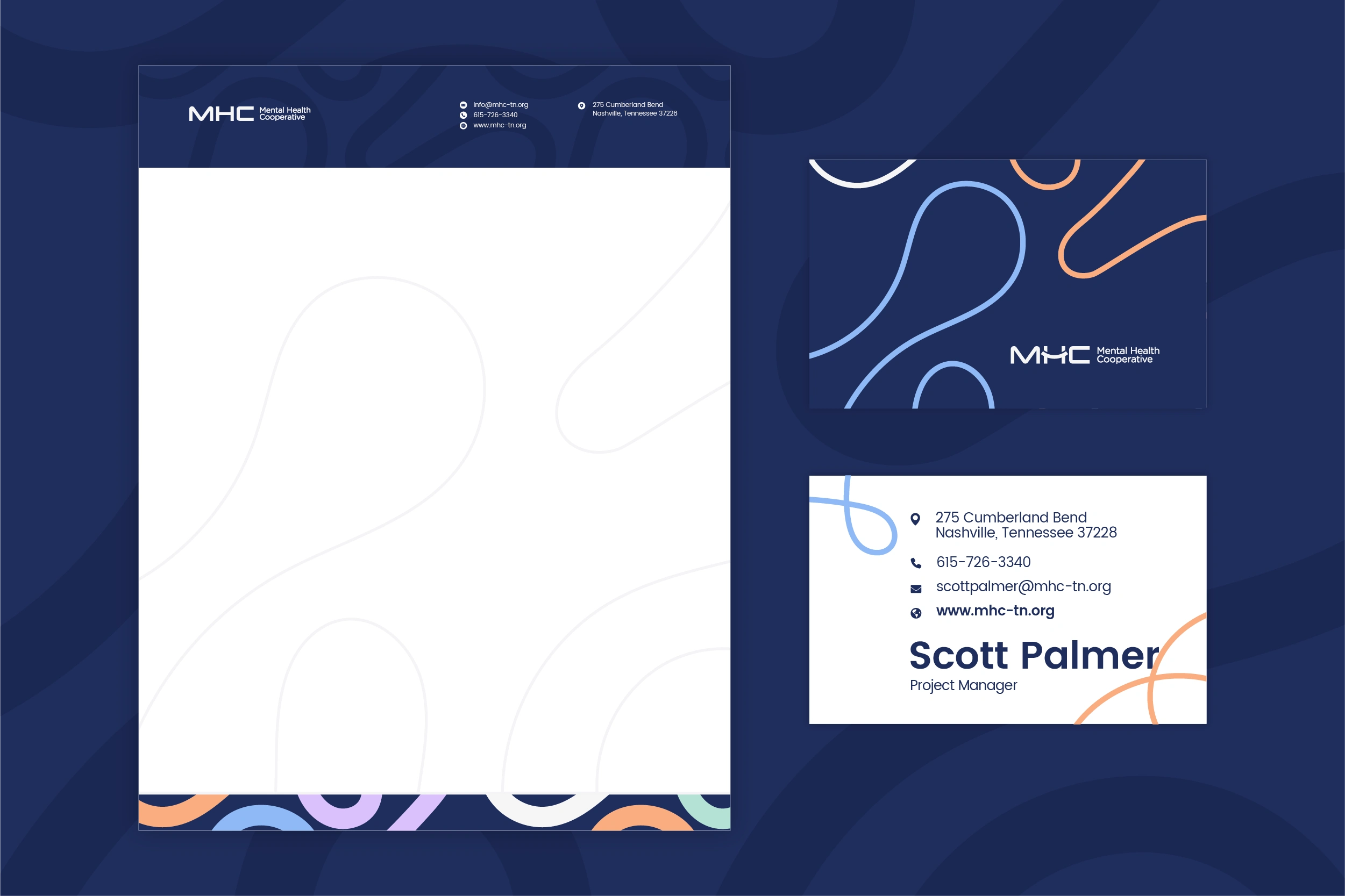
Business Card & Stationery
I designed a full stationery system, including business cards and letterhead, that brings MHC’s identity into everyday communication.
brand stationery, making it easy for the team to maintain professionalism and consistency in day-to-day communication.
The business card layout is minimal yet approachable, ensuring important details stand out while reflecting MHC’s accessible personality.
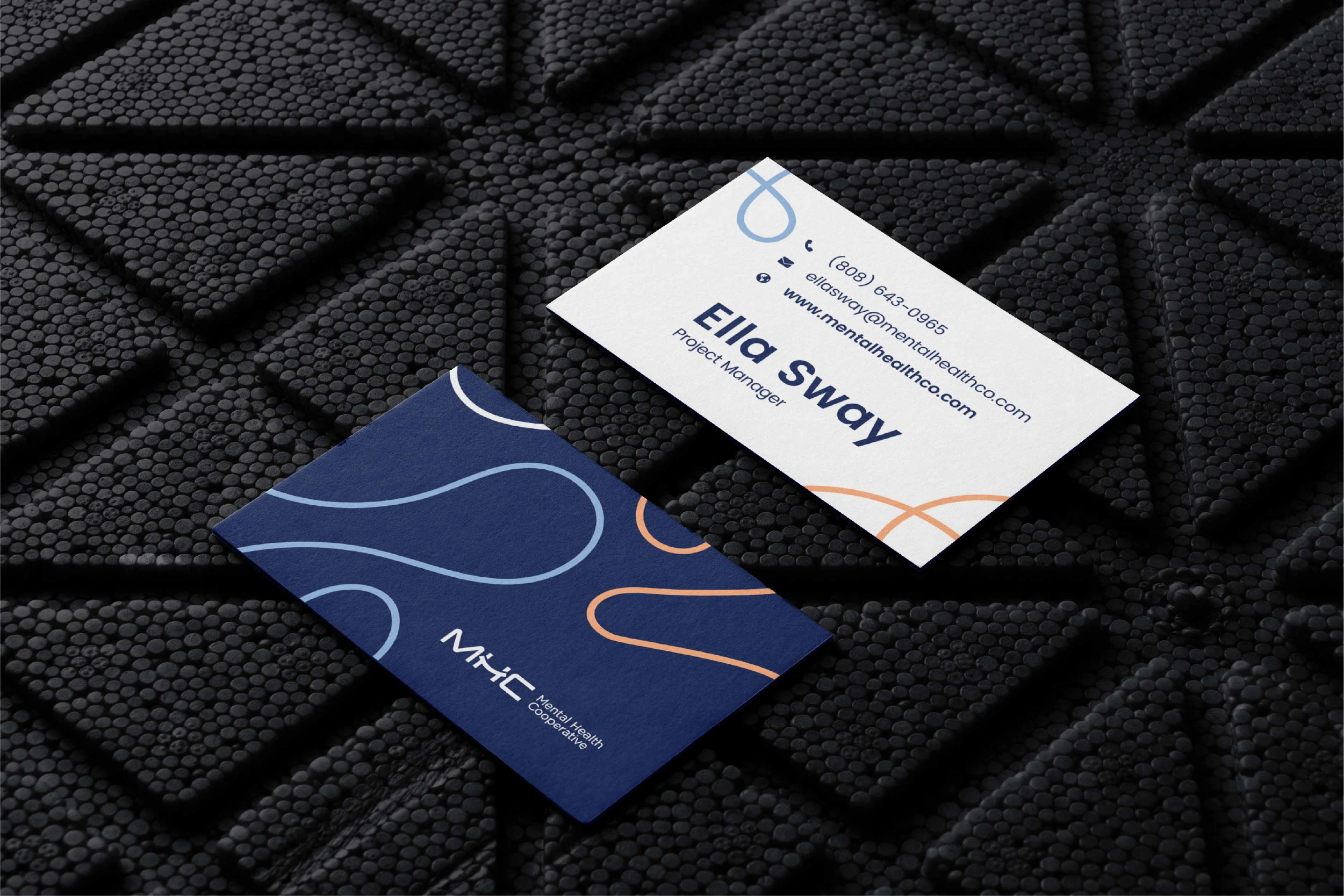
business card
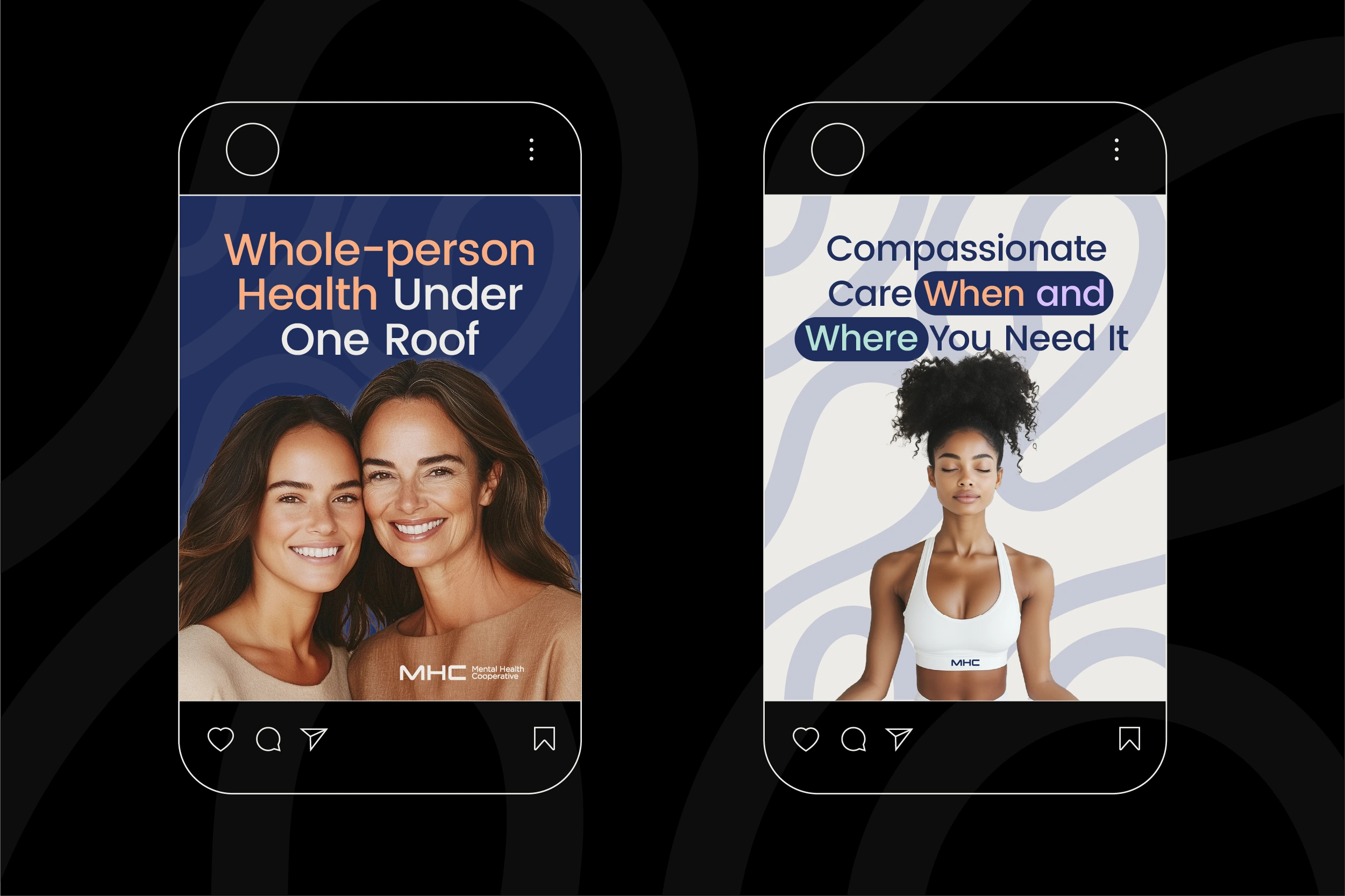
Social Media Post Templates
I created a set of 20 branded social media post templates to give MHC a flexible library for ongoing communication. Each template is built around the organization’s values of care, accessibility, and community, ensuring every post feels welcoming and consistent.
social media post template
Imagery plays a central role—diverse, authentic, and smiling faces reflect the hopeful outcomes of working with MHC. Paired with the brand’s color palette and typography, the templates create a cohesive visual system that strengthens trust and recognition across platforms like Facebook, Instagram, and LinkedIn.
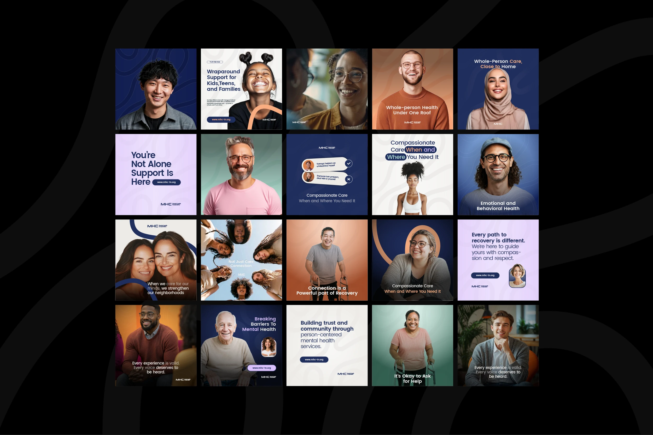
scoial post templates
Social Media Cover
I designed the media cover using curated imagery of real people across different ages, races, and backgrounds.
Smiling faces were chosen intentionally to show the positive outcomes of engaging with MHC—hope, trust, and belonging—rather than focusing on crisis imagery that can feel clinical or discouraging.
social media cover
By blending authentic photos with MHC’s color palette and typography, the covers create a welcoming first impression across platforms like LinkedIn, Facebook, and Twitter/X, making the organization’s values visible from the very first interaction.
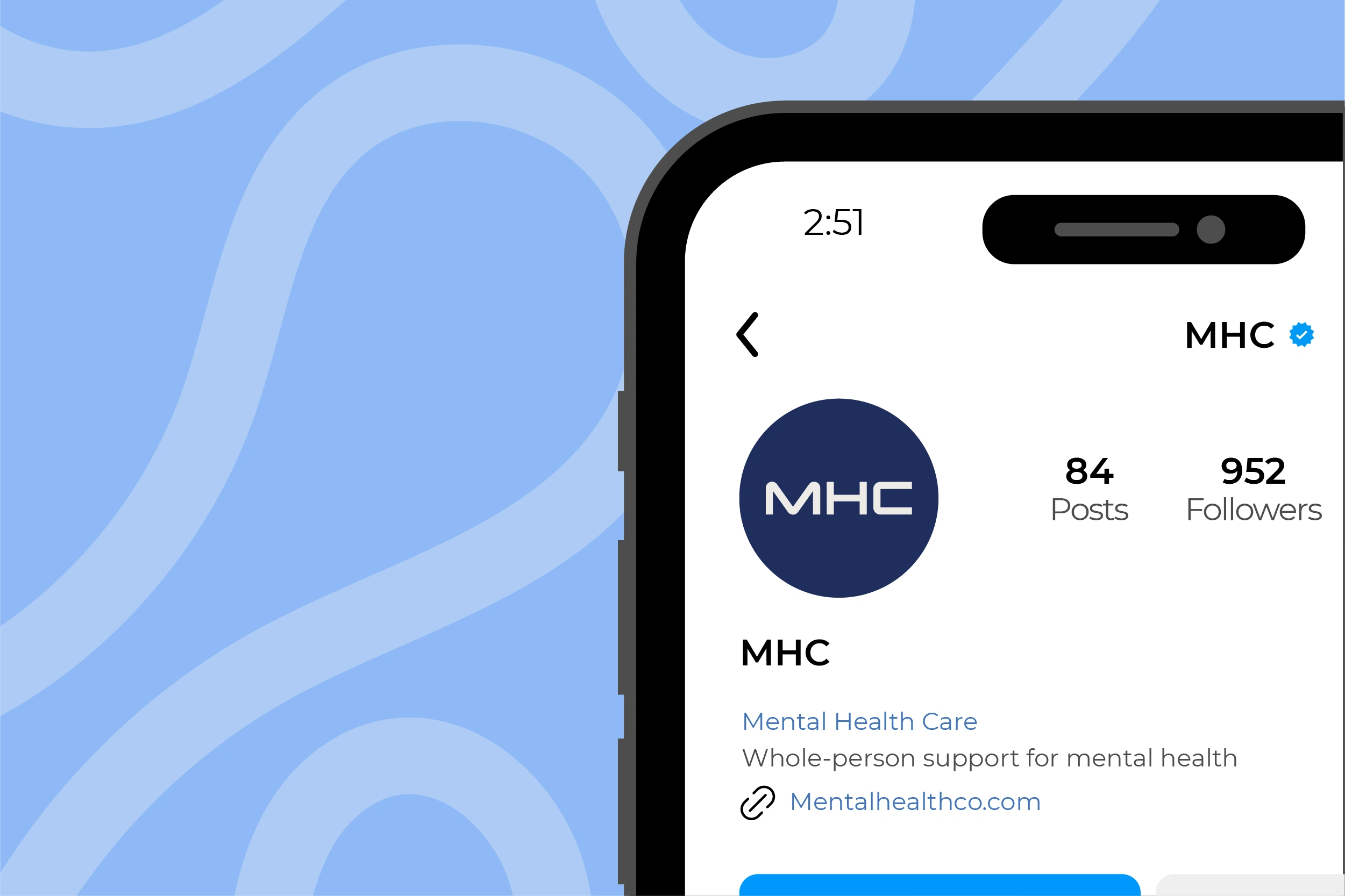
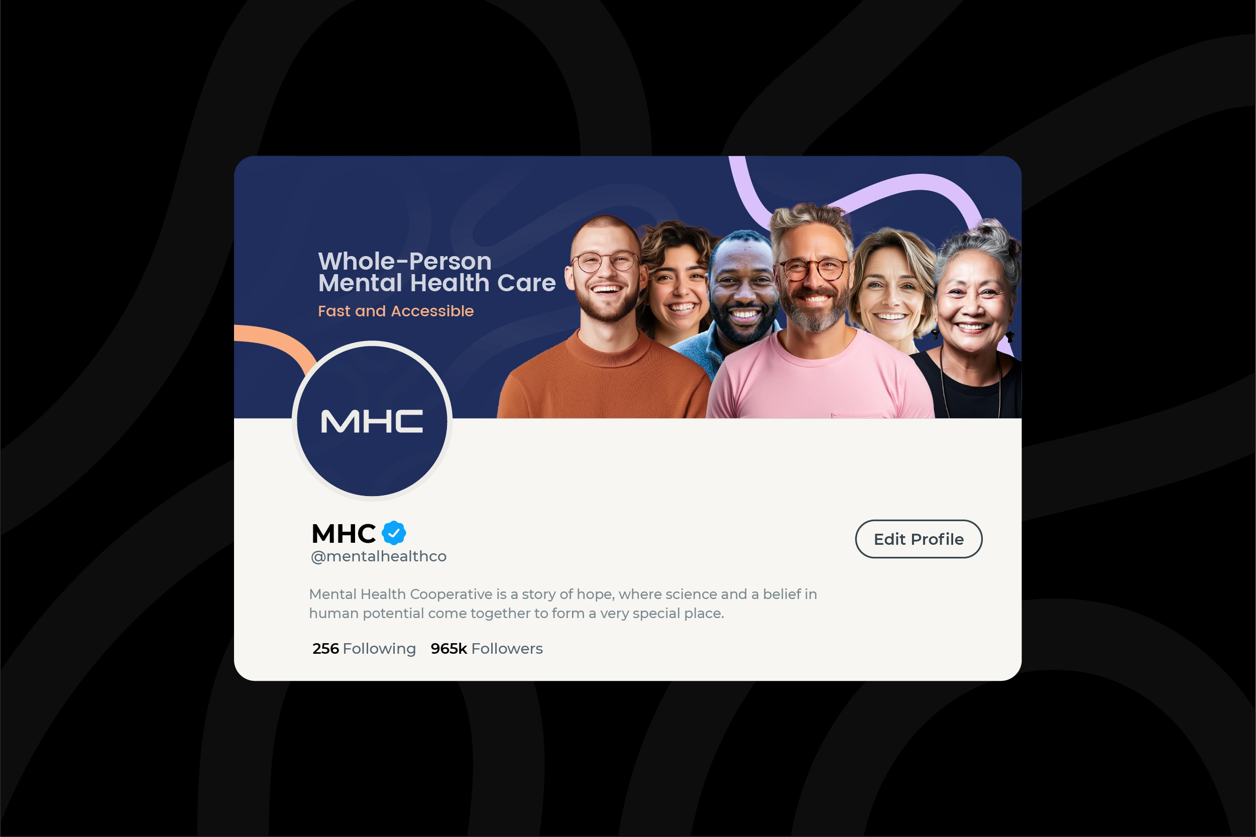
MHC Instagram page mockup
Hero Section Mockup
The hero section was designed as the first point of contact for MHC’s digital audience—setting the tone for the brand experience online. It combines authentic imagery of diverse, smiling individuals with the organization’s color palette, typography, and patterns, instantly communicating warmth, trust, and accessibility.
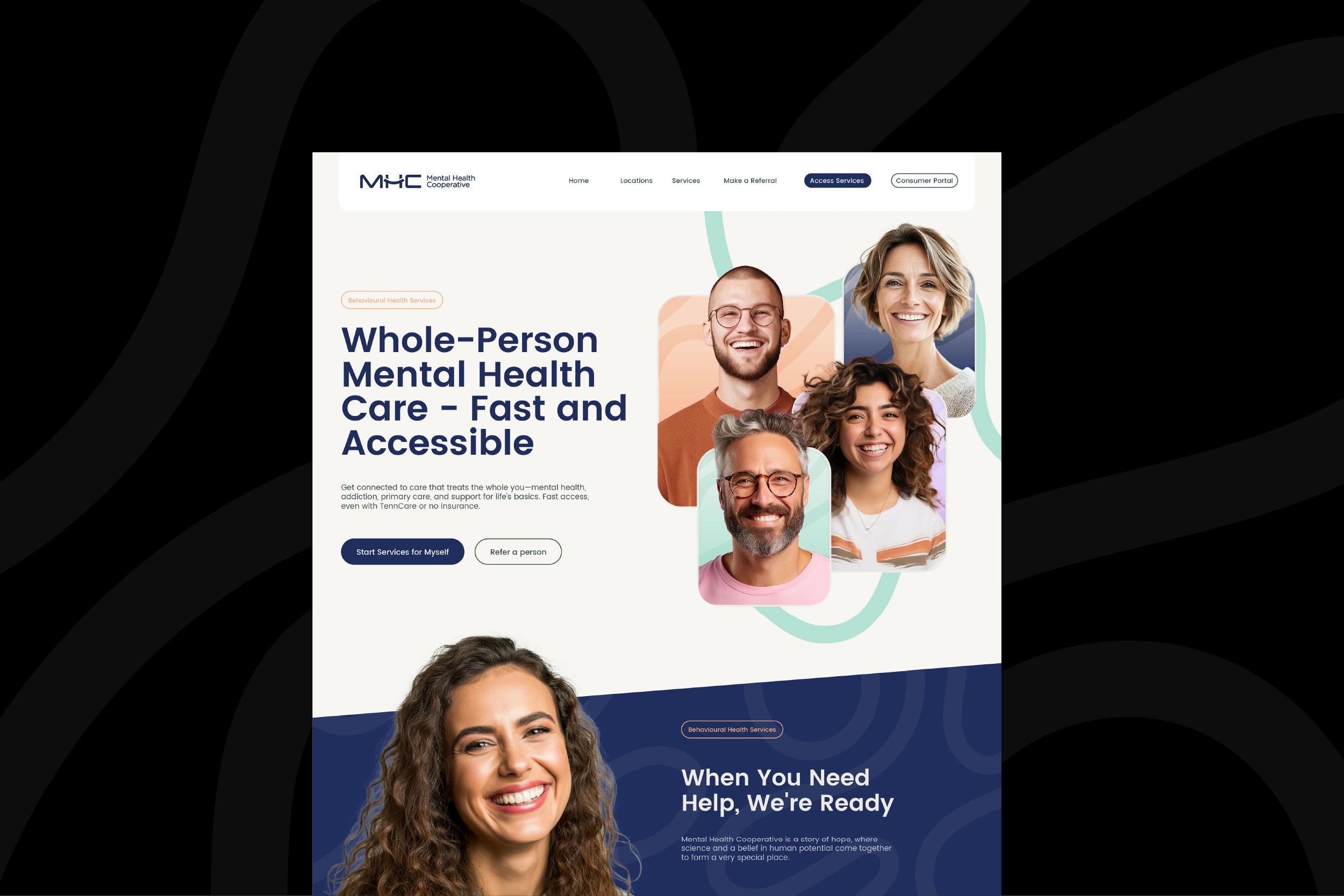
This mockup demonstrates how MHC’s refreshed identity can extend beyond static assets and live in digital applications
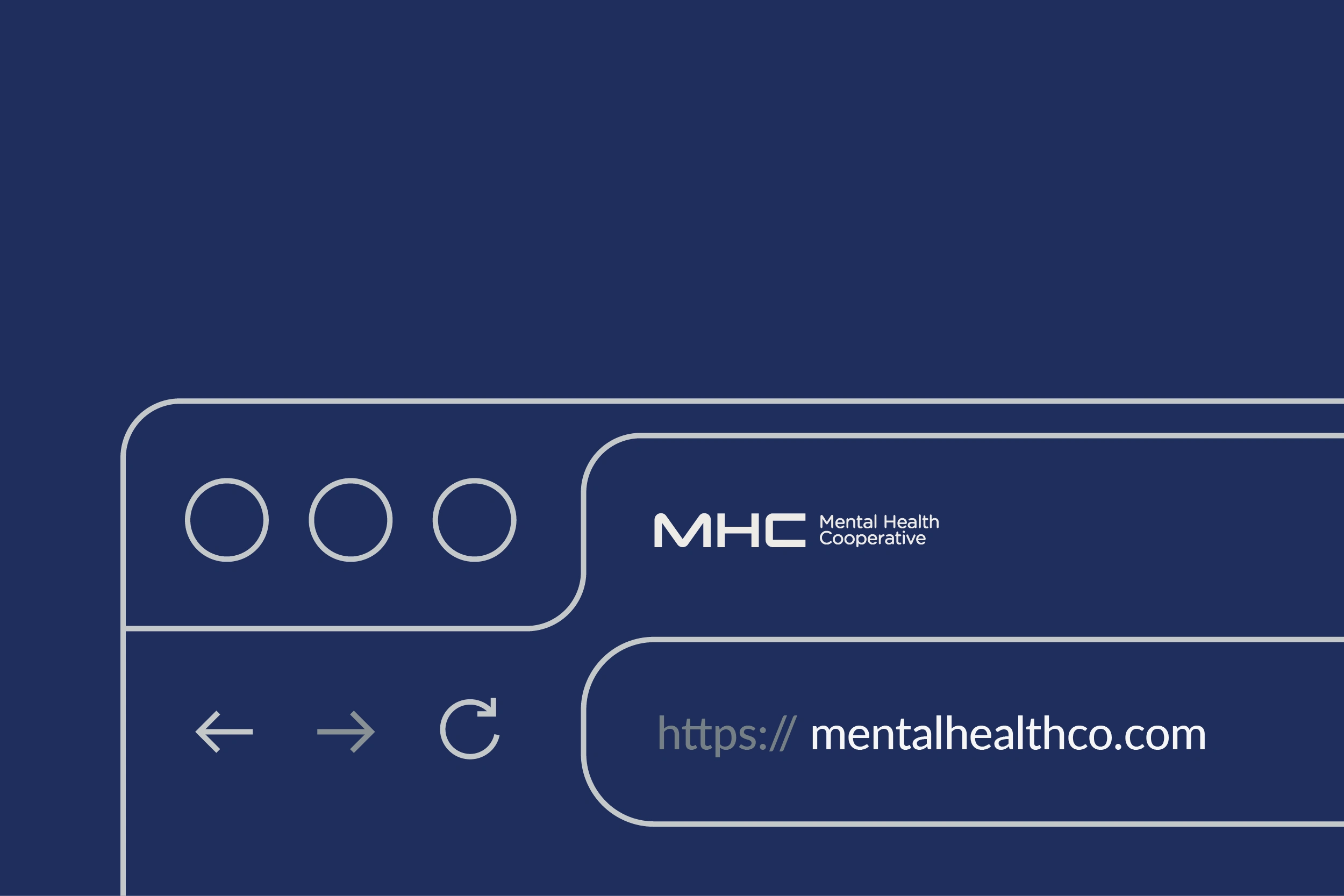
MS Word & PowerPoint Templates
I designed branded templates in Word and PowerPoint to bring MHC’s identity into everyday use. The Word template keeps reports and letters consistent with branded headers and footers, while the PowerPoint template includes custom master slides and layouts for storytelling, data, and case studies. Both were built for ease and flexibility, so staff can focus on content while maintaining a professional, unified brand presence.
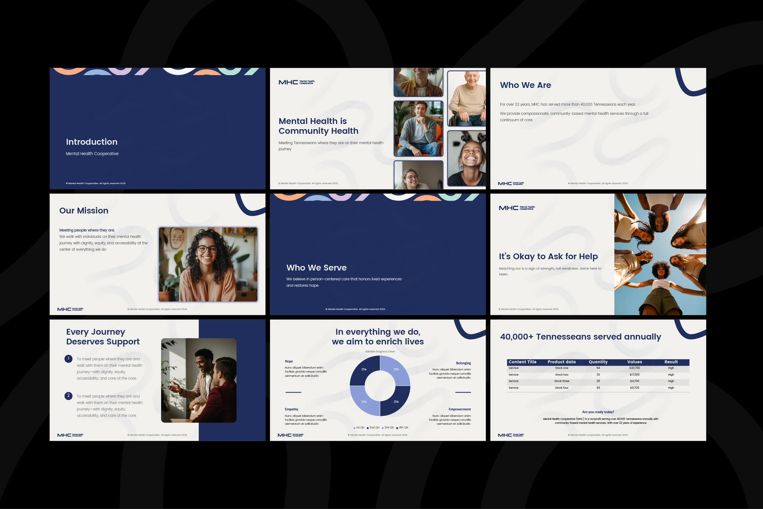
powerpoint template
ms word template
favicon
Email Banner
I designed branded email banners to give MHC’s digital communication a professional, recognizable touch.
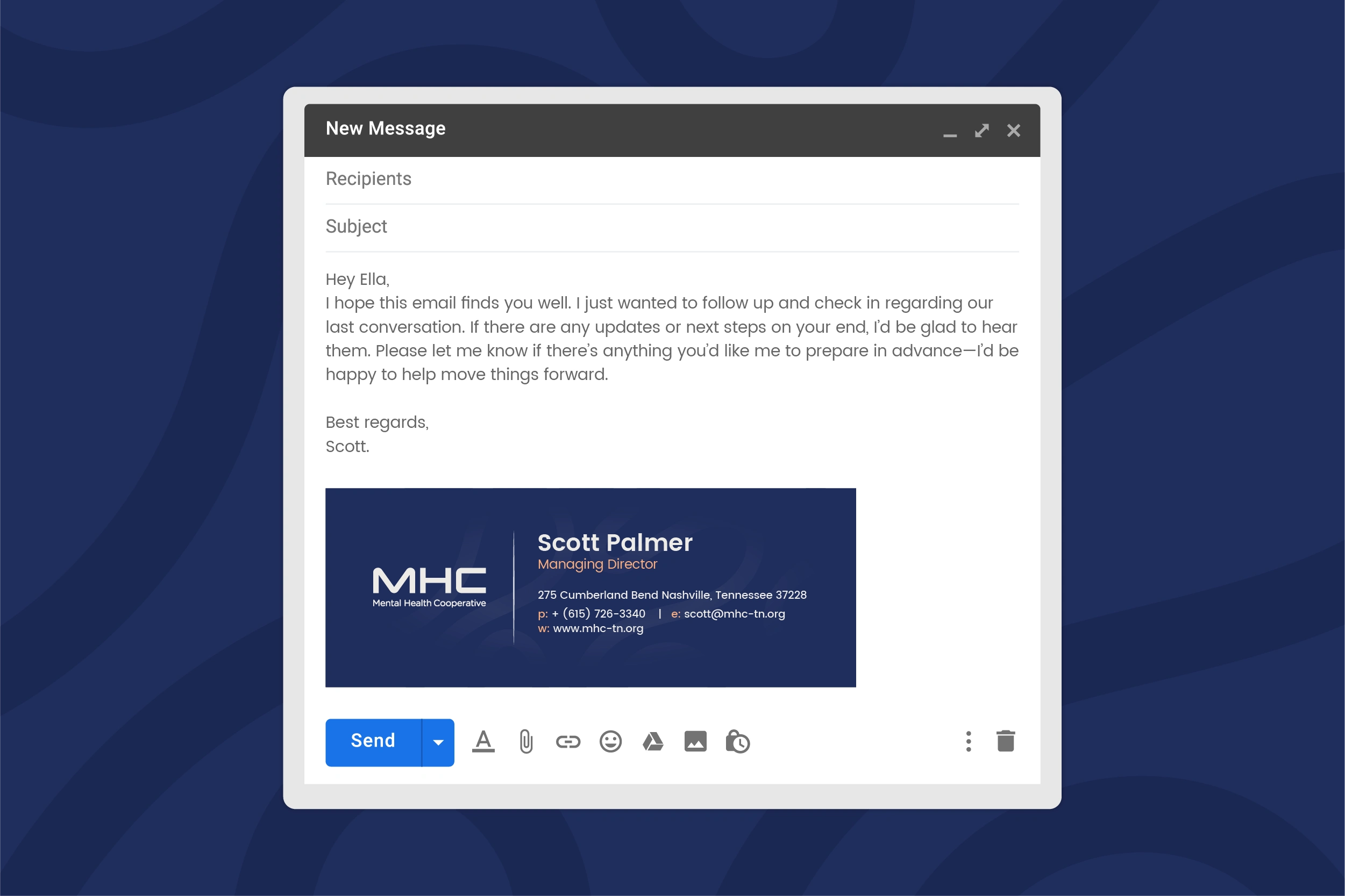
email banner
Staff Badge
I designed branded staff badges to extend MHC’s identity into everyday interactions. The layout is clean and professional, featuring the MHC logo, brand colors, and typography for instant recognition.
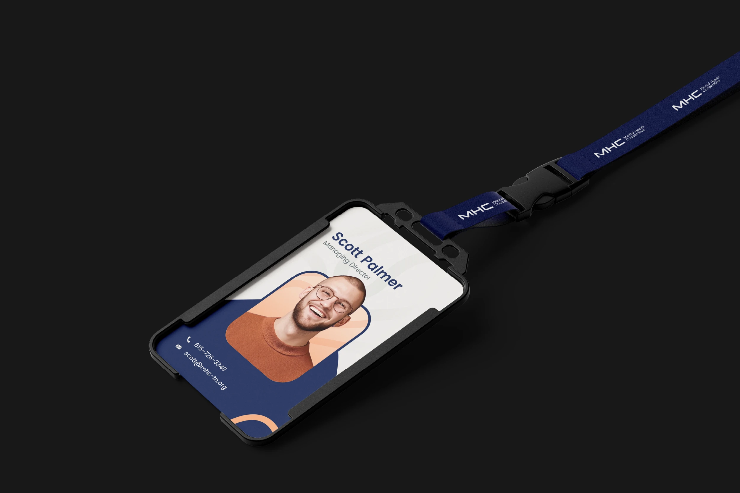
staff badge
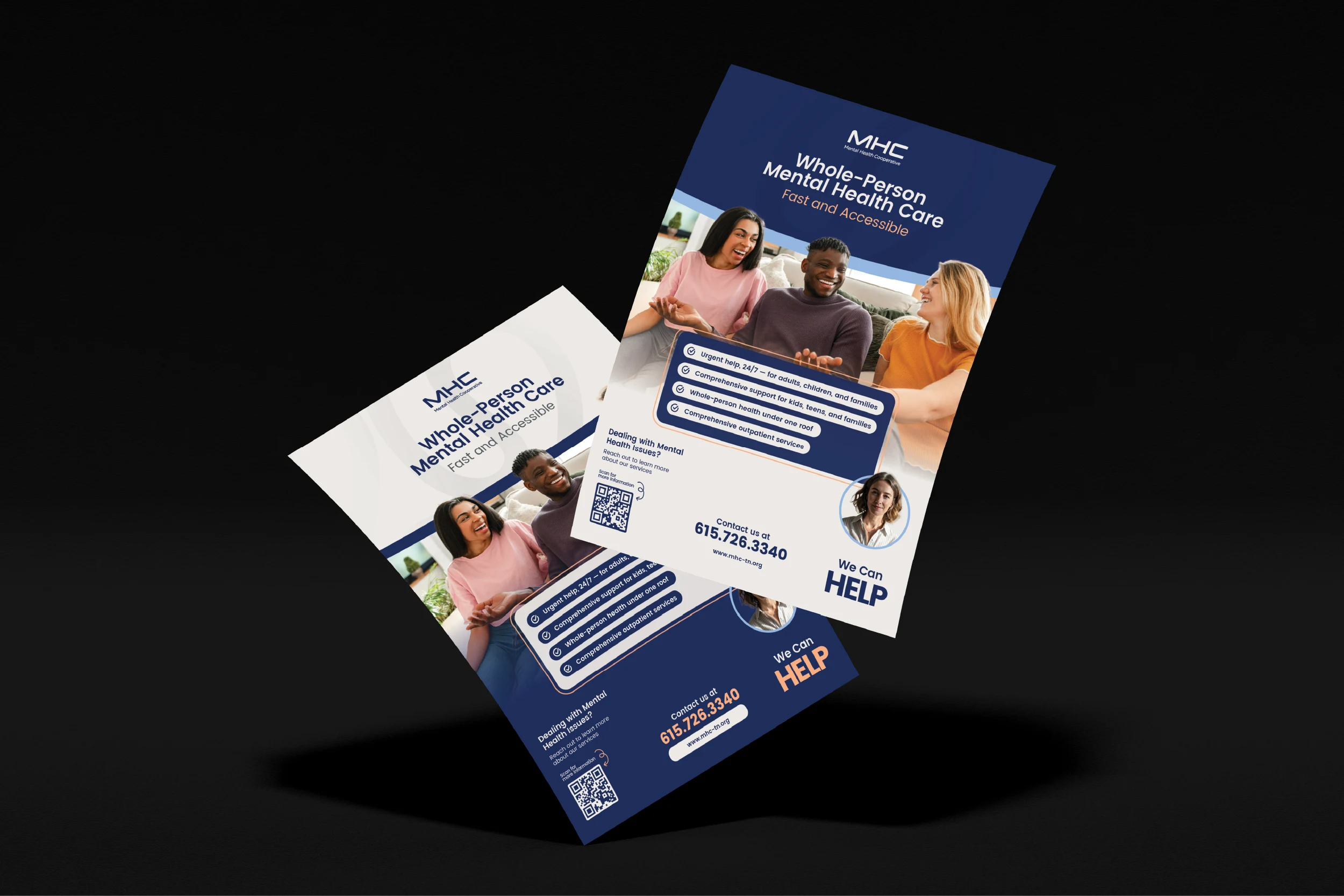
flyer template
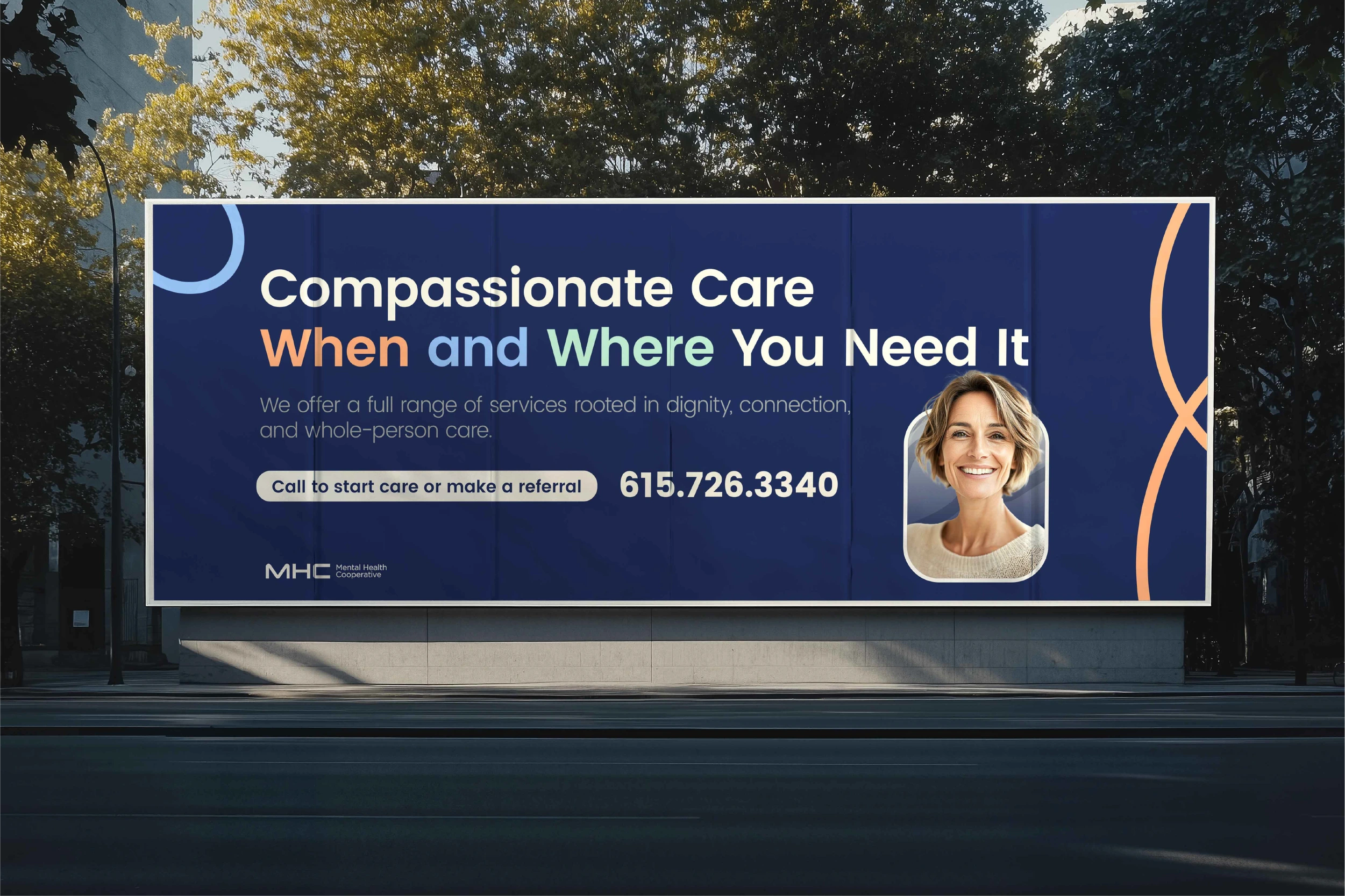
banner design
Outcome
The final identity system transforms MHC’s brand strategy into a unified visual language of hope, connection, and compassion. Every design element—from logo to pattern—works together to build a brand that not only looks trustworthy but feels human, just like the organization itself.
Reach out if you want to reinvent your brand into a professional, polished identity that attracts investors and inspires confidence. Whether you want a timeless design that will stand the test of time, believe it's time for your brand's look to match the success of your business, or are ready to move away from DIY efforts in favor of a professional touch, I'm here to help take your brand to the next level.
Like this project
Posted Oct 3, 2025
A compassionate identity system for Mental Health Cooperative, built to reflect dignity, inclusivity, and trust.
Likes
2
Views
18
Clients
Mental Health Cooperative