
THE PROJECT
Earthful is a wellness brand offering boba-inspired protein blends for people who enjoy active lifestyles, good nutrition and the outdoors.
The brand originally began with a sustainable cutlery concept. As the business evolved toward food and beverages, we developed the brand further and created packaging for its new nutrition range.
THE CHALLENGE
Earthful wanted to bring something different to the protein category – the enjoyable flavours of boba tea combined with convenient, everyday nutrition.
The packaging needed to communicate the product range and connect with an adventurous, nature-loving audience. We also wanted to give the brand a recognisable character that could grow beyond its first products.
BRAND IDENTITY & CREATIVE DIRECTION
The identity started with a friendly, rounded wordmark and a symbol inspired by an open window to nature. The idea was to make the outdoors feel close and accessible, even in the middle of a busy day.
I explored a visual direction built around natural colours, expressive typography and hand-drawn elements. The moodboard introduced an organic, playful character that became the foundation for the packaging.
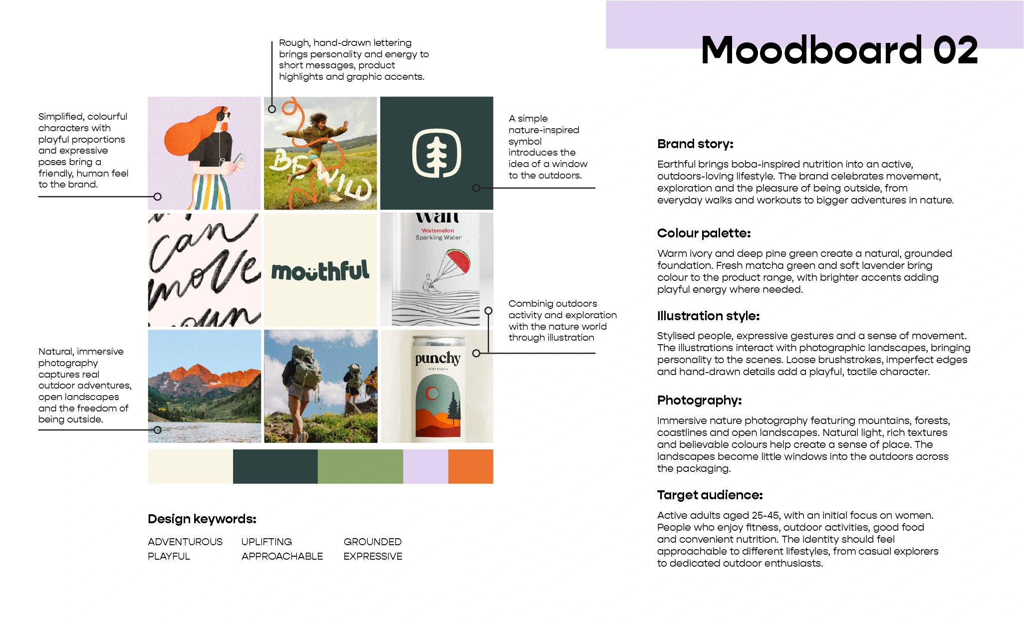

PACKAGING EXPLORATION
We explored several approaches before finding the right expression for the packaging. One early idea featured colourful illustrated worlds, with people stepping into the scenes. As we developed it further, I introduced a different approach - photographic landscapes paired with illustrated characters.
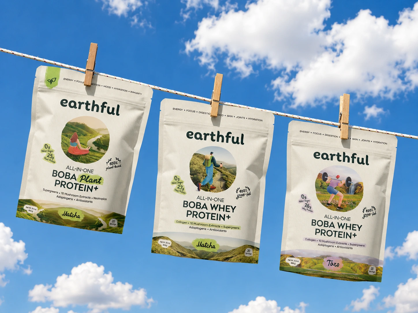
That change brought the concept closer to Earthful's identity. The circular landscapes became little windows into nature, and the characters brought them to life through hiking, surfing, exercising and moments of calm.
FINAL DESIGN & OUTCOME
The final packaging system was developed for four products: whey and plant-based protein blends in taro and matcha flavours.
Each pouch features its own illustrated character and natural landscape, giving the products individual personalities within a recognisable brand system. Colour accents help distinguish the flavours and formulations.
After finalising the packaging and preparing the artwork for production, I developed the brand guidelines and continued collaborating with the client on launch visuals, social media content and other branded materials.
The designs went into production, bringing the Earthful concept from our early explorations to physical packaging.


11 likes · 151 views · Apr 9, 2025
We established a strong, memorable brand presence for Earthful as a new market entrant who stands out on crowded shelves and digital platforms.


