Awarewell / Brand Identity / Healthcare

Loreta Lazarova


Awarewell / Healthcare
BRAND STRATEGY / DESIGN DIRECTION / VISUAL IDENTITY / GUIDELINES
Brand keywords: Caring, Calm, Warm, Transparency, Community, Human, Modern, Reassuring
WHAT?
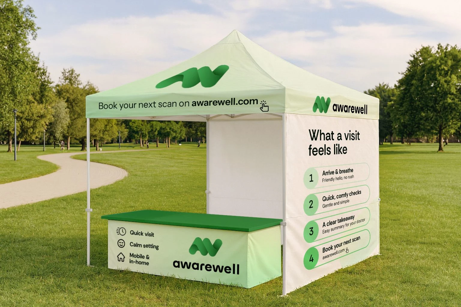
Awarewell delivers mobile, community-based and in-home preventive health screenings that give early, non-diagnostic insights and plain-language guidance for what to ask your doctor next.
WHY?
To bridge the gap between awareness and action by making early screening simple, comfortable, and affordable – without fear or pressure.
FOR WHO?
Adults 40+ and caregivers 25-55, plus community leaders coordinating events – people who value convenience, clarity, and trust. Served locally through community events and in-home visits across Southern California.
Strategic Insights
Keep the tone human and balanced – not overly clinical or salesy – and prove AwareWell shows up where life happens: churches, senior centers, workplaces and homes.
Draw bright boundaries – screenings create awareness, not diagnosis – and make next steps obvious with materials effortless to read, keep and share.
Solution
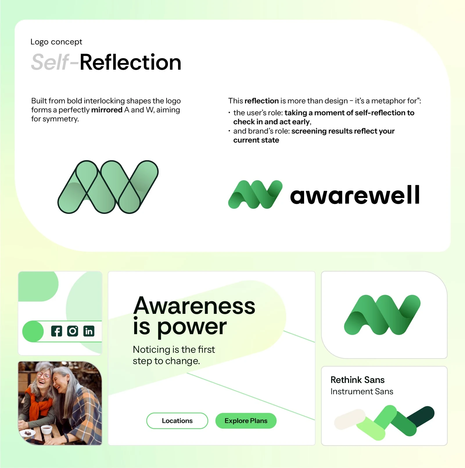
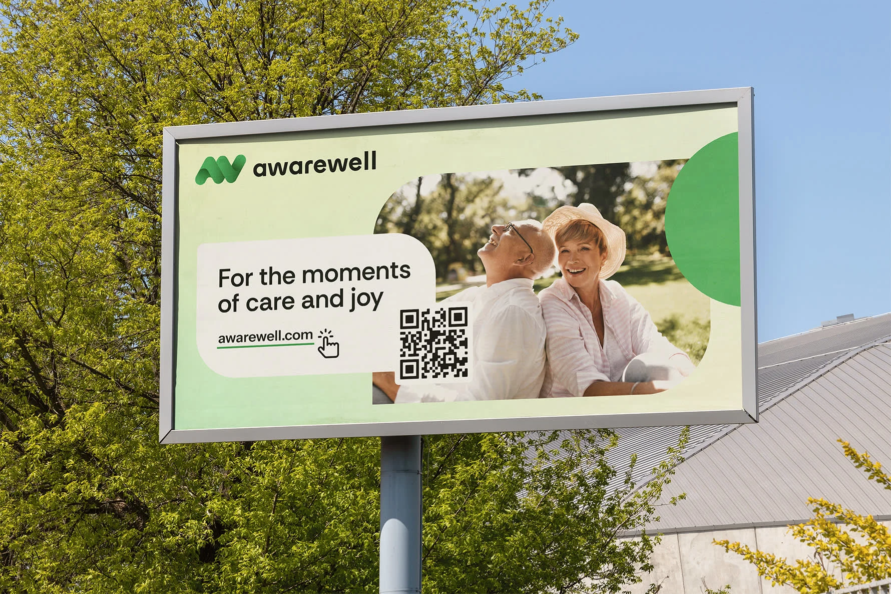
I built a human, local identity – the logomark embodies AW and self-reflection (as self-care). And as a leading visual element – photography with real seniors and caregivers in relaxed community and home settings.
Nature-drawn greens, soft gradients and beiges bring calm, health and reassuring, replacing clinical blues used by competitors; sans-serifs keep info clean, legible and matching the brand's personality .
Scope of work:
Strategy & Creative Direction
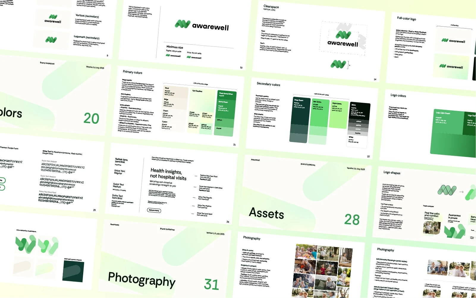
Visual Identity - Logo, Colors, Typography, Visual Direction
Brand Guidelines
Social Media Design
Like this project
Posted Sep 26, 2025
Created a human and local-feeling brand identity for Awarewell focusing on care, reliability and clarity.