Built with Framer
Brand, Website Design & Development for Finite

Artyum Grebenyuk (AGR Studio)


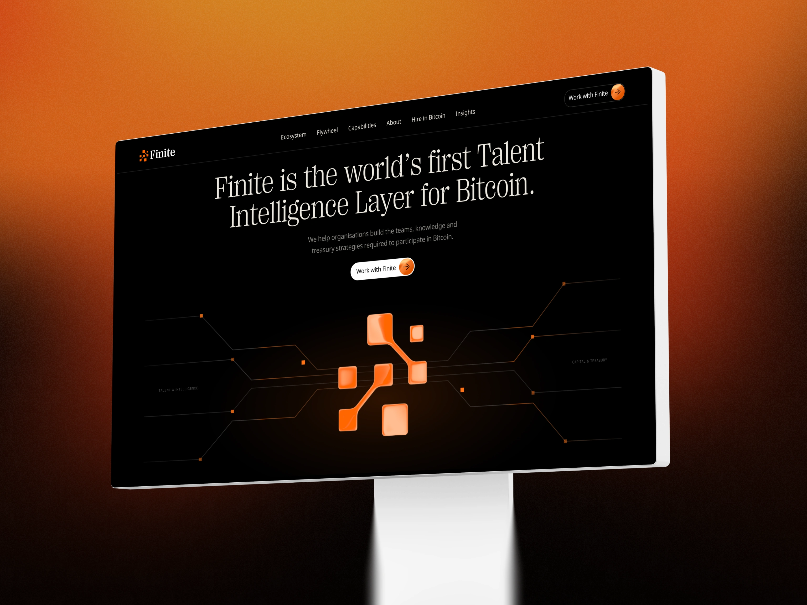
The network is the brand.
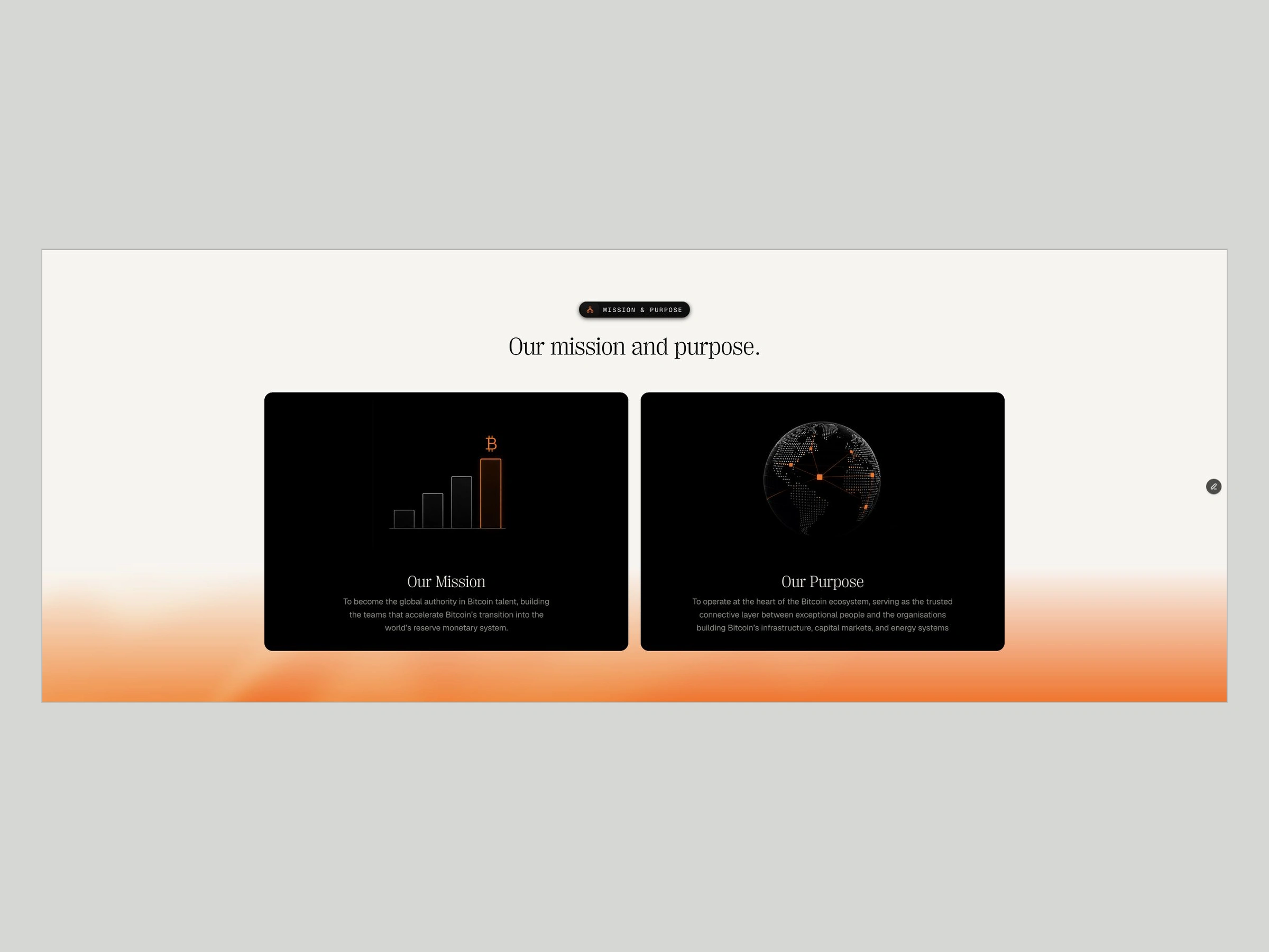
Finite brings talent, intelligence and treasury advisory to the Bitcoin economy. We designed its brand identity and Framer website as one visual system.
The insight
People, information and capital, in one network
Finite connects organizations building in the Bitcoin economy with talent, market intelligence and treasury advisory. Talent is the foundation of the business, but the three move together: the right people, the right information, and the capital flowing between them. Finite sits where those flows meet, and the brand had to show it.
The challenge
Three services, one institutional story
Founder David Lawrence came with an existing logo, a clear thesis and an ambitious brief. Intelligence and treasury advisory had to stand as services in their own right next to talent, without splitting Finite into three companies. And the whole brand had to feel ready for institutional conversations, giving prospective clients confidence in Finite's place in the Bitcoin ecosystem.
The solution
Put Finite at the center of the network
The strongest idea grew from the logo David already had. We placed Finite's symbol at the center of a network, where connections and moving signals show people, information and capital flowing through the firm. Angular paths, square nodes and integrated portraits make the network Finite's own, and subtle orange pulses mark the connections. PP Right Serif gives the headlines an editorial voice, with Geist for reading and Geist Mono for data, on black, charcoal and warm off-white. The same brand identity runs from the opening animation to the diagrams, company brochure, brand guidelines and social assets.
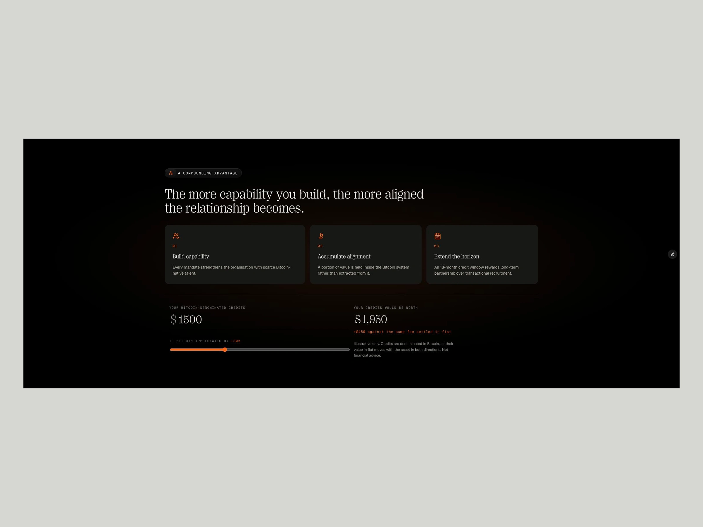
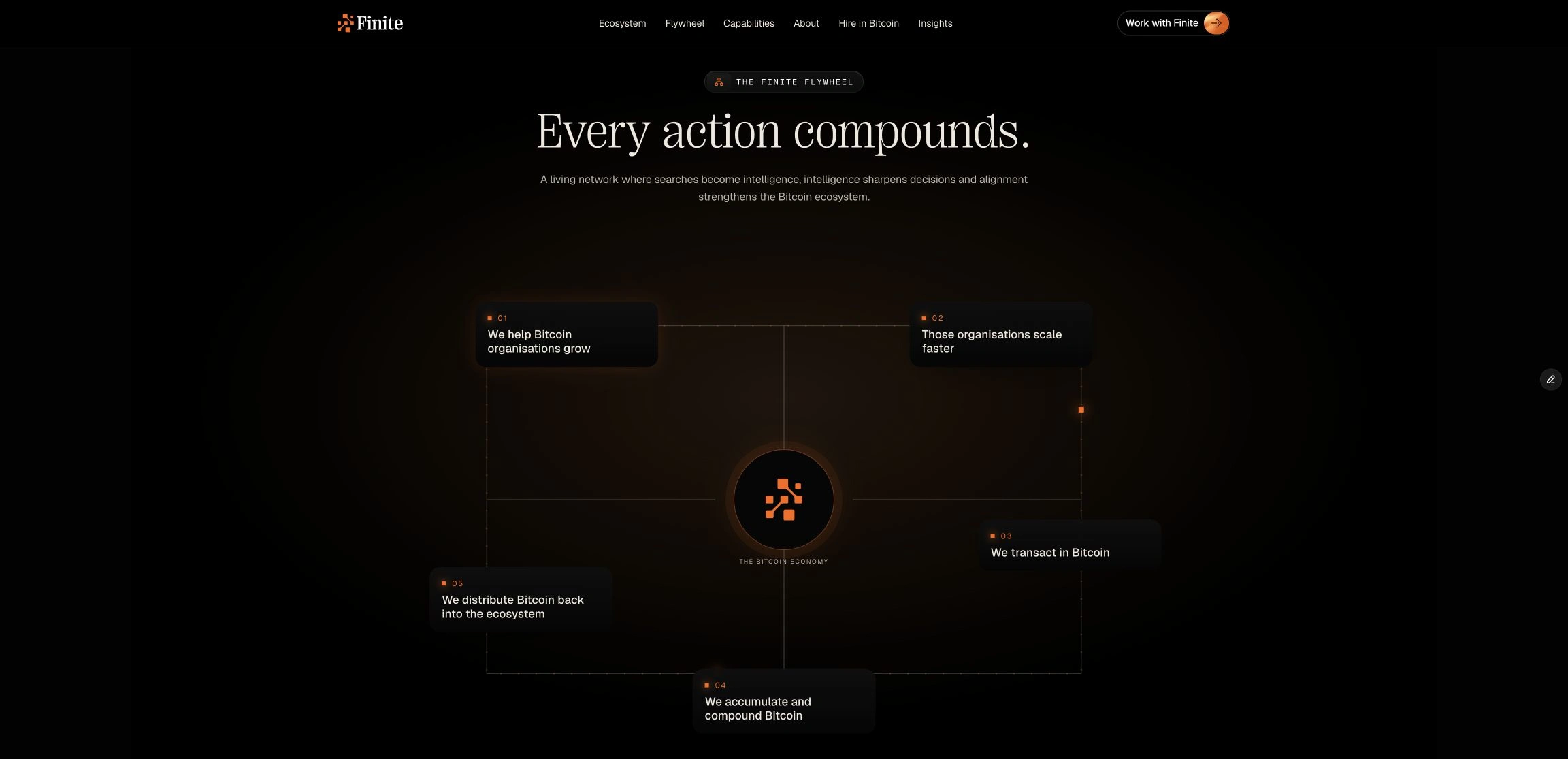
We built the responsive website in Framer, with custom React and TypeScript interactions for the network hero, a capability selector and a five-stage flywheel. An Insights CMS publishes articles filtered by sector and format, and clients and candidates follow separate paths, with CV uploads for candidates. David suggested a calculator for sales calls, and we turned it into an interactive tool for Bitcoin-denominated hiring credits that shows how their fiat value moves under different price assumptions, downside included.
The shift
From a founder's thesis to an institutional brand
Finite launched with a website, company brochure, brand guidelines and social assets built from one visual system, so a prospect hears the same story on the site, in the meeting and in the follow-up. CMS editing guidance at handover means Finite keeps the site current and publishes its own expertise.
“It feels like a proper institutional, global brand. That's the business I want to build,” says David Lawrence, Finite's founder.
Live site: finite.global
Full case study: agr.studio/projects/finite
Like this project
Posted Sep 5, 2026
Finite brings talent, intelligence and treasury advisory to the Bitcoin economy. We designed its brand identity and Framer website as one visual system.
Likes
4
Views
106
Clients
Finite


