Proper Pizza - Redesigning the Pizza Ordering Experience
🔬 Overview of the Project
Propper’s online ordering platform faced a significant challenge: users frequently placed orders from locations outside the delivery range due to the platform’s inability to guide them effectively.
This issue resulted in 67% of orders being invalid and led to user frustration and operational inefficiency. Additionally, the platform’s design resembled an eCommerce website for appliances, with features like product comparisons, unnecessary specifications, and redundant information, making the ordering process cumbersome and unintuitive.
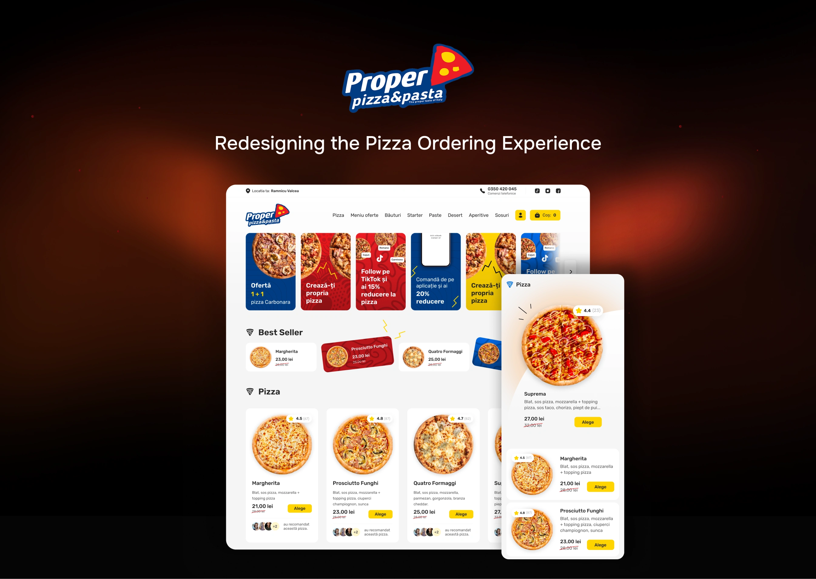
To resolve these issues, I redesigned the platform with a user-first approach, ensuring customers could easily order from their nearest restaurant. The solution involved creating a streamlined, single-page layout with a modern, visually appealing UI, robust location selection features, and optimized navigation for a seamless ordering experience.
📋 Task
Redesign the Propper pizza ordering platform to:
Eliminate ordering errors caused by location mismatches.
Simplify the user journey for both delivery and pickup orders.
Modernize the user interface to reflect the simplicity and fun of ordering food.
Create a consistent design system for future scalability.
📌 Challenges
Location Errors: Addressing the issue of users ordering from restaurants outside their delivery radius.
Irrelevant Features: Removing appliance-style eCommerce elements like product comparisons, unnecessary descriptions, and redundant information.
Cumbersome Checkout: Overhauling the multi-page checkout process to make it quicker and easier.
Consistency: Ensuring design uniformity across desktop and mobile versions while accommodating light and dark modes.
✅ Solution
Location Selection Page
Introduced an introductory page where users must select their location using a map or browser-based location sharing.
Reconfirmed location at key steps, including adding items to the cart and during checkout.
Offered a clear option for self-pickup if the user was outside the delivery area.
Streamlined Navigation
Replaced the multi-page structure with a one-page landing page for all product categories.
Added a fixed top navigation with category anchors for seamless scrolling.
Simplified Product Selection:
Eliminated separate product pages, allowing users to select pizza sizes and extra toppings directly on the main page.
Optimized Checkout
Consolidated the checkout process into a one-page design, reducing friction and improving usability.
Modern UI Redesign
Created a clean, modern design emphasizing products, offers, and new features.
Added interactive banners inspired by social media story formats for promotions.
Design System
Built a scalable design system in Figma, using variables for colors, typography,
spacing, and border radius.
Incorporated properties for easy light and dark mode toggling.
👨🏻💻 Contributions
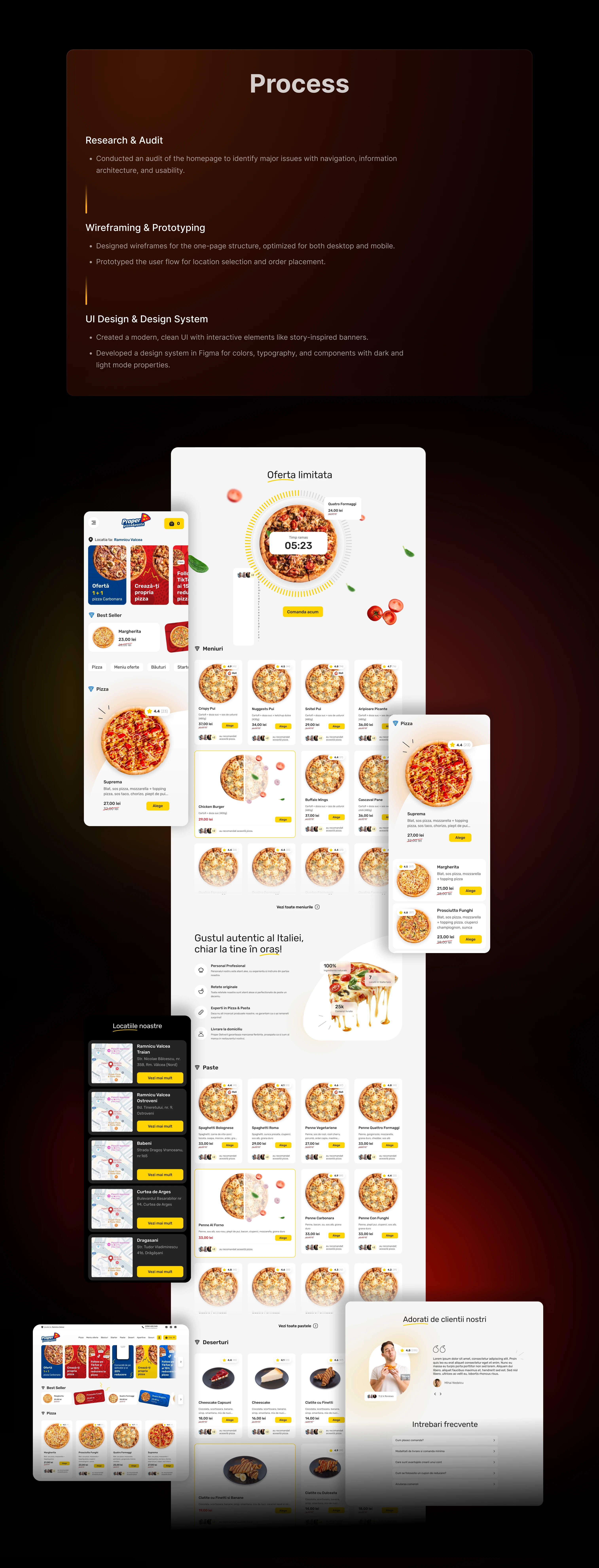
Conducted an audit of the existing homepage to identify pain points and areas of improvement.
Designed desktop and mobile versions of the platform for a consistent cross-device experience.
Created a location-based ordering system and streamlined product selection process.
Overhauled the checkout process to improve speed and efficiency.
Developed an interactive, user-friendly UI with a focus on usability and visual appeal.
Built a robust design system to ensure consistency and scalability across the platform.

🎯 Outcomes
92% Reduction in Order Errors
Users now place orders only within the correct delivery range.
75% Increase in Order Completion
Streamlined checkout and navigation improved user satisfaction and conversion rates.
Positive User Feedback
Enhanced design and simplified ordering process received high praise.
Scalable Design
The design system enabled future updates and ensured consistency across all restaurants.
86% Faster Checkout
The one-page checkout design reduced time spent per order.
68% Higher User Engagement
Leveraging analytics tools like user behavior data and patterns highlighted areas for optimization and helped prioritize feature development.
📚 Lessons Learned
Importance of User-Centric Design
Simplifying navigation and reducing unnecessary steps significantly improved user satisfaction and engagement.
Streamlining Checkout is Key
Transitioning to a one-page checkout eliminated friction and reduced cart abandonment rates, highlighting the value of user flow optimization.
Localization Matters
Ensuring users interact with the correct restaurant location through clear prompts and automatic location sharing was critical to solving the original business challenge.
Consistency Drives Efficiency
Creating a design system with reusable components not only ensured visual consistency but also streamlined future updates and iterations.
Embracing Familiar Patterns
Incorporating social media-inspired features like story banners fostered immediate user familiarity and increased interaction rates.
Collaborative Problem Solving
Close collaboration with stakeholders, developers, and users ensured the final solution met business goals and addressed user pain points effectively.
Like this project
Posted Nov 30, 2024
Audited the homepage, redesigned cross-device UI, streamlined ordering and checkout, improved usability, and built a scalable, consistent design system.
Likes
0
Views
25

