CRENDONY | Streetwear Brand Identity
Begüm Pek

Crendony Brand Identity
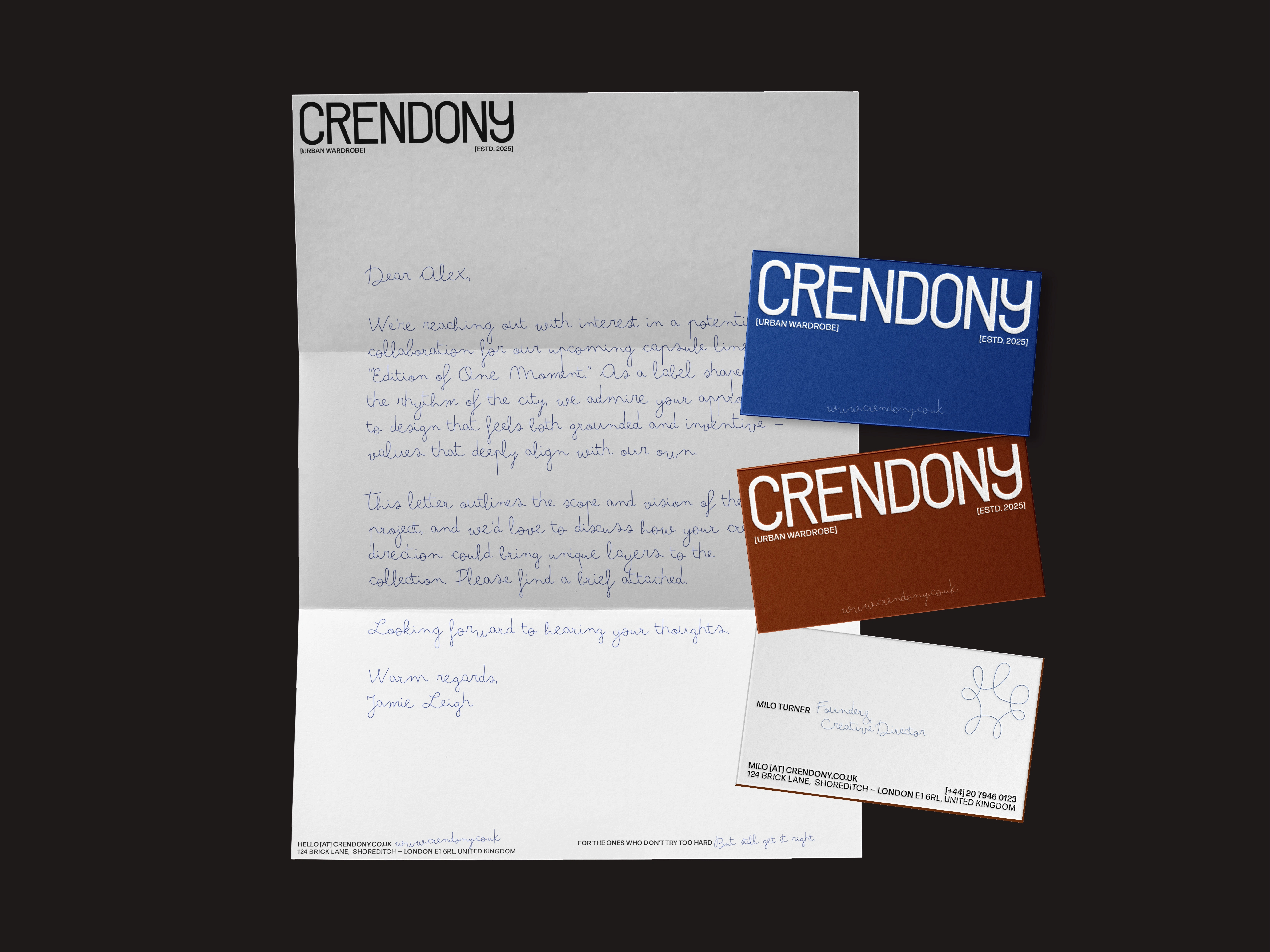
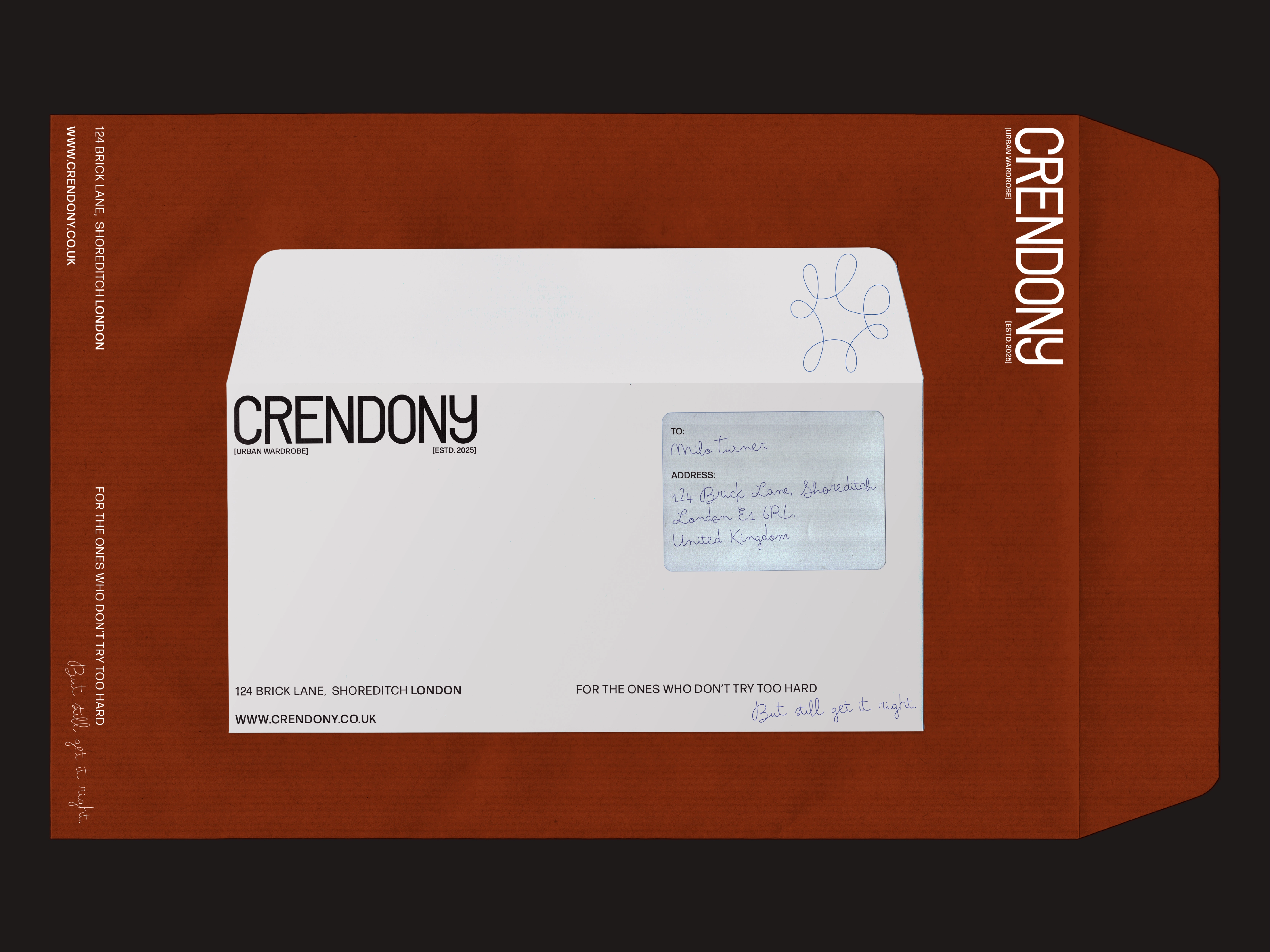
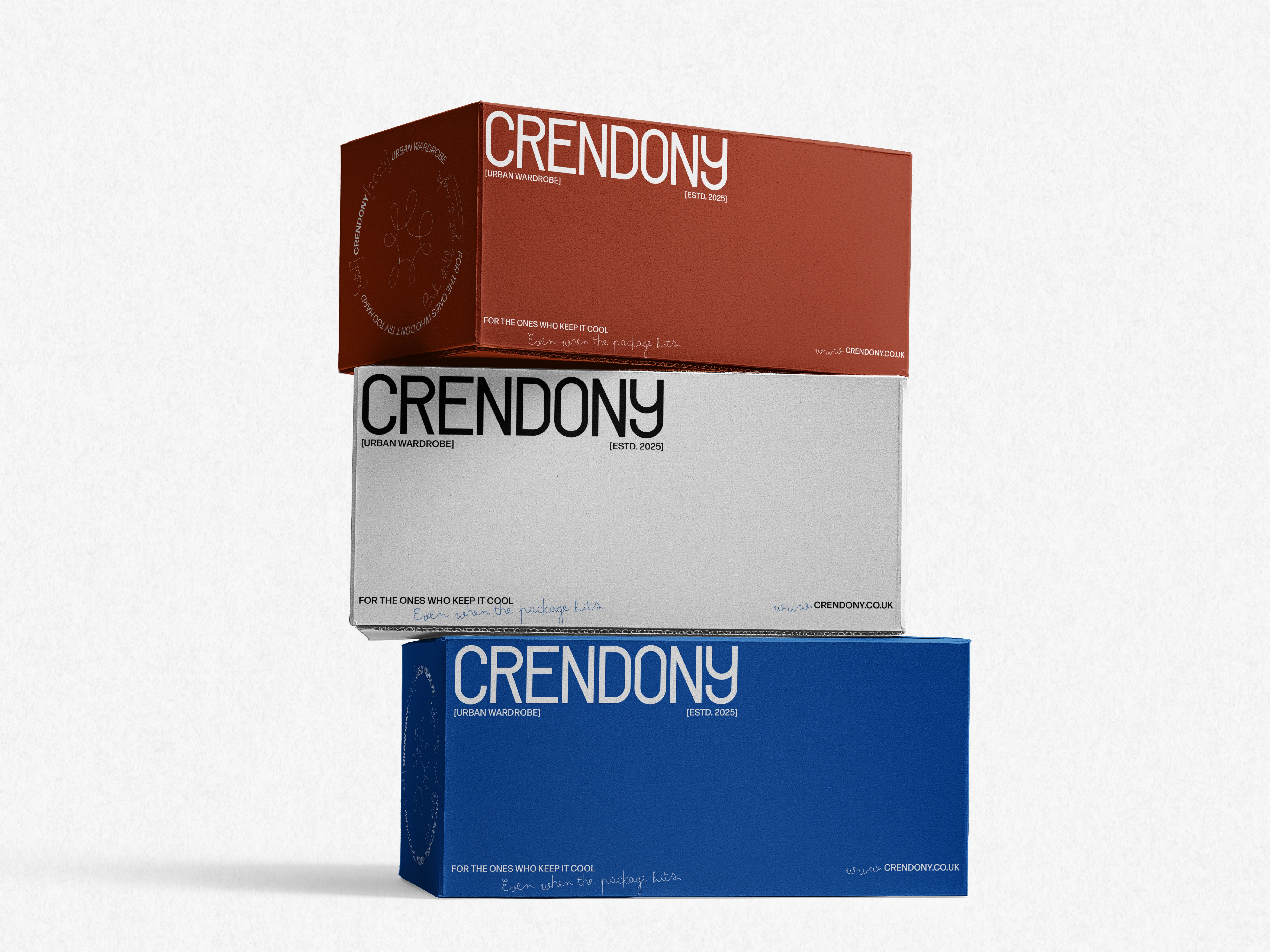
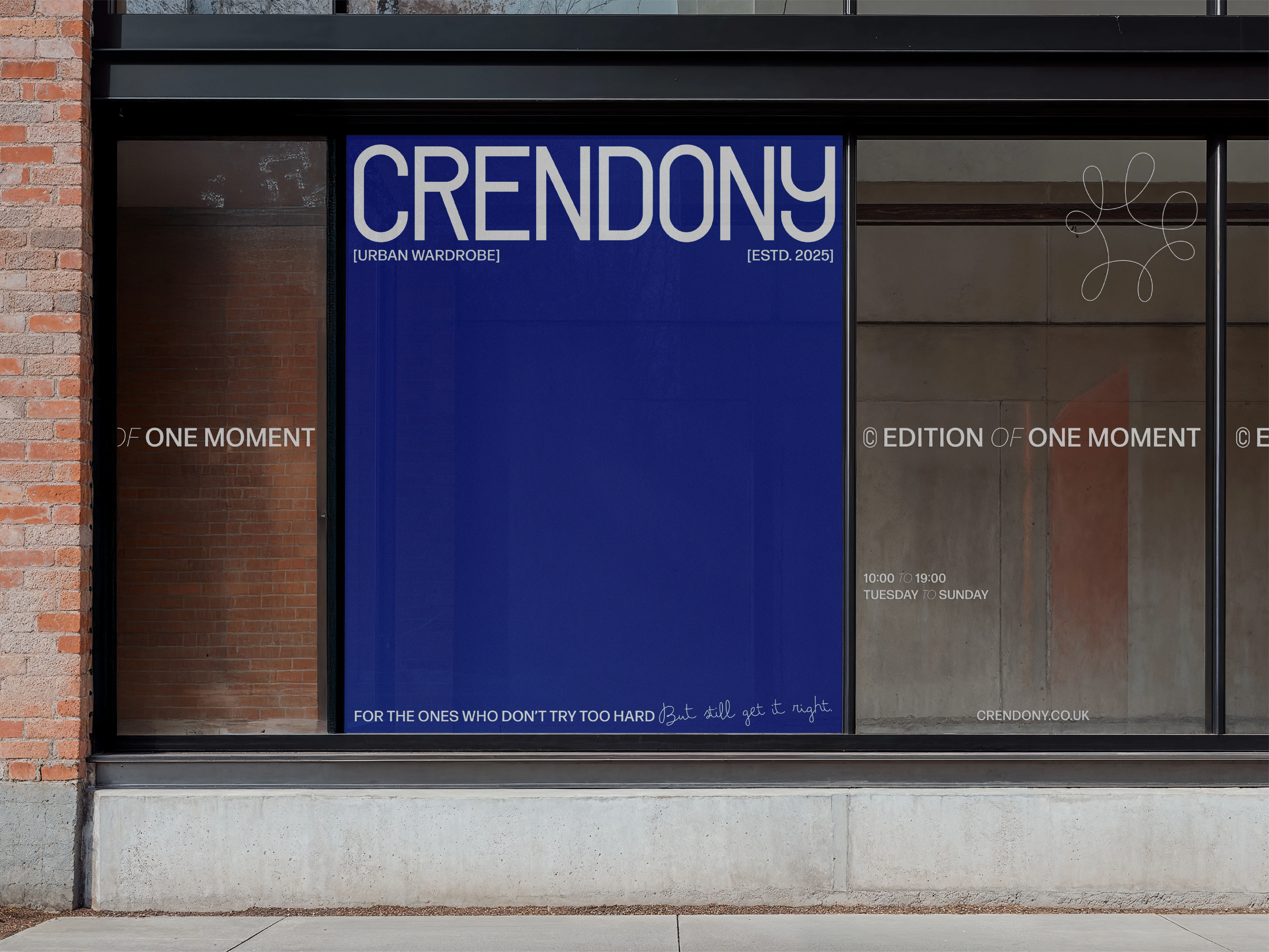
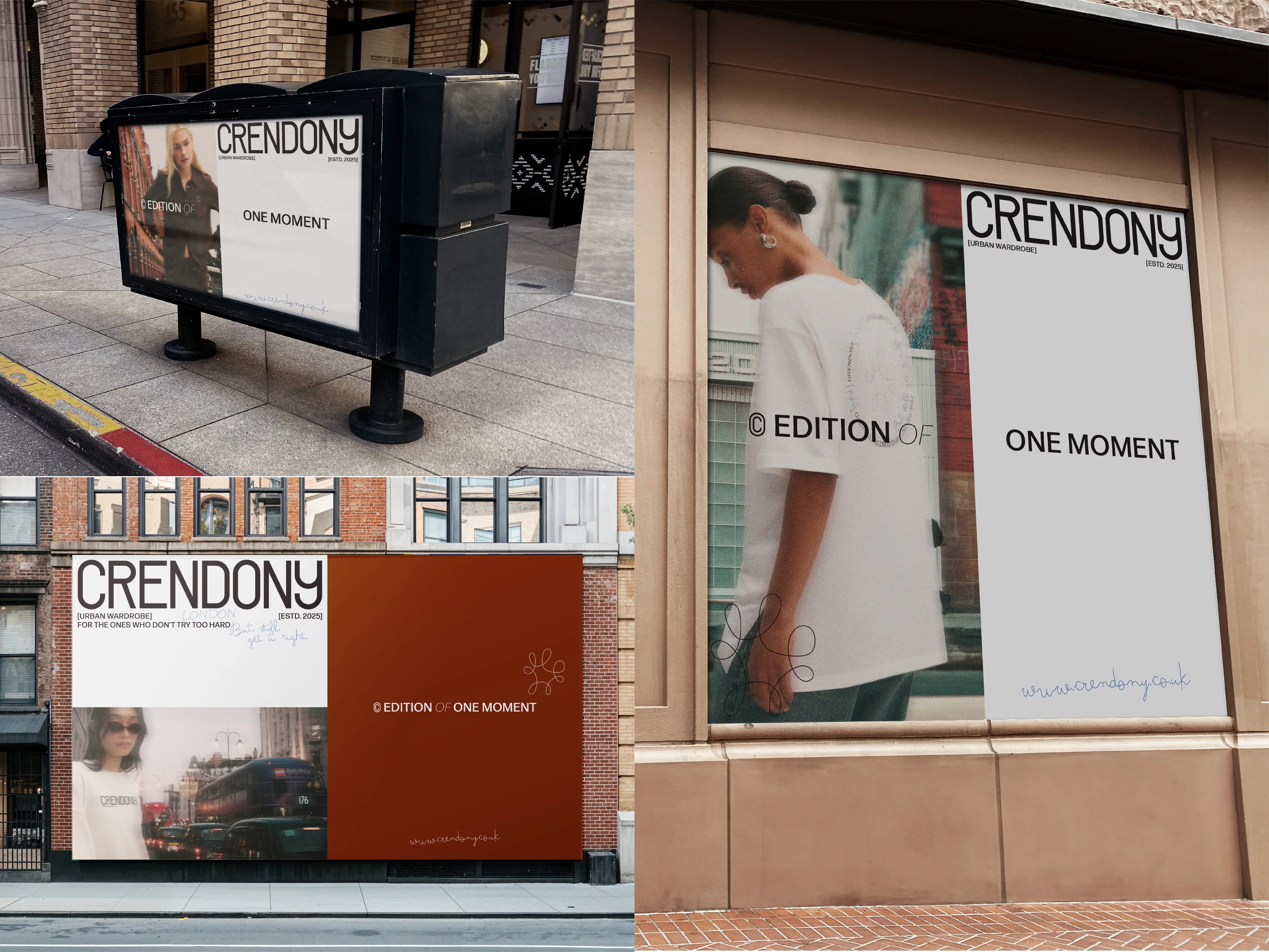
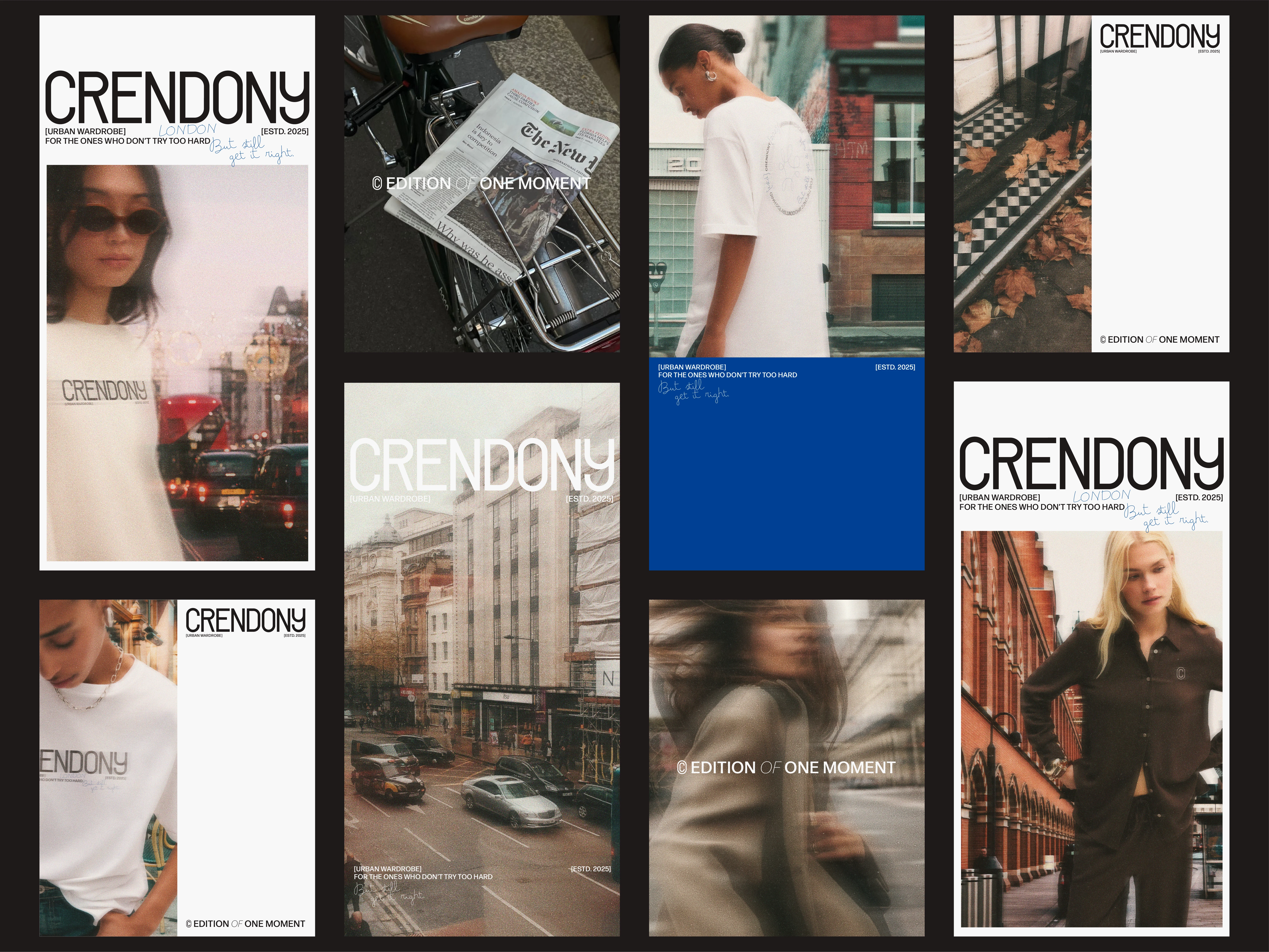
Crendony is a streetwear label shaped by the rhythm of London. Rooted in everyday style, it speaks to those who move through the city with intention. For its branding, it needed a clear visual system that could balance structure with its core values.
My approach was to build an identity that combines minimal layouts with tactile textures and handwritten interventions—where a minimal brand system is playfully interrupted by the brand character through pen marks, adding a distinctive layer to the brand story.
The result is a cohesive brand language that elevates Crendony’s presence, making it both culturally sharp and visually distinctive while staying true to its urban rhythm.


Like this project
Posted Sep 4, 2025
This project delivered a distinctive visual and verbal identity enriched with tactile textures, handwritten interventions, and a modular design system.
Likes
2
Views
10
Timeline
Aug 1, 2025 - Sep 15, 2025